The network for creativity
Join 1.25M professional creatives like you
Connect with clients, get discovered, and run your business 100% commission-free
Creatives on Contra have earned over $150M and we are just getting started
Back to feedPost


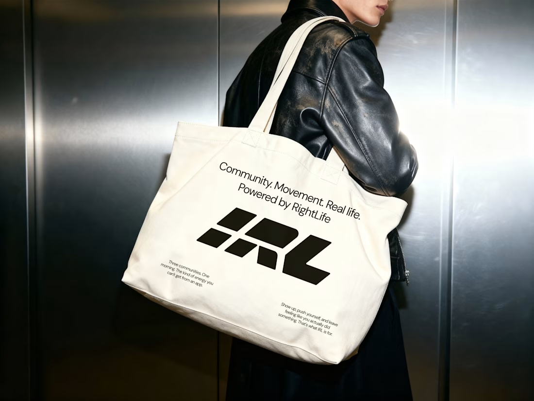
RightLife had a product ahead of its brand. We rebuilt the full brand identity system to reflect it: logo, IRL sub-brand, colour, typography, voice, and mockups.


The network for creativity
Join 1.25M professional creatives like you
Connect with clients, get discovered, and run your business 100% commission-free
Creatives on Contra have earned over $150M and we are just getting started
Challenges
View all


Related posts


Web Design for Contra Labs — an extension of the Brand Identity we created.
Translating the visual language, principles, and character of the identity into a cohesive digital experience.


More from ARDA®, a look at the desktop experience.
A, editorial approach to presenting architecture, built around typography, grid and imagery.


When u realize, there are websites with crazy animation but simple web like this has more conversations rate


Public animation for Revolut.
What do you think?


Love it 😍


