RightLife - Brand system rebuild

Ansh Jamdagni
1 collaborator


RightLife - Brand guidelines
Overview
RightLife is a prevention-first health app built around four daily pillars: movement, nutrition, sleep, and mental reset. They had a brand in place, but it looked like a prototype. Angular, utilitarian, and disconnected from the boldness of what they were actually building. We took it apart and rebuilt it, keeping the soul, shedding everything that was holding it back.
The challenge
The old identity was geometric to a fault. Clean lines with nowhere to go, a wordmark that could have belonged to any SaaS tool, and no visual language that felt alive enough for a brand asking people to rethink how they live. The product vision was sharp. The brand wasn't catching up.
What we built
A complete brand system documented across 15 pages, designed to scale from an app icon to an event booth.
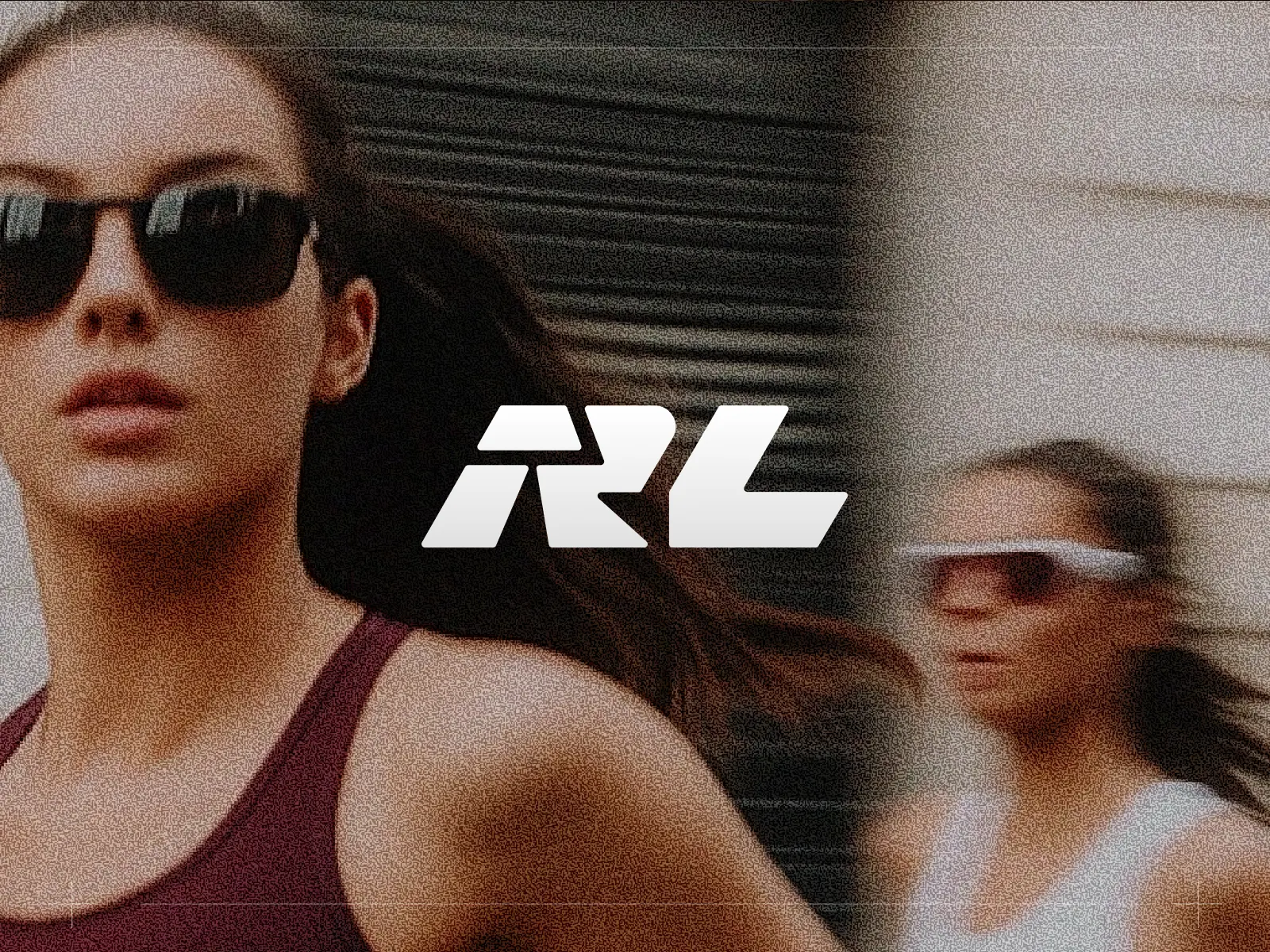
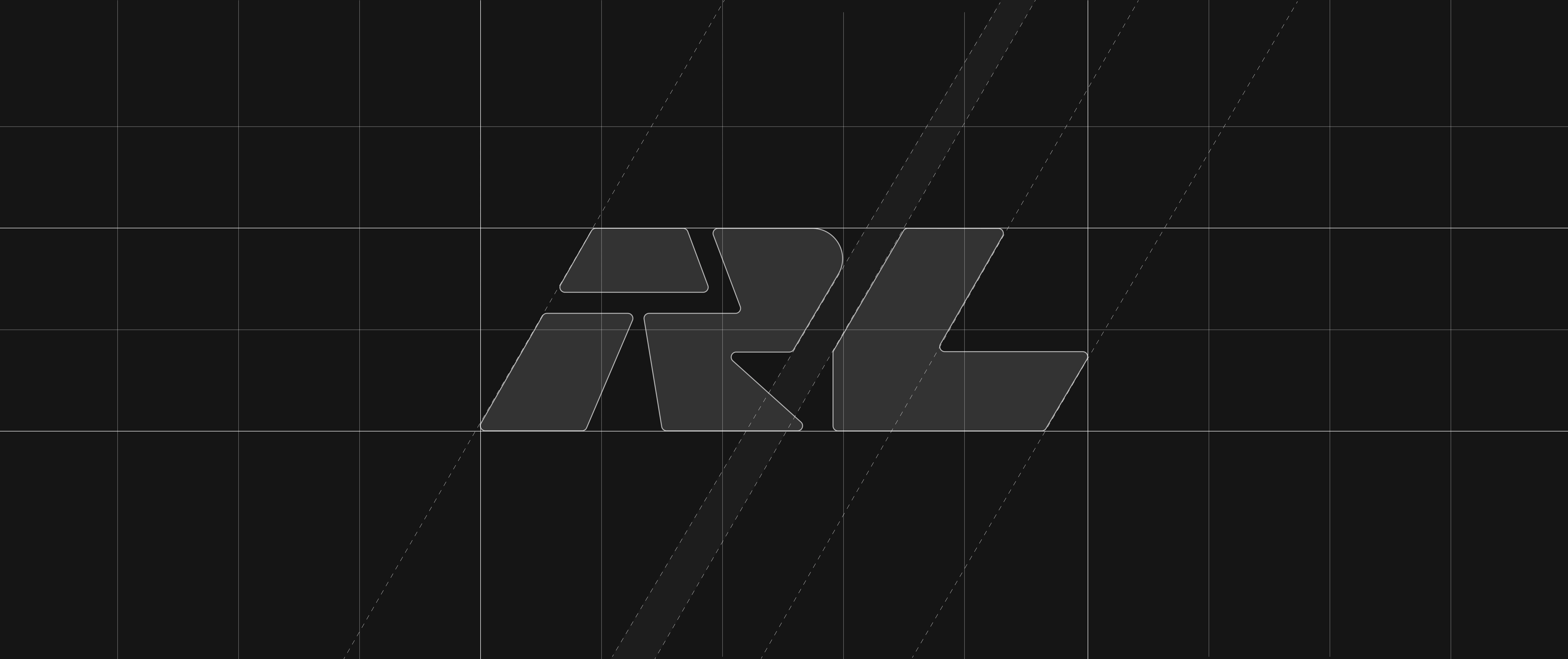
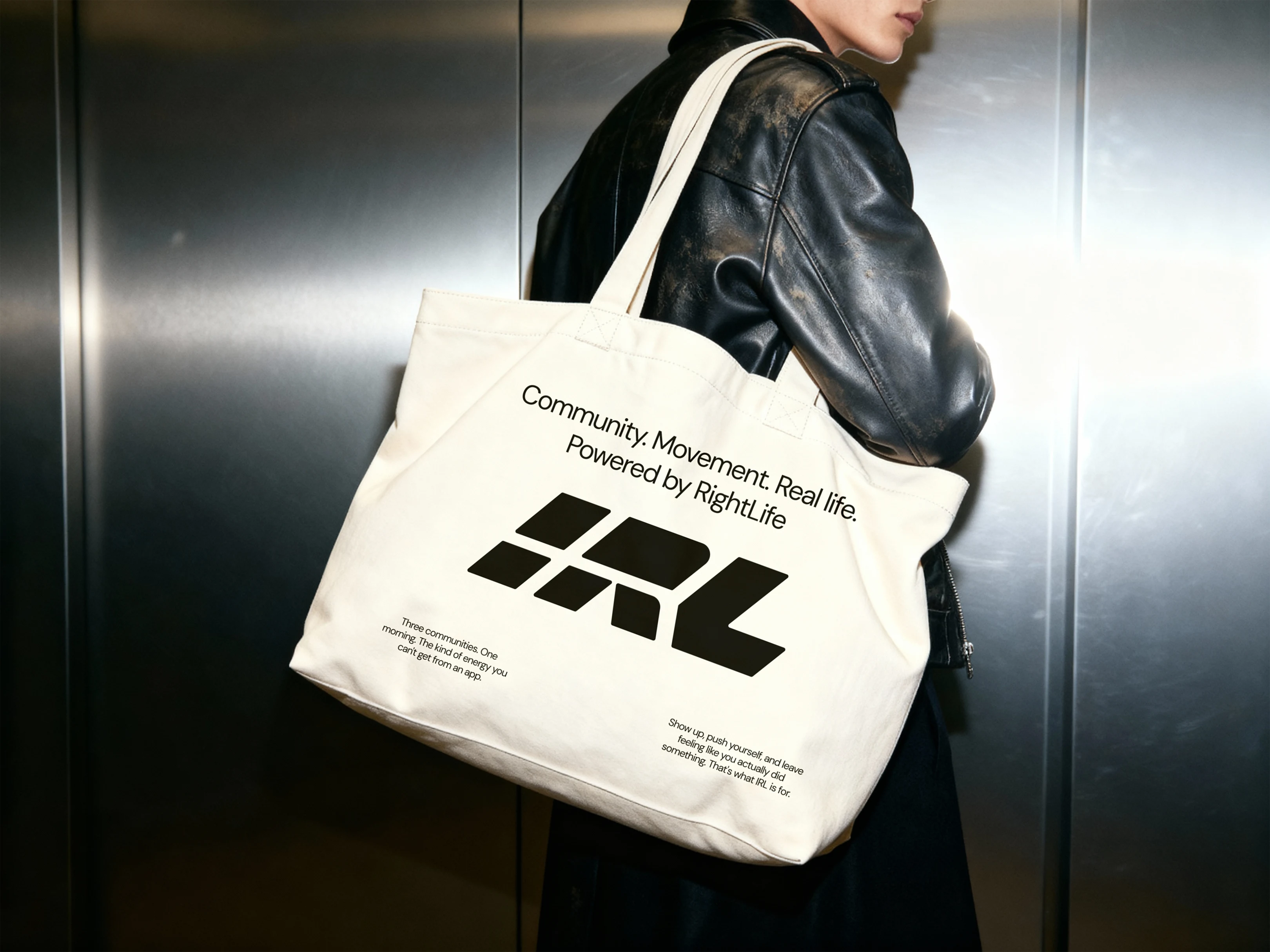
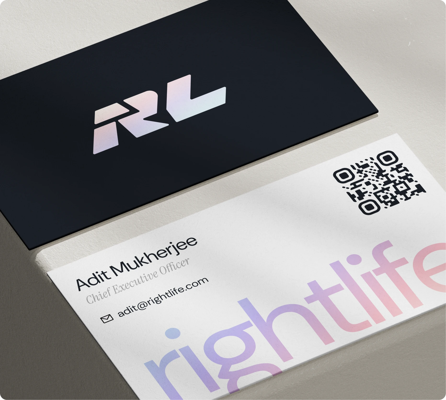
The RL monogram replaced the old mark entirely. Geometric and forward-leaning, built on confidence without aggression. Alongside it, we introduced IRL (In Real Life) as a distinct but subordinate identity for RightLife's offline presence, events, and community activations, always Powered by RightLife, never standing alone.
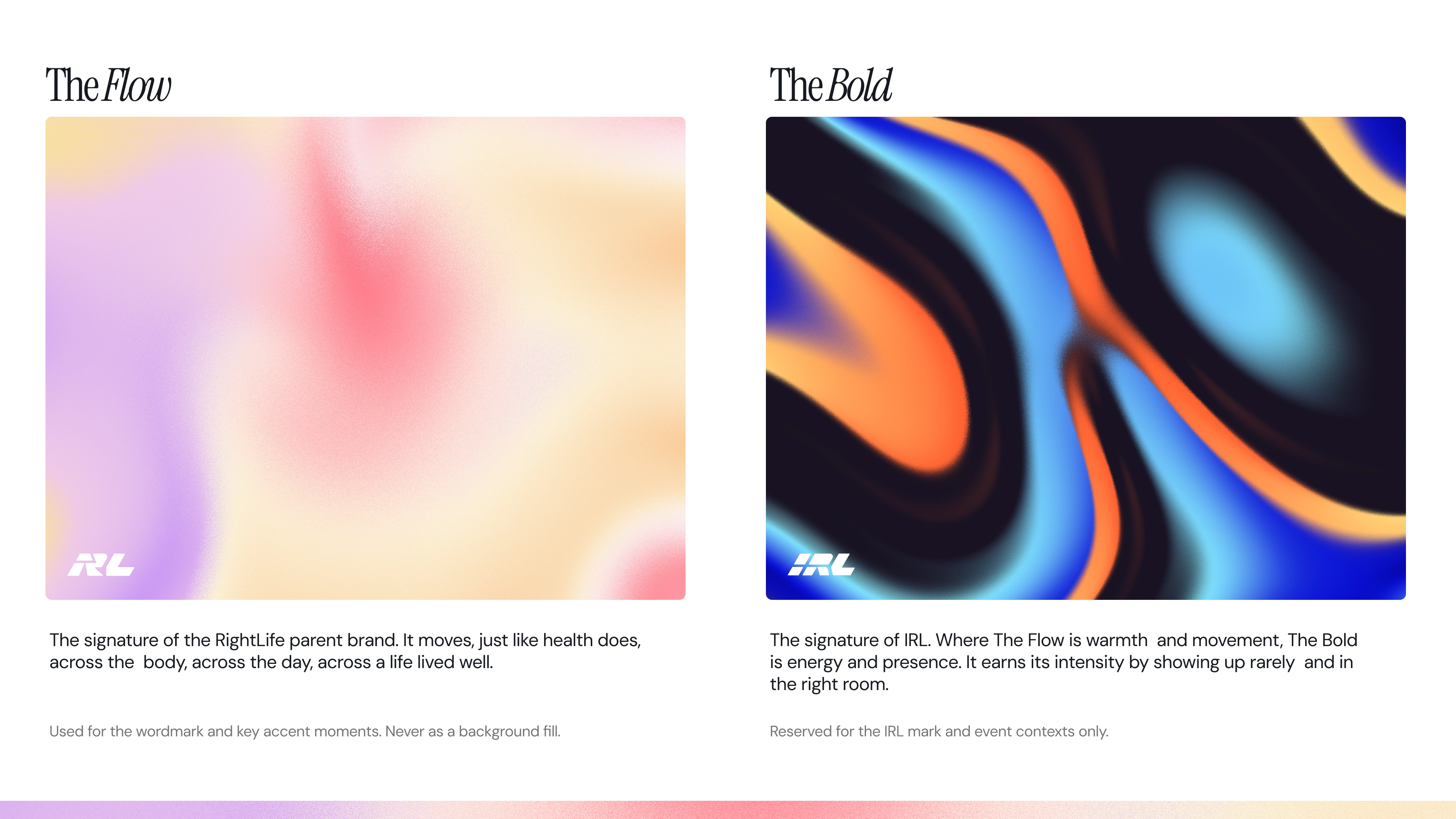
Two gradient languages define the visual texture. The Flow, a soft shifting gradient, is the signature of the parent brand. The Bold, high-intensity and electric, is reserved for IRL and physical moments where energy needs to fill a room. Each has a job. Neither shows up uninvited.
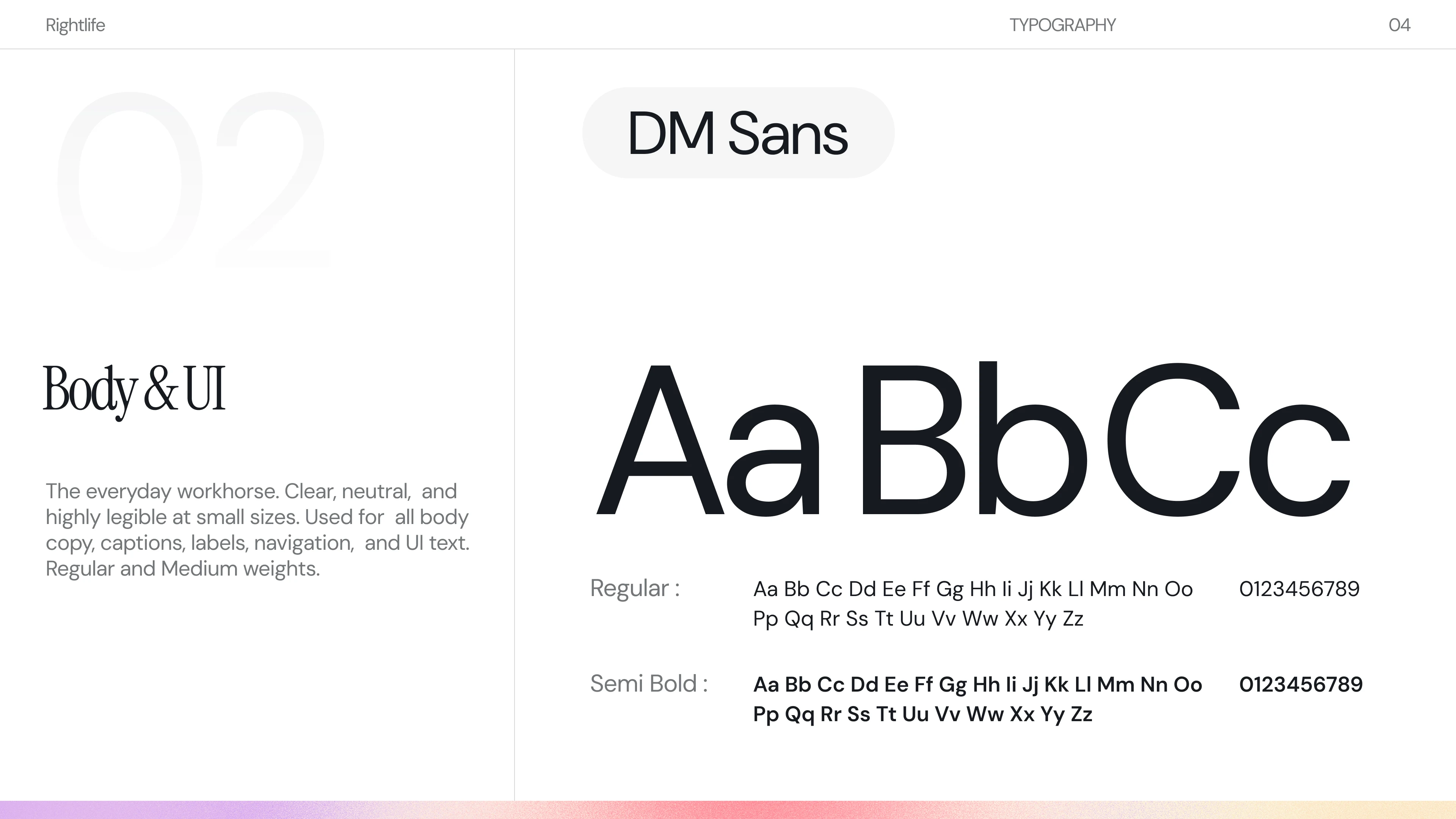
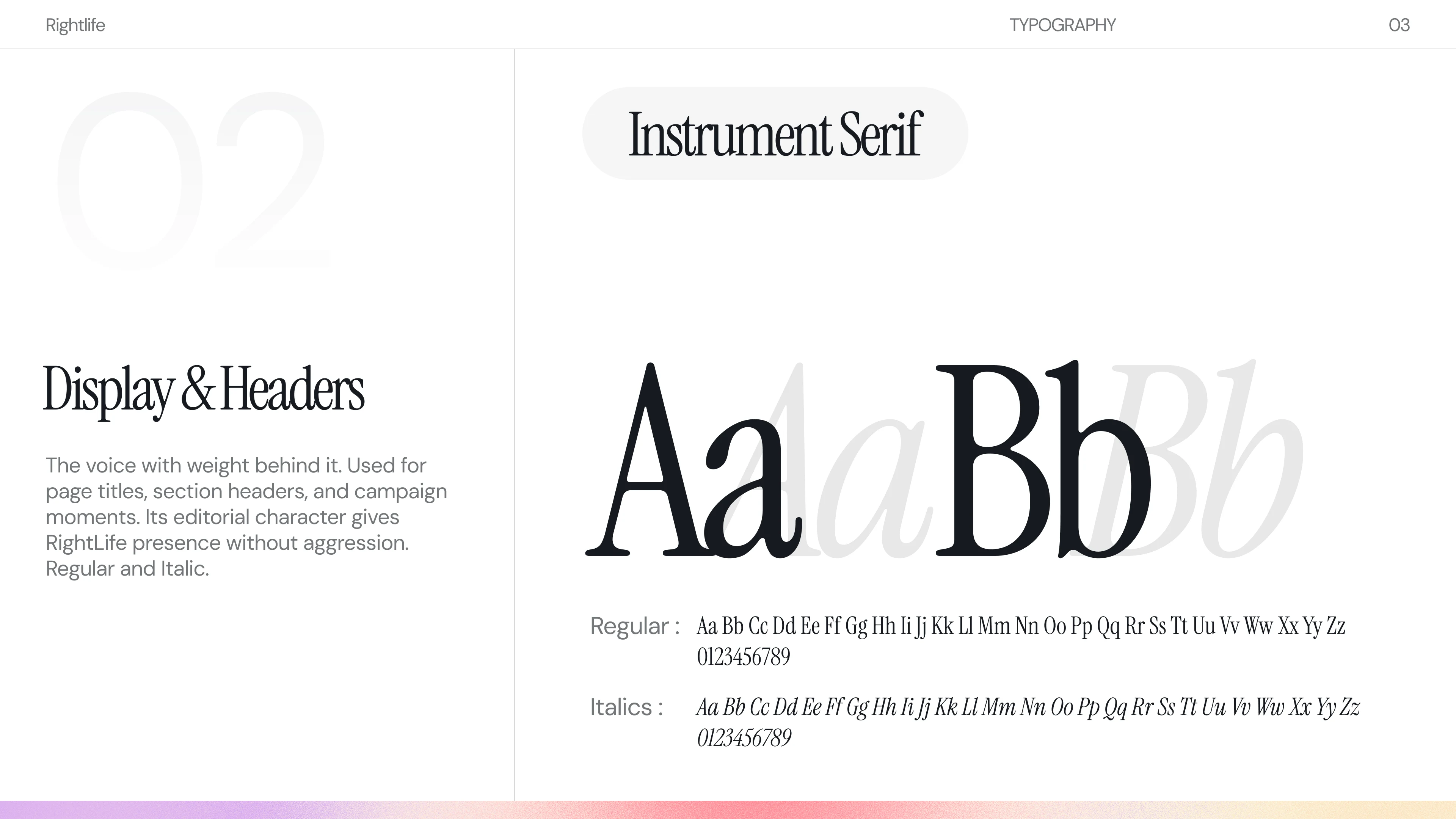
Typography pairs Instrument Serif (display and headers, editorial presence without aggression) with DM Sans (body and UI, clear and legible at any size). Voice and tone guidelines draw a hard line between how RightLife speaks and how wellness brands typically perform: no biometric jargon, no premium unlock language, no optimisation theatre.
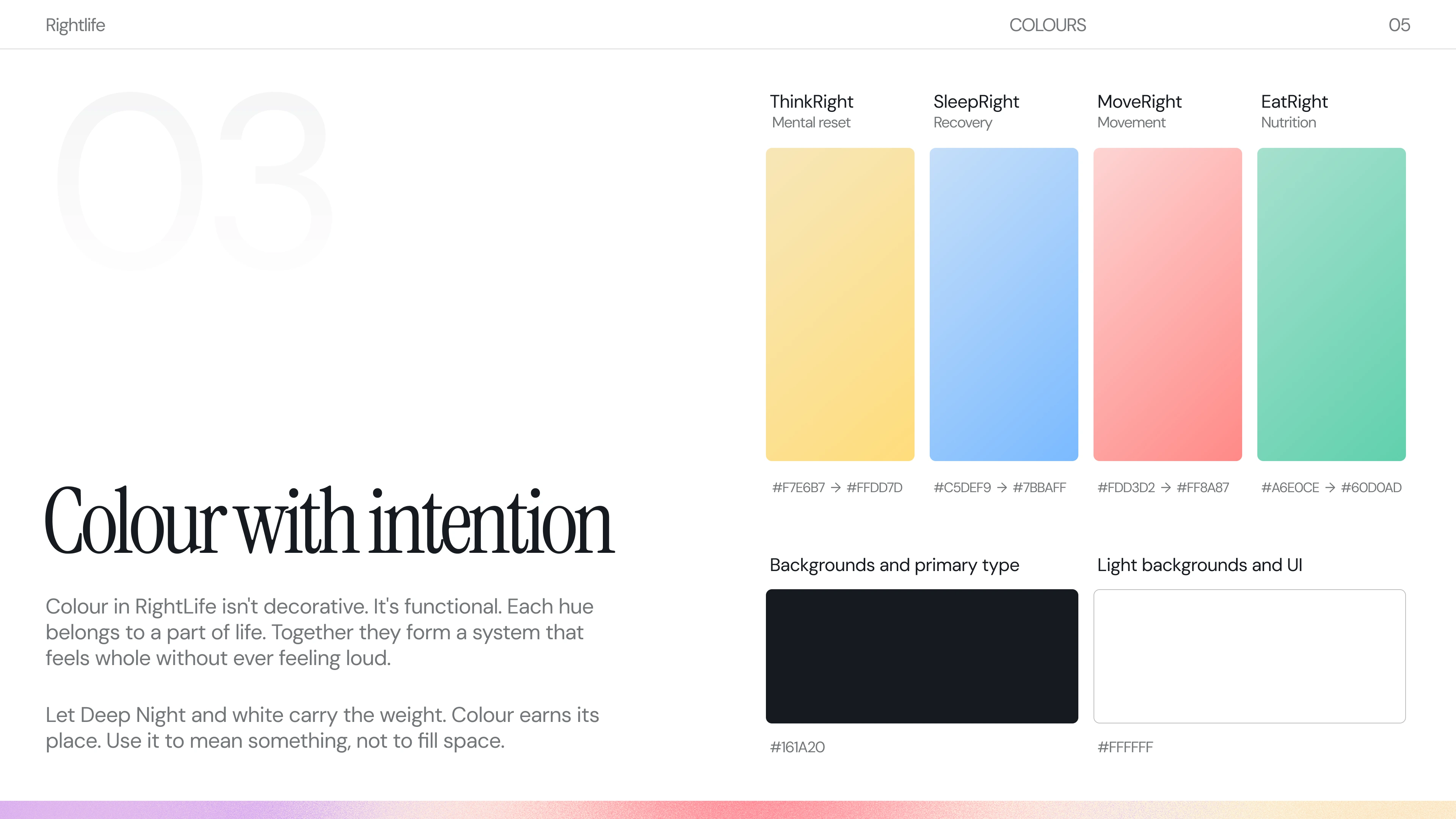
Colour in this system does something most brand colour palettes don't: it means something specific. Each of RightLife's four product pillars gets its own hue, warm yellow for mental reset, periwinkle blue for recovery, salmon pink for movement, and mint green for nutrition, so colour functions as navigation rather than decoration. Together they form a palette that feels whole without feeling loud. The darker neutral and white do the heavy lifting as backgrounds and primary type, keeping the stage clear for colour to appear only when it earns its place.
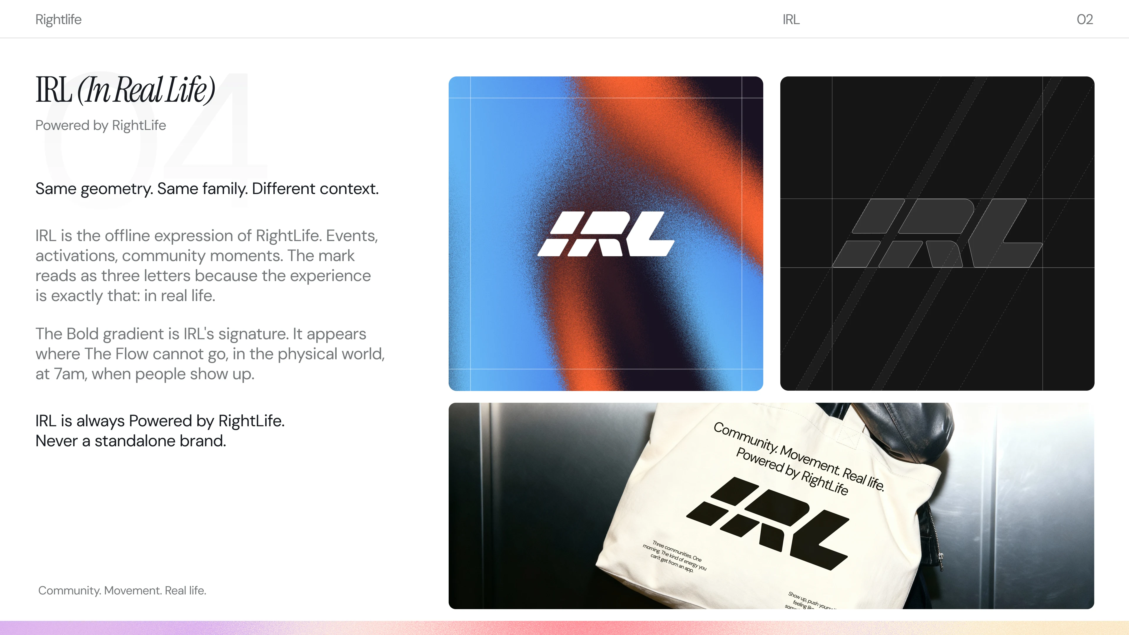
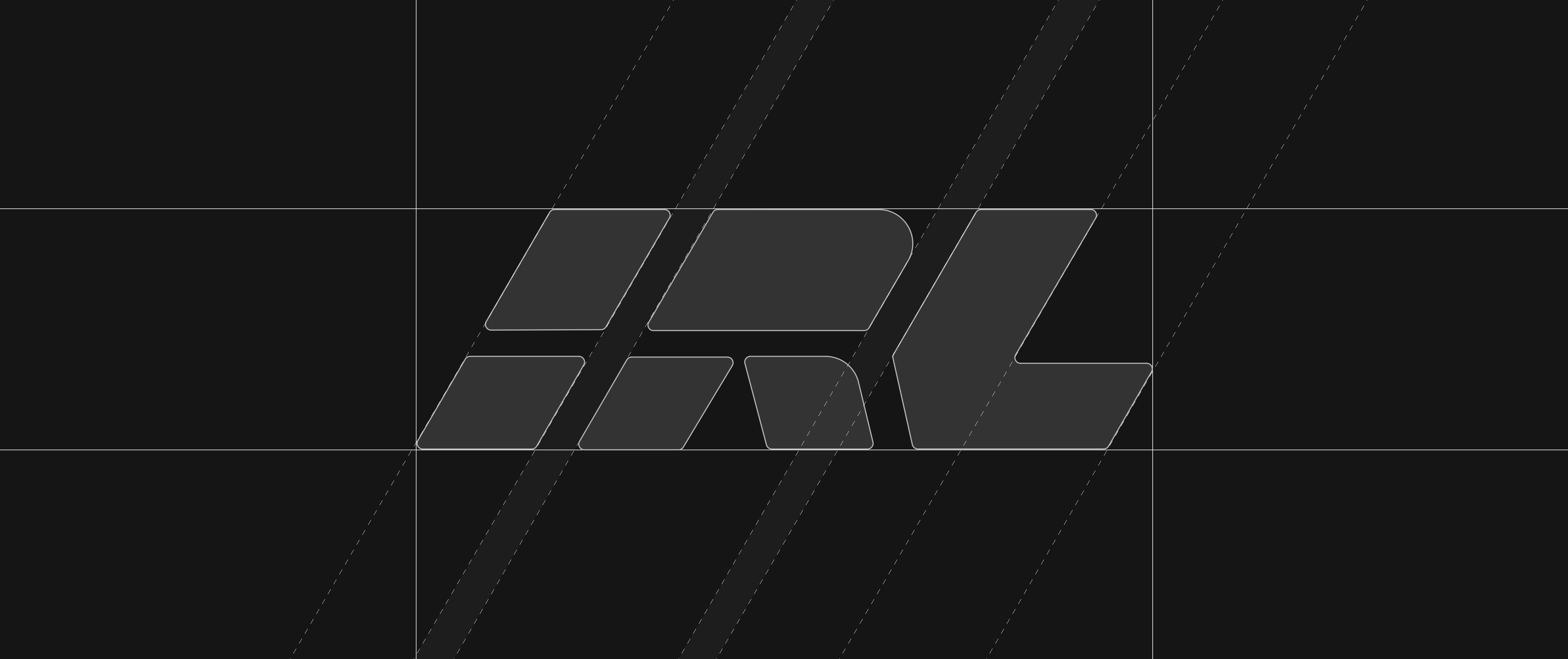
IRL is RightLife's offline expression, built for events, activations, and community moments where the app can't follow you. It shares the same geometric DNA as the parent brand but carries its own identity, its own gradient, its own energy. The name isn't clever for the sake of it: the experience is exactly what it says, in real life. It always appears as IRL Powered by RightLife, never as a standalone brand, because the whole point is that the physical world and the digital one belong to the same system. Same family. Different context.
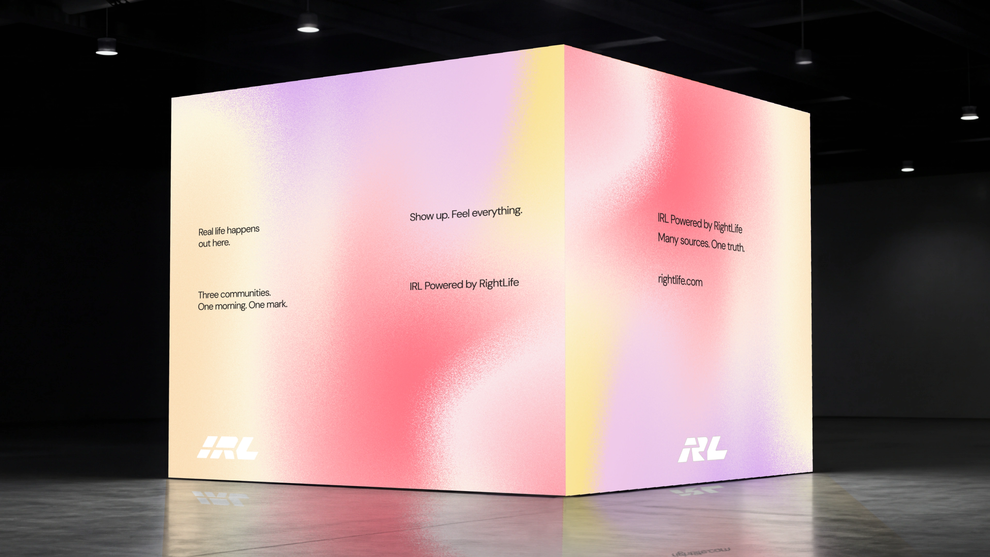
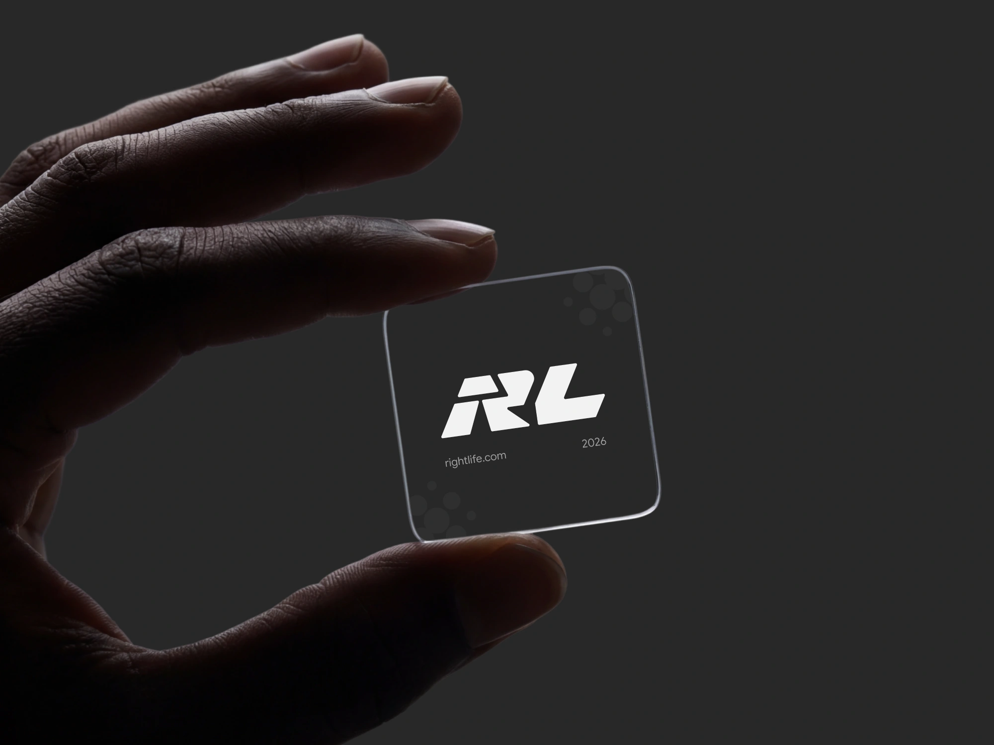
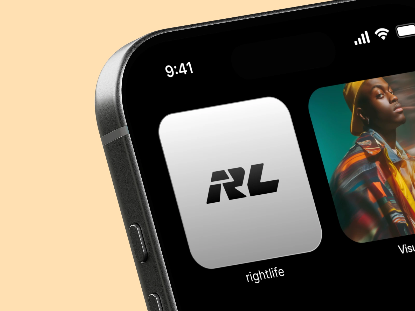
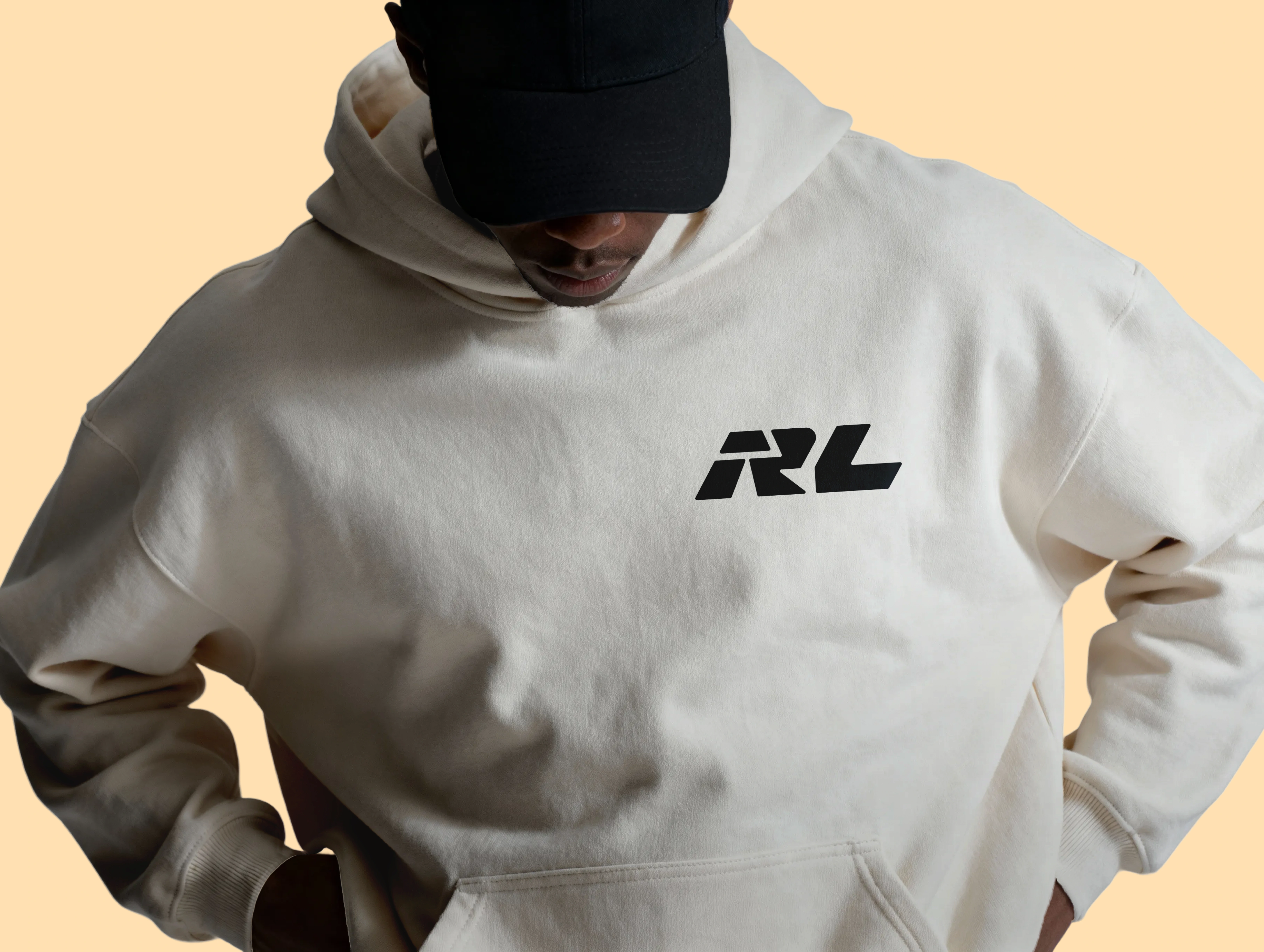
The brandbook closes with the system applied to the real world: a hoodie, an app icon, business cards, a frosted glass card, and a full event installation wrapped in The Flow gradient. These aren't decorative exercises. They show that every touchpoint, from something you wear to something you hand someone to the booth you walk into at 7am, carries the same identity with the same confidence. The brand holds at every scale because the rules were built to travel.
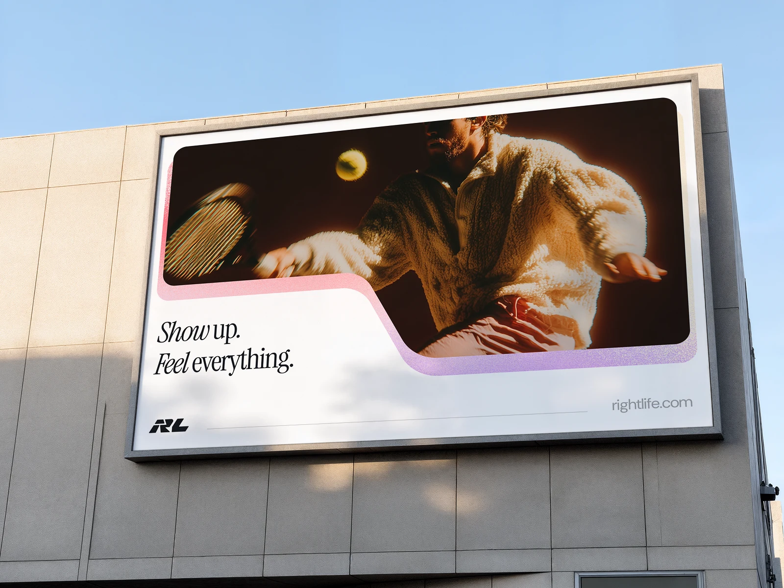
RightLife came in with a product that was ahead of its brand. They leave with a system that can finally keep up.
Like this project
Posted May 26, 2026
RightLife had a product ahead of its brand. We rebuilt the full identity system: logo, IRL sub-brand, colour, typography, voice, and mockups.
Likes
8
Views
117
Timeline
Feb 2, 2026 - Mar 8, 2026
Clients
RightLife
Collaborators