Built with Framer
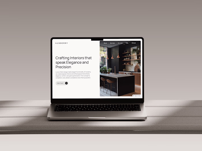
Website Design & Build for Formeta Studio
Ansh Jamdagni
1 collaborator
Website Design & Build for Formeta Studio
Designed and built Formeta’s official website — a clean, purposeful identity for a design studio focused on clarity, trust, and craft.
Project Overview
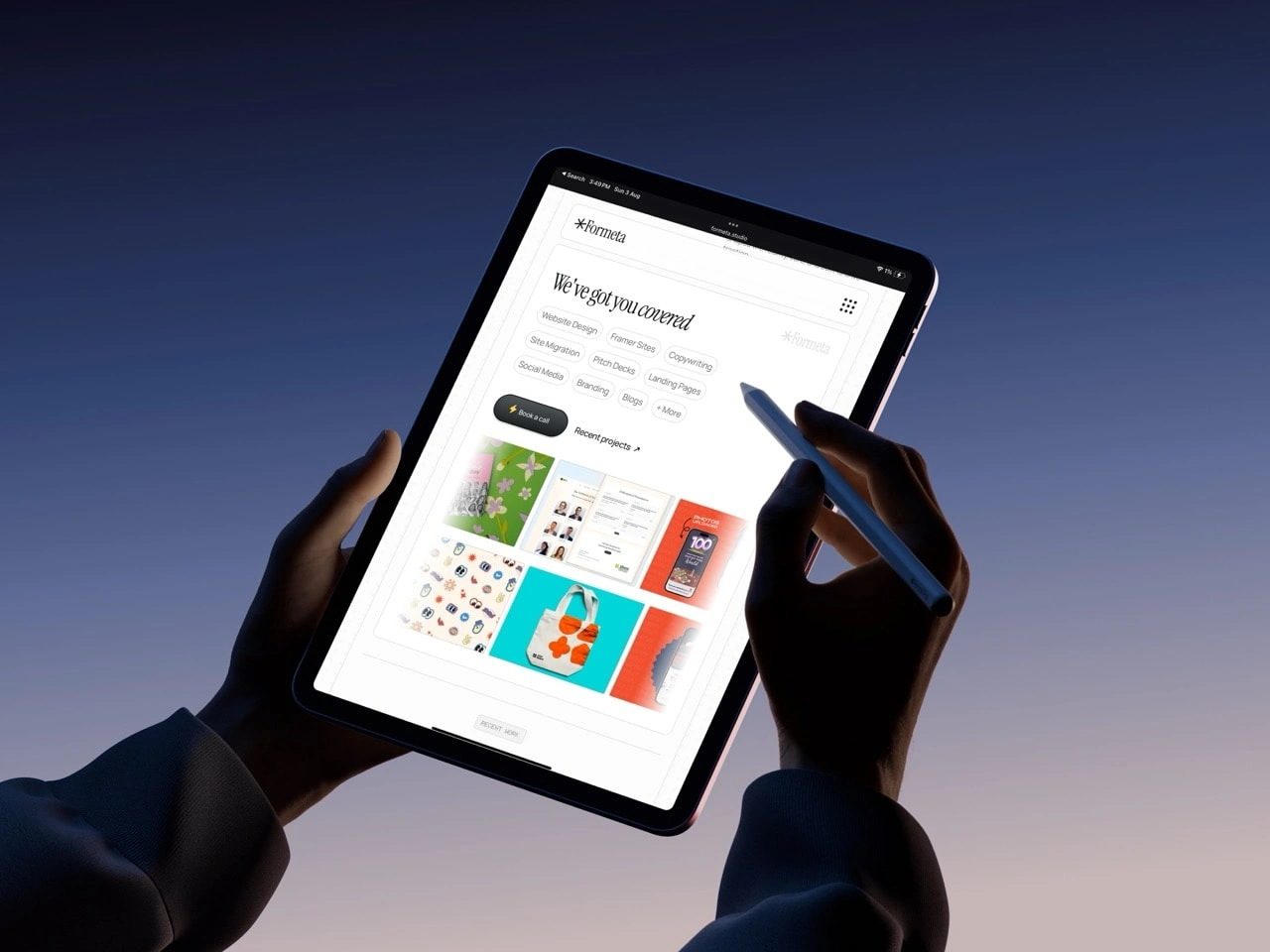
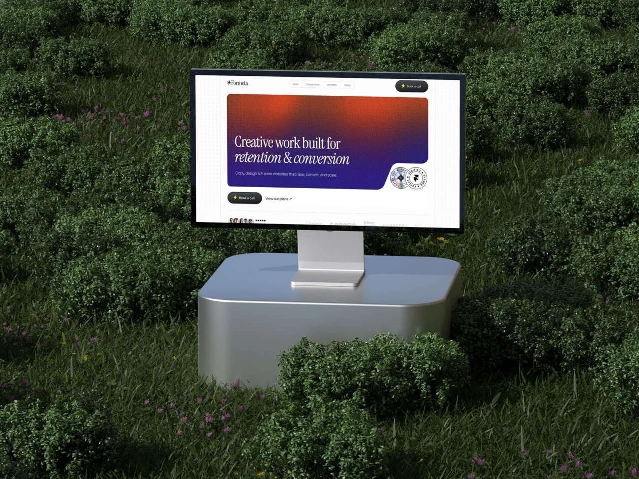
Formeta.studio was designed to communicate the studio’s values — clarity, consistency, and craftsmanship — through a digital experience that feels calm, confident, and refined.
The website balances structure and warmth, showcasing case studies, pricing transparency, and long-term partnerships without falling into the “agency cliché” trap.
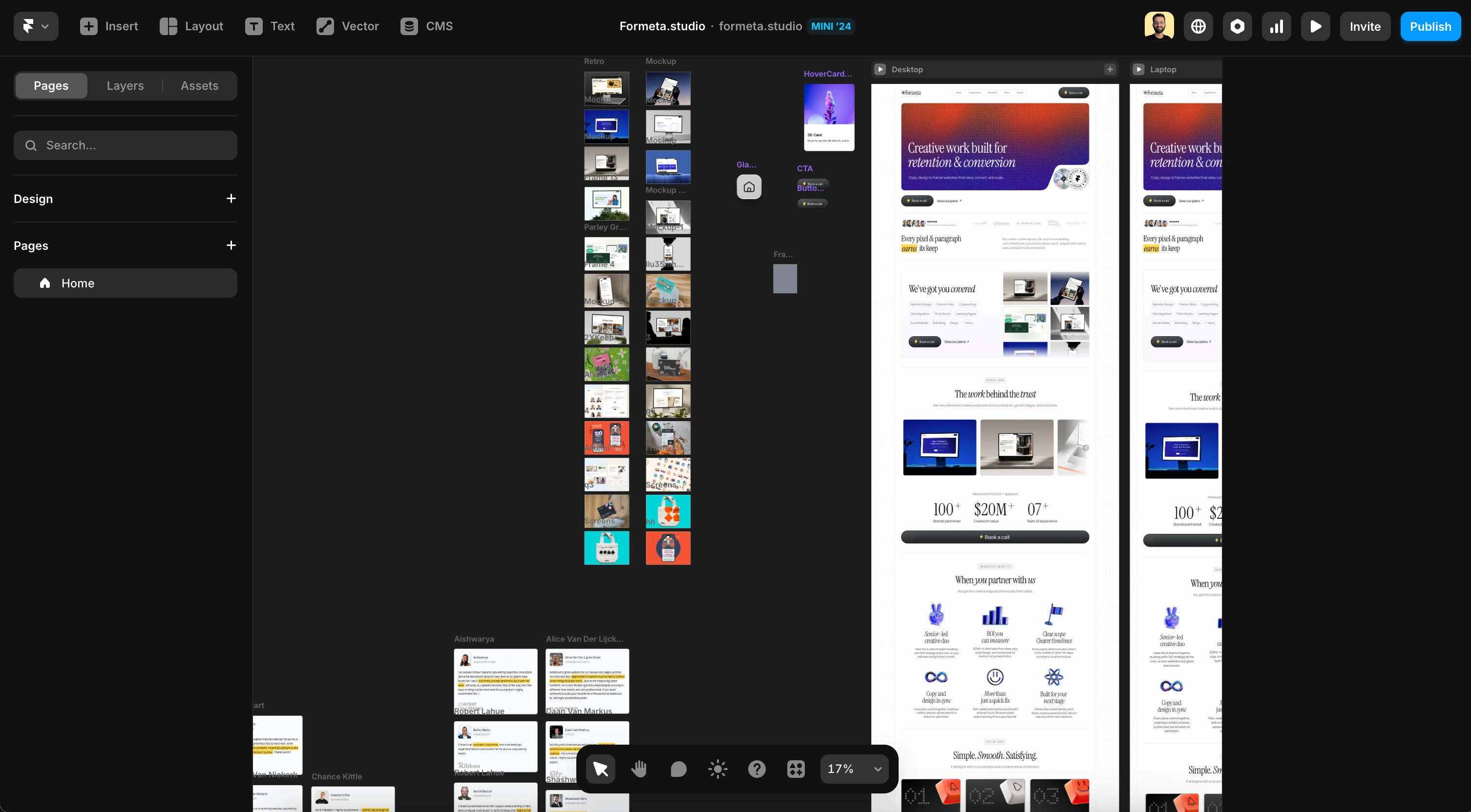
Built entirely in Framer, the site focuses on smooth motion, consistent spacing, and typographic hierarchy, using white space as a storytelling tool rather than filler. Every element — from the grid to the scroll behavior — was crafted to reflect Formeta’s design philosophy: make good work look effortless.
1. Website Design & Architecture
Defined site structure, navigation logic, and information hierarchy.
Crafted full-page layouts and responsive design system built for scalability.
2. Framer Development
Developed a fully responsive, SEO-optimized site with smooth transitions.
Integrated CMS collections for case studies, pricing, and blog posts.
3. Brand Integration
Extended Formeta’s visual language — typography, tone, and motion — across the web experience.
Ensured consistent messaging through microcopy and subtle interactions.
4. Performance & Optimization
Image optimization and preloading for lightning-fast load times.
Clean Framer setup for easy updates and long-term flexibility.
Process
1. Defining the Story
Before touching visuals, we distilled the narrative: What does Formeta stand for?
The answer shaped everything — tone, pacing, and layout. The language had to sound human, not promotional. The design had to mirror the way we work: clean, grounded, structured.
2. Architecture & Structure
We mapped a layout system that guides visitors through Formeta’s core ideas:
What the studio does (without overselling).
Why it’s different (through examples, not claims).
How it works (transparency in process and pricing).
This meant building a modular grid and layout system that could expand naturally with future work — the website grows as the studio grows.
3. Design Language
The visual system was stripped down to essentials — typography, space, and flow.
No heavy motion or gimmicks, just transitions that feel like natural extensions of thought.
Each element has a role: clarity first, craft second.
4. Framer Build
Developed fully in Framer for seamless responsiveness and content control.
CMS-driven sections for:
Case studies
Pricing and services
FAQs
Blog & updates
Every page was built for readability and load speed. Image assets were optimized, preloaded, and balanced for performance without sacrificing crispness.
5. Crafting Interactions
Animations were kept subtle — scroll-based easing, light fades, and crossfades between sections.
The point wasn’t to impress, but to flow.
6. Performance & Handoff
Delivered a site that runs under 1.5s on load, with SEO-ready meta structure, clean Framer setup, and content modularity for quick client updates.
Key Highlights
Clean, confident interface aligned with Formeta’s design ethos.
CMS-driven sections for scalable content and easy editing.
Fluid transitions and understated animations for a premium feel.
Design-first approach — no visual noise, just pure function and rhythm.
Results
The final site is an honest extension of Formeta’s identity — calm, confident, and crafted with care.
It doesn’t try to look like a studio; it feels like one.
Visit the live site: formeta.studio
Let’s work together.
If your site needs to do more than just look good, we help translate your brand strategy and story into a coherent, scalable website and creative system that earns trust and drives action.
Book a call today 🥂
Like this project
Posted Oct 9, 2025
Built Formeta’s website. A calm, structured space that reflects the studio’s focus on clarity, craft, and trust.
Likes
8
Views
186
Timeline
Aug 1, 2025 - Sep 10, 2025
Collaborators