
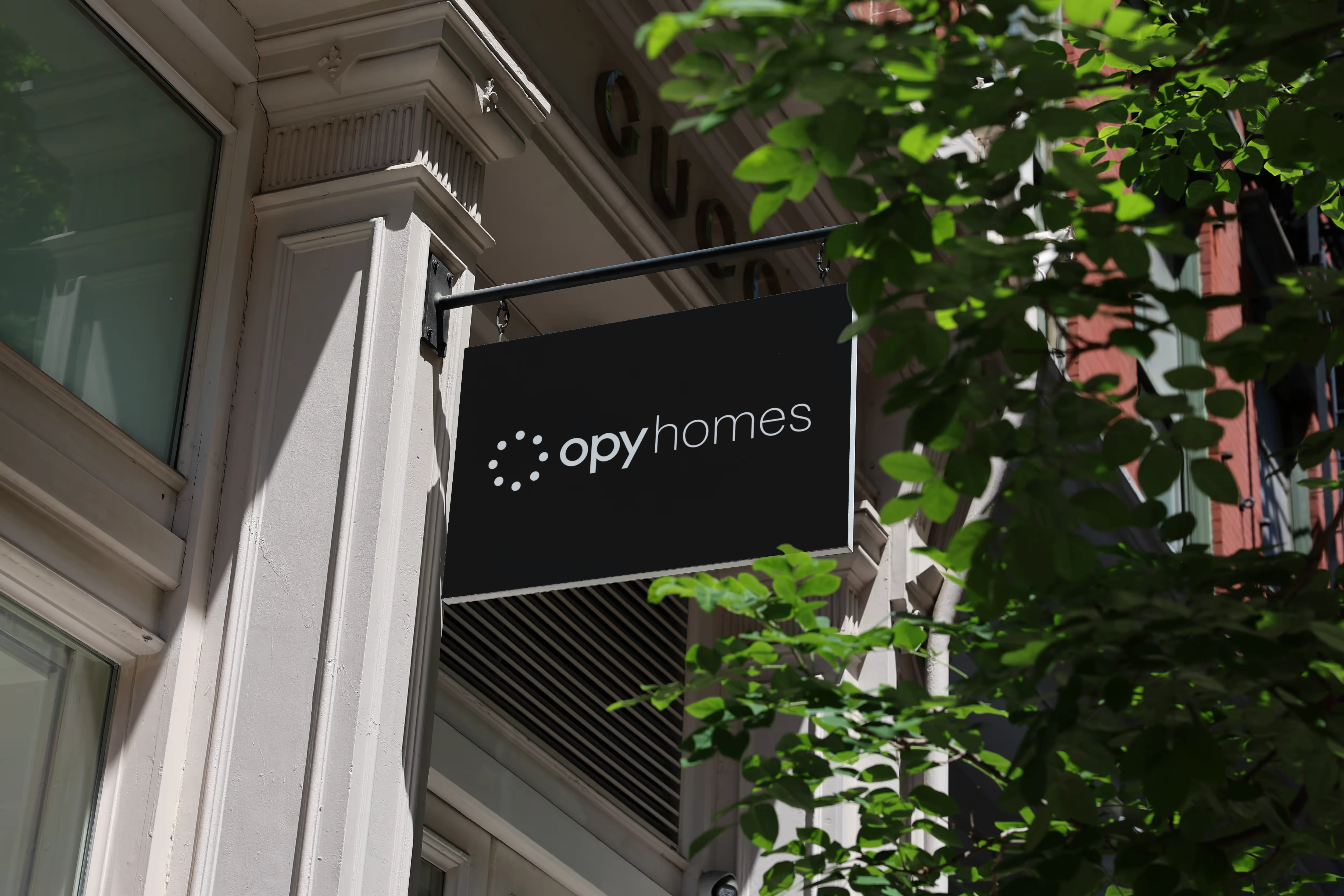
Overview
Opy Homes and Opy Parking sit within the wider Opy family, connecting accommodation with the practical experience of arriving, accessing a space and finding your way. I shaped their visual direction to make these different services feel related, without treating them as interchangeable.
The aim was to express Opy’s welcoming character through a clear, understated identity. Rather than adding decorative complexity, I focused on making the brand feel relaxed, trustworthy and easy to approach.
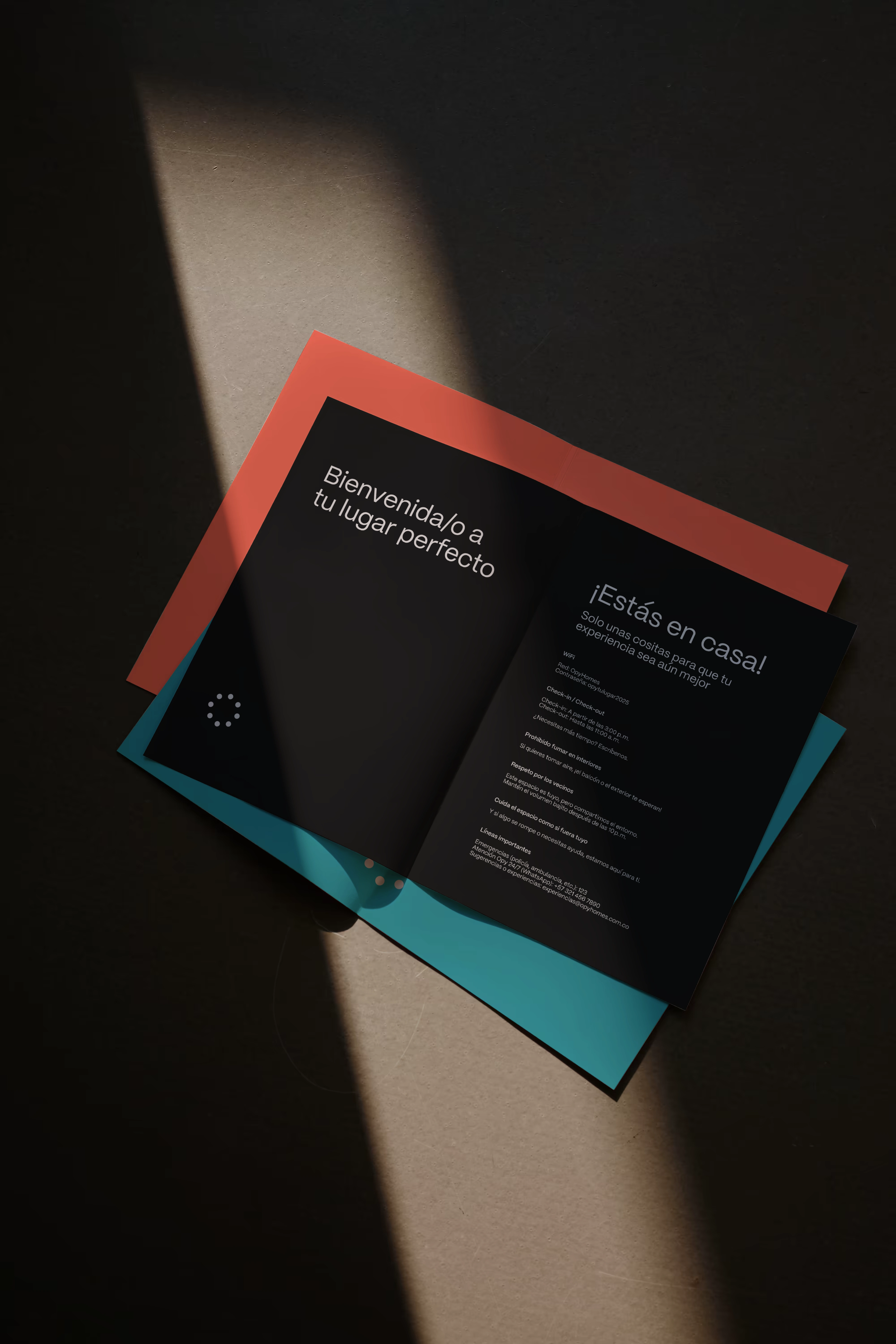
A concept for the guest welcome pack
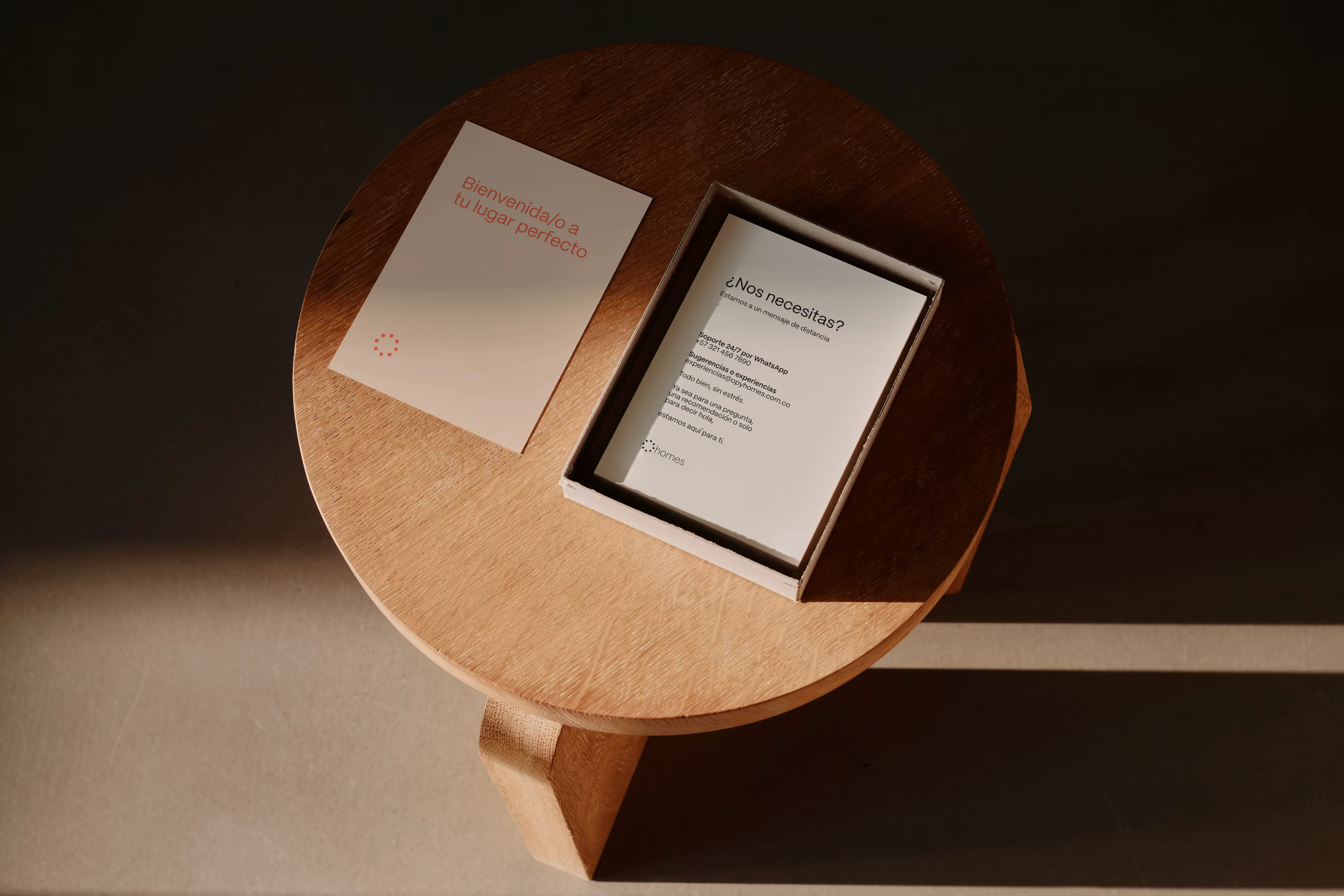
A concept for the guest welcome pack
One family, different needs
The design challenge was to carry the same personality across two different contexts. Homes needed to communicate comfort and hospitality. Parking needed to communicate access, direction and reassurance.
I approached the identity as a shared framework, with consistent typography, spacing and composition connecting the sub-brands. This allowed the applications to respond to their function while remaining recognisably Opy. Cohesion came from the relationship between the elements, rather than repeating an identical layout everywhere.
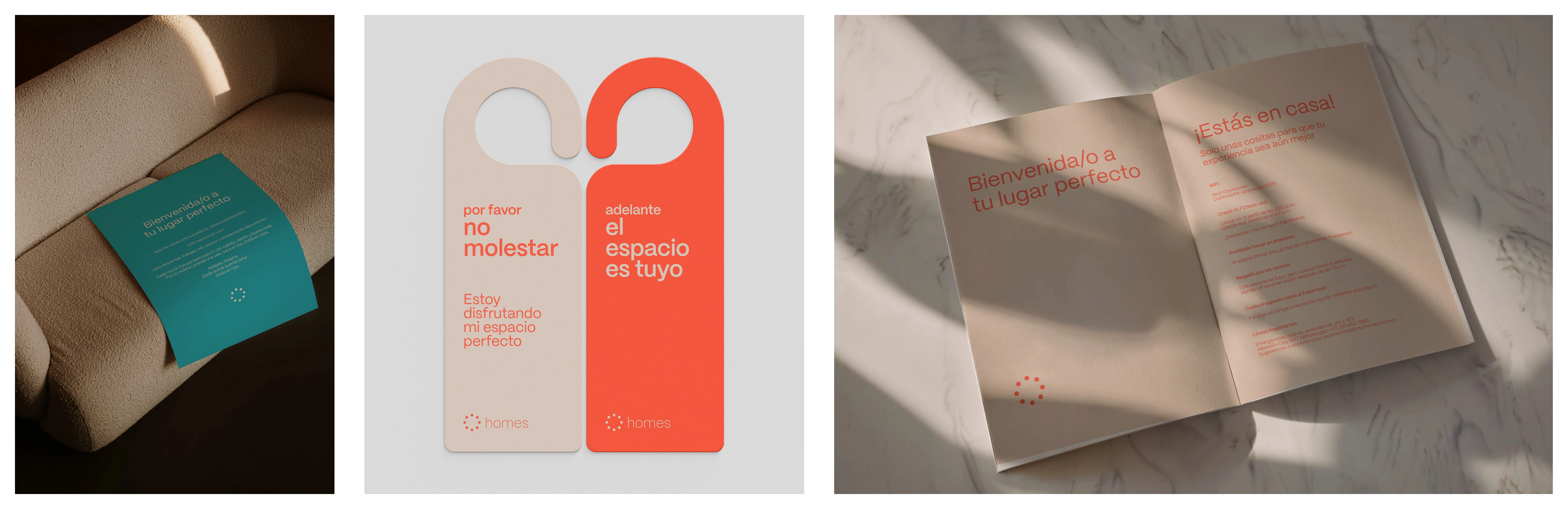
Visual direction
I kept the visual language calm and intentional, avoiding harsh contrasts and an overly corporate atmosphere. Softer colour relationships and considered use of space helped establish a more human tone.
That restraint was important: Opy needed a distinct personality, but the identity also had to leave room for useful information. The design brings warmth into functional communication without making it feel crowded or overly styled.
Opy Homes: making the welcome tangible
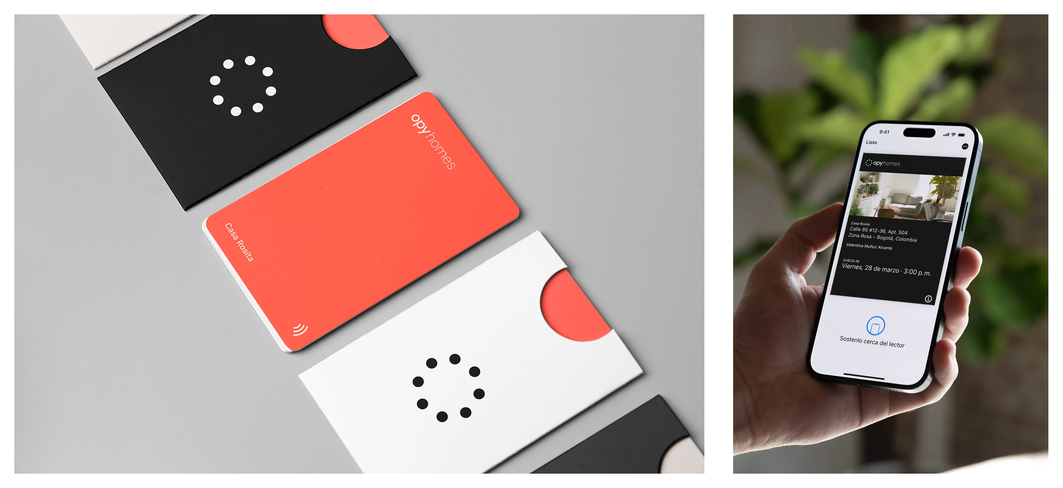
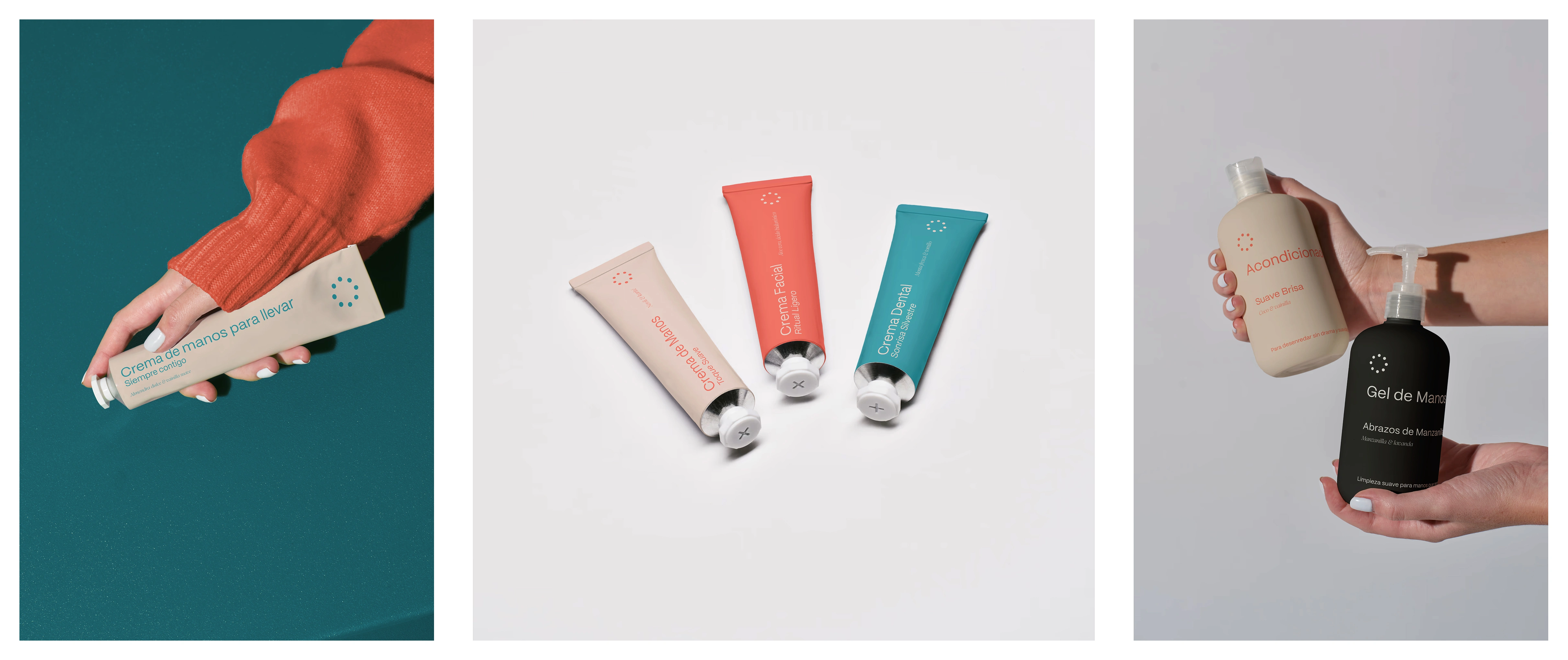
For Homes, the identity extends into guest communication, support information, a digital check-in card and small hospitality details such as a take-away hand cream.
These applications bring the brand into moments beyond the first impression. Welcome messages establish the tone, while contact and access information provide practical reassurance. I wanted these pieces to feel like parts of one considered experience, rather than disconnected branded objects.
Opy Parking: clarity as part of hospitality
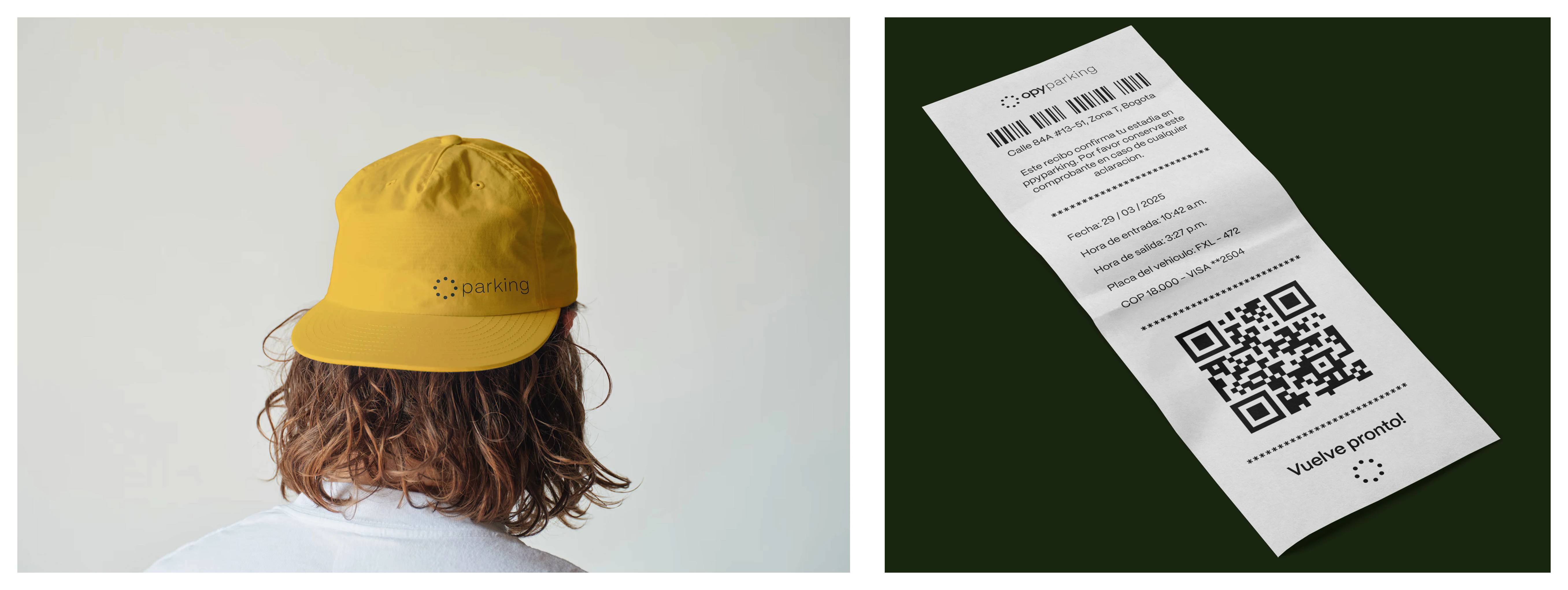
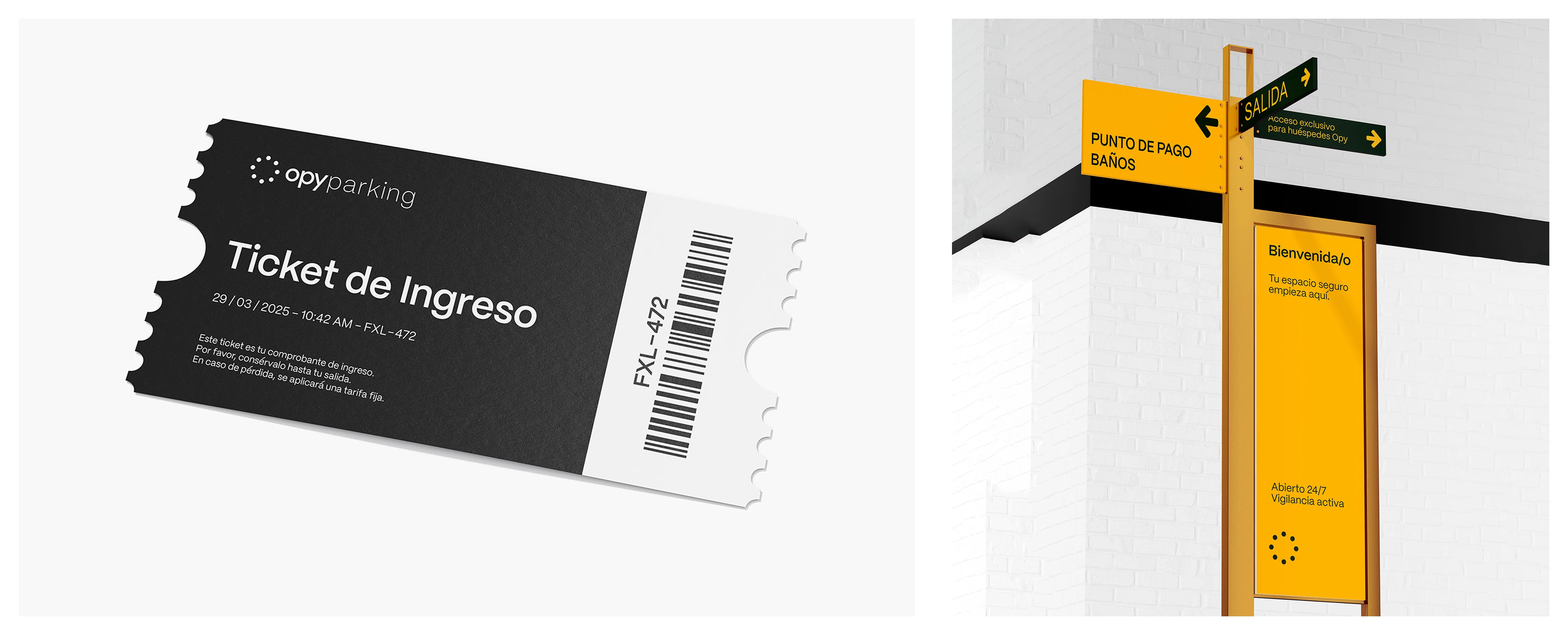
For Parking, the same approach becomes more direct. Directional signage, payment-point information, guest-access notices, staff clothing and entry tickets translate the identity into practical applications.
Here, the priority was to make the information easy to distinguish while retaining Opy’s approachable character. Messages about safety, access and availability sit within the same welcoming language as Homes, connecting an operational service to the wider hospitality brand.
The resulting system
The project brings together physical and digital applications under a coherent visual identity. Homes and Parking retain their individual functions, but share a consistent way of presenting information and welcoming people.
Developed as part of the wider Opy identity, which also includes Opy Café, the work demonstrates how one visual language can adapt across services without becoming rigid.
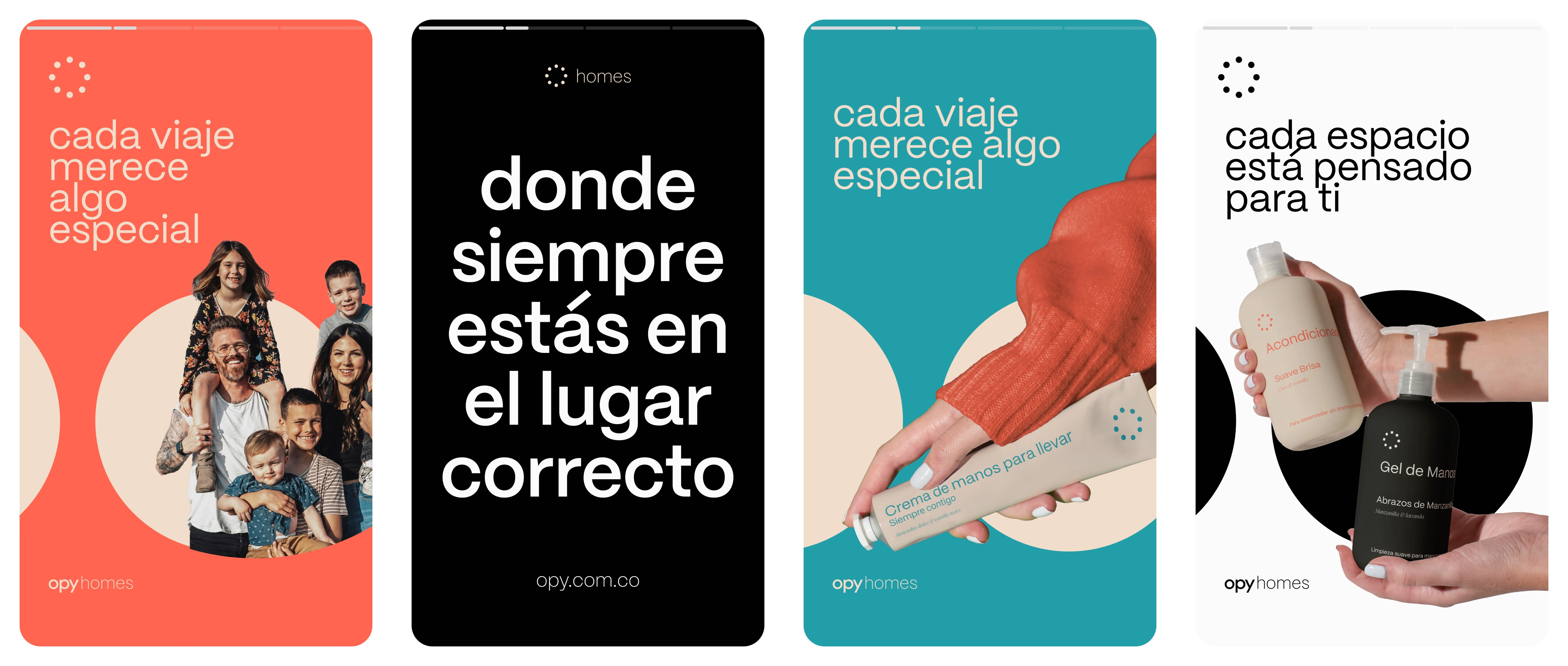
Look n' feel for communication channels
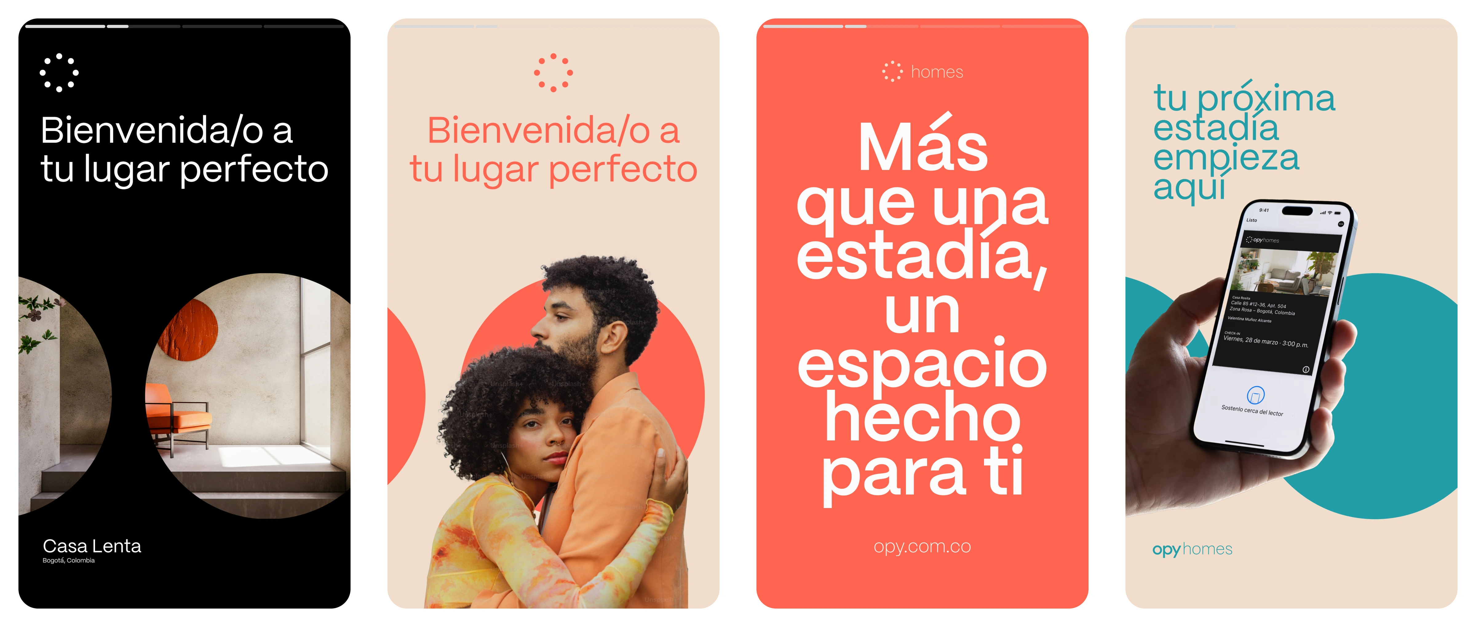
Look n' feel for communication channels
Credits
Visual Direction & Brand Identity: Furkan Özkaya
Brand Strategy: Montenegro Studio
2025, Bogotá.

1 like · 2 views · Nov 17, 2026
Brand identity for Opy, connecting stays and arrivals through a warm visual system.


