
KAZIM HAIDER SYED
Designing modern brands through UI/UX, web & visual content
New to Contra
KAZIM HAIDER is ready for their next project!
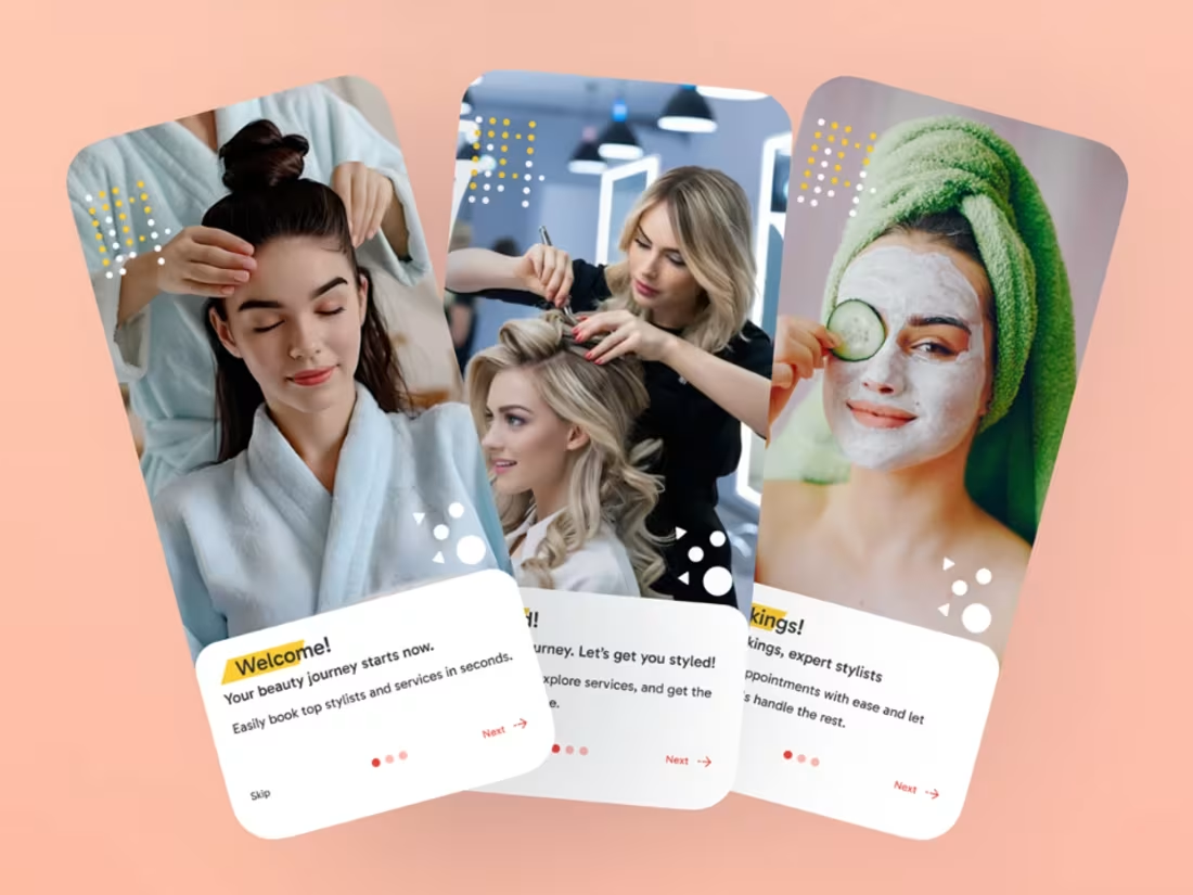
Salon Booking App
A seamless salon booking platform that enables users to discover beauty services, schedule appointments, manage bookings, and connect with trusted professionals—all through a clean and user-friendly mobile experience.
1
210
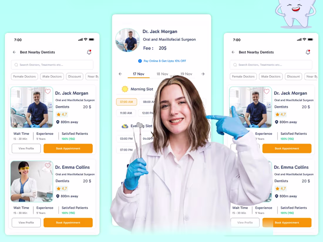
Dental Health – Healthcare Mobile App
Designed a user-friendly Dental Health mobile app that simplifies appointment booking, dentist discovery, patient management, and healthcare services. The interface focuses on accessibility, trust, and a smooth patient experience through clean visuals and intuitive navigation.
0
185
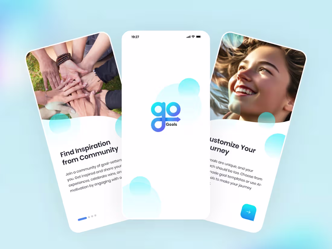
Daily Goals – Productivity & AI Assistant App
Designed a modern and intuitive Daily Goals mobile app focused on productivity, task management, habit tracking, and AI-powered assistance. The UI combines clean layouts, engaging visuals, and a seamless user experience to help users stay organized, motivated, and productive throughout their day.
0
192
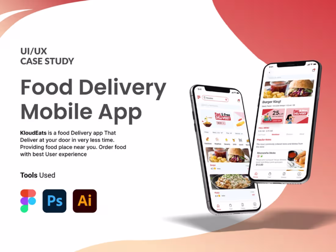
🍔 Food Delivery Mobile App – UI/UX Case Study
Designed a modern and user-friendly Food Delivery Mobile App focused on seamless ordering, intuitive navigation, and an engaging user experience. The project includes user research, personas, user flows, wireframes, visual design, and a complete mobile UI system to ensure a smooth journey from food discovery to checkout.
✨ Key Highlights:
• User Research & Personas
• User Flow & Empathy Mapping
• Wireframing & Prototyping
• Clean & Modern UI Design
• Easy Food Ordering Experience
• Responsive Mobile Interface
0
120
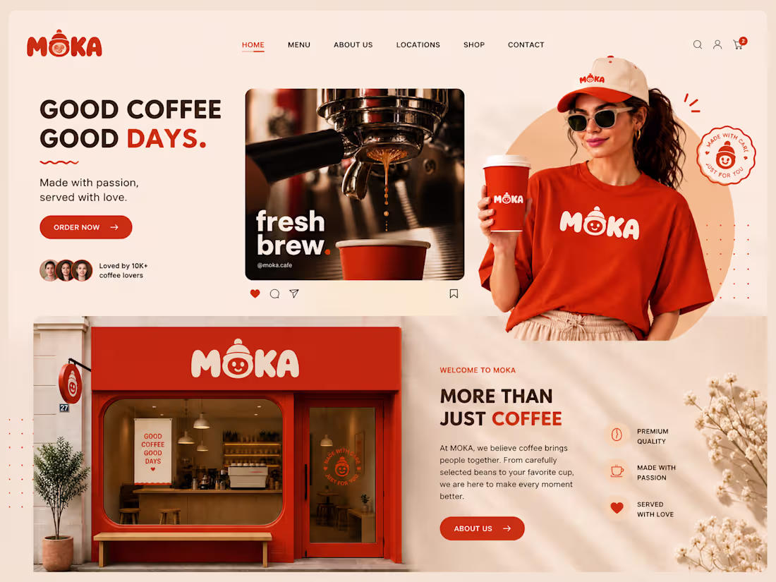
☕ Moka Café – Brand Identity & Website Design
Designed a complete brand identity and modern website experience for a café brand. Focused on creating a warm, inviting, and memorable digital presence that reflects the café's unique personality.
✨ Branding
✨ UI/UX Design
✨ Responsive Website
✨ User-Centered Experience
DM me for your brand and product.
0
71
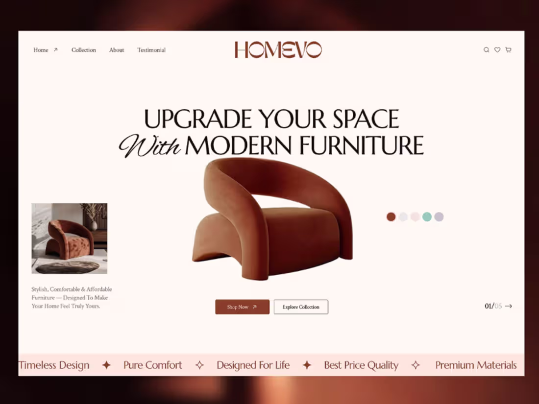
🛋️ Homevo – Modern Ecommerce Furniture Website
Created a modern and conversion-focused ecommerce website for a furniture brand. The design combines clean aesthetics with seamless user experience to drive engagement and sales.
✨ Ecommerce Design
✨ Modern UI/UX
✨ Mobile Responsive
✨ Customer-Centric Experience
DM me for your brand and product.
0
69
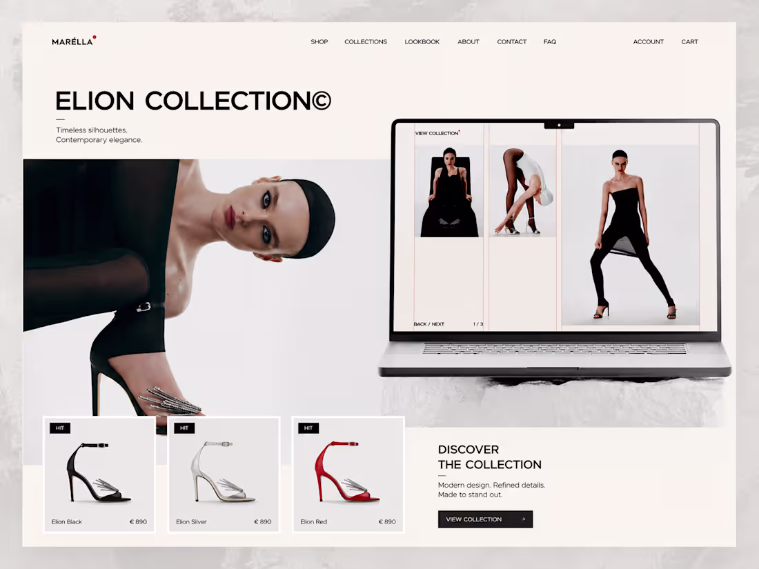
👟 Marella Footwear – Brand Identity & Website Design
Developed a strong brand identity and stylish website design for a footwear brand. The goal was to create a premium digital experience that builds trust and enhances brand recognition.
✨ Brand Identity
✨ Website Design
✨ Modern Visual System
✨ Responsive Experience
DM me for your brand and product.
0
60
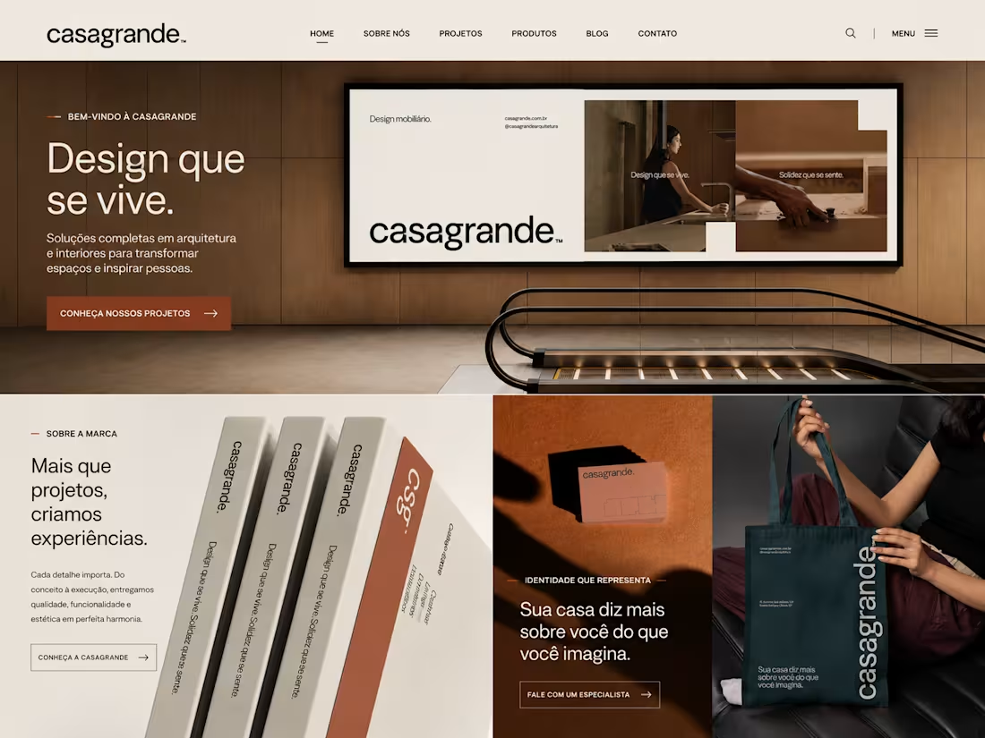
🏡 Casagrande – Furniture Website Design
Designed a clean and elegant website for a furniture brand, focusing on premium visuals, intuitive navigation, and a seamless user experience that showcases products effectively.
✨ Modern UI/UX
✨ Furniture Website Design
✨ Responsive Layout
✨ Premium Brand Experience
DM me for your brand and product.
0
69
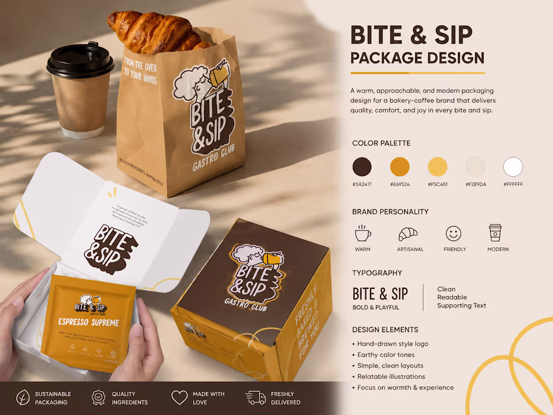
☕ Coffee Packaging Design
• Modern and eye-catching coffee bag design.
• Strong branding with premium packaging aesthetics.
• Packaging created to stand out in retail and online stores.
• Designed using Adobe Illustrator & Photoshop.
📌 Tools Used:
• Adobe Illustrator
• Adobe Photoshop
• Figma
• Mockup & Branding Tools
📩 DM me for your Packaging Brand, Product Packaging, Label Design, and Complete Brand Identity.
1
64
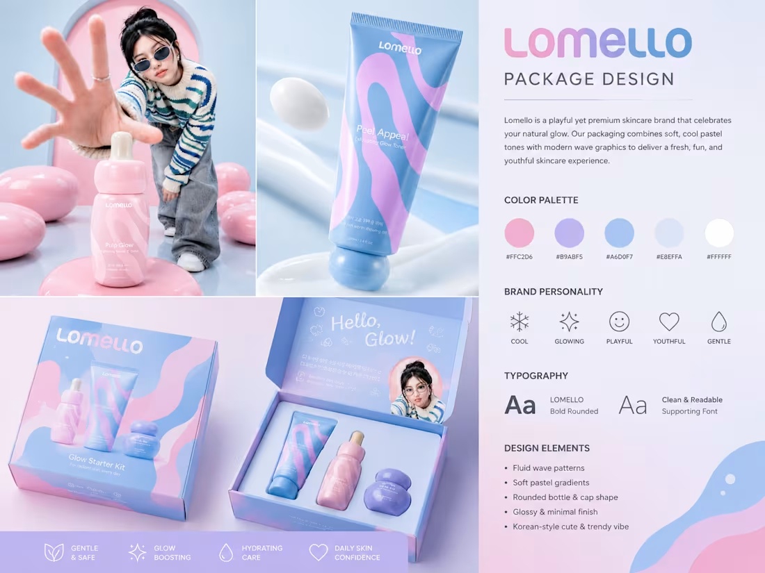
🧴 Skincare Packaging Design
• Clean and modern packaging for beauty products.
• Professional label design with brand consistency.
• Premium visual hierarchy for better product visibility.
• Designed using Adobe Illustrator, Photoshop & Mockup Tools.
📌 Tools Used:
• Adobe Illustrator
• Adobe Photoshop
• Figma
• Mockup & Branding Tools
📩 DM me for your Packaging Brand, Product Packaging, Label Design, and Complete Brand Identity.
1
39
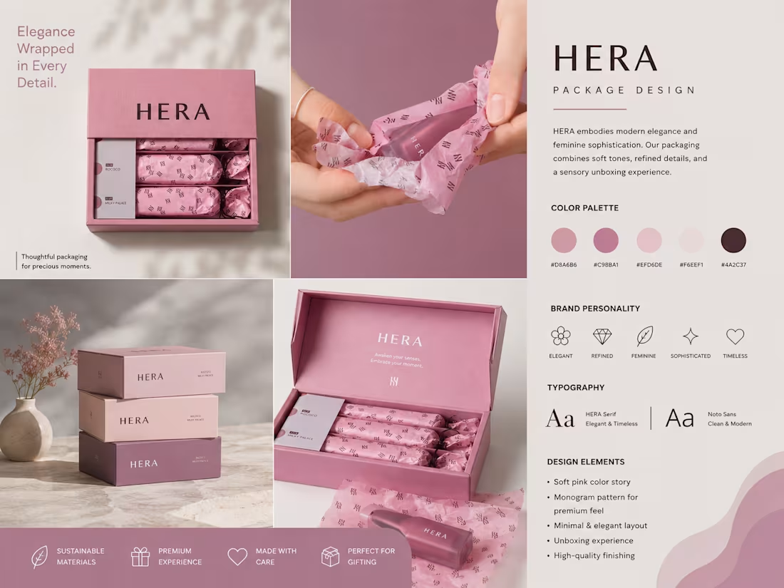
📦 Packaging Design Showcase
Packaging Design
• Attractive and colorful packaging for strong shelf appeal.
• Modern typography and premium product presentation.
• Brand-focused visual identity for better customer engagement.
• Designed using Adobe Illustrator & Photoshop.
📌 Tools Used:
• Adobe Illustrator
• Adobe Photoshop
• Figma
• Mockup & Branding Tools
📩 DM me for your Packaging Brand, Product Packaging, Label Design, and Complete Brand Identity.
0
43
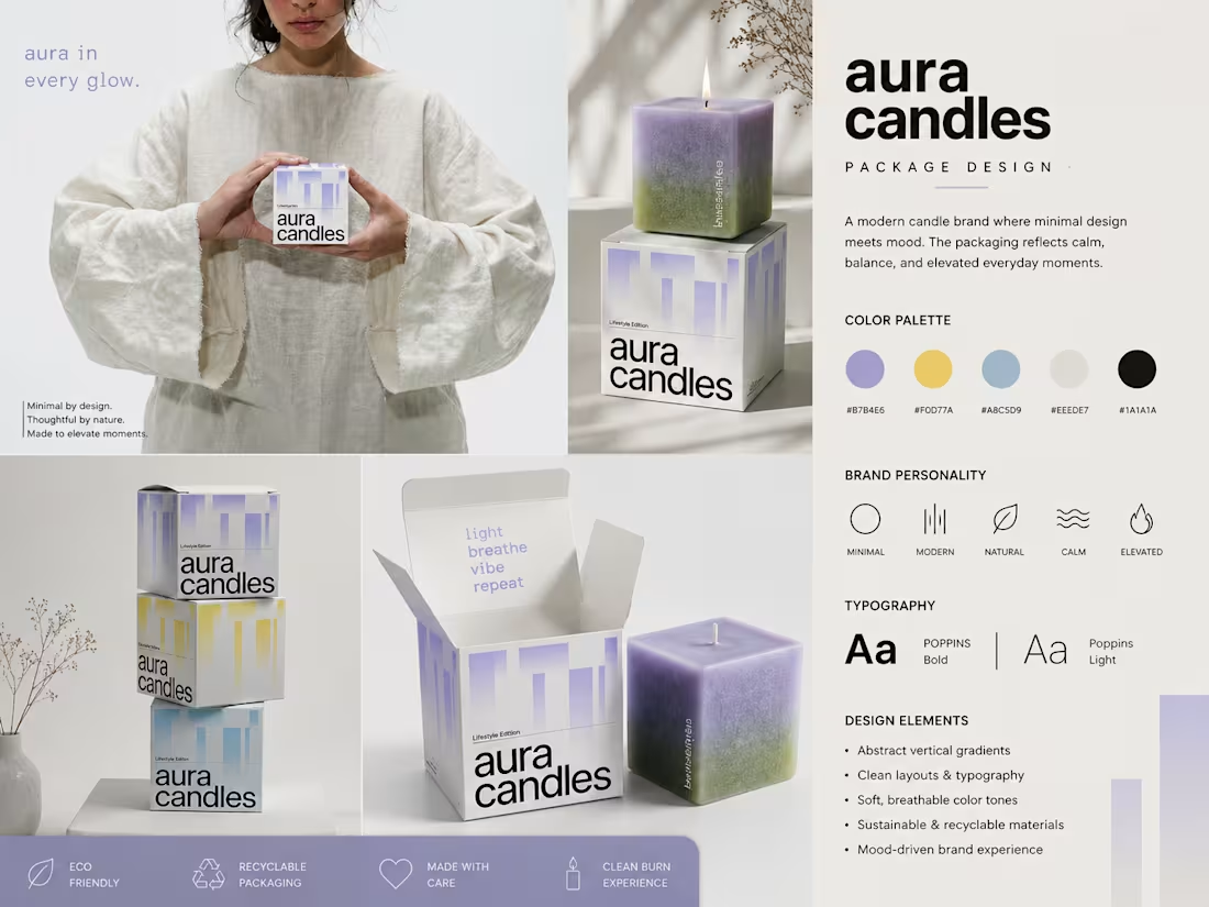
🕯️ Candle Packaging Design
• Elegant and luxury packaging concept.
• Minimal design with premium branding elements.
• Product-focused layout to enhance customer trust.
• Created with Adobe Illustrator & Photoshop.
📌 Tools Used:
• Adobe Illustrator
• Adobe Photoshop
• Figma
• Mockup & Branding Tools
📩 DM me for your Packaging Brand, Product Packaging, Label Design, and Complete Brand Identity.
0
40
logo Design for your brand
1
1
78
Want a logo that looks cool, feels premium, and instantly grabs your audience’s attention? 🎯
I create modern & interactive brand identities that help businesses stand out and connect with customers.
☕ Minimal • Creative • Memorable • Audience-Focused
📩 DM me to make your brand more powerful & recognizable.
0
196
✨ LOGO DESIGNER IS HERE ✨
Boost your brand with a unique and professional logo design that stands out in the market.
Modern • Luxury • Minimal • Creative
Your brand deserves an identity that people remember 💼🔥
📌 Custom Logo Designs
📌 Fashion & Clothing Brand Logos
📌 Premium & Unique Concepts
📌 USA Standard Professional Designs
🚀 Let’s turn your vision into a powerful brand!
DM NOW & LEVEL UP YOUR BUSINESS 💎
1
200
Luxury isn’t just what you wear — it’s how your brand feels. ✨
From beauty essentials to timeless accessories, every detail inside Lilia is designed to make elegance effortless. A space where fashion, wellness, skincare, and femininity come together in one premium experience.
Minimal. Feminine. Iconic.
Your audience doesn’t just shop here —
they step into a lifestyle.
Build a brand people remember.
DM now for luxury branding, logo design & premium visuals.
0
83
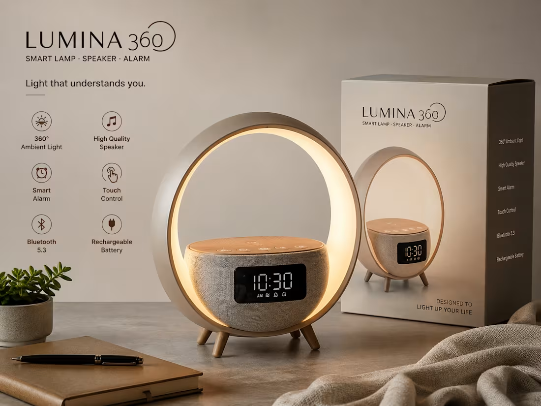
✨ LUMINA 360 – Smart Lamp, Speaker & Alarm
📦 Packaging Design
The packaging features a clean and premium minimalist design with soft neutral colors. The product image is displayed prominently on the front, creating a modern and professional look. The elegant branding and organized feature highlights make the package visually appealing and retail-ready.
💡 Product Features
• 360° Ambient Light for a warm and relaxing atmosphere.
• High-Quality Bluetooth Speaker for clear audio.
• Smart Alarm Clock with easy scheduling options.
• Touch Control for simple and seamless operation.
• Rechargeable Battery for portability and convenience.
• Modern and stylish design suitable for home and office use.
🛠 Tools Used
• Adobe Illustrator
• Adobe Photoshop
• Figma
• Blender (3D Product Mockup)
📩 DM for your Packaging Brand & Product Design.
1
26
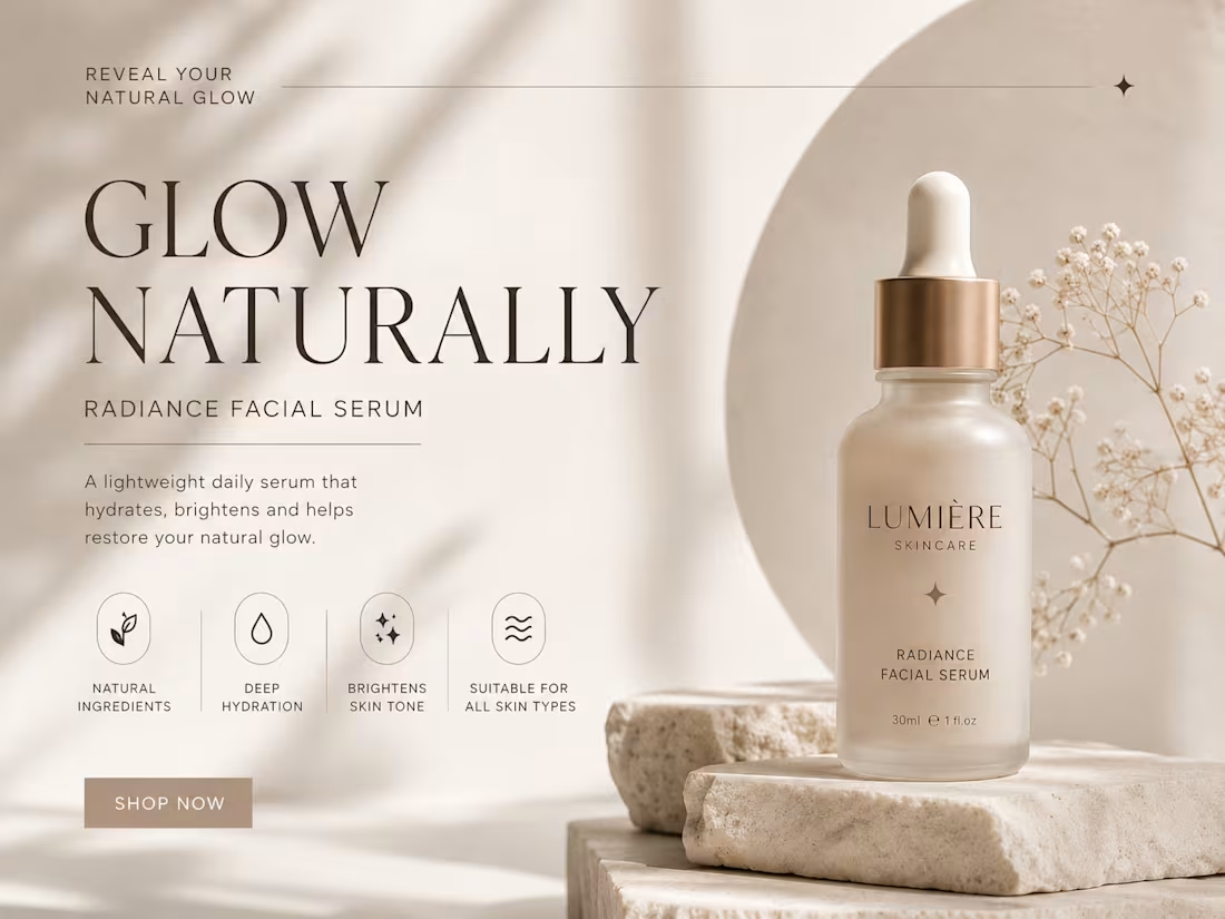
Beauty isn’t loud — it’s effortless. ✨
Crafting premium visuals that make your brand feel luxurious, modern, and unforgettable. From skincare campaigns to lifestyle branding, every detail is designed to attract, connect, and convert.
Minimal aesthetics. Clean typography. High-end visuals.
Because your brand deserves more than just “good design.”
Let’s turn your product into a visual experience.
DM now for custom branding & graphic design.
0
77
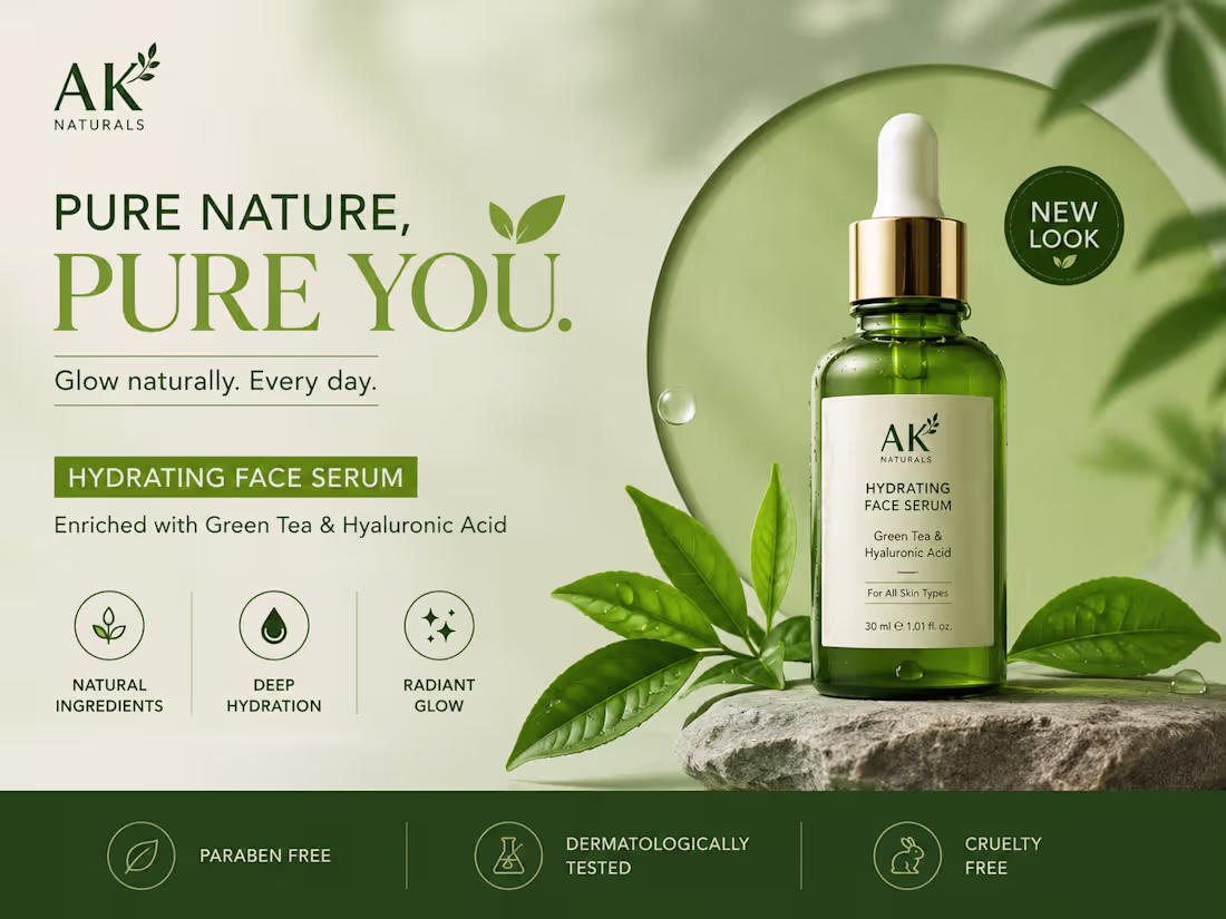
🌿 PURE NATURE. PURE YOU. 🌿
Your brand deserves a design that speaks before words do.
Clean visuals, premium feel, and a modern aesthetic that instantly grabs attention ✨
This skincare product ad was designed to create:
✔ Strong brand identity
✔ Client trust & attraction
✔ Modern luxury vibes
✔ High-converting social media presence
Good design doesn’t just look beautiful — it sells your product. 🚀
Need eye-catching graphics for your brand?
📩 DM me for:
• Product Ads
• Social Media Posts
• Brand Identity
• UI/UX Designs
• Creative Marketing Visuals
Let’s make your brand impossible to ignore. 💚
0
63
✨ Elevate Your Brand with Premium Graphic Design ✨
Your product deserves more than just a design — it deserves an identity that captures attention instantly.
From luxury packaging to modern brand visuals, I create designs that make your business look professional, premium, and unforgettable.
✔ Unique & Eye-Catching Designs
✔ Modern Brand Aesthetic
✔ Client-Focused Visual Strategy
✔ Social Media & Product Branding
✔ High-Quality Professional Look
Whether you’re launching a new product or upgrading your brand presence, I can help turn your vision into a powerful visual experience.
💬 DM me to create stunning designs for your brand today!
🚀 Let’s make your product stand out from the competition.
0
60
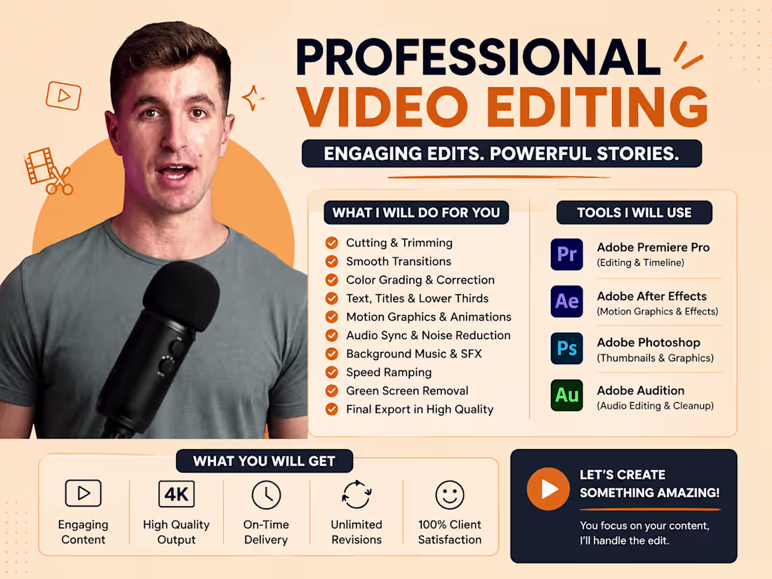
🚀 Want content that actually grabs attention & converts viewers into clients?
Professional video editing is not just about cuts & transitions — it’s about storytelling, engagement, and brand growth.
🎬 High-quality edits
⚡ Fast-paced engaging reels
📈 Content optimized for audience retention
💼 Perfect for brands, agencies & creators
If your content looks average, your audience scrolls away.
I help brands create visuals that stop the scroll instantly.
📩 DM for your next video / reel project
2
227
Your content should speak before you do. ✨
A strong visual presentation can completely change how people see your brand, profile, or business.
From editing to storytelling — every second matters.
💡 Clean visuals
🎯 Audience-focused editing
🎬 Professional reel production
📱 Social-media-ready content
Whether you are building a personal brand or growing a business, impactful content creates trust instantly.
📩 DM for professional videos & reels
2
234
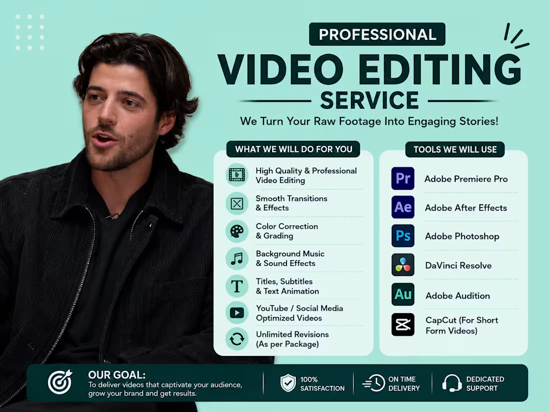
⚡ Fast-paced reels = higher engagement.
In today’s social media world, strong editing is what makes viewers stop scrolling and start watching.
🎬 Dynamic cuts
🔥 Trendy reel style
🎵 Music synced transitions
📈 Content built for reach & engagement
Perfect for creators, influencers, brands, and businesses looking to grow online with impactful content.
Portfolio: here (https://uiwexstudiodesign.lovable.app/)
📩 DM for your next reel / short-form video
0
128
🎥 Cinematic content is not just visuals — it’s emotion.
Every reel should make people feel something.
That’s how content becomes memorable.
🔥 Smooth storytelling
🎬 Cinematic editing style
🎵 Engaging pacing & transitions
📈 Content designed to increase engagement
Your audience remembers quality.
Let’s create reels that look premium and feel powerful.
📩 DM for cinematic reels & video editing services
1
231

Walli App
A visually immersive wallpaper application that allows users to explore, download, and personalize their devices with high-quality wallpapers through a sleek, modern, and engaging interface.
0
98
Nutrition & Fitness Tracking App
A modern nutrition and fitness tracking app designed to help users monitor calories, track daily activities, set health goals, and maintain a healthier lifestyle through an intuitive and engaging user experience.
1
1
109
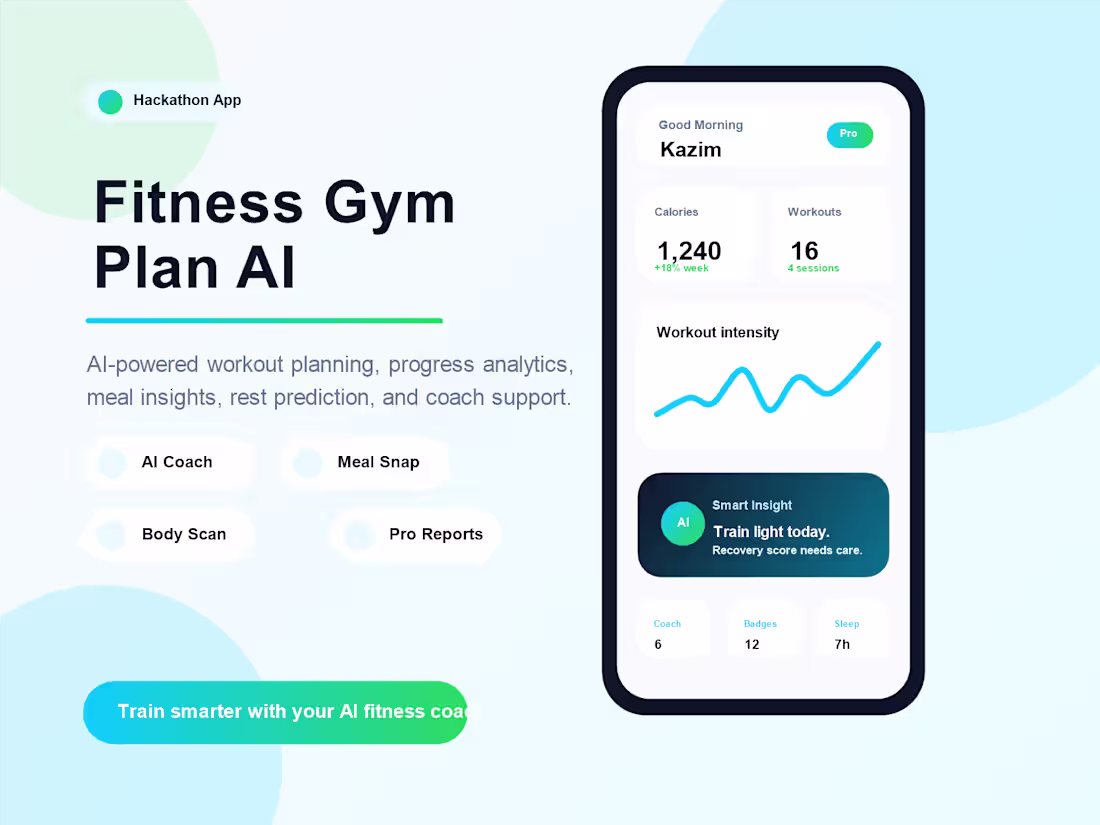
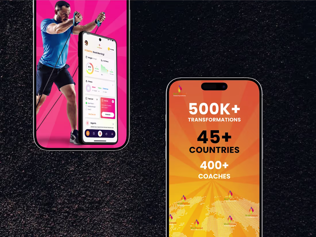
Small gym users and beginners often struggle with one problem: they track workouts in notes, diet in another app, progress in photos, and motivation in their mind. Everything is scattered, so they do not know what is actually working.
That is why I designed Fitness Gym Plan AI, a premium mobile fitness app that brings workout tracking, AI coaching, progress analytics, rest day prediction, meal calorie estimation, badges, challenges, and weekly reports into one simple dashboard.
The app is reliable because it helps users make decisions from their own fitness data. It can show daily, weekly, and monthly progress, suggest when to train or rest, track sleep and water, and guide users with an AI coach instead of leaving them confused.
Key features include AI Fitness Coach, Smart Rest Day Predictor, Meal Snap AI, Body Scan Progress, Streak & Badge System, Workout Buddy Challenge, Water & Sleep Tracker, Custom Workout Builder, Video Exercise Library, and Weekly PDF Reports for Pro users.
The goal is simple: make fitness easier, smarter, and more motivating for everyday users. Instead of just counting workouts, Fitness Gym Plan AI helps users understand their body, improve consistency, and stay on track with a clean, modern, user-friendly experience.
2
7
952
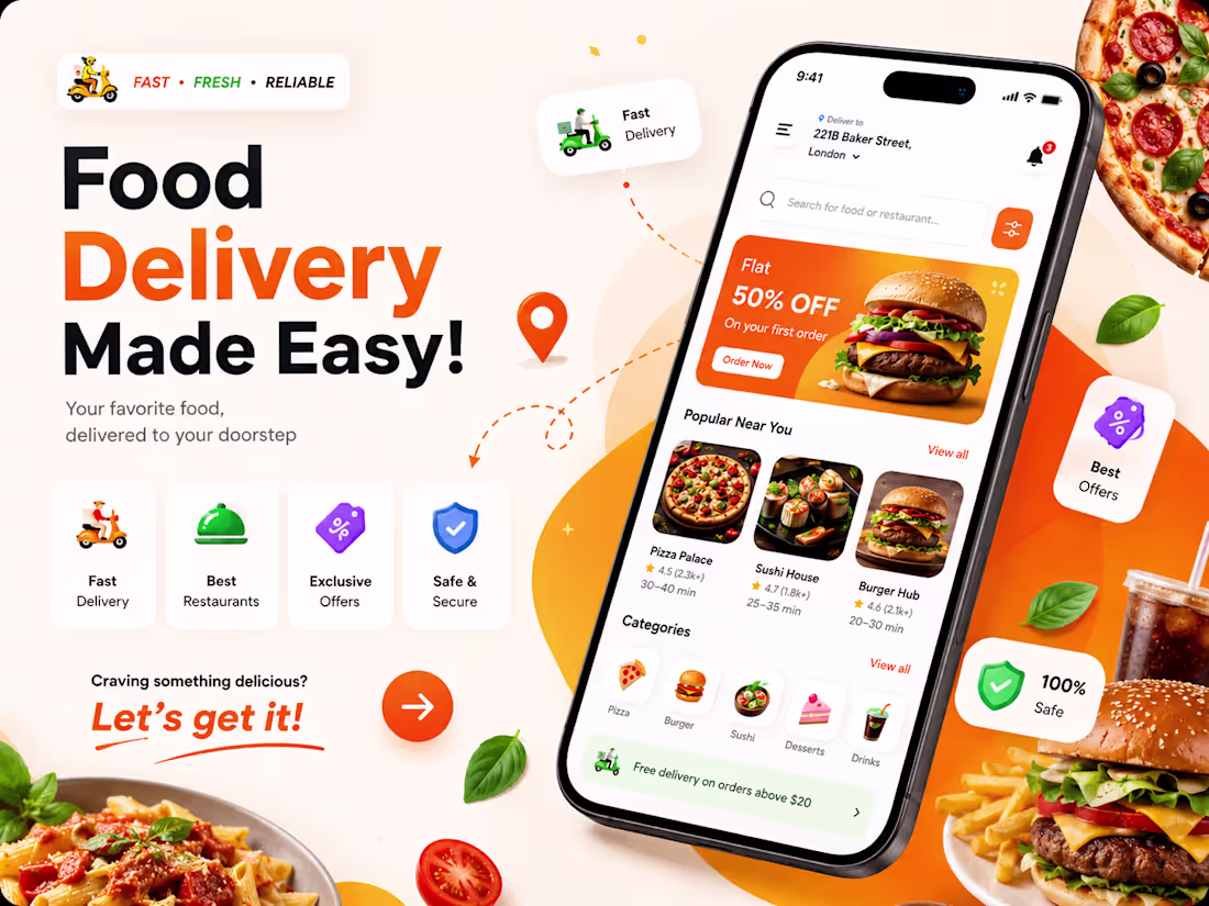
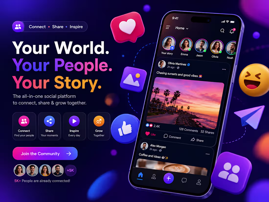
🚀 Turning Ideas Into Interactive Experiences! 📱✨
A great UI/UX design is not just about looks — it’s about creating smooth, engaging, and user-friendly experiences that people love to use.
🍔 Food Delivery App Design Highlights:
✔️ Clean & modern interface
✔️ Interactive mobile experience
✔️ Attractive color combinations
✔️ Easy navigation for users
✔️ Fast and friendly user journey
✔️ Designed to increase engagement & conversions
Good design helps your brand stand out and keeps users coming back.
💡 Need a modern UI/UX design for your mobile app or website?
I can help you create visually stunning and user-focused designs that elevate your brand.
📩 DM me to start your next project!
0
233
Celebrity Industry Website
A modern and visually engaging celebrity industry website designed to showcase profiles, media, and trending content. Clean UI with smooth navigation to enhance user experience and audience engagement.
0
93
E-commerce Website
A fully responsive e-commerce website built for seamless shopping experience. Includes product listings, user-friendly navigation, and optimized checkout flow to boost conversions.
0
90
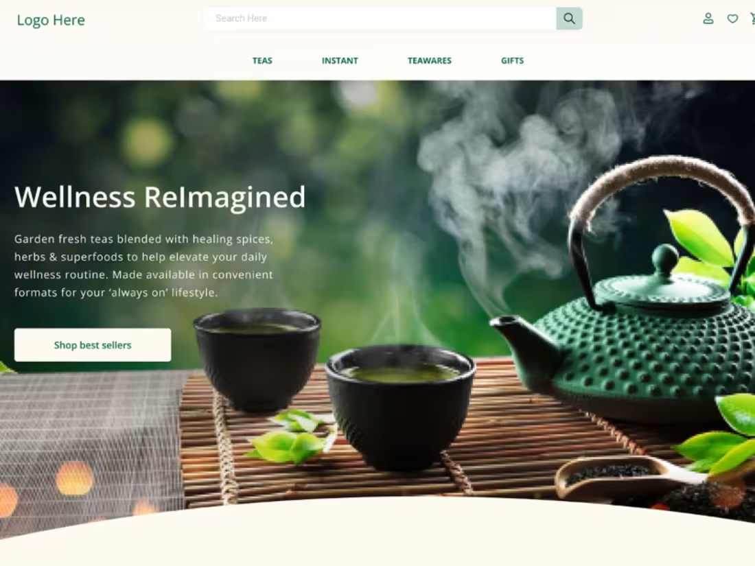
🌿 Designed a modern and responsive Wellness & Tea eCommerce website with a clean, premium UI.
📱 Fully optimized for desktop, tablet, and mobile devices for a seamless user experience.
🎨 Featured product showcases, testimonials, bestsellers, and engaging call-to-action sections.
🚀 Focused on brand storytelling, conversion optimization, and a visually appealing customer journey.
0
74
Web Design Project
A professional and creative web design focused on clean layout, user experience, and modern aesthetics. Designed to deliver high performance and visually appealing interfaces.
0
79
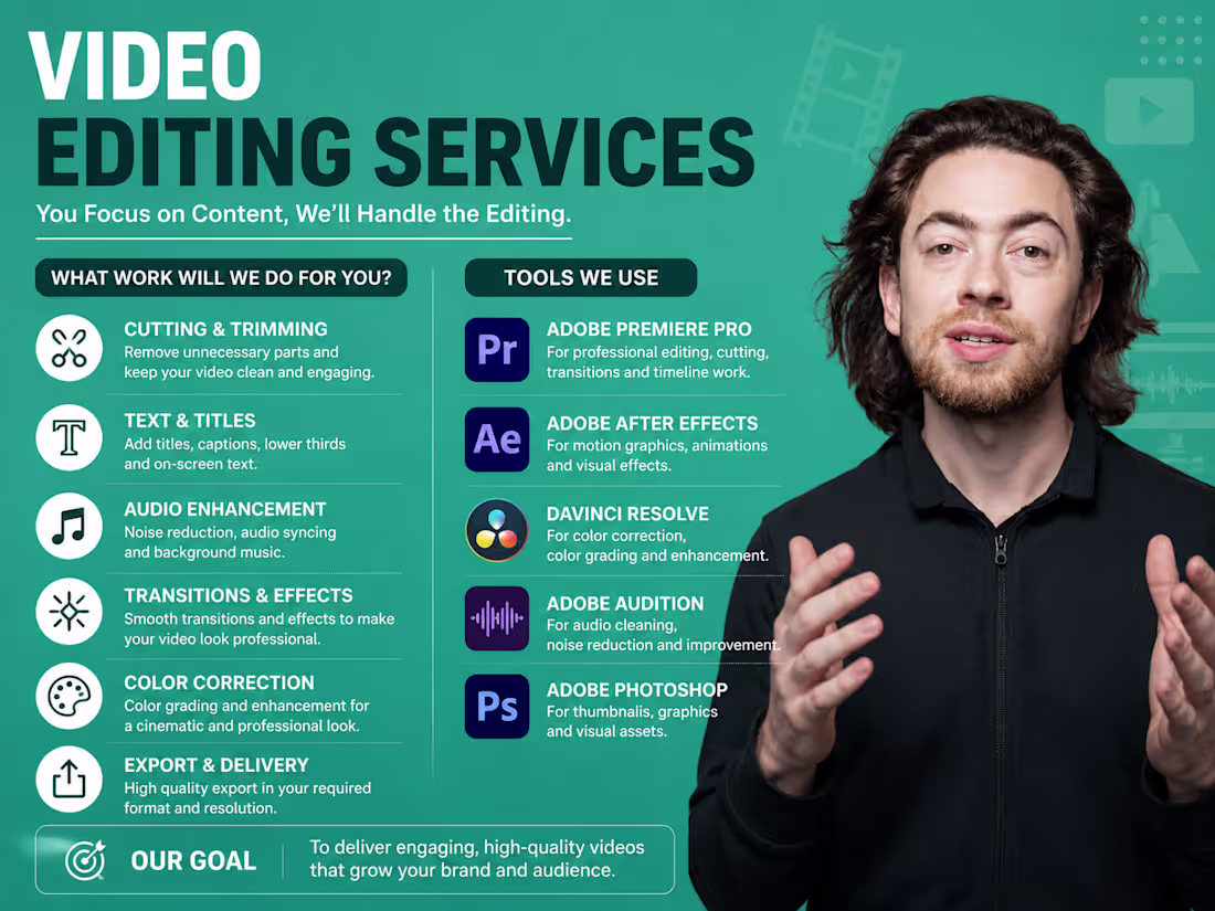
🎬 Great videos don’t just look good — they keep people watching.
From clean cuts to engaging storytelling, every second matters when building content that connects with your audience.
✨ Smooth editing
🎯 Clear storytelling
⚡ Engaging pacing & transitions
📈 Content optimized for retention
Whether it’s long-form content, podcasts, educational videos, or creator content — professional editing makes the difference.
📩 DM for professional video editing services
2
181
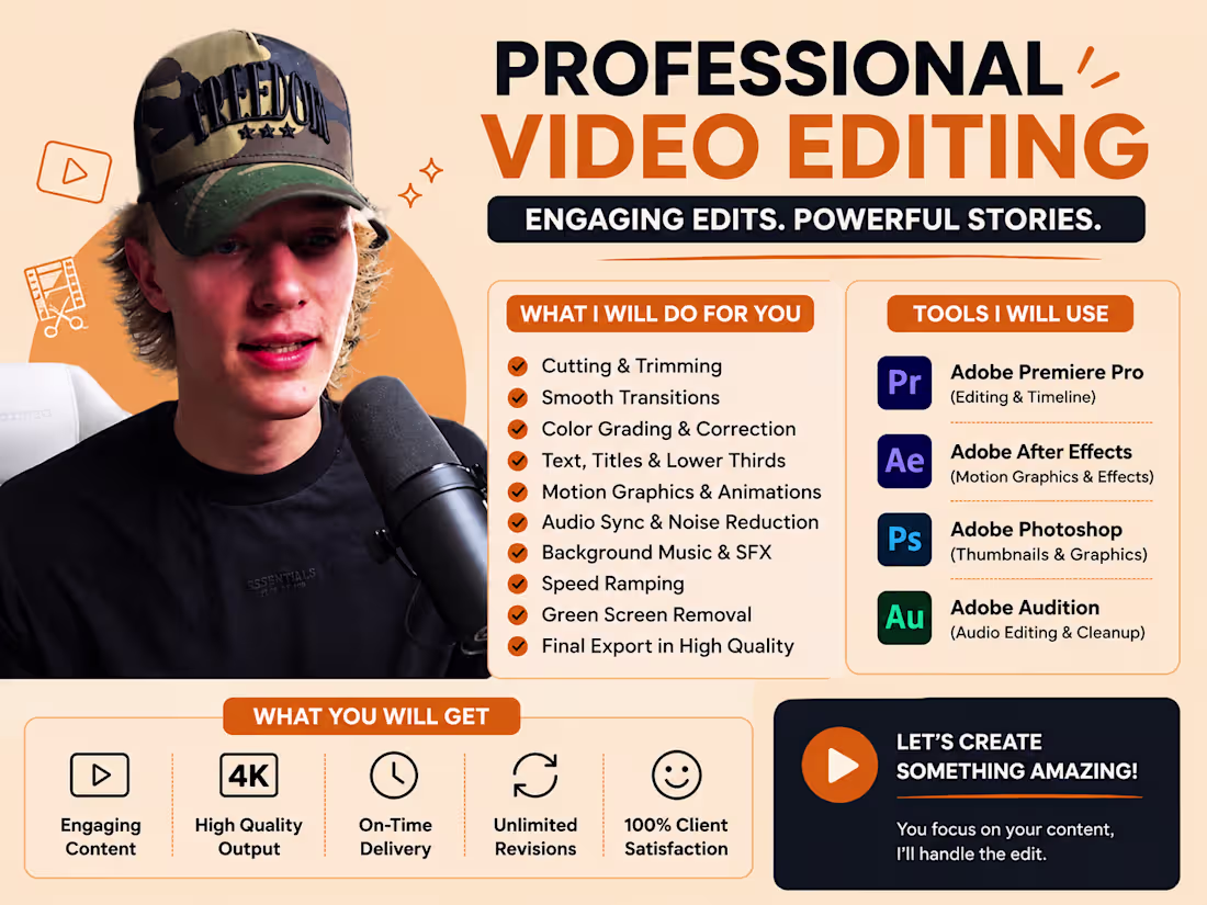
🚀 Your content deserves more than basic editing.
Professional visuals help creators and brands stand out in today’s fast-moving digital world.
🎥 High-quality editing
🔥 Attention-grabbing visuals
🎬 Modern transitions & motion
📱 Optimized for social platforms
I create content designed to increase engagement, improve watch time, and give your brand a premium feel.
📩 DM for your next video project
2
120
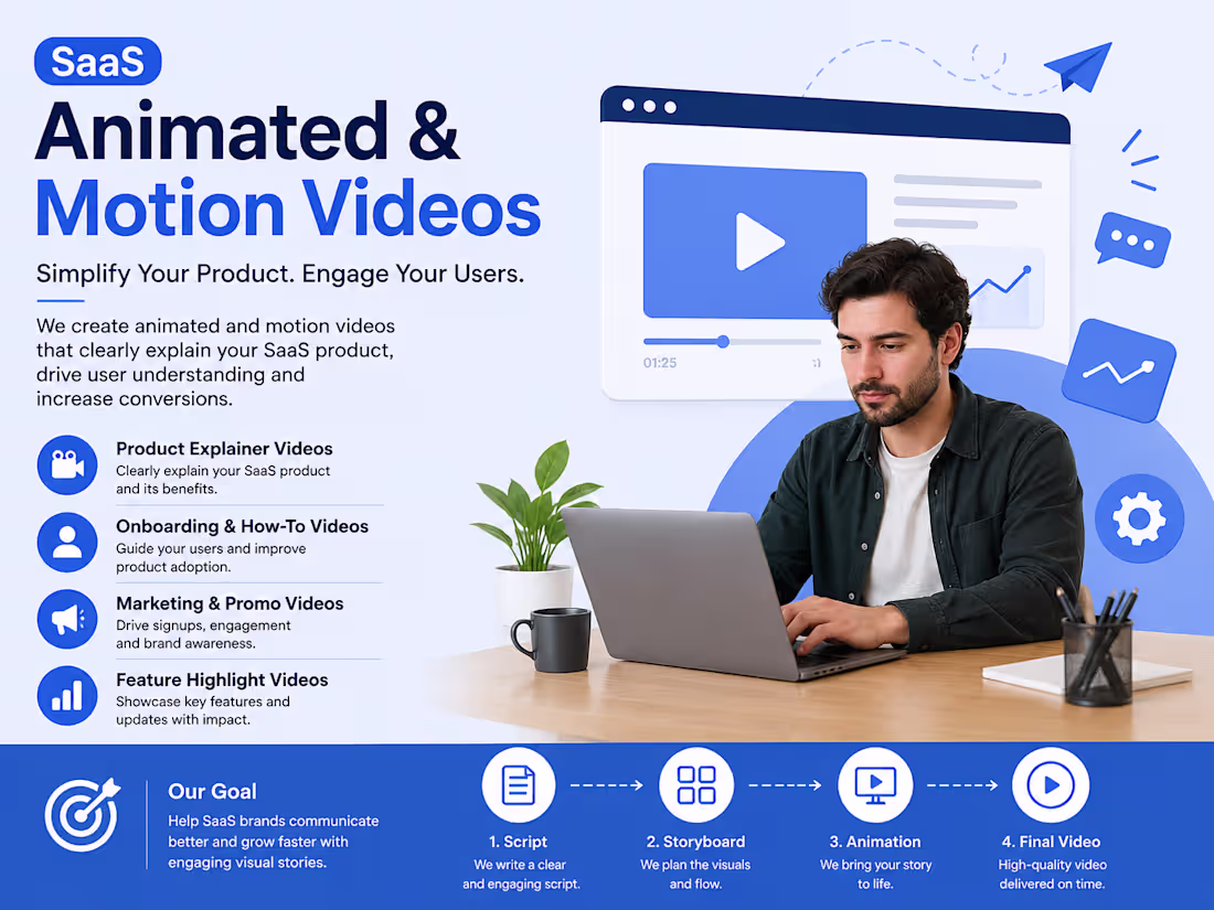
SaaS type video Editing + animation + motion video
0
70
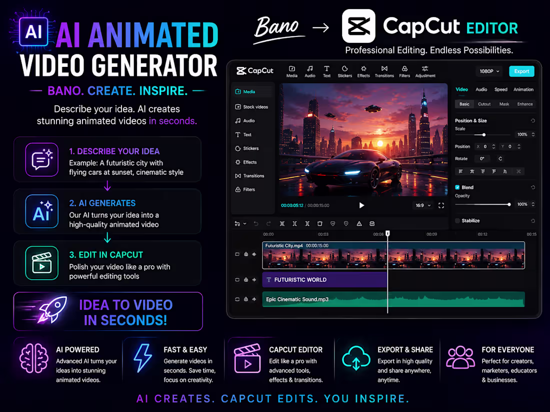
🚀 What if "Ctrl + Z" existed in real life?
A simple idea.
A powerful story.
A cinematic experience.
Using CapCut, a concept as simple as an "Undo" button was transformed into a futuristic short film that makes people question their biggest life decisions.
This is the power of creative storytelling.
CapCut is no longer just a video editor.
It's a creative studio where you can:
Create cinematic short films
Build futuristic AI concepts
Design viral social media content
Produce brand advertisements
Generate motion graphics
Create storytelling videos that connect emotionally with audiences
The best content isn't about expensive equipment.
It's about turning a simple idea into something people can't stop watching.
"Ctrl + Z in the Future" is proof that one creative concept can become an unforgettable visual experience.
🎬 If you can imagine it, CapCut can help you create it.
0
165
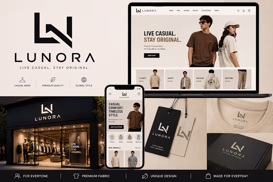
🔥 Your Brand Deserves a Logo That Stands Out.
A strong logo is not just a design — it’s the identity of your brand.
Modern, bold, and premium logo concepts crafted specially for clothing brands to give your business a cool and effective look.
✅ Unique Brand Identity
✅ Premium & Modern Style
✅ Perfect for Fashion Brands
✅ Professional Store & Social Media Look
Make your clothing brand look powerful and unforgettable.
📩 DM NOW to create your custom brand logo & fashion branding design.
0
132
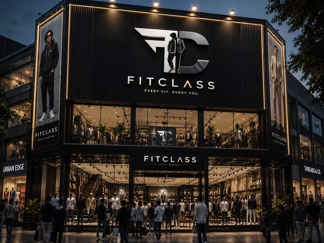
✨ How Your Brand Will Represent ✨
Your brand is more than clothing — it’s a lifestyle, an identity, and a statement of confidence.
With a premium visual identity like “FITCLASS,” your brand instantly creates a bold and luxurious impression in the market.
🏬 A modern storefront
🔥 Eye-catching logo presence
👔 Premium fashion identity
🌟 Strong customer attraction
📸 Social-media-ready branding
This design represents:
✔ Confidence
✔ Style
✔ Luxury
✔ Modern Men’s Fashion
✔ Premium Brand Value
From streetwear to formal wear, your brand will stand out with a powerful and memorable identity that customers recognize instantly.
A strong logo doesn’t just look good — it builds trust, attracts attention, and makes your brand unforgettable.
💬 Need a luxury brand identity for your business?
DM me and let’s create something iconic for your brand. 🚀
0
65
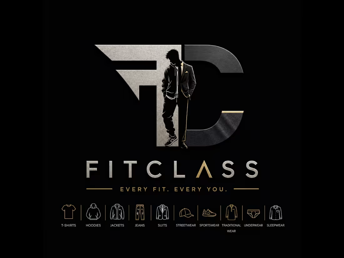
🔥 Elevate Your Brand Identity with Luxury Fashion Logo Design 🔥
Your brand deserves more than just a logo — it deserves a powerful identity that people remember.
This premium “FITCLASS” concept represents style, confidence, luxury, and modern men’s fashion all in one bold design.
👕 Streetwear
🧥 Hoodies & Jackets
👔 Suits & Formal Wear
👖 Jeans & Casual Fashion
⚡ Sportswear & Modern Trends
A strong logo creates:
✔ Brand Recognition
✔ Premium Brand Feel
✔ Customer Trust
✔ More Audience Attraction
✔ Professional Market Presence
As a Logo Designer, I create modern luxury branding concepts that help fashion brands stand out in the market and attract the right audience.
✨ Minimal
✨ Bold
✨ Premium Look
✨ Fashion Industry Ready
Need a luxury identity for your brand?
DM me and let’s build a brand people can’t ignore. 🚀
0
71
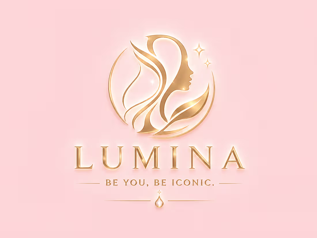
✨ Crafted a luxury beauty brand identity for a modern cosmetics store from logo design to full storefront branding.
Presenting LUMINA ✨
A premium beauty brand concept designed with a soft luxury aesthetic, elegant typography, and a feminine visual identity that creates an unforgettable customer experience.
✔ Logo Design
✔ Storefront Branding
✔ Interior Brand Visualization
✔ Beauty & Cosmetics Identity
✔ Premium Luxury Aesthetic
Every detail was designed to make the brand feel iconic, elegant, and market-ready for modern beauty businesses.
Looking for a premium brand identity that instantly attracts customers and makes your business look world-class?
I create luxury logo designs, storefront concepts, and complete visual branding that helps brands stand out professionally. Let’s build your next iconic brand together.
#LogoDesign #BrandIdentity #LuxuryBrand #BeautyBrand #
0
231
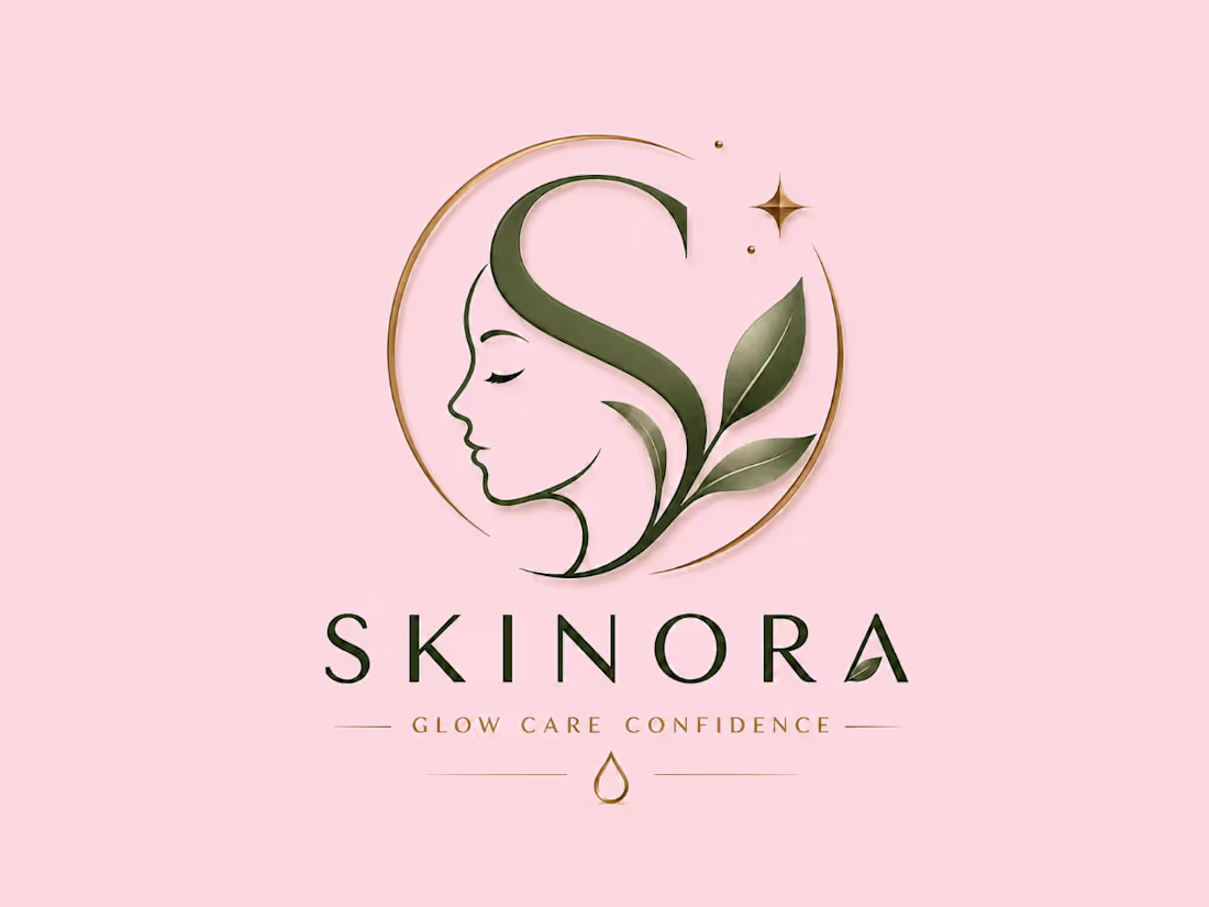
✨ Build Your Premium Brand with SKINORA ✨
Your brand deserves a luxury identity that attracts customers instantly 💖
We create:
🌸 Luxury Logo Designs
🌸 Premium Skincare Brand Identity
🌸 Elegant Shop Mockups
🌸 Social Media Branding
🌸 Packaging Design
🌸 Modern & Feminine Aesthetic Designs
Introducing SKINORA — a luxury skincare brand concept designed with elegance, confidence, and beauty in mind ✨
Soft Pink • White • Golden Luxury Theme 👑
Want your business to look PREMIUM and high-end like this?
📩 DM ME NOW to create your own luxury skincare brand, beauty brand, cosmetic brand, or feminine business identity.
Let’s turn your vision into a premium brand that customers remember 💎
1
243
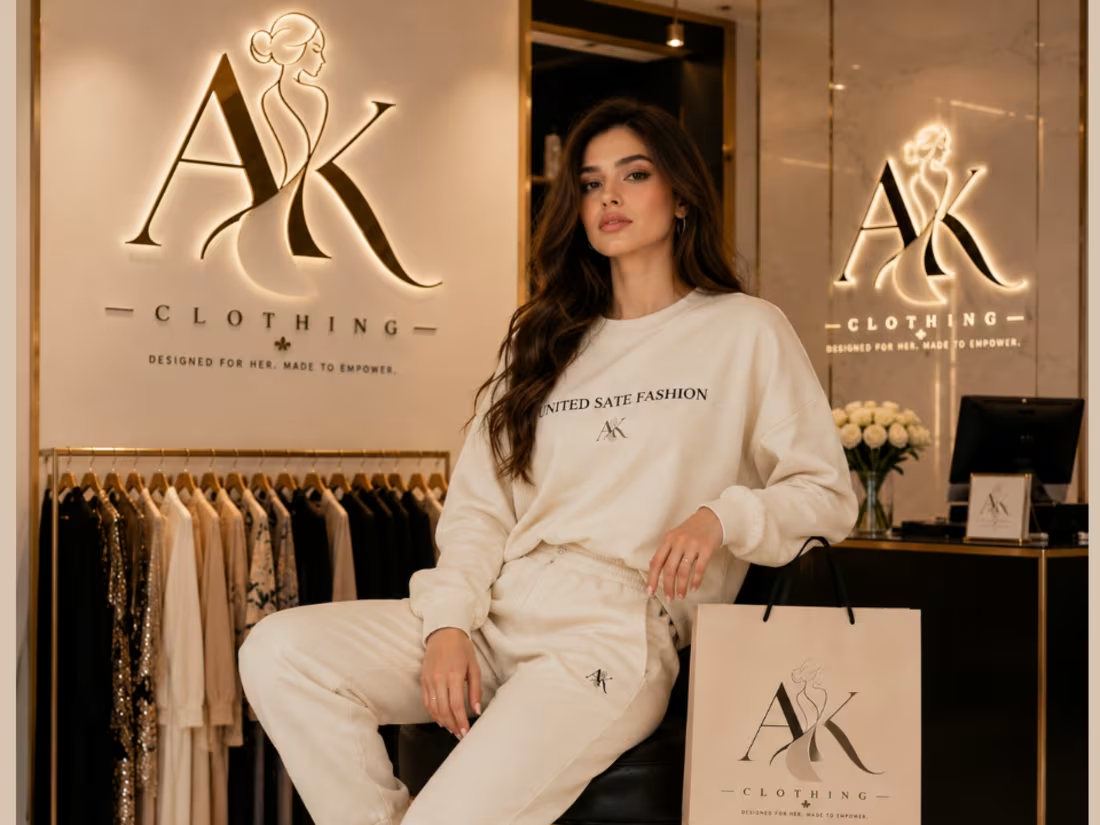
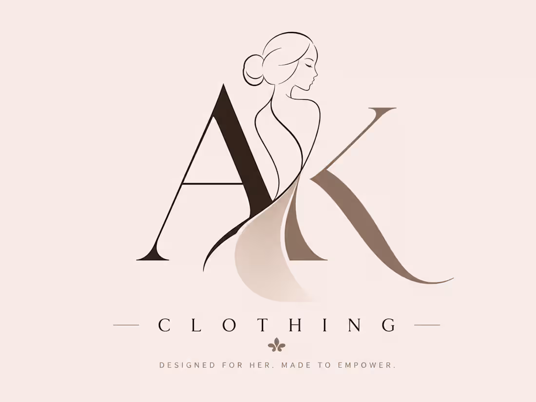
Your Brand Deserves a Logo That Speaks Luxury ✨
A logo is not just a design — it’s the identity of your brand.
This “AK Clothing” concept represents:
✔ Elegant & Premium Fashion Identity
✔ Feminine Luxury Aesthetic
✔ Modern Minimalist Branding
✔ Strong Visual Recognition
✔ Professional Brand Presence
From the custom typography to the soft luxury tones and stylish silhouette, every detail is designed to make the brand feel classy, memorable, and high-end.
A powerful logo helps your brand:
• Build trust instantly
• Attract the right audience
• Stand out in the fashion industry
• Create a premium customer experience
Whether it’s for clothing brands, skincare, beauty, or luxury boutiques the right logo changes everything.
Designed to represent confidence, elegance, and modern fashion. ✨
1
189
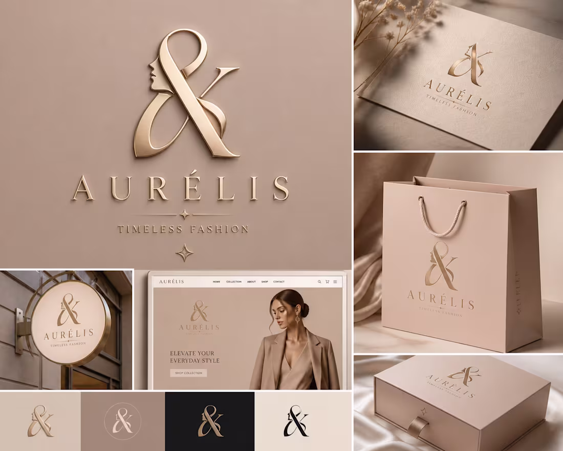
✨ Luxury Brand Identity Design ✨
Make your fashion brand look premium, elegant & unforgettable.
A logo is not just a symbol — it’s the first impression of your business.
✔ Unique Luxury Logo
✔ Website Branding
✔ Shopping Bag & Box Mockup
✔ Premium Fashion Identity
✔ Elegant Nude Beige Aesthetic
💼 Perfect for:
Fashion Brands • Clothing Stores • Boutique Labels • Luxury Startups
📩 Want a brand identity that attracts clients instantly?
Let’s create something iconic for your business.
3
257
Luxury isn’t just designed — it’s experienced. ✨
Focused on cinematic lighting, luxury typography, black-gold aesthetics, and immersive product storytelling to create a brand that feels elite before the first spray.
From logo identity to luxury product visualization — every detail was crafted to attract premium customers and elevate brand perception.
✔ Luxury Brand Identity
✔ Premium Product Presentation
✔ High-End Visual Direction
✔ Social Media & Website Ready
✔ Modern Luxury Aesthetic
Looking for visuals that make your brand feel expensive and unforgettable?
📩 Available for:
• Luxury Branding
• Perfume/Product Ads
• Packaging Design
• Social Media Creatives
Let’s build a brand people remember.
0
160
🚀 Transform Your Fitness App Idea Into a Powerful User Experience!
Modern UI/UX isn’t just about looks — it’s about creating an experience users love, trust, and keep coming back to.
I design mobile app interfaces that are:
🔥 Clean & Interactive
🎯 User-Friendly & Conversion Focused
📱 Modern Mobile UI/UX Designs
⚡ Smooth User Experience
🎨 Attractive Visual Systems
💡 Designed for Real Business Growth
Whether you need:
✔ Gym/Fitness App UI
✔ Dashboard Design
✔ E-commerce UI
✔ SaaS Interface
✔ Mobile App Design
✔ Landing Pages
I can create premium and engaging designs that make your brand stand out.
✨ Your app deserves more than “just a design” — it deserves an experience.
📩 DM me to start your next UI/UX project
Let’s build something modern, interactive, and unforgettable.
0
191
🚀 Need a Modern UI/UX Design For Your Brand?
Transform your ideas into stunning digital experiences ✨
I create clean, interactive & attractive UI/UX designs for:
📱 Mobile Apps
🌐 Websites
🛍️ E-commerce Stores
💬 Social Media Apps
📊 Dashboards & SaaS Platforms
💡 What You’ll Get:
✔ Modern & Premium Design
✔ User-Friendly Interface
✔ Interactive Prototypes
✔ Responsive Layouts
✔ Trendy Gradients & Clean Aesthetics
✔ Fast Delivery & Professional Work
🎨 Tools I Use:
Figma • Adobe XD • Photoshop
🔥 Let’s build something people love to use!
📩 DM now and bring your vision to life.
0
196
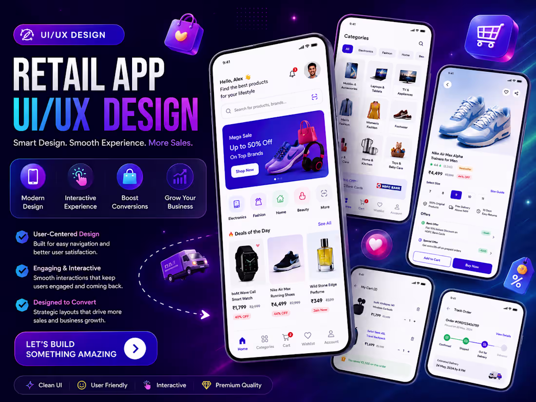
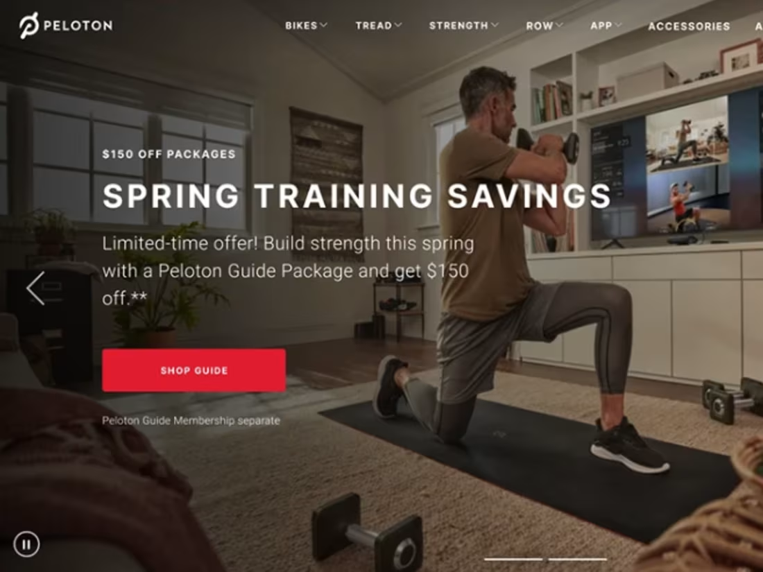
🚀 Transforming Retail Experiences Through Smart UI/UX Design 📱✨
Your app is not just about selling products — it’s about creating an experience customers love to use every day.
I design modern, interactive, and user-friendly mobile app interfaces that help brands:
✔ Increase customer engagement
✔ Improve user experience
✔ Boost conversions & sales
✔ Build a strong brand identity
✔ Create smooth and attractive shopping journeys
From clean layouts to premium animations and intuitive navigation, every screen is crafted to make your retail app look professional, modern, and unforgettable.
🎨 What I Can Design:
• Retail Mobile Apps
• E-Commerce UI/UX
• Dashboard Interfaces
• Product Showcase Screens
• Modern App Prototypes
• Interactive User Flows
💡 Minimal • Premium • Interactive • User-Centered
If you want your app to stand out in today’s competitive market, great UI/UX is the key.
📩 Let’s build a mobile experience your customers will love.
0
217
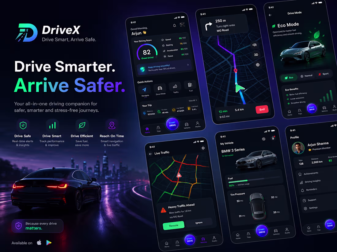
🚗✨ Turning ideas into smooth driving experiences!
A complete UI/UX design crafted for a modern Driving Mobile App — designed with clean navigation, interactive screens, smart dashboards, real-time driving insights, and a futuristic user experience.
✅ UI/UX Design Done Completely
✅ Modern & Interactive Mobile App Design
✅ User-Friendly Experience
✅ Clean Dashboard & Navigation Flow
✅ High-Quality Visual Design
Need a stunning mobile app design for your startup or business?
📩 DM for your custom UI/UX design project.
0
99