Projects using Figma in Zwolle
Projects using Figma in Zwolle
Sign Up
Post a job
Sign Up
Log In
Filters
2
Projects
People
Message
22
Roos van Gestel
pro
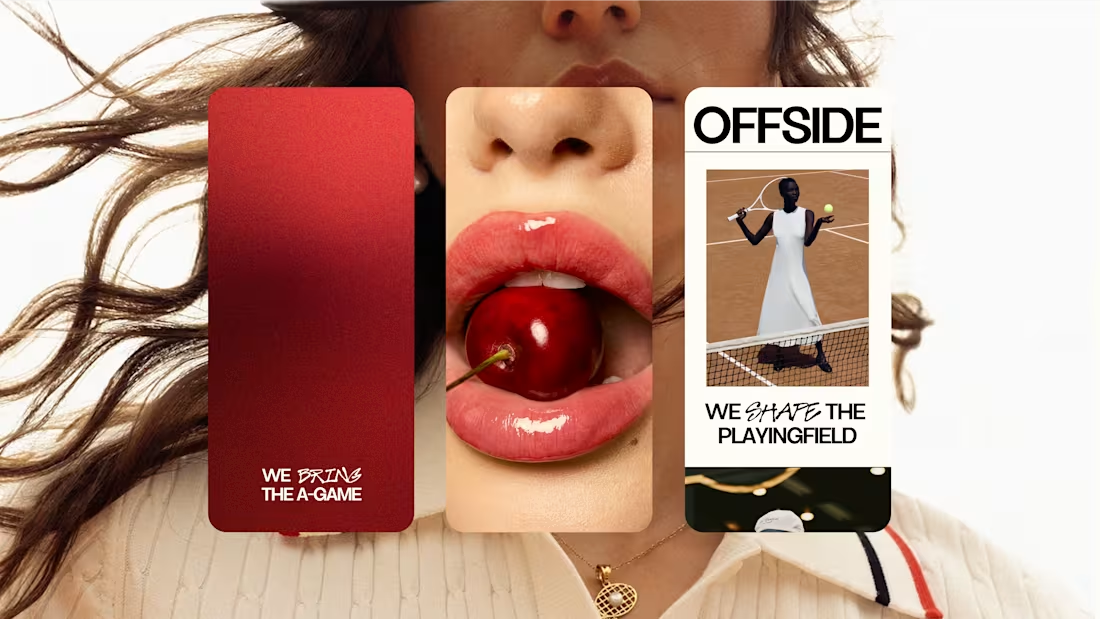
OFFSIDE Marketing Agency
22
137
Message
1
crew 7™ studio
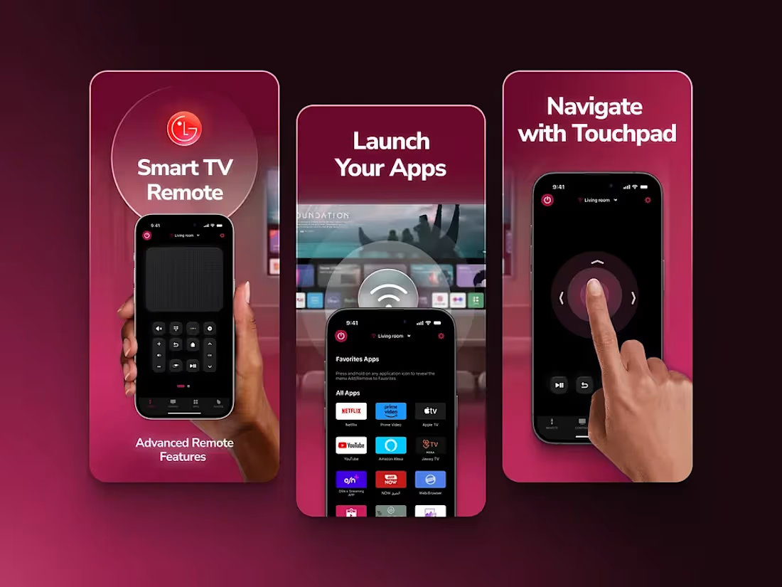
Screenshots design for LG Remote App
1
9
Message
0
Joost Damhuis
pro
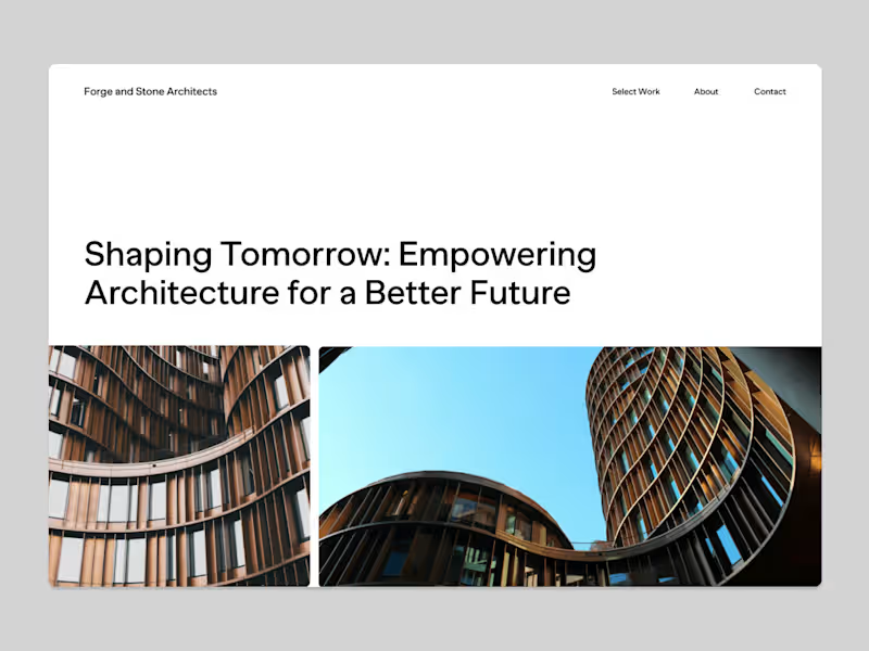
Stone & Forge - Shaping Tomorrow
0
39
Message
1
Philip Wallage
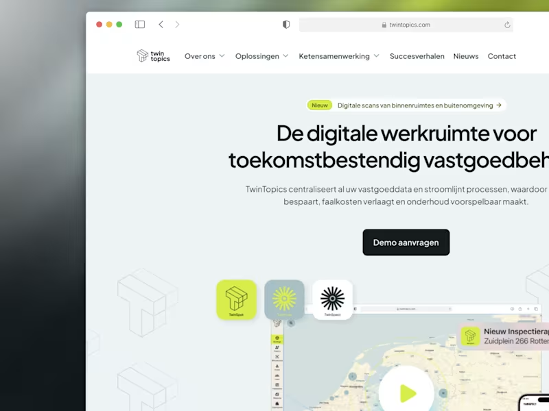
TwinTopics: Designing the Future of Real Estate Management
1
33
Message
1
Erwin Luijendijk, Cut the Code
A design system that enables international growth & ownership
1
16
Message
0
Nick Gazendam
Website Redesign
0
9
Message
0
Aron Koehoorn
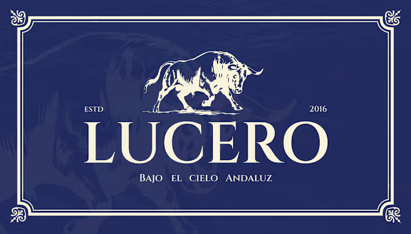
Lucero – Brand Identity & Web Design for an Authentic Andalusian Restaurant Services: Brand Identity, Logo Design, Web/UI Design, Custom Illustration, Exterior Signage About the Project Lucero is an authentic Spanish restaurant established in 2016, dedicated to bringing the rich, passionate culinary heritage of Andalusia to its guests. The objective of this project was to elevate their visual identity to match the premium, atmospheric, and romantic dining experience they provide—true to their tagline, "Bajo el Cielo Andaluz" (Under the Andalusian Sky). The Challenge Designing for traditional cuisines often comes with the risk of falling into touristy clichés. The challenge was to capture the authentic spirit of Southern Spain in a way that feels highly sophisticated, established, and elegant. The visual identity needed to communicate quality and tradition while appealing to a modern, discerning clientele seeking a high-end gastronomic experience. The Solution & Design Choices Logo & Iconography: The centerpiece of the brand is a majestic, hand-drawn illustration of a Spanish bull—a powerful symbol of strength and heritage. This is paired with a highly refined, classic serif typeface. The logo is designed to work beautifully across a flexible grid, easily adapting to light and dark backgrounds. Color Palette: I moved away from the expected bright reds and yellows of typical Spanish branding. Instead, the primary palette relies on a rich, deep midnight blue—representing the Andalusian night sky—perfectly contrasted with a warm, elegant cream tone. Custom Pattern Design: To add rustic charm and texture to the brand, I illustrated a bespoke, hand-drawn pattern. Featuring staple ingredients and culinary elements like garlic, vine tomatoes, pomegranates, and tapas, this pattern adds a playful yet artisanal touch to menus and packaging. Digital Experience: I designed a premium, responsive website interface that immediately invites users to "Dine under the Andalusian sky." The dark UI mirrors the intimate, warmly lit atmosphere of the physical restaurant, utilizing rich photography and elegant typography to drive reservations. Physical Branding & Storefront: The identity translates seamlessly into the physical environment. From the elegant window decals welcoming guests at the bistro-style storefront, to the classic, round projecting outdoor sign, the brand establishes a strong, sophisticated presence on the street. Deliverables Primary Logo & Responsive Brand Marks Color Palette & Typography System Custom Hand-Drawn Brand Pattern Responsive Website Design (Desktop & Mobile) Exterior Signage & Window Graphics
0
60
Message
0
Yay Designs
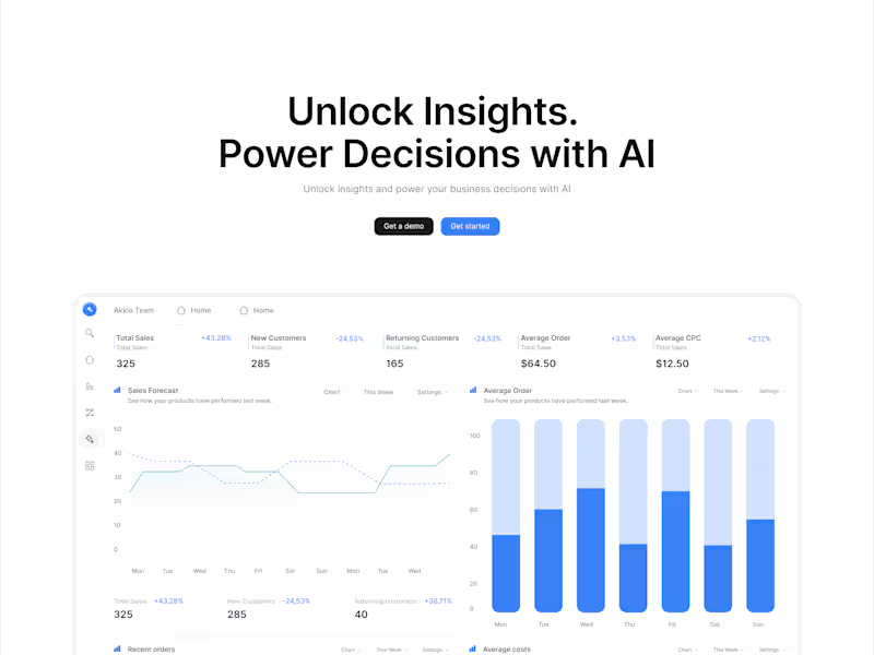
AI data analytics Web Development and Product Design
0
12
Message
0
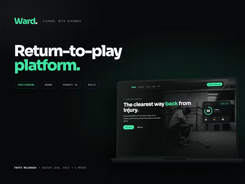
Thuto Mojanaga
A return-to play platform for sports rehab | Ward 🟢
0
1
Message
1
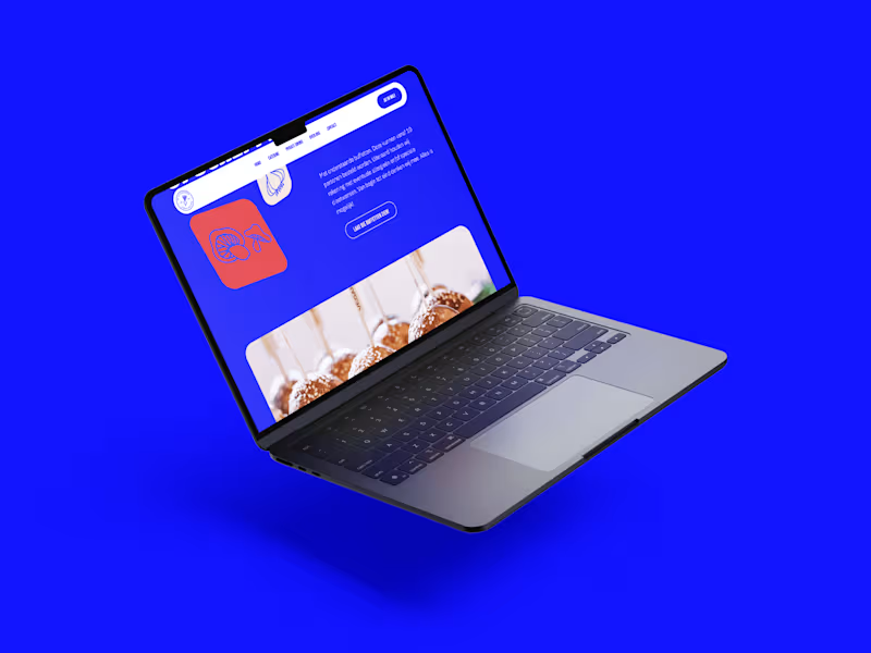
Douwe Dijkink
Catering de Opscheppers
1
12
Message
0
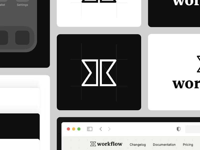
Dennis Metselaar
workflow rebrand "24
0
30
Message
12
Roos van Gestel
pro
NexHus Tiny Homes
12
76
Message
3
crew 7™ studio
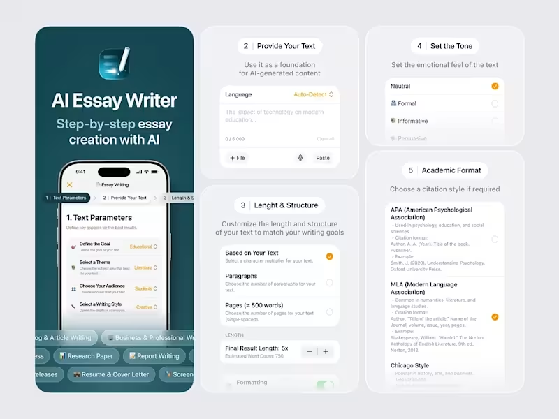
AI Essay Writer App Project
3
10
Message
0
Nick Gazendam
Webdesign in Framer
0
8
Message
3
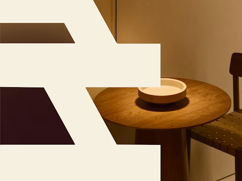
Joost Damhuis
pro
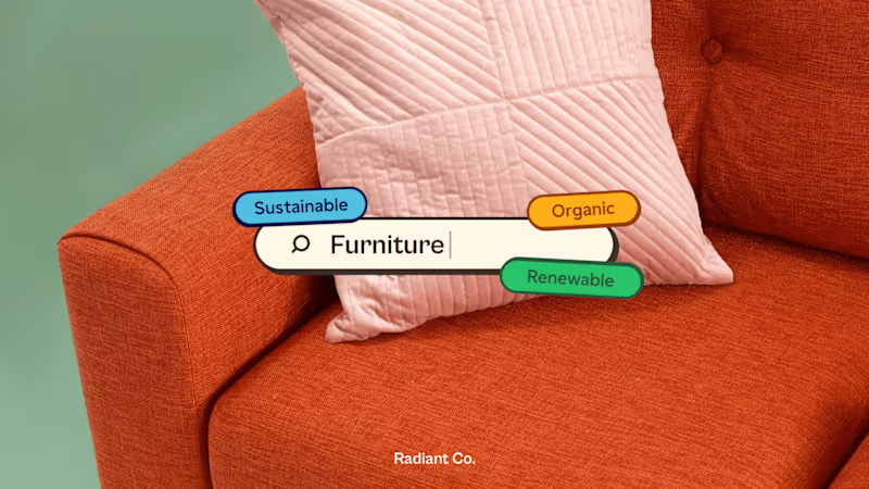
Radiant Co. - Future Forward Furniture
3
131
Message
26
Philip Wallage
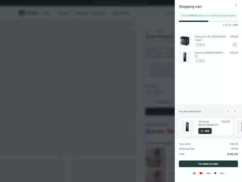
Most e-commerce stores leave money in the cart. Not because their products are wrong. Because their cart experience is lazy. New research from Baymard Institute: 52% of shoppers will actively hunt for more items if they see they're close to free shipping. Half your customers want to spend more. They just need to see how close they are. That's what a cart drawer with a dynamic progress bar does. Takes about 2 hours to implement. Results show within days. Here's what it looks like. The bar moves as they add items. Shows exactly how much more to hit the threshold. No guessing. No math. Just visual motivation. 23% will checkout anyway. Fine. But 52% will add more to their order. If your average order is €80... Can push 52% of customers to add one more item at €20?
26
451
Explore projects