Freelance Visual Artists in United StatesFreelance Visual Artists in United States
AI Creative Director - Campaigns, Content & Custom Builds
5.0
Rating
94
Followers
AI Creative Director - Campaigns, Content & Custom Builds
Cover image for SEEDANCE 2.5 | 30-SECOND ONE-SHOT
SEEDANCE 2.5 | 30-SECOND ONE-SHOT CINEMATIC TEST So I wanted to see how far I could push Seedance 2.5 with one continuous 30-second camera movement. The challenge was simple: Take one complex storyline, keep the same heroine, maintain her wardrobe and appearance, move continuously through the environment, introduce a gravity anomaly, bring in the crater, transfer the power to the heroine, reveal the creature, and end with incoming meteors. All inside one generation. I pushed it. The result was surprisingly cinematic. The character consistency held throughout the sequence. Her outfit stayed intact. The continuous tracking movement worked. The gravity effect came through. The crater interaction worked. The power-transfer moment worked. The monster appeared. The incoming meteors created the final cliffhanger. The biggest issue was pacing. I gave the model too many major story beats for 30 seconds, so it compressed several actions together. The pool transition is where the sequence loses some continuity. Instead of giving that moment enough time to develop, the model rushed her into the pool and back toward the crater. Still, I decided to keep the test. Why? Because this was never intended to be the final version. I wanted to understand how Seedance 2.5 interprets a complex one-shot prompt, and this test gave me a clear answer. The model followed the overall direction. The next step is better scene planning. Instead of forcing an entire story into one 30-second generation, I would break the major action beats into shorter sequences and give each moment enough room to breathe. My biggest takeaway: More story inside a single generation does not automatically create a better video. Sometimes better AI video direction means giving the model less to execute at once. This was a test. This was the result. And I’m keeping it because the experiment itself was worth documenting. Tool tested: Seedance 2.5 @Renoise Format: 30-second continuous one-shot Goal: Character consistency + camera continuity + complex action Result: Strong visual execution, rushed narrative pacing Next experiment: Shorter controlled sequences with fewer major actions per generation
2
4
170
Bold designs. Seamless web. Creativity with purpose.
$5k+
Earned
5x
Hired
5.0
Rating
23
Followers
Bold designs. Seamless web. Creativity with purpose.
Senior Web and Brand Designer at monday.com | Framer Expert
$1k+
Earned
2x
Hired
4.9
Rating
64
Followers
Senior Web and Brand Designer at monday.com | Framer Expert
Graphic + UI Designer for brand, web, and motion

1x
Hired
114
Followers
Graphic + UI Designer for brand, web, and motion

Product & Visual Designer · Brand Identity · UI/UX
2x
Hired
5.0
Rating
60
Followers
Product & Visual Designer · Brand Identity · UI/UX
Cover image for Project title
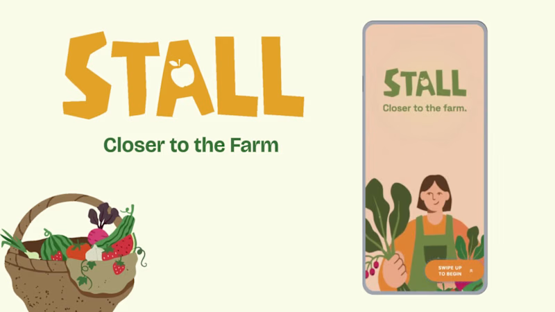
STALL — Your farmers
Project title STALL — Your farmers market, alive. A swipe-to-shop farmers market companion that connects local vendors with regulars before Saturday ever arrives. The problem Every Saturday, the same thing happens. You show up to the farmers market at 10am. The ramp vendor you wanted is sold out by 9. You forgot cash. You walk past a honey stall three times because you can't remember if you already bought some. And that new mushroom farm you heard about? Gone before you spotted them. On the vendor side, it's just as frustrating. Small farmers wake up at 4am, load the truck, drive an hour, and have no lightweight way to tell their regulars — the people who actually want what they grow — "I have asparagus this Saturday. Come find me." STALL fixes both sides of that problem. What STALL does STALL is a two-sided farmers market app built around one weekly ritual: Saturday morning. For shoppers: Follow vendors at your local market Swipe through a weekly produce deck — right to add to your list, left to skip — exactly like Bumble, but for ramps and sourdough Get a Friday evening digest: what your vendors have this week, your auto-built shopping list, and where each stall is on the map Pre-reserve high-demand seasonal items before you leave the house Discover first-of-season arrivals with a "what's new this week" spotlight For vendors: Post a weekly inventory update in 3 taps — what you're bringing, quantities, price Reach your regulars directly before market day Manage pre-reservations without a complicated system The app celebrates the seasonal nature of farmers markets — ramps in April, strawberries in June, squash in October. Every week feels like something worth showing up for. How I built this with Google Stitch STALL was designed and prototyped entirely using Google Stitch as the primary build tool, with Figma used only for initial wireframing. The workflow: Day 1 — Brand and wireframes I started by defining the brand: the name, palette (Pumpkin Spice Forest — a warm amber, fern green, mauve, and cream system), and illustration direction. I wireframed the three core flows — swipe deck, Friday digest, and vendor post — before touching Stitch. Day 2 — Into Stitch I imported my Figma file directly into Stitch using the .fig import feature. From there I used streaming generation to build each screen live on the canvas — watching the splash screen, onboarding flow, and homepage assemble in real time was genuinely remarkable. The HTML-native canvas meant every animation I added — card tilt on swipe, drawer slide-up, bento tile stagger — rendered exactly as it would in production. Key Stitch prompts used: "Add a swipe gesture to the produce card stack — right swipe shows a green Added overlay with 5° card tilt, left swipe shows a mauve Skipped overlay with -5° tilt" "Make the shopping list items stream in one by one with 120ms stagger on page load" "Add a bottom drawer that slides up from the vendor card with spring easing — show the farm bio, full inventory list, and two action buttons" "Build the Friday digest screen — vendor items animate in sequentially, the seasonal spotlight card pulses gently" "Export web assets and deploy to Netlify" In-place edits I used: Swapped the swipe overlay color from red to mauve to match brand Adjusted the bento grid gap from 8px to 6px after seeing it render on canvas Changed the CTA button from outlined to filled after in-place visual comparison Rewrote the seasonal spotlight copy directly on the canvas without regenerating What Stitch made possible that nothing else could: The swipe gesture interaction, the drawer spring animation, and the staggered list streaming — all three of these would have taken days to hand-code. In Stitch, they were prompt-driven and live on the canvas within minutes. The gap between "designed" and "interactive prototype" collapsed entirely. Screens delivered Splash screen — farmer illustration, full-bleed cream background Onboarding screen 1 — market basket illustration, "Your market, every Saturday" Onboarding screen 2 — swipe mechanic explainer with card UI Onboarding screen 3 — Friday digest bento preview Homepage — bento grid with market header, seasonal spotlight, list, map preview, swipe deck, streak tracker Swipe deck — card front, vendor expand drawer, swipe right (added), swipe left (skipped) Friday digest — streaming vendor list, seasonal spotlight, auto-built shopping list Market day map — vendor stall grid, spot numbers, live confirmation states Vendor post flow — 3-tap inventory update screen Design decisions worth noting The swipe mechanic — Borrowing the Bumble swipe pattern for produce discovery was the conceptual breakthrough. It transforms a passive browse into an active, satisfying decision. Every right swipe builds your list. Every left swipe still shows you where the vendor is on the market map — skipping is never permanent. The Friday digest as the hero feature — Most apps make you come to them. The Friday evening push notification with a personalised market brief is the one moment where STALL comes to you. It changes Saturday morning from reactive to intentional. Bento homepage — Instead of a scrolling feed, the homepage gives you everything at a glance: your market, your list, the seasonal moment, your vendors. Seven tiles, seven pieces of information, zero scrolling. The color system — Pumpkin (#E8872A), Fern (#728040), Mauve (#B07090), Cream (#FDFAF6), and Moss (#4A5228). Every color has one job. Pumpkin is interactive. Fern is seasonal and confirmed. Mauve is reserved and streaks. Cream is every surface. Nothing competes. What I learned Stitch genuinely changes the prototyping workflow. The moment I stopped thinking of it as a design tool and started thinking of it as a build tool — one where the canvas is the product, not a picture of the product — everything accelerated. The in-place edit feature is the one I'll keep coming back to: being able to change a color, rewrite copy, or swap a component without regenerating the whole screen is the difference between iteration and rework. STALL started as a hackathon idea. After building it in Stitch, it feels like something real. Live Prototype: https://stitch.withgoogle.com/preview/8229547464152593644?node-id=e53124995cda49808685283be978dc8c
50
44
884
Top AI/3DCreator | Expert in Kinetic Websites™️ & Video Ads
5.0
Rating
9
Followers
Top AI/3DCreator | Expert in Kinetic Websites™️ & Video Ads

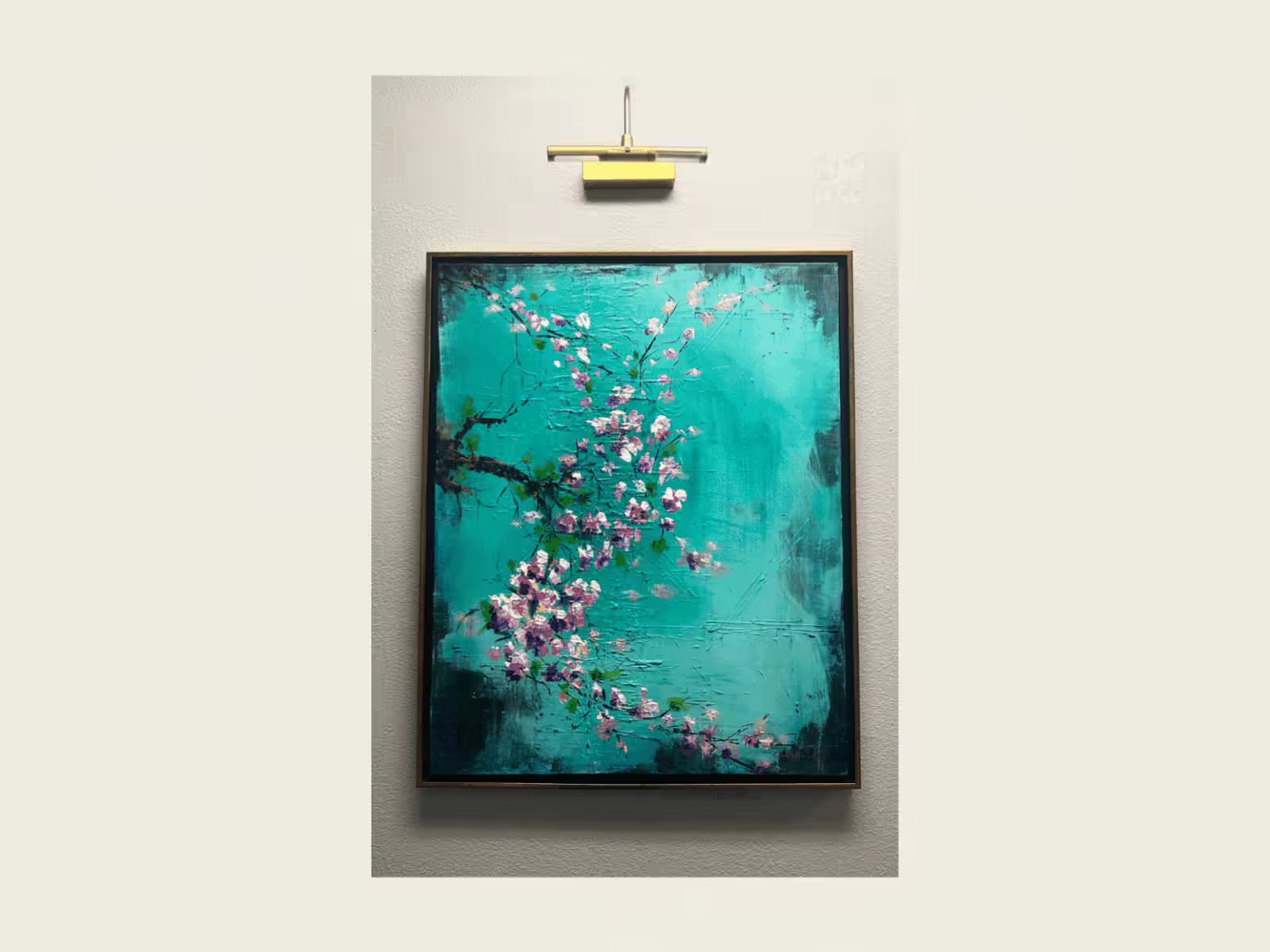
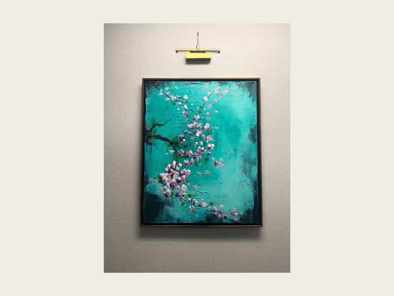
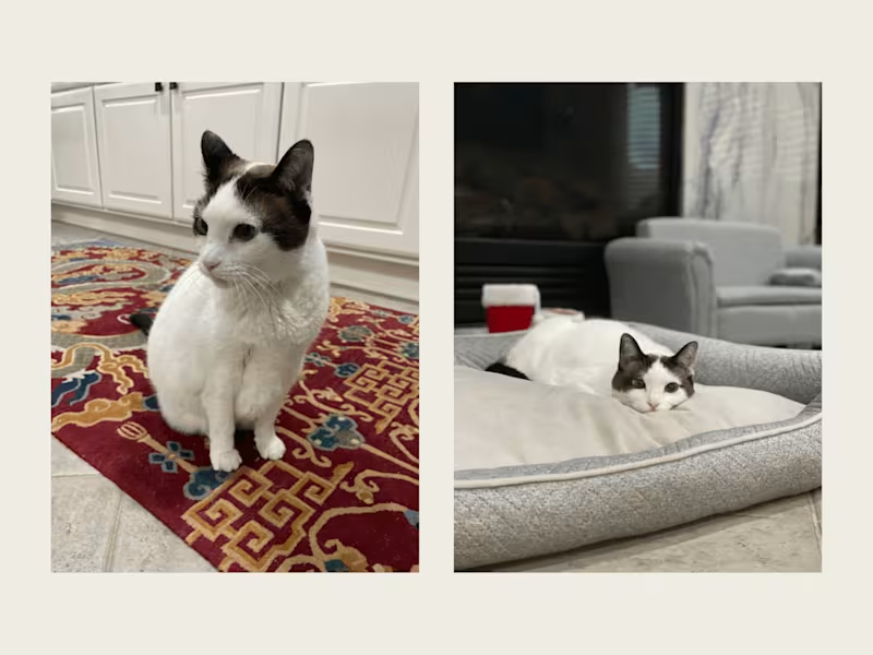
Pet portraits and abstract painting uniquely yours
2x
Hired
5.0
Rating
5
Followers
Pet portraits and abstract painting uniquely yours
Visual Alchemy & Brand Worldbuilding

18
Followers
Visual Alchemy & Brand Worldbuilding