Brand Identity Showcase

Sumayya Maya


Brand Identity Showcase
This showcase brings together selected identity explorations and brand applications. Each presentation focuses on how a clear visual direction can move beyond a single logo, creating a recognisable system for the places where a brand actually appears: packaging, signage, printed materials, digital touchpoints, and campaign assets.
The work is built around a consistent principle: the identity needs to feel distinctive at first glance, then stay useful when it is put to work. That means considering the mark, typography, colour, composition, imagery, and hierarchy as connected parts of the same system.
Identity Presentation 01
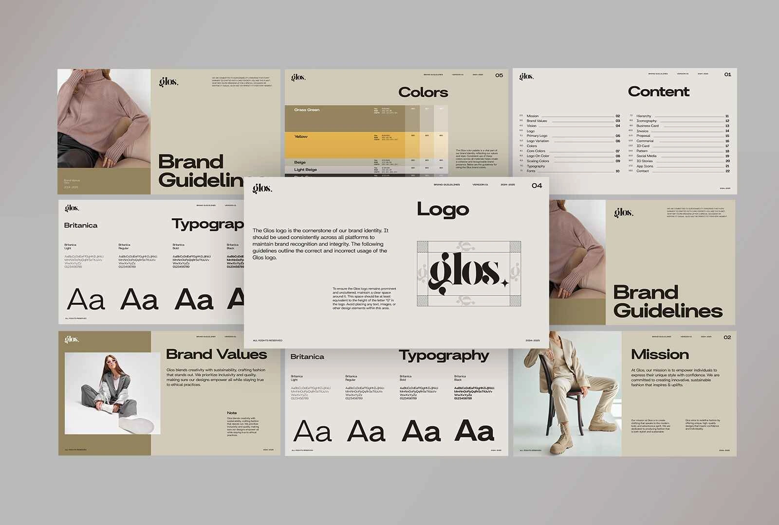
Brand identity mockup
A visual identity designed for real-world presence
This presentation explores how a brand identity can carry across a composed set of applications. Rather than treating the logo as a standalone asset, the direction considers the wider visual rhythm of the brand: how elements sit together, where contrast is introduced, and how the identity holds its character across different formats.
The design process begins with the brand’s visual foundations. The logo establishes the first point of recognition, while typography and layout create a consistent voice around it. From there, supporting graphic elements can extend the system without competing with the core mark. The aim is a flexible identity that feels cohesive whether someone encounters it on a small printed piece, a larger display, or a digital screen.
This approach keeps the work practical. A strong identity needs room to breathe, clear rules for hierarchy, and enough variety to avoid feeling repetitive. Every application becomes an opportunity to reinforce recognition while giving the brand a distinct tone.
Sufra

Sufra brand identity
A considered direction for a food and hospitality brand
The Sufra presentation centres on creating a brand presence that feels intentional, approachable, and ready for day-to-day use. For food and hospitality identities, the visual system has to do several jobs at once: it needs to be memorable, guide customers through information clearly, and create an atmosphere that carries from one touchpoint to the next.
The identity direction brings structure to that experience through a focused logo treatment and supporting visual language. Typography is used to balance personality with readability, while the layout system helps the brand communicate consistently across customer-facing materials. The result is a foundation that can adapt to menus, packaging, social content, print, and in-store communication without losing its centre.
The detail work matters here. Spacing, scale, placement, and contrast shape how the identity feels in use. They turn a set of individual assets into a brand that appears organised and recognisable, whether viewed up close or across a room.
Bean and Leaf

Bean and Leaf brand identity
Building an adaptable brand system
Bean and Leaf explores a visual identity with a clear, repeatable signature. The goal is to create a system that can feel consistent without becoming rigid, giving the brand a recognisable foundation while leaving room for different formats, products, and communications.
A well-built identity system considers how the brand will grow. The logo needs to work at small and large sizes. Typography needs to stay readable while carrying the right tone. Supporting graphics and composition need enough range to make packaging, promotional materials, and digital content feel related rather than copied and pasted.
This direction focuses on those relationships. The presentation shows how a core identity can be extended through considered visual choices, maintaining clarity while allowing each application to do its own job. It is designed as a framework for repeatable brand expression, not just a one-off mark.
Design Approach
Across the showcase, the work follows a structured identity process:
Define the visual territory: establish a direction that gives the brand a distinct point of view.
Create the core mark: develop a logo that is recognisable, balanced, and practical across sizes.
Build the visual language: pair typography, colour, layout, and graphic elements into a cohesive system.
Test in context: apply the identity across representative formats to check clarity, consistency, and flexibility.
Refine for use: shape the final assets so the system can be carried forward with confidence.
The final outcome is a collection of identity directions designed to make brands easier to recognise and easier to use. Each one is grounded in the same belief: visual identity works best when it has both a strong idea and a clear way of showing up in the world.
Like this project
Posted Nov 6, 2026
A collection of thoughtfully crafted brand identities, bringing together strategy, visual storytelling, and distinctive design to create memorable brands.

