SaaS Logo Collection

Sumayya Maya


SaaS Logo Collection
A detailed collection of logo directions and identity systems created for SaaS and technology-focused brands. Every identity is designed to help a digital product feel clear, credible, and recognisable from the first interaction.
SaaS branding has to work hard in small spaces. A mark may appear in a browser tab, product interface, social profile, pitch deck, landing page, or app icon before it ever appears at a large scale. This collection focuses on visual systems that stay legible, distinctive, and consistent across those moments.
Kony
Kony SaaS logo
Building a confident digital signature
The Kony identity direction focuses on creating a compact, recognisable brand signature for a software product. The logo is developed as the starting point for a wider visual system, with attention to balance, proportion, and how the mark performs across digital touchpoints.
For a SaaS brand, clarity matters as much as character. The identity is shaped to feel direct and usable in product environments, while still giving the company a visual presence that can carry across marketing material, sales decks, social content, and interface moments. The system is designed to remain coherent when scaled down for an icon or expanded for a high-impact landing page.
Logiqly
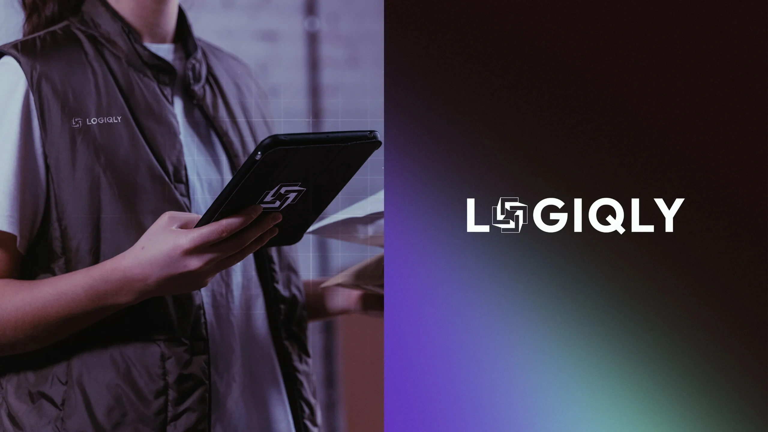
Logiqly SaaS logo
A logo system built for clarity and momentum
Logiqly explores a technology identity that feels structured, modern, and easy to identify. The approach is grounded in the relationship between the logo, typography, and surrounding space, creating a visual direction that can communicate with confidence without adding unnecessary complexity.
The identity is intended to support a growing product brand. A consistent framework makes it easier to apply the look across user-facing communications, onboarding assets, presentations, website sections, and product updates. The result is a visual foundation that gives the brand a steady, professional voice as it moves between different formats.
Mintora Crypto Platform
Mintora Crypto Platform logo
Trust-led identity for a digital platform
Mintora Crypto Platform is approached as an identity that needs to communicate precision and trust in a fast-moving digital category. The logo direction establishes an ownable visual cue, while the broader system supports clear communication across web, product, and campaign surfaces.
For platforms handling complex information, the identity should help simplify the experience rather than compete with it. The visual language is designed to give the brand a stable centre, using consistency in form, hierarchy, and application to support recognition across the customer journey.
NIOVO
NIOVO SaaS logo
A versatile identity for a product-led brand
The NIOVO direction centres on a logo that can carry a product-led brand across both interface and marketing contexts. The identity is created to have enough personality to stand out, while retaining the clean structure needed for repeated use in digital environments.
A strong SaaS identity should make the brand easier to remember after a quick interaction. This system considers the details that shape that memory: the mark’s silhouette, how it sits beside a wordmark, how it can appear in constrained spaces, and how it is supported by a consistent visual framework.
Qubila
Qubila SaaS logo
Distinctive design with room to scale
Qubila presents a logo direction designed to give a SaaS brand a memorable visual starting point. The work considers the identity as a set of repeatable decisions rather than a single graphic, making it easier to maintain consistency as the brand adds new features, campaigns, and customer touchpoints.
The system can support product pages, pitch materials, documentation, social assets, and interface details through a shared visual logic. That flexibility is essential for a software company, where brand expression often needs to shift quickly without losing its recognisable core.
Furious
Furious logo redesign
Sharpening a technology brand’s visual direction
This identity presentation explores a focused logo direction for Furious. The goal is to build a visual signature with energy and clarity, creating a mark that can hold attention while remaining practical for everyday use.
The brand system is considered through the lens of digital application. The identity needs to feel deliberate across a website header, platform interface, presentation slide, or campaign graphic. By defining a clear hierarchy between core mark, type, and supporting elements, the direction creates a more unified experience for the audience.
Remaxi
Remaxi SaaS logo
A structured mark for an evolving product
The Remaxi logo direction is built around a clear, adaptable visual identity. The emphasis is on creating a brand that can feel established and credible while leaving room for future growth and new product communication.
The design considers how identity elements perform when repeated. A SaaS brand often needs to communicate quickly, sometimes in highly functional spaces. This system supports that need by giving the logo a strong visual role and pairing it with a framework that can be used consistently across product, web, and sales materials.
Revox
Revox SaaS logo
A recognisable identity for digital communication
Revox explores a logo system that prioritises a clean first impression and a recognisable long-term presence. The work brings together visual simplicity and brand character, creating an identity direction suited to a digital product company.
The approach tests the logo as part of a larger system, not in isolation. It should have a clear role across interface details, digital advertising, product launches, and brand storytelling. This makes the identity more useful over time, especially as new content and touchpoints are introduced.
Tech Logo
Tech logo design
A flexible foundation for a tech brand
This technology logo direction focuses on clarity, adaptability, and visual consistency. The mark is treated as a central anchor for the brand, with a structure that can translate across a range of formats without losing impact.
The broader identity framework considers how a tech company can show up with a cohesive voice. Typography, scale, spacing, and supporting graphic decisions work together to help the brand communicate clearly, whether it is explaining a product feature, introducing a new service, or presenting to prospective customers.
Zentix
Zentix SaaS logo
A polished visual system for a software brand
The Zentix direction brings together a distinct logo treatment and a scalable visual approach. It is designed to give the brand a clear point of recognition while supporting the functional demands of a software business.
The work is shaped around practical brand use. A logo should stay identifiable in a navigation bar, on an app tile, or in a presentation, while the wider system should create consistency across every customer-facing moment. This identity direction provides a framework for that continuity, helping the brand feel deliberate as it grows.
Identity Approach
Across this collection, each direction follows a considered brand-design process:
Position the visual direction: establish a clear tone and recognisable point of view for the product.
Develop the core logo: create a mark and wordmark with balance, memorability, and practical usability.
Build the supporting system: define typography, colour, layout, and graphic principles that carry the identity forward.
Apply the system in context: test the identity across product, web, presentation, and campaign use cases.
Refine for consistency: shape the final direction into a usable framework for repeatable brand communication.
The outcome is a collection of SaaS-focused identity directions that pair visual character with day-to-day usability. Each logo is designed as the first part of a wider system, helping software brands look more coherent wherever customers meet them.
Like this project
Posted Nov 6, 2026
Curated collection of SaaS and technology logo designs, where creative thinking meets modern aesthetics to build distinctive identities for the next generation.
