UI/UX Designer crafting intuitive, modern digital experience
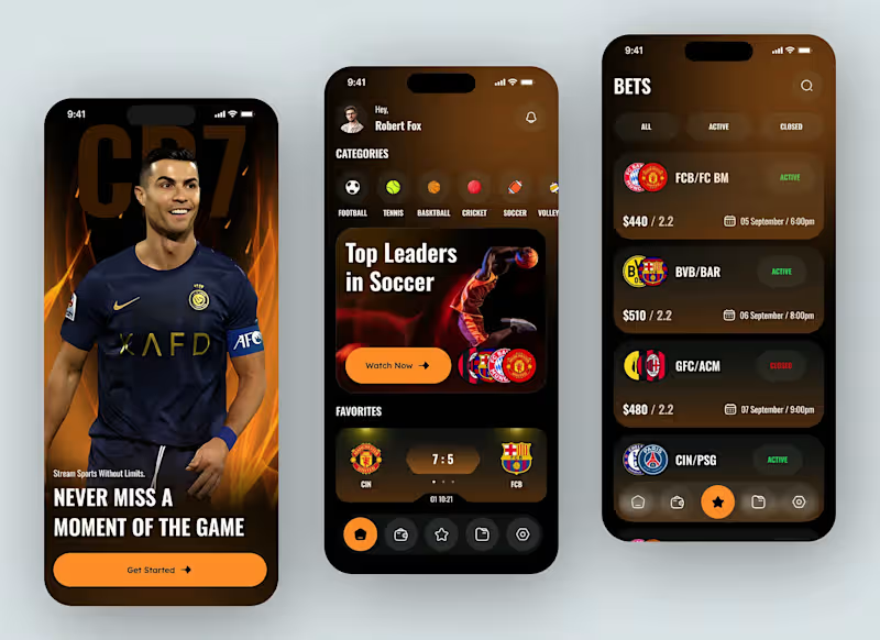
We design MVP apps that help startups move fast, validate ideas, and launch with confidence. Our focus is on building only what matters—clear user flows, essential features, and a product experience that’s easy to understand and test.
0
68
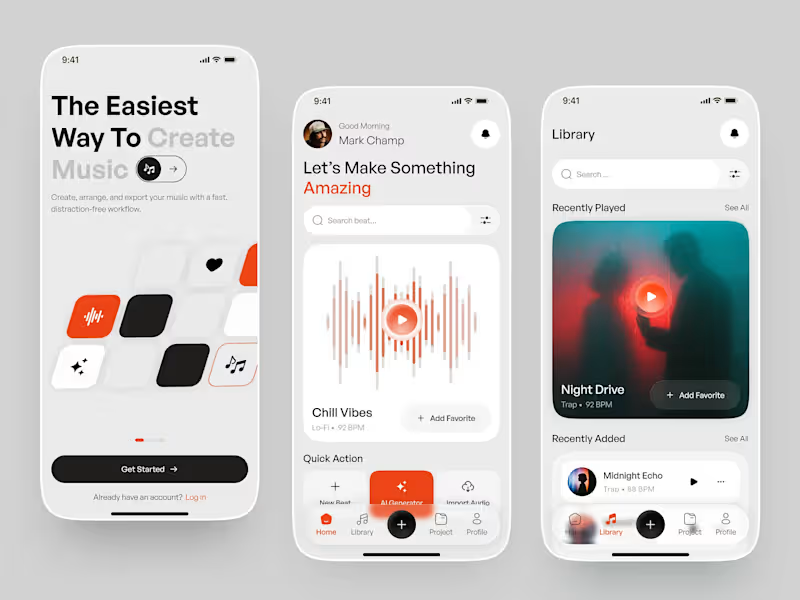
Music creation experience designed to make producing music feel simple, fast, and distraction-free.
The concept explores a smooth workflow for creating beats, generating music with AI, discovering sounds, and managing projects—all within a minimal and intuitive interface.
The visual direction combines soft neutrals, bold orange accents, rounded cards, and spacious layouts to create a friendly yet premium music-production experience.
Designed with a focus on simplicity, discoverability, and effortless music creation.
0
78

Amazon VA: Product Research, Listings & PPC Expert
Amazon VA: Product Research, Listings & PPC Expert


View more →

Multimedia Designer: graphic design and marketing expert
- $5k+
- Earned
- 2x
- Hired
- 6
- Followers
Multimedia Designer: graphic design and marketing expert



Social media manager and designer




Senior Brand Identity & Visual Communication Designer


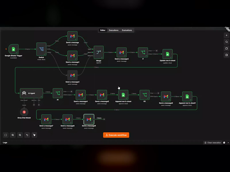
AI Automation Engineer | Web, Apps, Graphic & Video Editing
- 112
- Followers
AI Automation Engineer | Web, Apps, Graphic & Video Editing

Direct Response Copywriter for eCommerce brands


It happens all the time. Someone likes the product.
Adds it to cart.
Then disappears.
Not because they don’t want it…
but because their brain doesn’t feel safe enough to buy.
Here are the 3 real psychological reasons:
1️⃣ Friction
The brain hates effort.
Even small friction feels big: too much scrolling
unclear information
confusing layout
slow loading
When the brain feels “this is work”…
it postpones the decision.
2️⃣ Doubt
People doubt themselves more than the product.
“Will it work for me?”
“What if it doesn’t look like the pictures?”
“What if I choose the wrong one?”
Doubt = hesitation.
Hesitation = no purchase.
3️⃣ Fear of making a bad decision
This is the strongest blocker.
People don’t fear the price.
They fear regret.
1
2
69


Virtual Receptionist, Support & Content Partner
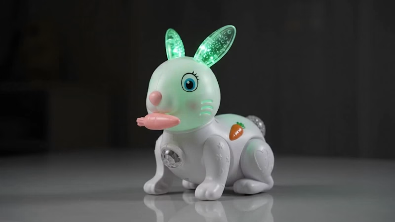
I created a set of 8-second promo videos for a new online toy store, featuring a light-up walking bunny and a light-up walking elephant.
The challenge: The store owner had only phone photos of the toys, taken on cluttered backgrounds with mixed lighting. The toys needed to look attractive and accurate in short video ads, without a studio shoot.
What I did:
Reviewed the product photos and prepared clean reference images for AI video generation
Wrote a reusable toy description block for each product so the toy's colors, shape and details stay consistent across every clip
Wrote timed prompts (0-3s, 3-6s, 6-8s) so each 8-second clip has a clear beginning, middle and end
Built shots that highlight each toy's real features: walking motion, glowing ears, tail and belly lights on the bunny, and the glowing ear and light panels on the elephant
Created multiple styles for each toy: a dark-room glow shot, a lifestyle shot with a child's hands, and a combined walk + lights promo
Added sound direction, such as a friendly elephant trumpet at the end of the clip, while keeping the ad honest about what the real toy does
Deliverables:
8-second vertical (9:16) and horizontal (16:9) promo clips
Consistent prompts the client can reuse for future toys
Guidance on start images, lighting and captions
0
56
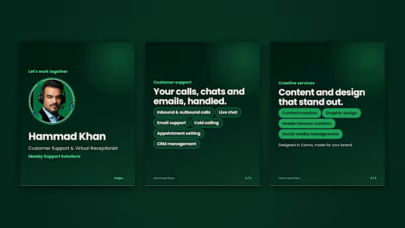
I designed a swipeable 5-slide presentation that explains my services in about 30 seconds. It covers customer support, creative services (content, graphic design and banners), my certifications and tools, and the clients I help, and ends with a clear call to action. It's sized 1080×1350 for LinkedIn, in a green and dark-teal palette that matches my brand, and it's readable on a phone.
What I delivered
5 designed slides as one PDF
A consistent layout, colors and typography
A cover slide with a photo and a final call-to-action slide
0
80