Brand Identity for Byhiras Capital Markets Platform

Ummul Bannin



Byhiras
Brand Identity for a Capital Markets Compliance Platform
A mark built from the name's own meaning, transparency made geometric.


Overview
Financial data intelligence for the institutional world. Byhiras needed an identity that could earn trust in capital markets, a category where credibility outweighs visual appeal.
Role & Details
Brand Identity: Logo, Colour System, Typography, Applications
Mayfair Technology Partners, 2025
Role: Brand Identity Designer
Problem
A credibility gap no amount of good data could close. Byhiras had strong underlying technology but no visual identity capable of signalling trust to institutional clients in a trust-deficit category.

Insight
Every competitor chose authority. Name chose distinction. Rather than compete on generic corporate-authority cues (navy suits, generic fintech blues), the identity was built around the meaning embedded in the name itself.
Concept
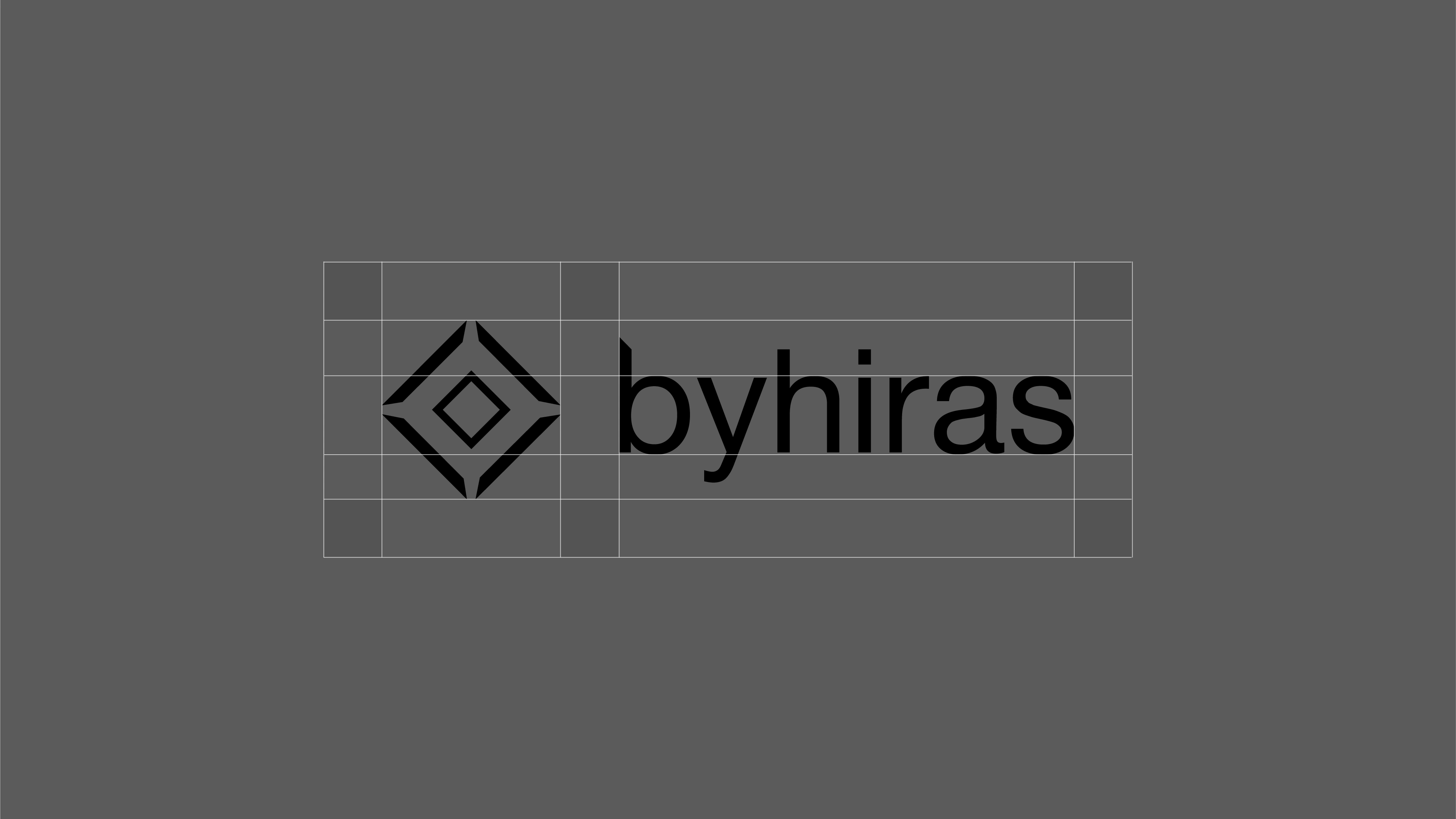
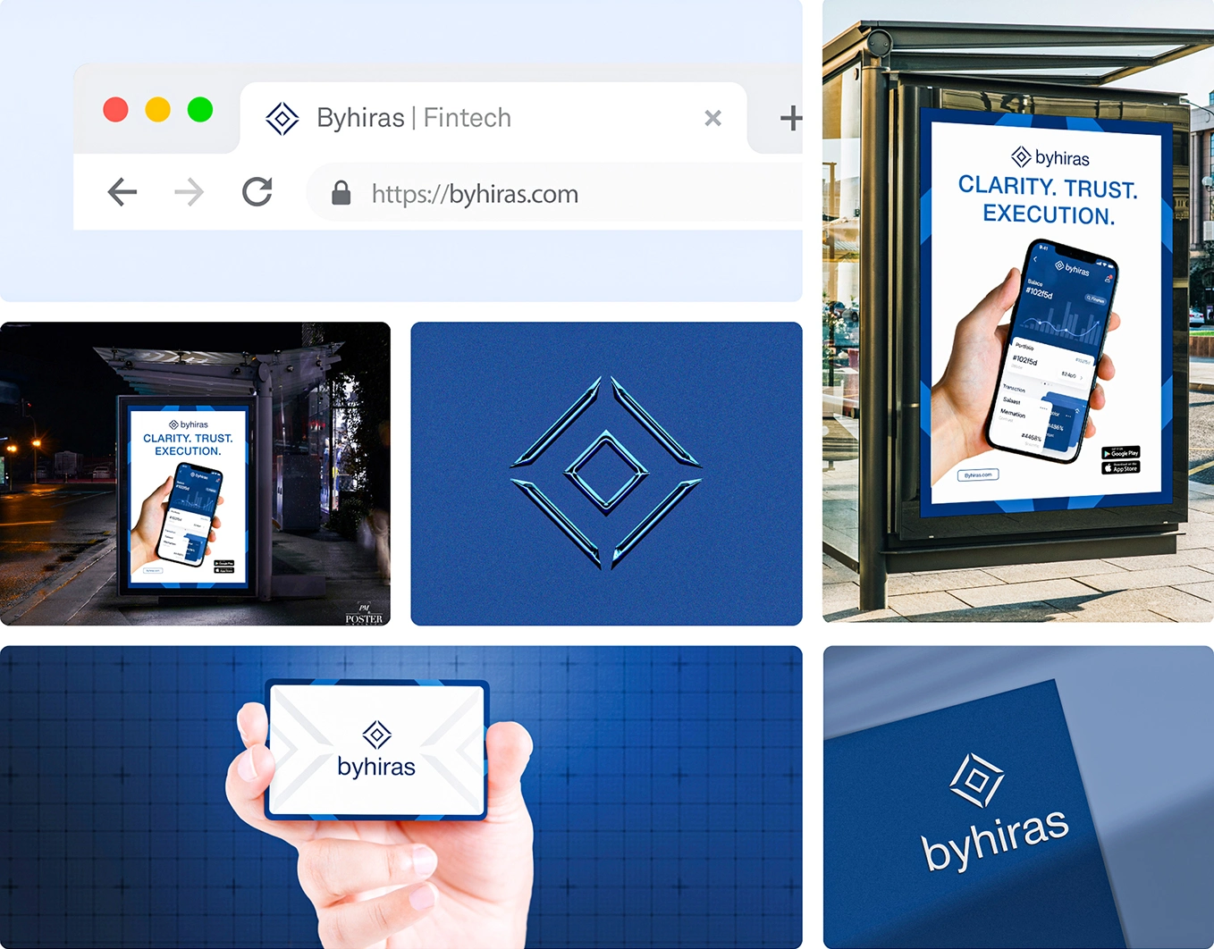
Central focus: diamond insight. The mark uses a diamond form as the core geometric device, reflecting precision, transparency, and clarity, translated from etymology into a clean geometric system.
Execution
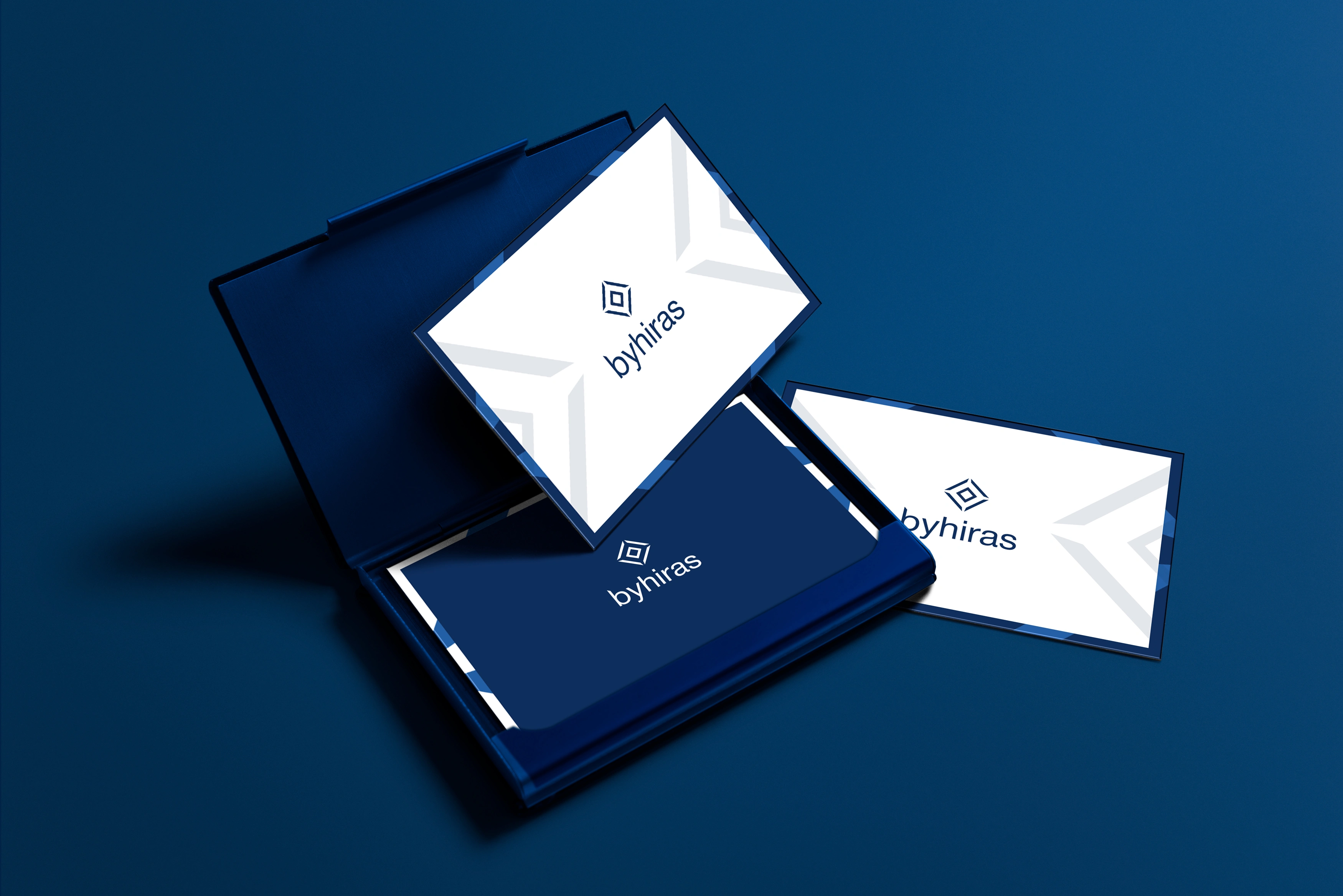
Colour: deep navy with a diamond mark institutional, precise, restrained.
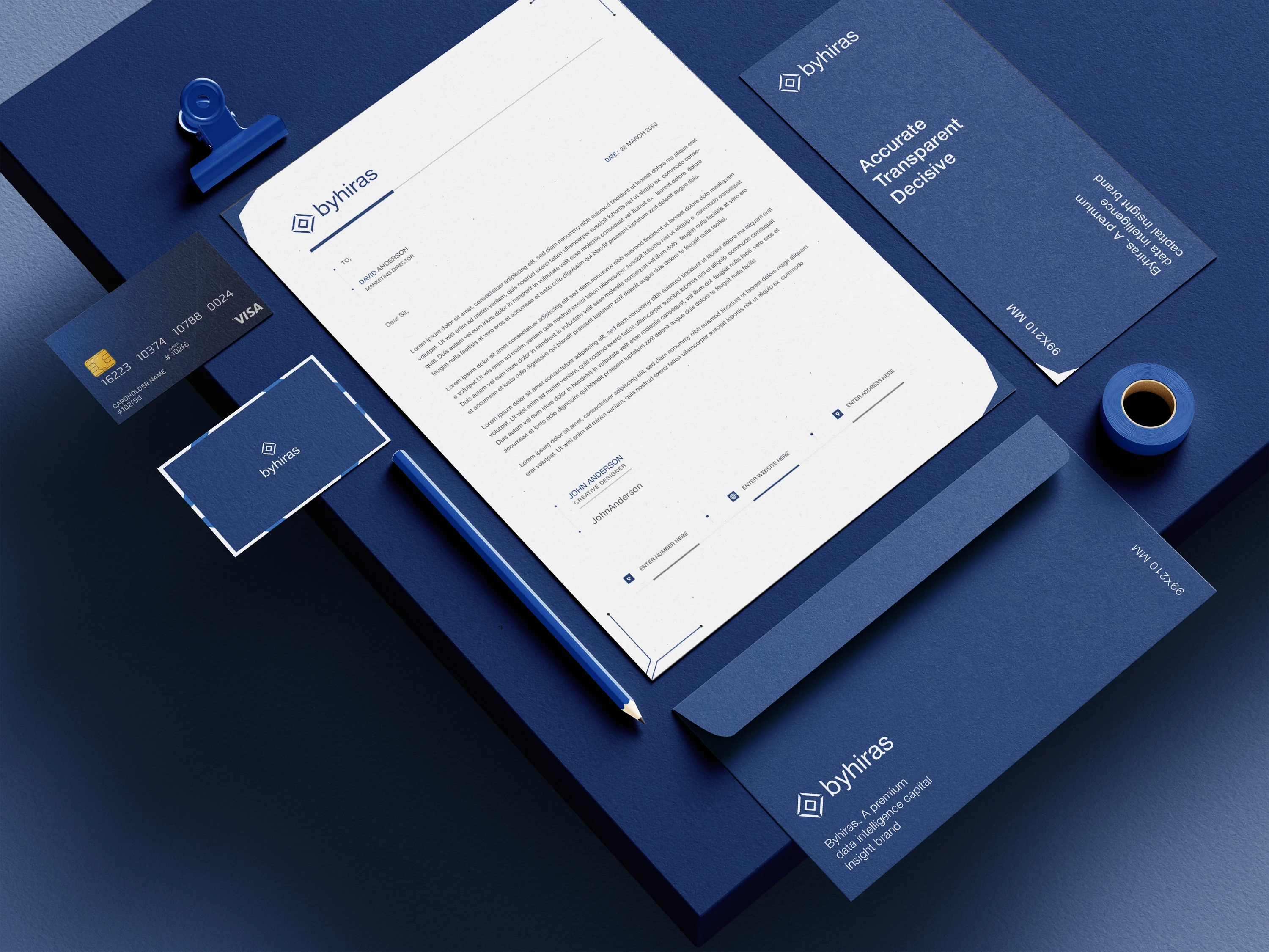
Typography: Helvetica Neue paired with the mark across cards, devices, apparel, and digital touchpoints.
Outcome
Identity deployed across every institutional touchpoint cards, stationery, digital platform, signage, and apparel giving Byhiras a mark that earns the room before the pitch begins.
Credits
Client: Byhiras (Mayfair Technology Partners)
Mayfair Technology Partners, 2025
Role: Brand Identity Designer

Like this project
Posted Aug 14, 2026
Developed a brand identity for Byhiras to build credibility in capital markets.