StokkedPro Brand Identity Development

Ummul Bannin


StokkedPro
Brand Identity for a POS Inventory Intelligence Platform
A sibling brand given its own authority without leaving the family.
Overview
Inventory intelligence for POS providers, undefined. StokkedPro was spun out as its own product but launched under a generic placeholder identity (ExtractPro) with no distinct visual system.
Role & Details
Brand Identity: Logo, Colour System, Typography, Applications
Mayfair Technology Partners, 2025
Role: Brand Identity Designer
Problem
A product built for scale had no identity. StokkedPro needed to read as trustworthy and distinct while every competitor in the category explained the same thing with no ownership over how it looked.
Insight
Every competitor explained the product; none owned it. The opportunity was restrained intelligence over a generic tech symbol signalling precision without defaulting to category-standard tech cues (abstract swooshes, generic circuit motifs).
Concept
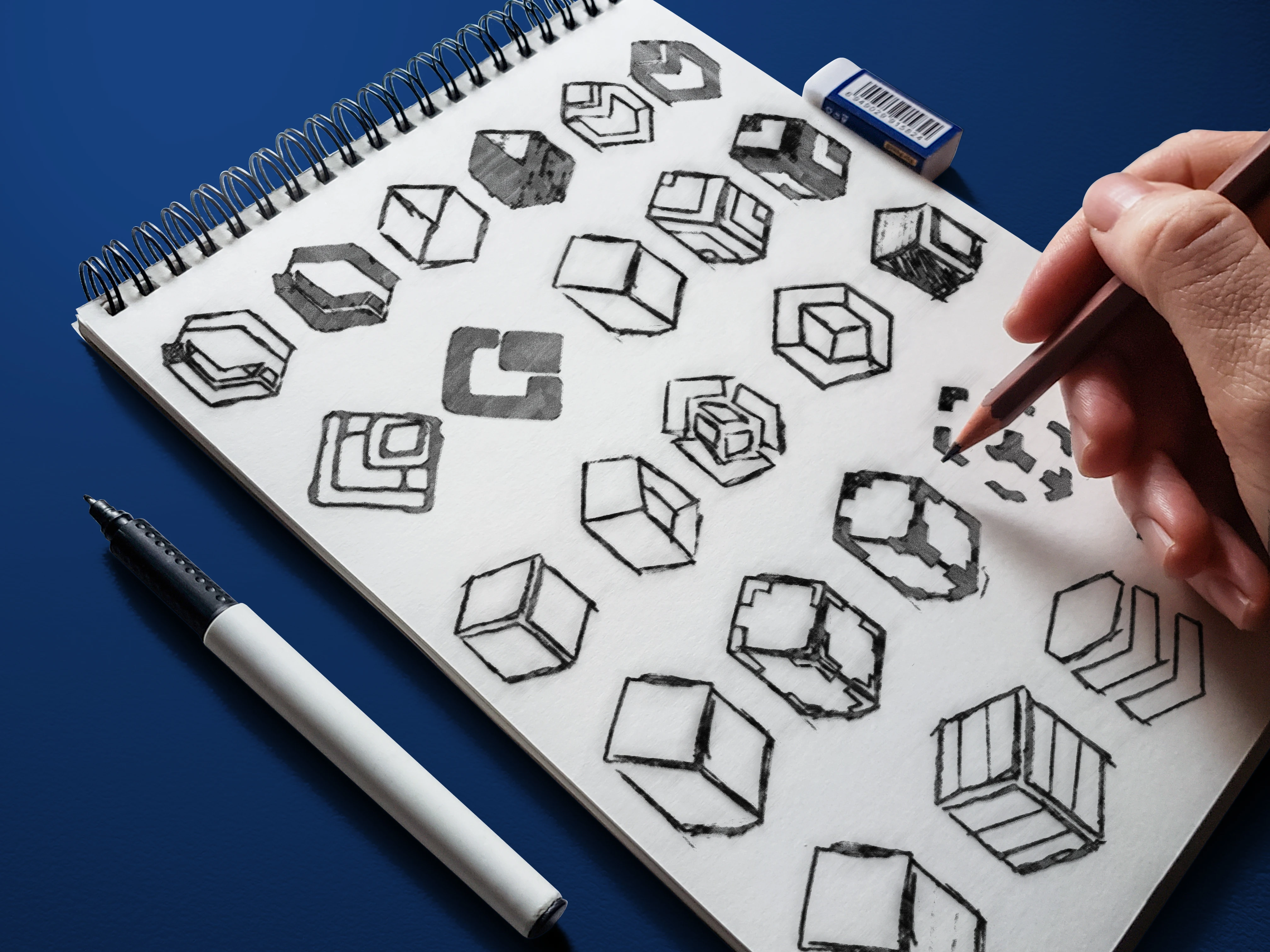
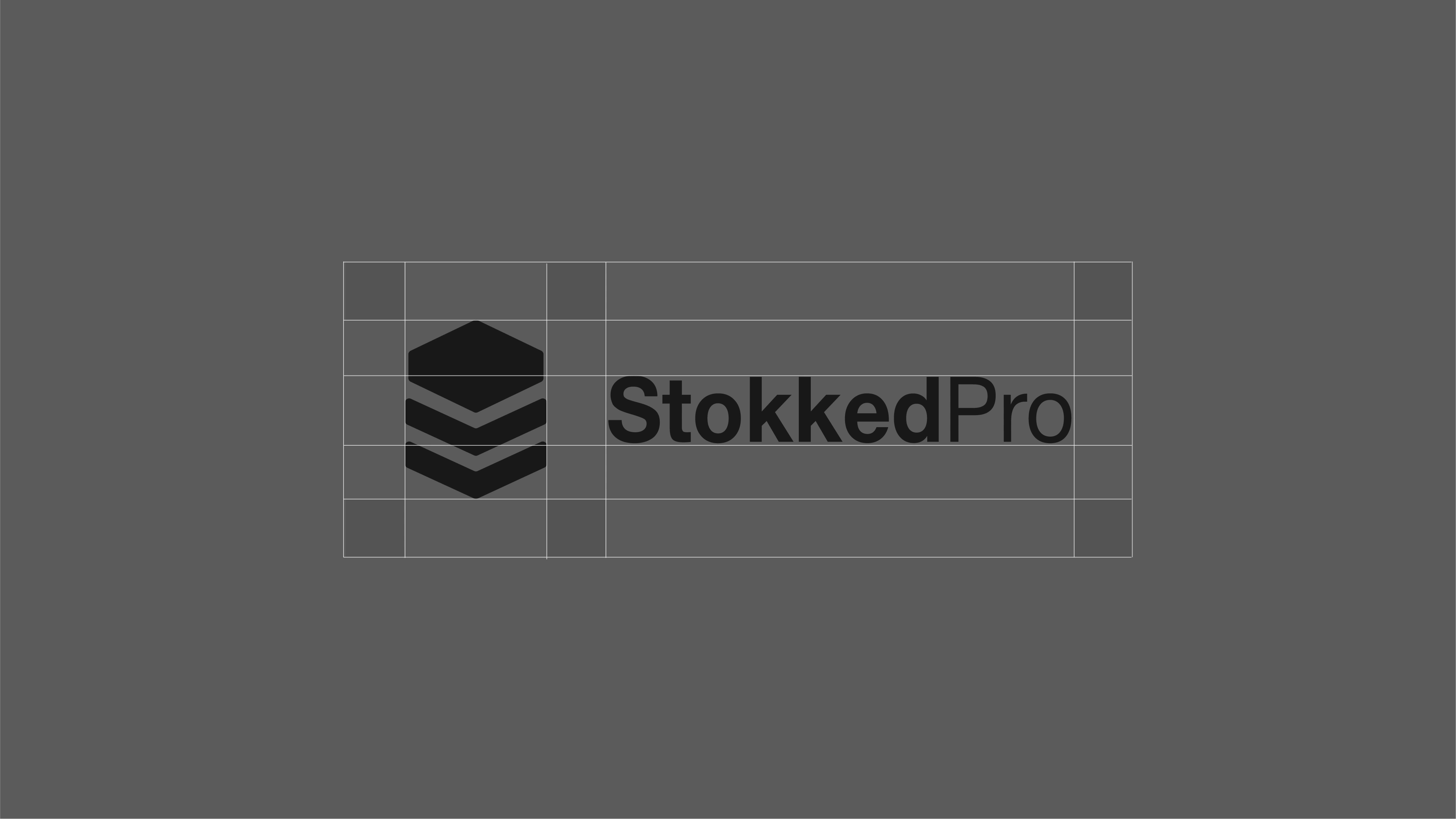
The Stack layers with logic. The mark is built from stacked geometric forms referencing inventory layers, translated from etymology to a clean, systemised geometric logo.
Execution
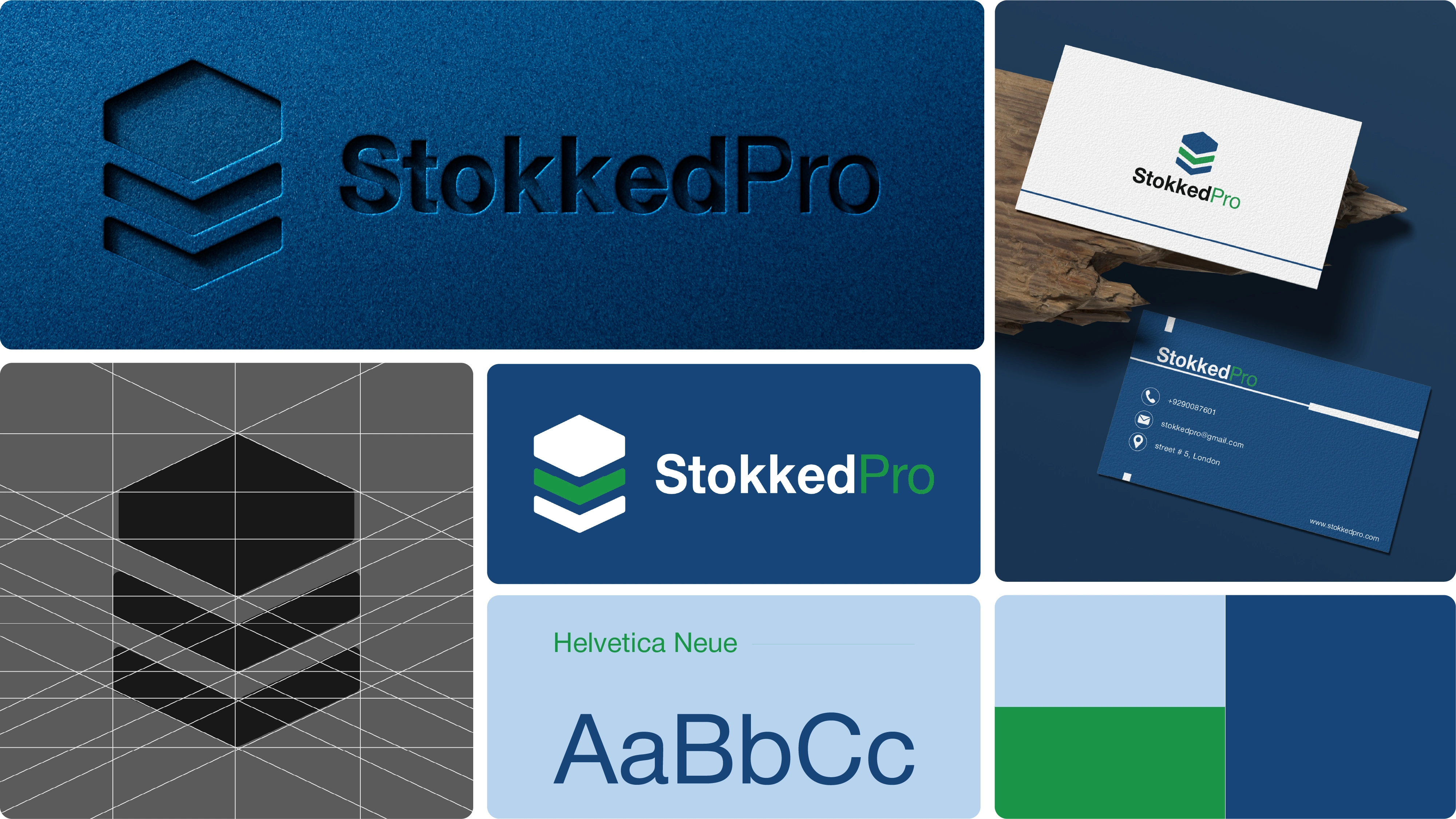
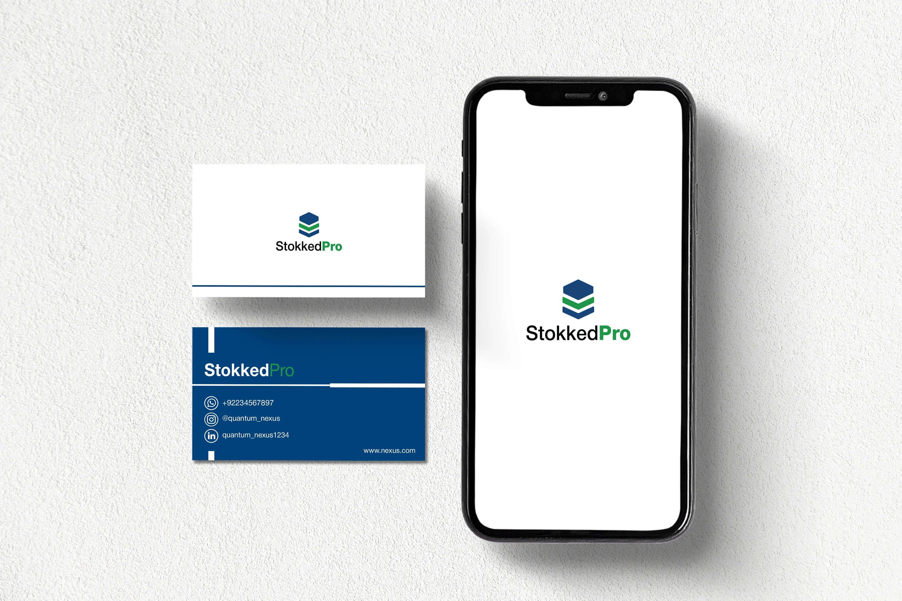
Colour: deep navy, soft blue, and green accent, restrained and confident rather than loud.
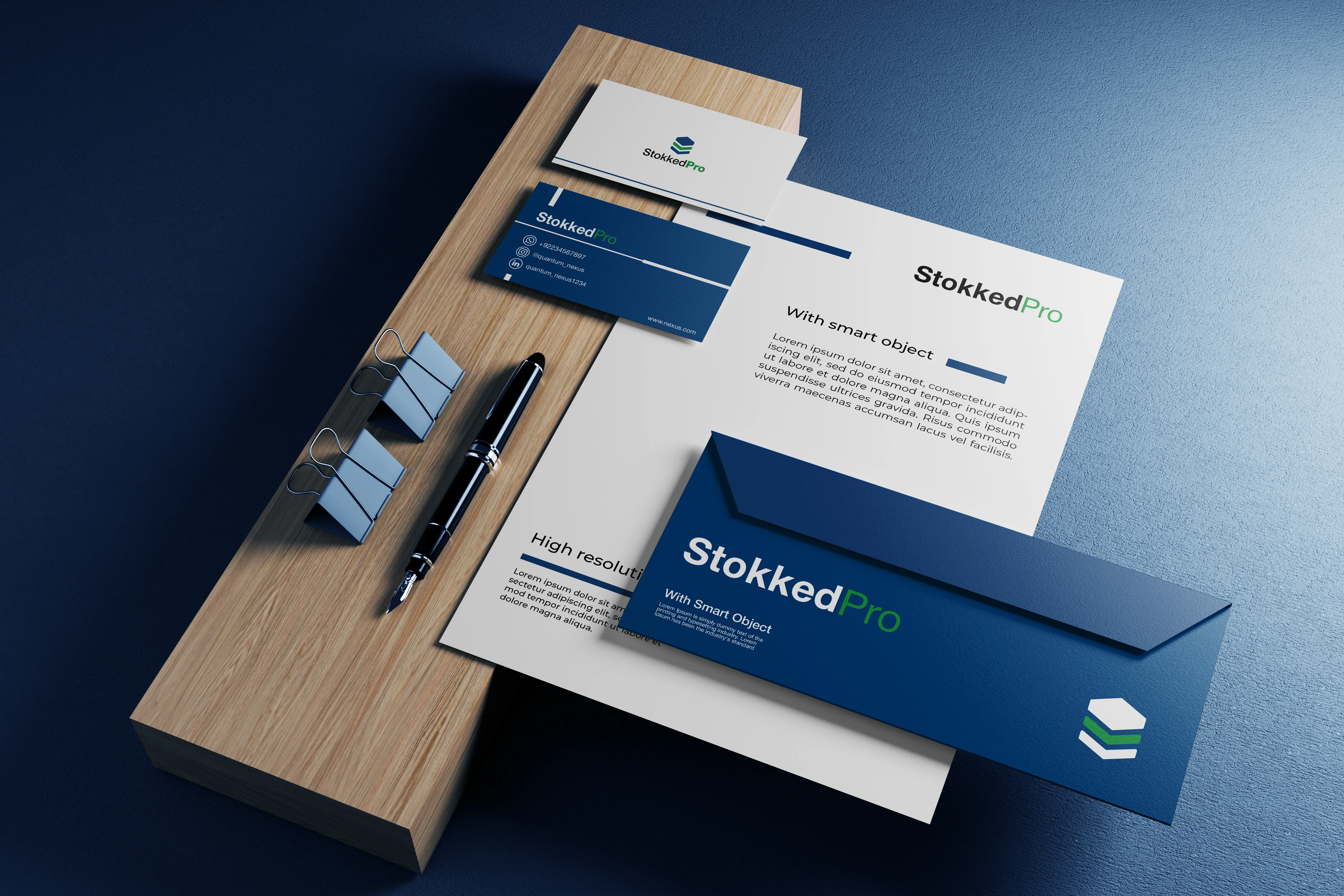
Typography: Helvetica Neue paired with the mark for a consistent, systems-first identity across product UI, stationery, and merchandise.
Outcome
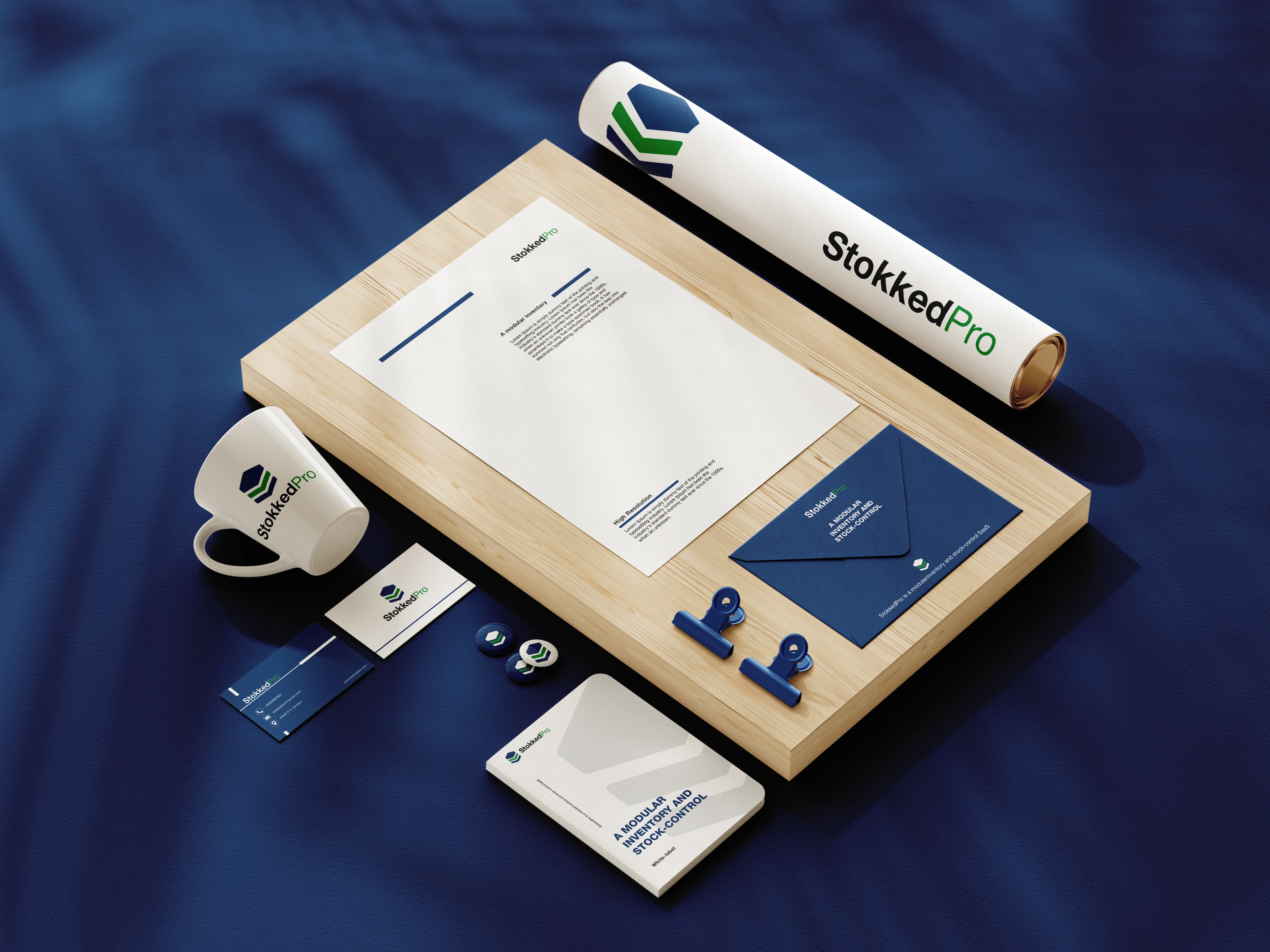
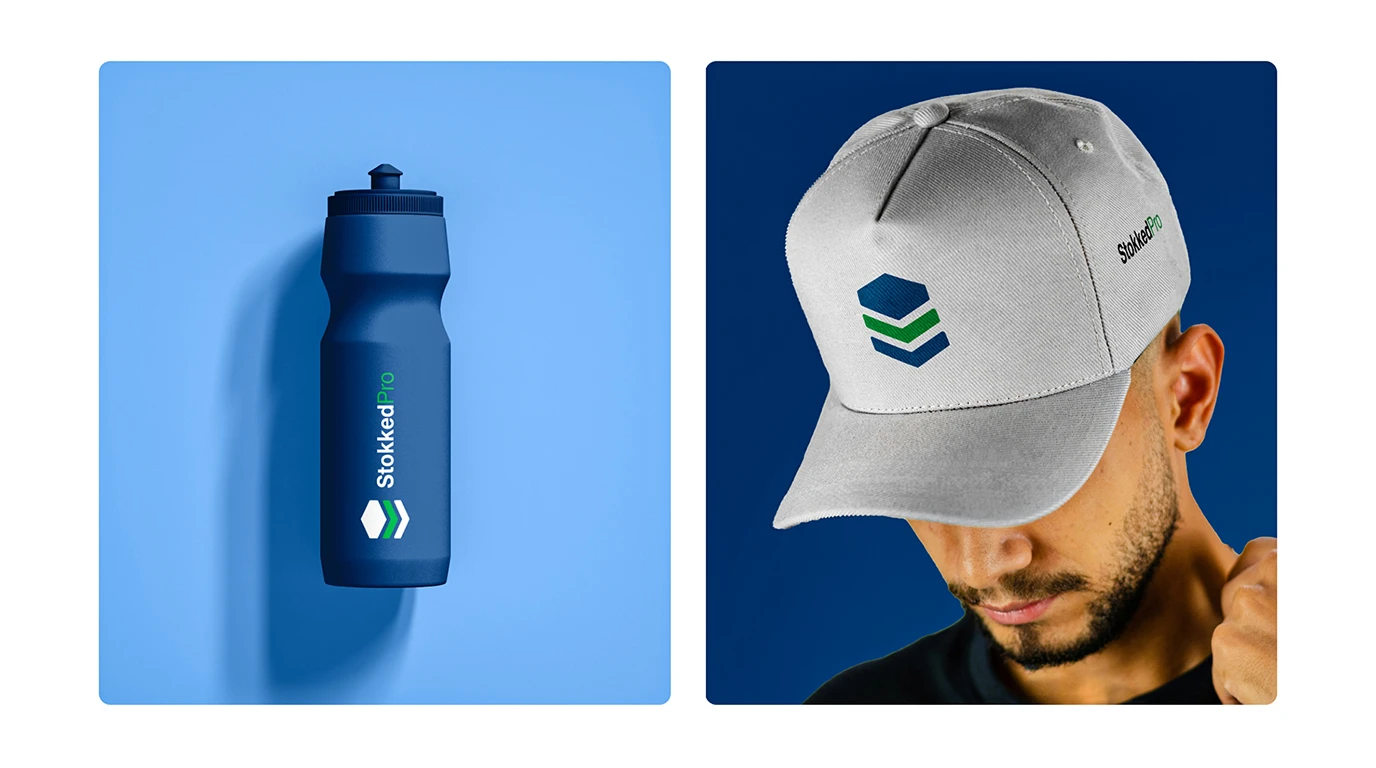
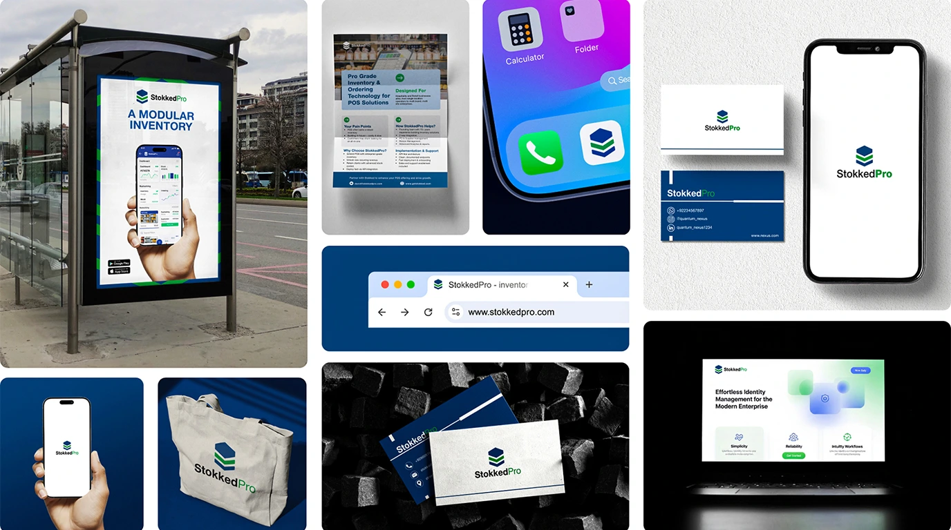
Rolled out across every product touchpoint UI, business cards, packaging, and branded merchandise giving StokkedPro its own authority as a standalone brand within the Mayfair product family.
Credits
Client: StokkedPro (Mayfair Technology Partners)
Mayfair Technology Partners, 2025
Role: Brand Identity Designer
Like this project
Posted Aug 14, 2026
Developed brand identity for StokkedPro, a POS inventory platform.
Likes
0
Views
0
Clients
Mayfair Technology Partners