Puffin Packaging Redesign Project

Ummul Bannin


Puffin
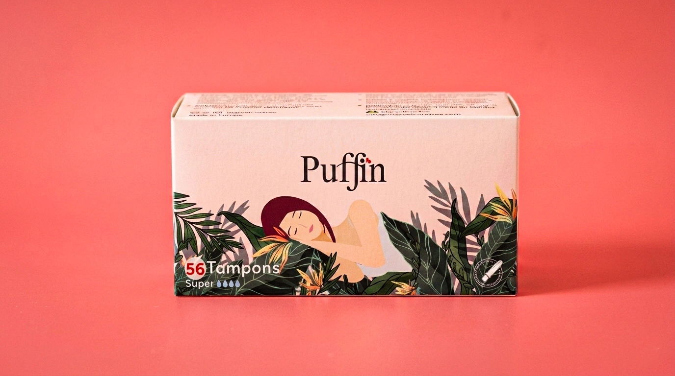
Packaging Redesign for a Medicated Hygiene Brand
Replacing a cold, medicated aesthetic with an illustrated, nature-led system that speaks to comfort before function.
Overview
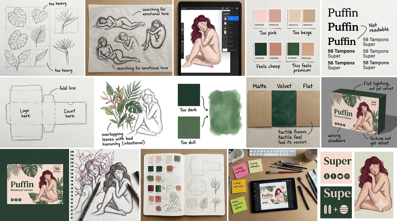
A trusted hygiene brand entering a new conversation. Puffin was a credible, established product hiding inside clinical, category-default packaging that undersold its position on shelf.
Role & Details
Packaging Design, Illustration, Structure, Colour System
Happa Studios, 2022
Role: Packaging Designer
Problem
The category had defaulted to clinical, every competitor spoke the language of medicine, not comfort. Puffin's own packaging followed the same convention, so it read as generic rather than trusted.
Insight
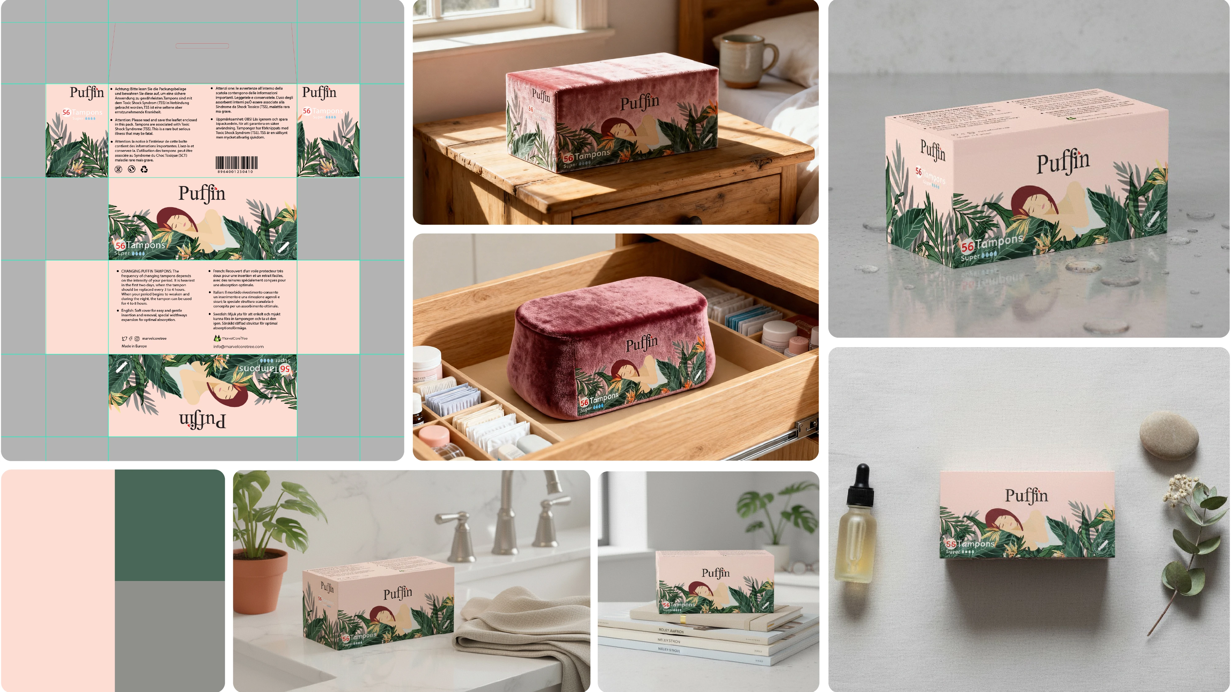
A premium product was hiding inside a clinical box. The opportunity was to let the product's real equity trust and comfort lead, instead of competing on sterile, category-standard cues.
Concept
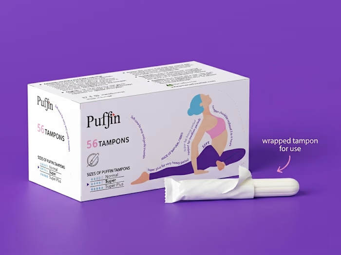
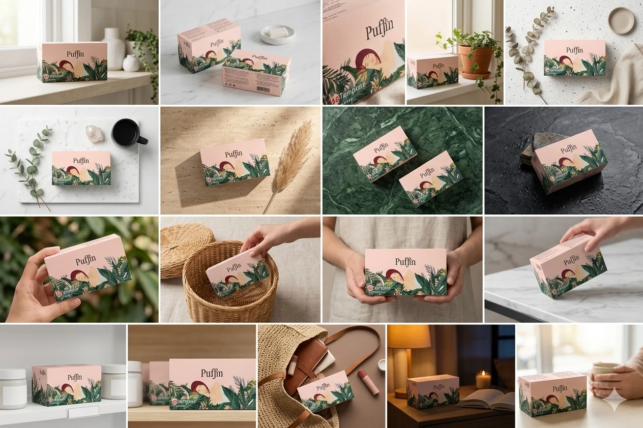
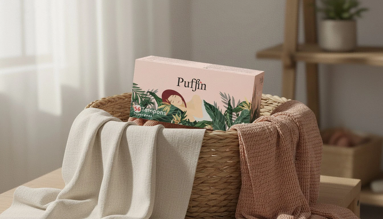
Nature as language, not as pretense. Illustrated botanical and wildlife motifs replace clinical imagery, repositioning the product around comfort and care rather than medical function.
Execution
Colour: three colourways built from a soft blush, deep forest green, and warm neutral a unified shelf presence across variants.
Structure: illustrated box system designed to read as premium at shelf distance and personal at close range.
Outcome
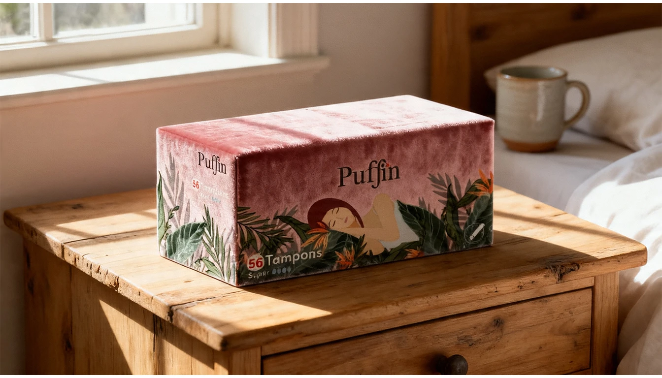
The packaging became the product's most persuasive argument on shelf, shifting Puffin from a clinical default to a distinct, comfort-led presence in-category.
Credits
Client: Puffin Marvelcoretree
Studio: Happa Studios, 2022
Role: Packaging Designer
Like this project
Posted Aug 14, 2026
Redesigned Puffin packaging to emphasize comfort with nature-inspired visuals.
Likes
0
Views
0
Timeline
Jan 1, 2022 - Dec 31, 2022
Clients
Puffin