Rebranding Medical Equipment & Systems

Ummul Bannin


MES
Rebranding Medical Equipment & Systems for Institutional Trust
The first mark in seventeen years of operation, built to stand alongside the global brands it distributes.
Overview
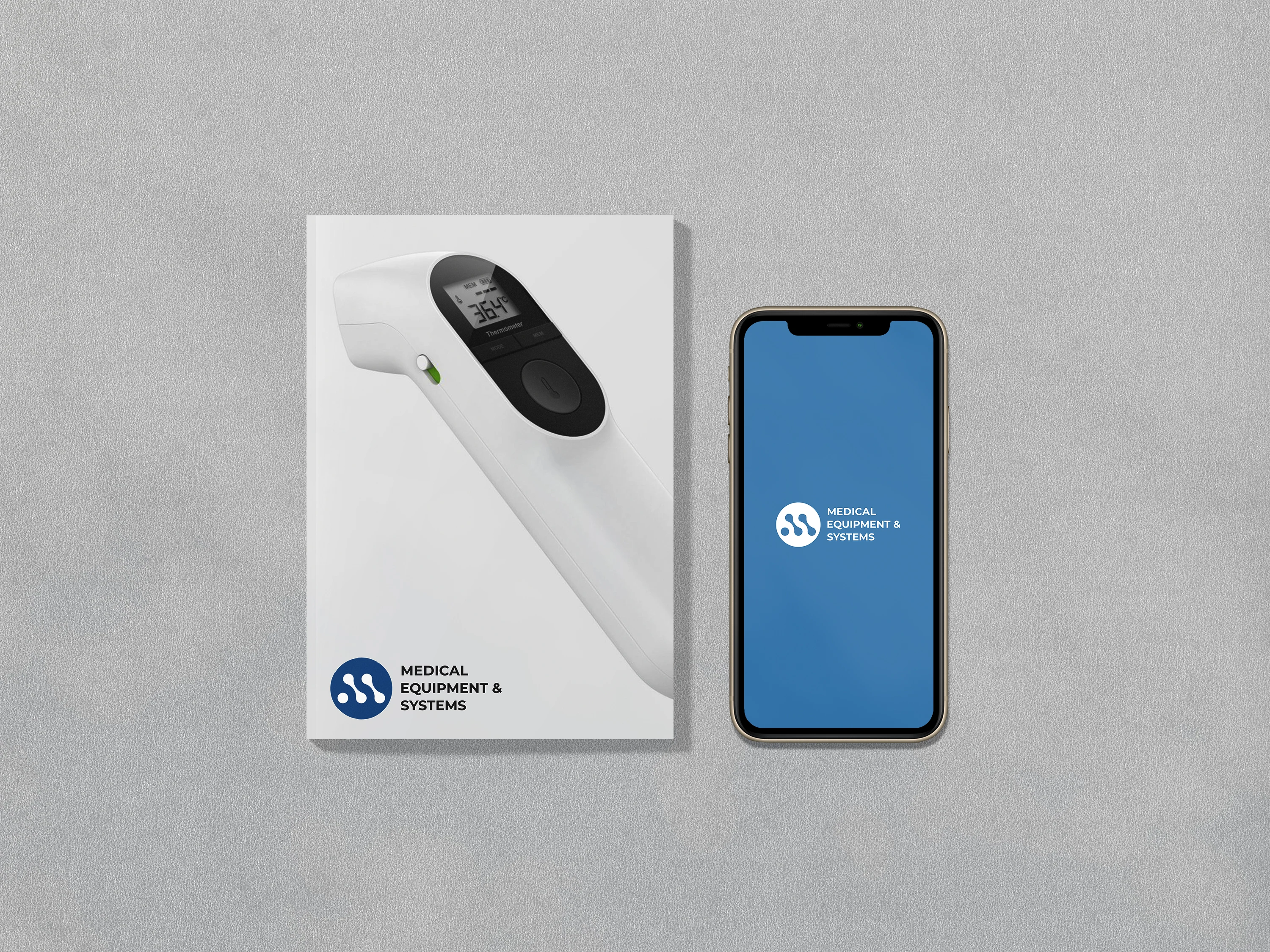
Institutional-grade healthcare, no mark. MES had operated for 17 years without a visual identity, distributing global medical brands under an unbranded name. The project built the company's first system-level identity.
Role & Details
Brand Identity - Logo, Colour System, Typography, Applications
Happa Studios, 2022
Role: Brand Identity Designer
Problem
MES was invisible next to the international brands it partnered with. No mark meant no recall, no equity, no seat at the table as a brand in its own right, only as a distributor.
Insight
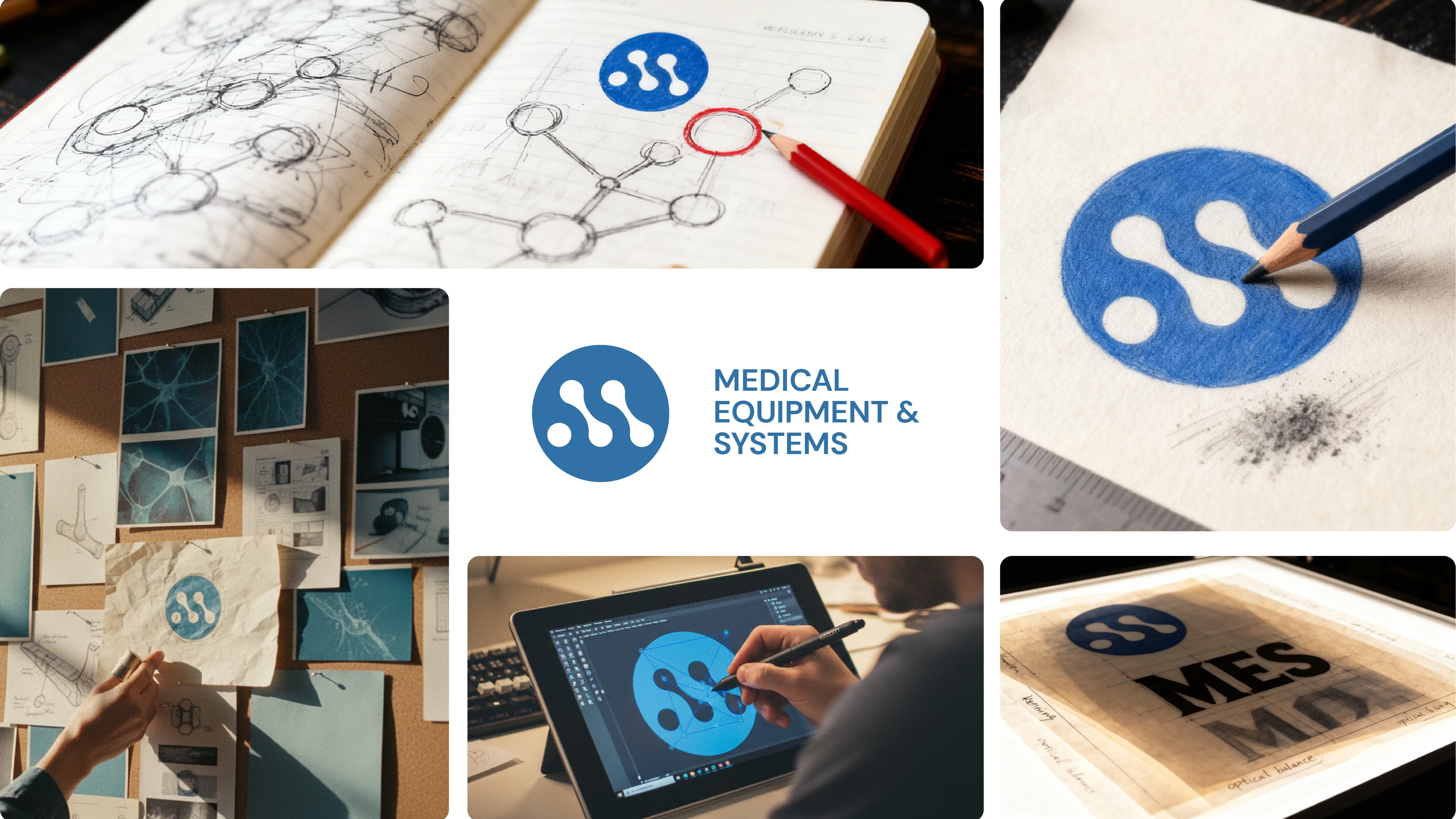
A distributor of life-saving equipment needed a mark that read as precise and systems-level, not decorative. The identity had to earn trust in a room full of clinicians and procurement officers, not consumers.
Concept
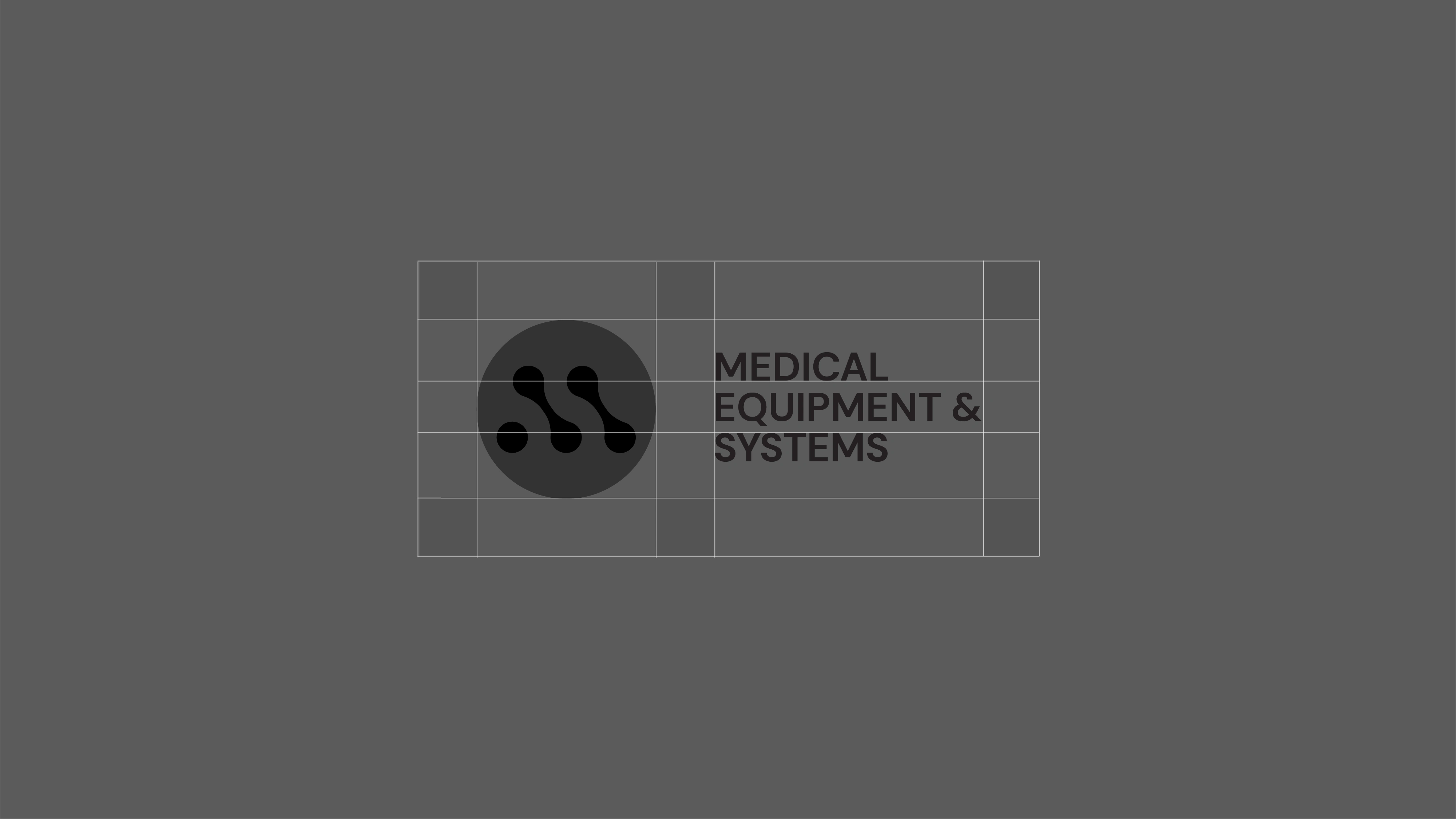
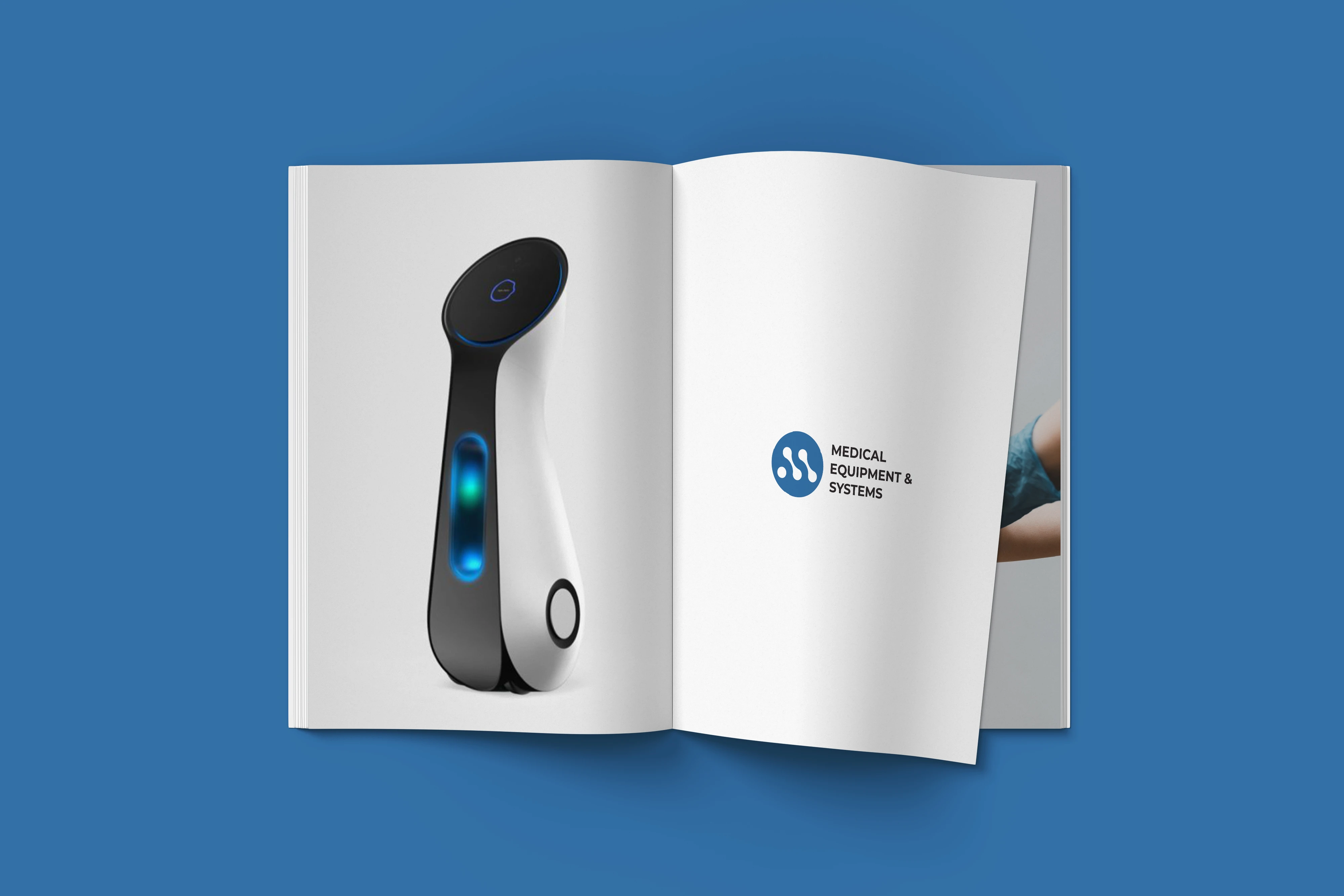
The mark is built from the etymology of "Medical Equipment & Systems" reduced to interlocking geometric forms that read as both an M and a system diagram. Deep blue and clean geometry signal precision over warmth.
Execution
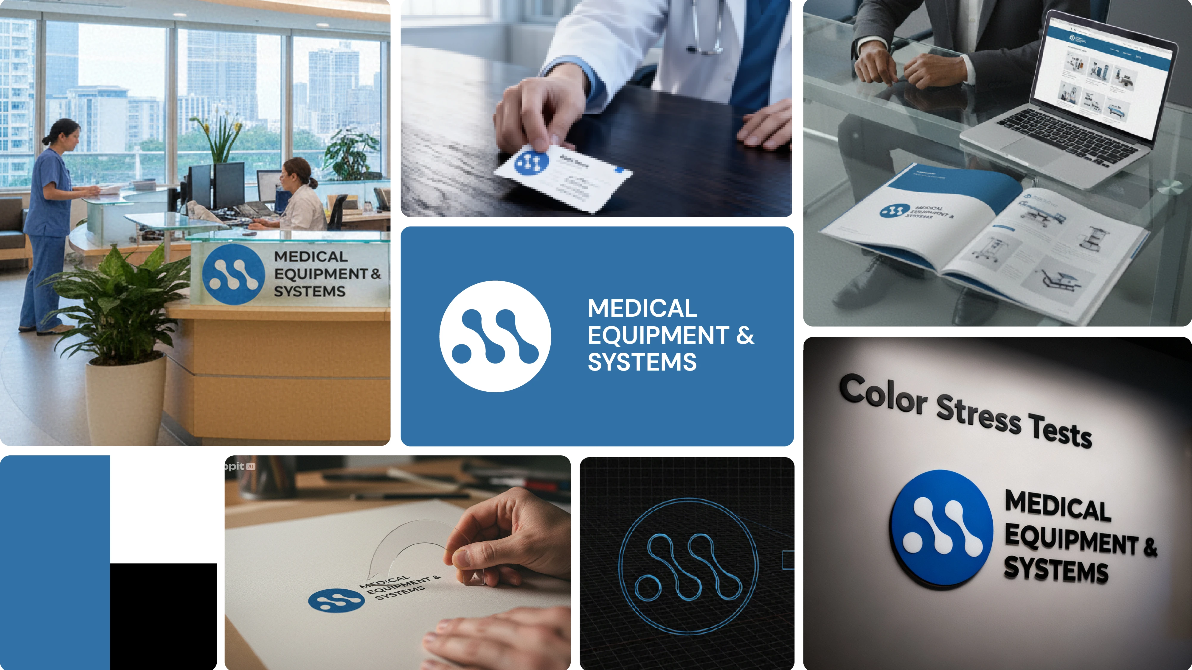
Colour: deep institutional blue, black, white, clinical, not corporate.
Typography: paired a structured serif with a technical sans for hierarchy across print, signage, and digital touchpoints.
Outcome
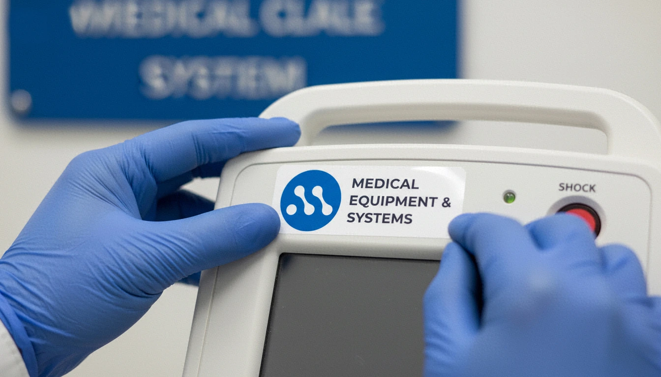
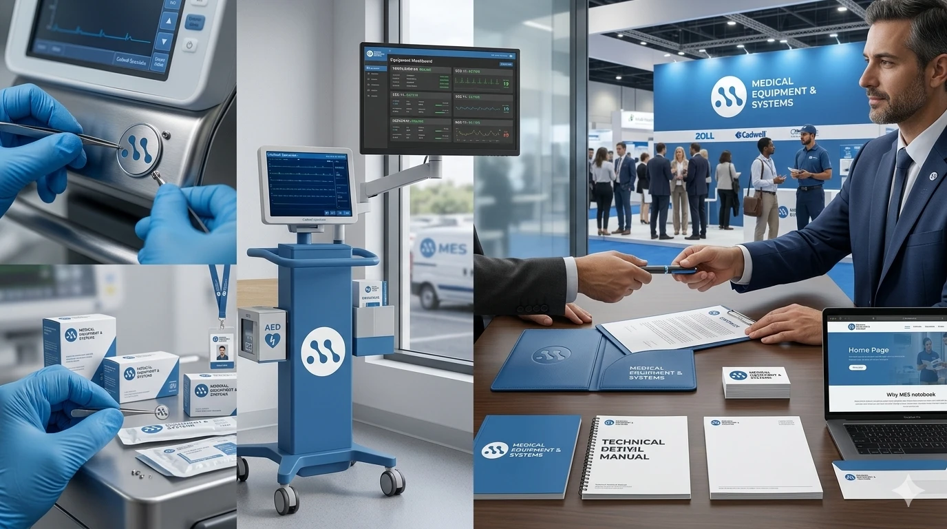
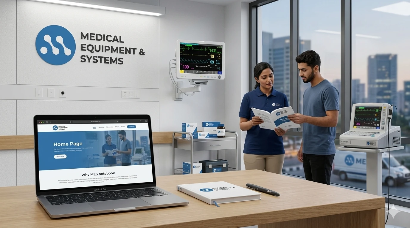
Rolled out across packaging, signage, vehicles, and digital assets, giving MES its first standalone brand presence after 17 years of operating unmarked.
Credits
Client: Medical Equipment & Systems
Studio: Happa Studios, 2022
Role: Brand Identity Designer
Like this project
Posted Aug 14, 2026
Created MES's first brand identity with logo and system design.
Likes
0
Views
0
Timeline
Jan 1, 2022 - Dec 31, 2022