Freelance UI Designers in Petaling Jaya
Sign Up
Post a job
Sign Up
Log In
Filters
2
Projects
People
Mira C
Kuala Lumpur, Malaysia
20 Years of Designing Desirable Products for Startups & SMBs
New to Contra
Follow
Message
20 Years of Designing Desirable Products for Startups & SMBs
0
I had the incredible opportunity to work as a senior product designer on the redesign of the TED Talk page in collaboration with engineers, product manager, and ux designer and the TED Design System which I had spearheaded. During that time, I also got to contribute to the mini player feature for the TED mobile app, helping to bring TED’s inspiring content to life in new and engaging ways. TED Talk Page Redesign: The goal of the TED Talk page redesign was to transform it from a one-time viewing experience into an engaging platform where users return regularly to participate and share ideas. We wanted TED.com (http://TED.com) to stand out from other video platforms like YouTube by encouraging meaningful conversations and active community involvement. To achieve this, we focused on enhancing interactivity—highlighting user discussions, thoughts, and recommendations—to inspire more participation and idea exchange. We also prioritized performance improvements, ensuring faster load times and efficiency by adopting newer technologies and meeting standards like the Google Lighthouse Score. Lastly, we created an updated guide for the talk page’s functionality to make future updates and management smoother. The result was a more dynamic, interactive hub that reflects TED’s mission of spreading and exchanging ideas. Design System: In redesigning TED.com (http://TED.com), we blended old features with new, like user-driven discussions, under a modern design system I led. Data-driven decision-making refined essential elements and removed outdated ones, enhancing the site's interactivity and appeal.We also had conducted user testing our prototypes throughout our iterations. More Than Just a Face Lift: We ran over 20 user tests to make sure our designs were as intuitive as we hoped. I iterated and refined the UI multiple times, using insights from these tests to guide each improvement. Along the way, I incorporated new design system components to keep everything consistent and seamless. The result? A more user-friendly experience that not only meets our goals for ease of use but also feels cohesive and polished — making sure users stay engaged and find real value in what we’ve built. TED Mobile iOS Mini Player: There has been a significant demand to enhance the browsing and video-watching experience for viewers on the TED mobile iOS app. In order to align with the current YouTube viewership standards, it has been crucial for us to deliver what our users truly need — a miniplayer for videos, audio-only functionality, and podcasts. Throughout this 3-month project, my responsibilities included analyzing the scope and requirements, designing the flow and UI, conducting user testing, and gathering valuable feedback. Working as a senior product designer at TED was a true privilege. I learned so much from our users by gathering their feedback during testing of the new Talk page, Homepage redesign concepts (built with the design system I had spearheaded), and the mobile mini player. While there were mixed reactions on whether these changes would boost user engagement on the site, every step of the process was a valuable learning experience.
0
34
1
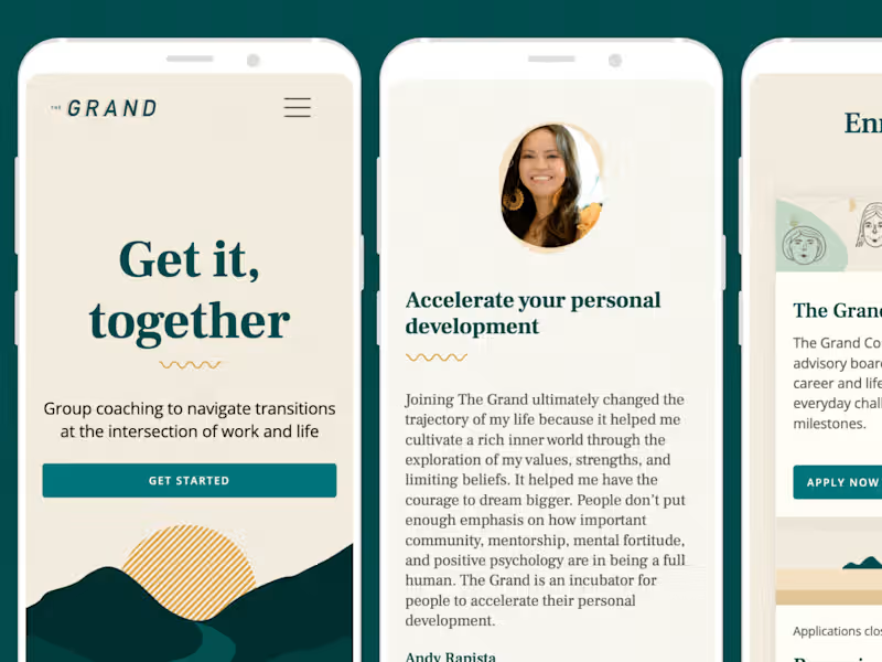
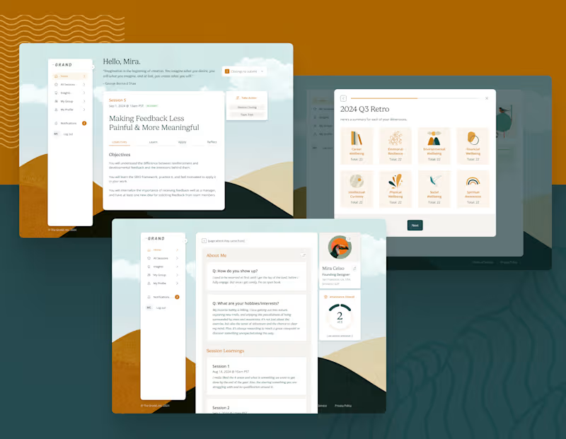
Member Platform: I led the design of our Member Digital Platform with a focus on connection, growth, and ease of use. The platform supports group coaching by giving members the tools to reflect, track their progress, and engage meaningfully with their cohorts. Designed to foster vulnerability and community, it ensures the right resources reach the right people at the right time. Digital Platform: I focused on creating experiences that feel smooth and intuitive, making it easy for users to navigate every step of their journey. The user flow, based on our extensive user interviews' insights, shows how I’ve mapped out the signup process and dashboard interactions to keep things clear and straightforward. The wireframes break down each stage — from pre-session prep to in-session interactions and post-session follow-ups — so members and coaches have a consistent, easy-to-use experience. My goal was to reduce friction, make things feel effortless, and ensure people stay engaged. I think through every detail, making sure the design supports users at every point and aligns with business goals. Ultimately, I want to create products that feel helpful, supportive, and simple to use. Coach Platform: The goal of the Coach Platform is to make it easy for coaches to deliver great group sessions and stay organized. It helps them access session content, track member progress, rearrange their session modules, and document 1:1 recap sessions. With streamlined dashboards and navigation, coaches can spend less time on admin tasks and more time fostering connection and growth. This supports key product goals like engagement, continuous improvement, and personalization for both coaches and members. Similar to how I mapped out the Member Platform where I’ve outlined the coach’s journey with user flows and wireframes. Now, I’m excited to show you the high-fidelity screens, which are set to be built by the end of Q1 2025.
1
68
0
Research & Ideation: It all started with user research. To guide our design decisions, I dove deep into understanding the primary personas who used our legacy products. I analyzed user feedback and observed how people were interacting with these tools in real-world settings. Collaborating with the product team, I led the ideation and development of what would become The Grand Council. We kicked things off with a brainstorming workshop that sparked some great ideas, and I carefully mapped out the user journey to make sure the experience was intuitive and seamless. Marketing & Design: I also played a key role in the lead-up to our big product launch. Partnering closely with a marketing team, we rolled out a comprehensive social media campaign designed to drive potential users to our freshly updated website that I had spearheaded. Our efforts paid off. We converted an impressive 30% of members within the first month of launch. It was a powerful reminder of how effective product design not only enhances usability but can also amplify marketing impact. Beta Launch: To validate our approach, we ran extensive testing with two small user groups, and the feedback was incredibly encouraging. Those insights helped us refine the product and ultimately led to the successful launch of The Grand Council. Design System: Before we started scoping out the Member Platform and Coach Platform, I strongly advocated for creating a design system. The goal was to standardize components and design patterns to create a cohesive and high-quality user experience. This evolution aimed to make the platform more adaptable, scalable, and user-friendly, ensuring it meets the needs of both current and future product developments.
0
51
0
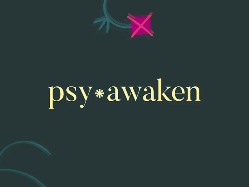
PsyAwaken was born out of my final project at the Vital Psychedelics Training program. Through surveys and research conducted during the program, I identified the need for a supportive, community-based approach to integration. I also handled all the brand design work for PsyAwaken, combining my skills in product design with my passion for helping others heal and grow. Common Pain Points: Through my own experiences and research, I’ve identified key challenges that many people face when it comes to psychedelic integration: 1. Isolation in Self-Exploration: Many people feel alone in their psychedelic journeys due to a lack of a supportive community that understands what they’re going through. 2. Lack of Guidance: Without expert support, it’s easy to feel lost or overwhelmed when trying to integrate the insights from these profound experiences. 3. Cost Barrier: The high cost of one-on-one therapy makes regular integration support inaccessible for many people. 4. Need for Continuity: Sustaining the benefits of a psychedelic journey requires ongoing support, but it’s hard to find resources that provide continuous growth and connection. Concepting: To address these challenges, I created PsyAwaken — a unique group integration experience designed to support and empower individuals on their healing journeys. PsyAwaken’s solutions include: 1. Community Support: By offering a group coaching model, PsyAwaken creates a supportive community where people can share their experiences, learn from each other, and feel a sense of belonging. 2. Expert-Led Integration: Guided by knowledgeable coaches, PsyAwaken helps participants understand and integrate their experiences, making the process safer and more effective. 3. Affordable Access: Group sessions are offered at a fraction of the cost of individual therapy, with a sliding scale to make support accessible to more people. 4. Continuous Engagement: The 12-week program includes weekly self-paced exercises, live sessions, and ongoing access to resources and community chat, ensuring sustained growth and support. The Program: PsyAwaken’s 12-week program provides a structured path for deep personal growth and integration. Each week offers a new exercise or experience designed to promote reflection, awareness, and healing. Some examples include: Week 1: Wheel of Wellness – Explore different dimensions of wellness and create a plan for balance. Week 2: My Core Values – Align your daily life with your core values for more authenticity. Week 3: Sharing Circle – Gain insights and healing through peer support and shared experiences. Week 4: Gratitude – Build resilience and happiness through gratitude practices. Week 6: Meditation – Cultivate awareness to integrate your insights into everyday life. Week 8: Body Mapping – Integrate somatic awareness with your psychedelic experiences. PsyAwaken reflects my belief that true healing and growth happen when we’re supported by a caring community. I hope to make psychedelic integration more accessible, empowering, and meaningful for everyone who embarks on this journey.
0
26
UI Designer
(2)
Follow
Message
Nasfath Rahman
Kuala Lumpur, Malaysia
Expert Product Designer (UIUX)|10+ years of exp.| Framer Pro
Follow
Message
Expert Product Designer (UIUX)|10+ years of exp.| Framer Pro
0
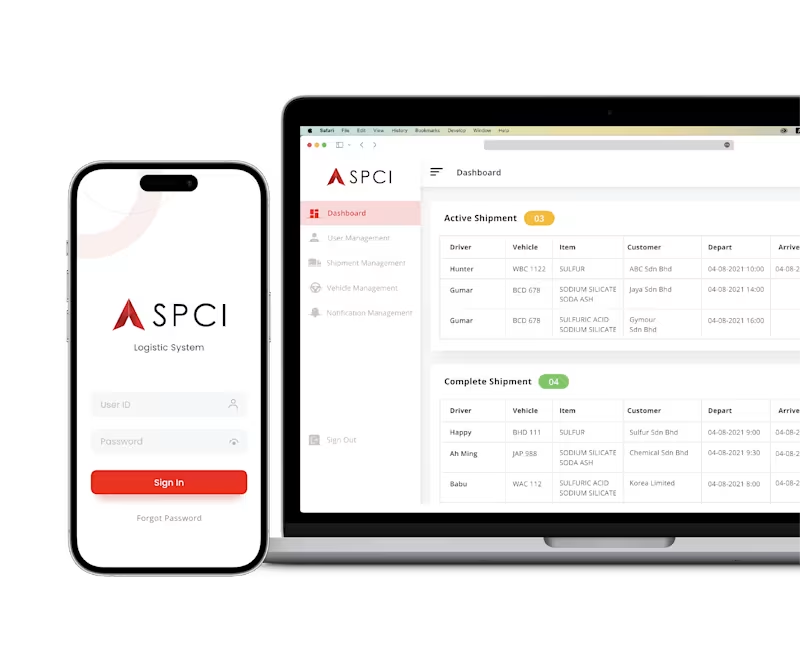
Logistic Management System
0
27
0
Adept - Empowering Efficiency in Field Operations
0
72
0
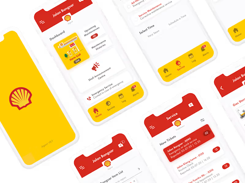
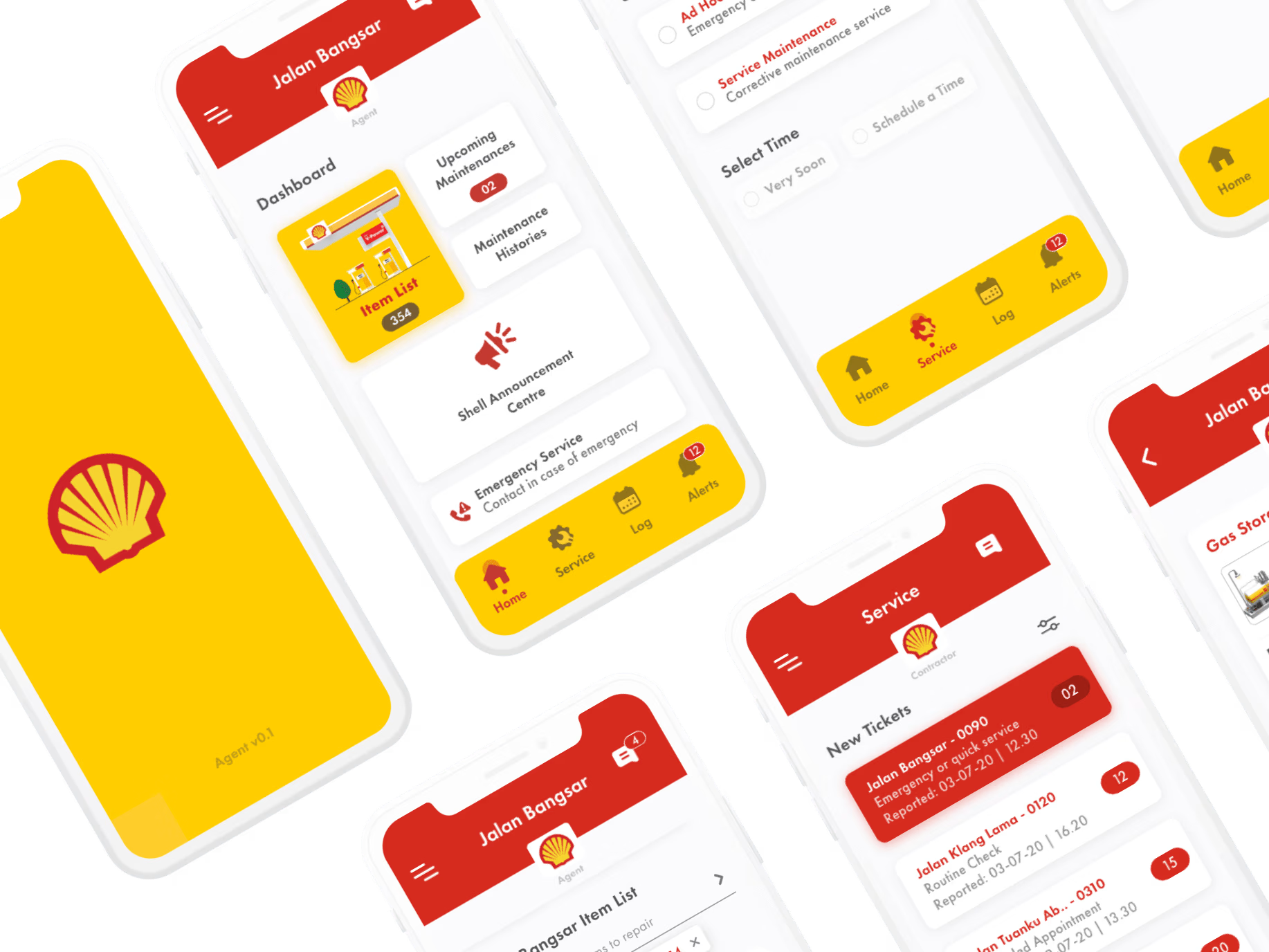
Shell - Revolutionizing Maintenance Management
0
30
View more →
UI Designer
(3)
Follow
Message
Alvin Ng
Kuala Lumpur, Malaysia
We Create Stories that tell Stories & Create Emotions
Follow
Message
We Create Stories that tell Stories & Create Emotions
1
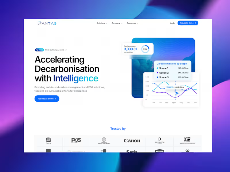
Pantas Website Revamp – ESG & Carbon Intelligence Platform
1
8
0
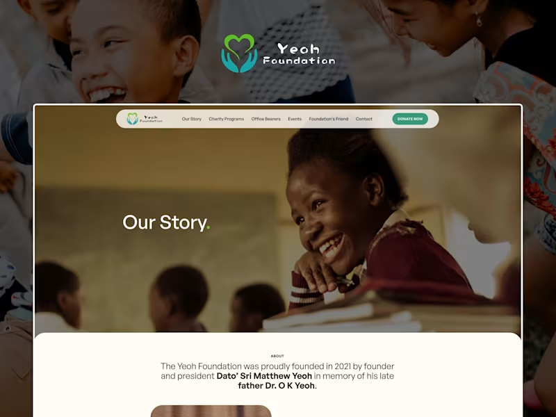
Yeoh Foundation: Save The Children
0
9
0
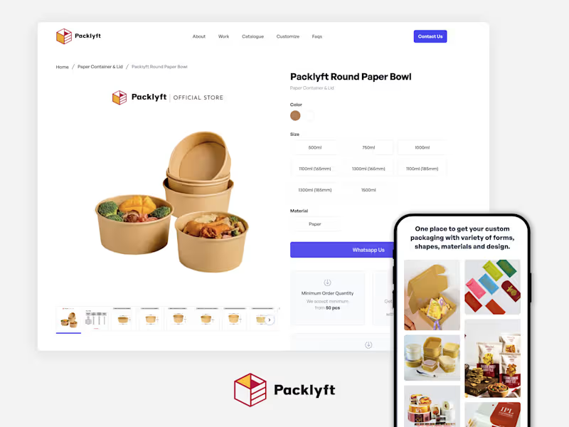
Packlyft: Customized Packaging Expert
0
9
0
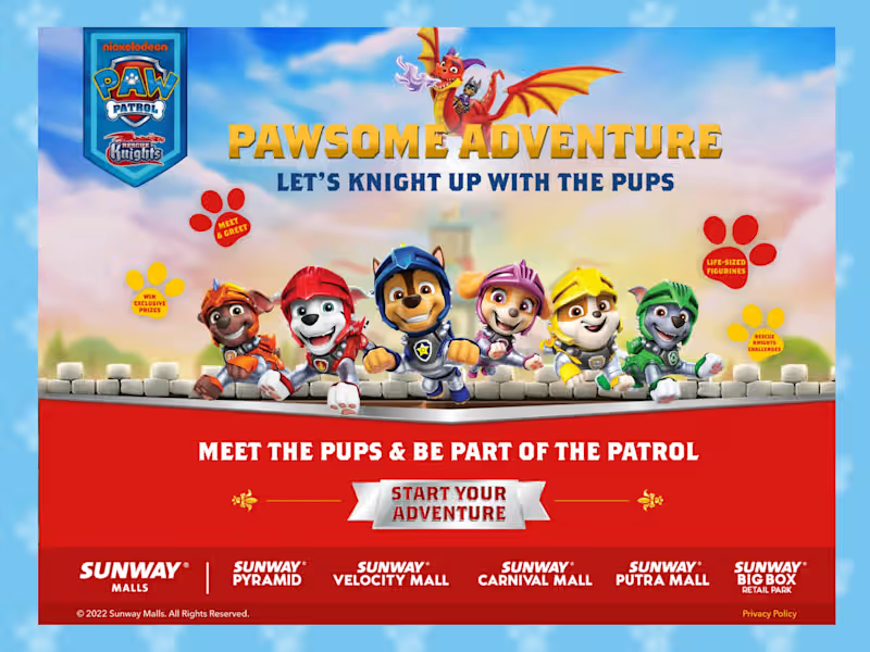
Rescue Knights Paw Patrol: Sunway Malls Campaign Microsite
0
6
UI Designer
(4)
Follow
Message
oxkim — onc
Kuala Lumpur, Malaysia
design partner for future first products
34
Followers
Follow
Message
design partner for future first products
2
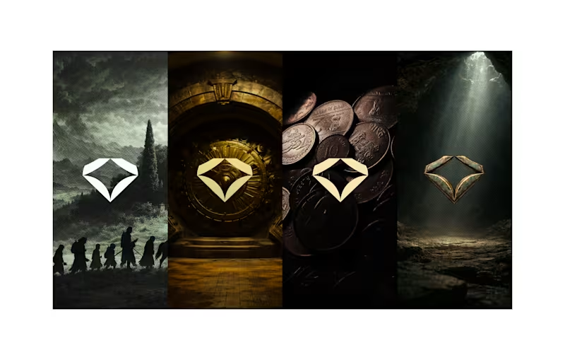
As AI tools evolve, it’s easy to generate more faster. But that’s exactly when "Taste" becomes the real differentiator. This environment wasn’t generated. It was composed scene by scene, with intention. I built it to guide perception before a product even speaks. To inject scarcity, weight, and heritage into a digital-first asset.AI can assist. But it doesn’t understand "taste" That’s where the authencity comes in. 📐 Visual Direction Includes: • Marketing worldbuilding • In-product tone & iconography • Cinematic brand touchpoints • Texture, light & trust design When not AI? When your product needs to feel rare.
2
109
5
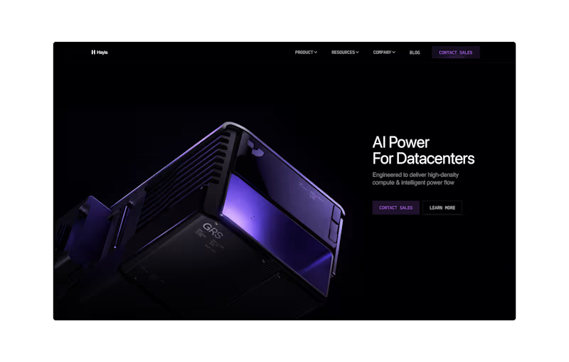
A $100M website isn’t about flashy visuals. It’s about clarity, trust, and decision-making at scale. This redesign focuses on: • Clear value articulation above the fold • Enterprise-grade visual confidence • Reducing friction for high-intent buyers Built to support long sales cycles, complex products, and serious stakeholders.
2
5
224
4
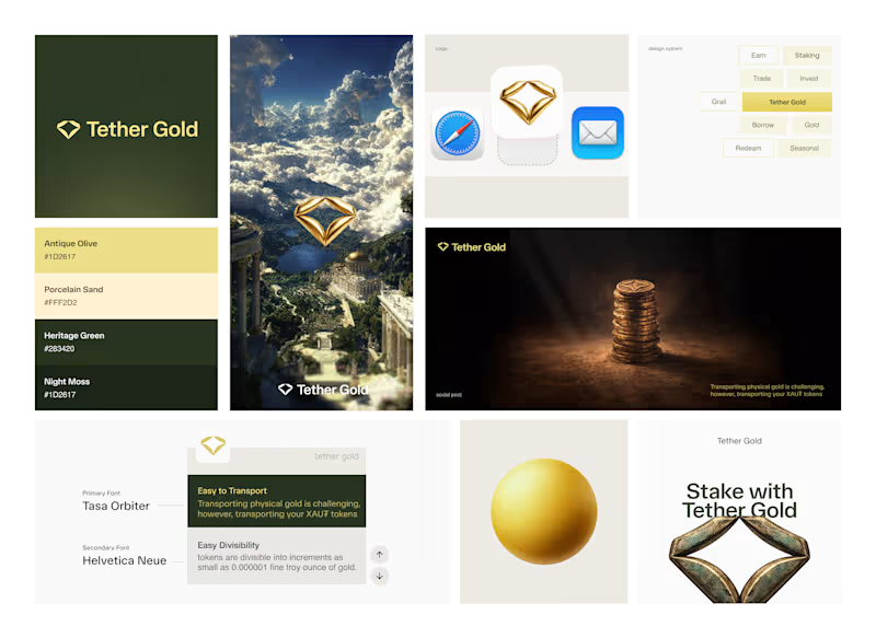
Making Digital Gold Feel Credible This project explores how design can support user confidence in a gold-backed digital product. Instead of chasing visual novelty, the focus was on: 1.Stability over trend 2.Clarity over decoration 3.System consistency over one-off screens The outcome is a product-ready visual foundation designed to support growth, feature expansion, and user trust over time.
1
4
166
0
swap animation
0
68
UI Designer
(18)
Follow
Message
Celine Wong
Kuala Lumpur, Malaysia
UI/UX Designer | Branding | SaaS | Web3 & Blockchain
Follow
Message
UI/UX Designer | Branding | SaaS | Web3 & Blockchain
1
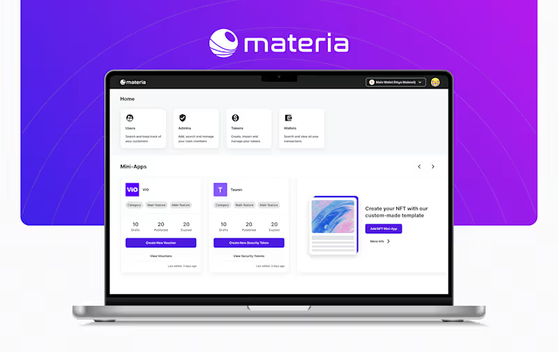
Materia | Web App Design
1
10
0
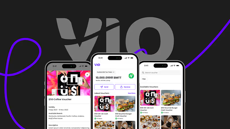
VIO | Mobile App Redesign
0
9
0
Coded Solution | Brand Identity
0
14
0
Houndr | Logo Design
0
9
UI Designer
(2)
Follow
Message
Jvanash Hemachandra
Kuala Lumpur, Malaysia
Full-Service UX Design for Business Success
Follow
Message
Full-Service UX Design for Business Success
0
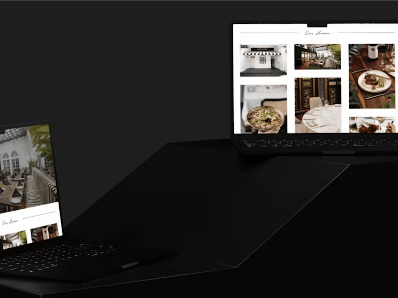
New website for the top-rated Italian Restaurant in Malaysia.
0
31
0
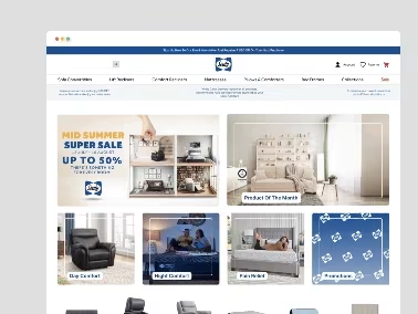
A fresh new e-commerce website UI reflective of Sealy Home
0
23
0
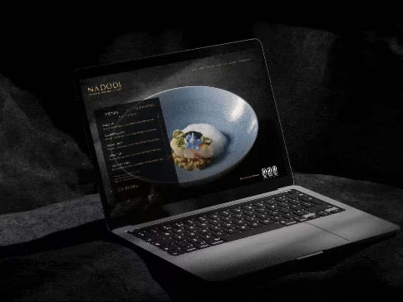
No-Code website for Michelin Restaurant Nadodi
0
21
View more →
UI Designer
(3)
Follow
Message
Amirul Safuan
Kuala Lumpur, Malaysia
Creating a product that are simple and intuitive
Follow
Message
Creating a product that are simple and intuitive
0
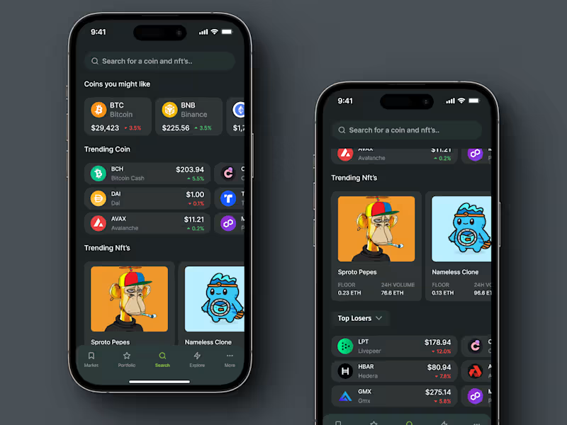
Redesign crypto search page
0
69
0
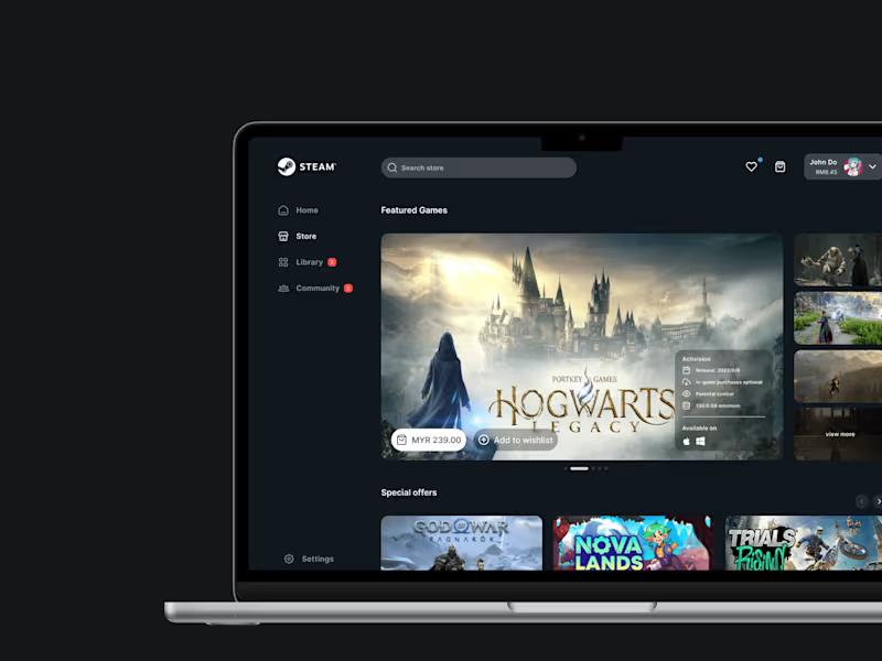
UI Showcase : Redesign store page for Steam library
0
63
0
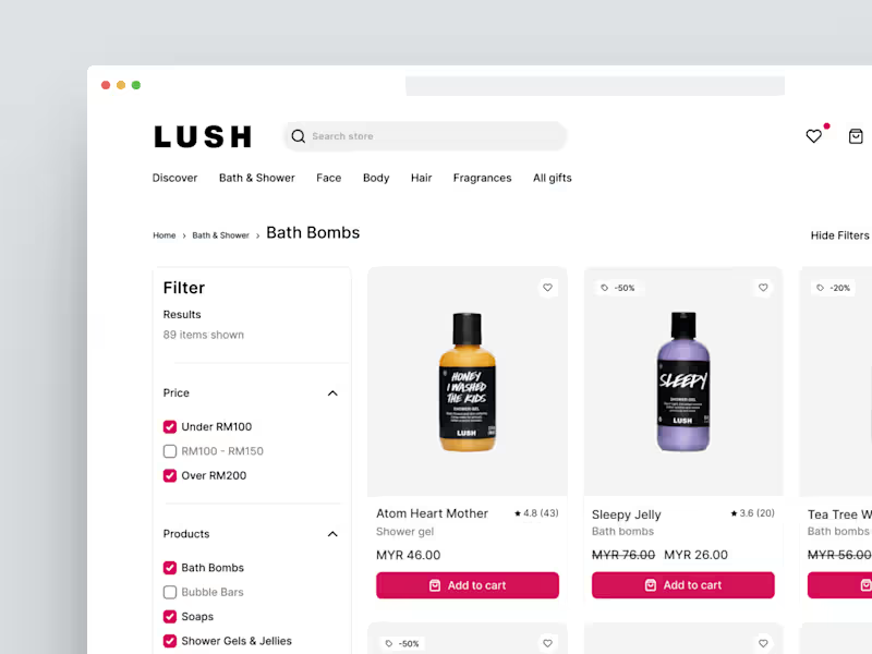
UX Study case : Redesign Lush category page
0
95
0
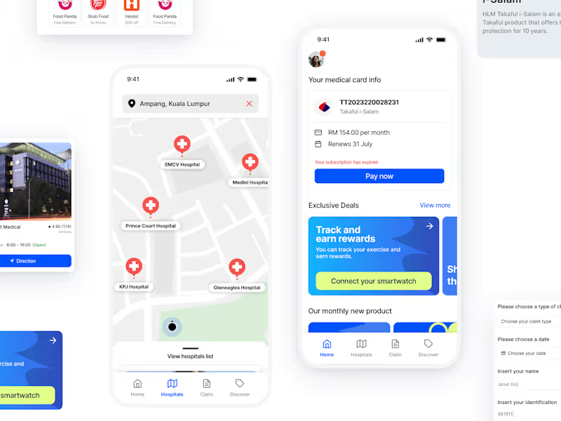
UX Study case : Redesign HLMT360 App
0
91
UI Designer
(4)
Follow
Message
Wai Wai Phua
Petaling Jaya, Malaysia
Blending technology, creativity, and thoughtful design
New to Contra
Follow
Message
Blending technology, creativity, and thoughtful design
0
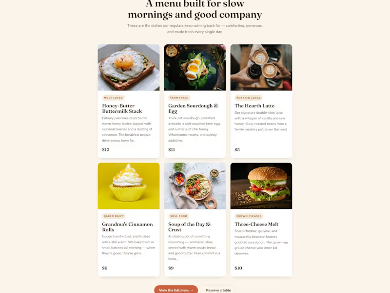
Hearth & Honey — Neighborhood Café Landing Page A warm, inviting landing page for a neighborhood café built around comfort and belonging. The design intentionally rejects the cold minimalism most restaurant sites use — soft cream backgrounds, a coral-and-brown palette, a friendly serif, and food photography given room to breathe. Copy is written in a homey, first-person voice ("We didn't set out to build a café. We set out to build a feeling."). Sections include the hero with a trust bar, an origin story, a menu built as appetizing cards with prices, a "why neighbors choose us" block, local testimonials, a functional table-reservation form, and a newsletter CTA offering a free pastry. The whole page is designed to make someone feel welcome before they've walked in.
0
69
0
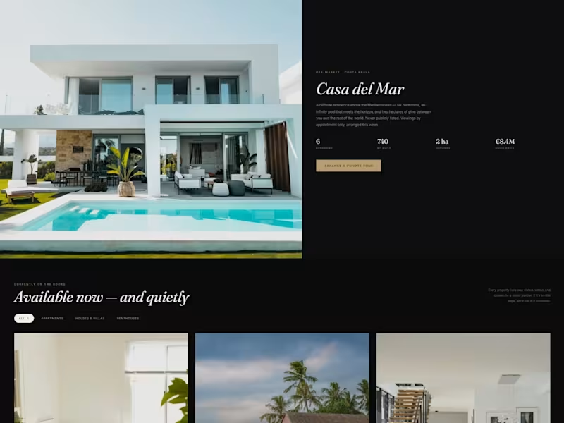
Walles — Private Real Estate Buyer's Agency A landing page for a boutique buyer's agency that sources off-market homes across Europe. The brief was to feel less like a property portal and more like a private members' service — discreet, editorial, and unhurried. I leaned into a dark charcoal palette with warm gold accents, an italic serif headline ("The home you're looking for isn't listed yet"), and generous negative space so the architecture photography carries the page. Sections include a featured off-market listing, a quiet listings grid with filters, a private-viewing booking flow, a four-step "how we work" explainer, agent profiles, testimonials, and an FAQ. The goal throughout was trust over hype — every element written to sound like a senior partner, not a sales funnel.
0
81
0
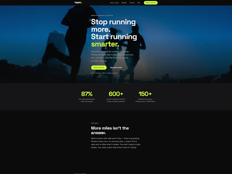
Conversion landing page — coded + copywritten A dark, premium landing page for TEMPO, a remote running coach. The goal: turn plateaued runners into booked intro calls. I designed and hand-coded the page in semantic HTML, modern CSS, and vanilla JavaScript — no page builders — and wrote all the conversion copy, from the hero to the pricing tiers and FAQ. Fully responsive, fast-loading, and accessible. Mobile-first, built to convert, with clean source code the client owns.
0
104
0
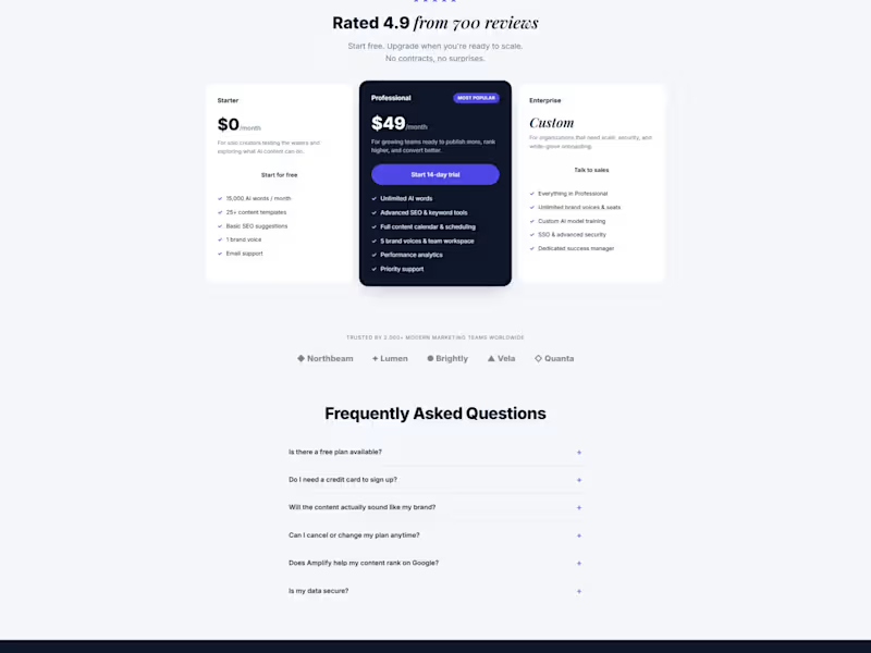
Amplify AI — AI Content Tool Landing Page A conversion-focused landing page for an AI content platform aimed at growing marketing teams. The design balances a clean, trustworthy SaaS layout with enough energy to read as a modern AI product — indigo accents, an italic serif highlight on key phrases, and a dark "proven results" section built around dashboards and metric cards to make the value tangible. The page walks a visitor from hook to proof to action: hero with social proof, a results section with real-looking analytics, a feature grid, a testimonial, a three-tier pricing table with a highlighted "Most Popular" plan, an FAQ, and a closing email-capture CTA. Structured to support a clear free-to-paid path and reduce friction at every step.
0
58
UI Designer
(3)
Follow
Message
Explore people