UX Study case : Redesign HLMT360 App
Overview
Timeline : 4 Weeks
Platform : iOS
My Role : UI & UX Designer
What is HLMT360 App?
HLMT360 is an app that provides a range of features and services for insurance and takaful products. With this service, users can easily view their insurance policies or certificates, as well as provides information about various insurance and takaful products offered by HLMT.
In this project, I redesigned the user experience and interface to improve the app's system.
Why Redesign the app?
HLMT360 application is one of the insurance companies I regularly to read my policies and make a payment. Yet, the application was difficult to navigate and I had difficulty finding the information I needed. Since HLMT360 has many users, I felt the design could be more clear-cut.
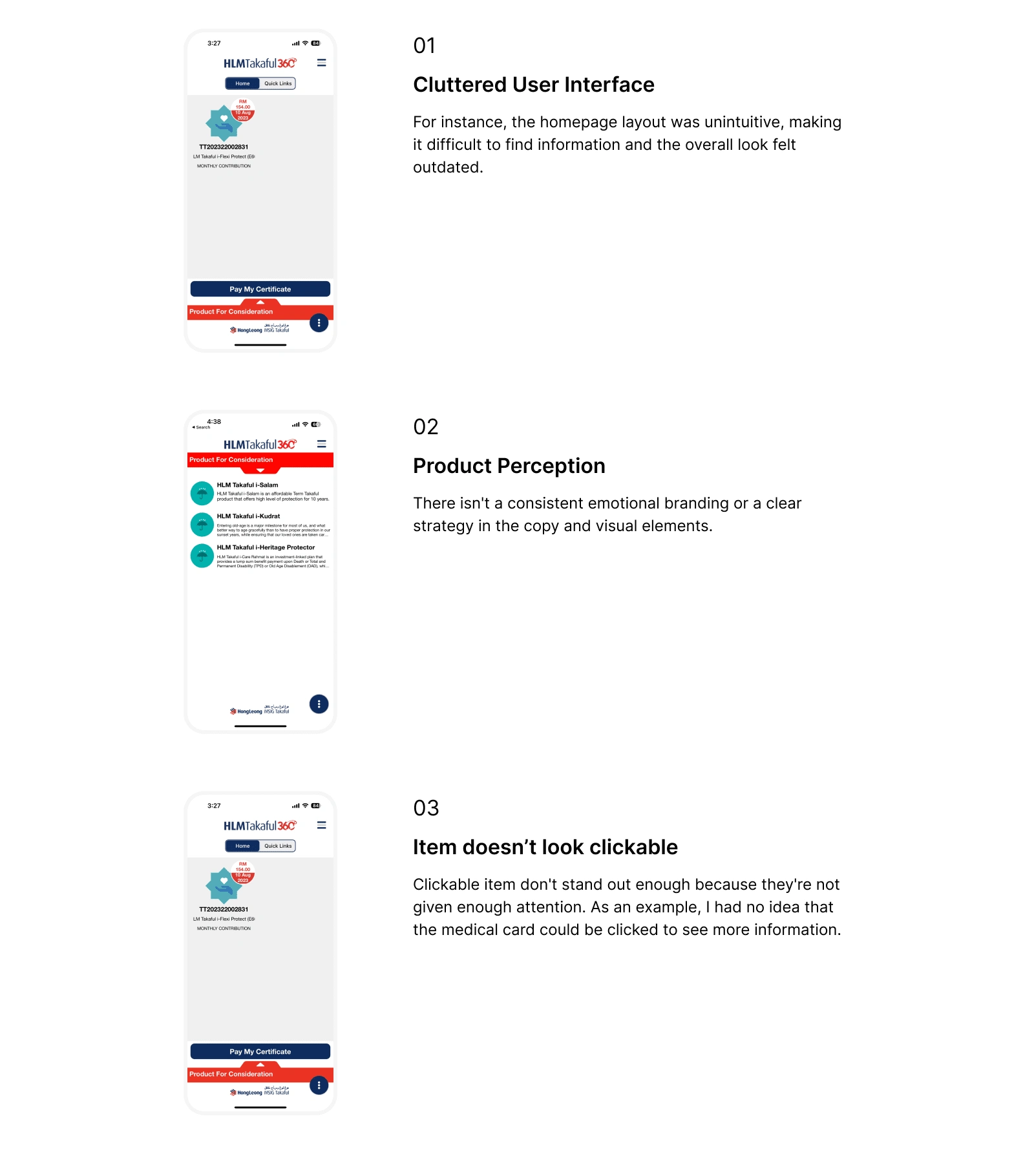
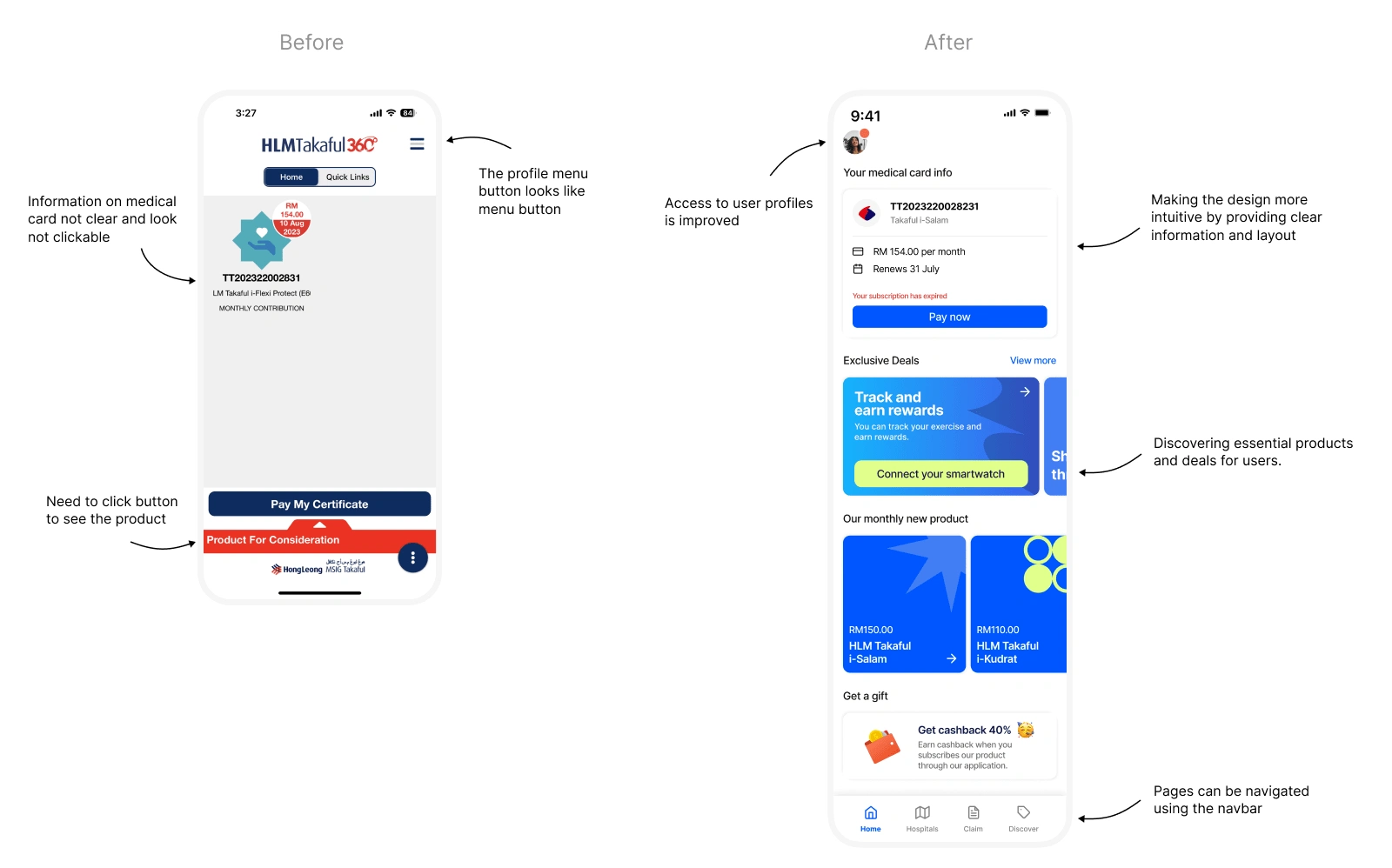
Here are the key issues I have observed:
Goals
Improve visual design
Allow users to quickly and confidently identify the item and understand its purpose. This helps to reduce confusion among users.
2. Make core products more accessible
In order to provide engagement with a product, the session should be interactive and have something that indicate to clickable
3. Restructure the navigation button
Restructure the menu section to make it easier to navigate and add visual cues to indicate where to click for next steps. As a result, the user will have a delightful experience, and the task will be easier to complete.
4. Impact of deliverables
I want to ensure that the information and guidance are in line with the user's needs and expectations.
Process
Targeted Users
Lets get started,
Before I started designing, I tried to figure out who would be my target users and how they would use the application.
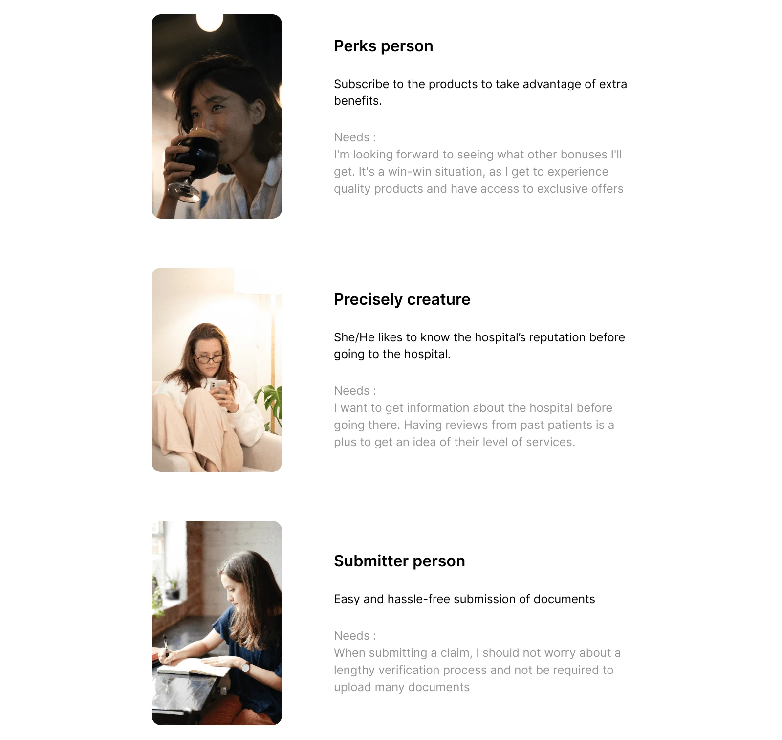
After I have done research and analyzed existing users, I have defined 3 user archetypes and mapped them to their respective needs as a way of better understanding.
User flow
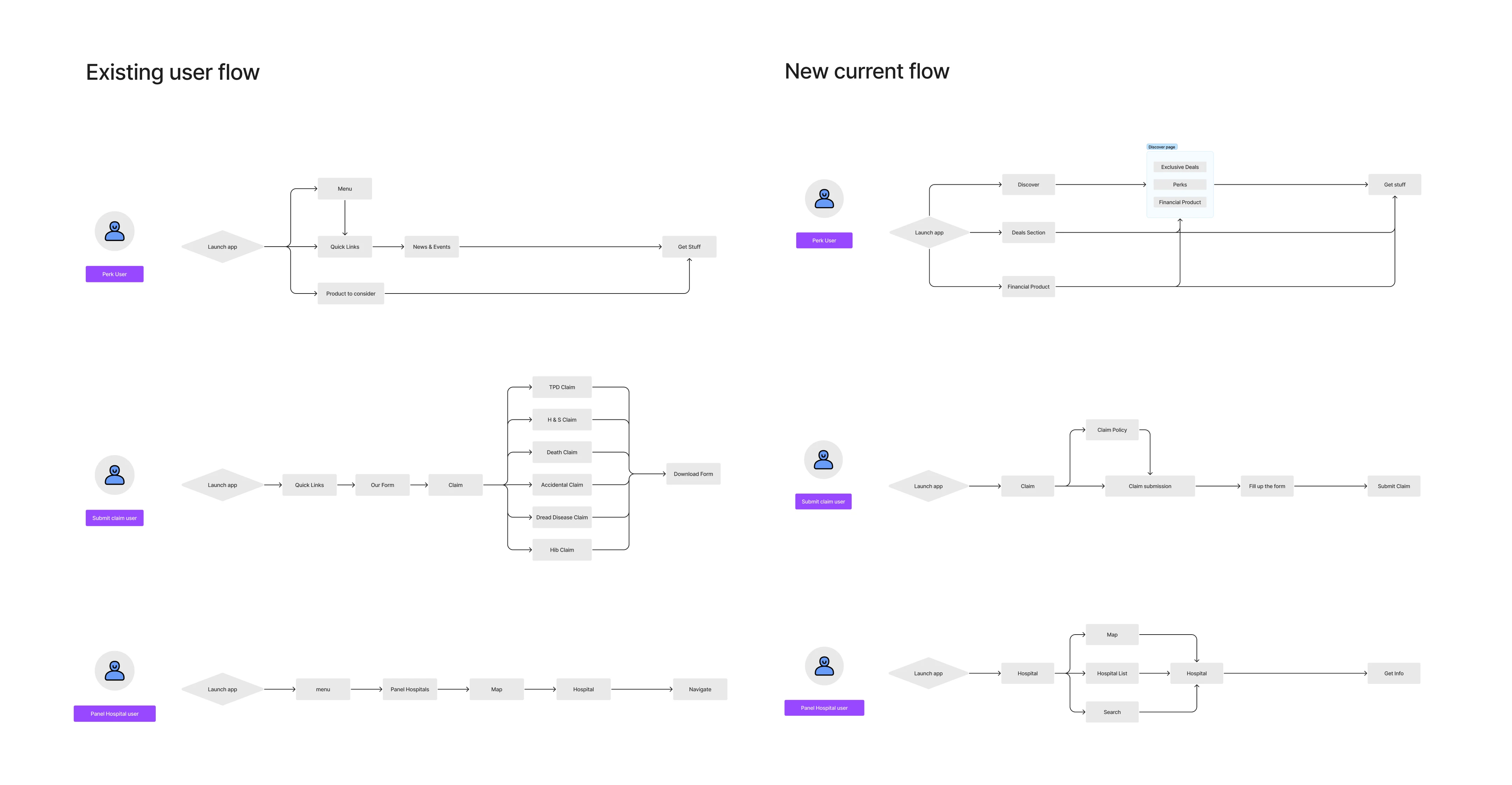
On the user flow, I tried to map each archetype to their user journey on the app before I started designing. By doing this, I aimed to gain a deeper understanding of how different types of users interact with the app and tailor their experience accordingly.
User flow
User research
To gather different perspectives, I invited a group of friends who had not used HLMT360 before to use the application, and they highlighted the following common pain points :
UI outdated
User felt the UI are outdated which leads them to have dull and boring feeling when using the application.
2. It's not clear what to do
The homepage lacks sufficient content to provide users with essential information about the application, product, or service in which they feel uncertain about the application's purpose.
3. Features are hidden
Inconsistent navigation patterns, menu structures and labelling make them feel confused and irritated.
4. No connection to the app
Users find there is nothing to do with the app and it leads them to lose interest in using the app and forget the existence of the app.
Early Designs
Sketches
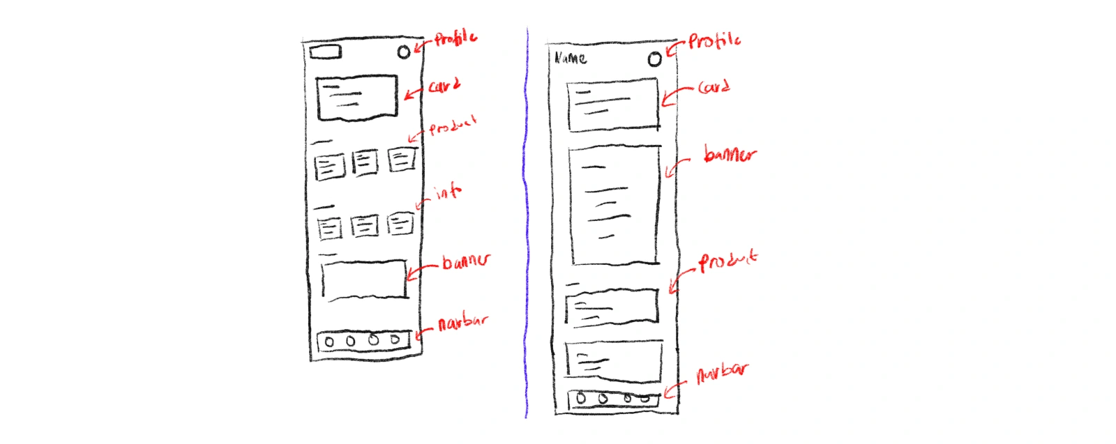
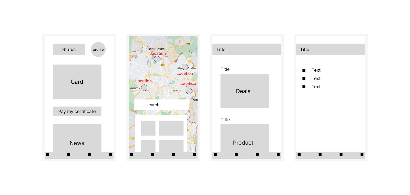
After done researching design problem, I started to sketch to get some early ideation. At this stage, my primary objective is to explore different possibilities before narrowing down to a specific direction.
Wireframes and iteration
I had did the wireframes, lo-fidelity designs and drafts. I have iterated a lot more on the visual language to refine and enhance the design. It is due to create an optimal user experience.
There are so many parts of this process that I wish I could show you all !
Final Designs
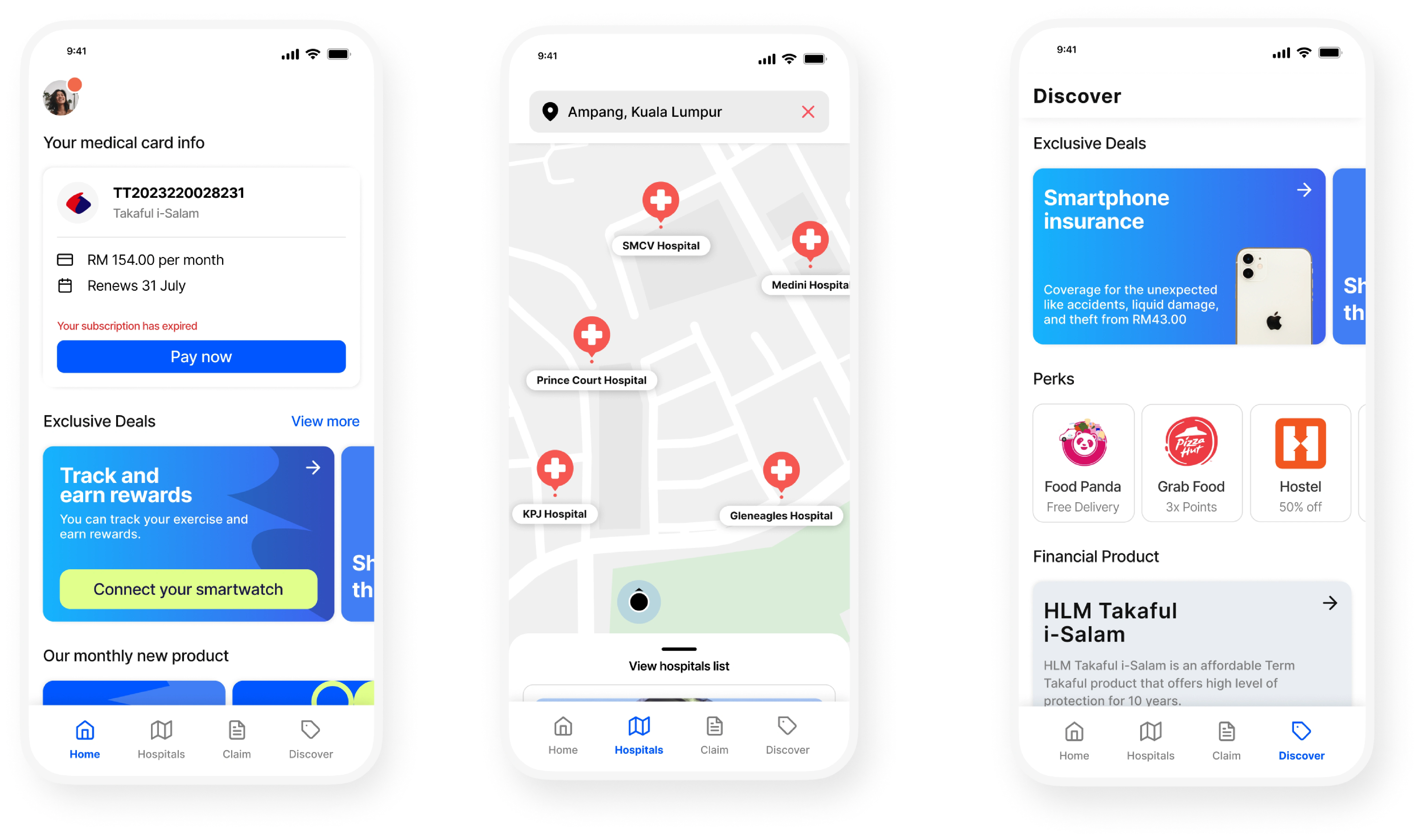
Before redesign, the app was messy and has a problem with visual design. It had a lack of what the app can give to the customer and the user can get lost when using the application. Now users are able to navigate the app with ease, and they had a clearer understanding of the app's value proposition.
You can see how I redesigned the app in this walkthrough
Home tab
Homepage has been improved to ensure it relevance to user need. I have enhanced the homepage discoverability by adding additional content and prioritizing the core features. I carefully redesigned the homepage to provide a clear and intuitive layout that immediately communicates the app's value proposition.
Panel hospital map
I gave the panel hospital section more flexibility. The panel hospital can now be viewed in map and list. I also rearranged the hospital card to convey a more compelling story.
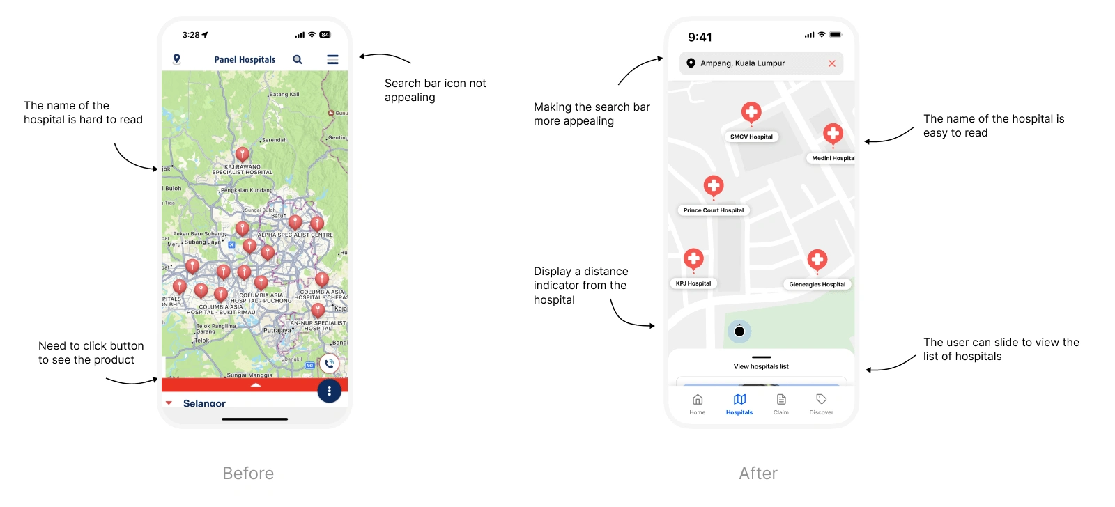
Map view
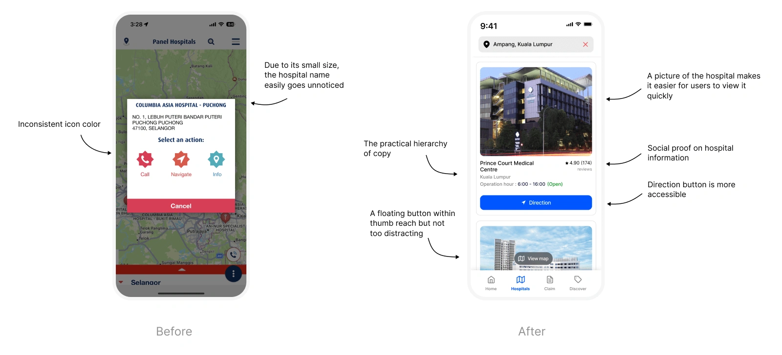
List view
Discover tab
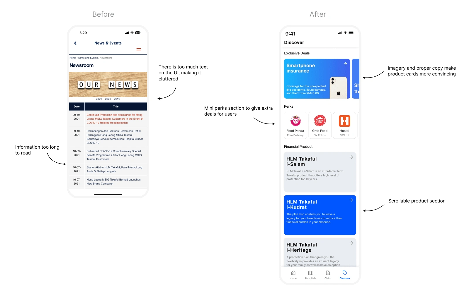
I have replaced the old 'Events and News' page with the new 'Discover' page. Despite not being an easy decision, people now have more opportunities to explore deals and discover new products.
Claim form
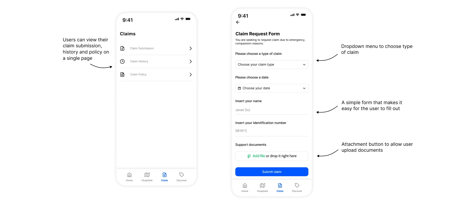
Now the claim section has been redesigned to be more accessible as well as display their claim history and claim policy. In the submission claim form, I make it straightforward and easy to fill out.
Profile page
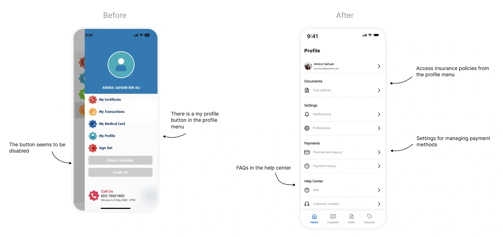
Besides making the profile page look more intuitive, I also added a couple of extra settings to give users more control over their preferences.
Reflection and Key takeaways
Learning :
It's important to understand the user requirements in detail before making any design decisions.
I understand that a good UI is accompanied by a good UX, as well as the other way around
The whole user experience can be significantly improved by small design changes
Challenges :
To reach the highest possible solution, I worked on a lot of iterations in order to achieve the right outcome. It was during this process that I realised the importance of iteration.
Due to the fact that this is my own case study, I have to do a lot of research in order to understand the business model to align the app product with the business model.
Does "working solo with many iterations" count? ;)
Future :
To complete the entire journey of using HLMT360 application, I plan to continue designing the onboarding process.
Since HLMT360 is available on the web, I look forward to designing the web version as well
Like this project
Posted Jul 14, 2023
In this project, I'll explain how I approached redesigning the HLMT360 user experience.
Likes
0
Views
78

