UX Study case : Redesign Lush category page
Overview
Timeline : 2 Weeks
Platform : Desktop / Website
My Role : UI & UX Designer
Project Brief
A category page by Lush Cosmetic allowing users where they can browse and explore products relevant to that category.
Why redesign category page
As this is my personal project, my main objectives are to enhance my skills, particularly in user experience. But considering Lush's diverse user base, which may include non-tech-savvy individuals, I aim to create a user interface that is more intuitive and easier to understand.
These are some of the observations I've made :
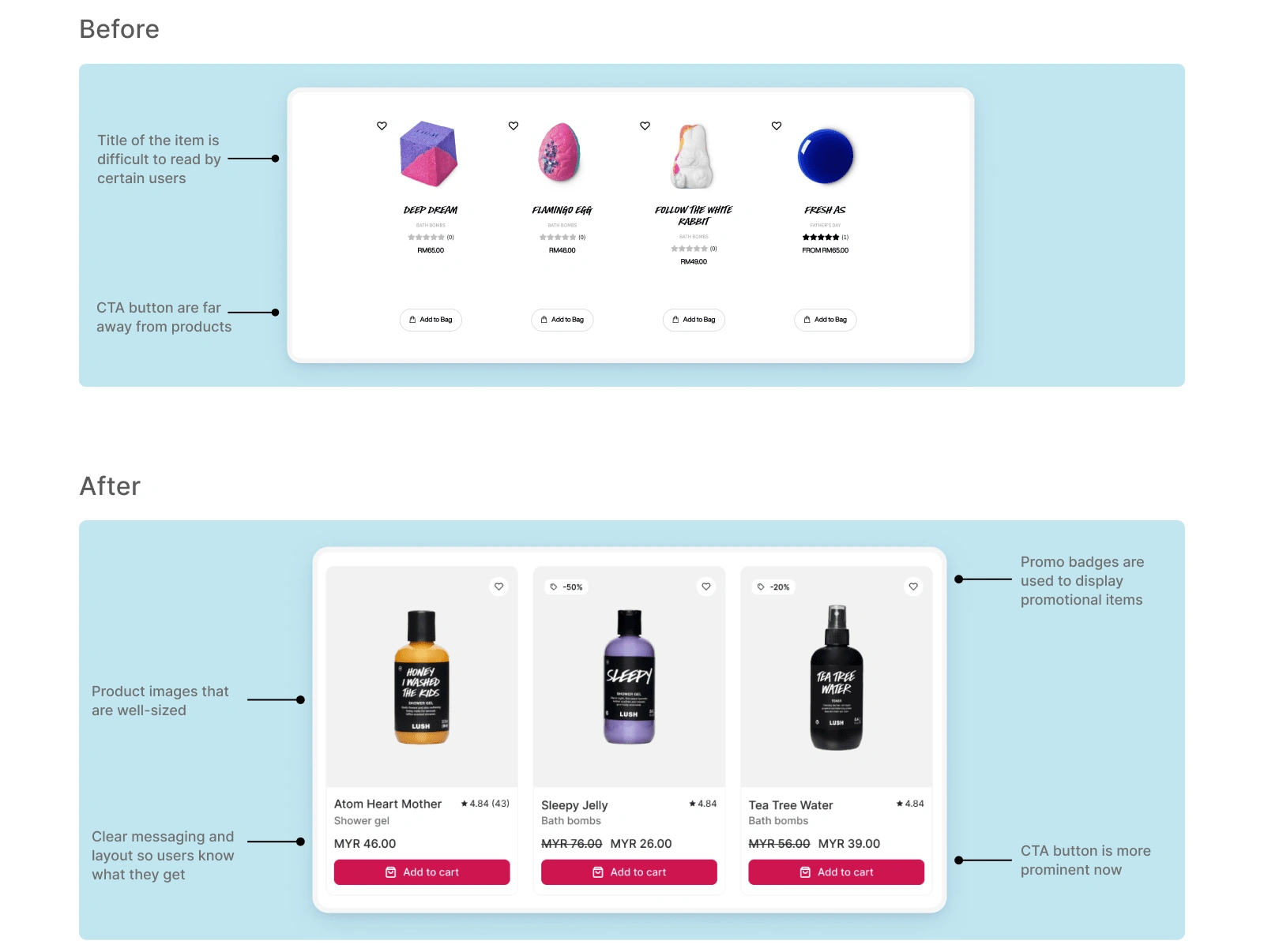
There is lack of feature that look the page outdated.
The CTA button not convincing enough to make the user click.
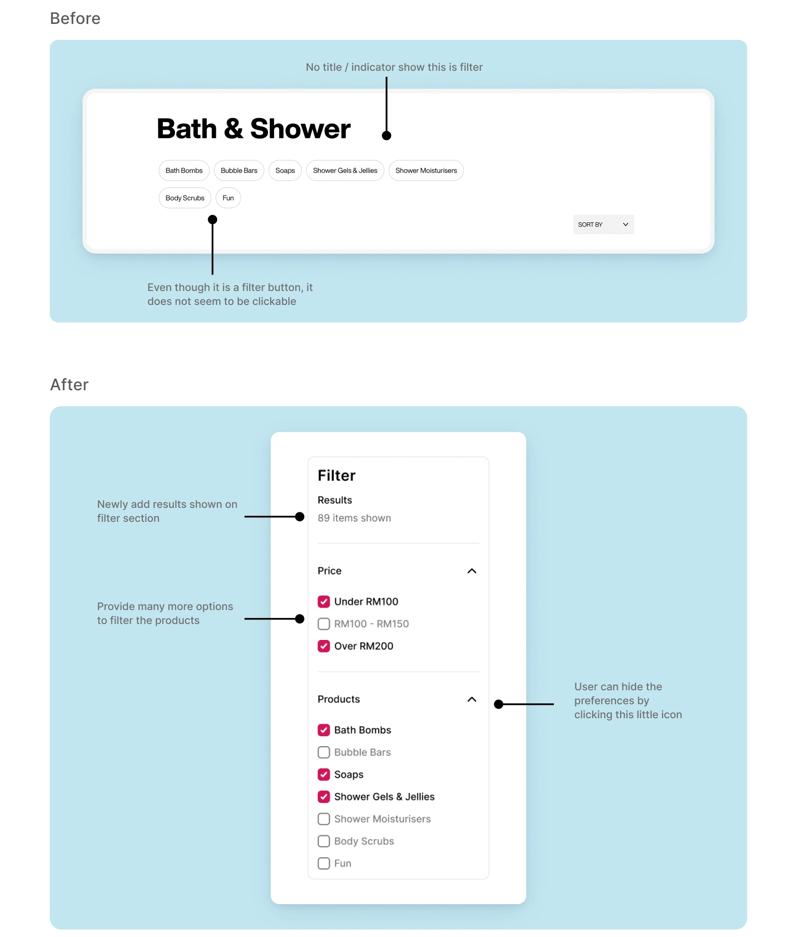
Filter options don't look like they are clickable. There isn't enough emphasis on them to make filter options stand out.
Goals
In order to minimize the time spent searching for their required items, I aim to streamline the user experience.
My goal is to improve the chances of user adding items to their cart
To make product card more informative but easy to understand
Process
Competitor Analysis
Before starting the project, I did competitive analysis to gain valuable insights and understanding about user experience approaches used by other companies. I studied every single feature and functionality the competitors offered.
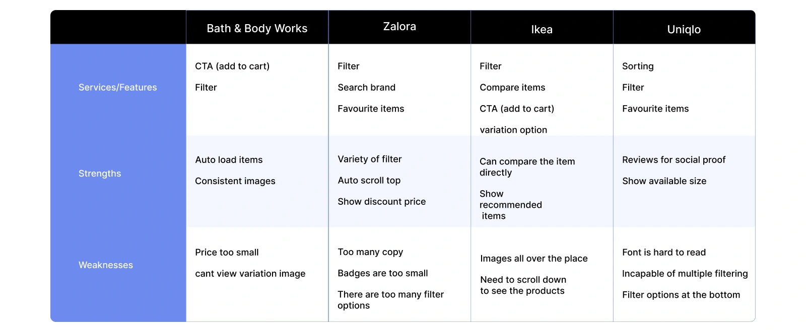
Although these platforms offer different types of products on their category page, but they still share similarities in functionality and features.
User Research
In order to gain additional perspectives, I asked a few friends who are frequent online shoppers to share their main concerns or pain points while navigating through a category page by Lush. Below are their main concerns and pain points :
The image are not interesting.
The title of the items are hard to read.
Somehow the product cards not convincing enough to purchase the items.
Information Architecture
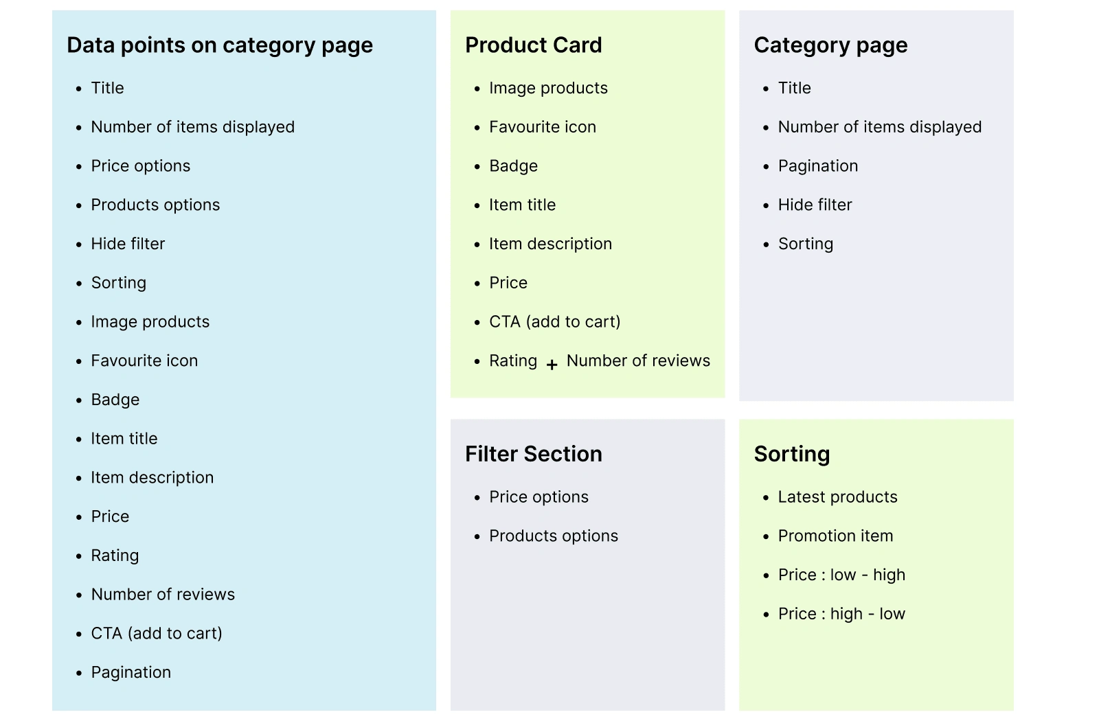
To facilitate users in finding, understanding, and interacting with content, I have compiled a list of all data points and categorized them based on their context, aiming to organize and structure the information effectively.
Early Design
Wireframe and iterations
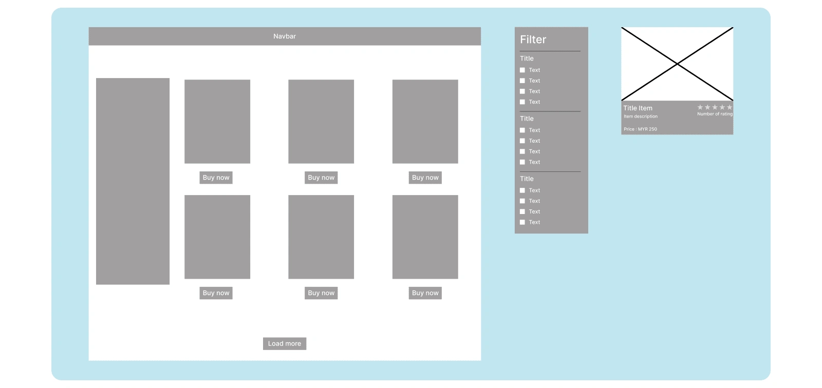
In early design stages, I started with wireframe to create product's layout and structure. Also Im focusing on the placement of elements and content without the distractions of design aesthetics.
In this stage, I have made a lot of iterations that I wish i could show you all :)
Final Design
Category page
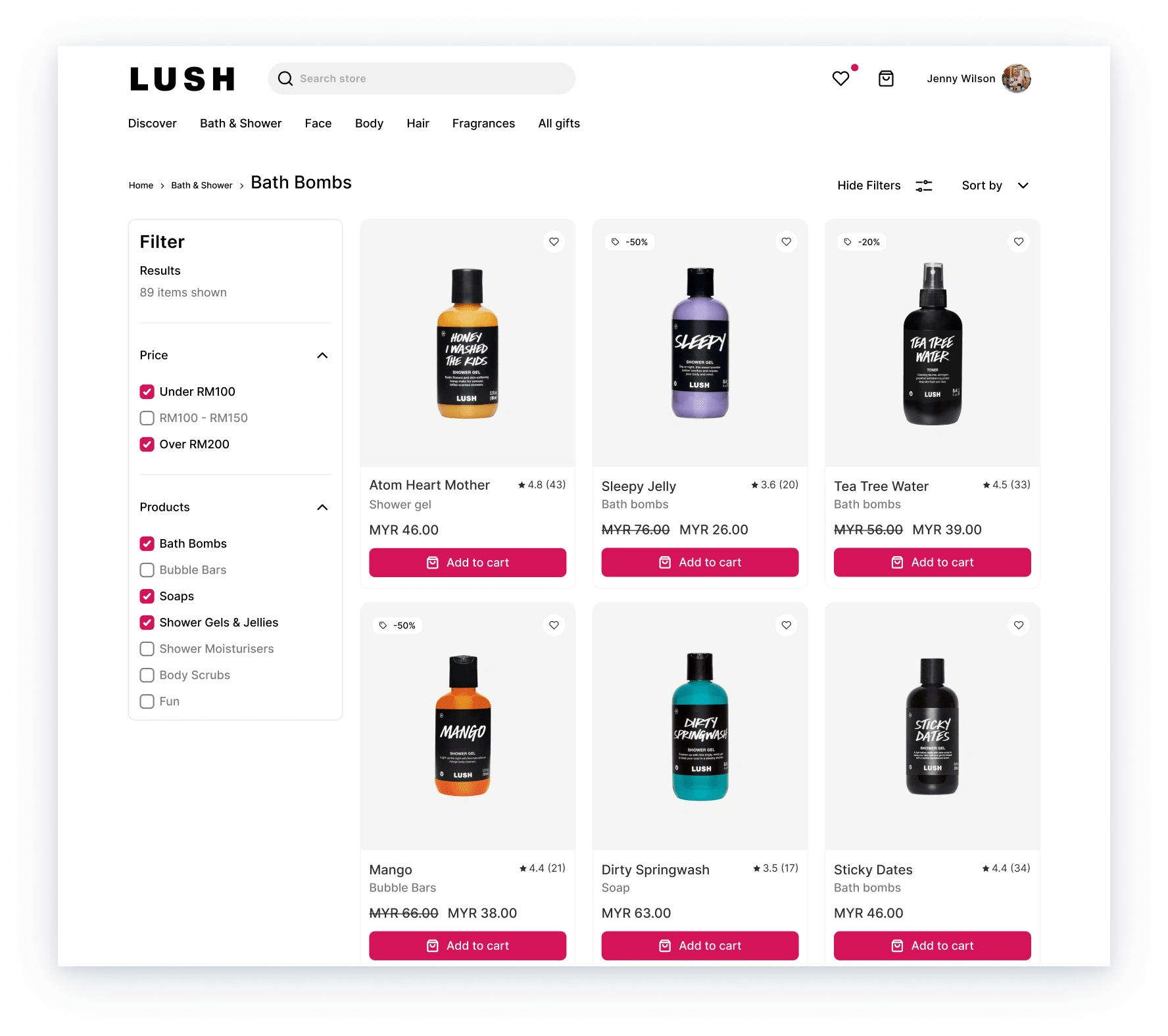
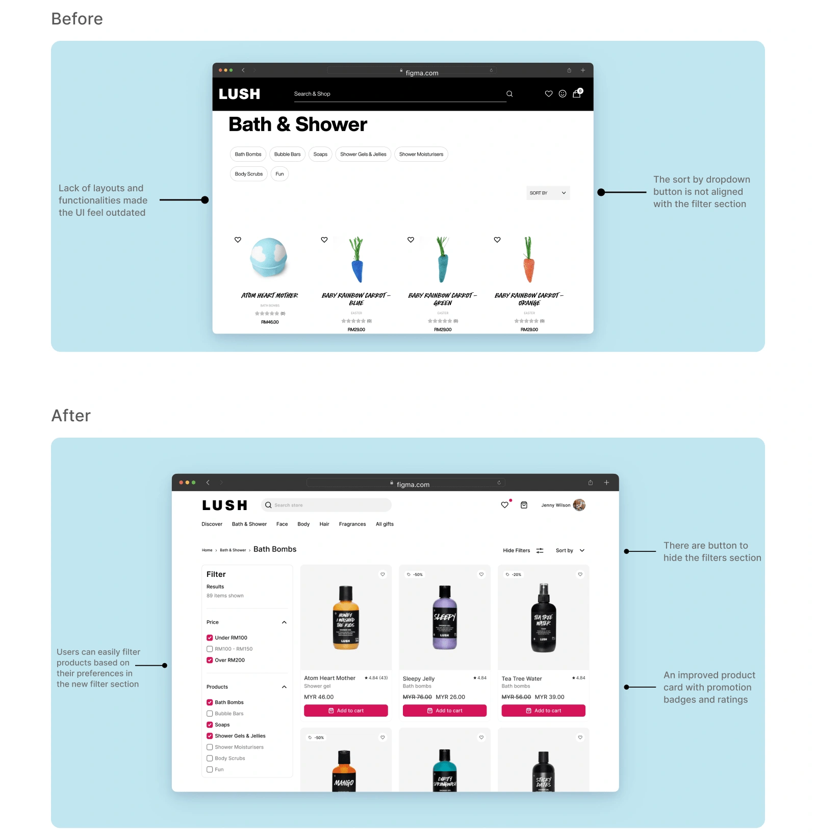
The new look of category page with more clearer image and prominent CTA for user either to add to cart or favourite their items. Additionally, I relocated the filter to capture and maintain user attention.
Product card
I introduced a new feature on the product card, displaying a badge for promotional items. This addition is intended to help users quickly identify which items are on the promo list, ultimately increasing the efficiency of their browsing experience.
Filter section
I improved the filter layout, making it more prominent, to help users easily differentiate prices and products based on their preferences.
Reflection and Key takeaways
Learning :
Each data point possesses a distinct rank in the hierarchy and must be identified and communicated accordingly.
Empathy-driven design ensures that user requirements are met by thoroughly In-depth analysis.
Challenges :
It was challenging for me to find the balance between visual appeal and usability since I wanted users to attract with the product and feature, but I did not want them to feel overwhelmed.
In the process, one of the most significant challenges I encountered was finding a way to effectively present substantial amount of content on the category page while ensuring clarity and organization.
Designing filtering and sorting options that are easy to use and understand, enabling users to refine their search results effectively.
Like this project
Posted Jul 20, 2023
A category page by Lush Cosmetic allowing users where they can browse and explore products relevant to that category.
Likes
0
Views
86

