Senior Product Designer with 8+ experience
- 1x
- Hired
- 4.4
- Rating
- 31
- Followers
Senior Product Designer with 8+ experience
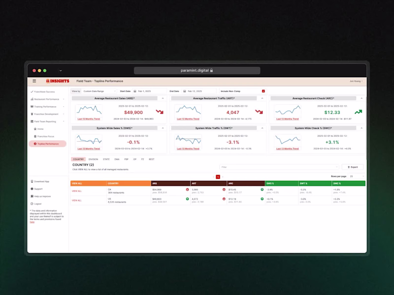
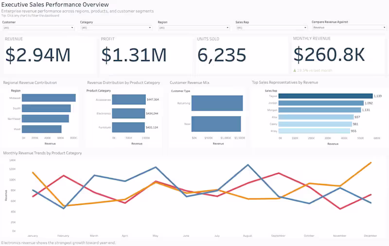
Data visualization expert for actionable insights
- $25k+
- Earned
- 1x
- Hired
- 26
- Followers
Data visualization expert for actionable insights

View more →
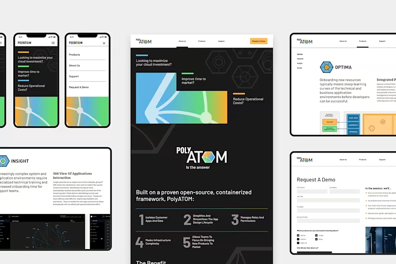
Tableau & BI Design Expert: From Data to Decisions 📊
Tableau & BI Design Expert: From Data to Decisions 📊

View more →
Analytics consultant for dashboards, SQL, and insights.
Transforming Brand Data into Visual Stories
Transforming Brand Data into Visual Stories

View more →
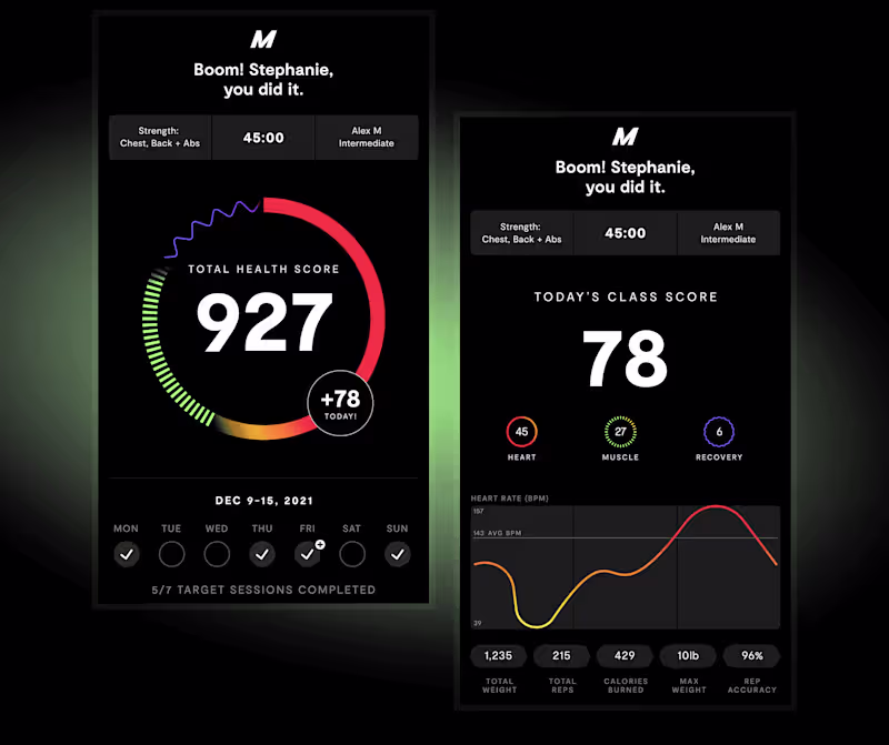
Motion Graphics, 3D Renders & Photography Expert


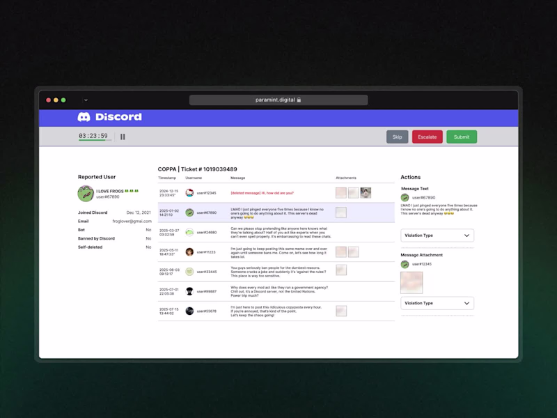
Distill to resolve.
Distill to resolve.


High-quality Retool web and mobile apps built fast.