PolyATOM: Cloud Management at Scale

PolyATOM is a kubernetes-based language agnostic cloud native platform for app development and deployment. It was developed by a group of engineers as the backend for American Tire.
Mission
After reaching maturity they sought to spin it off as a its own product. They reached out to DMI, who began to work on Strategy. I was brought in to work on developing a Brand Identity.
Outcome
Over the course of five months we worked together to create a logo, iconography for the sub-brand, stationery, marketing collateral, and a website for the new service.
A LINE OF COMMUNICATION
One of the hurdles early on was communication. The team of engineers and had never worked with designers before. Our first few meetings ended being overly technical for what was needed.

We developed a structure to prevent our presentations from going off the rails or getting muddled in jargon. From here I was able to start ideation.
FROM MANY...
We wanted to move outside what was common in the space for cloud computing platforms like Azure Cloud, Redhat OpenShift, and AWS. I was free to go as broad as possible during the ideation phase as we would reel it in as needed as we refined the logos.
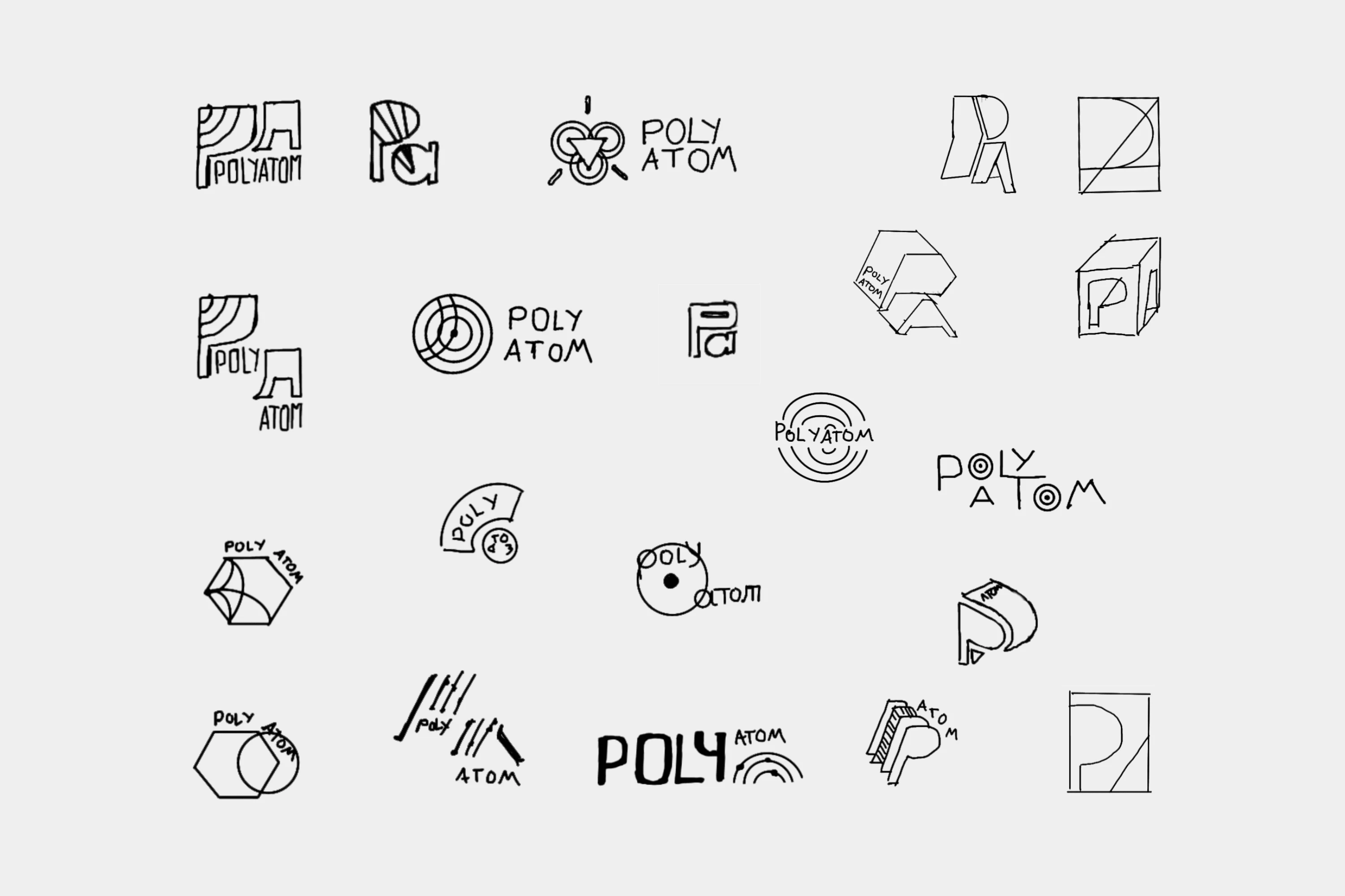
Option 1 - Exponential
Adapting by spinning up instances as needed the platform could grow as needed. The raised power replaced the word ATOM, also a doubled visually as the atomic weight you'd find on a periodic table. The hexagonal resembles a cube in isometric view, and represented both containerization in Kubernetes services as well as a container housing all the services the brand offered.

Option 2 - Scalability
The handling of microservices from small to large. The design language was based around a circle representing the core platform with an interlinking shape representing a service.
Option 3 - Rising Sun
Being the new kid on the block, it was a dawn of a new era, as it did all the things only some of its competitors did. The design represented a rising sun on the horizon. The halos of light being represented by rings of an atom as seen in the Bohr's model, with the dots being a different service around the core platform.

AND THEN THERE WERE TWO...
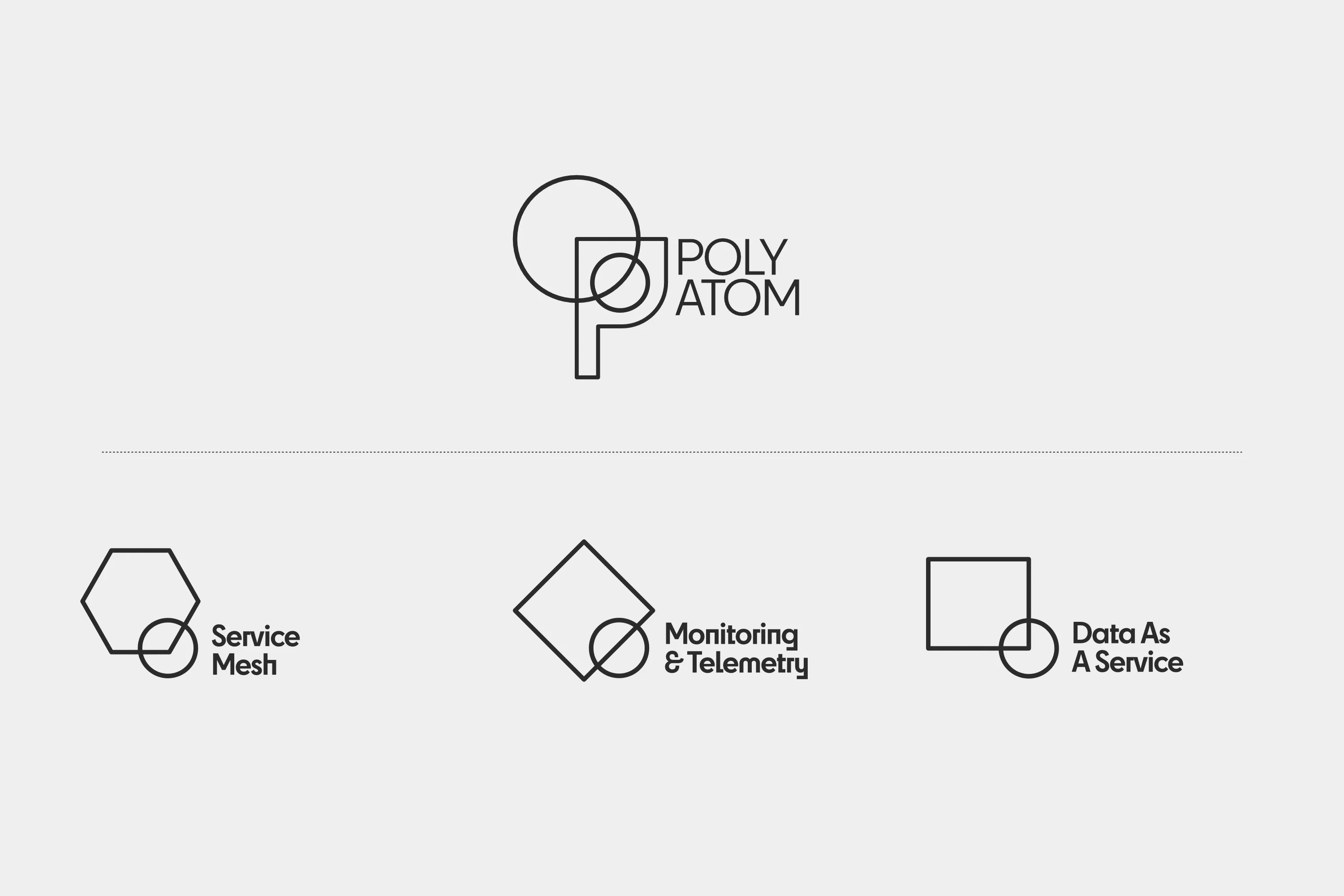
After a few meetings, we were able to narrow it down to two options.

We received the final names of the services in the subrand in addition to one new product. We adjusted those icons accordingly.
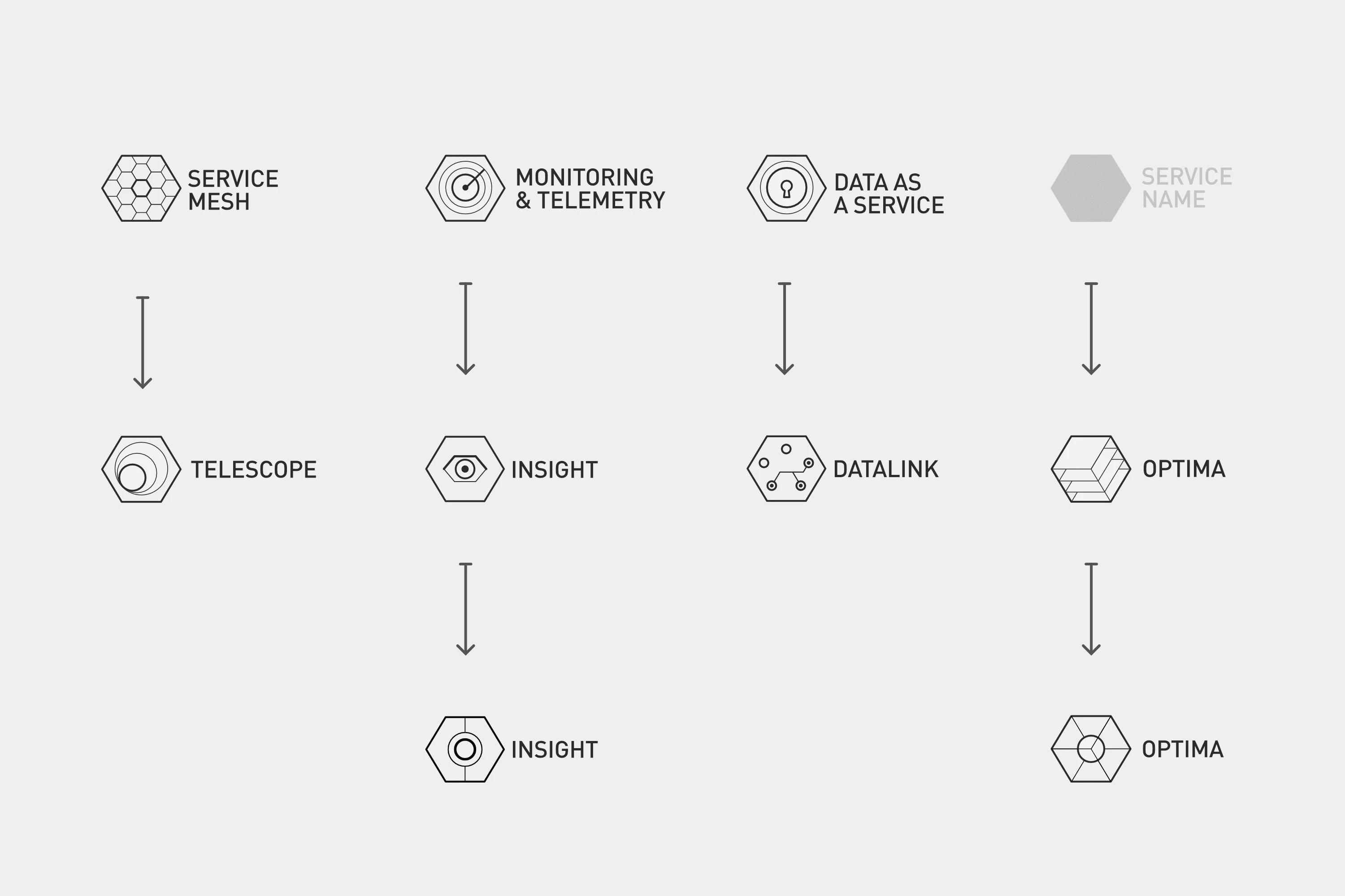
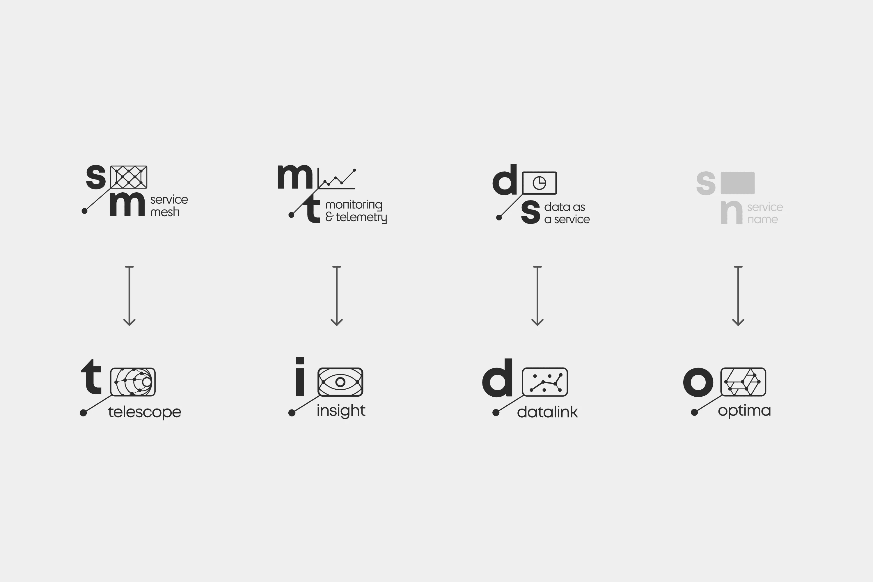
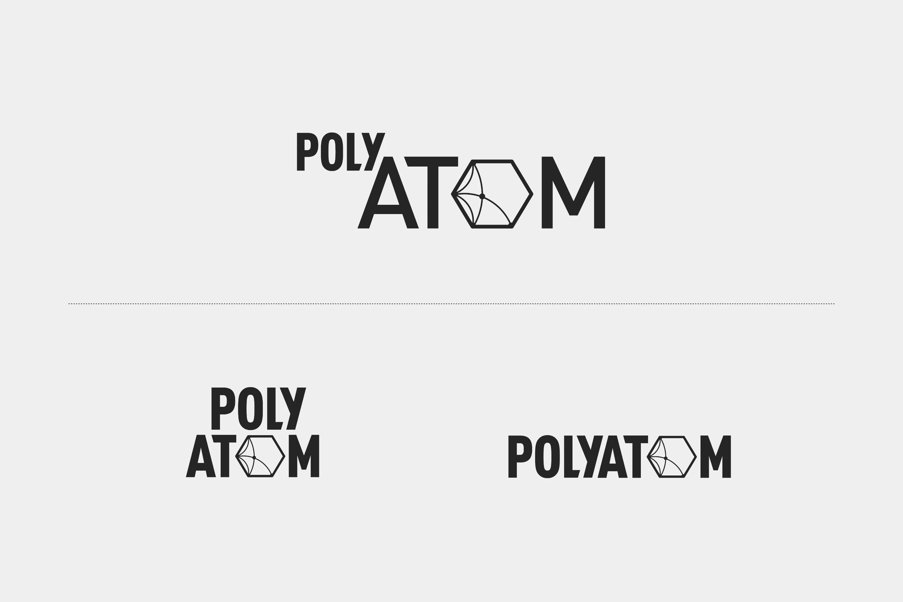
The client ultimately chose the first option. One more revision and we had our final logo set.
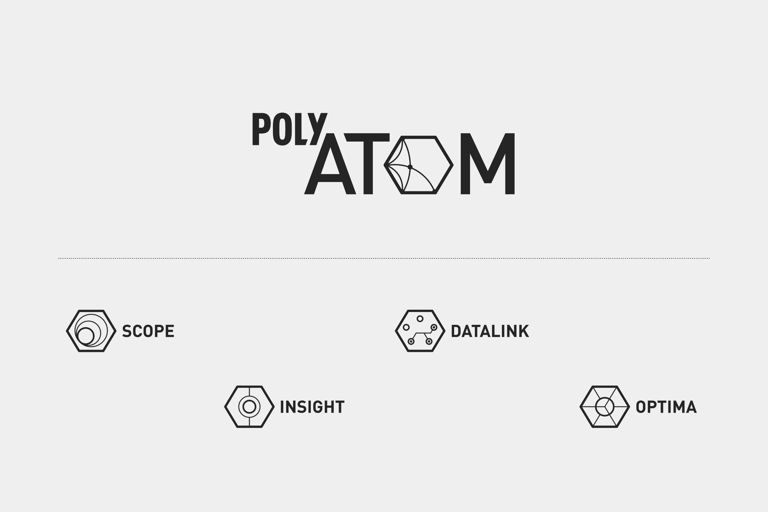
Though they originally liked the exponent concept they wanted to emphasize the ATOM part of PolyATOM as it was an acronym.
BRINGING IT TO LIFE
Color
After the initial round of colors were finalized, the client decided that they would like more flexibility should they decide to add products down the line.

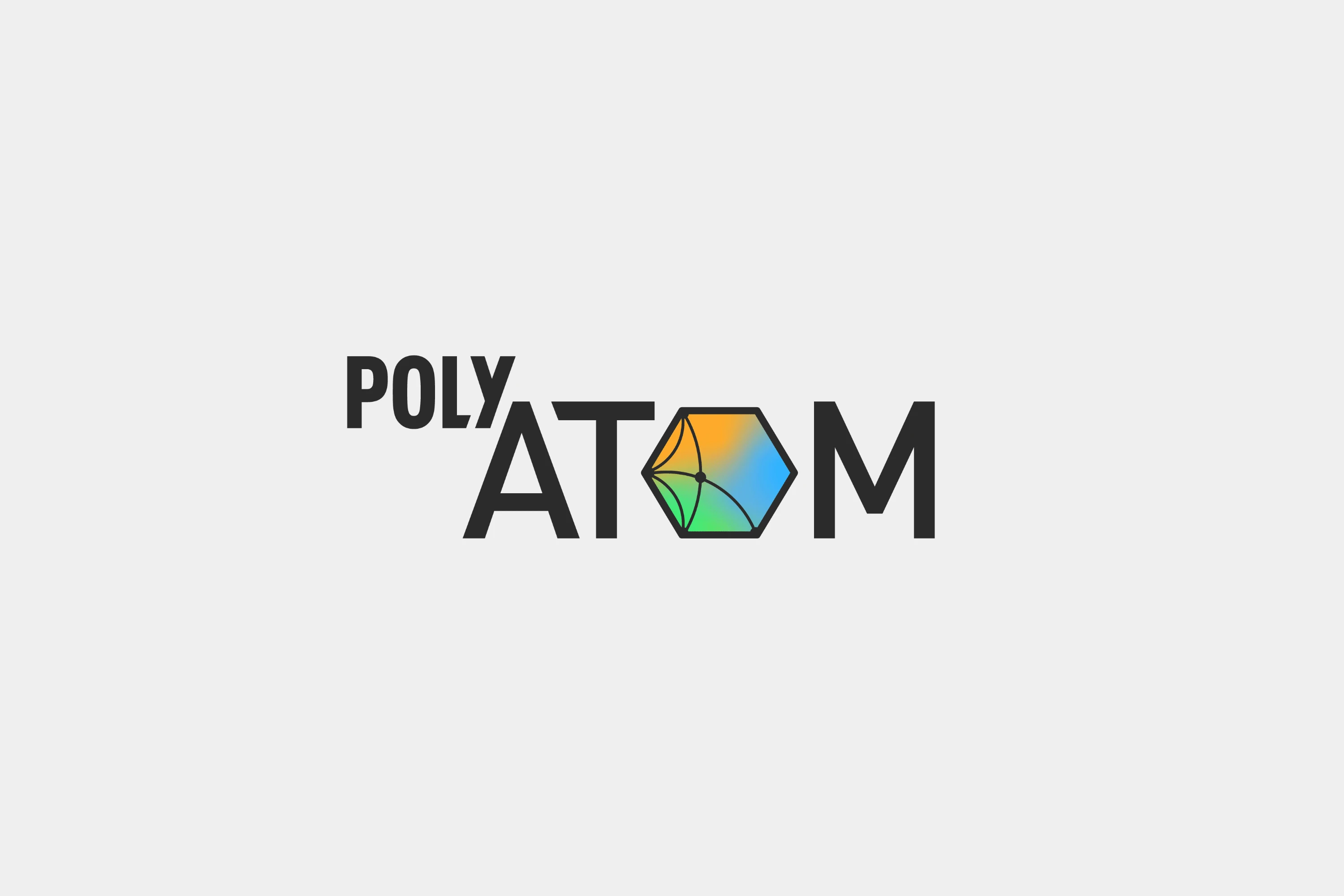
We came up with a mesh gradient. This gave them flexibility as they could pull from any color within the gradient.

Typography
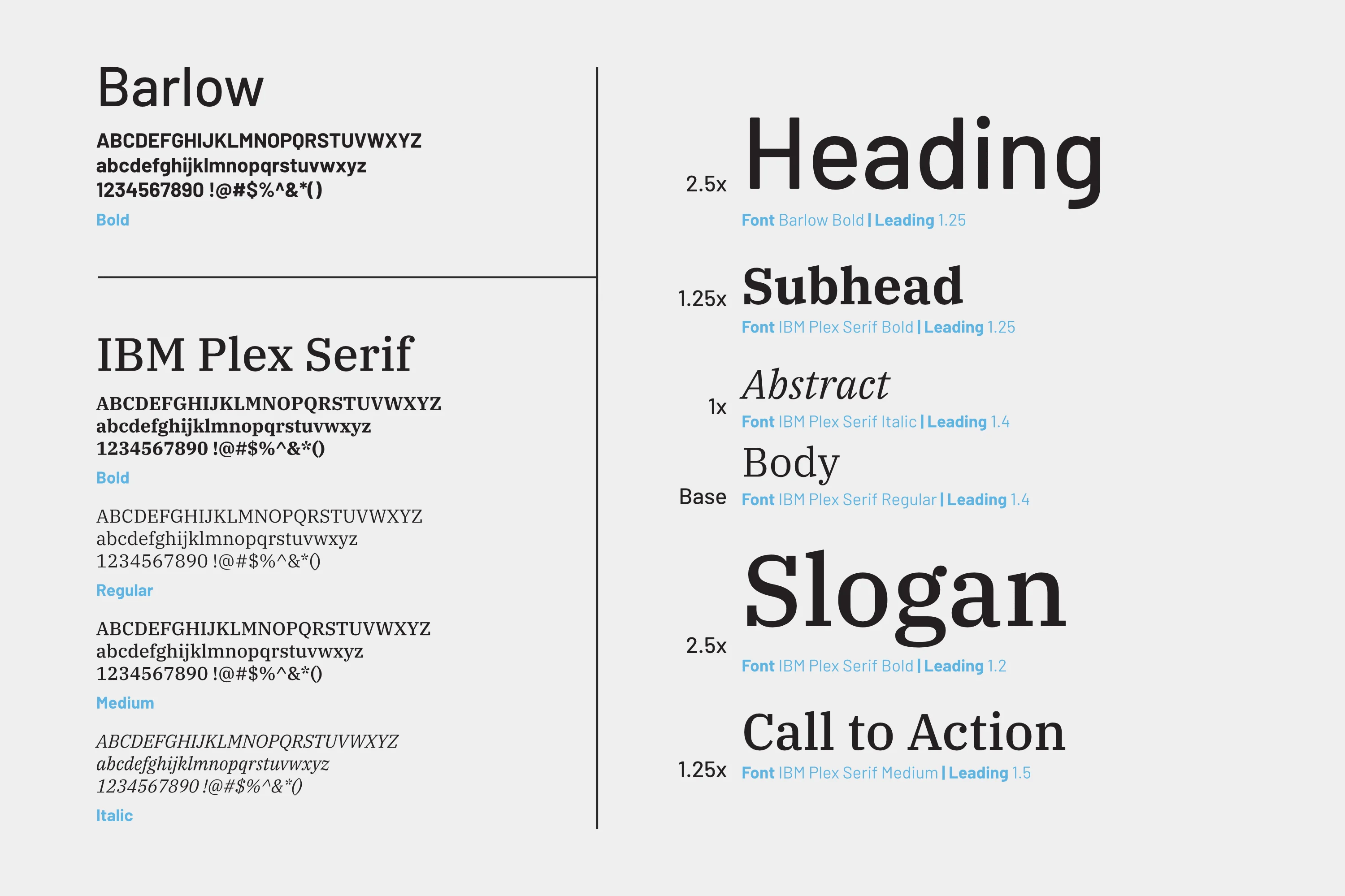
We chose open fonts Barlow for displays and headings, as it was clean and utilitarian. IBM Plex Serif as it provided contrast, and is readable at small sizes.
EXPANDING THE NODES
One-Pager & Pitch Deck
One-pagers and a pitch deck were created for product marketing. It allowed the client to be concise about their product to potential customers, and it allowed me to stress test the brand being built.


Templates
Marketing email templates, and letterheads were created for easy access in the future.


Style Guide
The brand was documented for quick reference when needed.

LAUNCHING THE PRODUCT
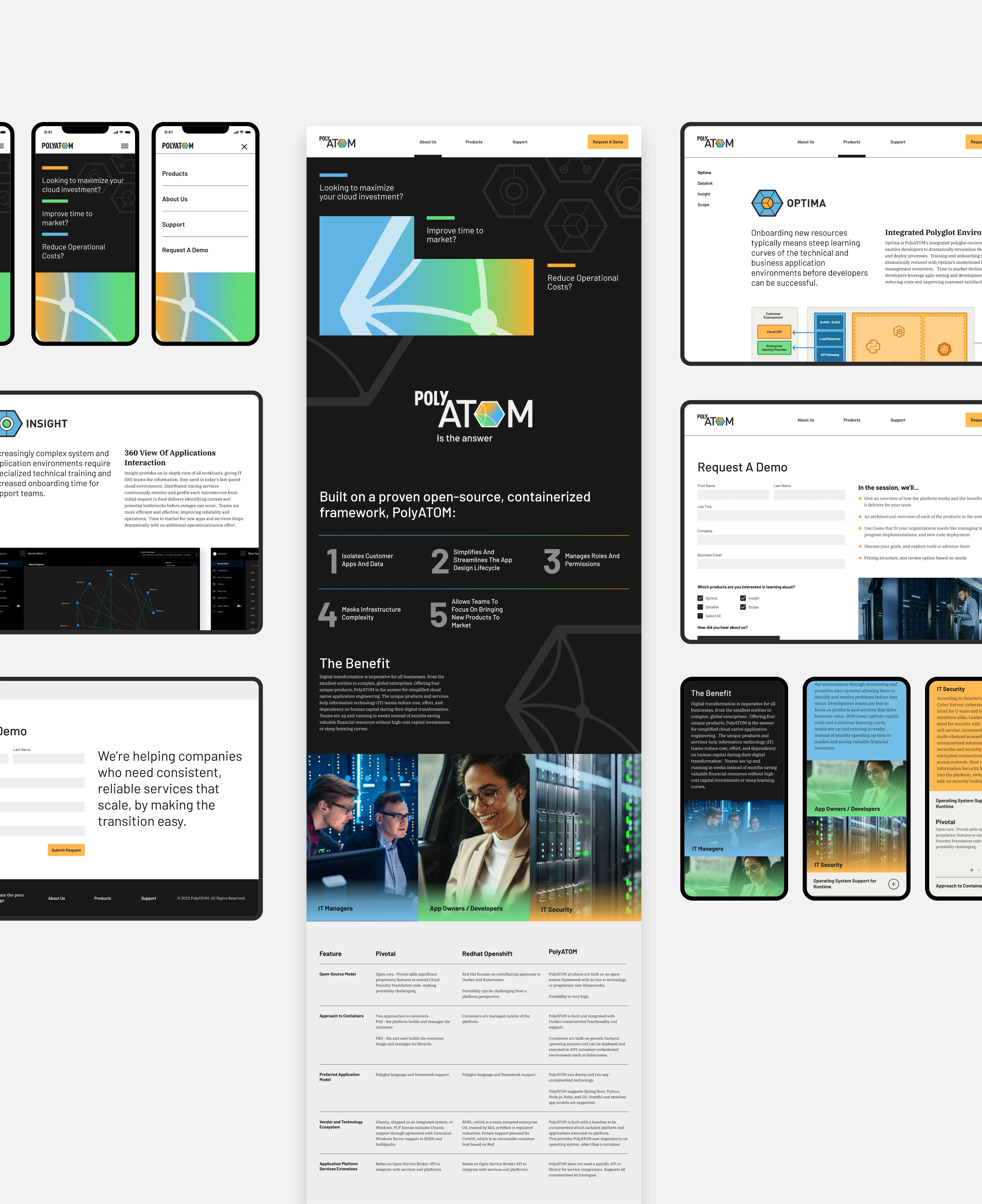
We created a website introducing potential customers to the product, detailing the services, and giving them an easy way to request a demo to the platform.


Like this project
Posted Aug 15, 2023
Developed brand identity and website for PolyATOM, a kubernetes-based language agnostic cloud native platform for app development and deployment.
Likes
0
Views
16
Clients

Digital Management
American Tire Distributors


