
Make your brand standout


Make your brand standout


Product Design for Founders. From Zero to Launch.
- $10k+
- Earned
- 6x
- Hired
- 5.0
- Rating
- 842
- Followers
Product Design for Founders. From Zero to Launch.


Your go-to Strategic design partner and Webflow developer.
- $50k+
- Earned
- 6x
- Hired
- 5.0
- Rating
- 48
- Followers
Your go-to Strategic design partner and Webflow developer.


Original ideas. Designs that actually work.


Wanted to share some recent work this is Barista 010, a branding project for a coffee course made for home baristas.
Had a lot of fun diving into modern coffee shop aesthetics, playing with illustrations, and really trying to capture the right vibe!
You can check out the full project here (https://www.rubenvanas.nl/projects/barista-010)
36
90
937

I think working on my portfolio is the coolest thing ever because I can go as crazy as I want, who is there to stop me? 😅
It's been seven years since I first discovered Webflow and built my very first portfolio site. A few redesigns later, at the end of this summer, it felt like the time to push myself again and come up with something fresh.
This time I wanted to create something that doesn’t really follow the standard web design rules. I mixed GSAP with some custom code to build this grid-like setup, which functions as an online archive of everything I’m proud of, from paid projects to passion projects.
Check it out: https://www.rubenvanas.nl/
Would love to hear what you think!
92
175
1.5K

Last Friday, a friend from Lombok asked if I could help him create a website for booking local tours on the island.
Even though the deadline was coming up, I couldn’t pass up this opportunity.
I loved the challenge to explore a new concept and create something that truly stands out in both look and feel.
After a very intense weekend, I’m proud to share the result with you all and I’d love to hear your feedback!
👉 Lombok Local Tours (https://lombok-local-tours.webflow.io/#GuidesSection)
66
123
2K

UX/CX/Digital Designer & Strategic Advisor


Webflow Developer & Web Designer


Webflow Developer & Web Designer
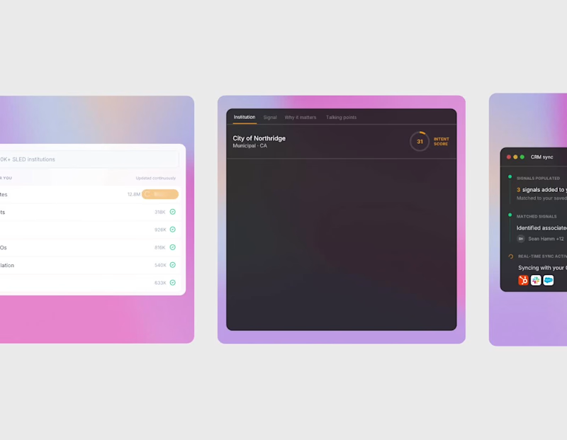


I build Framer sites for people who care about design.


I build Framer sites for people who care about design.


Brands built from idea to launch, with brains & personality.

Brands built from idea to launch, with brains & personality.

Part 2 of REFORMR expands the concept further into physical and digital applications; exploring how the identity moves across space, interaction, and membership experiences.
This phase focuses on building a more connected brand system through:
• app and booking flow concepts
• membership and access design
• environmental and spatial visuals
• campaign-style compositions
• tactile print explorations
The direction continues to balance structure and softness through a restrained palette, bold typography, and calm interface design; creating a system that feels both functional and atmospheric.
Full case study coming soon ✦
7
29
1K

REFORMR is a reformer pilates studio concept built around structure, control, and intentional movement.
The direction combines softened athletic energy with a more refined and atmospheric visual identity system; balancing performance with restraint across both physical and digital touchpoints.
For this first presentation, I explored:
• identity direction
• visual language
• tactile brand elements
• digital applications
• spatial and editorial-inspired compositions
Built to feel calm, recognizable, and structured without losing warmth.
Part 2 + full case study coming soon ✦
4
10
640
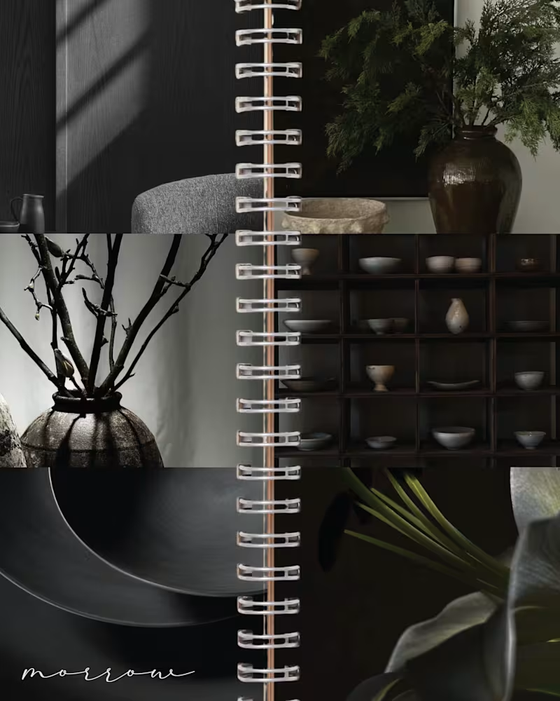
MORROW | Brand Identity & Art Direction
MORROW is a self-directed homeware brand concept built around a slower approach to living. Thoughtful objects, natural materials and a sense of permanence, brought together through a brand designed to feel as considered as the pieces it represents.
The visual direction combines deep greens, warm browns and soft ivory, balancing rustic character with understated luxury. The goal was to create an identity that feels collected rather than overly polished, with a quiet sense of permanence running through every detail.
From the visual identity to the overall art direction, I developed the branding from start to finish, building a cohesive visual world around the idea of slow-made living.
MORROW. Design made to stay.
47
109
4.3K
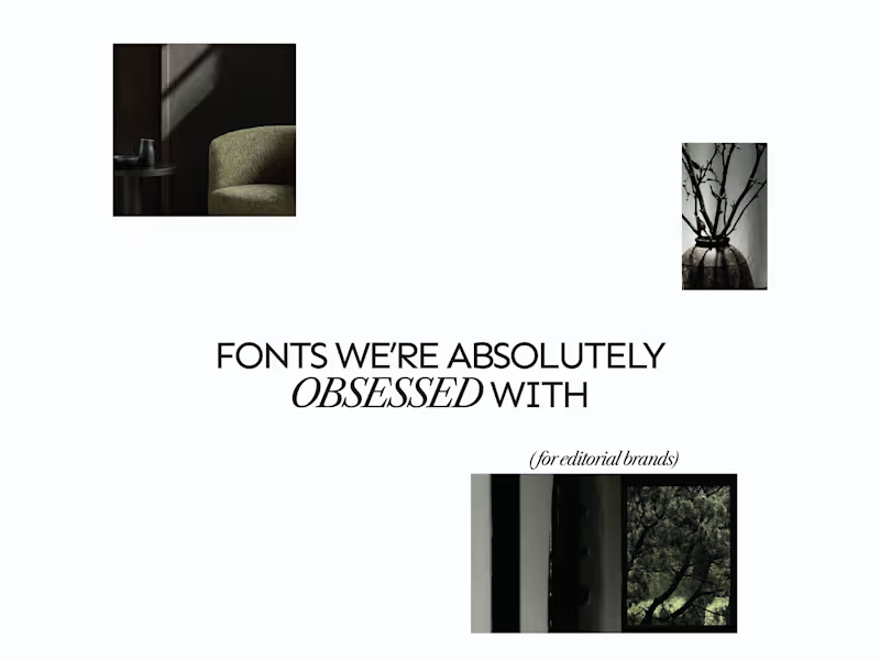
A few editorial typefaces we’re absolutely obsessed with right now.
These are some of the fonts we keep coming back to at Studio Mayze when we want a brand to feel considered, distinctive and a little more editorial without pushing the design too far.
Good type can do a lot of the heavy lifting. The right one can completely change how a brand feels before you’ve even added anything else.
Each slide shows the typeface in use at the top, with the font name underneath, so you can see how it could look in context rather than just as a specimen.
These are three of our favourites at the moment. Want to see the full selection? We’ve shared all of our favourites over on Instagram (https://www.instagram.com/p/Dewd73IkcWw/?img_index=1).
Which one would you pick? 👀
6
21
803