



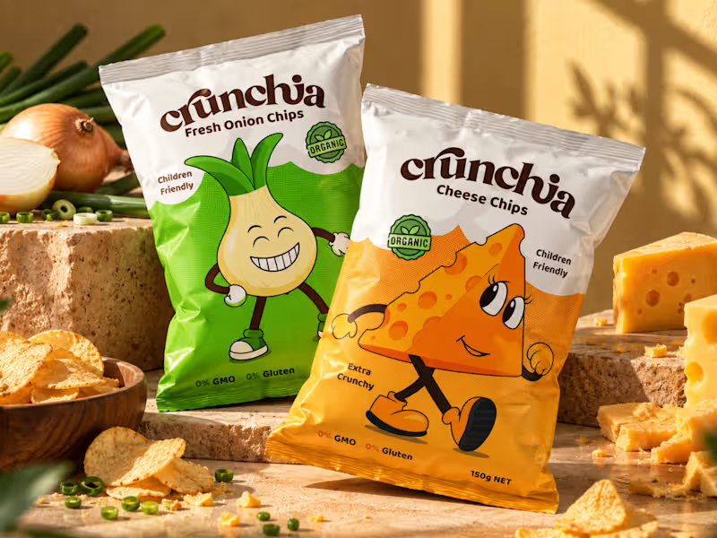
Crunchia – Brand Identity & Packaging Design
Developed a playful and eye-catching brand identity and packaging design for Crunchia, a tomato chips brand aimed at children and families. The project included a custom logo, vibrant packaging design, and a friendly tomato mascot to create a memorable and recognizable brand.
I also created realistic product mockups and lifestyle visuals to showcase the packaging and present the product in an engaging, market-ready way.
17
31
1.1K

Hello Contra 👋 - I spent the past year collaborating with Dynaplus, a fastener brand, to improve consistency, messaging and visual identity across their brand. The result is a wide range of print- and digital works!
To go into detail, the previous system relied on decorative elements that distracted from the information. We stripped those away and replaced them with brand photography, showing the product in use instead of scattering complex shapes around each design. This made it a far more coherent visual style!
Heading into 2026 we're working on redesigning all the packaging used for products which will lead to less plastic use and more sturdy packaging.
15
411

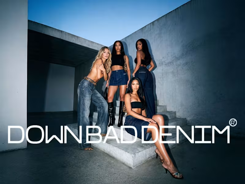
A full brand identity for Down Bad Denim Co., a premium small-batch denim label specialising in embroidery, rhinestone embellishments, and statement-making fashion.
The brief called for a visual identity that feels expressive, fashion-forward, and unmistakably premium — equally at home in a boutique window and on a social feed.
We built a complete brand system covering the logo suite, typography, color palette, packaging, and label design. Every decision was made to match the quality and boldness of the product itself.
8
25
919
