
Websites, Stores & Funnels | Framer, Shopify, Kajabi,Webflow


Websites, Stores & Funnels | Framer, Shopify, Kajabi,Webflow


Product & Visual Designer · Brand Identity · UI/UX
- 2x
- Hired
- 5.0
- Rating
- 67
- Followers
Product & Visual Designer · Brand Identity · UI/UX

Project title
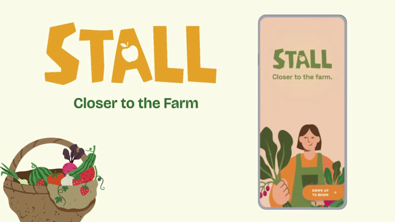
STALL — Your farmers market, alive.
A swipe-to-shop farmers market companion that connects local vendors with regulars before Saturday ever arrives.
The problem
Every Saturday, the same thing happens.
You show up to the farmers market at 10am. The ramp vendor you wanted is sold out by 9. You forgot cash. You walk past a honey stall three times because you can't remember if you already bought some. And that new mushroom farm you heard about? Gone before you spotted them.
On the vendor side, it's just as frustrating. Small farmers wake up at 4am, load the truck, drive an hour, and have no lightweight way to tell their regulars — the people who actually want what they grow — "I have asparagus this Saturday. Come find me."
STALL fixes both sides of that problem.
What STALL does
STALL is a two-sided farmers market app built around one weekly ritual: Saturday morning.
For shoppers:
Follow vendors at your local market
Swipe through a weekly produce deck — right to add to your list, left to skip — exactly like Bumble, but for ramps and sourdough
Get a Friday evening digest: what your vendors have this week, your auto-built shopping list, and where each stall is on the map
Pre-reserve high-demand seasonal items before you leave the house
Discover first-of-season arrivals with a "what's new this week" spotlight
For vendors:
Post a weekly inventory update in 3 taps — what you're bringing, quantities, price
Reach your regulars directly before market day
Manage pre-reservations without a complicated system
The app celebrates the seasonal nature of farmers markets — ramps in April, strawberries in June, squash in October. Every week feels like something worth showing up for.
How I built this with Google Stitch
STALL was designed and prototyped entirely using Google Stitch as the primary build tool, with Figma used only for initial wireframing.
The workflow:
Day 1 — Brand and wireframes
I started by defining the brand: the name, palette (Pumpkin Spice Forest — a warm amber, fern green, mauve, and cream system), and illustration direction. I wireframed the three core flows — swipe deck, Friday digest, and vendor post — before touching Stitch.
Day 2 — Into Stitch
I imported my Figma file directly into Stitch using the .fig import feature. From there I used streaming generation to build each screen live on the canvas — watching the splash screen, onboarding flow, and homepage assemble in real time was genuinely remarkable. The HTML-native canvas meant every animation I added — card tilt on swipe, drawer slide-up, bento tile stagger — rendered exactly as it would in production.
Key Stitch prompts used:
"Add a swipe gesture to the produce card stack — right swipe shows a green Added overlay with 5° card tilt, left swipe shows a mauve Skipped overlay with -5° tilt"
"Make the shopping list items stream in one by one with 120ms stagger on page load"
"Add a bottom drawer that slides up from the vendor card with spring easing — show the farm bio, full inventory list, and two action buttons"
"Build the Friday digest screen — vendor items animate in sequentially, the seasonal spotlight card pulses gently"
"Export web assets and deploy to Netlify"
In-place edits I used:
Swapped the swipe overlay color from red to mauve to match brand
Adjusted the bento grid gap from 8px to 6px after seeing it render on canvas
Changed the CTA button from outlined to filled after in-place visual comparison
Rewrote the seasonal spotlight copy directly on the canvas without regenerating
What Stitch made possible that nothing else could:
The swipe gesture interaction, the drawer spring animation, and the staggered list streaming — all three of these would have taken days to hand-code. In Stitch, they were prompt-driven and live on the canvas within minutes. The gap between "designed" and "interactive prototype" collapsed entirely.
Screens delivered
Splash screen — farmer illustration, full-bleed cream background
Onboarding screen 1 — market basket illustration, "Your market, every Saturday"
Onboarding screen 2 — swipe mechanic explainer with card UI
Onboarding screen 3 — Friday digest bento preview
Homepage — bento grid with market header, seasonal spotlight, list, map preview, swipe deck, streak tracker
Swipe deck — card front, vendor expand drawer, swipe right (added), swipe left (skipped)
Friday digest — streaming vendor list, seasonal spotlight, auto-built shopping list
Market day map — vendor stall grid, spot numbers, live confirmation states
Vendor post flow — 3-tap inventory update screen
Design decisions worth noting
The swipe mechanic — Borrowing the Bumble swipe pattern for produce discovery was the conceptual breakthrough. It transforms a passive browse into an active, satisfying decision. Every right swipe builds your list. Every left swipe still shows you where the vendor is on the market map — skipping is never permanent.
The Friday digest as the hero feature — Most apps make you come to them. The Friday evening push notification with a personalised market brief is the one moment where STALL comes to you. It changes Saturday morning from reactive to intentional.
Bento homepage — Instead of a scrolling feed, the homepage gives you everything at a glance: your market, your list, the seasonal moment, your vendors. Seven tiles, seven pieces of information, zero scrolling.
The color system — Pumpkin (#E8872A), Fern (#728040), Mauve (#B07090), Cream (#FDFAF6), and Moss (#4A5228). Every color has one job. Pumpkin is interactive. Fern is seasonal and confirmed. Mauve is reserved and streaks. Cream is every surface. Nothing competes.
What I learned
Stitch genuinely changes the prototyping workflow. The moment I stopped thinking of it as a design tool and started thinking of it as a build tool — one where the canvas is the product, not a picture of the product — everything accelerated. The in-place edit feature is the one I'll keep coming back to: being able to change a color, rewrite copy, or swap a component without regenerating the whole screen is the difference between iteration and rework.
STALL started as a hackathon idea. After building it in Stitch, it feels like something real.
Live Prototype: https://stitch.withgoogle.com/preview/8229547464152593644?node-id=e53124995cda49808685283be978dc8c
50
44
997


Crafting compelling stories, frame by frame. Video Editor.
Crafting compelling stories, frame by frame. Video Editor.

We documented an intimate ceremony at San Francisco City Hall, followed by a private reception.
Our team consisted of two cinematographers and one photographer, providing full coverage without disrupting the day's flow. One cinematographer focused on stabilized wide frames and architectural movement, while the second captured close-ups, vows, and guest reactions. Our photographer worked alongside us to maintain a cohesive visual story across film and photo.
Audio for vows and speeches was captured live. We relied primarily on natural light and intentional positioning within the space.
Final deliverables included a cinematic highlight film, full ceremony edit, and vertical social cut.
0
102


ARKYVS produced one of the recap films for the SF Coffee Festival, a high-traffic consumer event featuring roasters, sponsors, live demos, and stage programming.
The goal was to create a sponsor-ready recap that captured the scale and energy of the festival while clearly highlighting brand participation and attendee engagement.
Our team executed multi-camera coverage across the venue, capturing vendor activations, product details, crowd reactions, and key programming. Stabilized movement shots navigated dense foot traffic, while telephoto coverage isolated meaningful brand interactions. Ambient audio was recorded to support immersion in post.
In post-production, we built a rhythm-driven edit balancing scale with clarity. Deliverables included the primary recap film and short-form cuts for digital marketing and sponsor reporting.
0
82


Virtual Assistant | Admin Support & Canva Design Specialist
Virtual Assistant | Admin Support & Canva Design Specialist


View more →

Versatile Content Creator: Video, Photo & Social Media
Versatile Content Creator: Video, Photo & Social Media


Multimedia Designer. Unique blend of expertise.
Multimedia Designer. Unique blend of expertise.


Freelance Travel Photographer & Content Creator
Freelance Travel Photographer & Content Creator

I created high quality, ad-ready content on location in Bali for American Tourister to promote their new product line. I worked with the brand from creative brief to final content handover to ensure all deliverables were met.
1
79

Shot, styled, and edited a campaign for Botanical H2O's new jewelry collection, a sustainable Australian brand. I produced the shoot remotely from Bali, ensuring all campaign objectives were met.
0
88

Shot, produced, and styled a campaign for an Australian jewelry brand, Botanical H2O on location in Bali. I worked with the brand from brief to final content handover, insuring that all campaign objectives were met.
0
106

I collaborated with a media team to produce photo + video content for The Sanubari Resort in Sumba, Indonesia. My roles spanned across photographer, creative director, model, and editor. The final visuals were to be used for both social media and website to showcase the hotel ammenities and unique activities.
0
119

Video Editor and Animator
Video Editor and Animator


