Freelance Brand Designers in Masovian Voivodeship
Sign Up
Post a job
Sign Up
Log In
Filters
2
Projects
People
Adrian Kuleszo
pro
Warsaw, Poland
Premium design to grow your business - DesignMe
$10k+
Earned
5x
Hired
5.0
Rating
242
Followers
Top
expert
+2
Follow
Message
Premium design to grow your business - DesignMe
6
Datawizz.ai branding exploration ✨
6
1.1K
3
Droxy.ai: Reinvented with a bold brand and dynamic web presence
3
191
9
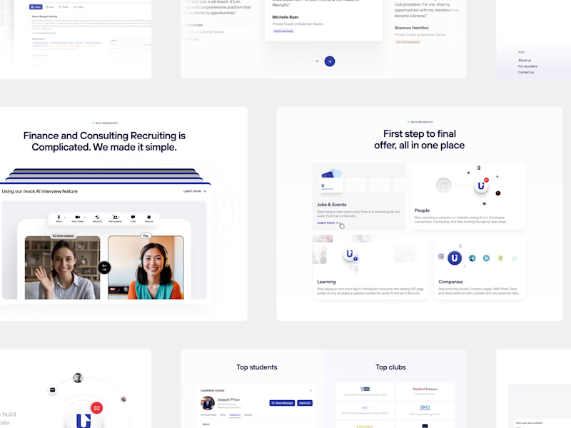
Road to $3.2M: RecruitU’s refreshed brand in 6 weeks
9
232
10
TravelWith - Onboarding
10
963
Brand Designer
(3)
Follow
Message
Daniella
pro
Warsaw, Poland
crafting engaging designs that speak human 🇺🇦
$10k+
Earned
3x
Hired
5.0
Rating
576
Followers
Top
expert
+1
Follow
Message
crafting engaging designs that speak human 🇺🇦
40
This project didn’t see the light of day, but I think it turned out really great 🥹
1
40
2.9K
2
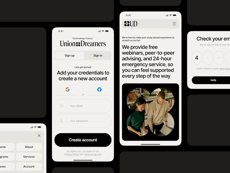
Union Dreamers: mobile page, brand identity
2
61
38
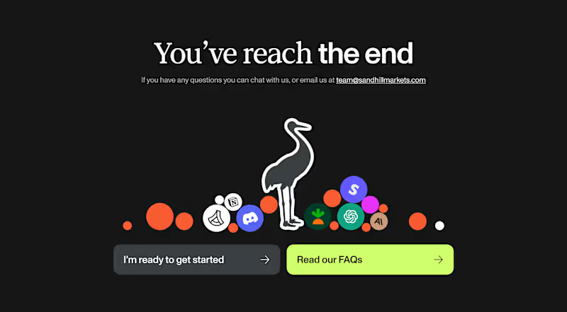
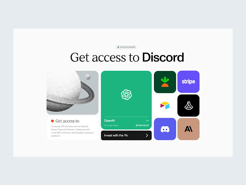
Next piece from this project: Sandhill, CTA section, an archive some of you liked
38
2.8K
47
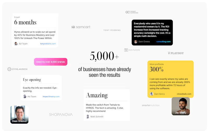
Testimonials section, ui design.
1
47
2.9K
Brand Designer
(2)
Follow
Message
Yunis Mikayilov
pro
Warsaw, Poland
Launch Videos for funded AI Startups | Motion Design
$50k+
Earned
10x
Hired
5.0
Rating
230
Followers
expert
Hired
Follow
Message
Launch Videos for funded AI Startups | Motion Design
3
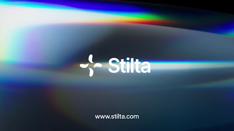
⭐ A shot from the launch video for Stilta. Agentic AI for patent litigation - raised $10.5M seed, a16z + YC.
3
484
2
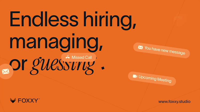
FOXXY | 2D Demo Film
2
211
3
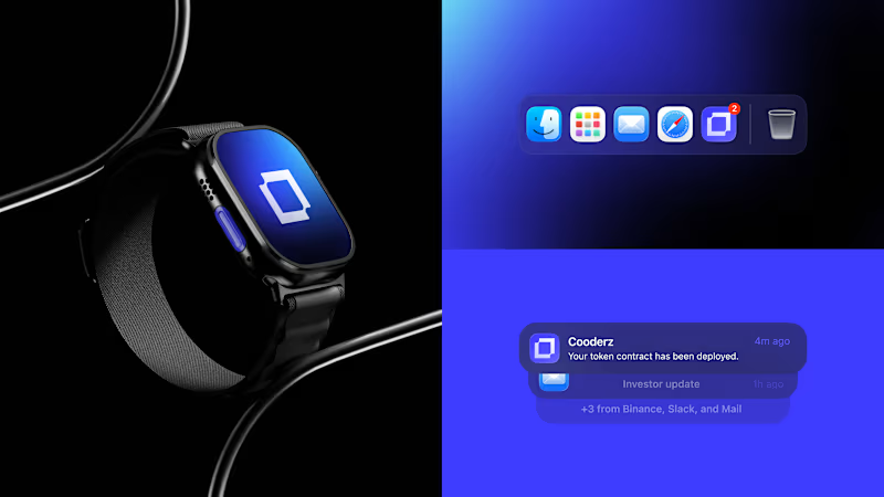
Cooderz — Branding
3
37
4
Vibecoder — Branding & Launch Video | Motion Design
4
117
Brand Designer
(6)
Follow
Message
Kris Anfalova
pro
Warsaw, Poland
Premium UI/UX & Web Design for Fintech, SaaS & Web3 | Framer
$10k+
Earned
1x
Hired
5.0
Rating
319
Followers
expert
expert
+1
Follow
Message
Premium UI/UX & Web Design for Fintech, SaaS & Web3 | Framer

30
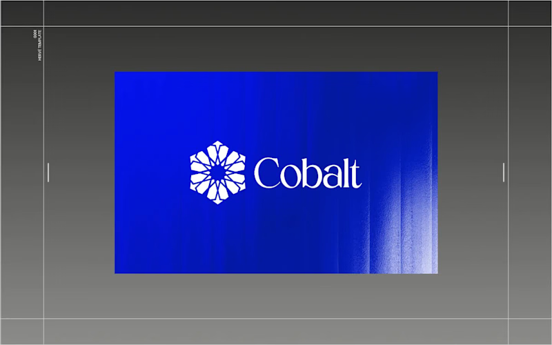
Architect of Chaos: Branding Cobalt Analytics for the Envato Challenge AI has completely changed the creative landscape, but it hasn’t changed what makes a digital product functional. For the Envato Challenge, I set out to design the brand identity and UI concept for a B2B SaaS platform, Cobalt Analytics. The goal was to show the crucial difference between machine generation and human curation. The Insight: The Azulejo Metaphor Data analytics is often visually represented by clichéd glowing nodes and neon webs. I wanted a metaphor with history. I turned to Azulejo — traditional Portuguese ceramic tiles. Historically, the art of Azulejo was about taking thousands of fragmented, independent tiles and assembling them into one grand, coherent narrative. This is exactly what a predictive data platform does: it turns chaotic metrics into a clear system. The Process: AI as the Miner, Human as the Filter I started by feeding AI historical references of Azulejo tiles. The result? Absolutely stunning, yet completely unusable visual noise. AI generated beautiful chaos, but as a designer, I know that algorithms don't understand scalability, negative space, or modular grids. The Extraction: I rejected 95% of the AI generations, extracting just one perfect geometric silhouette hidden in the noise. The Clean-Up: I moved to Envato Elements to source mathematically perfect vector shapes and rebuilt the AI's concept into a clean, scalable brand mark. The System (Figma): I established a strict modular Bento-grid, paired the complex geometry with a brutalist sans-serif typography, and built out the core UI dashboard widgets in Figma. The Execution (Zero Photoshop): To bring the brand into the real world, I utilized Envato’s native mockup generator. I applied my designs directly to premium physical and digital mockups right inside Envato's browser tool—no Photoshop required. A completely streamlined, modern workflow. The Result: Cobalt Analytics. A brand identity that is mathematically precise, highly scalable, and ready for development. AI generated the noise, but human judgment built the system. And for the brave souls, here is the link to the full Figma file. Fair warning: it’s a typical creative mess inside, you know how it is 😅 https://www.figma.com/design/5Du5Sjr7jCCZYNgH5Y9QtB/Envato-Challenge?node-id=17-2181&t=vap8tOu6fACNieNW-1
12
30
7.8K
2
Moola Landing Page, Branding and app design
2
20
2
Premium Brand Identity for Lemma
2
26
2
Clark Baldwin Travel Website Redesign
2
7
Brand Designer
(3)
Follow
Message
Anastasiia Barbashyna
pro
Warsaw, Poland
Designer for your SaaS, app, deck and brand.
$5k+
Earned
2x
Hired
5.0
Rating
57
Followers
Expert
Follow
Message
Designer for your SaaS, app, deck and brand.
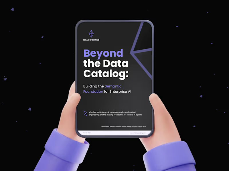
4
Whitepaper Design
4
11
2
Squared Marketing: Rebrand and Evolve
2
14
2
From Blank Page to Brand Presence: Seha Consulting
2
17
2
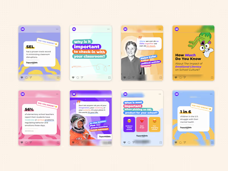
Scalable Brand Design System: SuperNoodle
2
19
Brand Designer
(4)
Follow
Message
Klym Yevtushenko
pro
Warsaw, Poland
SaaS Product Designer | UI/UX, Webflow & B2B Websites
$1k+
Earned
3x
Hired
5.0
Rating
298
Followers
Follow
Message
SaaS Product Designer | UI/UX, Webflow & B2B Websites
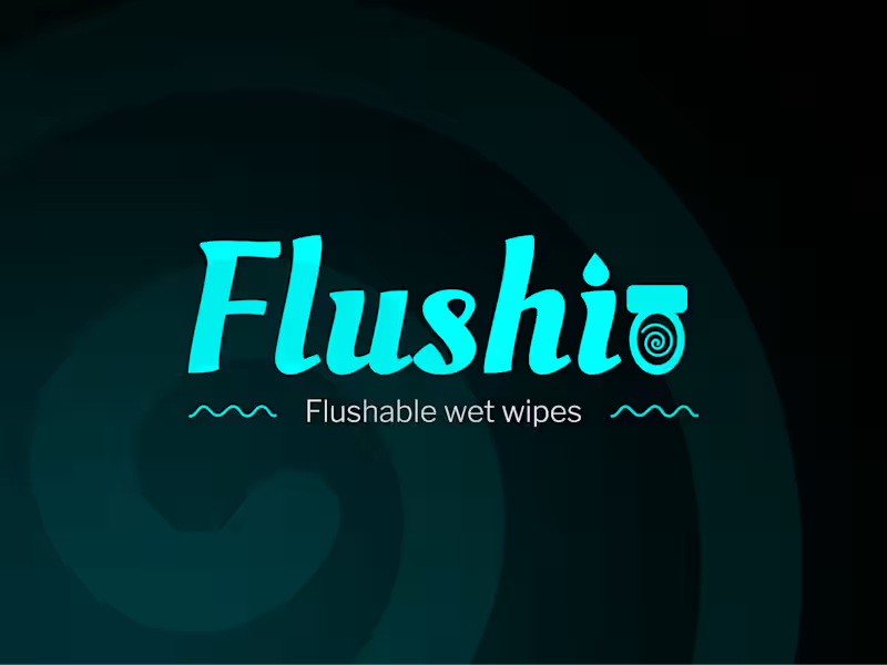
11
Flushi — Brand Identity for a Personal Care Product 💧✨ Flushi is a bold visual identity created for a flushable wet wipes brand that needed to feel clean, modern, and easy to remember. The direction combines expressive typography, a bright aqua color palette, and custom graphic elements inspired by water and motion. The goal was to create a brand that feels fresh and approachable while still looking distinctive across packaging, digital platforms, and promotional materials. Special attention was given to: • a custom wordmark with playful lettering and a built-in product symbol; • a clear visual system for light and dark backgrounds; • a fresh aqua-and-black color palette that reinforces cleanliness and recognition 🎨; • supporting patterns and graphic elements inspired by water flow; • brand guidelines that keep the identity consistent across different applications; • flexible logo versions prepared for packaging, print, social media, and digital use. The result is a memorable and scalable brand identity that helps Flushi stand out in the personal care market while keeping the product message simple, fresh, and recognizable 🚿 Looking to build a distinctive identity for your personal care, wellness, household, or consumer product? Let’s create a brand people remember 💙
11
574
16
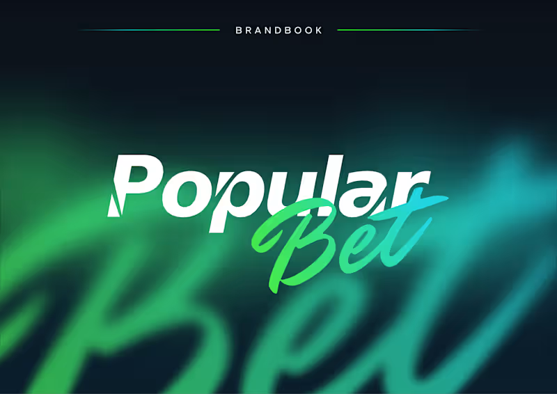
Popular Bet — Bold Brand Identity for an iGaming Platform 🎯⚡ Popular Bet is a dynamic brand identity concept created for a modern betting and entertainment platform built around speed, energy, and instant recognition. The visual direction combines sharp typography, expressive script lettering, and a vivid green-to-cyan gradient to create a brand that feels competitive, digital-first, and highly memorable. The identity was designed to stand out across fast-moving environments while remaining clear and consistent across different formats. Special attention was given to: • a distinctive wordmark combining bold sans-serif typography with expressive handwritten lettering; • a vibrant gradient palette that communicates energy, motion, and digital innovation 🎨; • flexible logo versions for light, dark, monochrome, and complex backgrounds; • clear-space and usage guidelines that protect readability and visual consistency; • a scalable identity system suitable for digital platforms, social media, campaigns, and promotional materials; • a high-impact visual language inspired by competition, momentum, and modern entertainment. The result is a confident and adaptable brand system that helps Popular Bet feel recognizable, energetic, and ready to compete in a crowded digital market 🚀 Looking to build a bold identity for your iGaming, entertainment, sports, or digital platform? Let’s create a brand people remember ✨
1
16
764
19
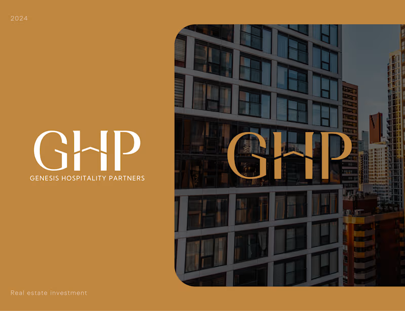
Genesis Hospitality Partners — Luxury Real Estate Brand Identity 🏙️✨ We designed a premium visual identity for Genesis Hospitality Partners 🏢 — a real estate investment brand focused on creating trust, sophistication, and long-term value perception from the very first interaction. The challenge was to develop a brand system that feels timeless and refined while standing confidently within the highly competitive real estate and hospitality investment space. Through elegant typography, architectural references, and a restrained premium palette, we created an identity that communicates stability, credibility, and ambition. Special attention was given to: • a distinctive monogram logo inspired by architectural forms and premium property aesthetics; • elegant typography designed to balance luxury positioning with corporate professionalism; • a sophisticated color palette combining warm gold tones with deep neutrals to reinforce exclusivity and trust; • scalable branding assets optimized for presentations, investment materials, digital platforms, and print applications; • visual language inspired by modern urban architecture and high-end hospitality developments; • a timeless identity system built to support long-term brand growth and market recognition. The result is a refined brand experience that helps communicate confidence, premium positioning, and investment credibility — creating a strong foundation for future growth in the hospitality and real estate sectors. Looking to create a premium brand identity for your real estate, investment, hospitality, or professional services business? Let's build something memorable together 🤝
1
19
750
33
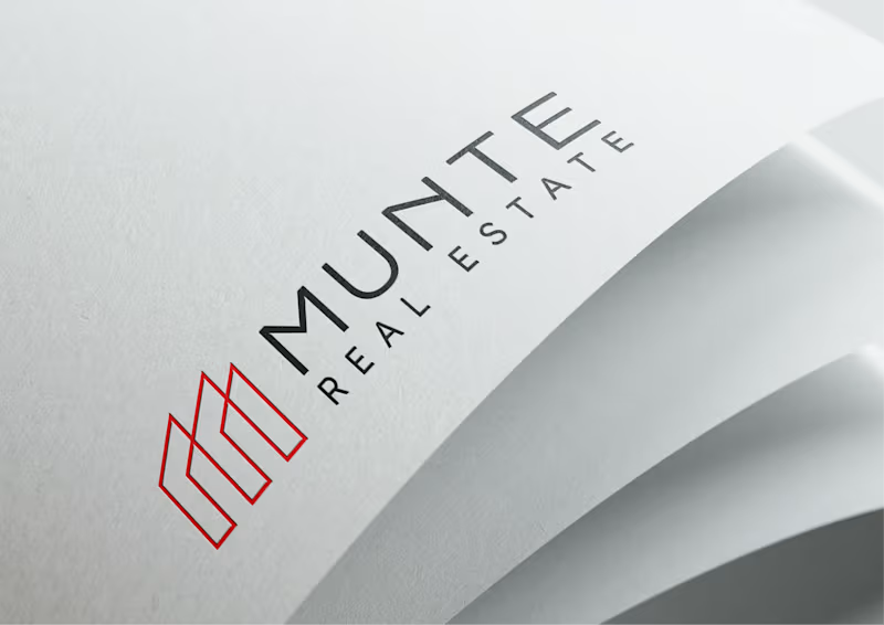
Munte Real Estate — Logo & Brand Identity Design We designed a clean and modern logo identity for Munte Real Estate, a property-focused brand that needed to feel professional, structured, and easy to recognize. The goal was to create a visual mark that reflects: 🏢 real estate and architecture 🤝 stability and trust ❤️ modern premium positioning 🧩 clear brand recognition across digital and print materials The logo combines a minimal geometric symbol with clean typography, creating a strong and flexible identity system for real estate communication. What we designed: ✔️ Logo concept ✔️ Brand mark ✔️ Typography direction ✔️ Color system ✔️ Logo variations ✔️ Real-world brand mockups Result: A simple but memorable real estate identity that feels professional, scalable, and ready to use across websites, presentations, documents, signage, and marketing materials. Looking to build a clear and trustworthy brand identity for your real estate or B2B company? Let’s create something strategic and memorable 🚀
9
33
1.4K
Brand Designer
(8)
Follow
Message
Paweł Wypych
pro
Warsaw, Poland
Web experiences for founders. Felt, not just seen.
$1k+
Earned
1x
Hired
5.0
Rating
169
Followers
expert
Follow
Message
Web experiences for founders. Felt, not just seen.
9
OrdoStrategica / Visual id • Web Design • No-code Dev
9
94
6
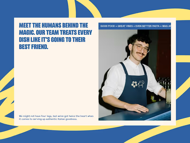
TUTTO PASTA / Visual id • Web Design • No-code Dev
6
37
20
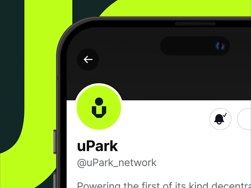
uPark / Visual id • Web Design • Animation
20
231
35
I had the privilege of collaborating with the team at northstar.cx (http://northstar.cx), who crafted the beautiful brand identity for Alokai (formerly Vue Storefront). Based on their exceptional work, I was invited to create this brand showreel introduction that brings visual identity to life.
35
2.1K
Brand Designer
(3)
Follow
Message
Dima Strizhak
pro
Warsaw, Poland
Webflow/Framer Expert & UX/UI Designer
$1k+
Earned
2x
Hired
3.5
Rating
62
Followers
Follow
Message
Webflow/Framer Expert & UX/UI Designer
2
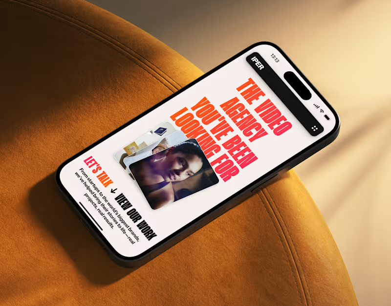
IPER - Website Design
2
16
1
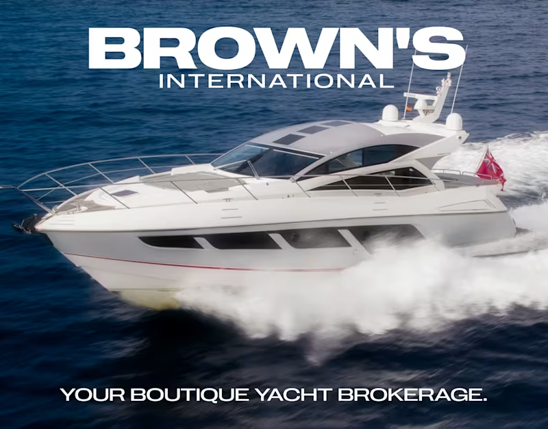
Brown's International Yachts: Branding & Website
1
9
3
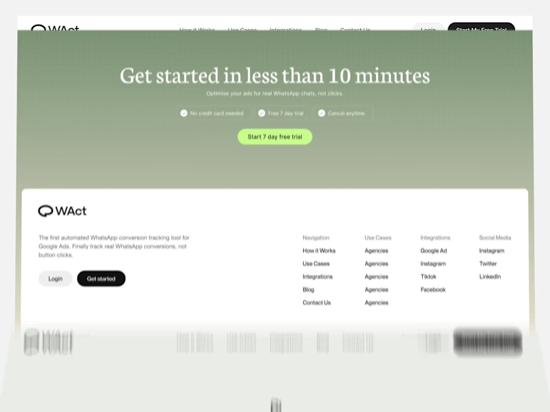
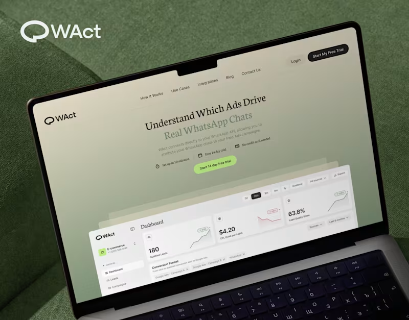
A quick look through the landing page layout for WAct 👀 🔗 Explore the full case study on Behance: WAct on Behance (https://www.behance.net/gallery/253815513/WACT)I believe most founders know the frustration of running paid ads that bring plenty of clicks, but zero qualified leads. The WAct team needed more than just a visually appealing layout, they needed a site that immediately explains how their platform connects ad spend to actual WhatsApp conversations. What I focused on here: Clear hero section: Addresses the pain point right away by showing how ad budget converts directly into real customer chats. Logical flow: Guides the reader step-by-step from the main problem to key analytics, integrations, and the contact form without any fluff. Approachable visual style: Combines warm editorial tones and sharp typography so complex B2B data feels straightforward and easy to digest. For me, combining UI architecture with clean technical implementation is what transforms a site from a static showcase into a high-converting product tool. I'm currently open to new project opportunities and collaborations. DM me if you have a project in mind!
3
145
22
When designing WAct, the main challenge was to make complex analytics feel calm, approachable, and actionable. Marketing tech platforms often suffer from visual noise: endless charts, aggressive contrast, and buried data. For WAct, I took an editorial SaaS approach: Visual Hierarchy: Kept the primary metric cards (CPL, Lead Quality Score) instantly readable at a glance. Warm Aesthetic: Used a soft, olive-green gradient backdrop paired with editorial typography to make the brand stand out from generic blue dashboard templates. Dashboard Logic: Structured the flow so users can track multi-channel ad conversions straight into WhatsApp chats without getting overwhelmed. Building a complex B2B platform or analytics tool? Let’s connect and create a seamless UI/UX for your product. 🔗 Explore the full case study on Behance: Check out WAct on Behance (https://www.behance.net/gallery/253815513/WACT)
7
22
550
Brand Designer
(2)
Follow
Message
Explore people