Hint: brand, mascot & app for an AI travel guide

Adrian Kuleszo


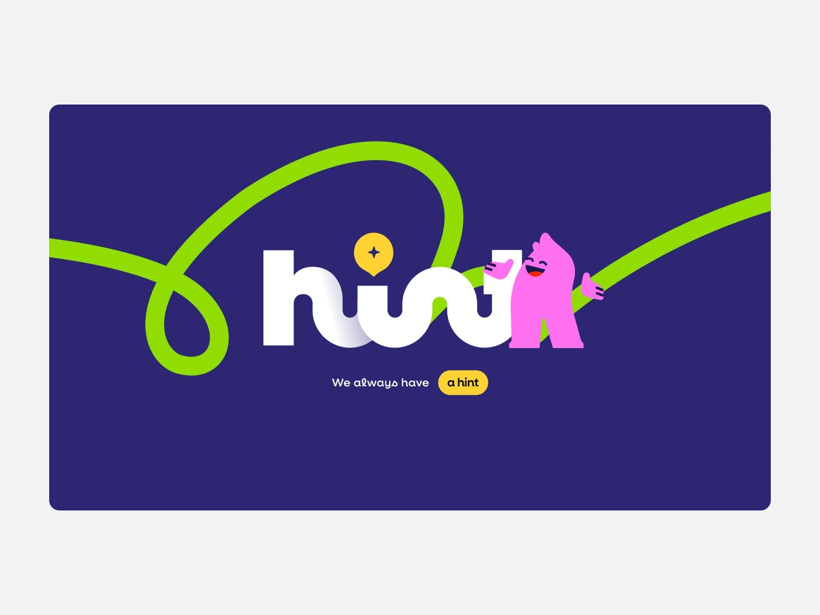
Brand, mascot and app for an AI travel guide built on local knowledge
Mr Franz grew from curated city maps into Hint, an AI travel guide. We designed its brand, the mascot, the app, the website and the launch film.
€500K Pre-seed raised by Hint from business angels, March 2026
About the project
Hint started as Mr Franz: curated city maps made by people who live in each city. As it grew into an app, the founders renamed it Hint, and it needed a brand to match, a character people remember and a product worth opening on every trip.
Hint is based in Milan and runs as an app on iOS and Android that matches travelers with locals and shows their picks on a personal map. We designed the brand and the mascot, the app that Hint’s own team built, the gethint.com website, a 3-minute launch film and a street event in Rome.
Project goals
The brand had to feel like a friend who lives in the city, not a search box with a logo.
A creator-led project of curated maps was becoming an app with accounts, bundles and a map of its own.03
App, App Store, website, social, print and a street event all had to read as one brand from day one.
Brand identity
We started from the brand identity, because everything else would stand on it: the app, the website, the launch film and the street event.
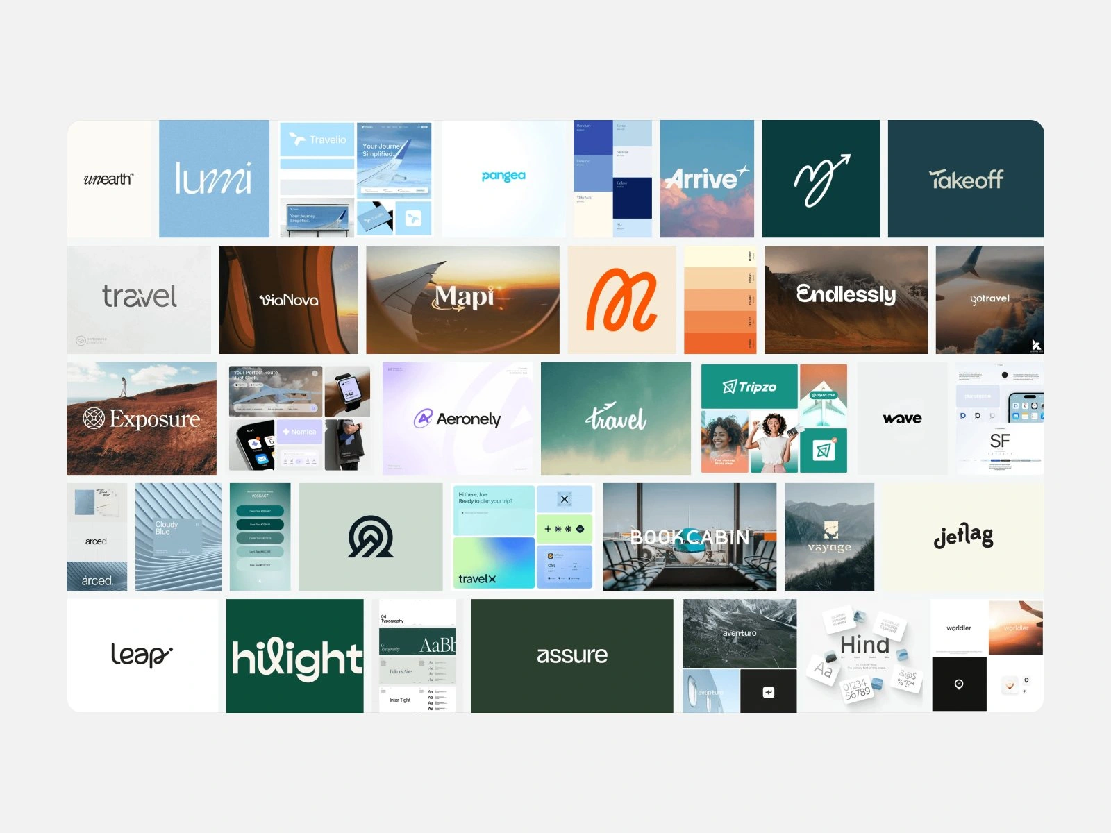
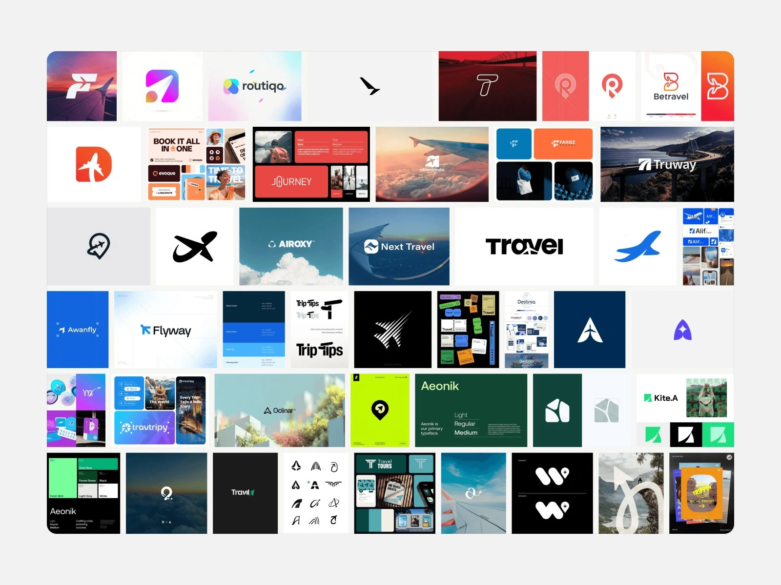
First came the moodboards. One gathered calm, wordmark-led travel brands, the other bold symbol marks that still read at the size of an app icon, and a third collected playful typefaces for the headlines.
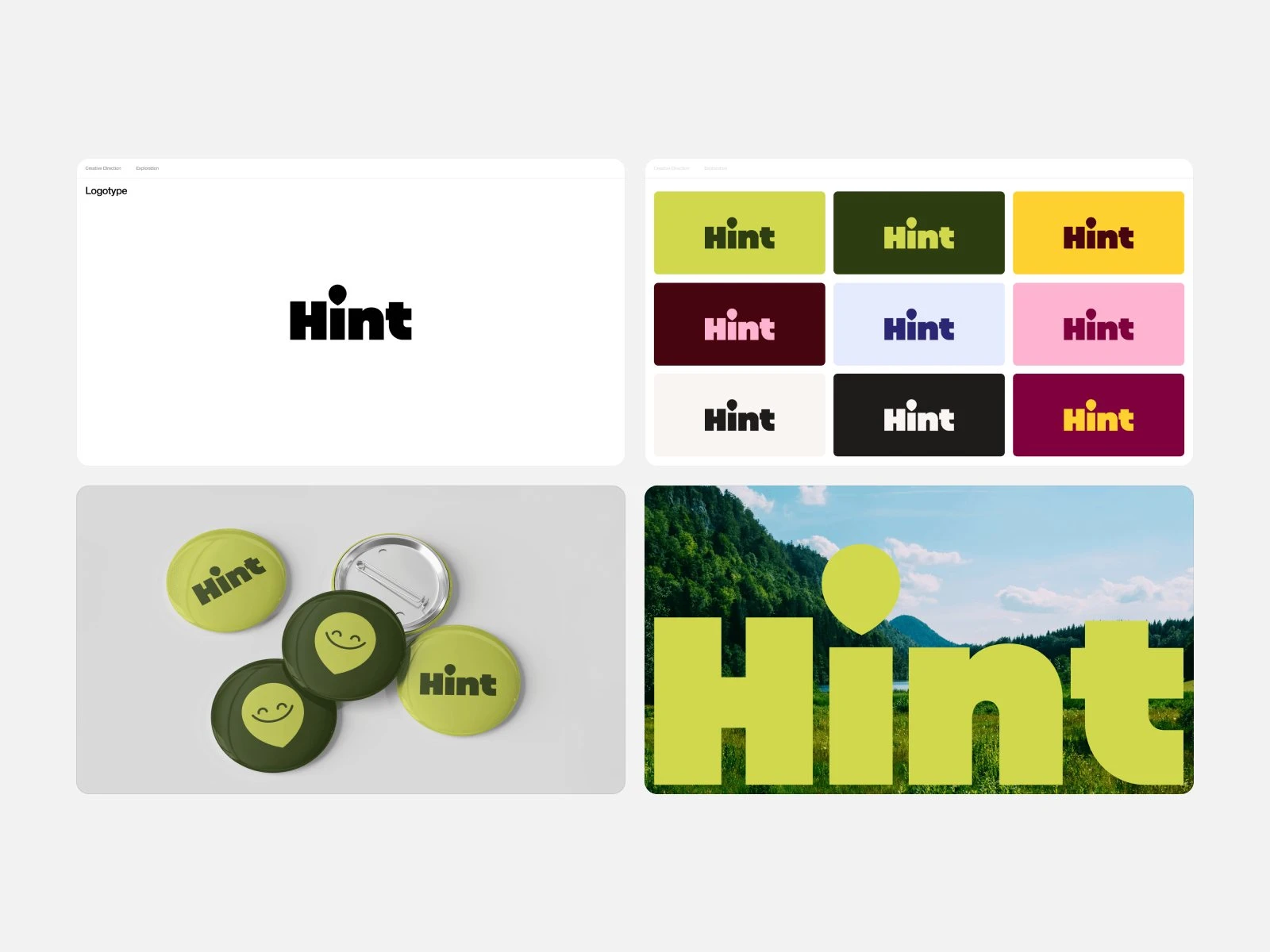
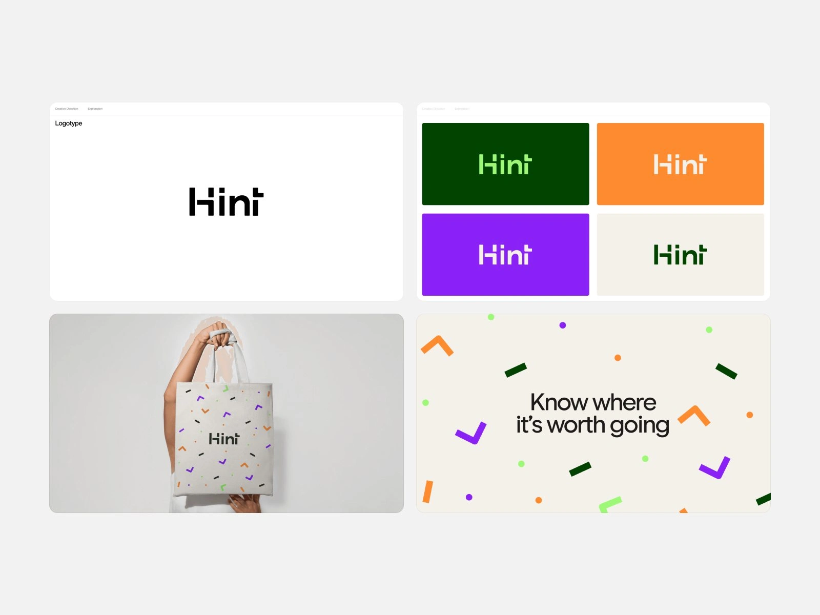
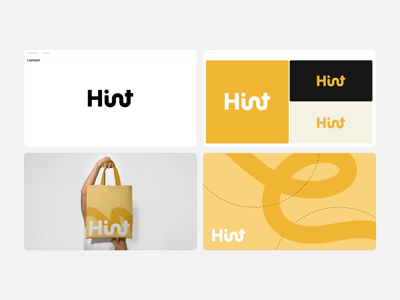
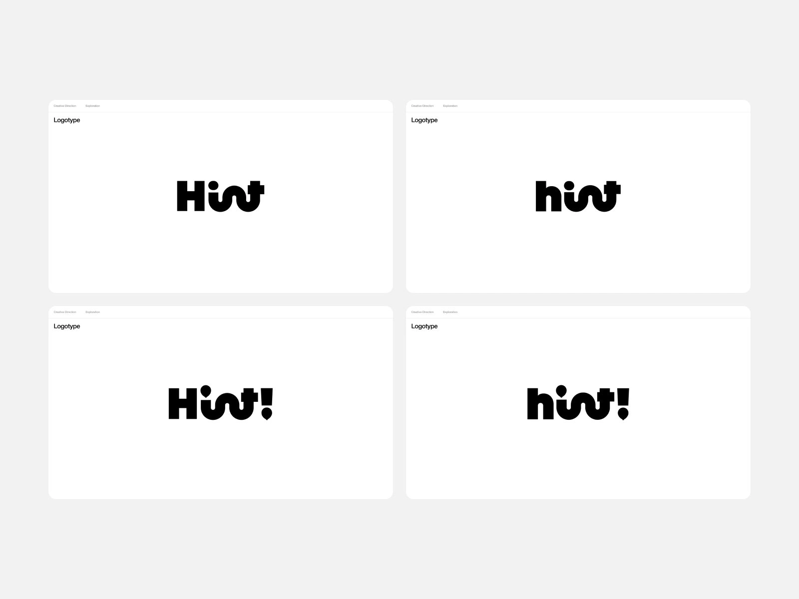
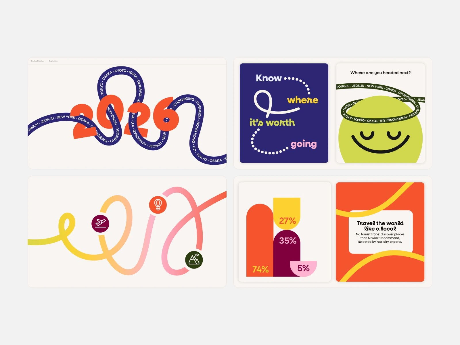
Then we explored over several rounds. The first tried a heavy wordmark with a map pin for the dot, a lighter one in green, orange and purple, and a yellow one with looping letters. We refined the looping letters into the lowercase hint, then tested a graphic language of routes, loops and city names before settling the system in the guide.
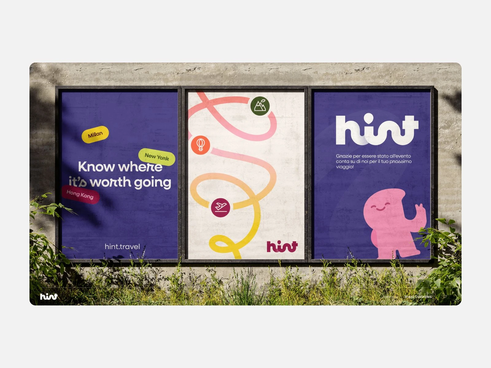
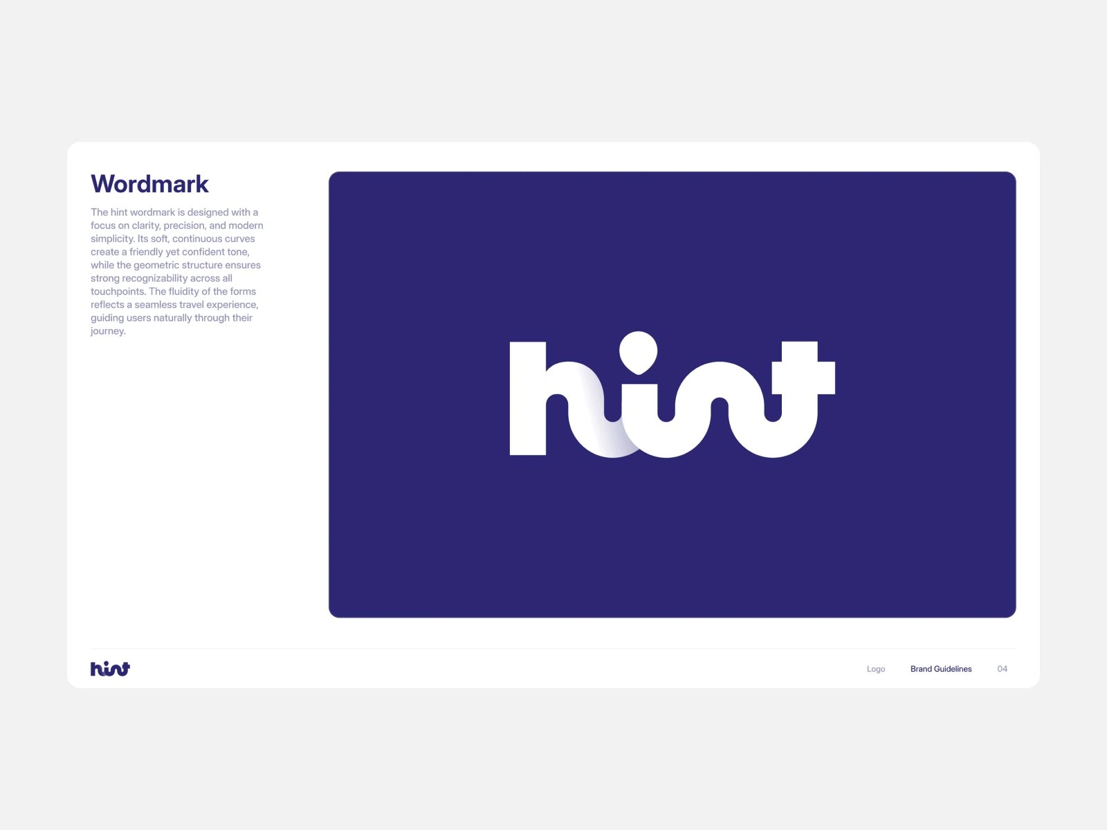
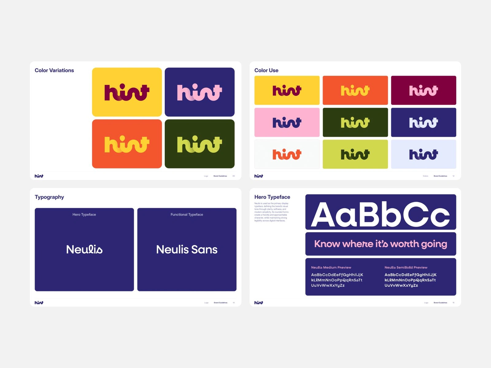
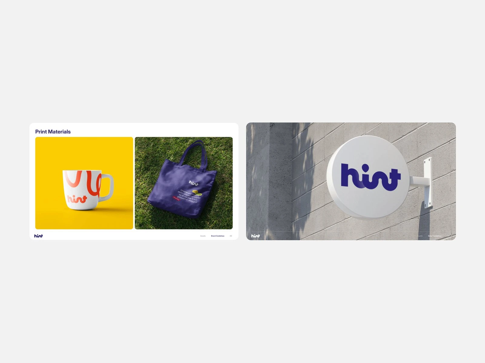
The final identity rests on a custom lowercase wordmark, a deep purple and a loud set of color pairs, so every screen and poster reads as Hint before you see the name. Neulis carries the headlines and Neulis Sans the interface, and the guide sets out how the logo, colors and type land on merch, posters and signage.
We are now designing a custom typeface for Hint as the next step for the brand.
Exploration 1.0: a heavy wordmark with a map pin for the dot
Exploration 2.0: a lighter wordmark in green, orange and purple
Exploration 3.0: looping letters, in yellow
Exploration 3.0: refining the wordmark
Exploration 3.1: routes, loops and city names
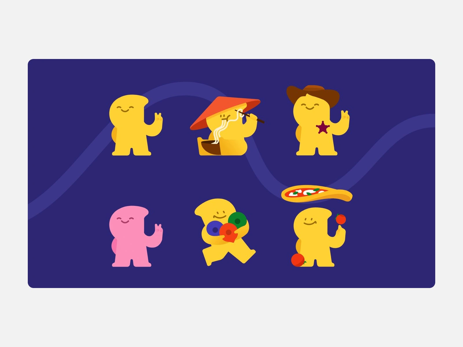
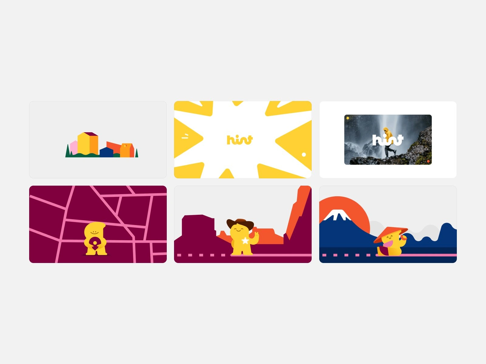
The mascot is the local friend in every screen. It points, waves, puts on sunglasses and shows up on cups, kiosks and App Store screens.
It went through two rounds of exploration before it settled into a small cast of poses and colors that hold up at the size of an app icon and the size of a street poster.
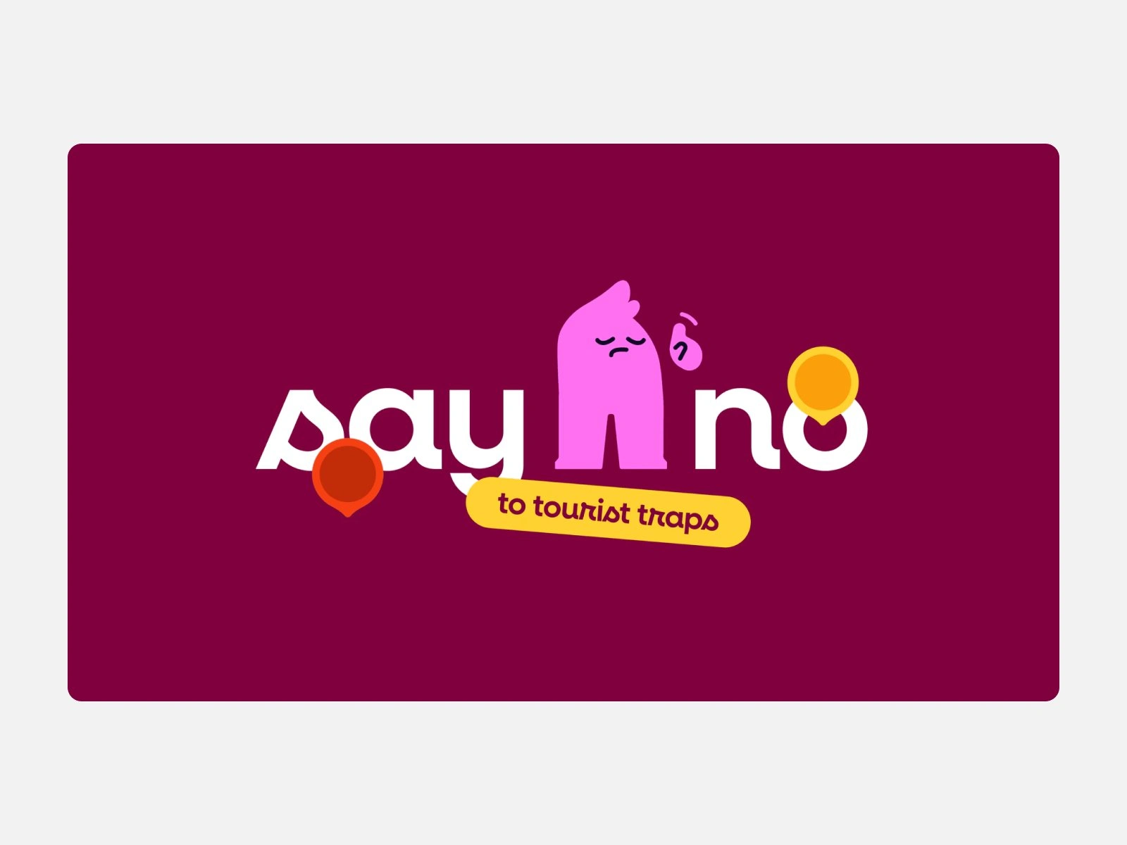
The campaign boards put it to work: standing in for a letter in “say no”, and in motion below, animated from the boards’ own vector artwork, slithering through “go beyond” to catch a map pin and riding the route to the hint wordmark.
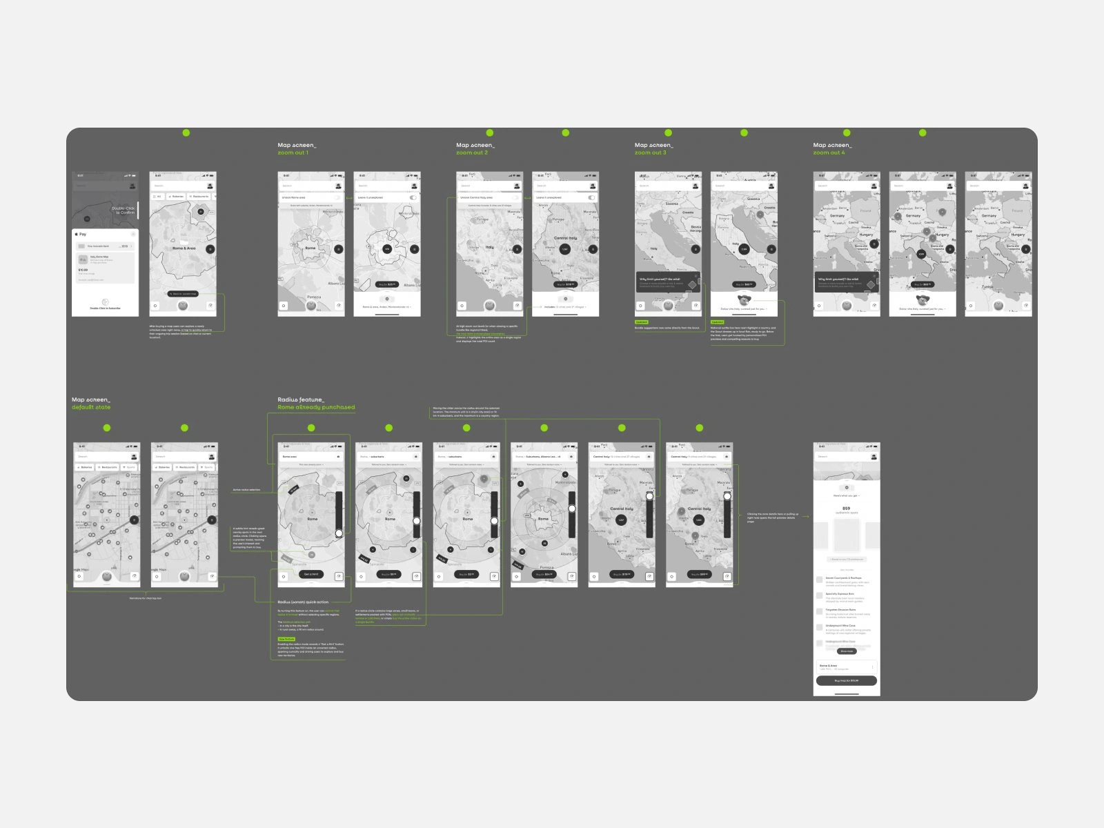
With the brand in place, we mapped the core flows in grey: the map at every zoom level, city and region bundles, and a radius tool that unlocks the spots around you.
Before the wireframes, we gathered three moodboards of travel and map apps, one per direction: friendly and clean, social and playful, and calm and curated.
Most of the time went into the UX. We redesigned the wireframes several times as the flows changed and new features came in, from bundles and the radius tool to chat with Scout, the AI travel buddy, until every path through the app held together.
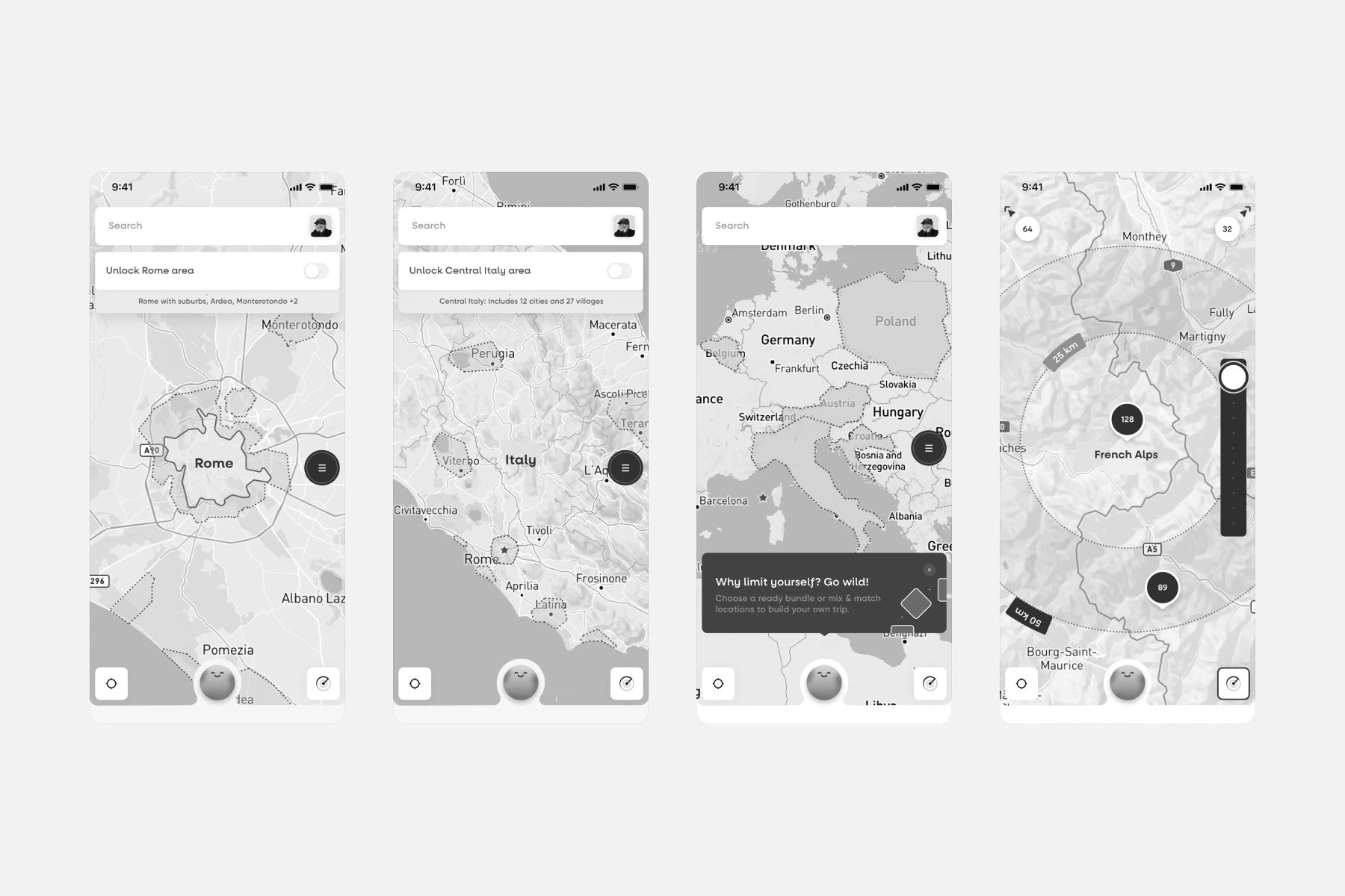
With the flows settled, we designed the high-fidelity app and a component library on top, and Hint’s own team built the app from it.
The library covers buttons, pins, place cards, search, navigation and chat, so the map, the saved spots and Scout all come from one set of parts.

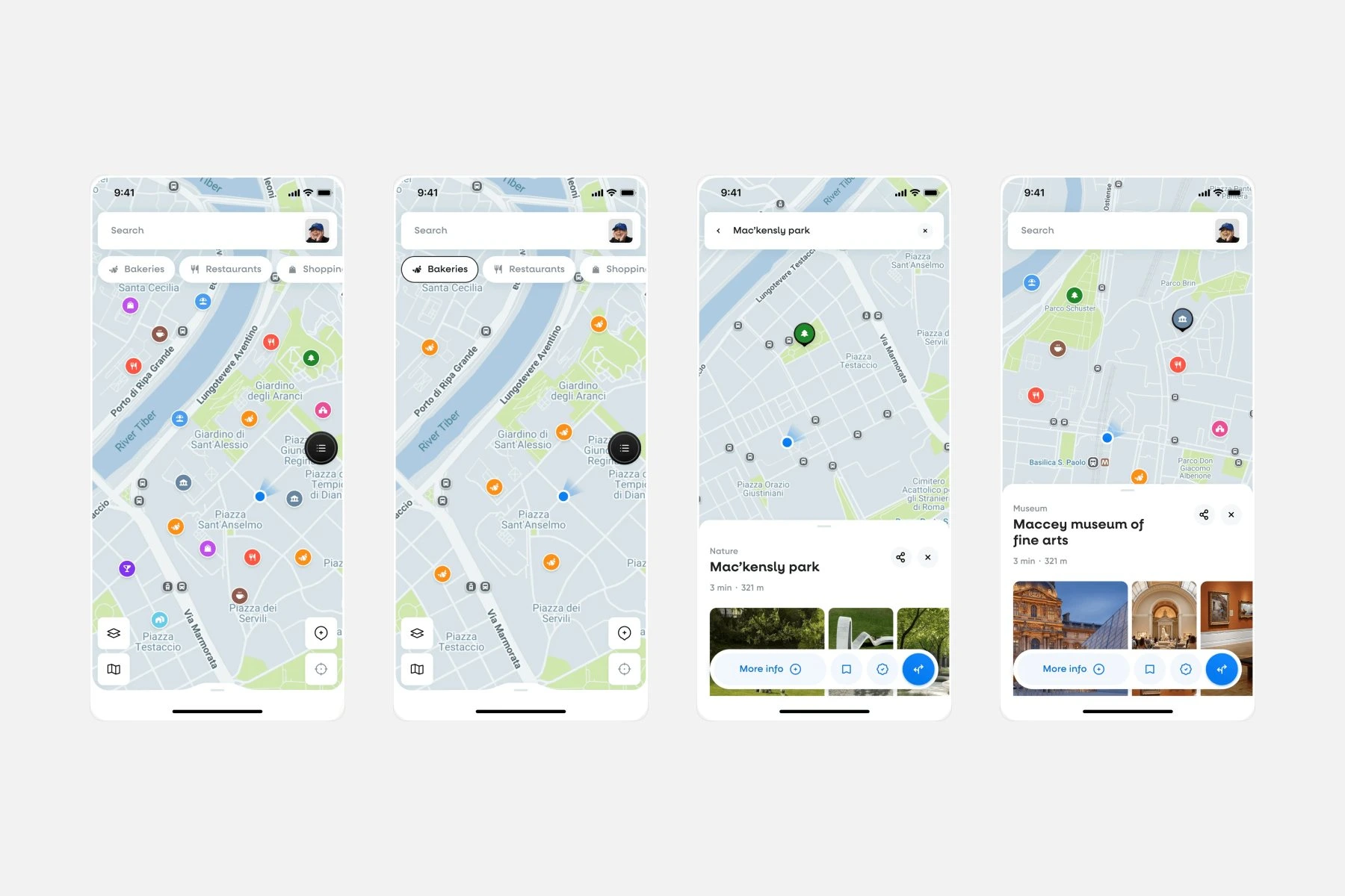
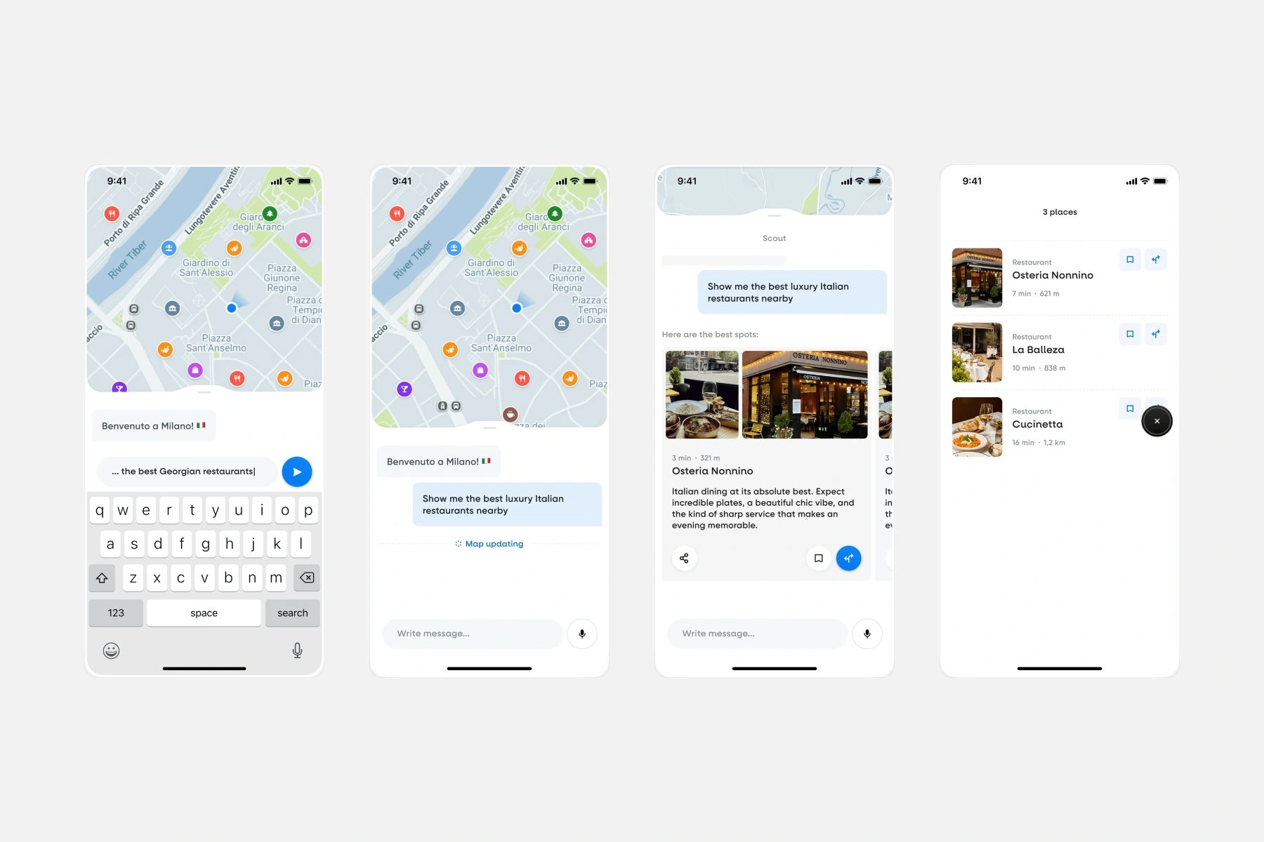
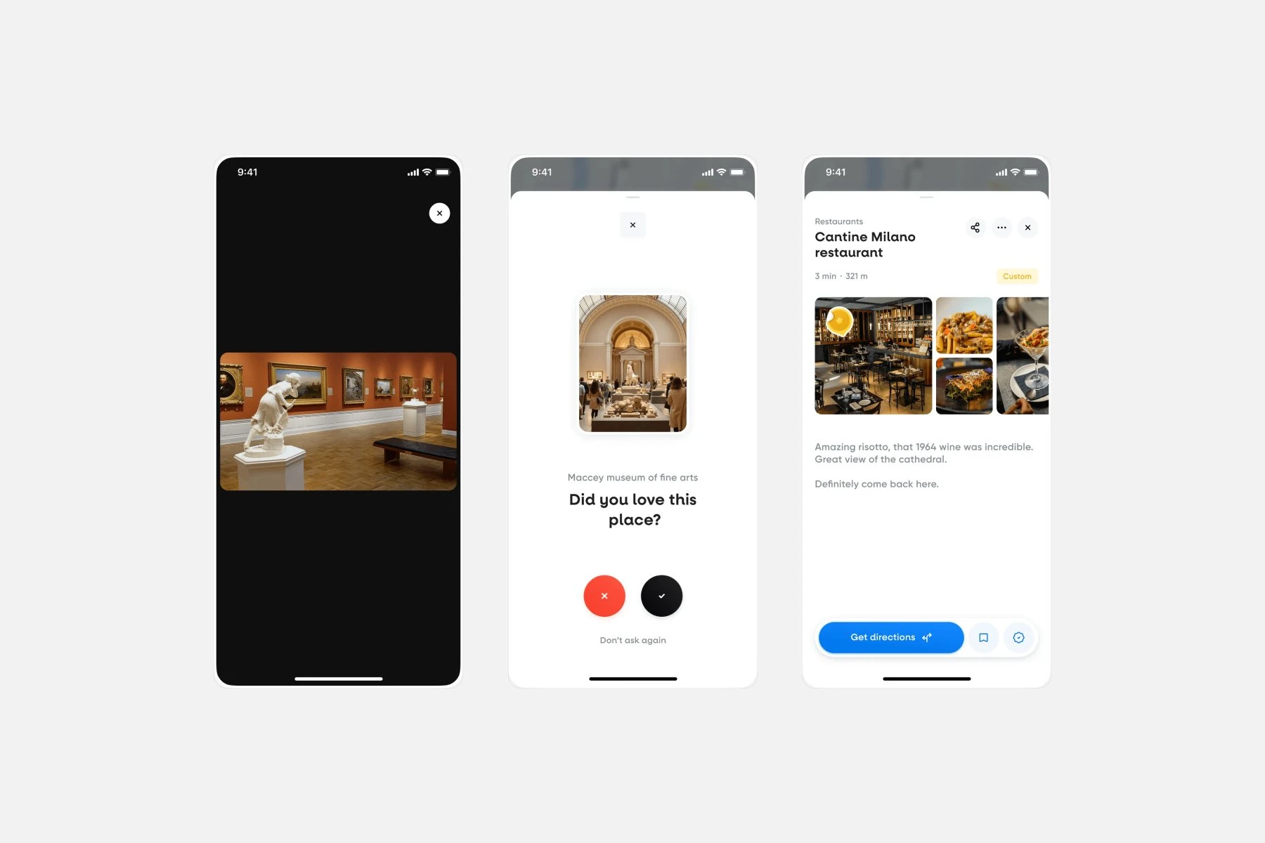
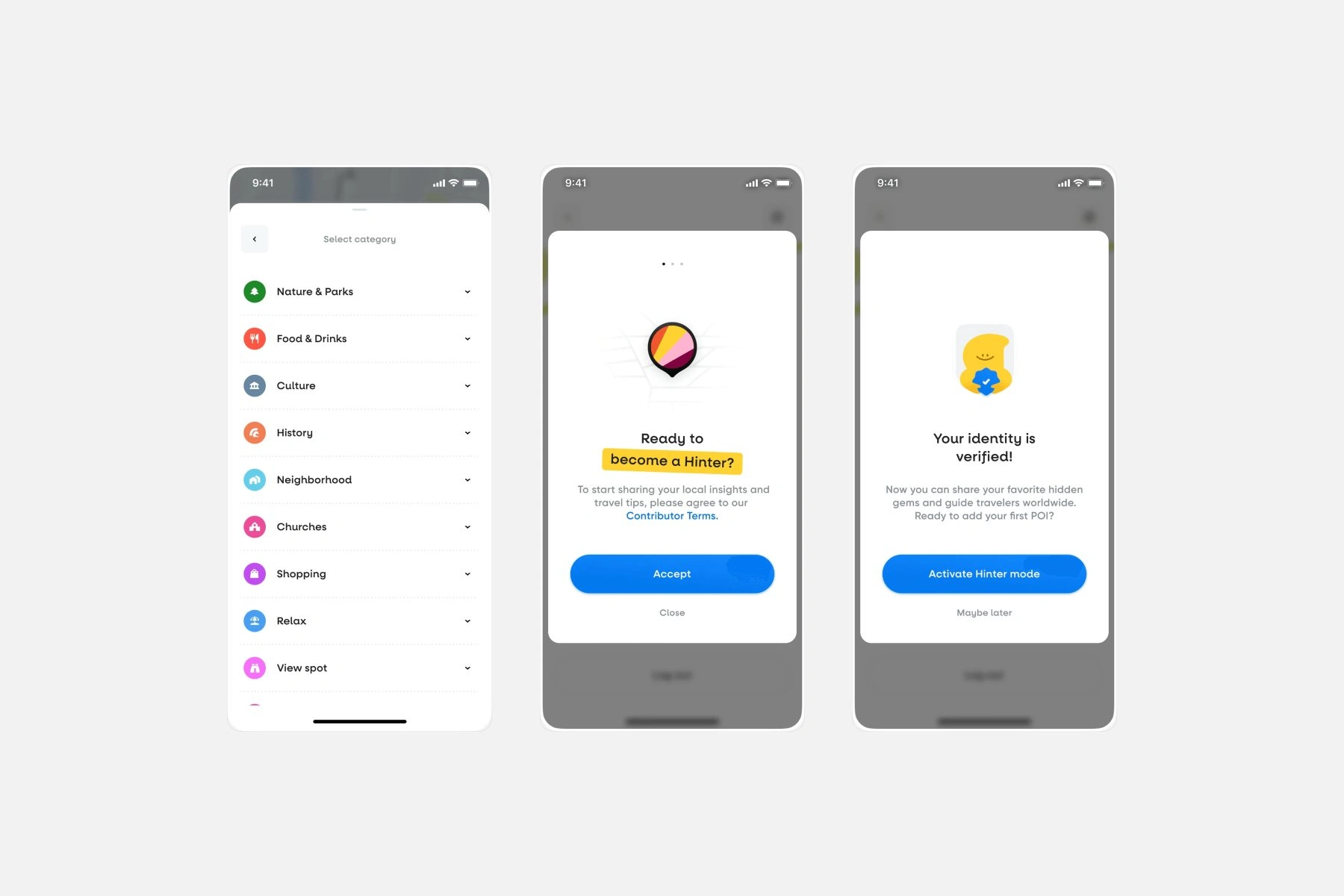
Web app
The web app had to show the same information as the mobile app and be just as easy to use.
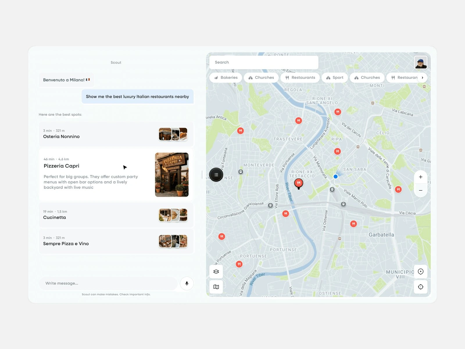
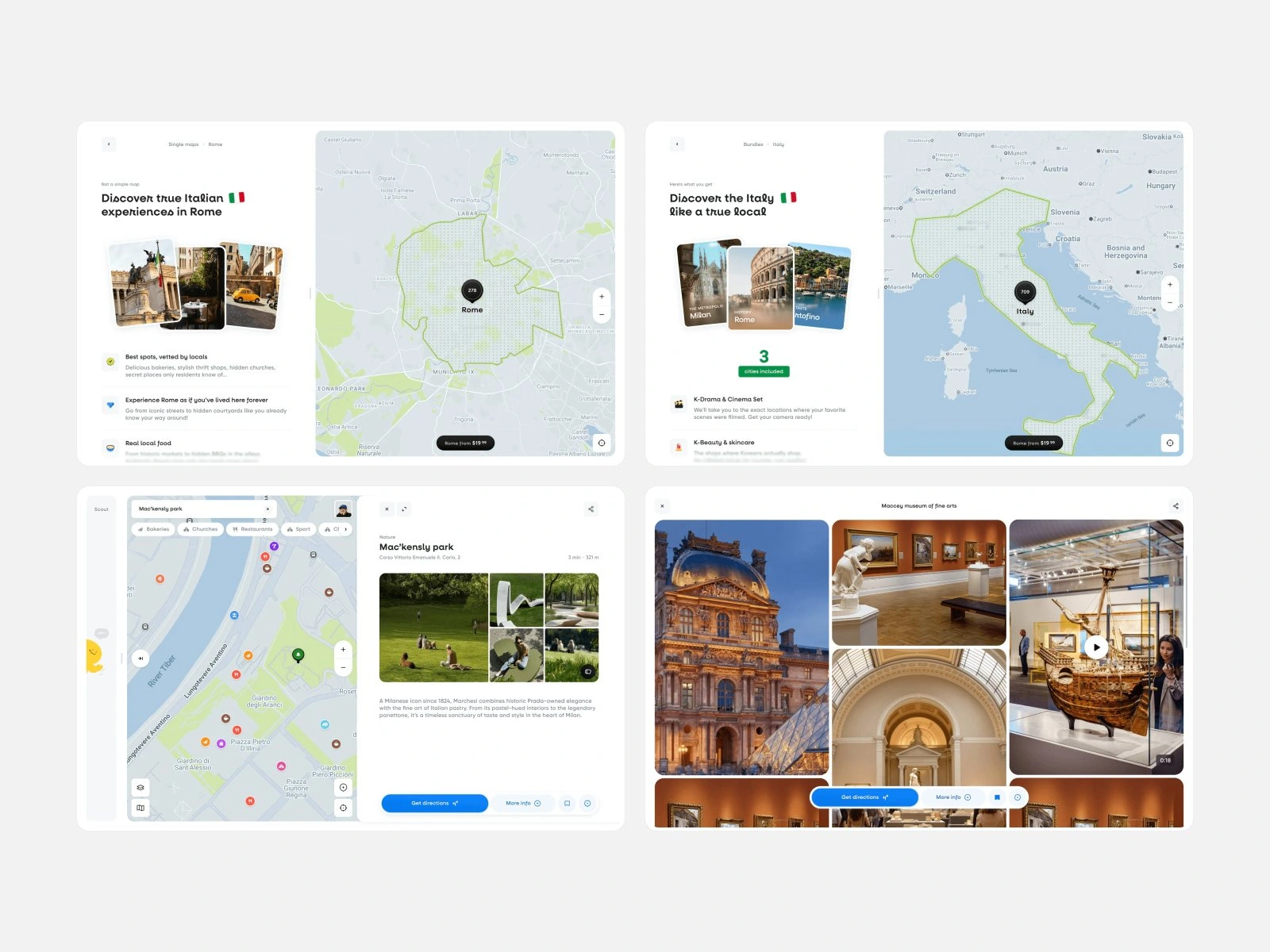
Scout and the map sit side by side, and the maps, bundles and place pages carry over from mobile, laid out for a bigger screen.
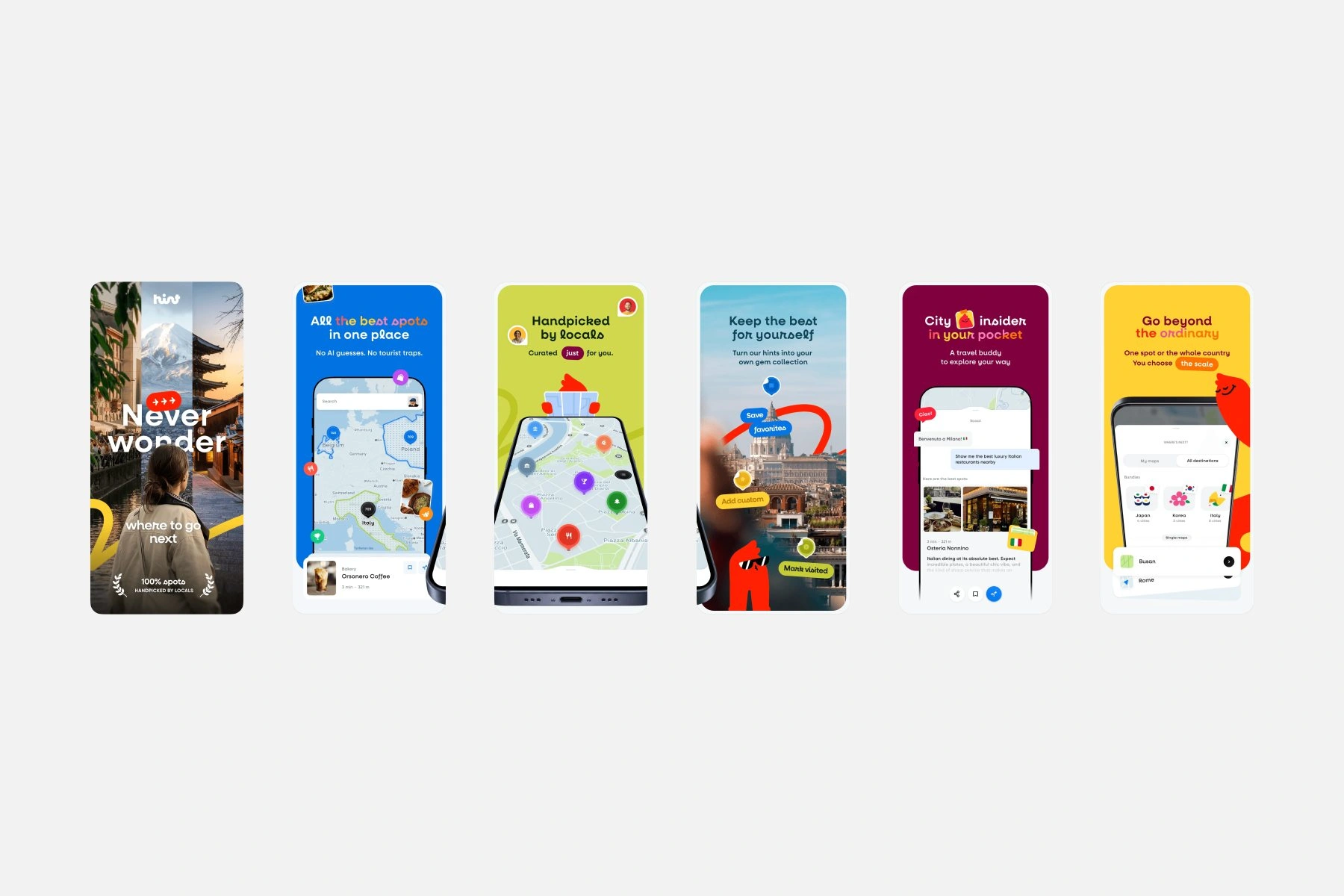
The store screenshots tell the story in the order people scroll: where to go next, every spot in one place, picks from locals, a collection of your own and a travel buddy in your pocket.
Each screen pairs one short line with a real view of the app, and the mascot and color pairs carry over from the brand guide, so the listing looks like the product people download.
Website design
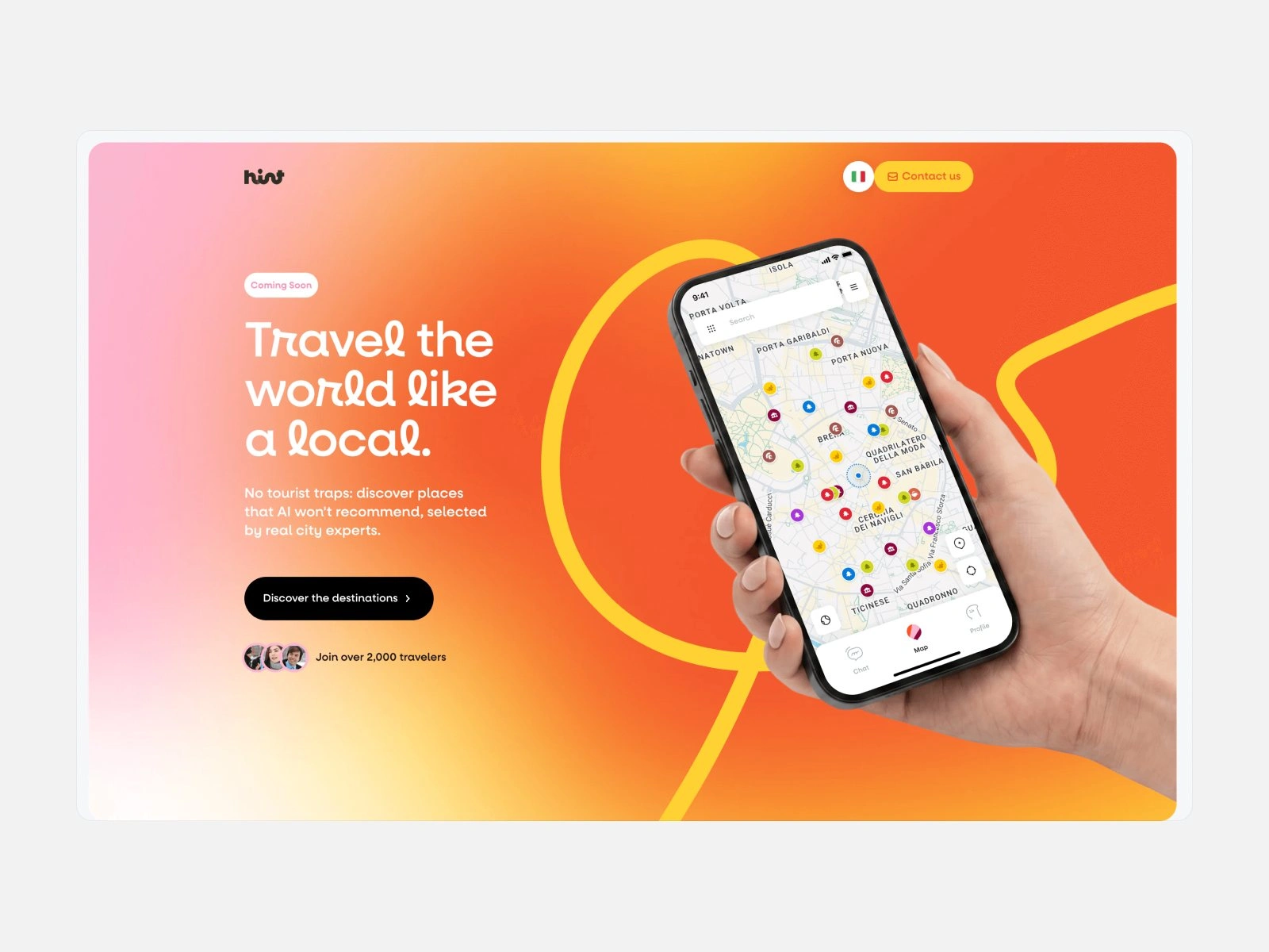
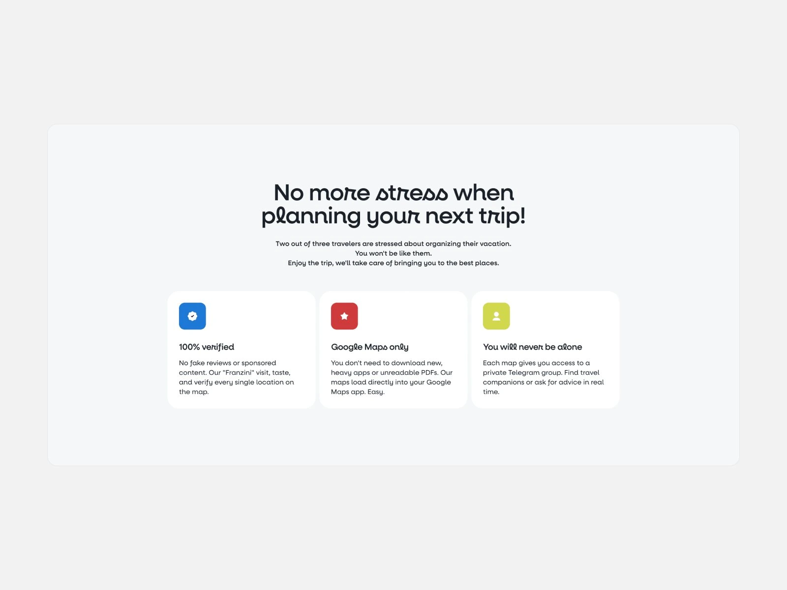
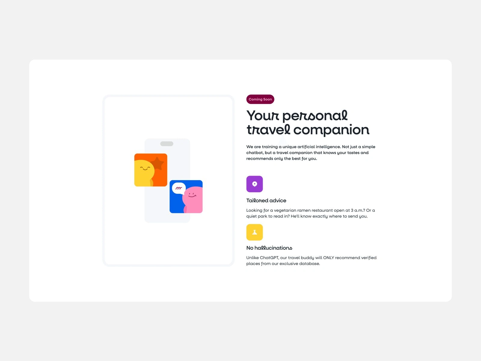
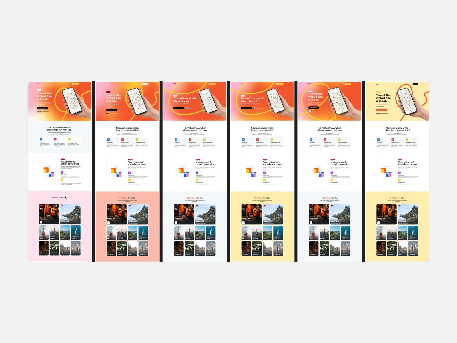
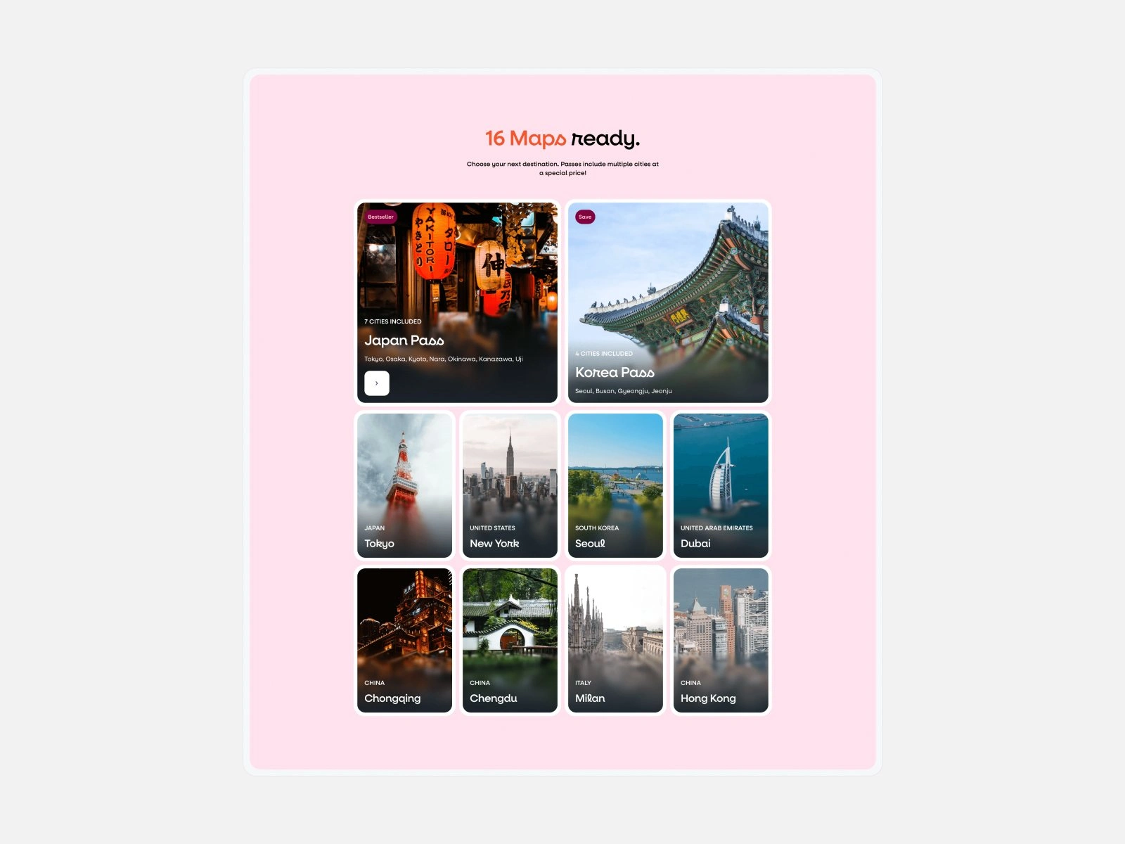
We designed gethint.com around one job: getting people from a first visit into the app.
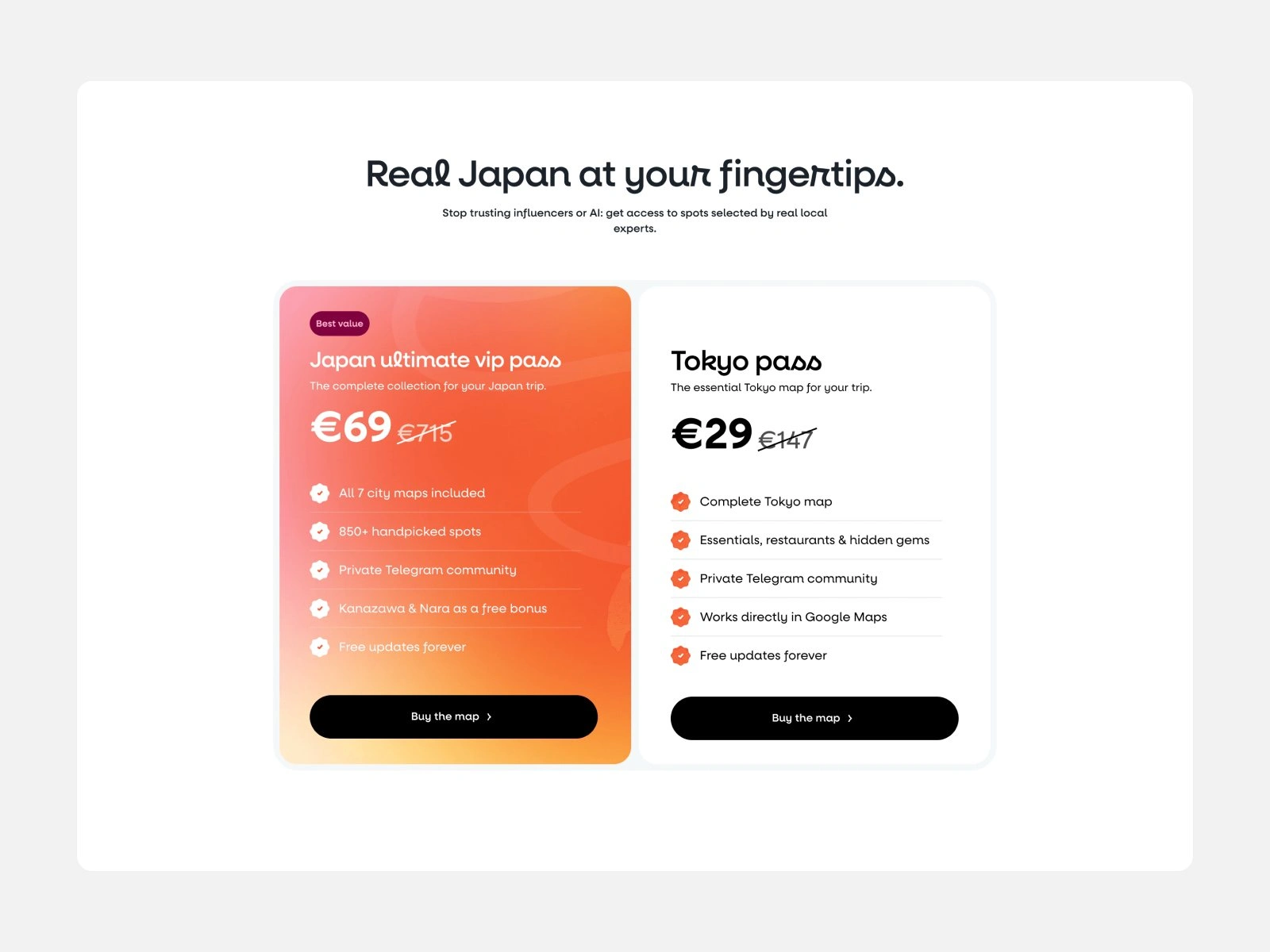
Inner pages sell the city maps and passes with the same cards and colors.
Out in Rome
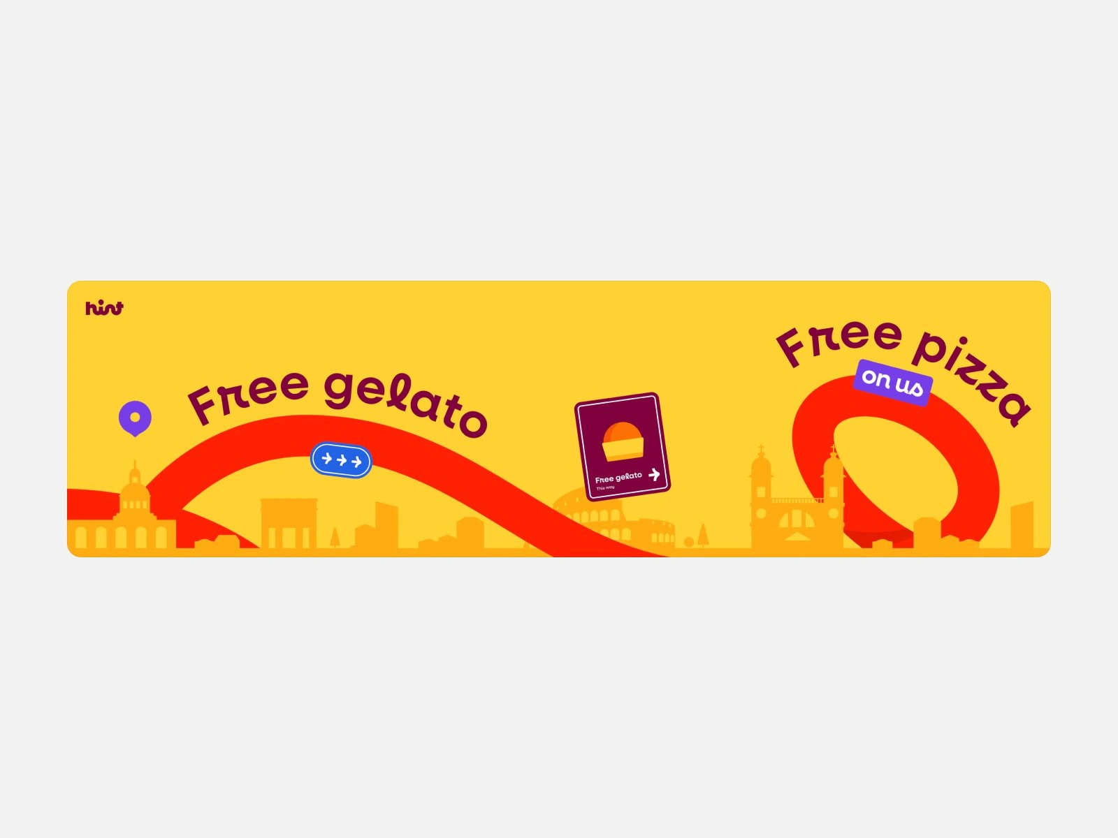
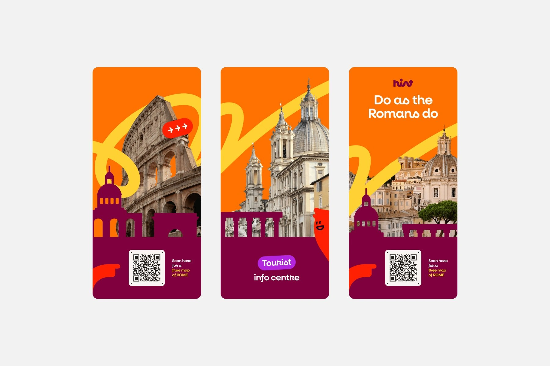
For Hint’s street event in Rome, 7 to 9 August 2026, we designed the kiosk: banners, posters, a fold-out map, cup stickers and a long fence banner promising free gelato, free pizza and a free Rome.
The posters carry a QR code for a free map of Rome, so people walking past can try the app on the spot.
The code leads to the event’s own website, getahint.com, which we also designed.
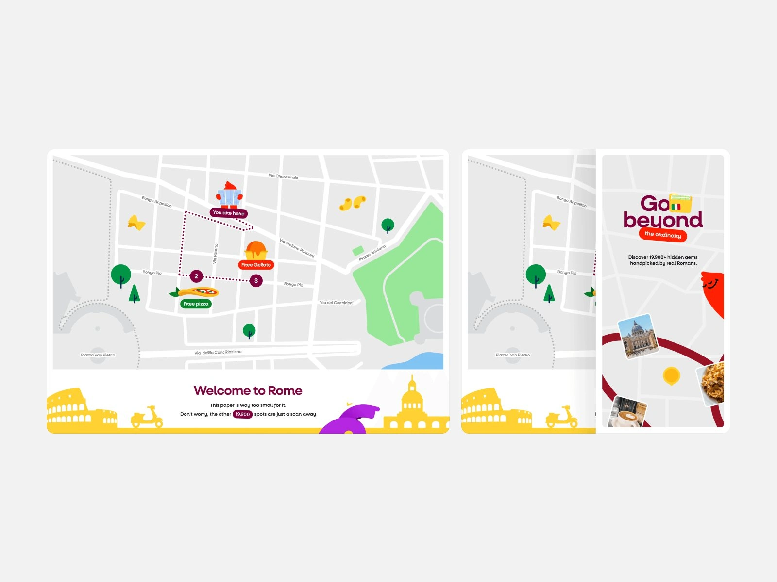
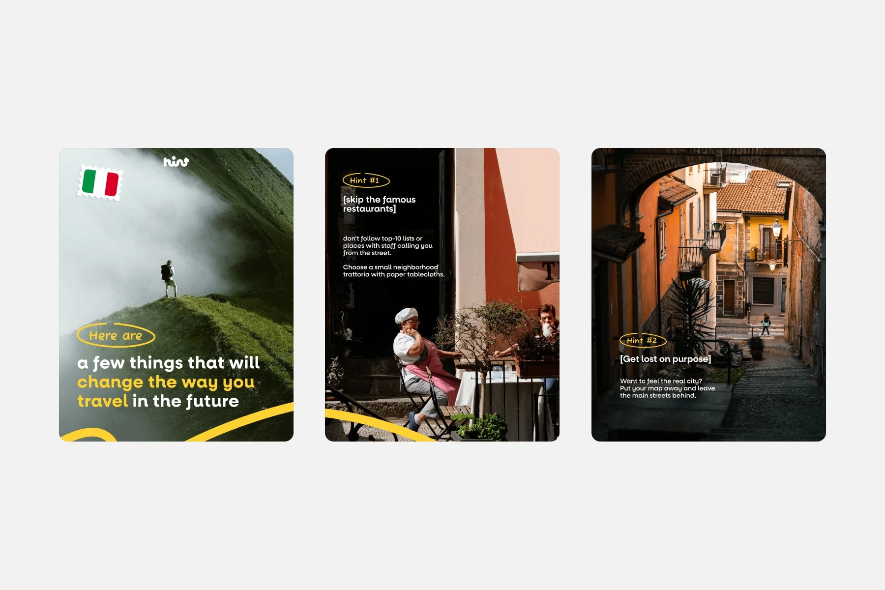
For the Rome launch we also designed the event’s own site, getahint.com: one long scroll that offers a free map of Rome and shows, with photos and illustrations, why most visitors end up in the same few places.
Website design for the Roman Launch
Like this project
Posted Oct 14, 2026
Mr Franz became Hint, an AI travel guide. We designed the brand, mascot, app, website and launch film. Hint raised a €500K pre-seed.
Likes
1
Views
3
Timeline
Jan 1, 2026 - Aug 9, 2026
Clients
Hint