
Strategic Brand & Packaging Design for Food & Bev Founders ⚡
- 35
- Followers
Strategic Brand & Packaging Design for Food & Bev Founders ⚡
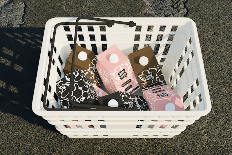
Every milk brand wants to be "bold."
However, most of them just slap a cow on the carton and call it a day.
How Dairy needed to actually feel bold. Not "we added a sans-serif" bold. Bold as in: you see it from 10 feet away and you already know it's not the same organic plain thing you've seen 50 times.
I built the brand identity and packaging system from scratch. The name does the heavy lifting tonally (playful, modern, irreverent), so I let the visual system match that energy: high-contrast colors, type hierarchy, and zero overused dairy imagery. The carton design reads more like a streetwear drop than a dairy aisle staple.
The goal: make someone grab it because it looks like it has personality and speaks to their values, not just protein content.
If your product is blending into the shelf, let's talk → contra.com/shakya_vaughn (https://contra.com/shakya_vaughn)
#PackagingDesign #CPG #BrandIdentity #FoodAndBeverage
0
158

Here's my first post for the #stealmyprompt sprint!
First, this prompt was created in Chatgpt ✨
Then used in Sora to create this base mockup image for Tropina✨
Left: Before
Right: After
Prompt: "A woman in a muted pink swimsuit lounging on her back on a sandy tropical beach, one arm resting over her head holding a wide-brimmed straw hat that partially covers her face. Her skin is sun-kissed and she’s relaxed beside the shoreline. Next to her in the sand is a small plain white rectangular beverage bottle with a brown cap, similar to a coconut water carton, The bottle is covered in light condensation, glistening slightly in the sun to emphasize its refreshingly cold temperature. The background includes turquoise water and a softly sunlit sky, capturing a luxurious, serene summer vibe"
2
2
212

Modern organic milk, but make it luxury. 🥛
I recently wrapped the brand identity and packaging design for Moo Moo, a modern high-end milk brand based in Toronto.
Packaging mockup was made with AI and I added my final design and edits in Photoshop.
This project was a great reminder of why cohesive brand systems matter so much:
-Custom wordmark with “O” counters inspired by cow spots + the flow of milk
-Pattern system built from those same organic shapes
-Collateral (cartons, billboards, thank-you cards)
When every touchpoint is aligned, a brand stops feeling generic and starts feeling instantly recognizable.
Whether it's on the shelf, a billboard, or in a customer’s hands.
👉 If you’re building a beverage brand and want your visual identity, packaging, and collateral to work together (not against each other), let’s connect.
6
16
318

Experience Designer
Experience Designer


CPG Branding, Packaging, and Ecommerce UX

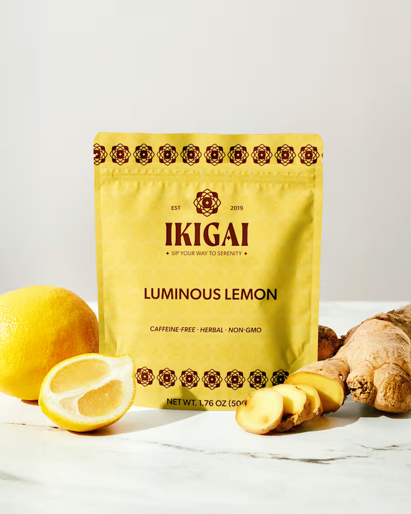
Brand Identity has been something that a lot of designers believe AI still can't get right and by itself, that is absolutely true! Total slop if you try to prompt and reference image your way to a fully functional brand identity. BUT I have figured out how to take that 10 years of being a creative and working in AI workflow that has helped me create this brand in roughly a day of work. I still had to illustrate, ideate, word associate, AI was my assistant, not my worker bee.
Let me know if you guys would like to learn more about how I came up with this brand from start to finish.
4
13
239

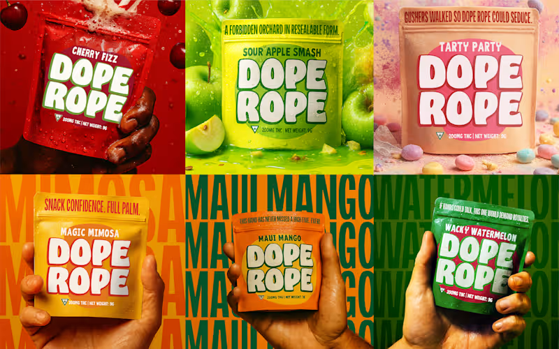
Dope Rope is a character-driven cannabis brand built to stand out in a crowded, lookalike market.
I developed a bold CPG brand system centered on craveable packaging, playful storytelling, and strong shelf presence. The focus was differentiation, memorability, and instant brand recognition while staying scalable across SKUs, formats, and retail environments.
The result is a high-impact brand that feels fun, intentional, and impossible to ignore on shelf or screen.
1
154


Web & Graphic Designer | Nice to meet you!
Web & Graphic Designer | Nice to meet you!


View more →

Magnetic Graphic Design and Branding for Eternal Impact.
Magnetic Graphic Design and Branding for Eternal Impact.


Brand success powered by brand strategy.


