Every milk brand wants to

Shakya Vaughn


Every milk brand wants to be "bold."
However, most of them just slap a cow on the carton and call it a day.
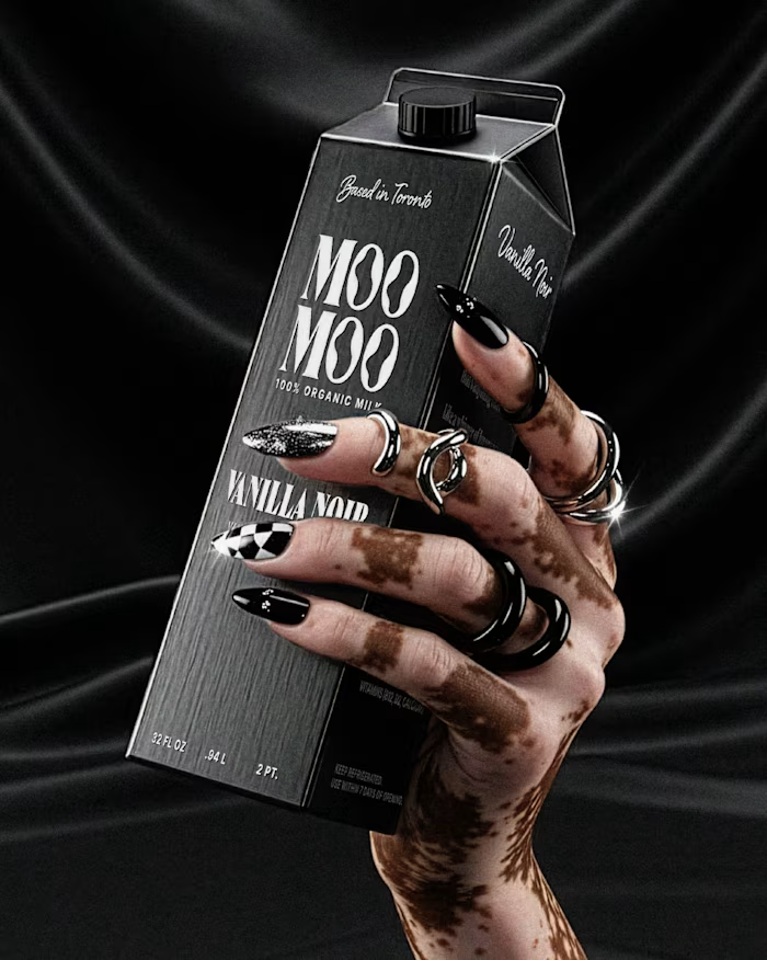
How Dairy needed to actually feel bold. Not "we added a sans-serif" bold. Bold as in: you see it from 10 feet away and you already know it's not the same organic plain thing you've seen 50 times.
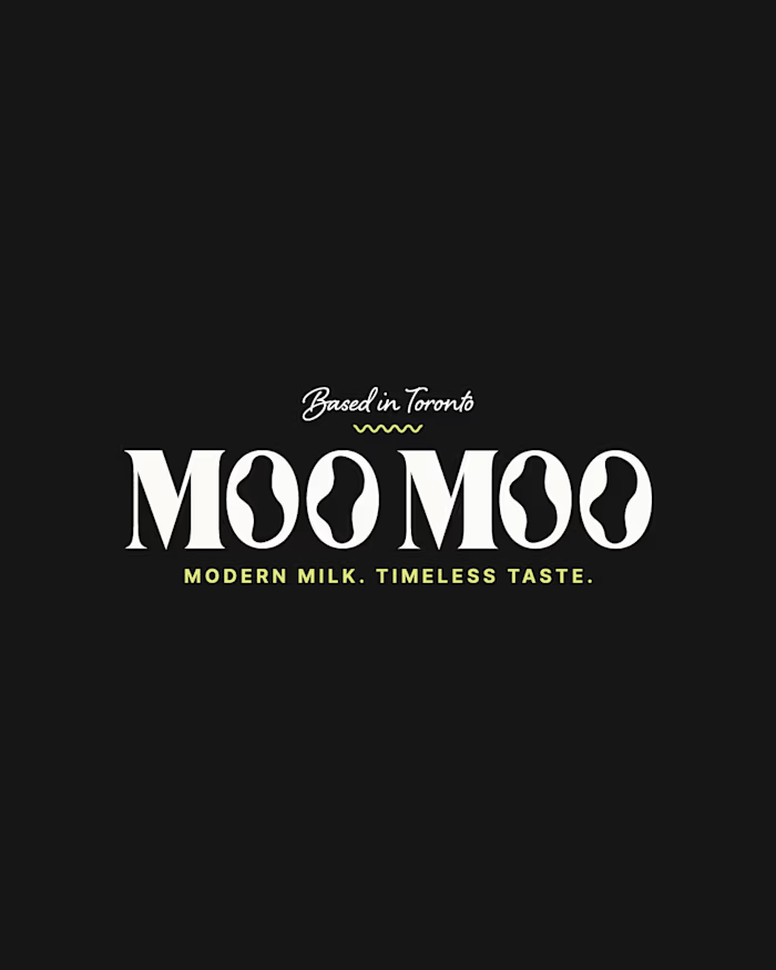
I built the brand identity and packaging system from scratch. The name does the heavy lifting tonally (playful, modern, irreverent), so I let the visual system match that energy: high-contrast colors, type hierarchy, and zero overused dairy imagery. The carton design reads more like a streetwear drop than a dairy aisle staple.
The goal: make someone grab it because it looks like it has personality and speaks to their values, not just protein content.
If your product is blending into the shelf, let's talk → contra.com/shakya_vaughn
#PackagingDesign #CPG #BrandIdentity #FoodAndBeverage
Like this project
Posted May 12, 2026
Every milk brand wants to be "bold." However, most of them just slap a cow on the carton and call it a day. How Dairy needed to actually feel bold. Not "we...