Branding Identity Designer
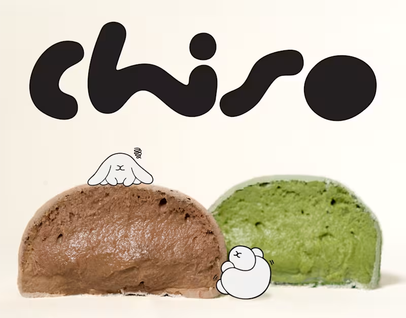
Chiso | Branding & Packaging Design
A good brand is more than what meets the eye. It's how every little detail comes together.
For Chiso, we explored a visual direction inspired by Japanese aesthetics, bringing together a distinctive logotype, soft visual elements, and thoughtfully designed packaging for mochi and soy milk.
From the typography to the packaging details, each element was designed to create a consistent identity that feels fresh, playful, and effortlessly recognizable.
A simple idea, thoughtfully brought to life.
0
13
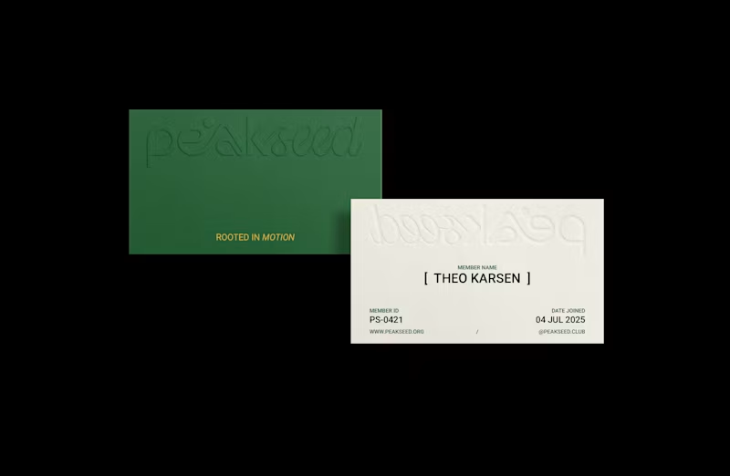
Peak Seed | Brand Identity
Inspired by the trail culture and alpine landscapes of Chamonix, France, Peak Seed is a mountain running community that sees running as more than a pursuit of performance. It is a continuous journey of movement, awareness, and connection with nature, ourselves, and one another.
The logotype combines organic typography with a defined geometric structure, balancing fluidity with precision. Its flowing curves and connected letterforms draw inspiration from the rhythm of each stride, the breath that sustains it, and the ever-changing contours of mountain trails.
The resulting identity reflects Peak Seed’s philosophy: moving freely while staying grounded, embracing the journey while remaining consistent, and finding connection along every path.
Have a brand in mind? Let’s build something meaningful together.
0
57


Crafting Brands That Last 🚀
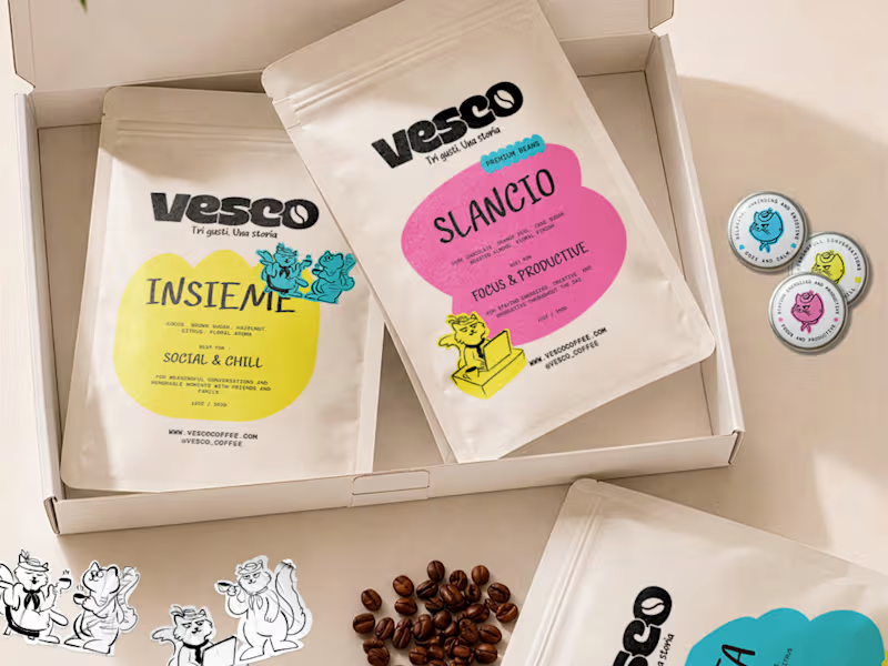


Graphic Designer | Logo, Pitchdeck, Branding


Brand Identity Designer for Startups & Modern Businesses
Brand Identity Designer for Startups & Modern Businesses


Brand & Design Studio for premium visual experience
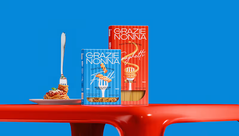
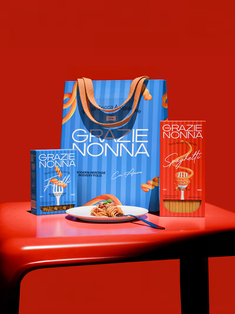
Grazie Nonna is a modern pasta brand inspired by the warmth, craft, and authenticity of handmade family recipes.
The challenge was to create a brand identity and packaging system that could celebrate Italian heritage without falling into the familiar visual language of traditional pasta brands.
Instead of looking backward, the identity brings nonna's heritage into a contemporary world: bold, expressive, colorful, and unmistakably Italian. The result is a visual identity built around one central idea: Tradition, reframed for a new generation.
4
3
143

AI Visual Designer for Brands | 15+ Years in Marketing
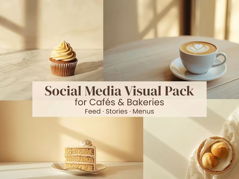
From Adobe Stock to client work — here's what 3,300+ approved assets taught me about commercial AI art.
The #1 lesson: buyers don't want "pretty." They want useful.
Cultural artwork sells because it has context.
Tattoo flash art sells because it's print-ready.
Wildlife imagery sells because it tells a story.
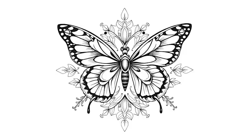
Even this butterfly isn't just decorative — it's a fine line illustration ready for tattoo stencils, apparel, and POD merchandise.
Every asset I create starts with one question: "Who needs this and why?"
That's the difference between AI art and AI content.
#aiart #adobestock #promptengineering #tattooart #fineline #contentcreator
0
62

Just crossed 3,300+ approved assets on Adobe Stock!
What started as an experiment with AI-generated art has grown into a full creative workflow — from prompt engineering to commercial licensing.
My niche: cultural artwork, mandala designs, cinematic landscapes, wildlife imagery, and tattoo flash art.
Tools I use daily: Leonardo.ai (http://Leonardo.ai) · Adobe Photoshop · CorelDRAW · Canva
If you're a brand or creator looking for unique, commercially licensed AI visuals — let's connect! 🚀
0
124


Passionate 2D Illustrator
Passionate 2D Illustrator


View more →

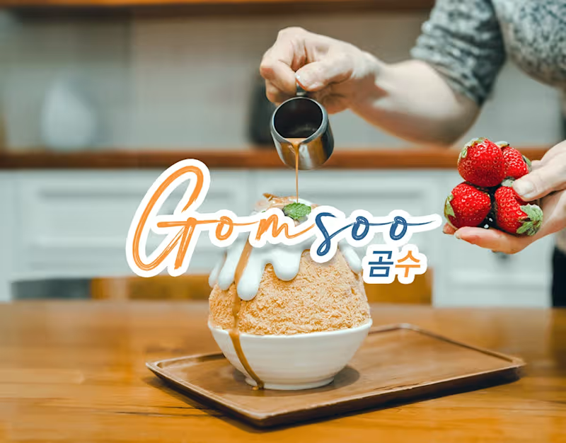
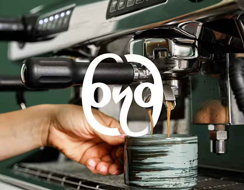
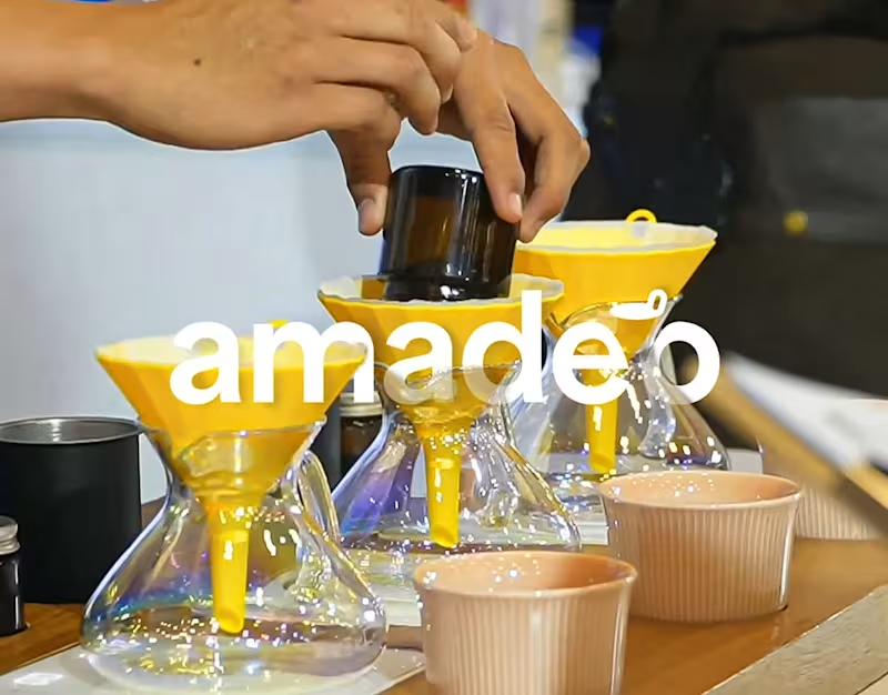
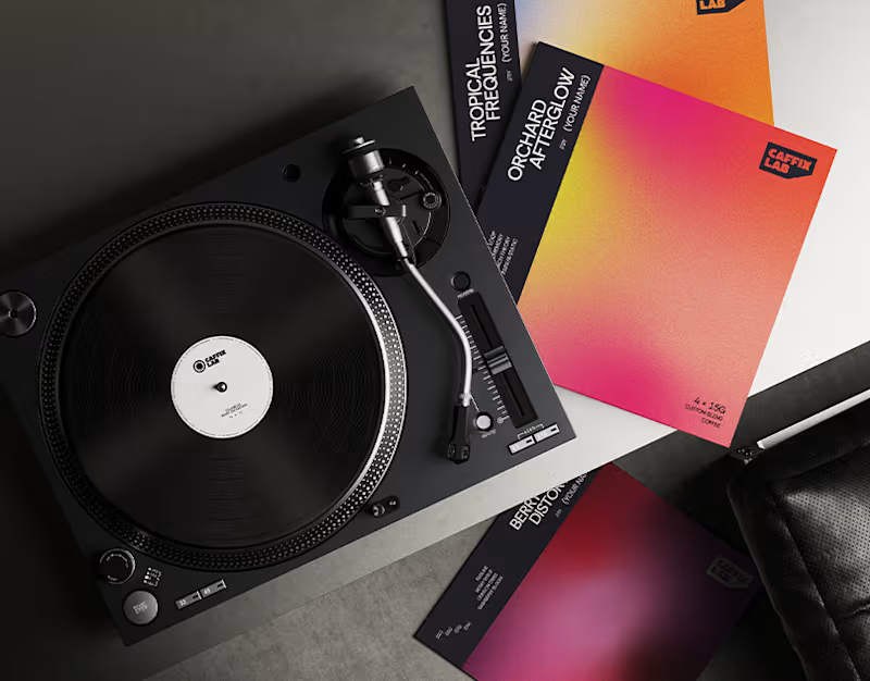
Logo & Brand Designer Specialist FNB & Coffeeshop
Logo & Brand Designer Specialist FNB & Coffeeshop