
Chiso | Branding & Packaging Design
A good brand is more than what meets the eye. It's how every little detail comes together.
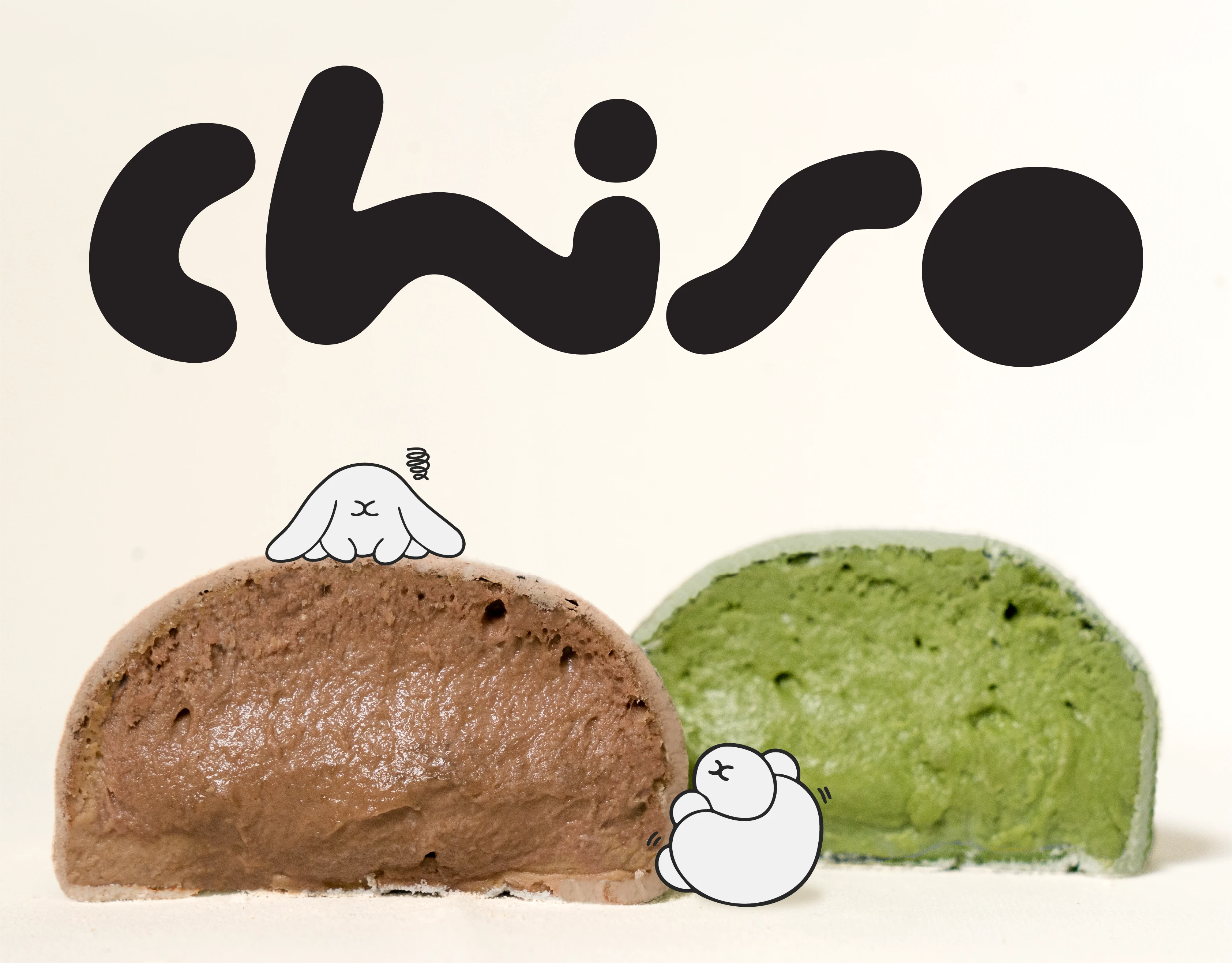
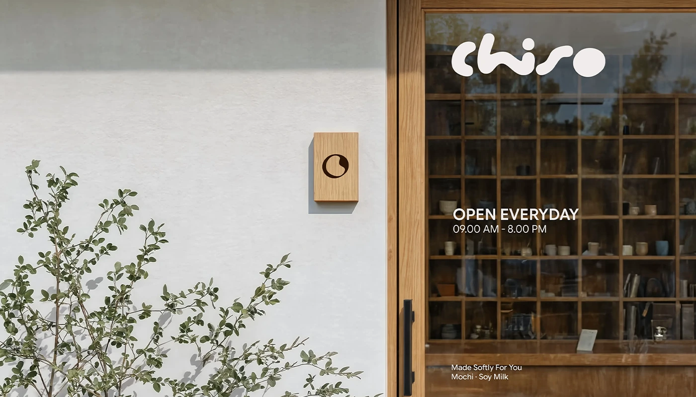
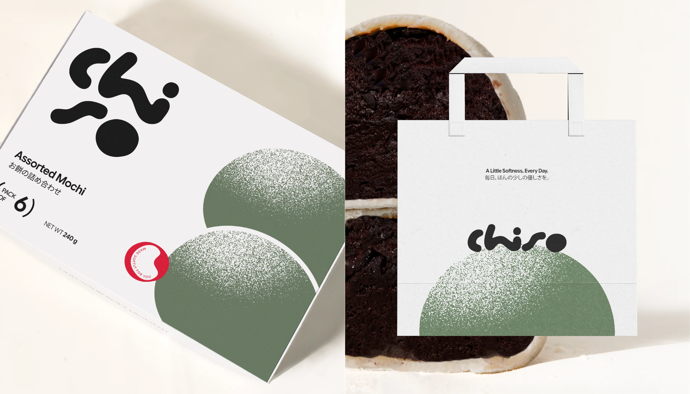
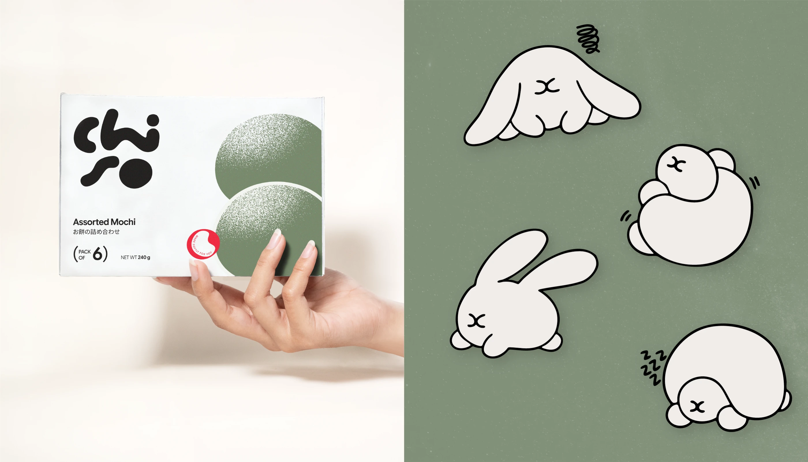
For Chiso, we explored a visual direction inspired by Japanese aesthetics, bringing together a distinctive logotype, soft visual elements, and thoughtfully designed packaging for mochi and soy milk.
From the typography to the packaging details, each element was designed to create a consistent identity that feels fresh, playful, and effortlessly recognizable.
A simple idea, thoughtfully brought to life.
0 likes · 0 views · Nov 2, 2026
Chiso | Branding & Packaging Design A good brand is more than what meets the eye. It's how every little detail comes together. For Chiso, we explored a visua...


