Visual Artist & Storyteller


Visual Artist & Storyteller



Branding, Packaging & Web Design, Award Winning | D2C Brands

Branding, Packaging & Web Design, Award Winning | D2C Brands


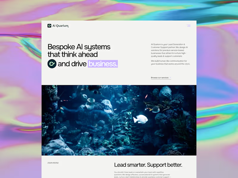
AiQuarium came to me as an AI agency and left with a brand people will trust, remember and gravitate towards.
They build tailored AI solutions for lead gen and customer support, drawing on the best tools available globally and configuring them around each client's business. The problem was that almost every brand in this space looks identical. Blue and white, sterile and interchangeable. For an agency whose entire value is bespoke thinking, that was working against them.
So I built the brand around the name. The aquarium is the business, the tools within it are the fish and coral and each client gets their own ecosystem assembled from resources gathered worldwide.
The mark came from the wordmark itself. I rotated the "Q" letterform 90°, let its natural typographic tail become a fish tail, added an eye - and taadaa, the letterform turned into a fish. I wanted it to be recognisable, playful and entirely their own.
For colour I moved away from the black and white category default - instead, I went for a luminous mint and light lavender for energy and intelligence, anchored by a deep teal green that reads as water, rather than tech cliché.
Full brand strategy, identity and website, designed and built in Framer.
They now look like the only agency doing what they do, rather than one of hundreds. In a category this crowded, that's usually a total game-changer.
0
135


Branding & Packaging Designer for Standout Brands
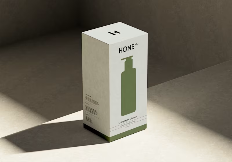
I've been slow to update my projects in my portfolio— you're all creatives, you know how this goes 😂 — BOTTOM OF THE PILE!
Finally going through a project I finished in March and taking it all in. During those projects, I have tunnel vision and I don't realise how dang good my work actually is! 🔥
2
17
448



Designing for connection ⋆˚꩜。
Designing for connection ⋆˚꩜。




Brand Design✦UI design✦Front-end development.
- $50k+
- Earned
- 10x
- Hired
- 5.0
- Rating
- 90
- Followers
Brand Design✦UI design✦Front-end development.



Startup & Brand Design Expert / Brand Strategist
- $1k+
- Earned
- 4x
- Hired
- 5.0
- Rating
- 26
- Followers
Startup & Brand Design Expert / Brand Strategist

Building something new.
Sprint Creative Studio — a brand design studio helping AI, fintech, Web3 and startup founders build brands that close clients and win investors.
4
7
334

Strong brands start with strong marks.
Sharing a few recent logo systems I’ve developed — designed for longevity, versatility, and brand impact.
Minimal where needed. Bold where it matters. Strategic always.
Let me know your thoughts.
1
2
305

Newly designed logo for Financial Resilience Authority (FRA). A body that protects consumers when regulated fintech and digital financial platforms collapse, fail, or become insolvent.
Thought behind the logomark: A protective cover / a structural shield.
Let me know your thoughts on this. Full case study coming soon.
6
445