Clear as glass branding for Verre Aesthetics
Eva Van der Borght
When I got a message from Nancy & Isabella, I had no idea yet what I was getting into with their project. After years of working for a medspa and being the smartest person in the room, Nancy decided that she wanted to start her own thing and jumped at the idea of building her own medspa business.
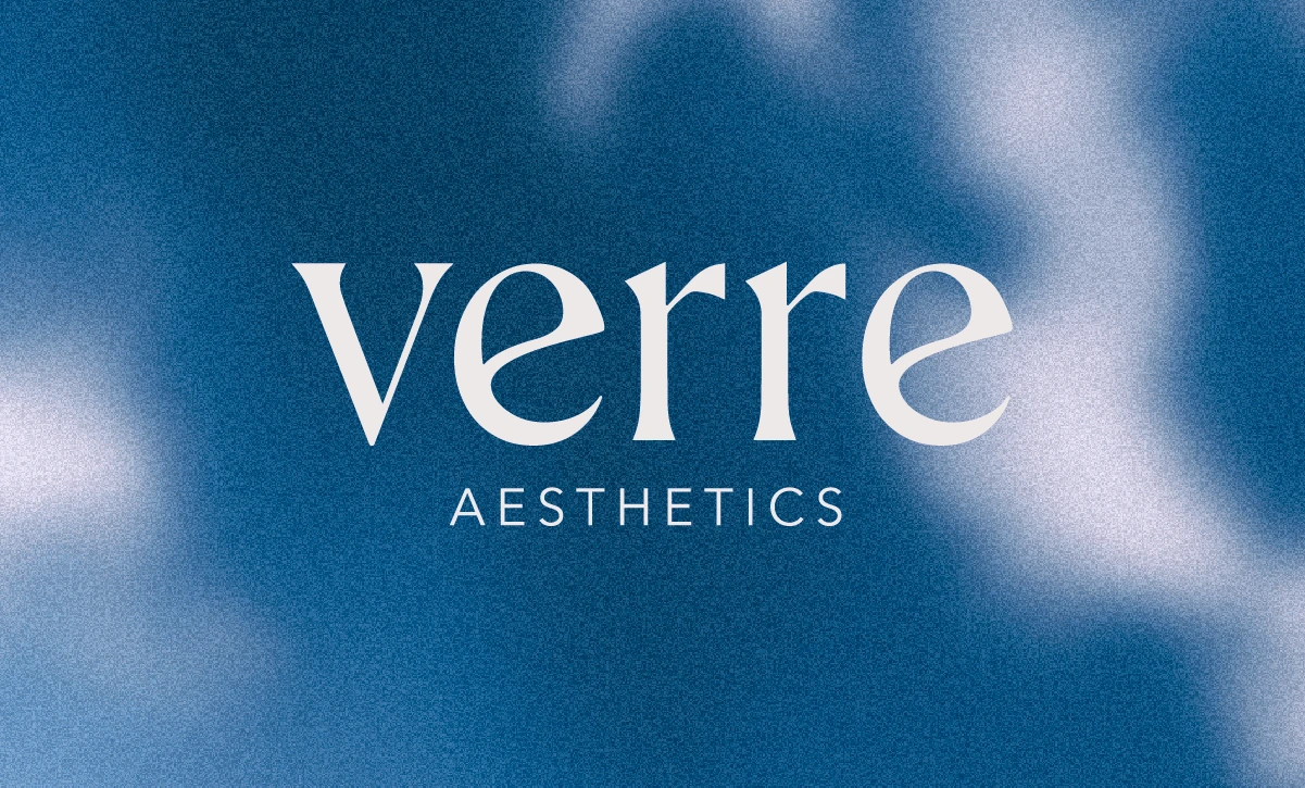
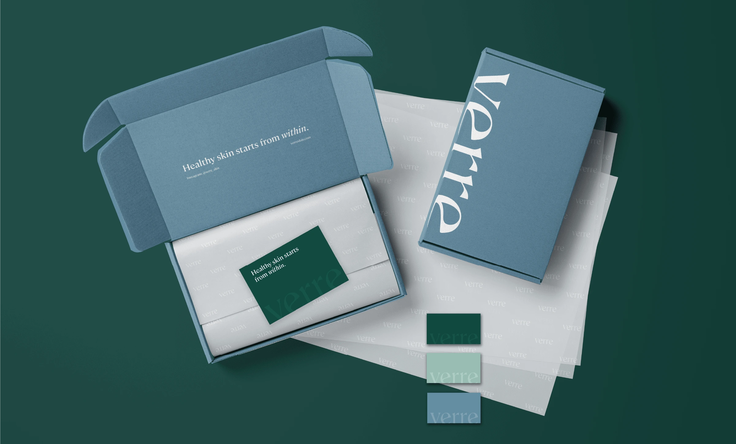
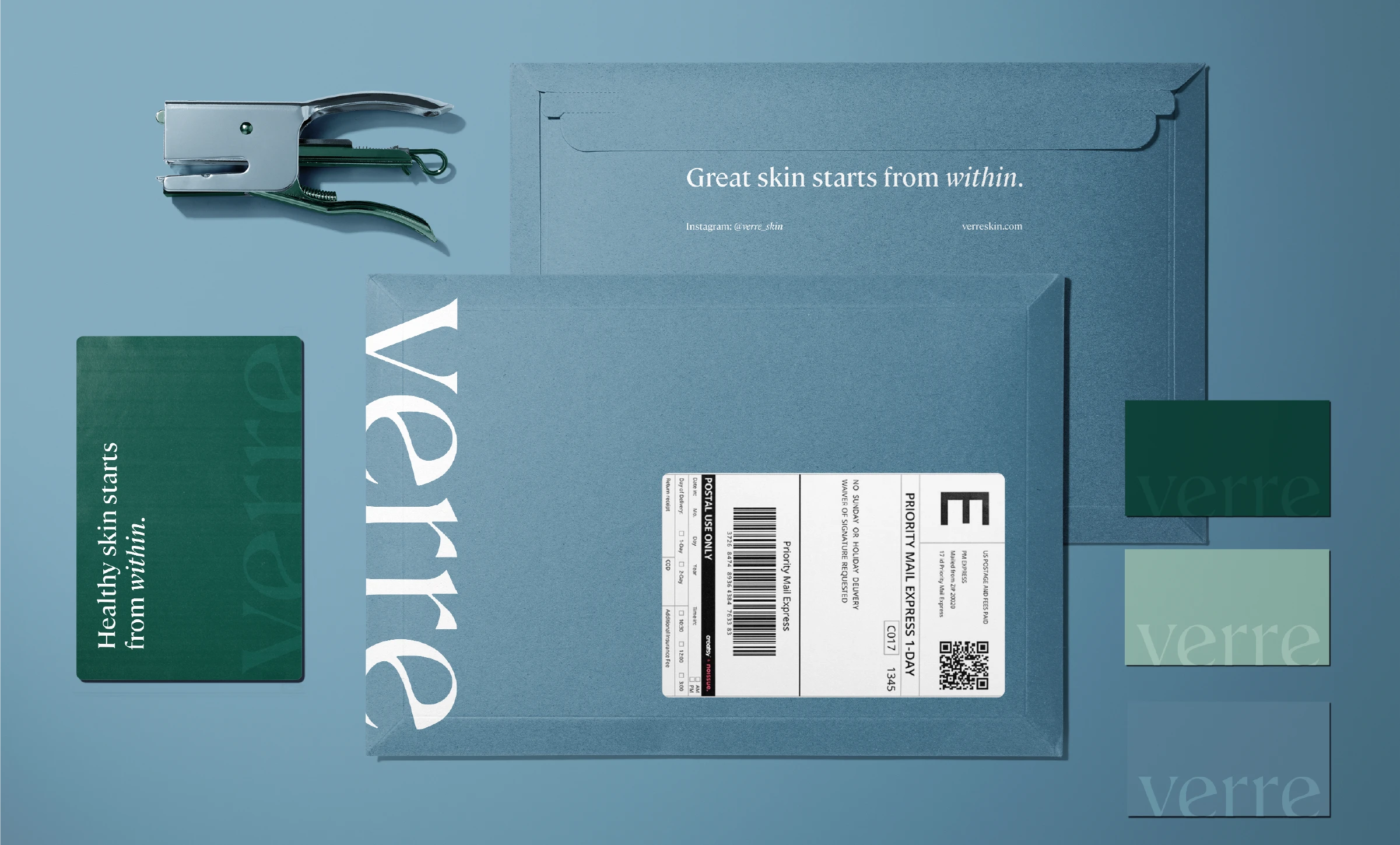
Together with her daughter, they knew what they wanted to create, but they needed help to visualize it. They needed a brand, had some idea about colors, needed packaging, signs, cards, and every asset imaginable for opening your own physical space. They chose the name Verre as the reference in French means glass and they wanted their clients’ skin to be clear as glass and they help their clients create the best regiment to do so. With the name and the meaning behind it, they wanted a brand that reflected this idea as well.
Nancy has been educating herself and her team and has been using science to look at the entire aspect of beauty - hence their brand slogan: ‘Healthy skin starts within’. She wanted to ensure that the brand came across as cutting-edge, elegant and professional without looking stiff and boring. - And that’s what we did.
Some considerations:
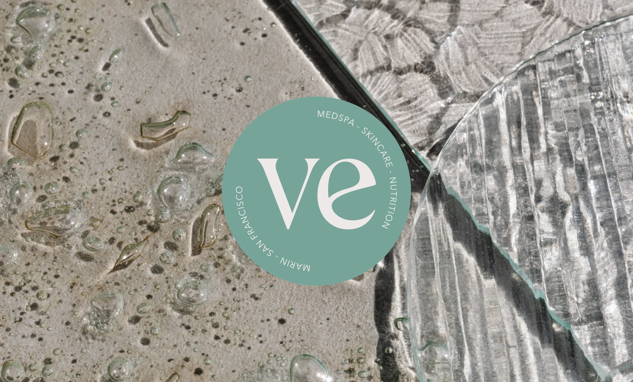
Their new hub, would be based in the middle of San Francisco, and there are a lot of medspas and beauty parlors established in the area - so how to you ensure that you don’t end up looking the same as everyone else and that you stand out high above the ret of the competition?
Verre also wanted to target a new audience in the bay area, without losing clients that had been coming to Nancy for her expertise for years.
What we did:
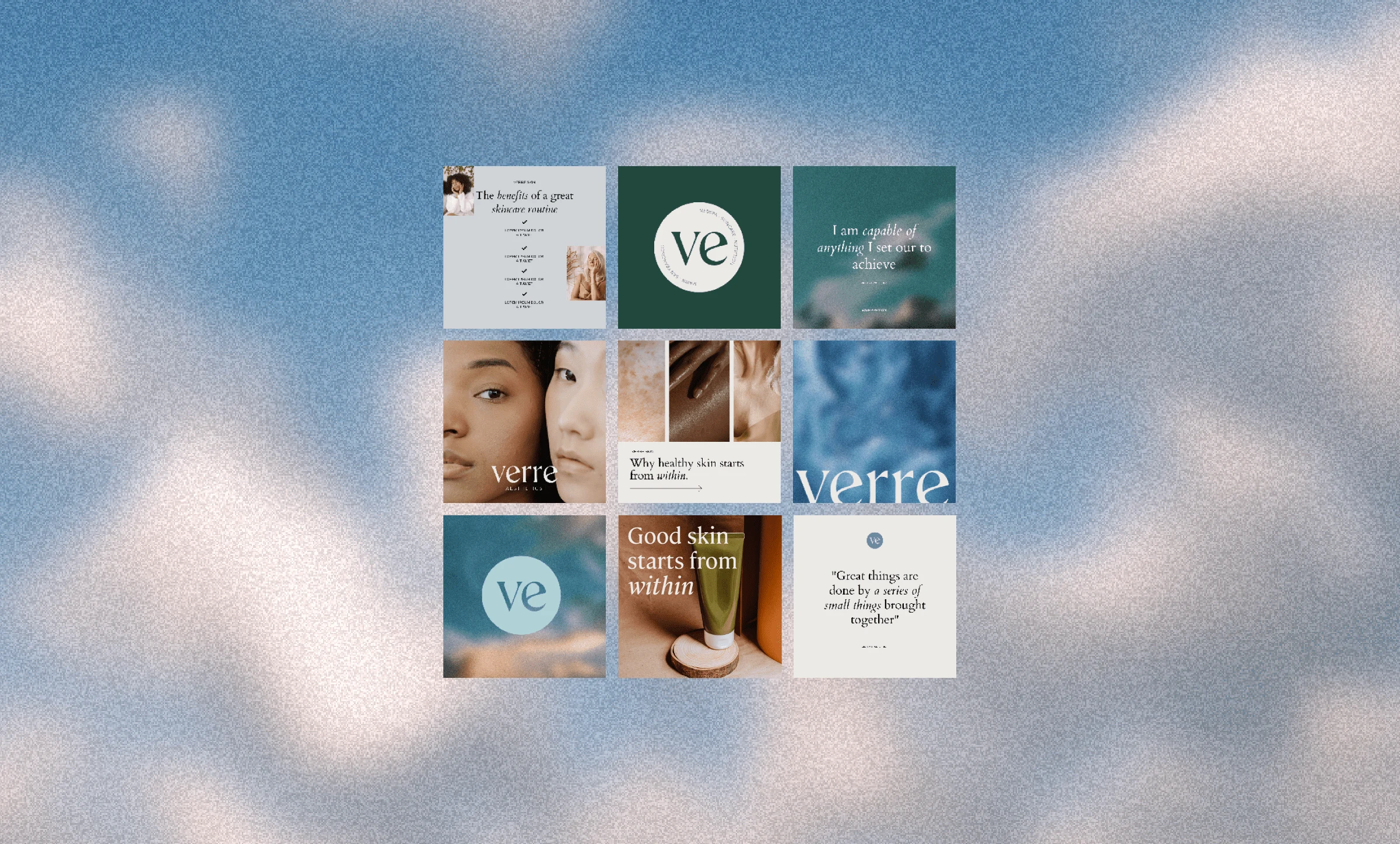
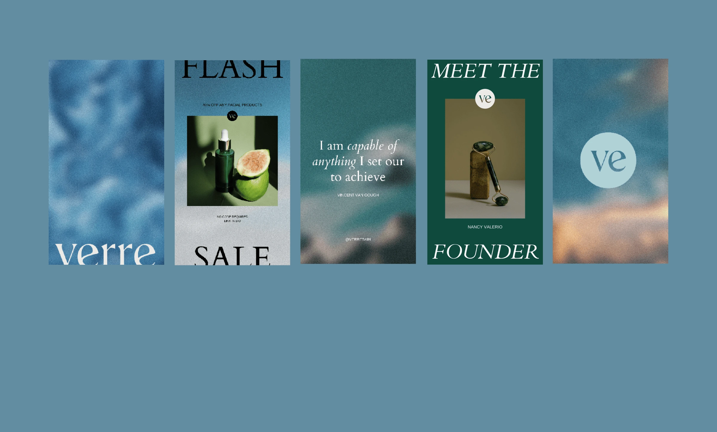
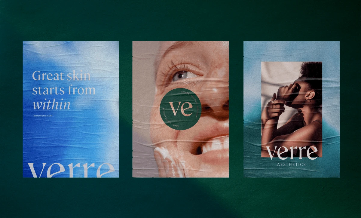
We wanted to link back to the idea of refreshing & renewing and how everything essentially exists out of water. And how water maintains us, cleanses us, and renews us. At the same time, bodies of water and looking at water are scientifically proven to lower stress and relax people. People come to Verre for expertise and knowledge and leave feeling renewed and energized with a plan in hand to maintain long-term results. Not superficial treatments but treatments that look deeper and look at other factors that influence our body, skin, and more.
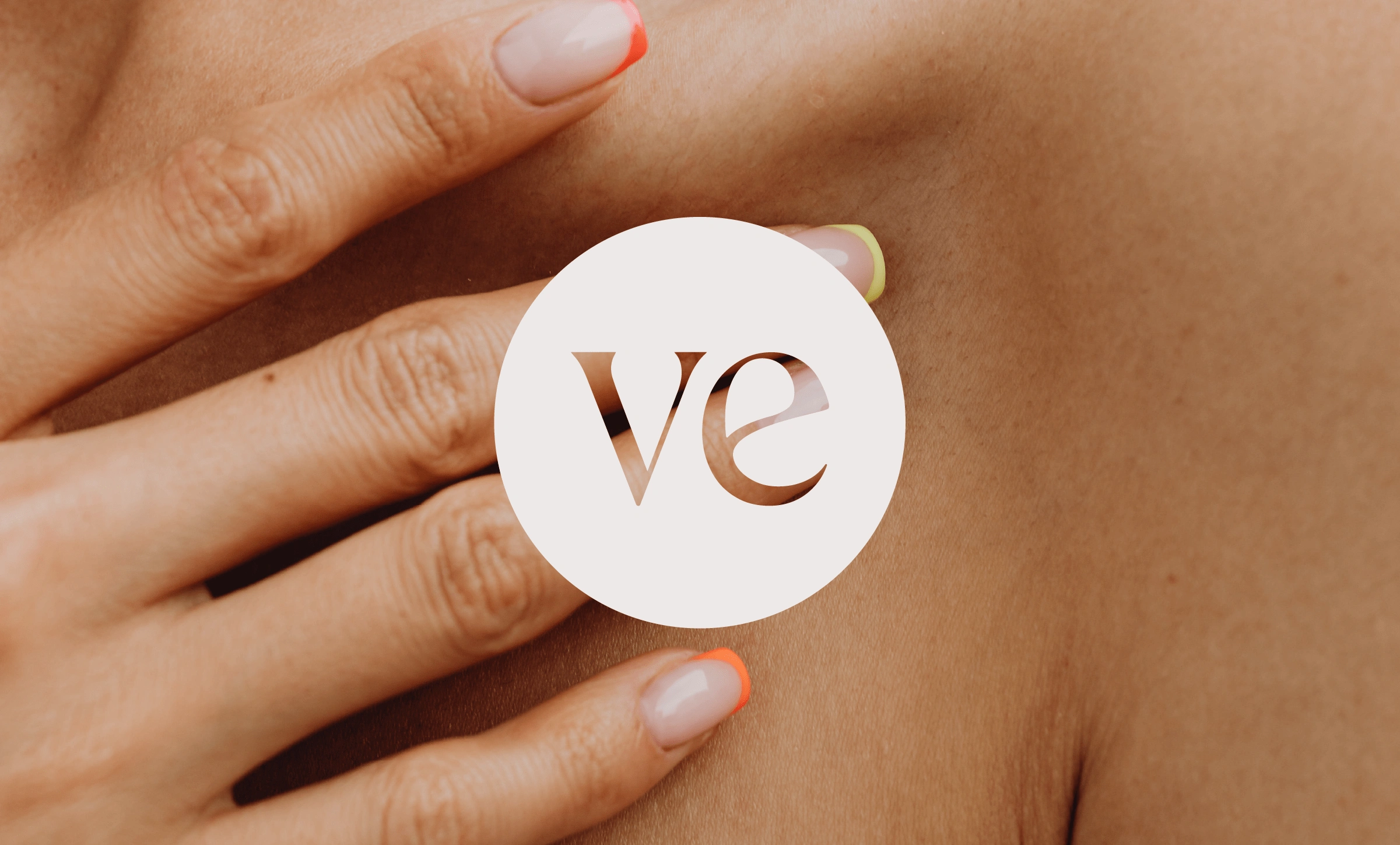
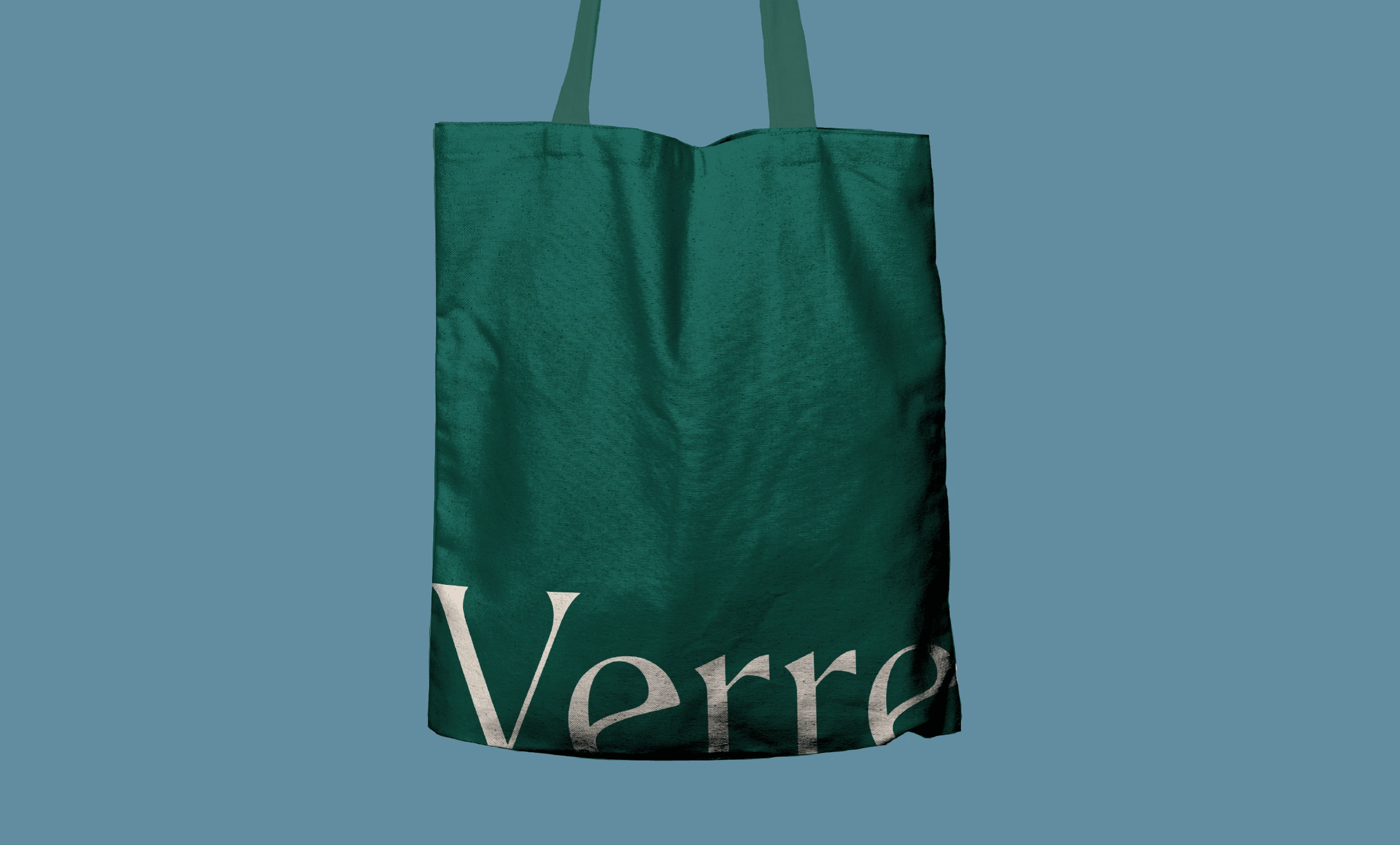
The Verre logo is a combination of sharp-edged type combined with a softer, rounder wave in the letter e giving it a strong but elegant touch. See what I did there, I said wave, as yes it refers to bodies of water again.
Using and customizing this typeface for the logo helped the brand stand out from the crowded competitive market and establish itself as a strong, simple, elegant, and still approachable brand.
Like this project
Posted Jul 19, 2023
Branding, logo design & marketing materials for Verre Aesthetics, a new store with about 30 years of holistic skincare experience.