
Designer, Illustrator & Character-Focused Storyteller
- $1k+
- Earned
- 5x
- Hired
- 5.0
- Rating
- 79
- Followers
Designer, Illustrator & Character-Focused Storyteller


Creative partner in your brand’s success


Creative partner in your brand’s success




Luxury Brand and Web Designer
- $5k+
- Earned
- 1x
- Hired
- 5.0
- Rating
- 15
- Followers
Luxury Brand and Web Designer


Château Mocha
Luxury Pâtisserie Brand Identity & Creative Direction
Overview
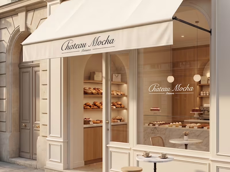
Château Mocha is a luxury pâtisserie concept inspired by the quiet elegance of Parisian cafés, where timeless interiors, artisanal craftsmanship, and refined simplicity come together.
The project was developed as a complete brand universe, combining strategy, visual identity, packaging, and art direction to create a cohesive experience across every customer touchpoint.
Rather than designing individual assets, the objective was to create a brand that feels instantly recognizable, from the storefront to the packaging, product presentation, and digital imagery.
The Concept
Luxury isn't created through decoration, it's created through consistency.
Château Mocha was imagined as a modern Parisian pâtisserie that celebrates slow mornings, handcrafted pastries, and elevated everyday rituals.
Every visual decision was made to communicate warmth, sophistication, and timeless elegance while allowing the products to remain the true focal point.
What I Created:
• Brand Strategy
• Creative Direction
• Brand Identity Design
• Logo & Monogram Design
• Visual Identity System
• Packaging Design
• Product Visualization
• Art Direction
Creative Direction
The visual language balances classic French elegance with a contemporary minimal aesthetic.
A restrained palette of warm creams, rich mocha browns, and soft neutrals creates a sense of warmth and refinement. Editorial-inspired photography, understated typography, and carefully styled product imagery establish an atmosphere that feels premium without appearing excessive.
Every element, from the embossed butter monogram to the takeaway packaging and storefront applications, was designed as part of one cohesive brand experience.
Outcome
The result is a fully realized luxury brand concept that demonstrates how consistent creative direction transforms individual assets into a memorable customer experience.
Designed to feel timeless rather than trend-driven, Château Mocha showcases how branding extends beyond a logo to shape the atmosphere, perception, and emotional connection of a brand.
0
104

Brand identity & launch websites for early-stage startups ·
- 44
- Followers
Brand identity & launch websites for early-stage startups ·



Purposeful branding, user-focused design & web experiences

Purposeful branding, user-focused design & web experiences


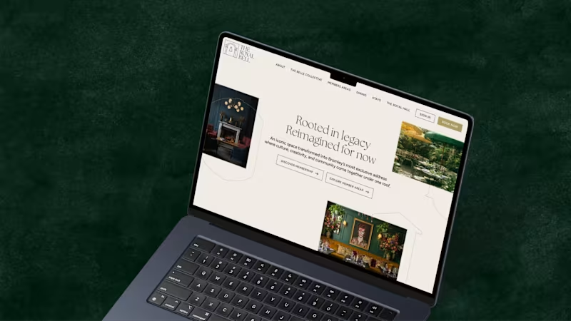
A recent project for The Royal Bell, a heritage venue reimagined as a modern members’ club. I led the brand development across print and digital, designing and building a website that complements the visual identity. The result is a refined brand system that balances heritage character with timeless elegance.
4
23
442
A bold refresh for The Dragon Trip, a travel company known for its immersive group adventures across Asia, from backpacking through Vietnam to family tours in Japan.
As they expanded their adventures worldwide, I led the brand and digital evolution: restructuring the website for better UX, introducing a clear trip segmentation system and evolving the visual identity to feel more global while staying true to their adventurous spirit.
21
481

Video editing, Content Marketing, Design


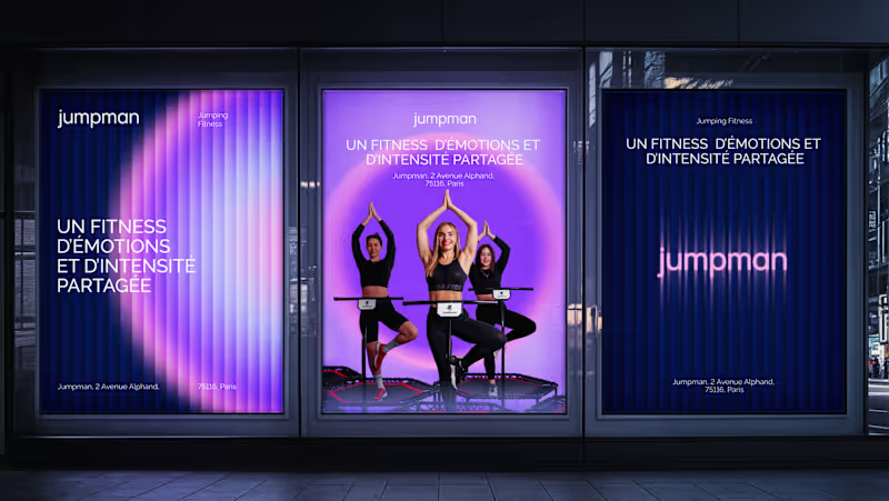


Brand Designer | Transforming vision into design that drives
- 104
- Followers
Brand Designer | Transforming vision into design that drives

Hey Contra community.
Wanted to share one of my favourite projects I’ve worked on recently.
This is Irene’s Dough, a warm and nostalgic brand built around a single handwritten signature. The “I” comes from Irene’s actual writing, and turning it into the heart of the identity was what shaped the whole visual direction.
The goal was to create a brand that feels personal, handmade and full of comfort. Soft colours, rounded type, and a crest built from the signature help bring that emotion into the packaging and overall look.
Loved building this one. It’s one of those projects that remind me why I enjoy branding so much, taking something small and meaningful and turning it into a full visual world.
Excited to share more soon. Thanks for having me here.
1
117

Hey Contra community.
Wanted to share another branding exploration I developed recently.
This one is Bake Boss, a bold and modern identity built for a bakery brand with attitude. The idea was to move away from the usual “cute bakery look” and create something with personality, clean, confident, and memorable.
I worked on a full visual direction: logo, colours, layout system and packaging feel. The goal was simple, make the brand look as professional as the products taste, while still keeping a fun, approachable energy.
Loved building this one and pushing a different kind of bakery aesthetic.
Excited to keep sharing more work with the community. Thanks for the space.
31
137
861

Hey Contra community.
Still getting used to the platform, so I wanted to share another project I’ve been building recently.
This is Ophie, a lip oil brand created around softness, femininity and effortless beauty.
The goal was to design something that feels delicate but still has presence, from the butterfly-inspired symbol to the sculpted metallic petals on the packaging.
I focused on creating a brand world that feels light, dewy and modern. Clean lines, soft tones, and a product experience that looks as smooth as it feels.
It was a fun challenge mixing elegance with a bit of fantasy, and I’m excited to finally put this one out there.
Looking forward to connecting with more creators here and sharing what’s next.
1
108

Hey Contra community, Lucas here.
First post on the platform, so I wanted to share something fun I’ve been working on.
This is Moo Moo, a branding concept I created from scratch. The idea was simple: build a beverage brand that feels playful, bold and full of personality. I wanted it to look like something you’d spot on a shelf and instantly smile at.
I explored colour, typography and expressive illustrations to give the brand its own character. Nothing too serious, just honest design that feels alive and a bit chaotic in the best way.
Excited to share more work here and connect with other designers.
Thanks for having me.
10
22
250

Brand Designer with Strategy and Purpose

View more →