Luxury Brand Identity for Hotel Intemporel
Carolina Marques
Case Study: Hotel Intemporel – Luxury Parisian Brand Identity
Project Overview:
Hotel Intemporel is a luxury boutique hotel located in the heart of Paris. This project involved developing a full brand identity—including a logo suite, color palette, typography, and applications—anchored in a strategic approach to position the hotel as a premier, timeless, and memorable destination for discerning travelers.
1. Brand Strategy
Although this began as a passion project, the branding strategy was intentionally crafted to ensure clarity, consistency, and market positioning:
Brand Purpose:
To provide a timeless, luxurious Parisian experience that blends historic elegance with modern comfort.
Brand Vision:
Become a top-of-mind destination for travelers seeking exclusive luxury, impeccable service, and authentic Parisian charm.
Target Audience:
International luxury travelers
Couples seeking romantic getaways
Business travelers who value style and comfort
Guests who appreciate art, design, and culture
Brand Positioning Statement:
"Hotel Intemporel offers an unforgettable Parisian experience, combining timeless luxury, classic elegance, and personalized service, making every guest feel uniquely celebrated."
Key Brand Values:
Elegance: Sophisticated and refined in every detail
Timelessness: Classic design that endures trends
Exclusivity: Personalized experiences for discerning guests
Authenticity: True Parisian charm and hospitality
Memorability: Every touchpoint creates a lasting impression
Strategic Goals:
Establish a cohesive, high-end visual identity that communicates luxury and sophistication.
Build brand recognition through memorable logos and a strong color palette.
Support digital presence and offline applications to create a seamless guest journey.
Reinforce the hotel’s unique positioning as an intimate, upscale destination in Paris.
2. Logo Suite
The logo system was designed to balance elegance, memorability, and versatility:
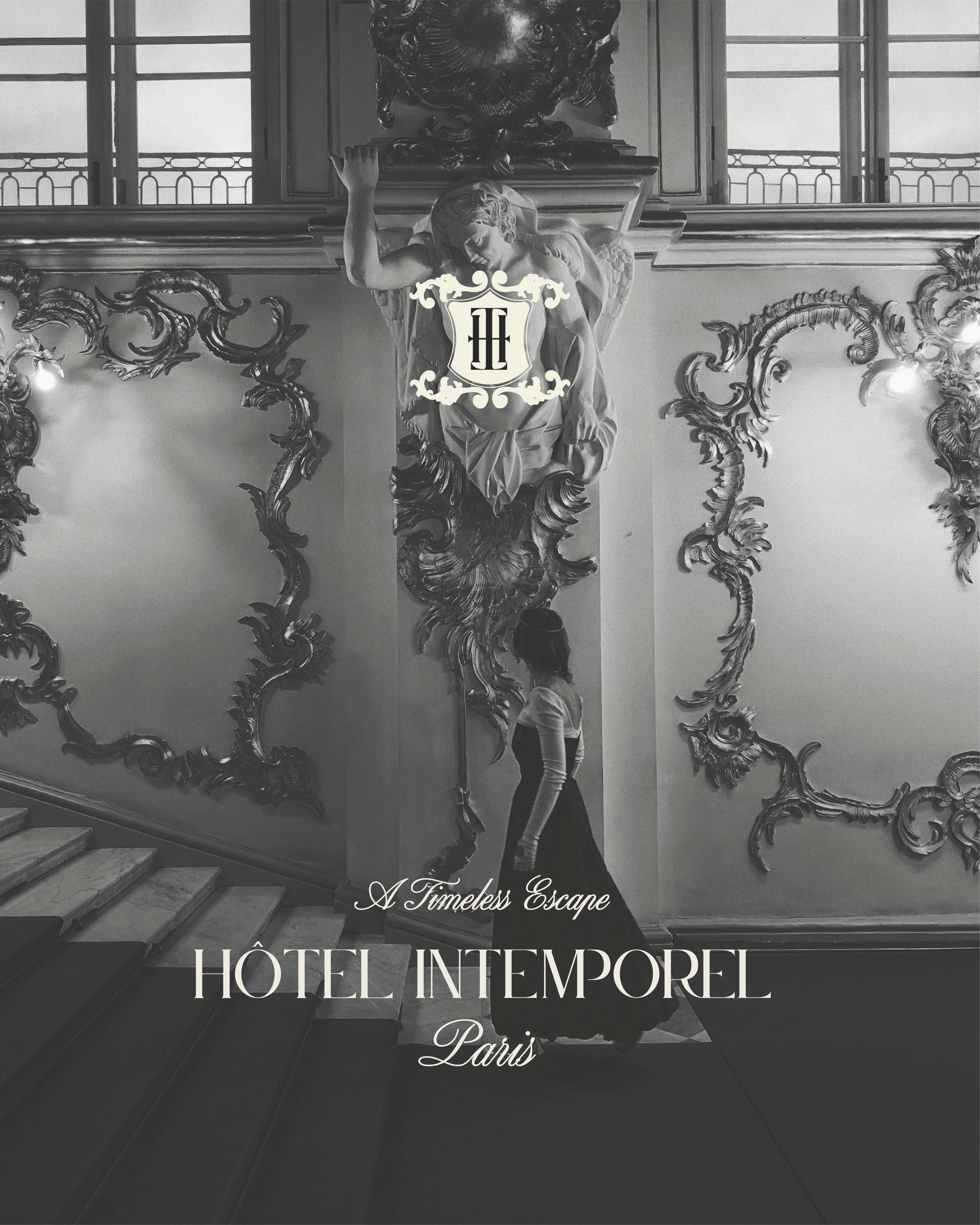
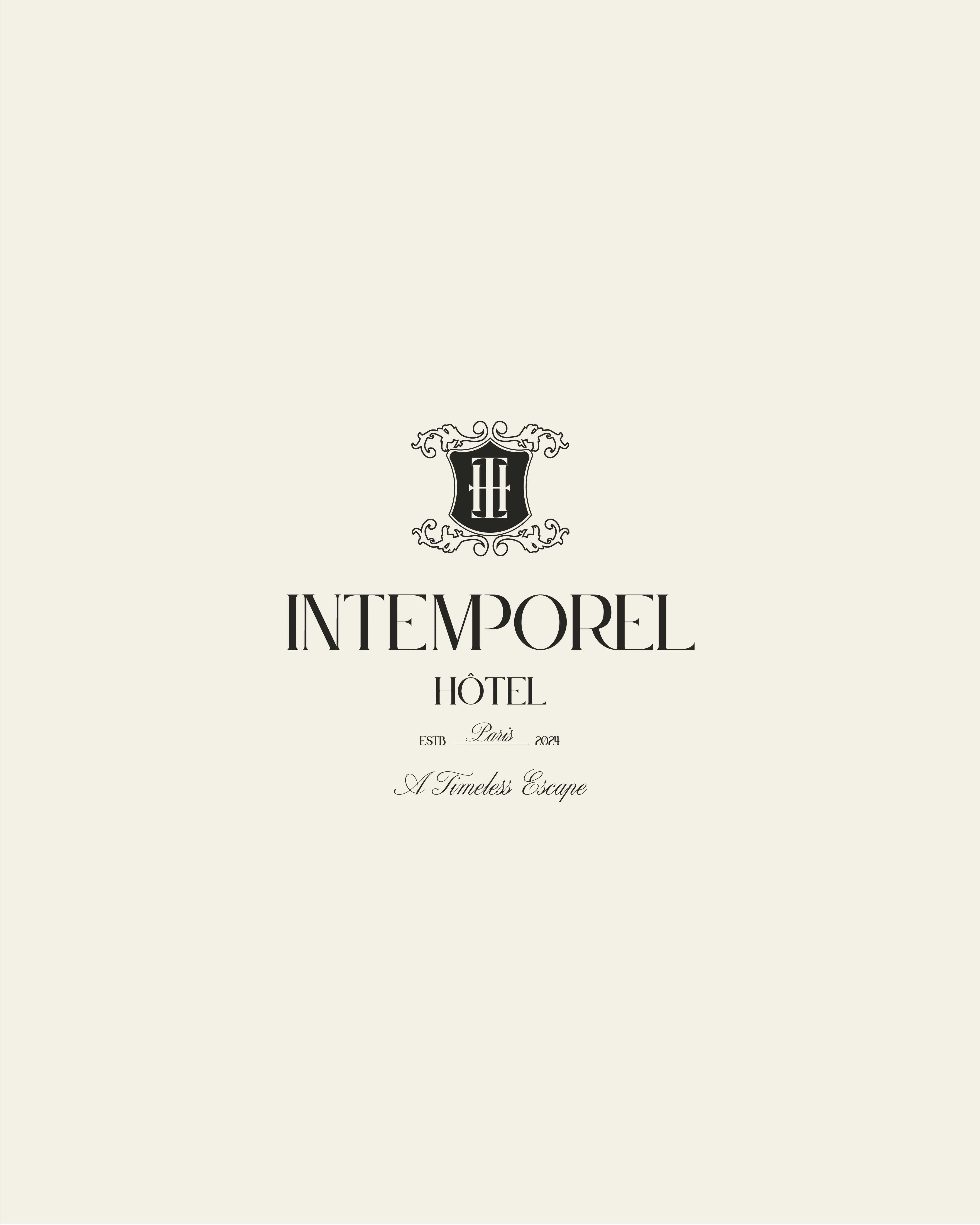
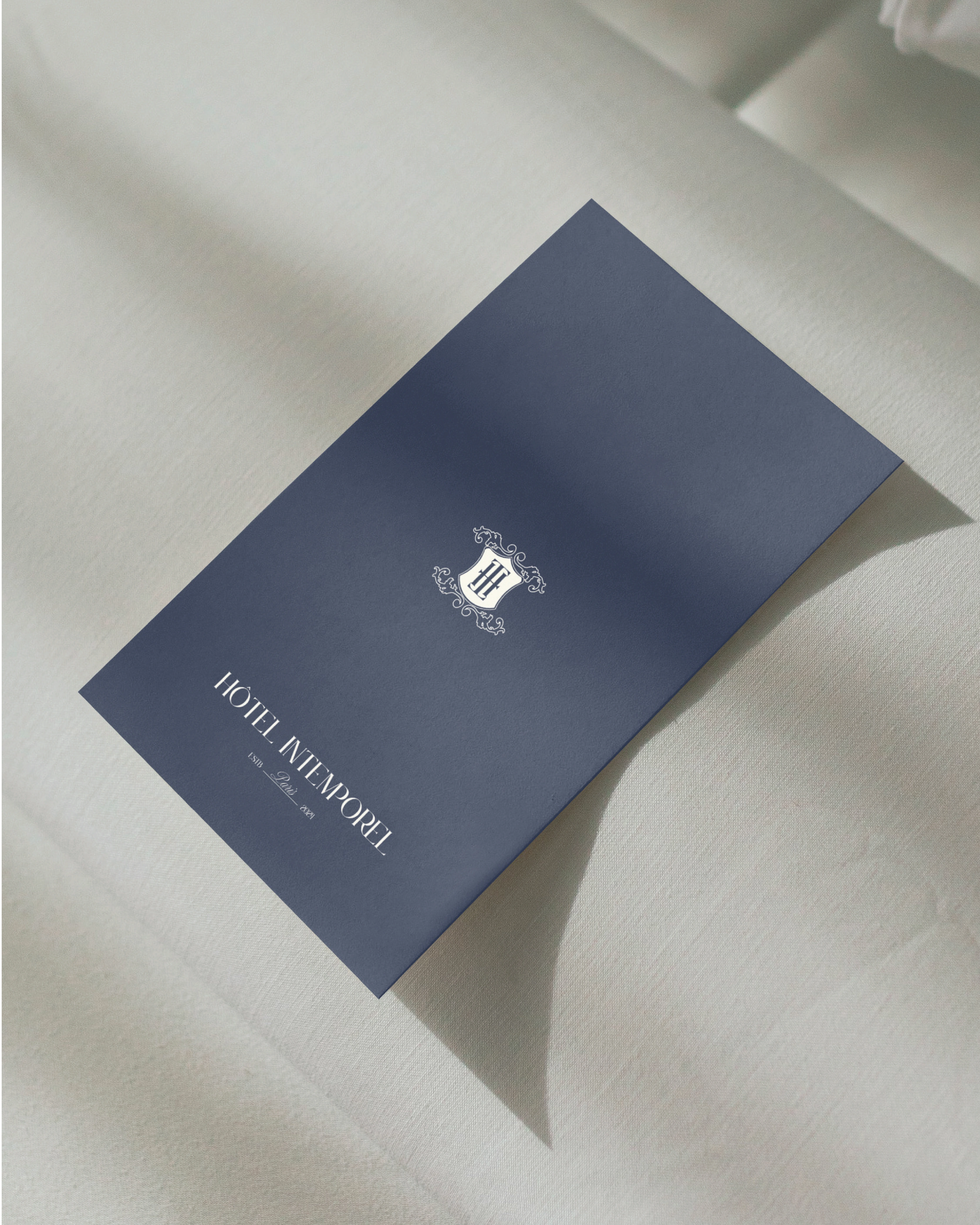
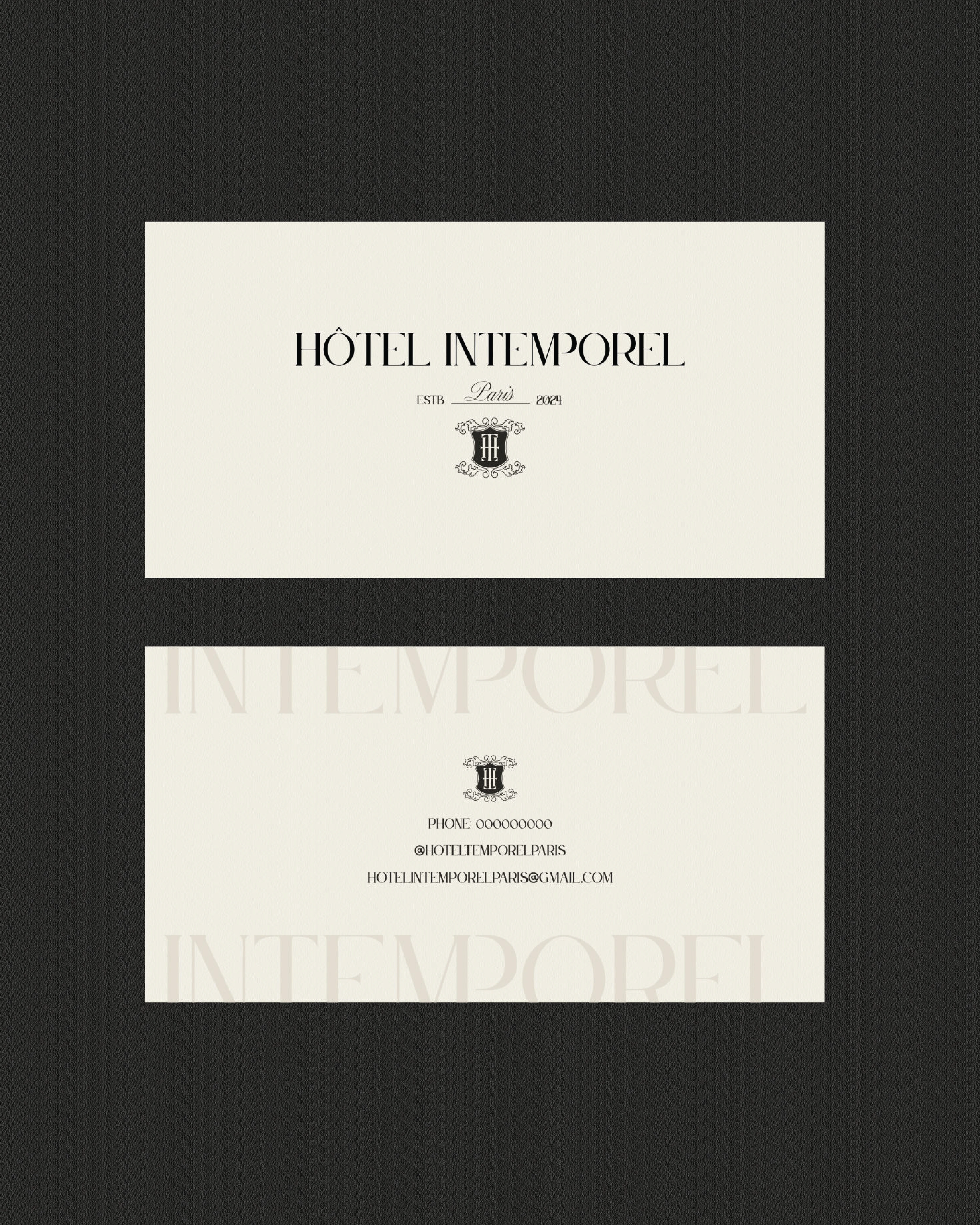
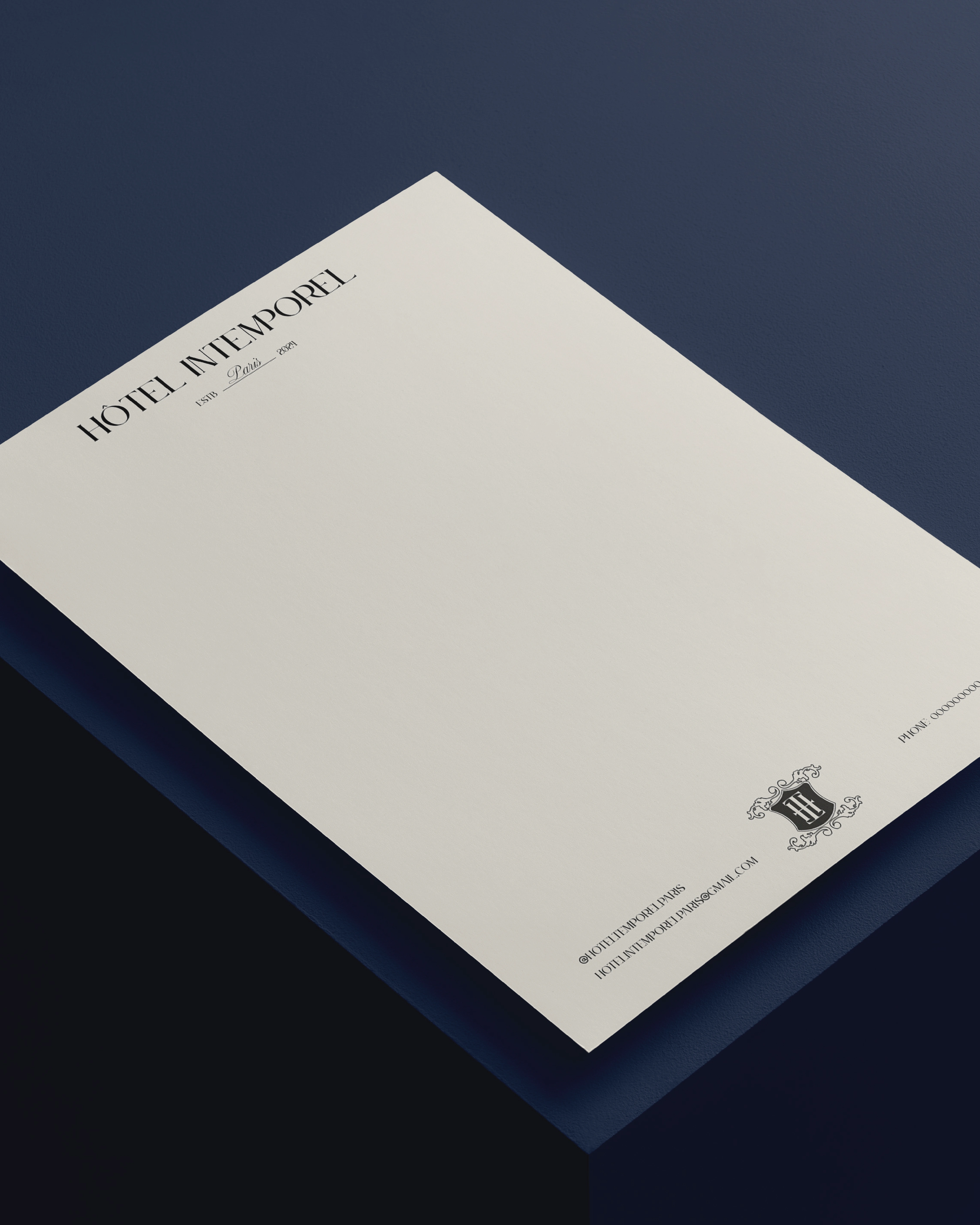
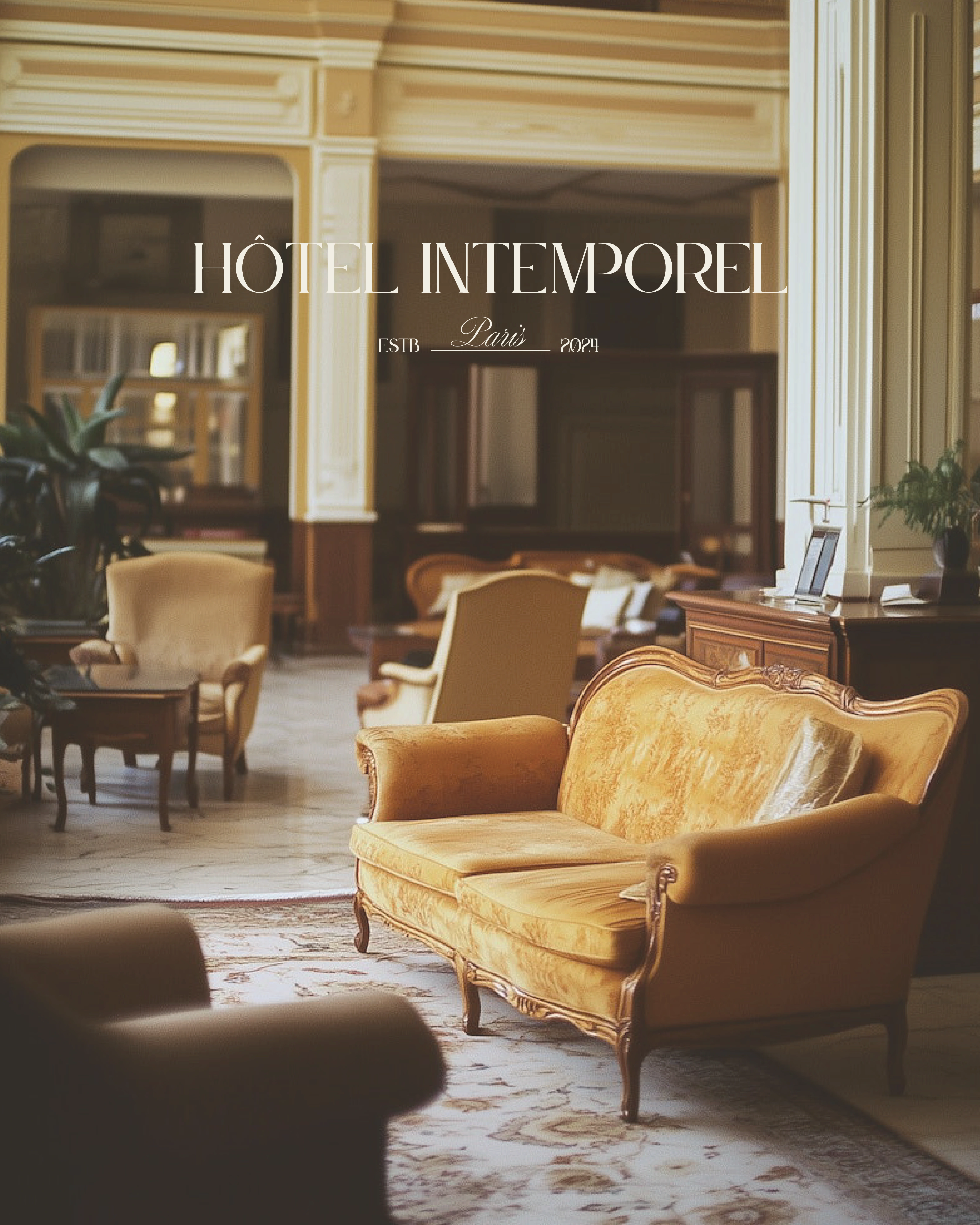
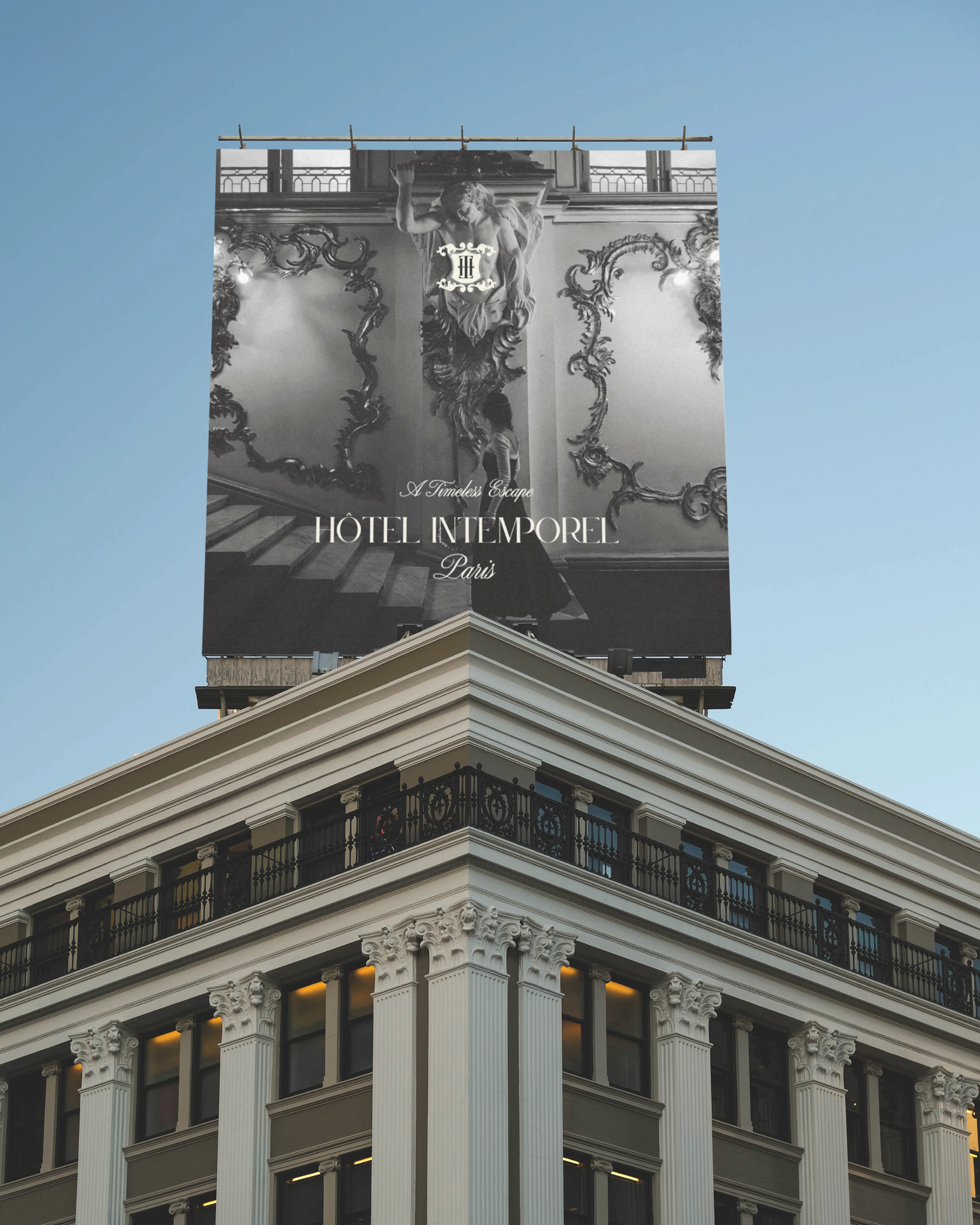
Primary Logo: Combines the hotel name, established date, location, tagline, and a symbolic emblem. Used across the website, exterior signage, and marketing collateral.
Secondary Logo: Compressed version with the hotel name and symbol, suitable for smaller formats like social media avatars.
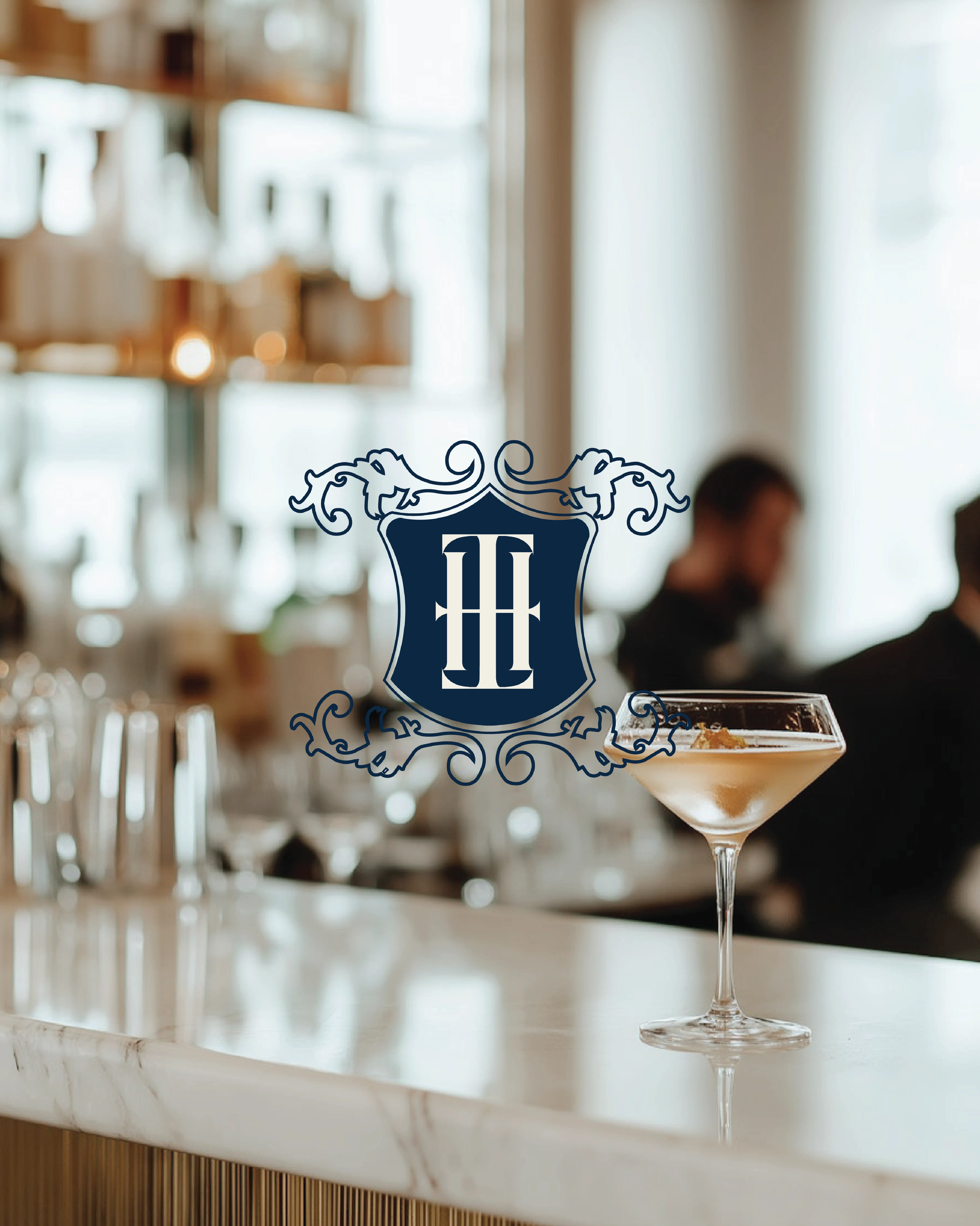
Submark: Features the hotel initials (HI) in the center of an elegant, classic symbol, used for decorative or small-scale applications.
Logo Variations: Horizontal, vertical, and digital/print variations to ensure flexibility and consistency.
Strategic Intent: Each logo variation ensures the brand remains recognizable in every context, from large-scale signage to subtle room amenities.
3. Color Palette
The color palette communicates luxury, warmth, and sophistication:
Light Off-White Beige: Clean, elegant foundation for the brand
Deep Royal Blue: Premium, authoritative, and timeless
Grayish Beige: Warmth and balance, complements neutral tones
Dark Grey: Modern, versatile, and strong for text and accents
Deep Gold: Luxury, opulence, and refinement for highlights
Strategic Intent: Colors were chosen to evoke a feeling of prestige and calm, enhancing the guest’s perception of quality and exclusivity.
4. Typography
Title Typeface: Le Jour (Serif): Classic elegance for headings and signage
Text Typeface: Raleway (Sans-Serif): Readable, modern, and sophisticated
Accent Typeface: Altesse Script: Luxurious, hand-drawn script for highlights, adding personality
Strategic Intent: Typography reinforces hierarchy, elegance, and brand personality, ensuring consistency across digital and physical materials.
5. Brand Applications
The visual identity was applied across multiple touchpoints to create a seamless guest experience:
Signage & Exterior: Primary logo featured on building facades and entrance signage
Digital Presence: Website, social media, and digital campaigns leverage the color palette, typography, and logo system
Guest Materials: Stationery, keycards, menus, and room guides incorporate submarks and variations for cohesive branding
Merchandising & Packaging: Amenities, gift packaging, and branded merchandise use deep gold accents and subtle HI submarks to reinforce premium positioning
Strategic Intent: Each touchpoint was considered part of the guest journey, creating a consistent impression of luxury and exclusivity.
6. Conceptual Narrative
The branding narrative positions Hotel Intemporel as:
Timeless: Classic design and logos reflect enduring elegance
Luxury: Deep royal blue and gold accents evoke richness and sophistication
Memorable: The HI submark creates a distinctive symbol of exclusivity
Authentic: Parisian-inspired details convey culture, style, and warmth
Guest-Centric: Every element—from color to typography—is designed to elevate the guest experience
7. Reflection & Takeaways
This project demonstrates that even a passion project can benefit from a strategic framework. By defining target audience, values, and positioning, the branding feels intentional and professional. Key takeaways include:
Clear strategy supports visual decisions and ensures consistency
Elegant and flexible logo systems strengthen brand recognition
Thoughtful color and typography choices reinforce luxury positioning
A strong brand narrative enhances the perceived guest experience
Project Type: Luxury Brand Identity / Hospitality Branding
Deliverables: Logo suite, color palette, typography, submark, brand variations, applications for digital and print
Like this project
Posted Nov 16, 2025
We developed a refined visual identity for Hotel Intemporel, conveying a high-end, memorable presence befitting a premium hotel in the heart of Paris.