OneSearch Group Brand Strategy & Visual Identity
Carolina Marques
Case Study: OneSearch Group – Full Brand Strategy & Visual Identity
Project Overview:
OneSearch Group (OSG) is a premium executive recruitment firm focused on elite talent and long-term strategic partnerships. This project involved developing a complete brand strategy and visual identity to position OSG as a knowledgeable, selective, and trusted partner in high-level talent acquisition.
1. Brand Foundation
OSG was built to elevate recruitment beyond transactional hiring. The strategy centered on the Sage archetype, emphasizing expertise, clarity, and strategic insight, while maintaining a human-centered and relationship-driven approach.
The brand positioning focuses on quality over quantity, exclusivity, and long-term partnerships.
2. Branding Objectives
Position OSG as an elite, knowledge-driven recruitment firm.
Communicate professionalism with approachability.
Reinforce exclusivity and premium service.
Create consistency across messaging and visuals.
3. Brand Strategy
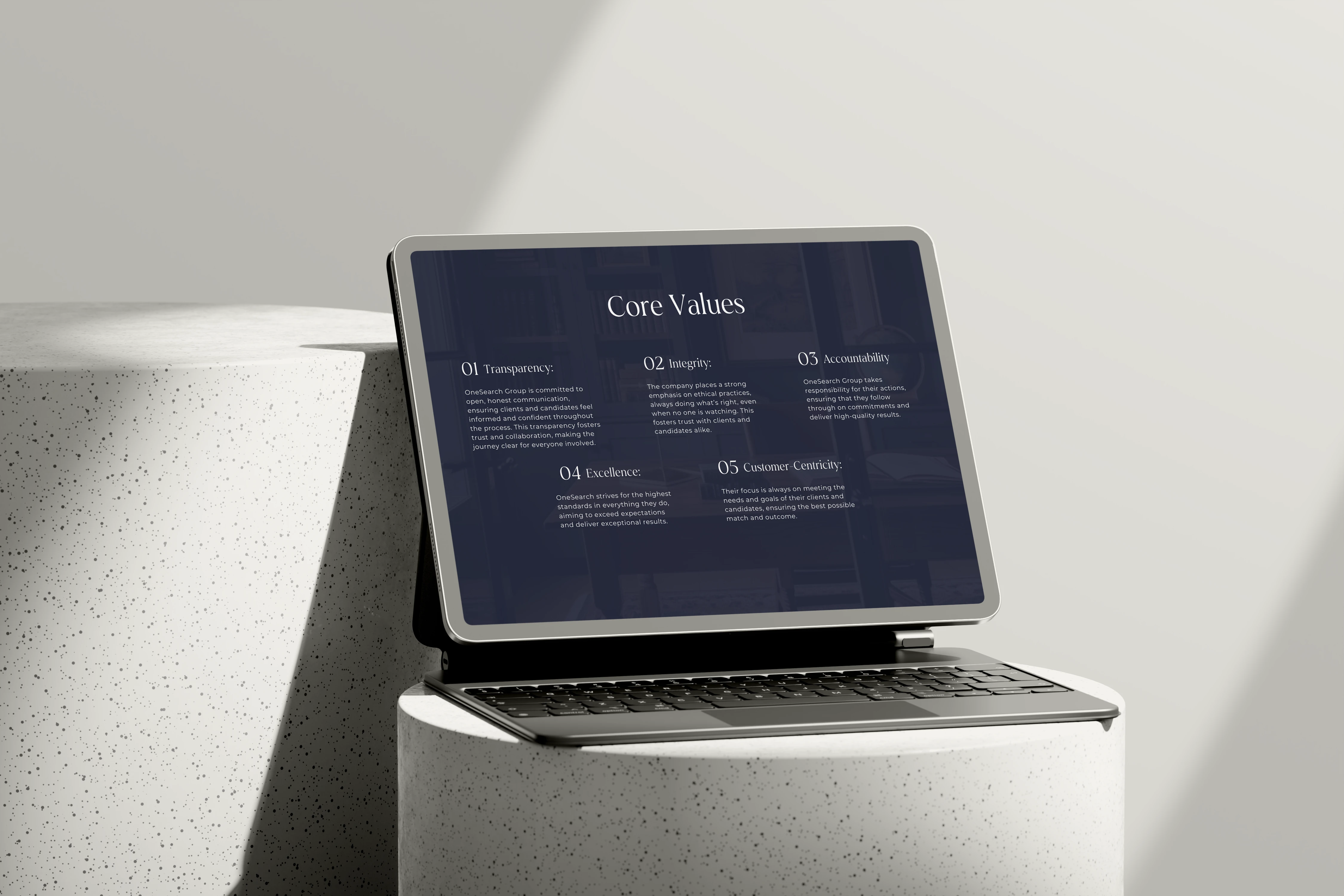
Core Values: Transparency, Integrity, Accountability, Inclusion, Excellence, Customer-Centricity.
Brand Personality: Knowledgeable, Professional, Trustworthy, Reliable, Empathetic, Approachable.
Tone of Voice: Confident, clear, and direct—expert-led but accessible.
Tagline Direction:
Precision Talent. Trusted Partnerships.
Tailored Solutions. Trusted Partnerships.
4. Target Audience
Ideal Client: Senior executives and partners in finance, corporate leadership, and high-level industries. Strategic, decisive, selective, and results-driven. They value premium service, exclusivity, and long-term impact.
Ideal Candidate: High-achieving professionals seeking leadership roles, aligned with growth, efficiency, and professional excellence.
5. Visual Identity
The visual identity was designed to reflect OSG’s dual nature: strategic precision and human connection.
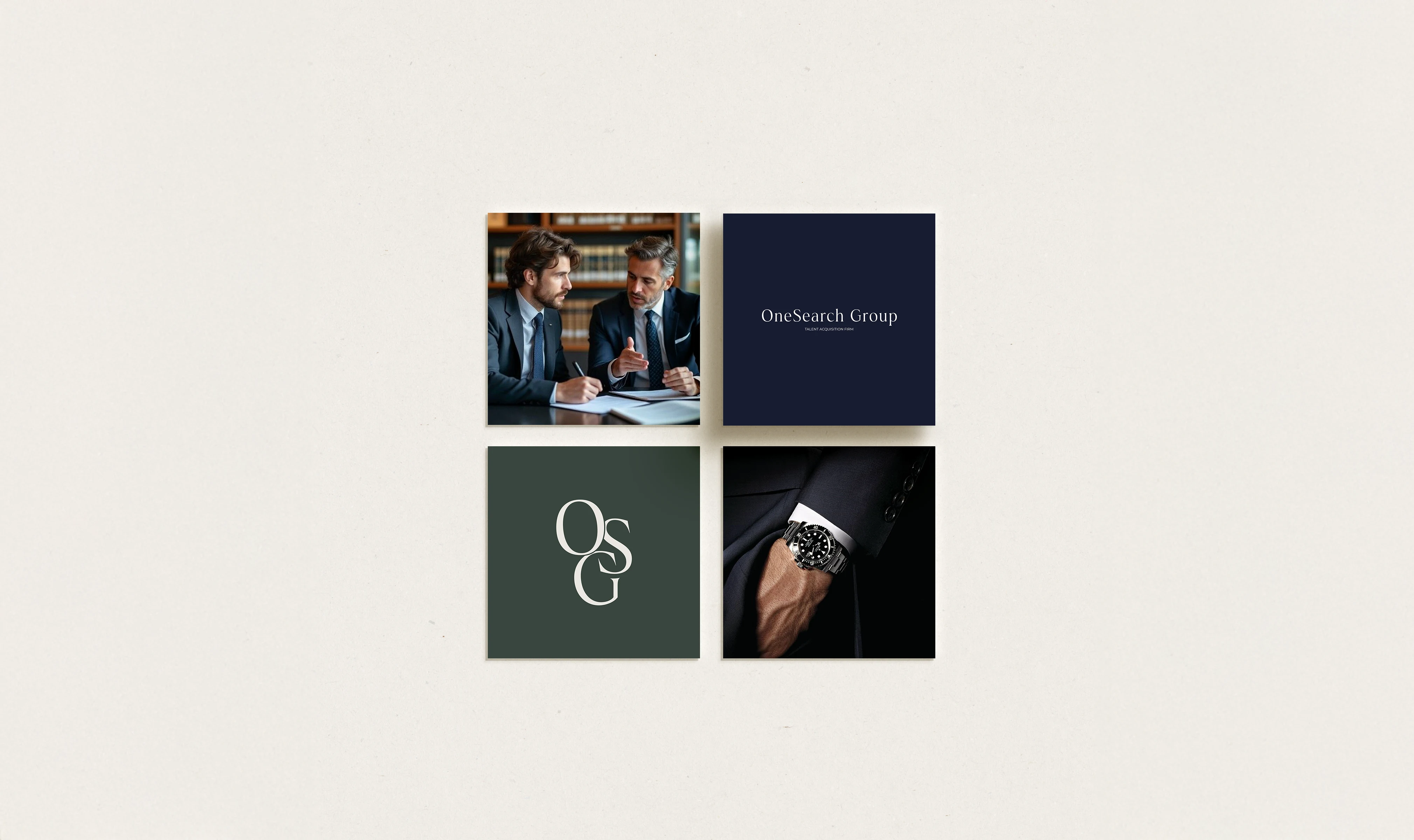
Logo System
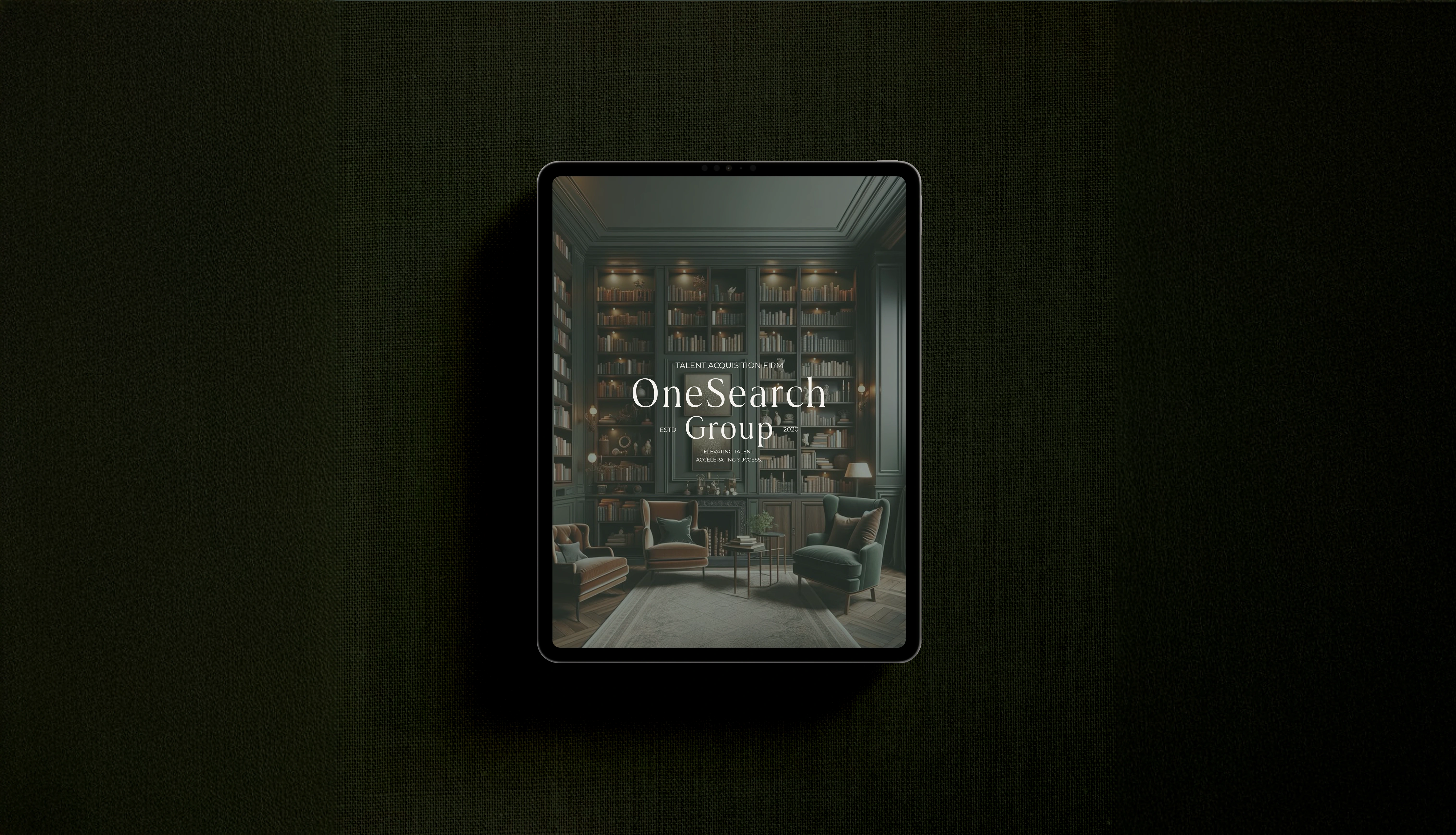
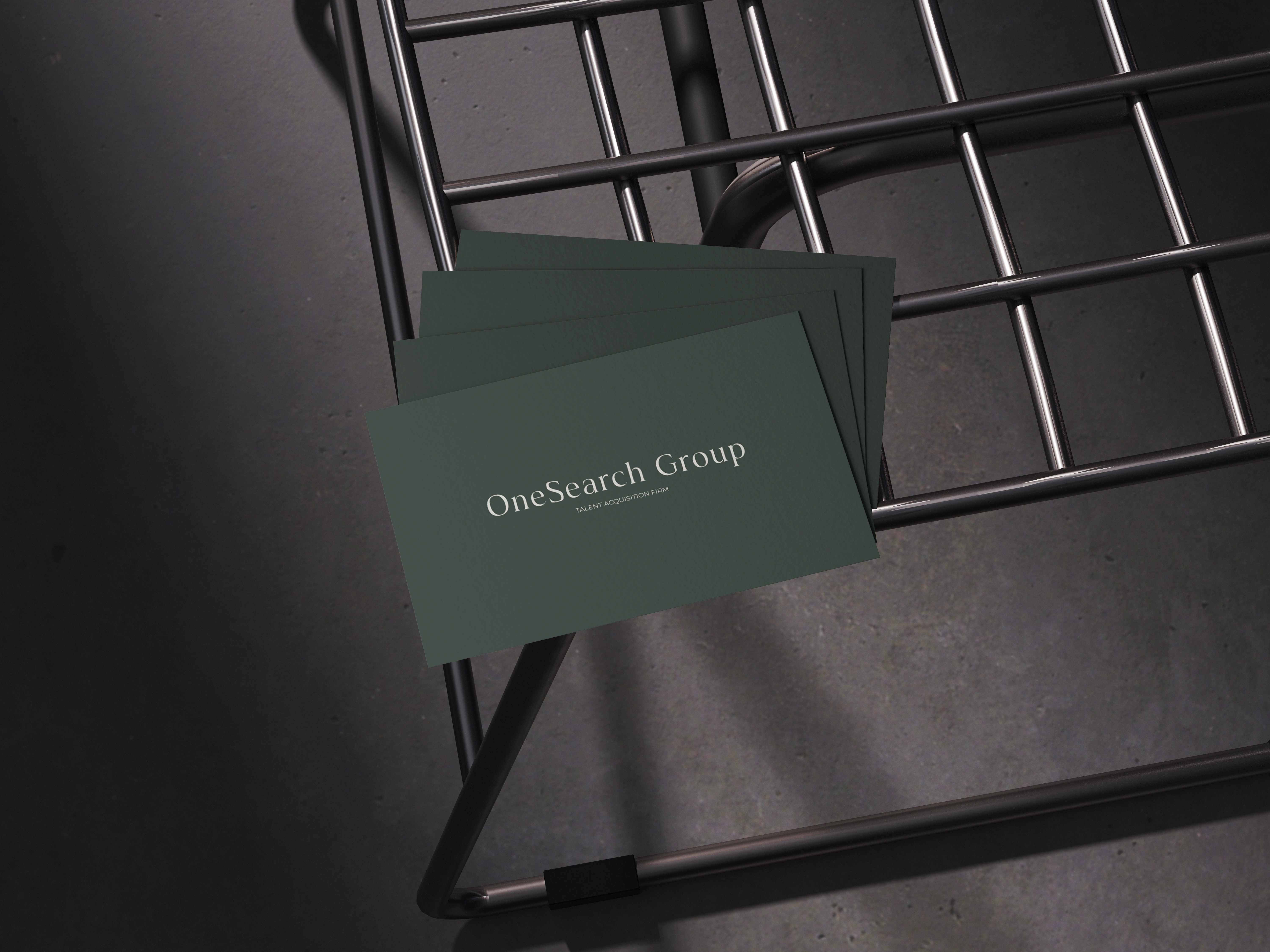
Primary Logo:
The most complete expression of the brand, combining thoughtful typography and balanced structure. It communicates professionalism, luxury, and approachability.
Montas Regular (Primary Typeface): A modern typeface with clean geometry and subtle humanist details. It conveys clarity, confidence, and warmth—reflecting OSG’s knowledgeable yet approachable personality.
Montserrat (All Caps) for secondary elements: Adds structure, hierarchy, and a corporate edge, balancing the softer qualities of Montas.
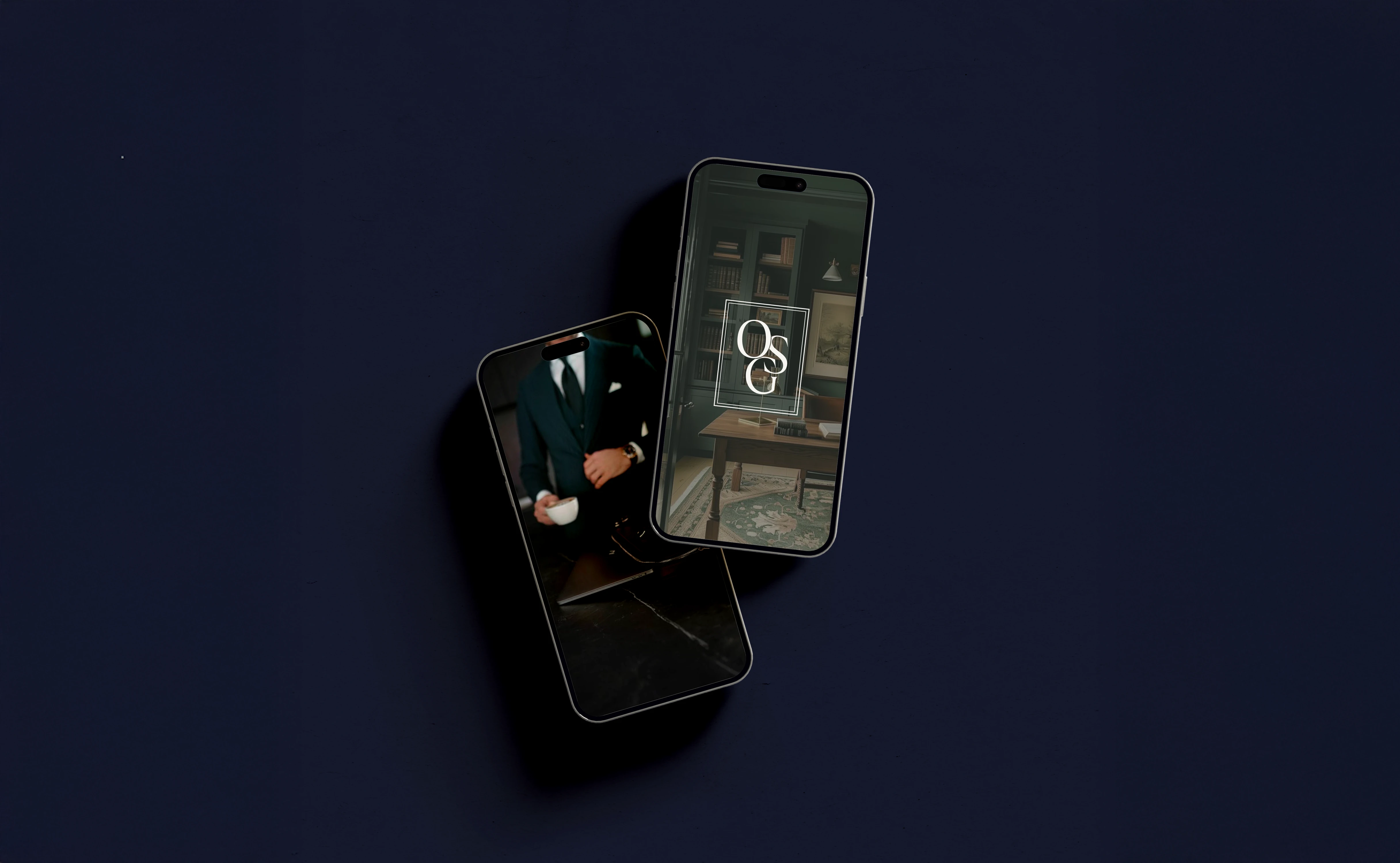
Secondary Logo:
A horizontal, simplified version for smaller or alternative spaces, maintaining consistency and flexibility.
Submark:
A refined monogram combining the initials “O,” “S,” and “G.” The intertwined letters symbolize unity, trust, and connection. Sharp-edged rectangular framing contrasts with softer curves, representing the balance between empathy and strategic precision.
Logo variations ensure adaptability across digital, print, social media, and merchandise while maintaining cohesion.
Color Palette
The palette was curated to communicate professionalism, trust, and modern sophistication.
Soft White & Warm Beige: Lightness, openness, and human-centered warmth.
Rich Navy: Authority, reliability, and strategic depth.
Forest-Toned Green-Gray: Elegance, sophistication, and grounded confidence.
Together, these tones create a refined yet approachable identity that feels elite but never distant.
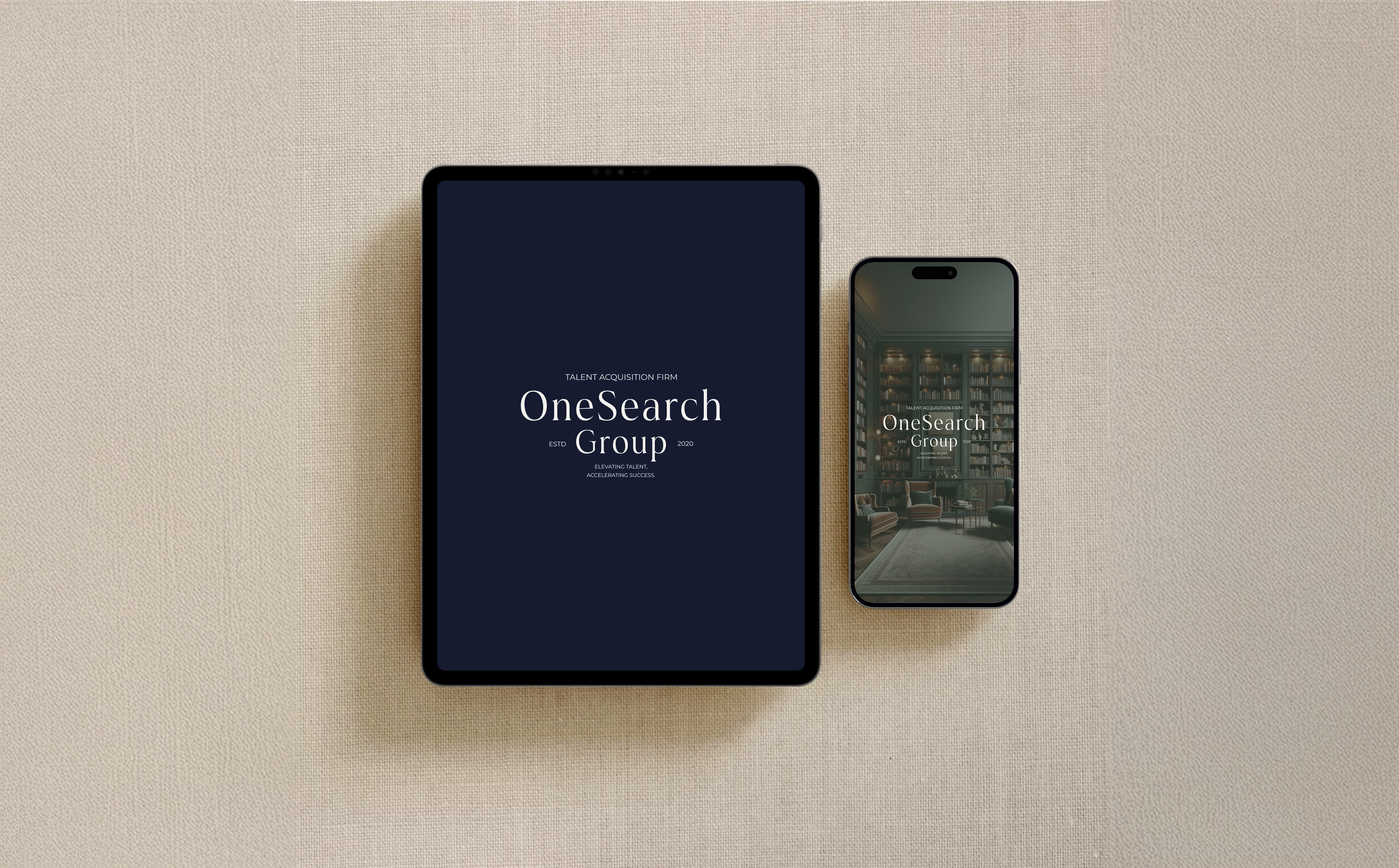
Typography System
Montas Regular (Headlines): Professional yet warm, structured yet personable.
Montserrat (Body Text): Clean, readable, modern—ensuring clarity across platforms.
The pairing reinforces OSG’s positioning as a forward-thinking, trustworthy, and human-centered brand.
6. Outcome & Impact
The project resulted in:
A clear archetype and positioning strategy.
Defined tone of voice and messaging framework.
Strong tagline direction.
Refined target audience profiles.
A cohesive, scalable visual identity system.
OneSearch Group now stands as a premium, knowledge-driven recruitment partner—modern, selective, and built on trust and long-term strategic collaboration.
Project Type: Full Brand Strategy & Visual Identity
Deliverables: Brand strategy, archetype definition, tone of voice, messaging framework, logo suite, typography system, color palette, brand guidelines
This Project was made in partnership with House of Blossame.
Like this project
Posted Feb 17, 2026
Developed a comprehensive brand strategy and refined visual identity for OneSearch Group, positioning the firm as a premium recruitment partner.
Likes
0
Views
13