VivaHealthier Brand & Website Design
Carolina Marques
Case Study: VivaHealthier – Brand & Website Design
Project Overview:
VivaHealthier is a holistic wellness brand founded by Vicky, a nutritionist with a personal journey of overcoming obesity and disordered eating. The brand focuses on supporting women, especially mothers, in achieving balanced nutrition, self-love, and overall wellbeing for themselves and their families. I worked on the full brand identity and website design, translating Vicky’s vision into a visually cohesive and functional digital experience.
1. Brand Strategy
Although the brand was already founded, the visual and digital strategy aimed to amplify its core values, mission, and audience connection:
Purpose:
To empower mothers through holistic wellness, creating sustainable habits for body, mind, and spirit.
Vision:
Position VivaHealthier as a trusted, inspiring authority in maternal health and nutrition.
Target Audience:
Mothers in all stages of maternity (preconception to postpartum)
Women seeking holistic wellness beyond fad diets
Families looking to build sustainable healthy habits
Brand Positioning Statement:
"VivaHealthier helps mothers embrace self-love and holistic wellness, nurturing both themselves and their families through science-backed, sustainable nutrition practices."
Core Values:
Authenticity: Transparent, personal, and true to Vicky’s story
Empathy: Deep understanding of challenges women face in health and wellness
Sustainability: Focus on lasting habits over quick fixes
Excellence: Commitment to high-quality, evidence-based guidance
Passion: A deeply personal mission reflected in every touchpoint
Brand Personality:
Maternal, nurturing, and approachable
Friendly, playful, and slightly witty online presence
Knowledgeable and trustworthy, with a human touch
Strategic Goals:
Create a cohesive visual identity that communicates trust, empathy, and professionalism
Ensure consistent brand presence across digital and print touchpoints
Build a website that is accessible, user-friendly, and aligned with the brand’s mission
Strengthen brand recognition among mothers seeking wellness guidance
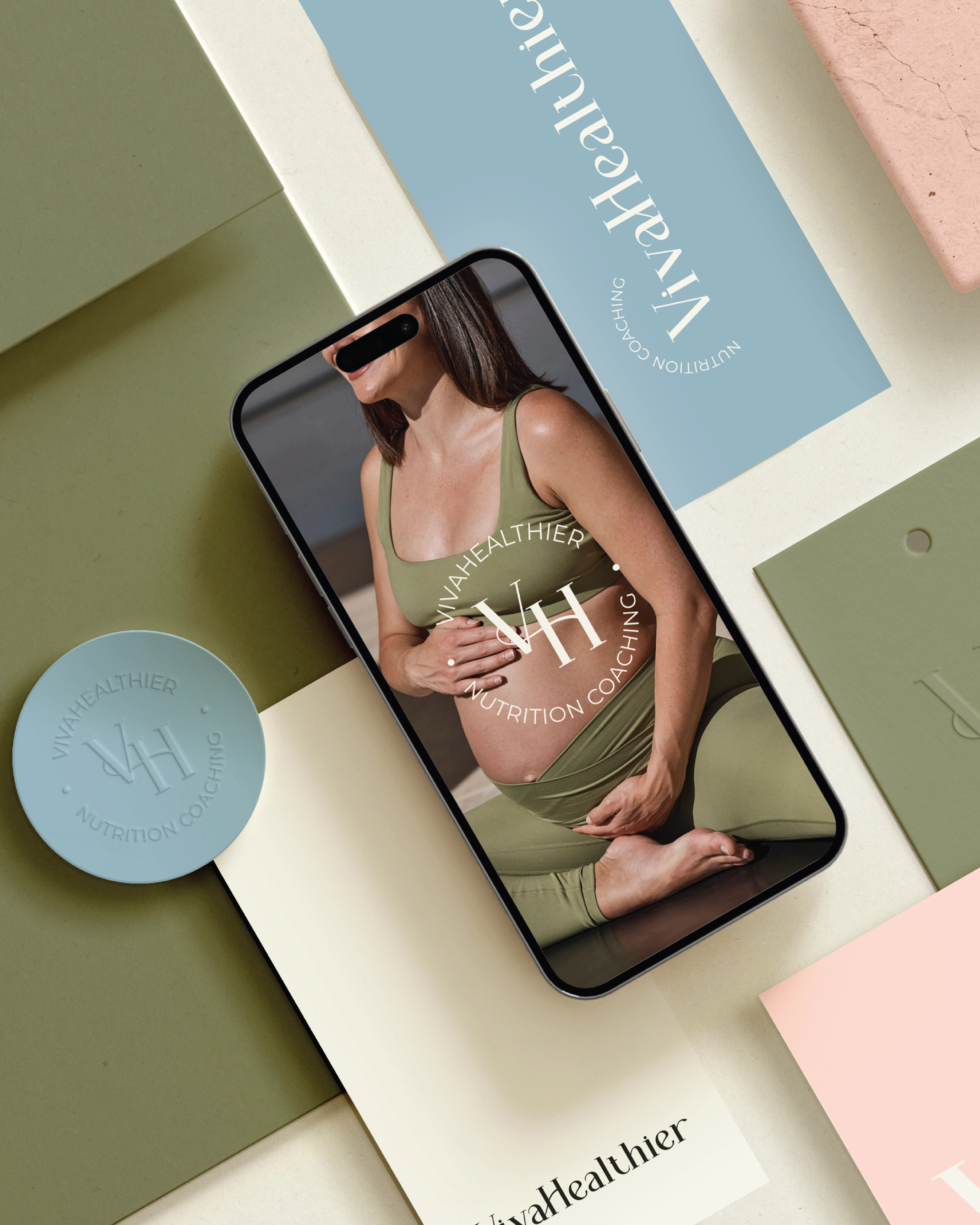
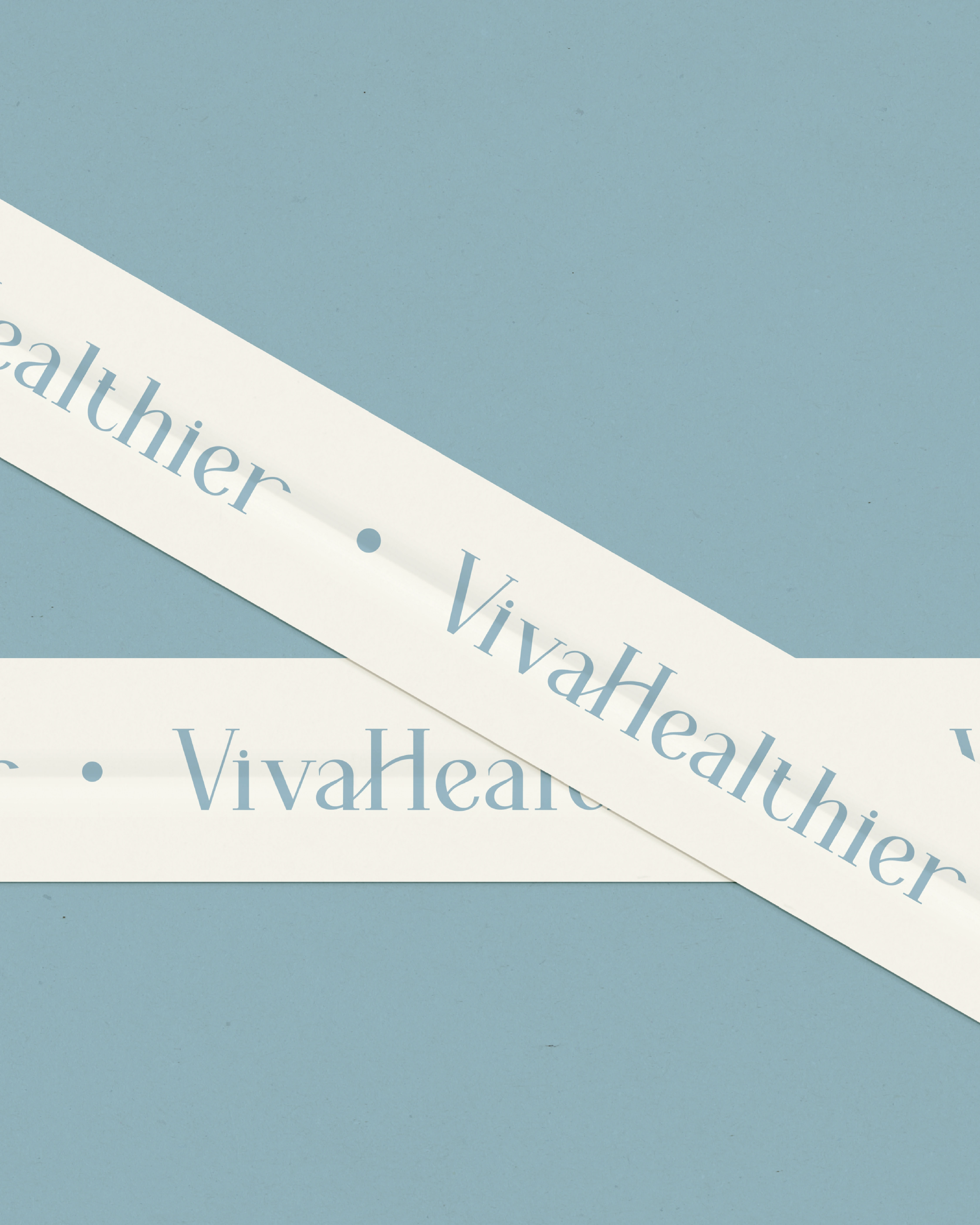
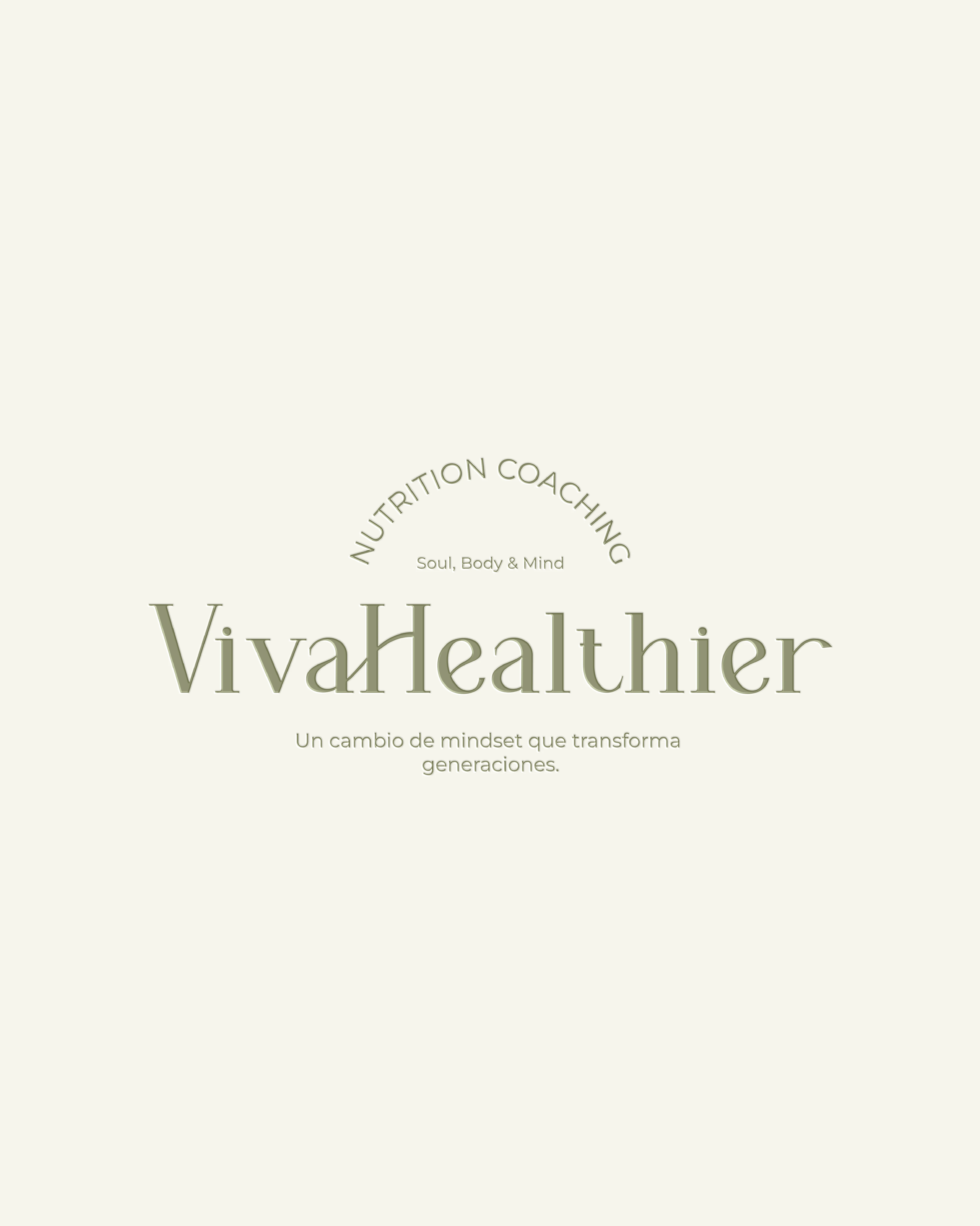
2. Logo System
The VivaHealthier logo system reflects the holistic, nurturing nature of the brand:
Primary Logo: Integrates the brand name, tagline, profession, and the pillars “Soul, Body & Mind.” Used for website, social media, and official materials.
Secondary Logo: Compressed version for smaller spaces while maintaining legibility and brand recognition.
Submark: Circular emblem with “VH” in the center and brand name surrounding it, ideal for social media avatars, icons, and small-scale applications.
Variations: Adapted for different backgrounds, sizes, and contexts to ensure consistent visual identity.
Design Intent: Each variation ensures the brand remains recognizable and professional across all platforms, from social media to print.
3. Color Palette
The colors were chosen to evoke warmth, trust, and maternal care:
Ivory Sand : Neutral, clean base for a soft and professional look
Olive Mist : Natural, earthy tone conveying balance and wellness
Blush Petal : Warm, approachable, and maternal
Serene Sky : Calm, soothing, reflecting clarity and mental well-being
Charcoal Shadow : Professional, grounding, and high-contrast
Strategic Intent: The palette supports emotional connection, clarity, and professionalism while evoking empathy and care for mothers.
4. Typography
The Heverly Serif (Titles): Elegant, refined, approachable, used in headings
Montserrat (Body): Modern, clean, legible for content-heavy pages
Oooh Baby Regular (Accent): Handwritten style for personal, emotional touches
Strategic Intent: Typography balances authority and warmth, reinforcing accessibility while maintaining brand sophistication.
5. Brand Applications
Business Cards: Incorporate primary logo and submark with colors to create a professional, memorable impression
Email Signatures: Personal photo and submark highlight Vicky’s personal connection to the brand
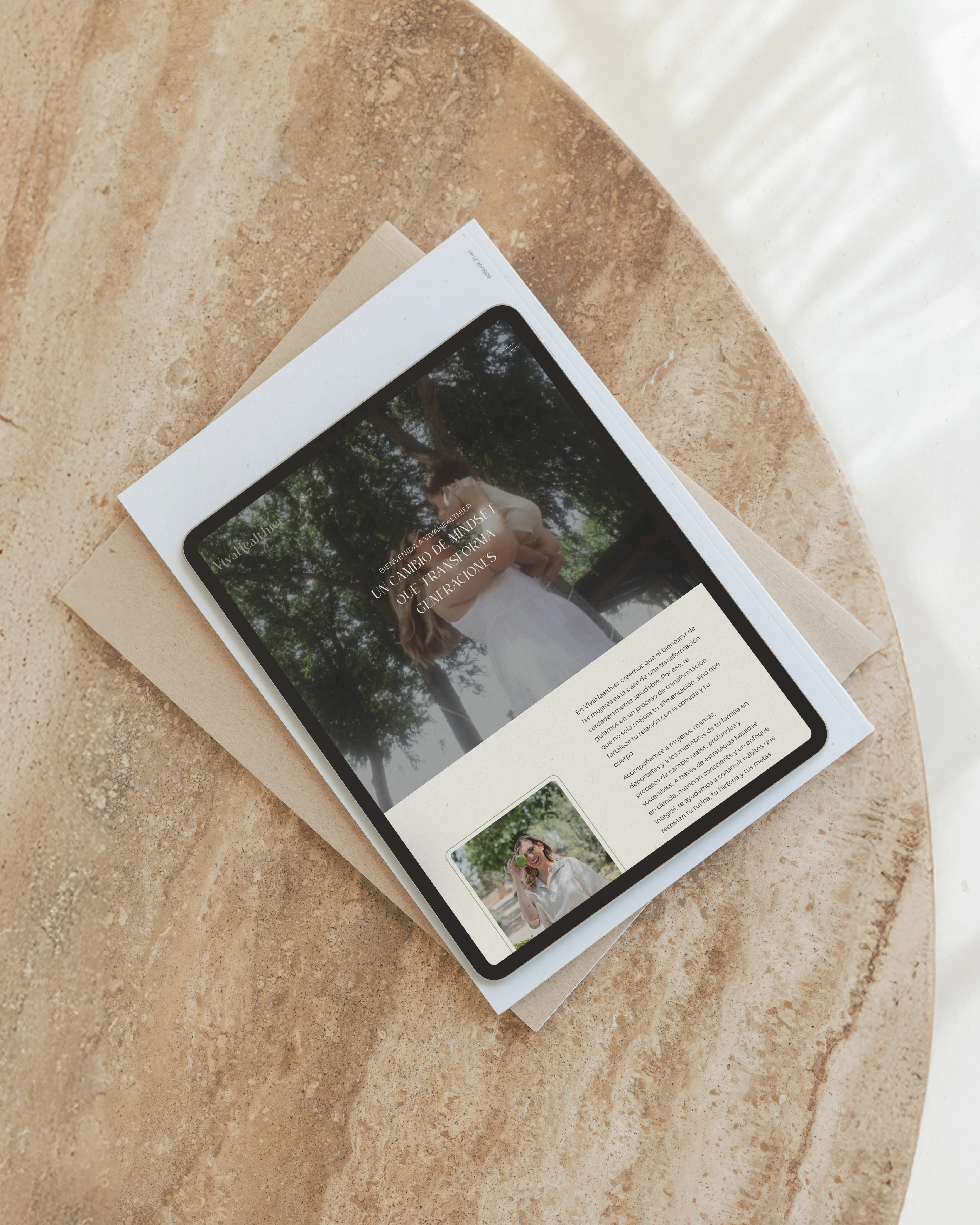
Educational Materials: 4R’s recovery document and nutritional pyramid use brand colors and logo system for visual consistency. Design of three extensive E-books.
Design Intent: Every touchpoint reinforces the brand’s commitment to wellness, empathy, and professional guidance.
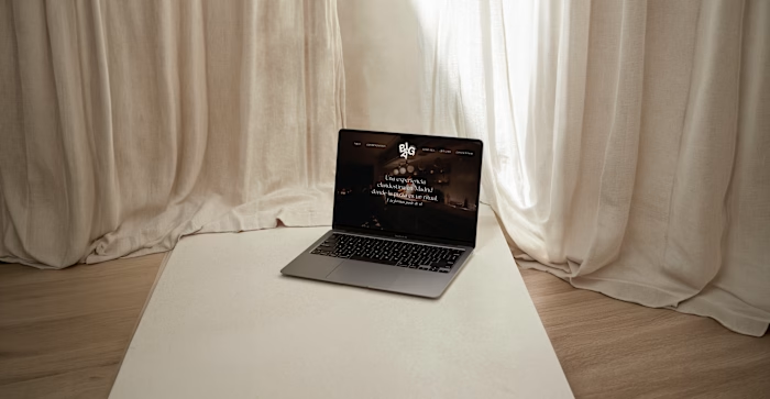
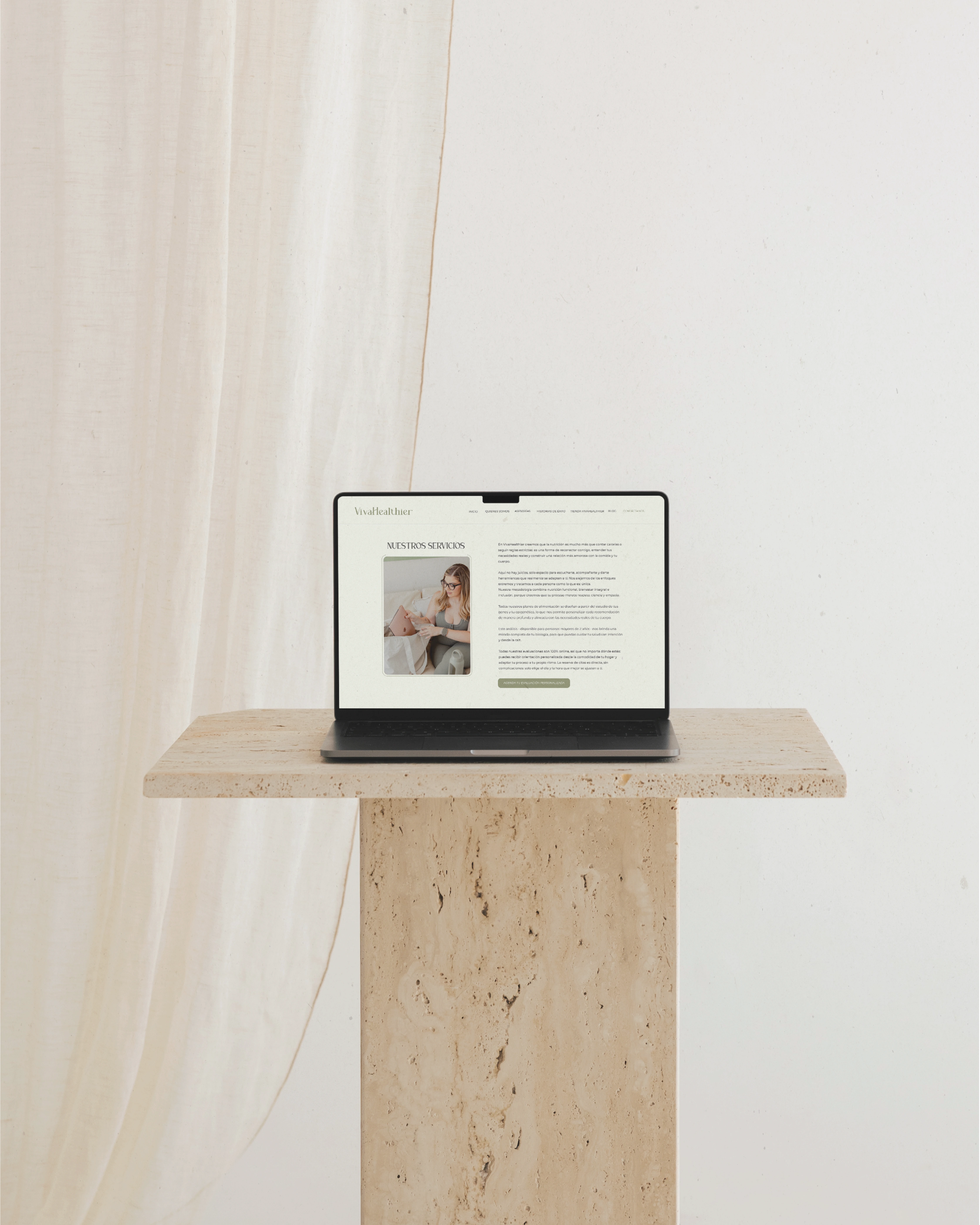
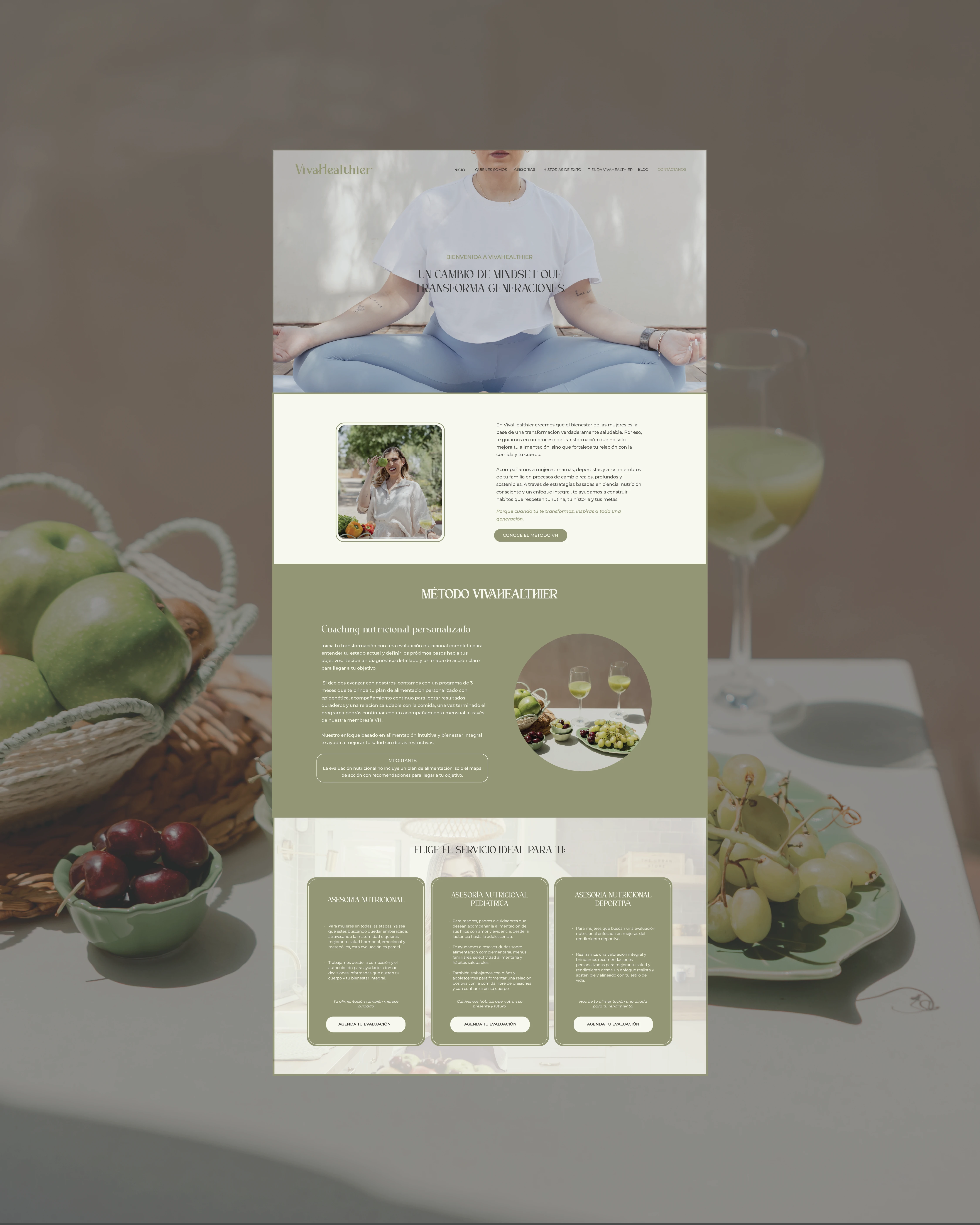
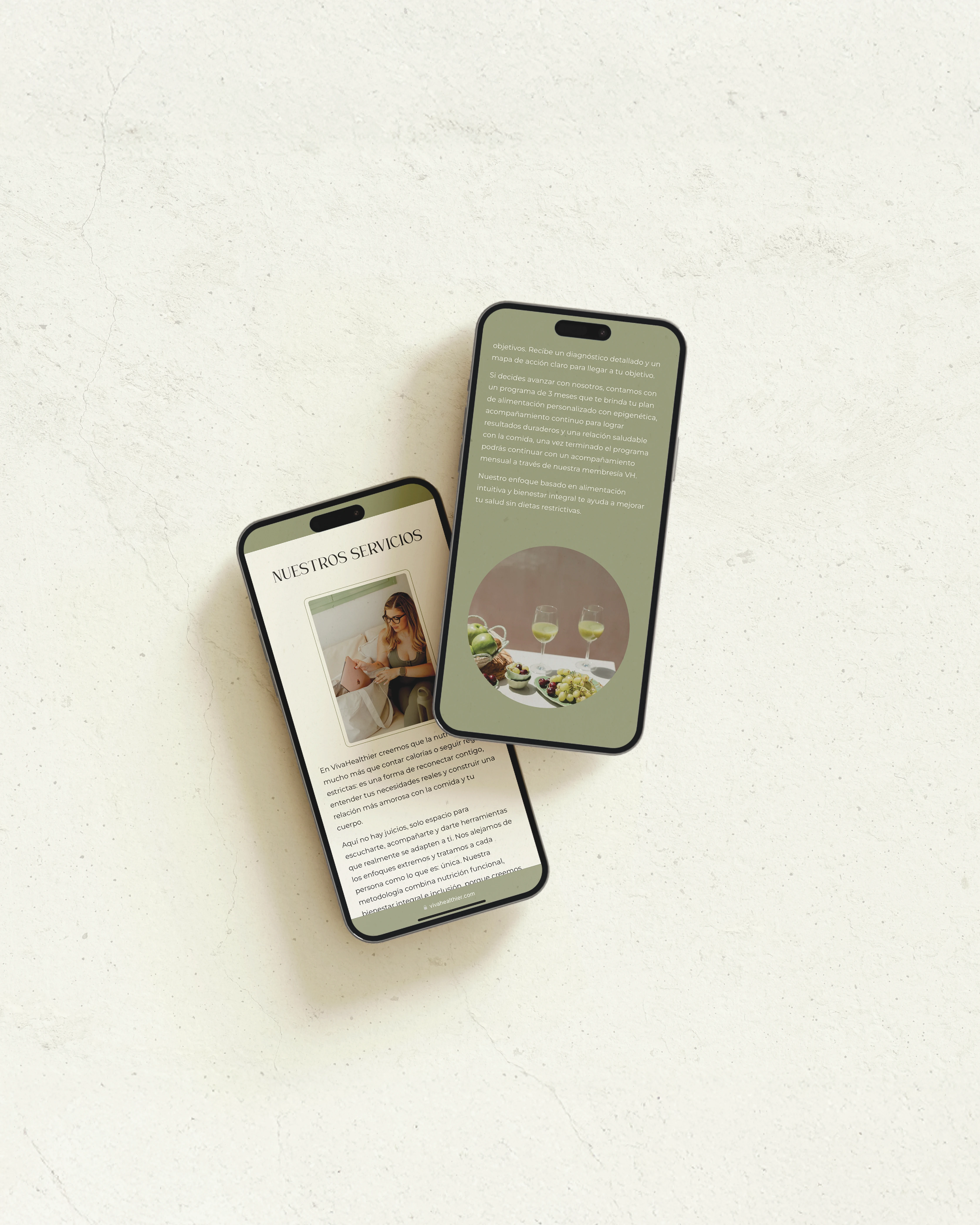
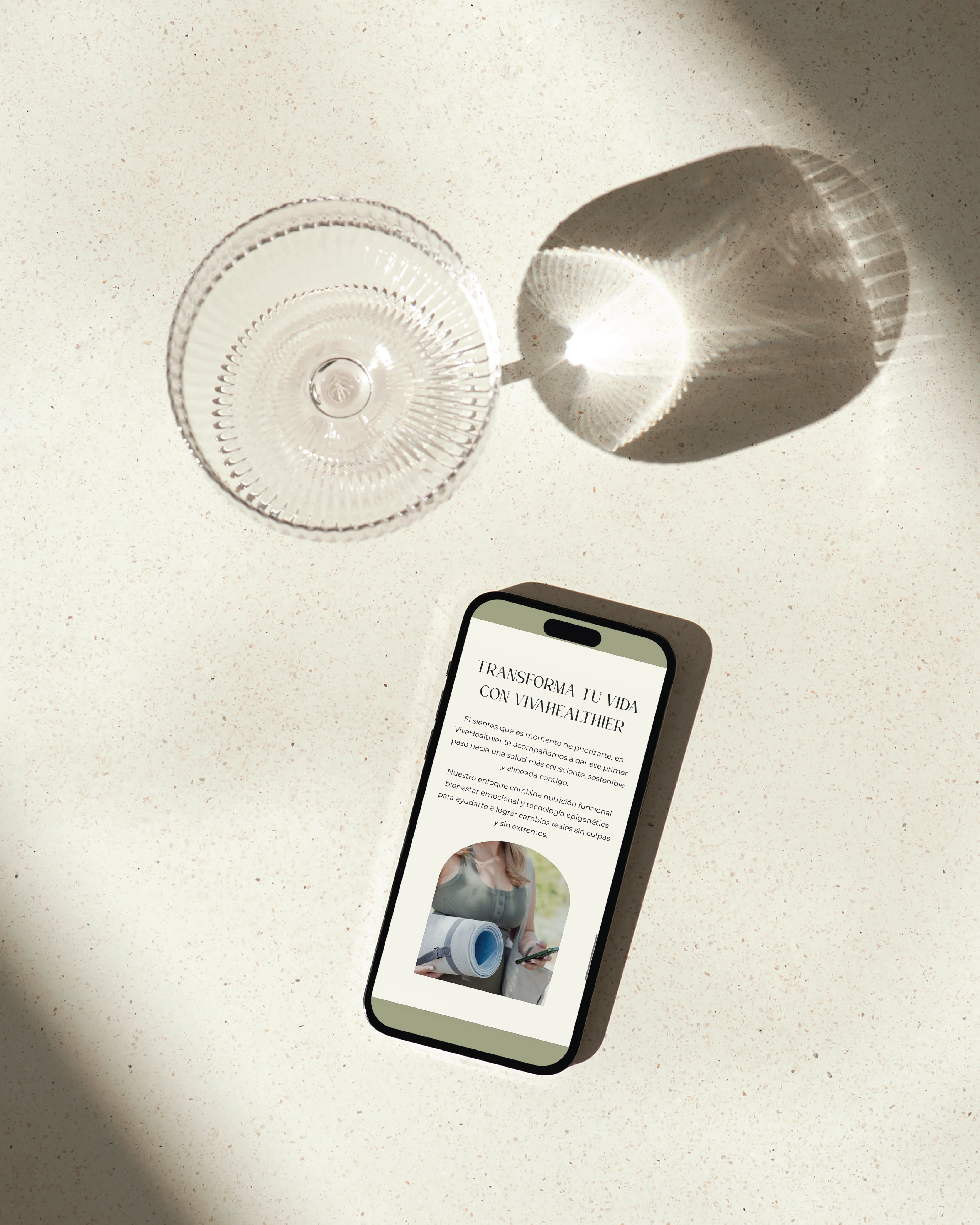
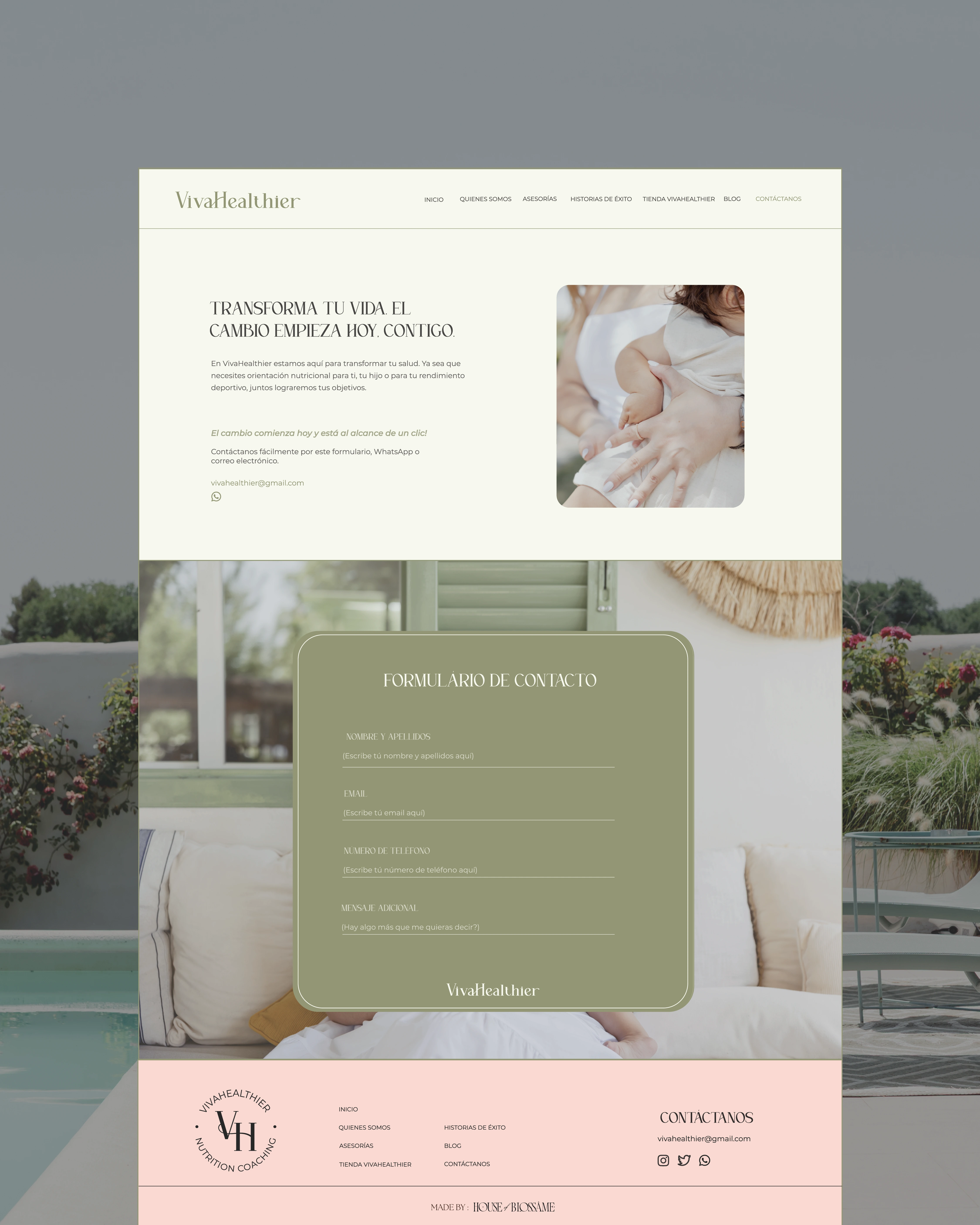
6. Website Design
The website design reflects VivaHealthier’s mission and values:
Goals:
Showcase Vicky’s story and expertise in an authentic, relatable way
Offer easy navigation for wellness programs, resources, and services
Create a visually calming experience aligned with the brand palette
Ensure mobile responsiveness and accessibility
Key Features:
Hero section with welcoming imagery and mission statement
Program overviews with clear call-to-actions
Educational resources
Testimonials and community-building elements
Integrated blog for content marketing and authority-building
Design Intent: The website acts as a hub for mothers to explore wellness solutions while reflecting Vicky’s empathy, expertise, and personal connection.
7. Reflection & Impact
This project successfully translated VivaHealthier’s holistic vision into a cohesive visual identity and functional digital experience, helping the brand:
Connect with mothers and women in general on a personal and emotional level
Communicate credibility and professionalism in wellness guidance
Strengthen brand recognition through consistent design across channels
Support long-term growth and digital presence with a user-friendly website
Conclusion: VivaHealthier’s brand and website exemplify how thoughtful design can amplify a personal story, build trust, and create a welcoming, professional experience for the target audience.
*This project was made in partnership with House of Blossame
Like this project
Posted Nov 16, 2025
We developed a fresh brand identity and website for VivaHealthier, capturing the essence of holistic well-being and supporting women on their wellness journey.