Brand Identity for Category Company
Murad Malik
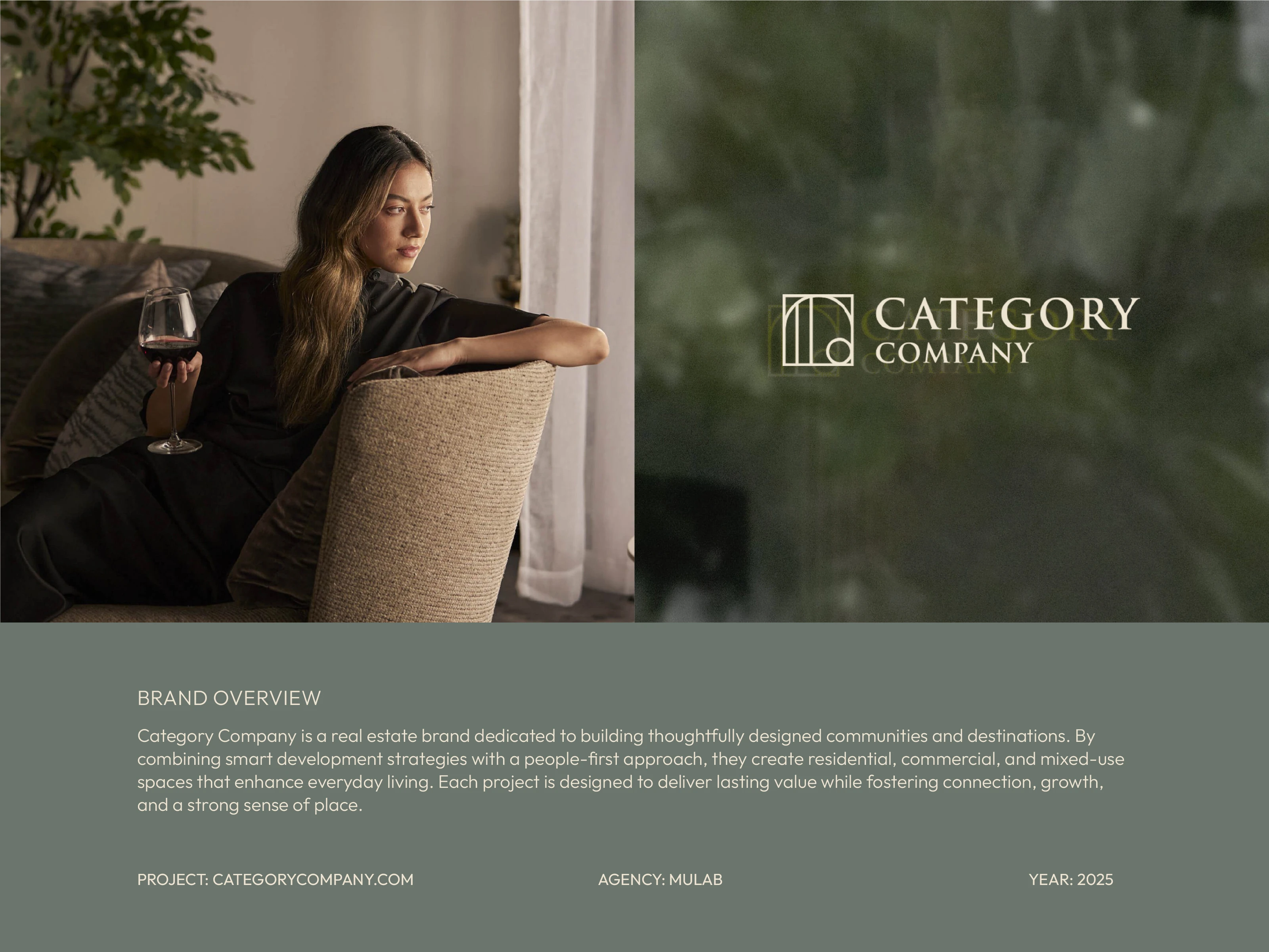
Category Company is a real estate brand dedicated to building thoughtfully designed communities and destinations. The brief was clear: create an identity that feels both refined and familiar , sophisticated enough for high-end positioning, warm enough to feel like home.
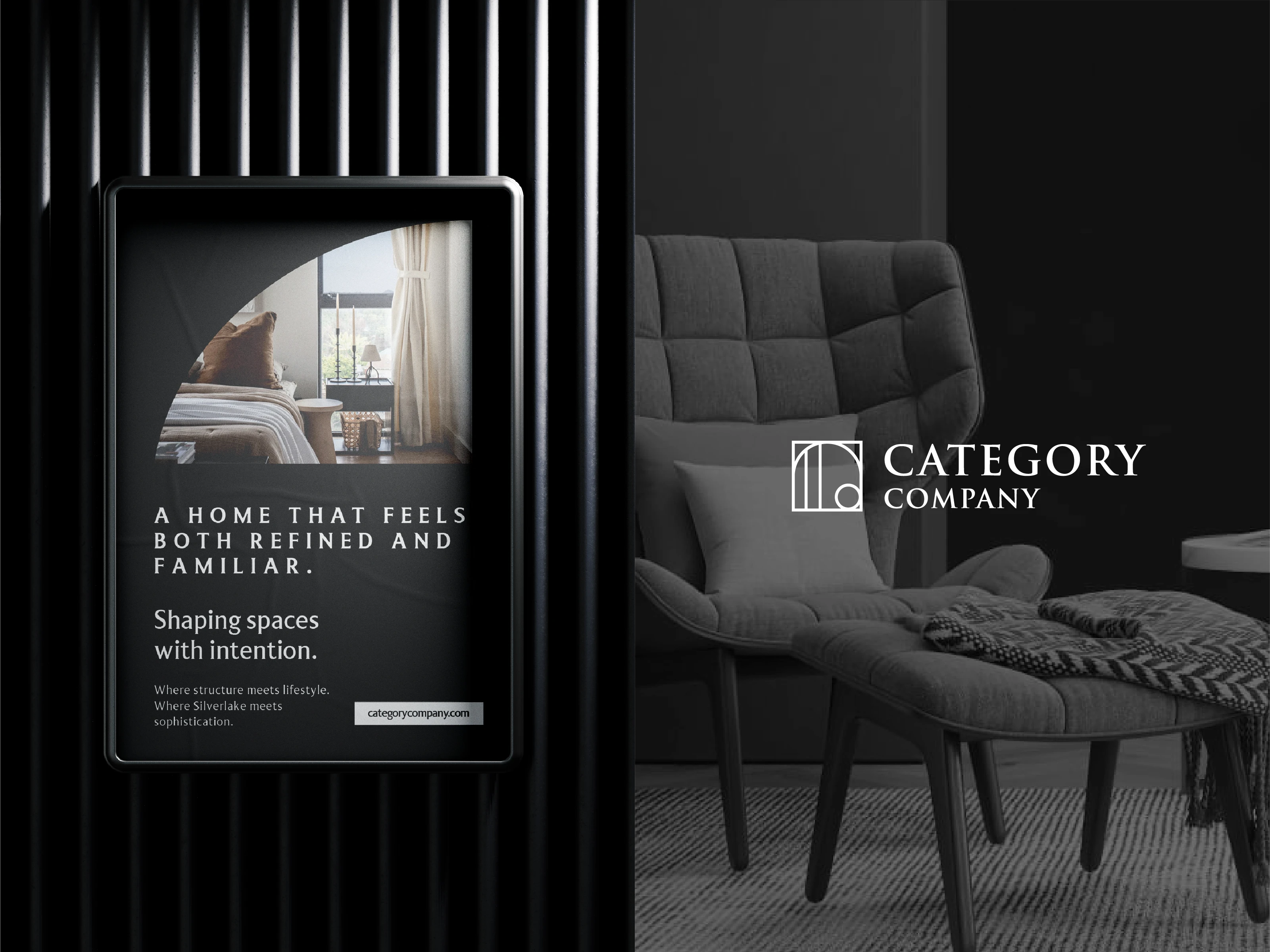
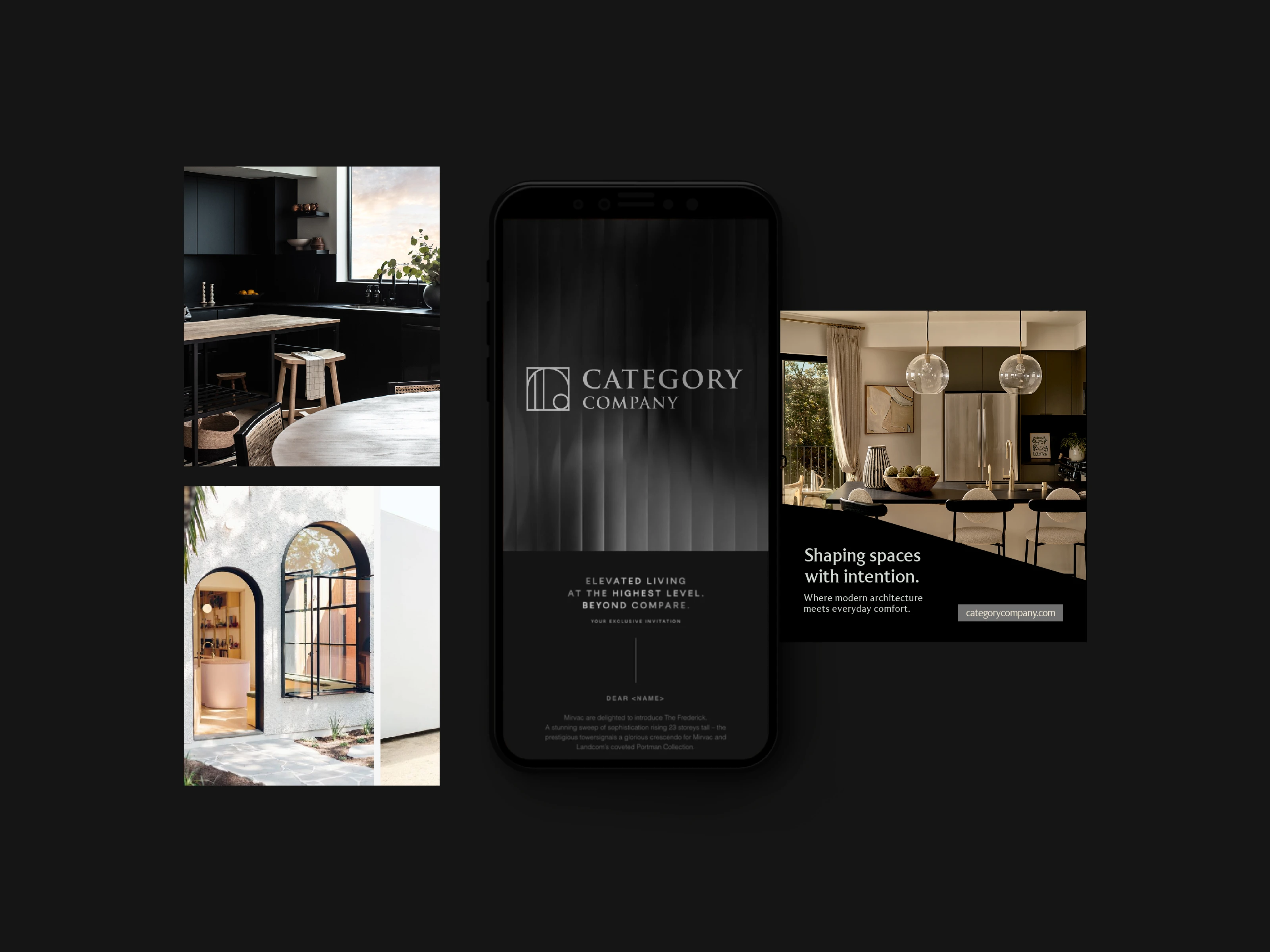
Logo system in dark mode, the architectural logomark paired with editorial typography across a digital display application.
The logomark is built from structural geometry that subtly references doorways, columns, and interior space. Simple in form, but specific enough to feel ownable within the real estate category.
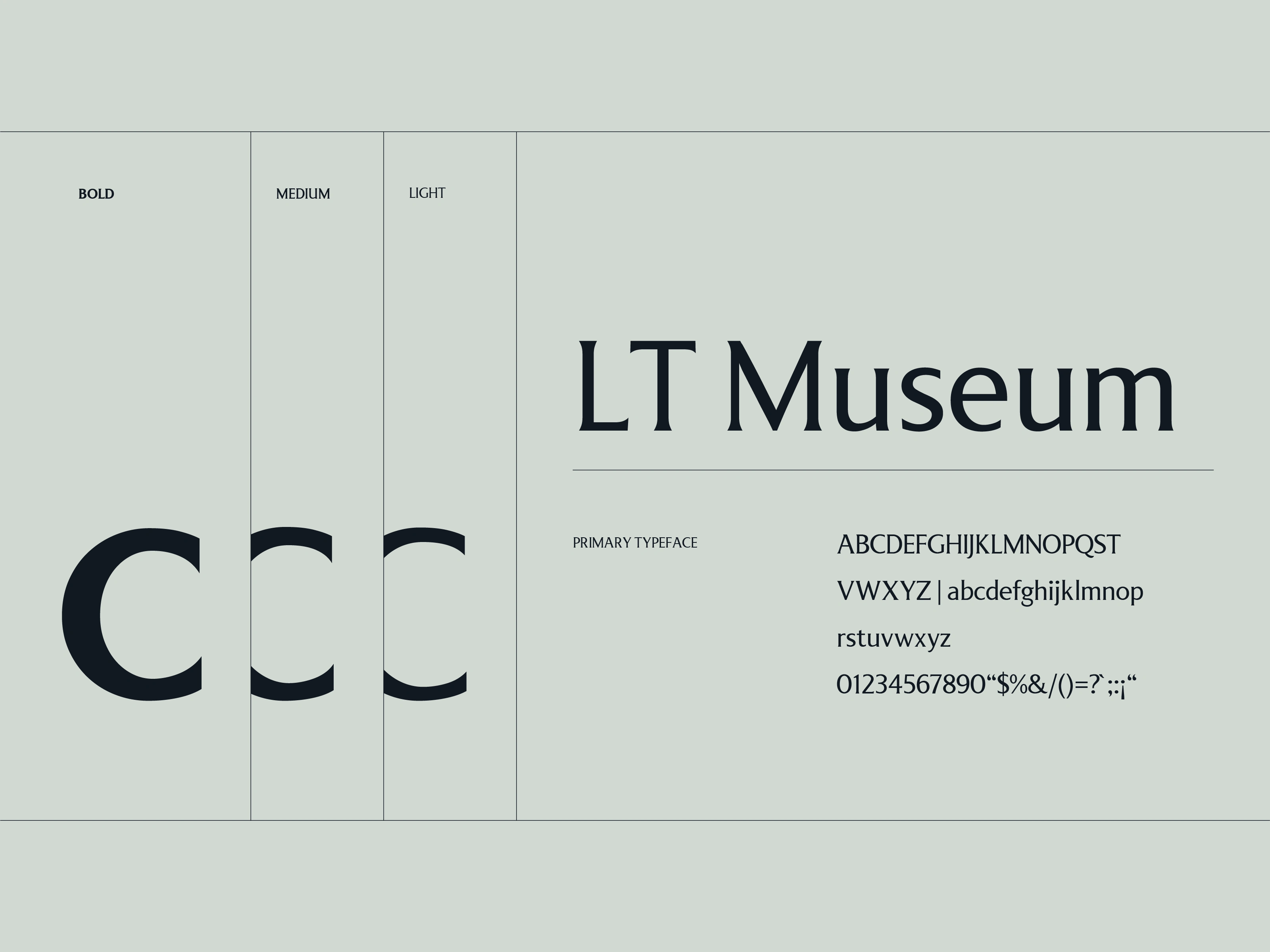
Primary typeface LT Museum, deployed across Bold, Medium, and Light weights to give the brand editorial range without losing warmth.
LT Museum was selected for its ability to sit between editorial and architectural, precise enough for headlines, readable enough for body copy across both print and digital formats.
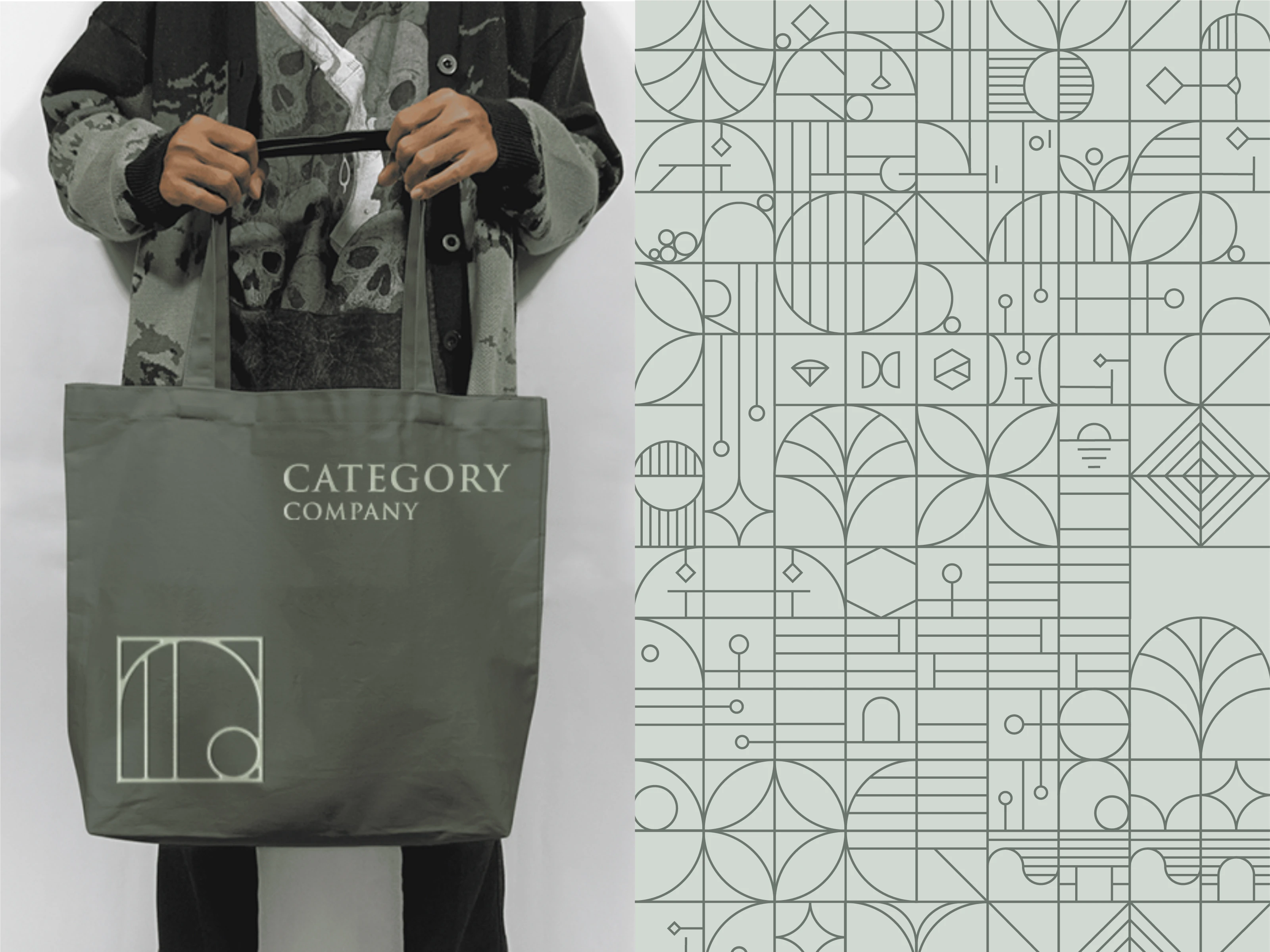
Brand pattern and merchandise, a geometric graphic language rooted in architectural motifs, applied to physical brand touchpoints.
The graphic pattern extends the logomark's language into a full visual system. Intricate but structured, it gives the brand texture and depth across merchandise, print, and environmental applications.
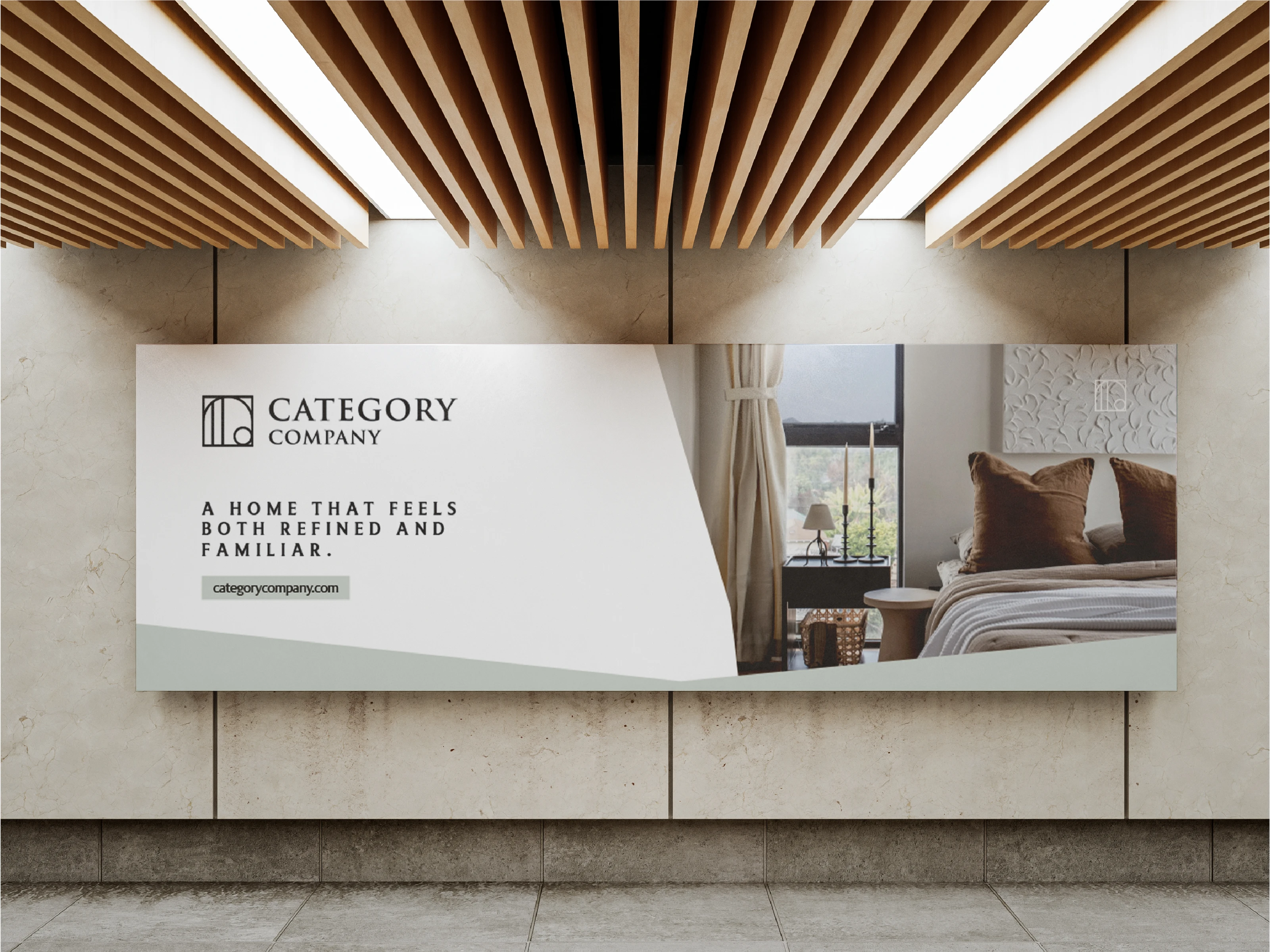
Out-of-home application, light mode billboard demonstrating the brand's warmth and restraint at scale.
Across large-format applications, the identity holds its character. The diagonal layout device and restrained color palette keep the brand feeling premium without becoming cold or corporate.
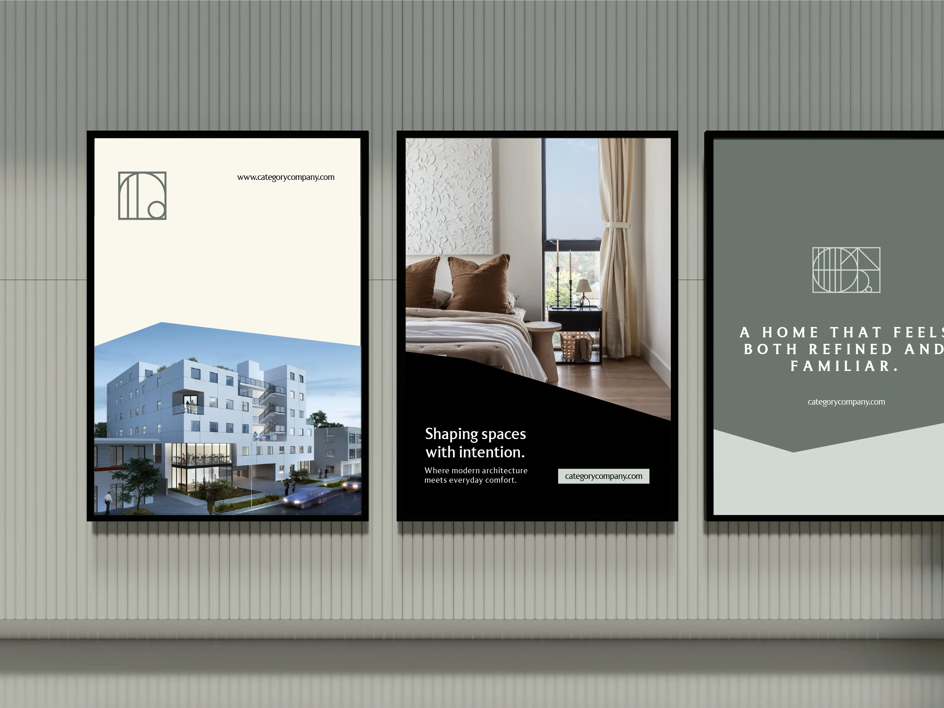
Signage system across three visual directions, cream, black, and sage, showing the brand's range across different environments.
The three-poster system demonstrates how the identity flexes across light, dark, and brand-color backgrounds without losing coherence. Each execution feels like the same brand seen through a different lens.
The three-poster system demonstrates how the identity flexes across light, dark, and brand-color backgrounds without losing coherence. Each execution feels like the same brand seen through a different lens.
The result is a brand with genuine range, equally at home on a billboard, a phone screen, or a tote bag. Category Company now has an identity that can grow with the business without ever feeling generic.
Like this project
Posted Jun 25, 2026
Developed a sophisticated yet warm brand identity for Category Company. A Real Estate Brand Built Around Refined Living.