


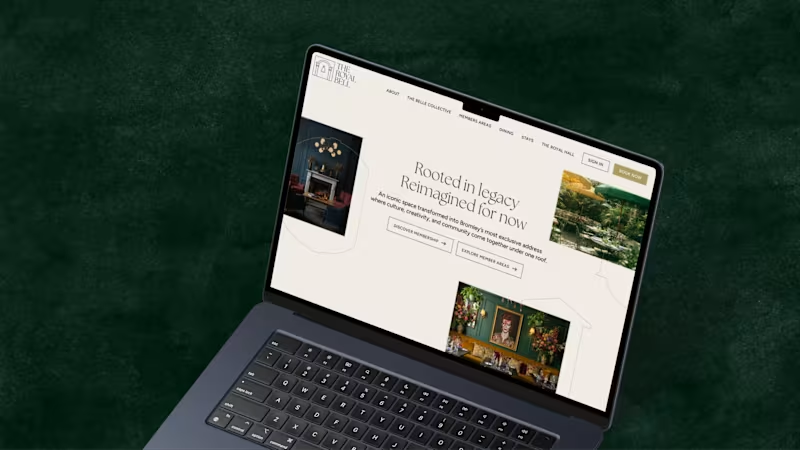
A recent project for The Royal Bell, a heritage venue reimagined as a modern members’ club. I led the brand development across print and digital, designing and building a website that complements the visual identity. The result is a refined brand system that balances heritage character with timeless elegance.
4
23
442

Pêxe: Brand Identity & Packaging for a Poke Restaurant in Lisbon
Pêxe is a poke bowl restaurant in Lisbon, built around fresh fish and a quick, takeaway-friendly experience. The client wanted a brand that felt young, playful and easy to recognise, one that could stand out on the street and also work on small items like stickers and sleeves.
Concept
The identity is inspired by water and the texture of fish. I created a custom wordmark where thin wave-like lines run through the letters, giving the logo movement and a sense of the sea. The accent on the “Ê” adds a local touch and makes the name feel more distinctive.
Secondary mark
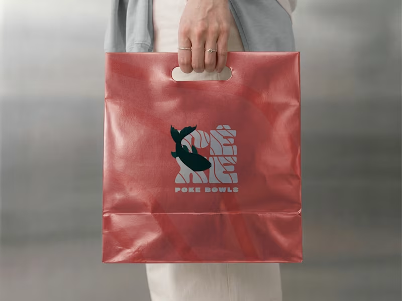
For smaller spaces and packaging, I designed a compact version of the logo with a fish illustration cutting through the lettering. It works as a symbol on its own and adds personality to the brand.
Colour & pattern
I paired a deep green with a bright coral red. The green feels fresh and grounded, while the coral brings warmth and makes the food look more appetising. The wave lines from the logo were turned into a subtle pattern that appears across the packaging, tying everything together.
Applications
The identity was applied across the shopfront awning, bowl sleeves, lid stickers and paper bags. The tagline “Your poke to go” reinforces the takeaway side of the business and gives the packaging a friendly, direct voice.
Result
A consistent and recognisable brand that works from the street to the table, with a flexible system that can grow with the restaurant. [Add: “The restaurant opened in (month/year)” or a short client feedback line, if you have one.]
My role: Logo design, visual identity, illustration, pattern, packaging design and signage.
2
230
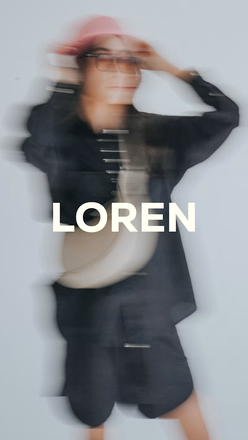
Created and developed from concept to market. I defined the positioning, brand architecture and long-term direction, establishing it as a restrained, design-led label rather than a trend-based jewellery line.
I built the identity system from the ground up, including naming, visual language, tone of voice and product narrative. Product development spans concept design, prototyping, supplier coordination and production oversight, ensuring consistency between idea and execution.
I directed all campaign development, including shoot concepts, art direction, casting and visual rollout across digital channels. E-commerce structure, pricing strategy and launch sequencing were defined to support sustainable growth rather than rapid volume.
0
96