Built with Jitter
DGERT Certification Rebranding Project
Tone Segurado
Rebranding // National Certification (DGERT)
Client: Direção-Geral do Emprego e das Relações de Trabalho (DGERT)
Role: Brand Designer & Creative Lead
Deliverables: Logo Redesign, Brand Guidelines Manual, Digital & Print Assets Timeline: 45 Days (April – June 2025)
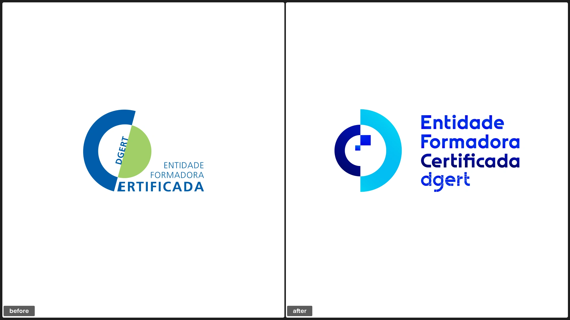
1. The Challenge: A Disconnected Seal of Quality
DGERT is the Portuguese government body responsible for certifying training entities. Their certification is the gold standard for quality in vocational training. However, their existing certification logo was outdated.
Visual Disconnect: The old logo predated DGERT's 2022 institutional rebranding, creating a clash between the certifying body and the certification seal.
Inconsistency: With over 3,000 certified entities using the logo on everything from websites to certificates, inconsistent usage was diluting the brand's authority.
Lack of Flexibility: The old assets weren't optimized for modern digital responsive environments.
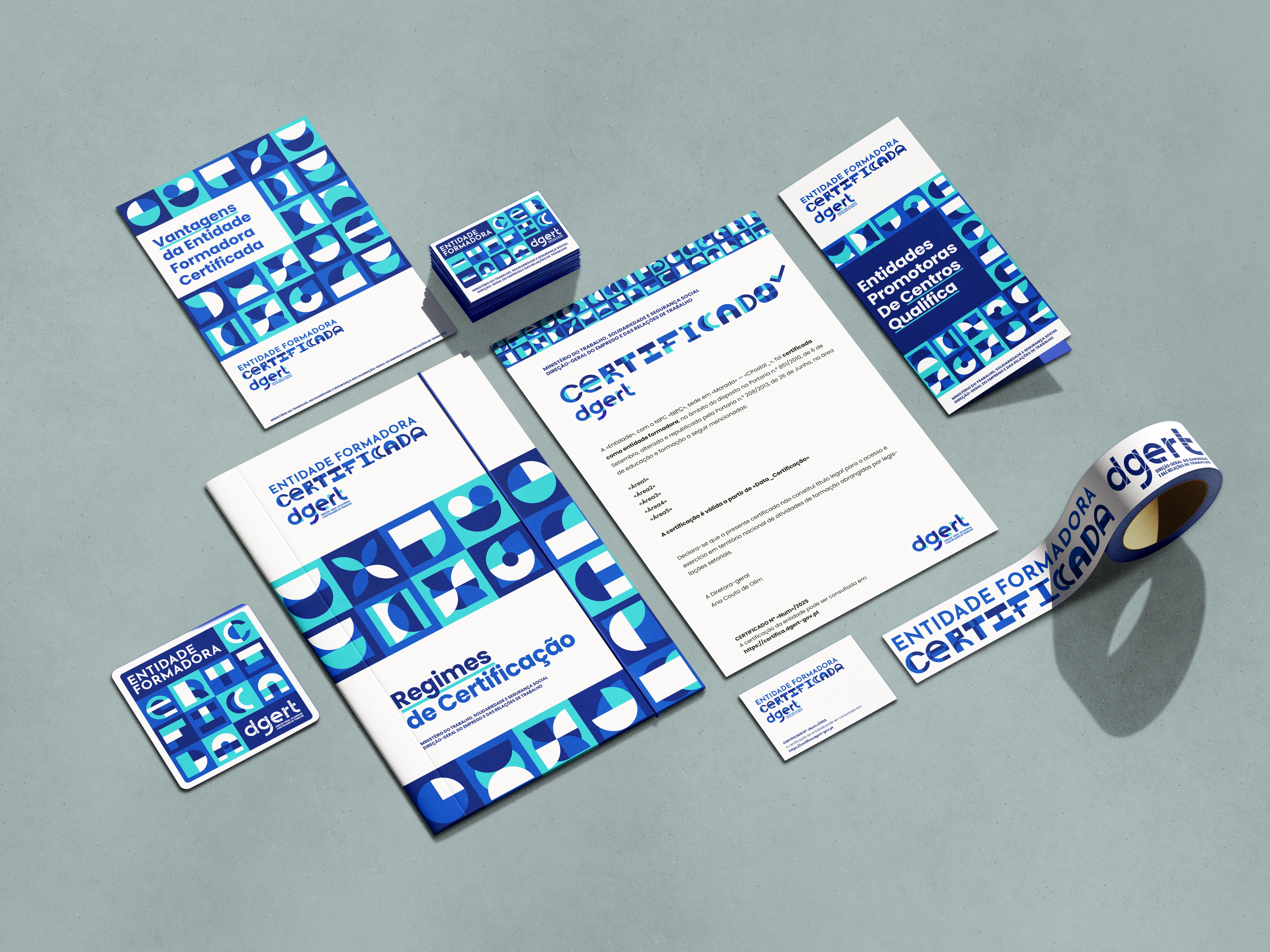
We created some routes with a clear goal: to establish a new visual identity for the "Entidade Formadora Certificada" (Certified Training Entity) status that reflected rigor, transparency, and partnership. The client ultimately chose option B with a different wordmark.
2. The Solution: Geometric Growth
I developed a new logo system rooted in the concept of shared growth.
The Symbol: Fibonacci & Stability
Concept: The new mark uses pure geometric forms (circles and squares) arranged according to the Fibonacci sequence. This spiral expansion symbolizes continuous improvement and the organic growth of knowledge.
Metaphor: It visualizes individual entities coming together to form a larger, organized system under DGERT's guidance.
Execution: A minimalistic, monochromatic-friendly shape that remains legible even at small sizes (e.g., website footers).
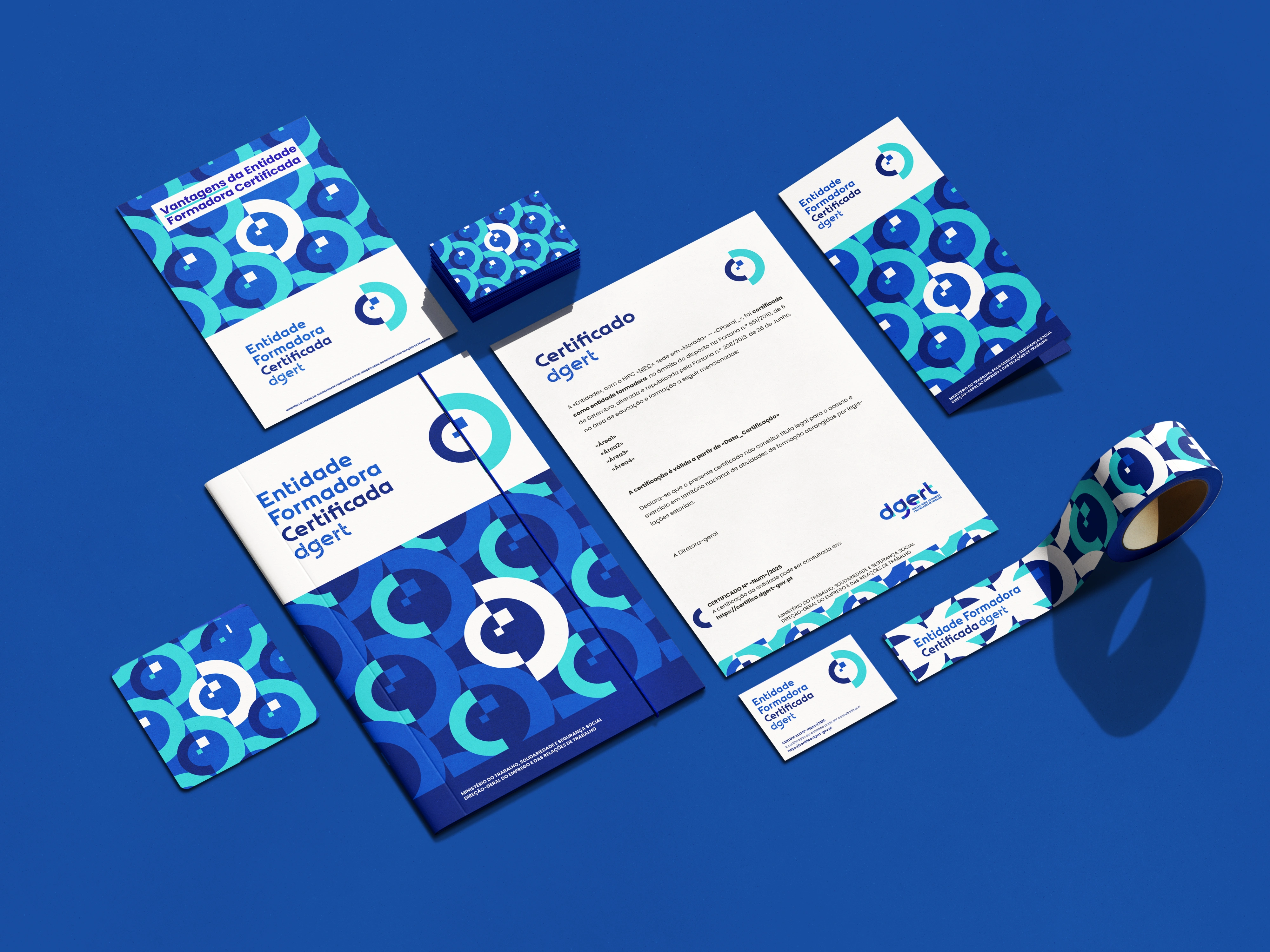
The System: A Complete Brand Manual
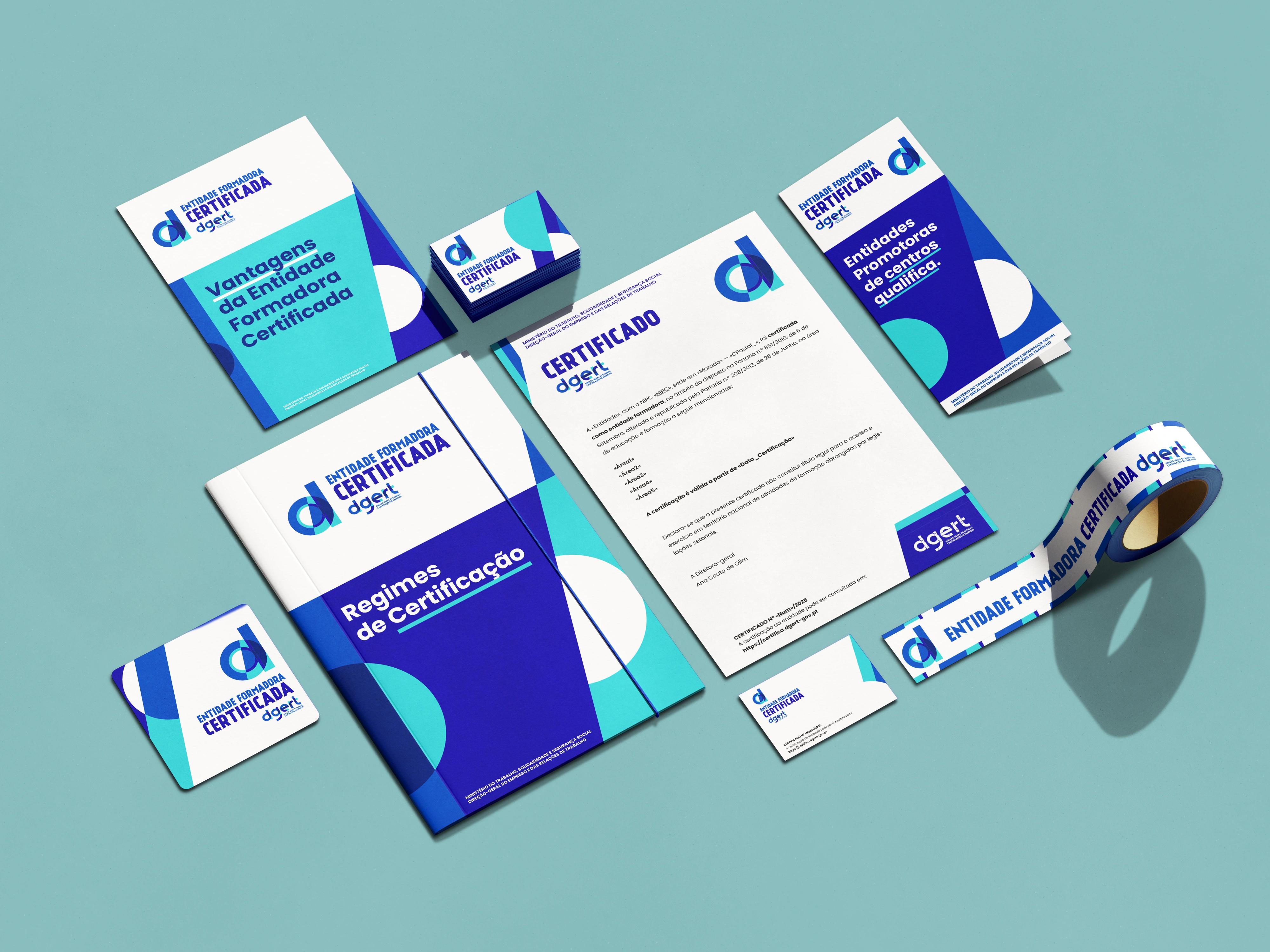
A logo is only as good as its rules. I delivered a comprehensive Graphic Standards Manual (30+ pages), ensuring the new identity is bulletproof across all government and private sector touchpoints.
Clear Hierarchy: Defined strict relationships between the symbol and the "Entidade Formadora Certificada" wordmark.
Versatility: Created specific variations for Print (high contrast) and Digital (screen-optimized RGB) to ensure the seal looks official on a 4K monitor or a printed diploma.
Compliance: The manual includes "Do's and Don'ts" to prevent misuse, crucial for a regulatory body.
3. The Process: Government-Level Rigor
Working with a public entity requires precision and formal adherence to administrative processes.
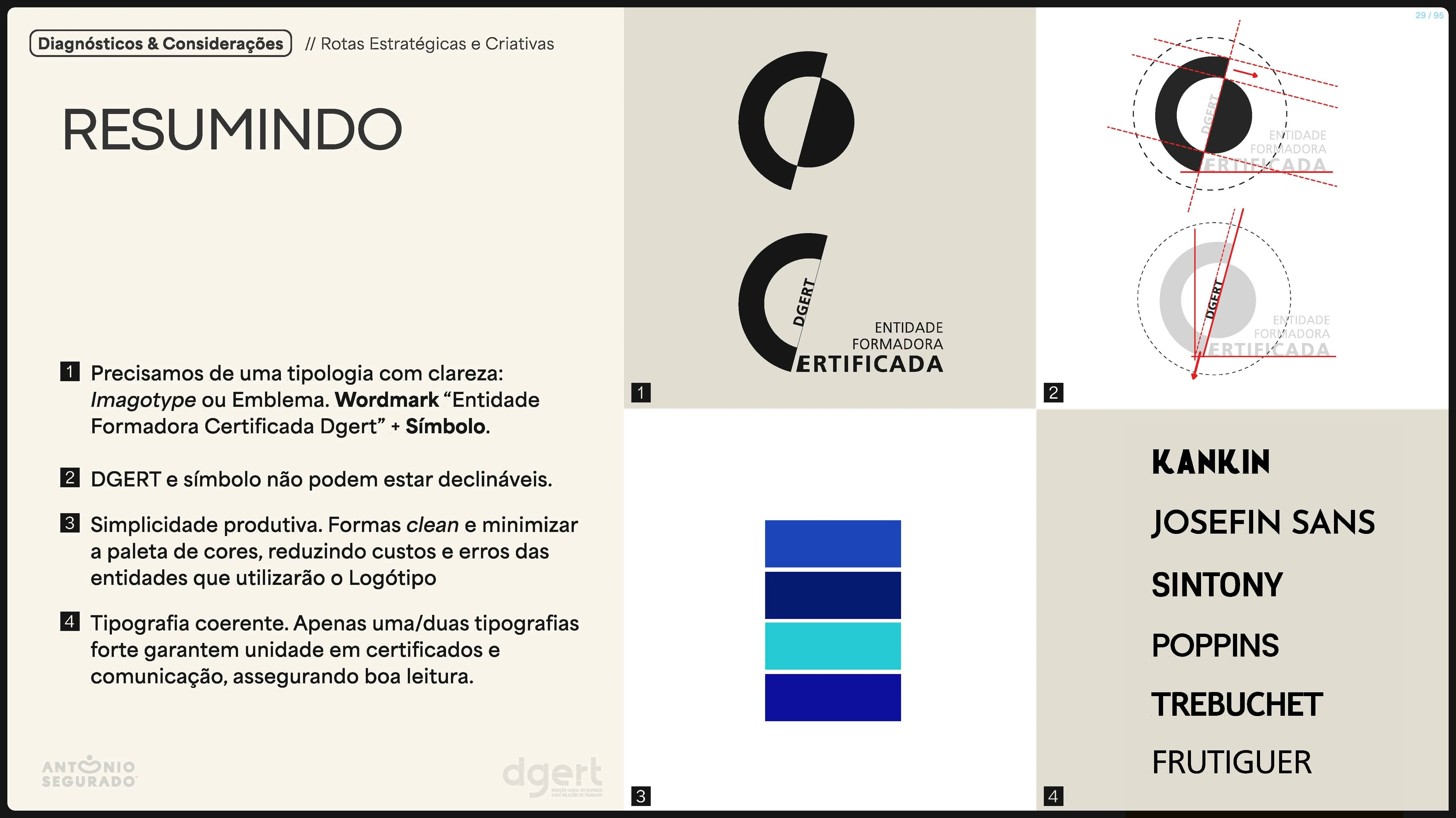
Phase 1 (Audit & Concept): Analyzed the "visual noise" of the old logo and proposed 3 distinct strategic routes. We selected "Option B" for its balance of institutional weight and modern simplicity.
Phase 2 (Refinement): Fine-tuned the geometry to align perfectly with DGERT's existing institutional palette (Blues and Turquoises), ensuring the new seal felt like a natural extension of the parent brand.
Phase 3 (Standardization): Developed the regulations for usage, ensuring the new logo met all legal requirements for public display.
4. The Outcome
The new Entidade Formadora Certificada logo now serves as the official seal of quality for thousands of training providers across Portugal.
Unified Identity: Successfully bridged the gap between DGERT's institutional brand and its certification product.
Modern & Scalable: A responsive identity system that works as a 16px favicon or a large-format plaque.
Public Trust: A clean, authoritative design that instantly communicates "Certified Quality" to trainees and employers.
Strategic Routes Deck
Brand Guidelines
Old Brand Identity summarized problems
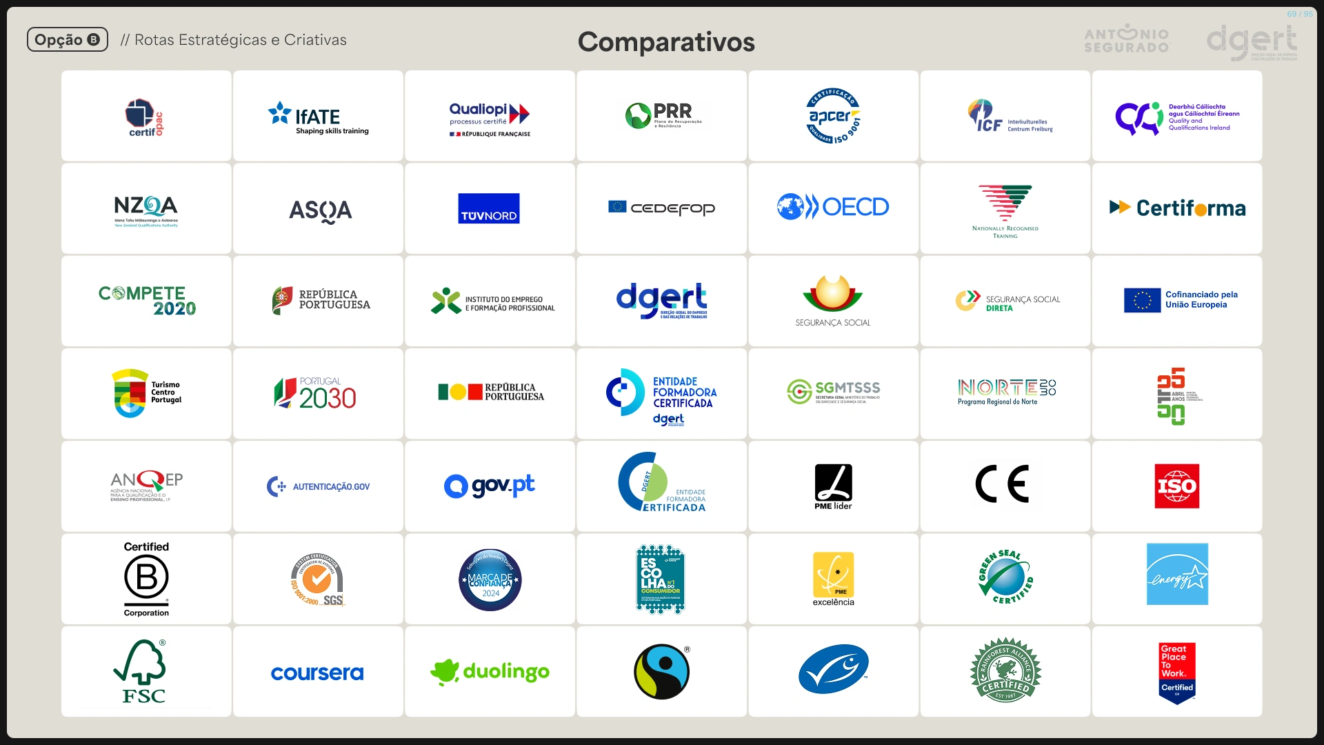
Competitive Landscape

Stationary
Abandoned Proposal
Abandoned Proposal
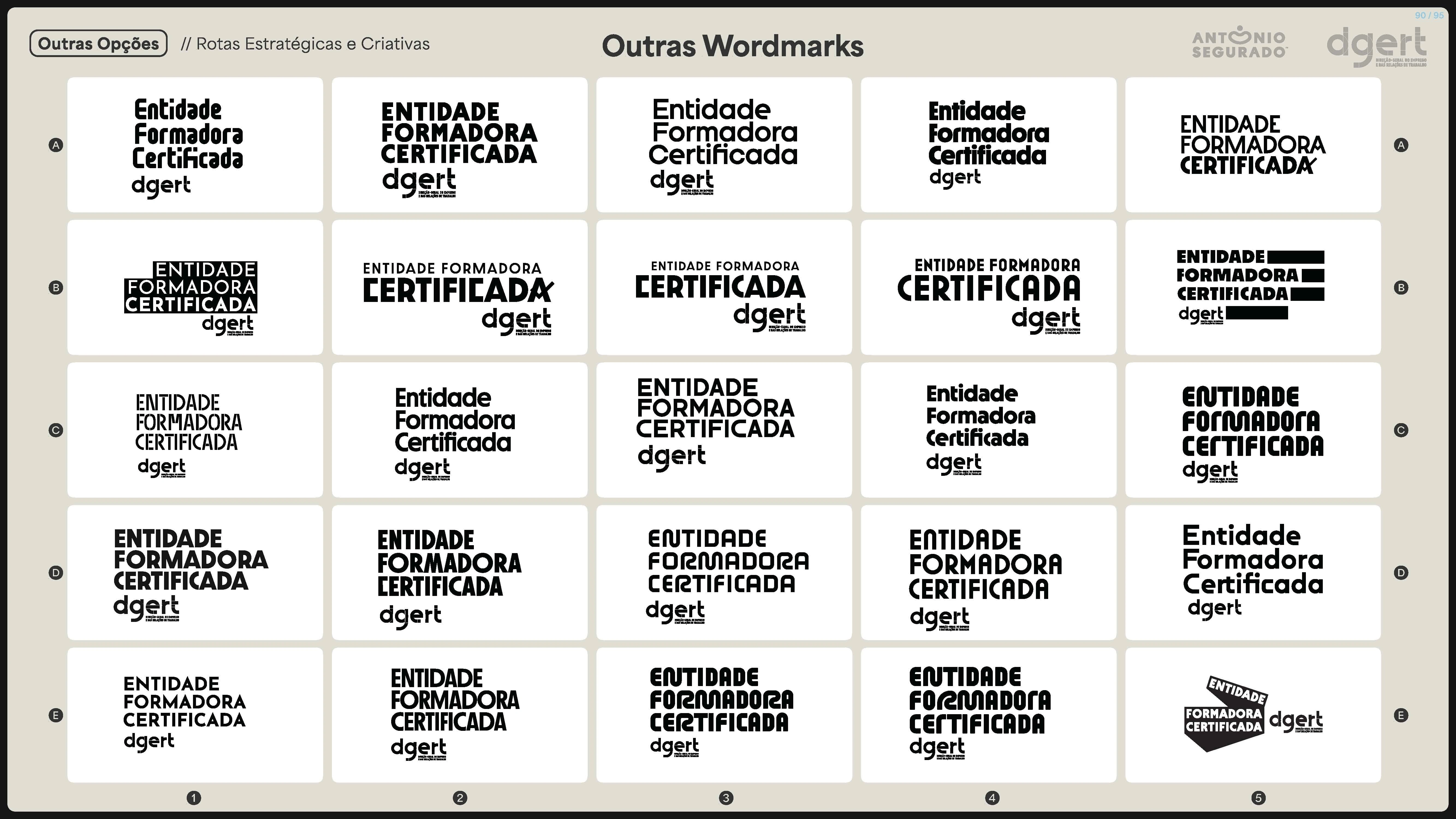
Wordmark Explorations
Monochromatic Symbol Explorations
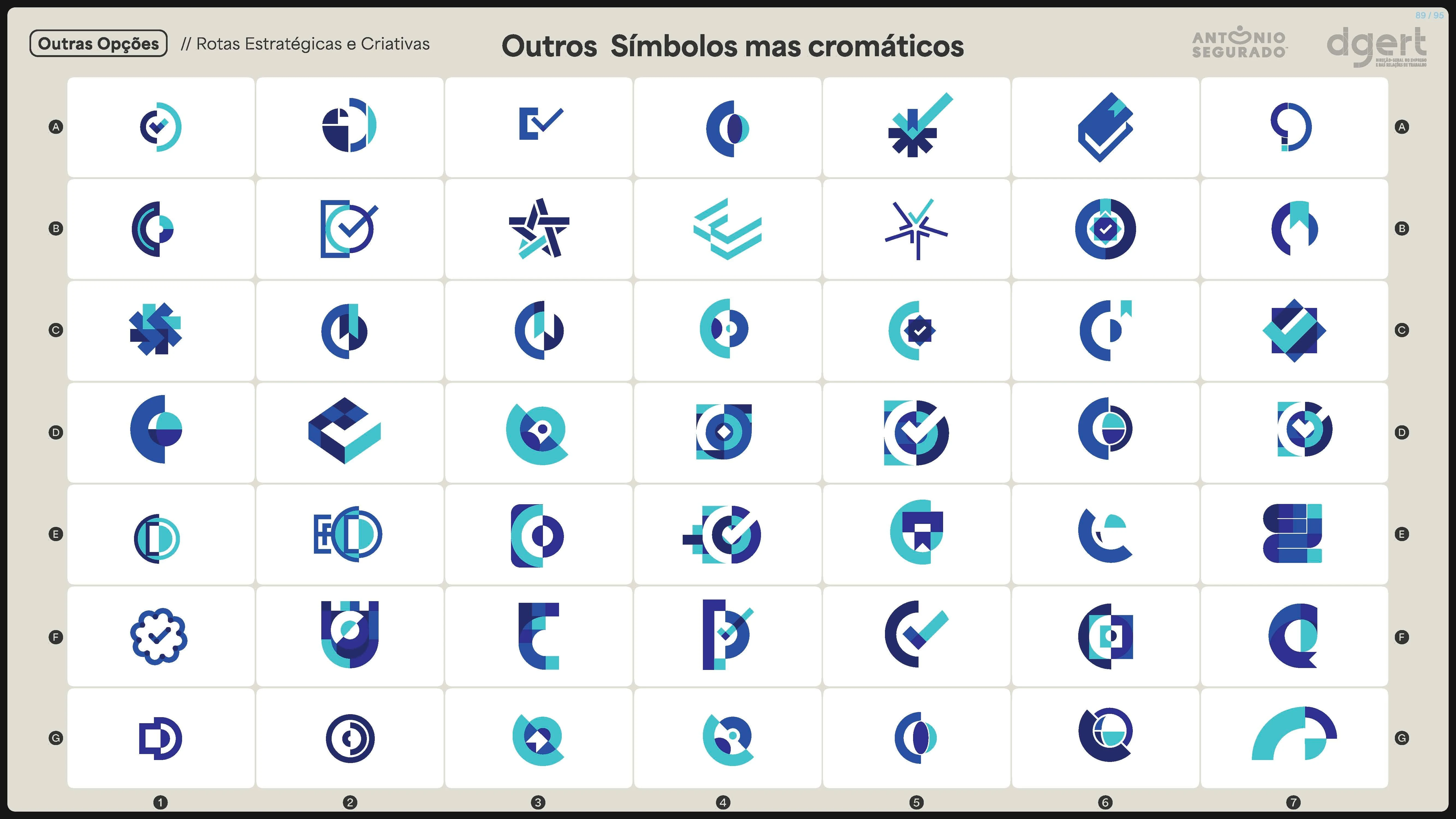
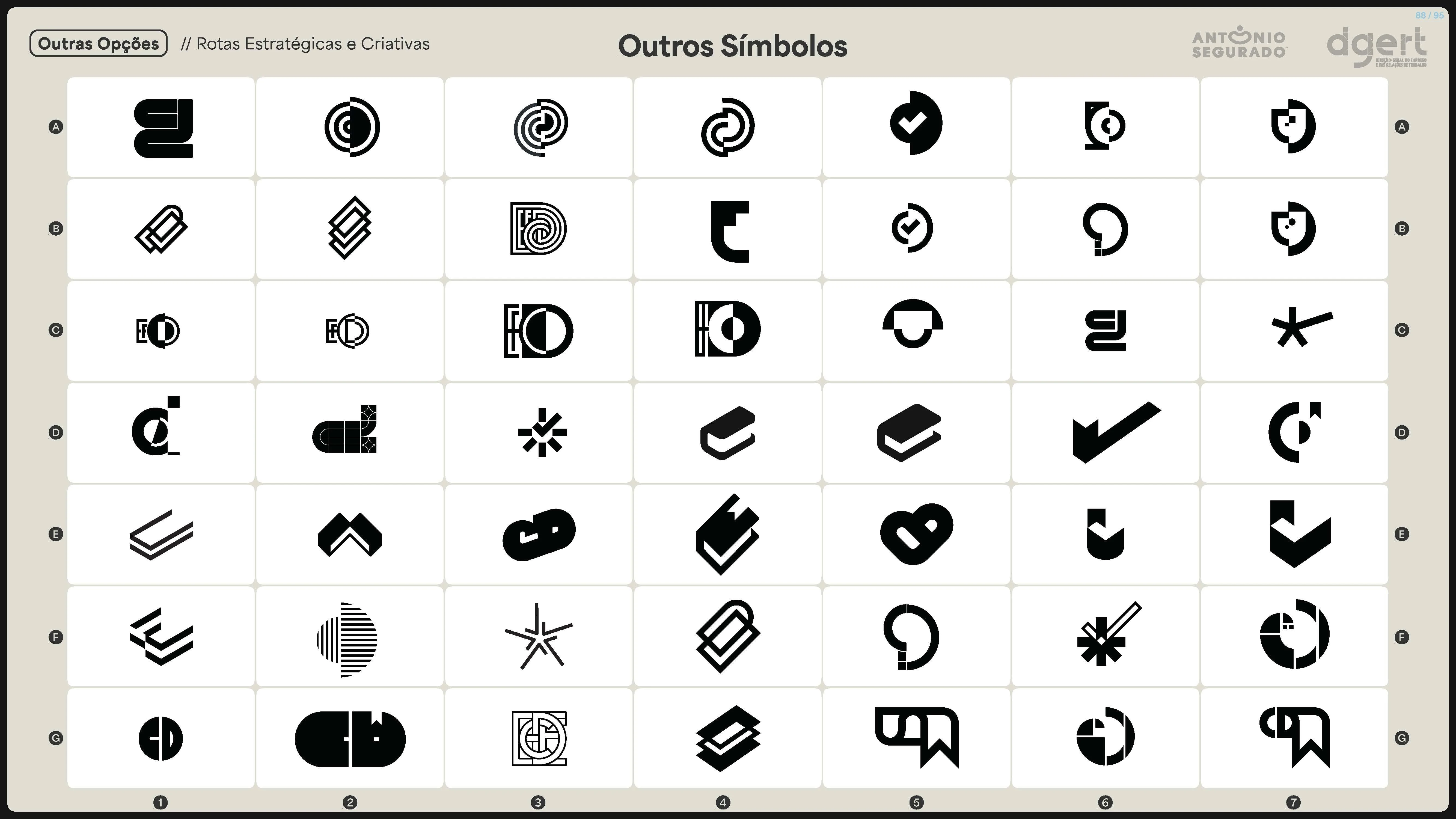
Symbol Explorations
Brand Design Solution
Comparative
Do you like what you see?
Let's talk.
Freelancer: tonesegurado.com
Agency: tonemaki.com
Like this project
Posted Jan 5, 2026
Created a geometric identity system and brand manual that unifies over 3,000 training entities under a modern seal of quality.
Likes
0
Views
14
Timeline
May 15, 2025 - Jun 30, 2025