Brand Refresh for Formalize

Roberto Espirito Santo


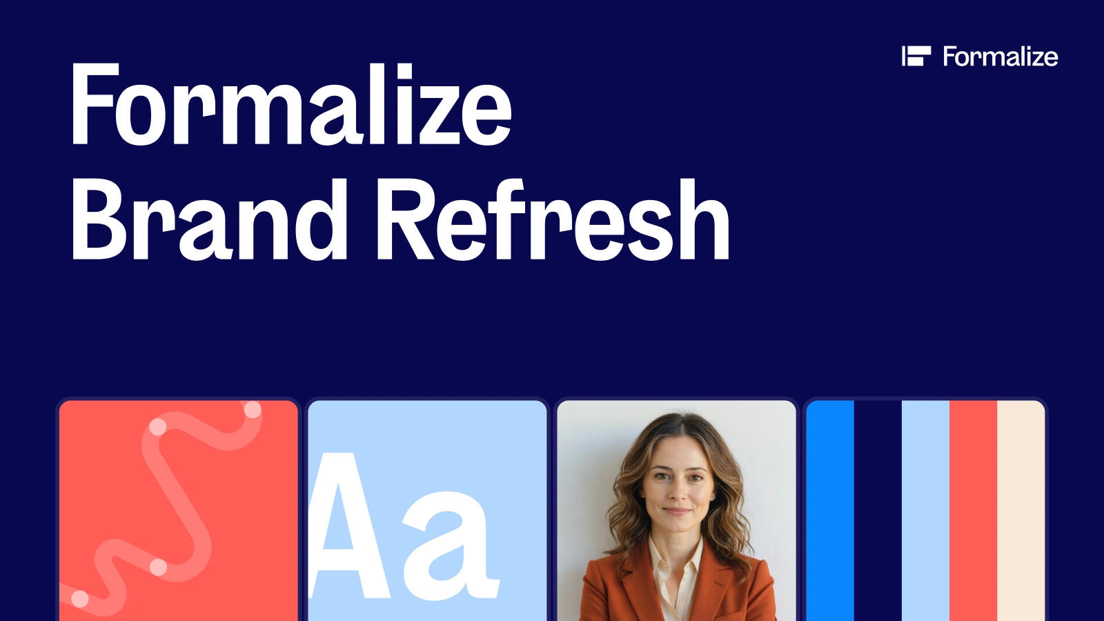
Project Overview
Formalize is a Danish compliance software company helping organizations manage complex requirements across areas like whistleblowing, GDPR, NIS2, DORA, ISO 27001, risk, and compliance documentation.
After raising €30M from their last investment round in October 2025, Formalize entered a new stage of growth. The company was no longer presenting itself as an early stage startup, but as a growing European compliance platform.
The goal of the brand refresh was to evolve the existing identity instead of replacing it. The brand needed to feel more mature, scalable, and more confident, while keeping its clarity and simplicity.
At the center of the refresh was one simple idea: Formalize exists to help companies navigate compliance with more confidence, from the beginning of their journey and throughout every new challenge that comes next.
My Role
I served as the lead designer on the brand refresh working closely with Aubrey, Formalize’s Head of Creative Design, a senior and very seasoned hands-on designer, as well as the Head of Product Marketing, Marketing Project Manager, and the Website Performance Manager.
My role covered both helping on strategy and visual work, from shaping the direction of the refresh to translating it into a flexible brand system to be used on every touch point, including the website.
Scope of Work
The scope included:
Art direction
Brand strategy support
Visual identity refresh
Color system
Typography direction
Social media visuals
Presentation deck templates
Website strategy
Website redesign
Web design system
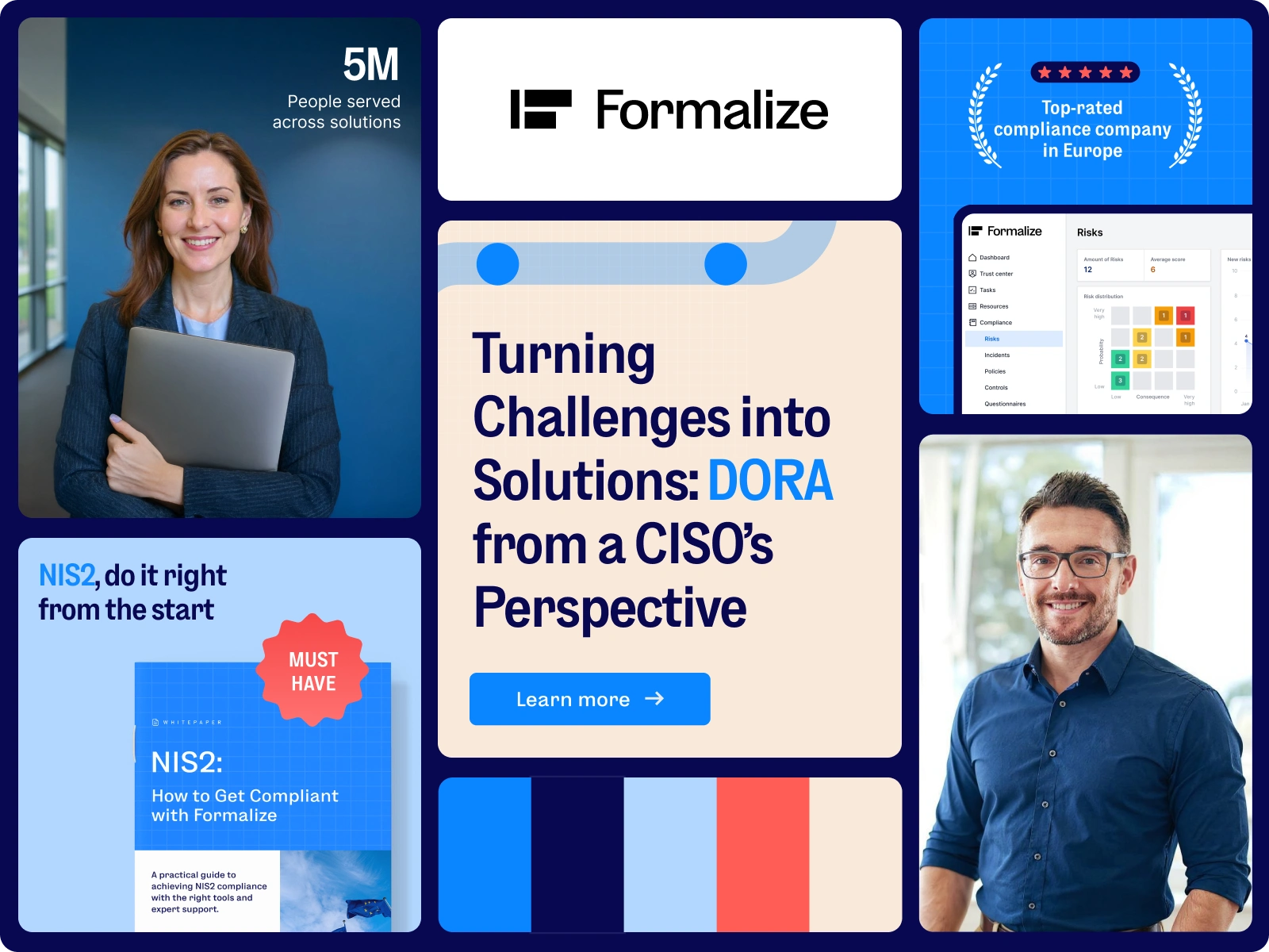
Brand refresh overview look
The Challenge
Formalize’s previous identity had a strong foundation, but it needed more structure and recognition as the company grew. The color system was hard to scale, with no clear primary, secondary, or extended palette, there were inconsistencies with the shapes being some sharp and some rounded, and there was also no strong visual element that could make Formalize recognizable without relying heavily on the logo.
At the start of the project, we explored the idea of creating a stronger brand signature, or as we later called, “the x-factor”. This included exploring patterns, shapes, mascot inspired ideas, and other visual elements that could give the brand a more ownable expression.
After several rounds of exploration, we realized one thing: The answer was not one single graphic element. The strongest direction came from building a connected system of elements that could guide the audience through the brand experience, just like Formalize guides companies through compliance.
Different visual directions explored
Brand Strategy Direction
The strategic direction was built around helping customers move from compliance complexity to compliance confidence.
Formalize needs to make the audience feel that they are not alone in the process. Whether a company is on its early compliance stage, or scaling across markets, the refresh needed to communicate guidance, clarity, and support.
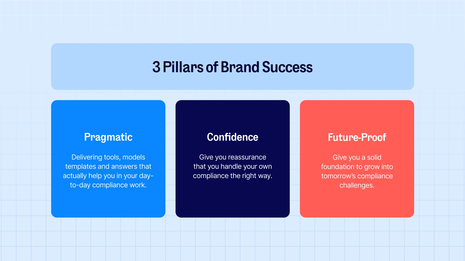
This direction was supported by three brand pillars:
Pragmatic: giving teams useful tools, templates, models, and answers they can actually use in their daily compliance work
Compliance confidence: helping companies feel reassured that they are handling compliance the right way
Future proof: giving organizations a solid foundation to grow into tomorrow’s compliance challenges.
Visual Direction
The visual direction was built around the idea of guided confidence. Compliance should not feel like a wall of legal information, instead, It should feel like a journey where every step becomes easier to understand.
After months of collaborative research and design explorations, we moved away from the idea of one single “x factor.” Instead, we created a visual system where multiple elements worked together to express the brand.
The final direction came from the combination of:
A clearer color system
An introduction of the journey line
A more digestible typography direction
Softer and more flexible visual elements
Usage of bento grids for a better information digestion
A consistent system for layouts, icons, illustrations, charts, and templates
Preview of achieved result
An Updated Color System
The new color system gave Formalize a stronger and more flexible visual foundation. Navy remained an important part of the brand, helping create trust, depth, and recognition. Lighter blues brought clarity and openness, making the brand feel easier to approach.
Coral was introduced as a key accent color. It added warmth, energy, and a more human feeling to the system, without making the brand feel too playful.
The core palette gave the brand consistency. The extended palette gave the team more flexibility across website sections, social visuals, charts, presentations, illustrations, and campaign assets.
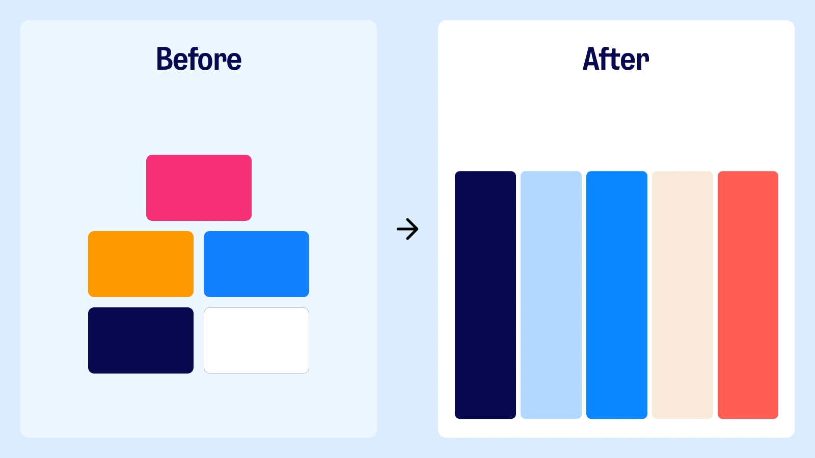
Left side: Previous color palette. Right side: refreshed colors
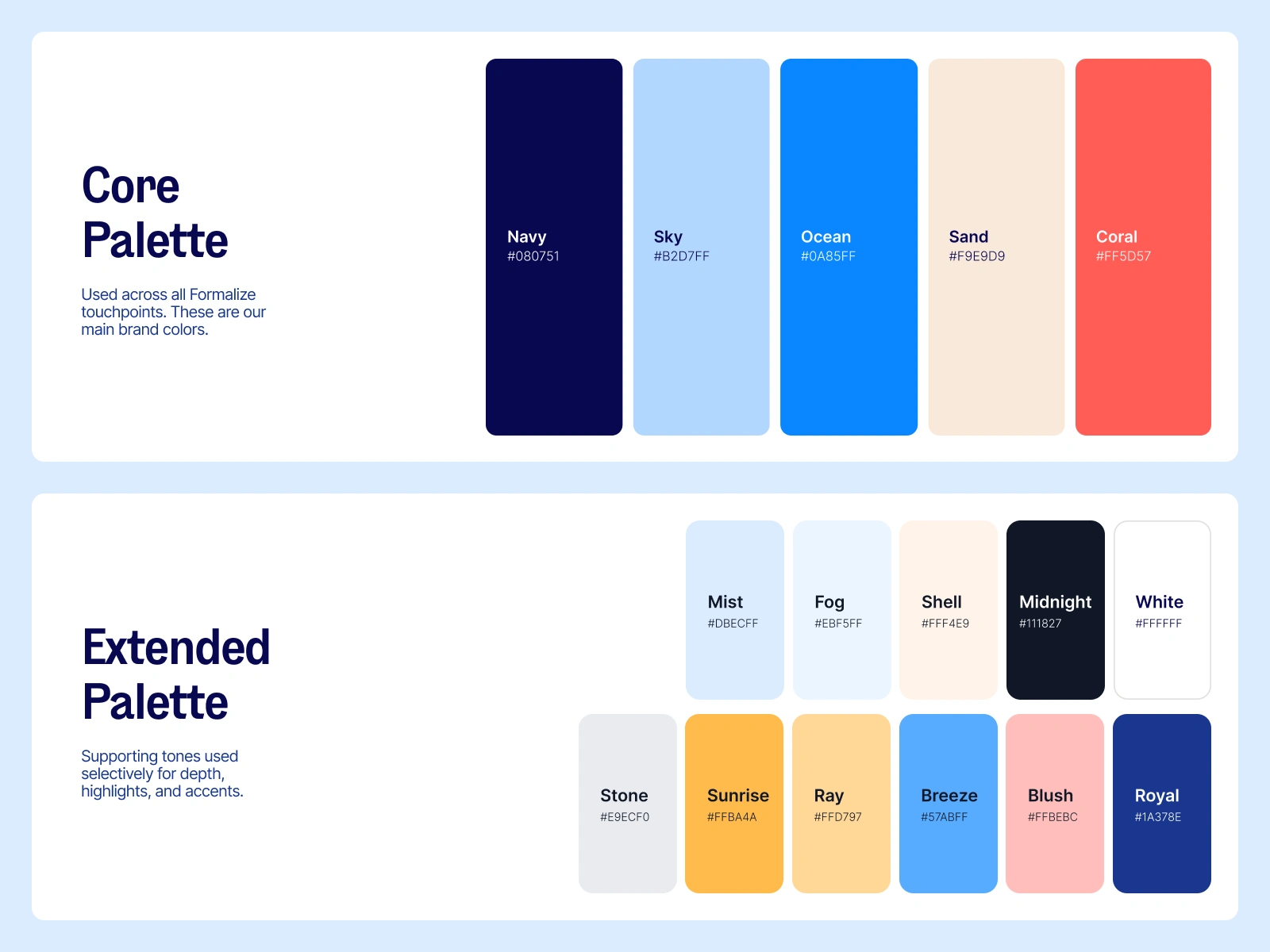
Core and extended color palettes
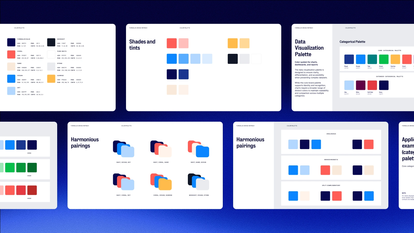
Color guidelines
A New Headline Font
Typography became an important part of making the brand to feel more mature and easier to use.
The previous headline font, ES Dokument Bold, gave Formalize a strong voice, but it was not always flexible enough for the long headlines used across the website and marketing content.
To solve this, we introduced ES Dokument Condensed SemiBold as the main headline typeface. It stayed within the same type family, so the brand still felt familiar, but it gave the team more control when working with longer messaging.
The result was a typography that felt more confident, and better suited for a growing SaaS brand.
Introduction to ES Dokument SemiBold
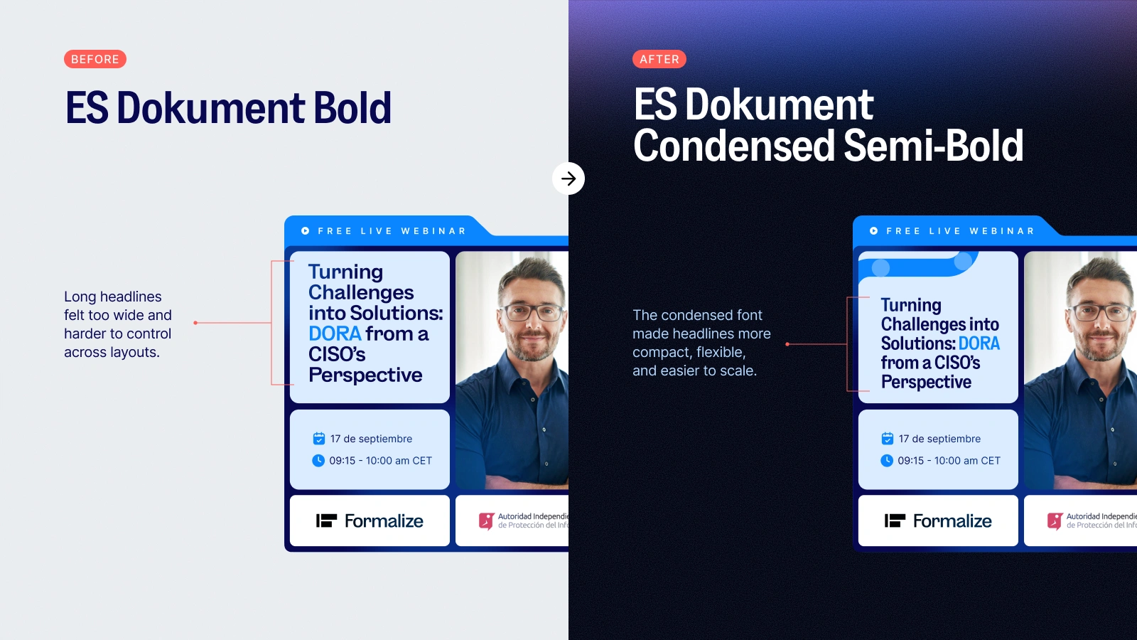
Left side: Old headline font. Right side: New condensed headline font
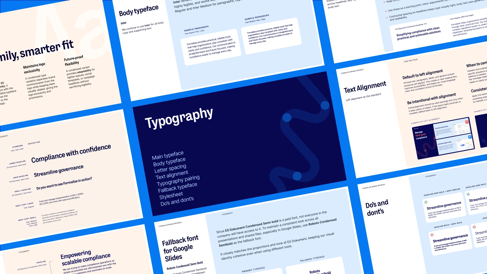
Brand book typography usage rules
The Journey Line
The journey line became one of the most important elements of the refresh as it represents the path from compliance complexity to compliance confidence. It shows that compliance is not a single moment, but a process that companies move through step by step.
The dots along the line represent meaningful moments in that journey, such as adopting a framework, implementing a control, creating internal structure, or overcoming a new challenge.
This made the visual system feel more connected to the actual customer experience. Formalize helps companies move forward with more clarity, and the journey line gave that idea a visual form.
The Journey Line in motion
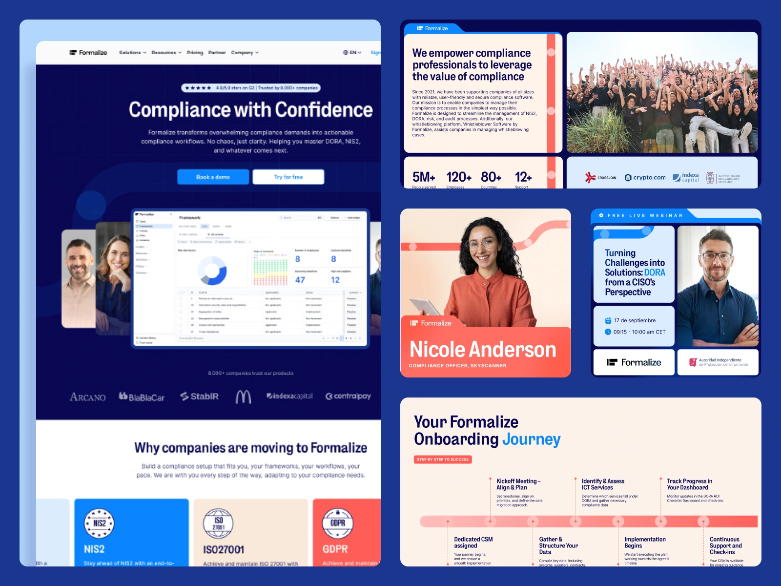
Application of the journey line across various touch points
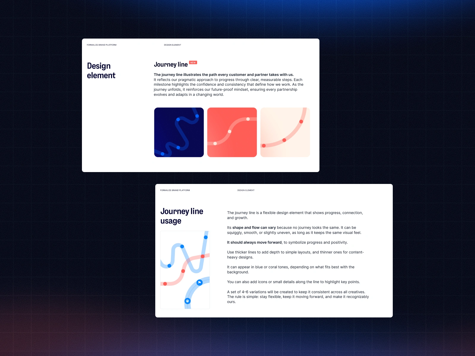
Brand guidelines - Journey line usage

An Integrated Brand System
The refresh was not only about improving the look of the brand. It was about creating a system every team could use consistently across different channels.
The brand system brought together the key elements of the refreshed identity, including:
Color typography
Spacing
Iconography
Illustration
Charts
Templates
Social media assets
Presentation decks
Website assets
and visual patterns.
This gave the Formalize team a practical foundation for creating new materials faster and with more consistency. It also helped the brand scale across marketing, product storytelling, sales enablement, content, and future campaigns.
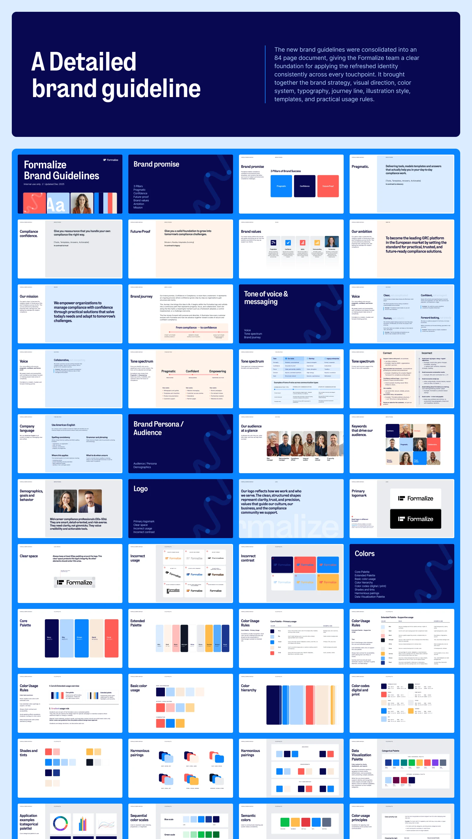
Extended brand guidelines
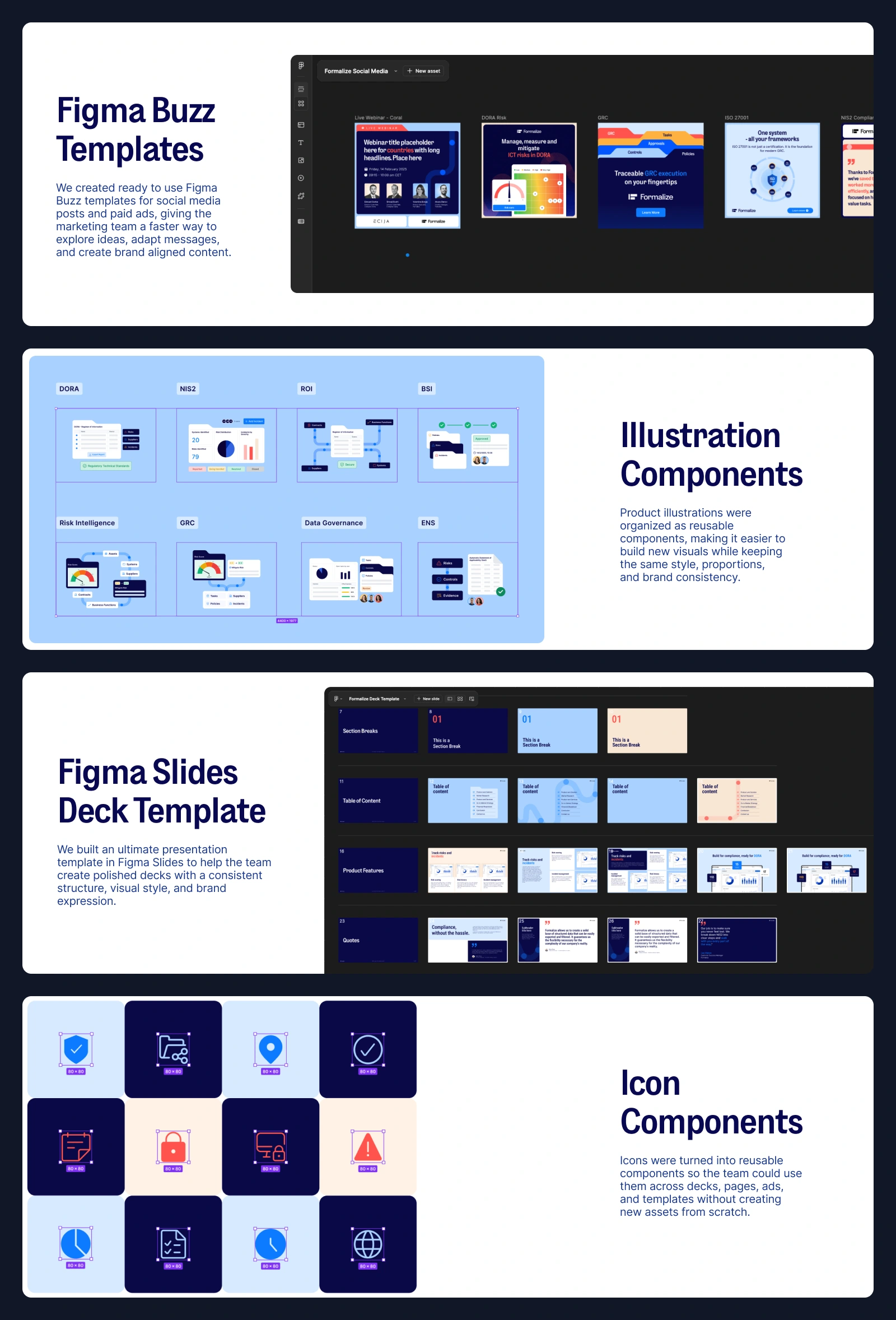
Templates and components

Website Redesign
The brand refresh created the foundation for Formalize’s website refresh.
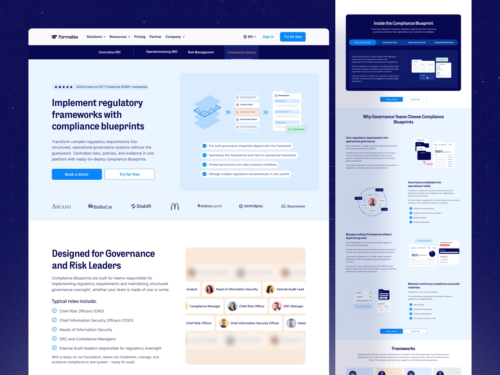
Once the new visual direction was defined, the next step was to translate the system into a more scalable digital experience across the marketing site, product pages, resource pages, landing pages, and other key website touchpoints.
The website became one of the main places where the refreshed brand came to life. It allowed us to connect the new visual system with clearer storytelling, stronger visuals, and a more guided experience for users exploring compliance topics.
I cover that process in more detail in the website redesign case study (coming soon).
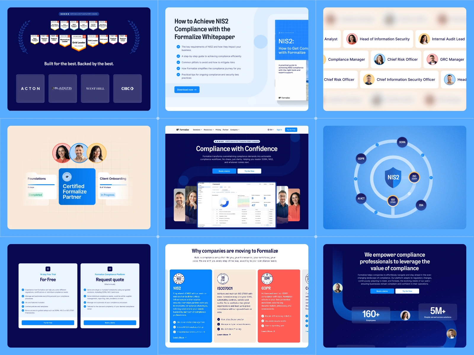
For now, here’s a glimpse of what was done.
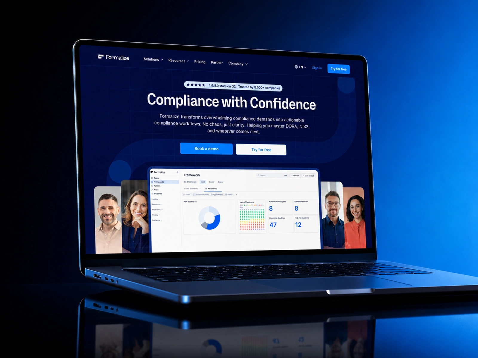
Homepage overview
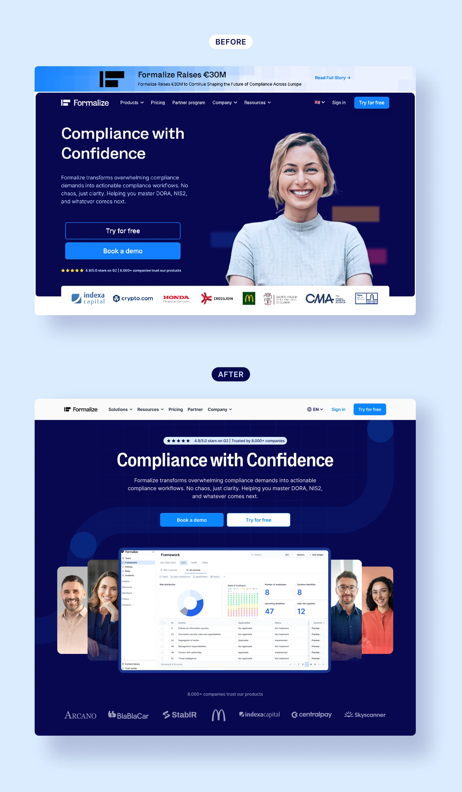
Homepage before and after
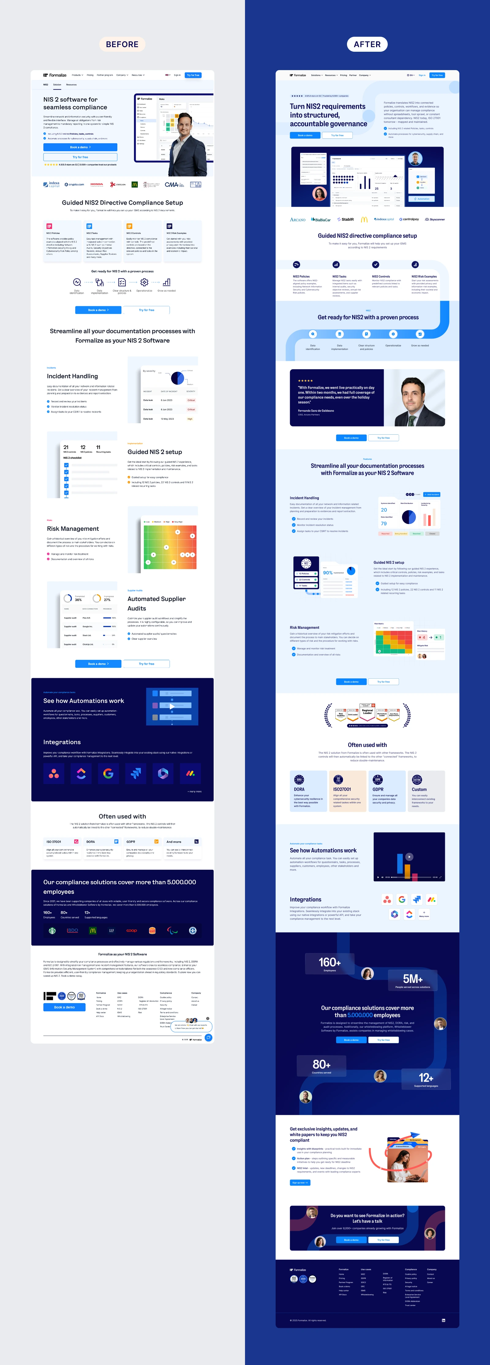
NIS2 Landing page before and after
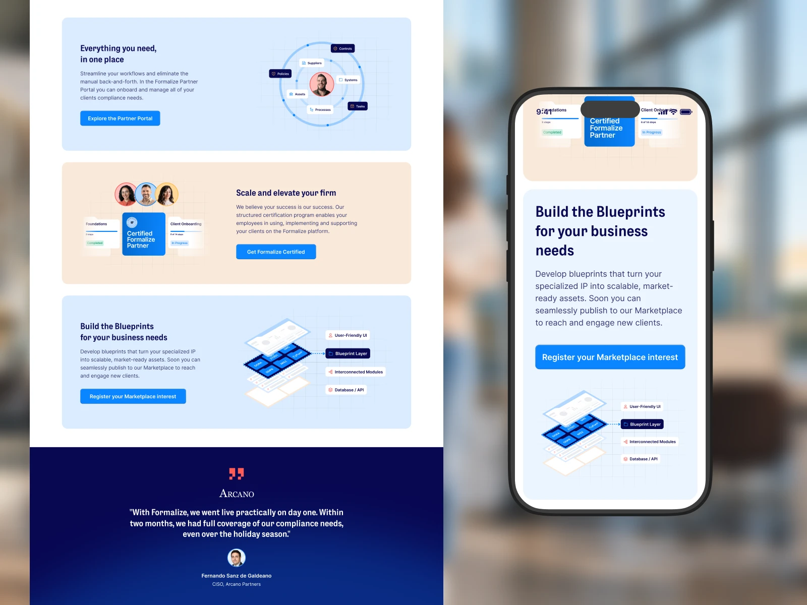
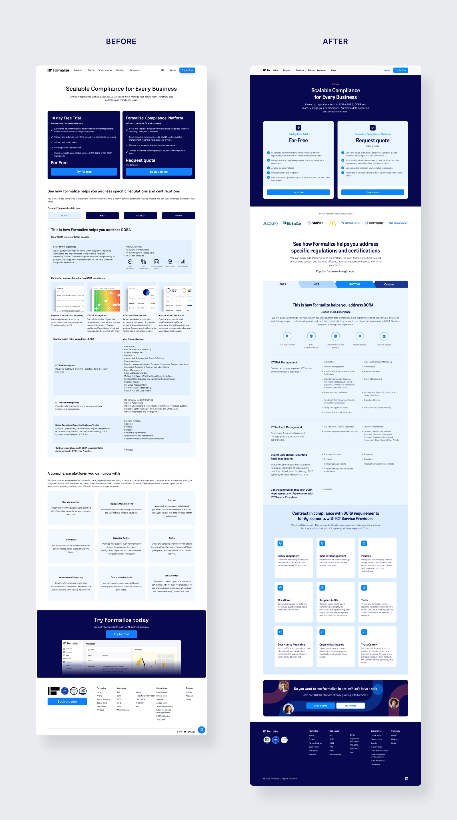
Pricing page before and after
Resource hero before and after

Like this project
Posted Jul 27, 2026
Lead design for Formalize's brand refresh, enhancing visual identity and creating a scalable brand system.
Likes
0
Views
38
Timeline
Oct 27, 2025 - Apr 20, 2026
Clients
Formalize