Answer - Brand Strategy Branding & Website
Roberto Espirito Santo
Project Overview
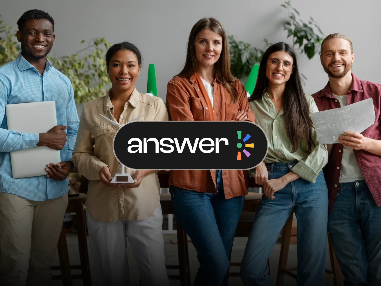
Answer is a community created to help newcomers in Canada find support, guidance, and real opportunities as they build their careers in a new country.
The idea behind the brand came from a very real problem: many educated newcomers arrive in Canada with experience, skills, and ambition, but still face a difficult process when trying to find work in their field. Answer was created to make that process feel less lonely and more supported, by connecting newcomers with mentors, employers, resources, and a community that understands what they are going through.
The goal of the project was to create a brand and website that felt welcoming, trustworthy, and community-driven, while still feeling serious enough for a platform focused on career growth, employment, and professional development.
Scope Work
The scope of the project included art direction, brand strategy, brand identity, web strategy, and website design.
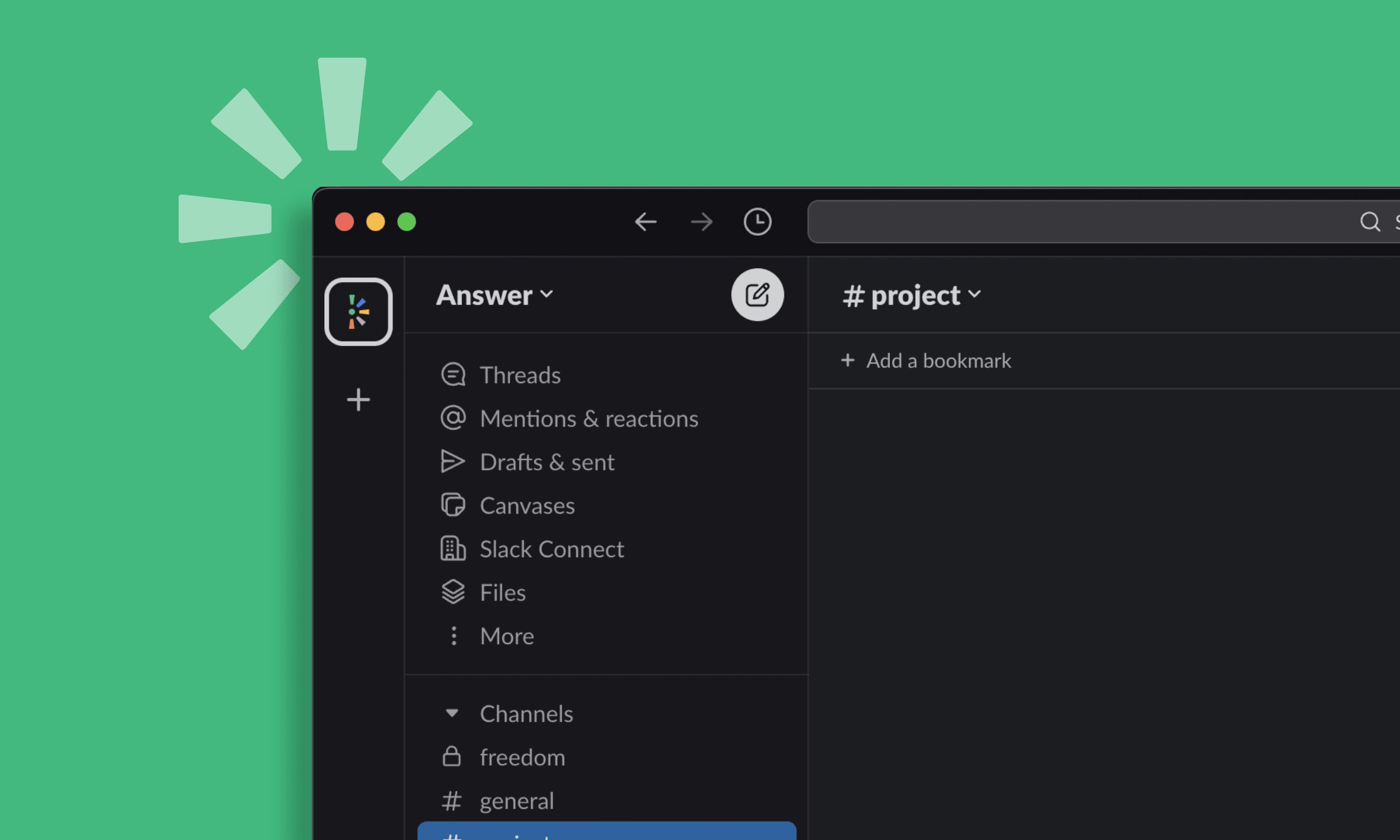
I worked on the full creative direction of the brand, from the visual foundation to the digital experience. This included defining the look and feel, developing the logo system, building the color direction, creating the overall brand language, and designing the initial website experience.
My Role
I was the sole designer behind the full project, working closely with the founders from strategy to execution. I led the creative direction, brand identity, website structure, visual design, and overall design system for the project.
The founders brought the story, mission, and personal understanding of the problem. My role was to take that foundation and turn it into a complete visual identity and website experience that could communicate the purpose of Answer clearly.
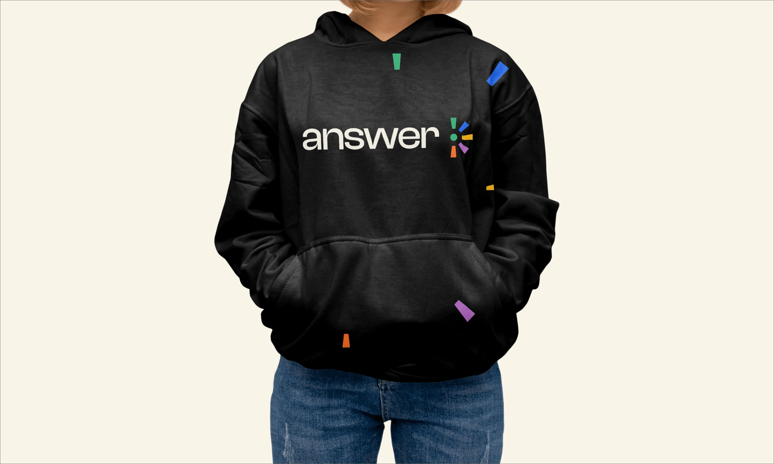
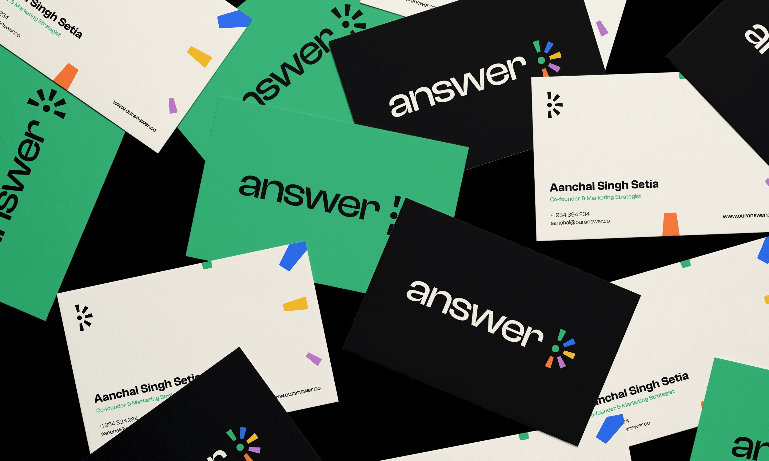
Brand Identity
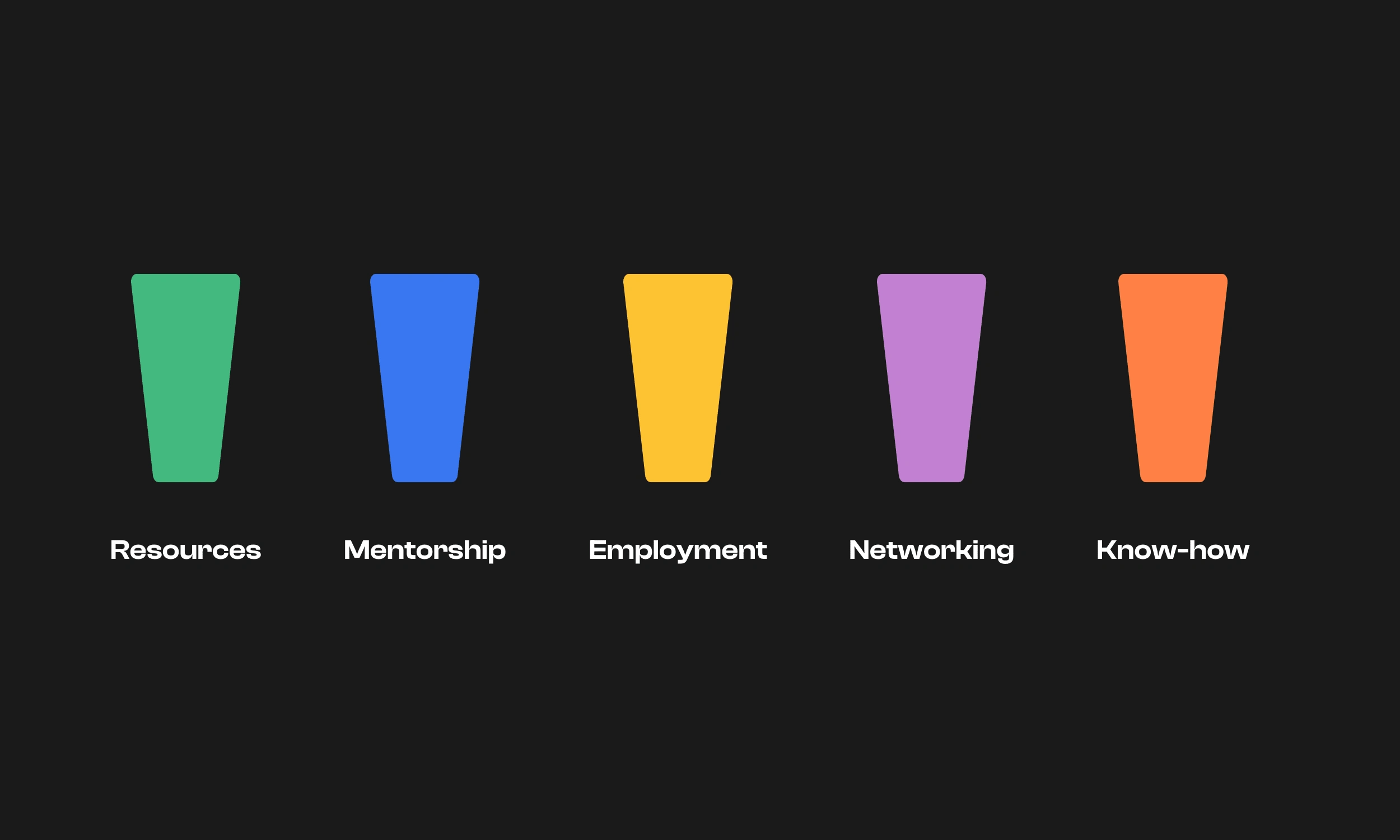
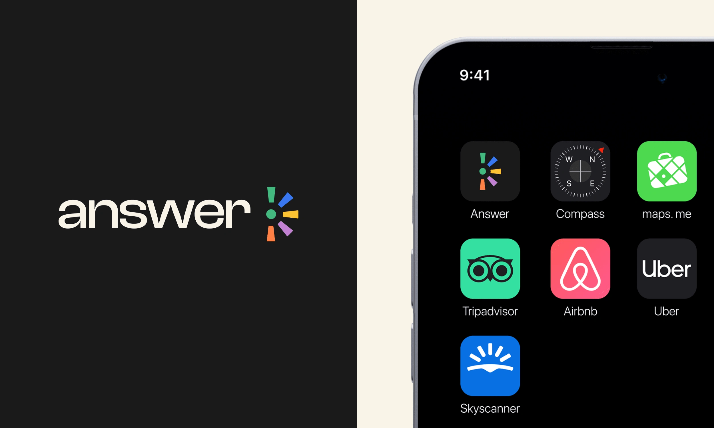
Answer's identity was built around the idea of different types of support coming together in one place.
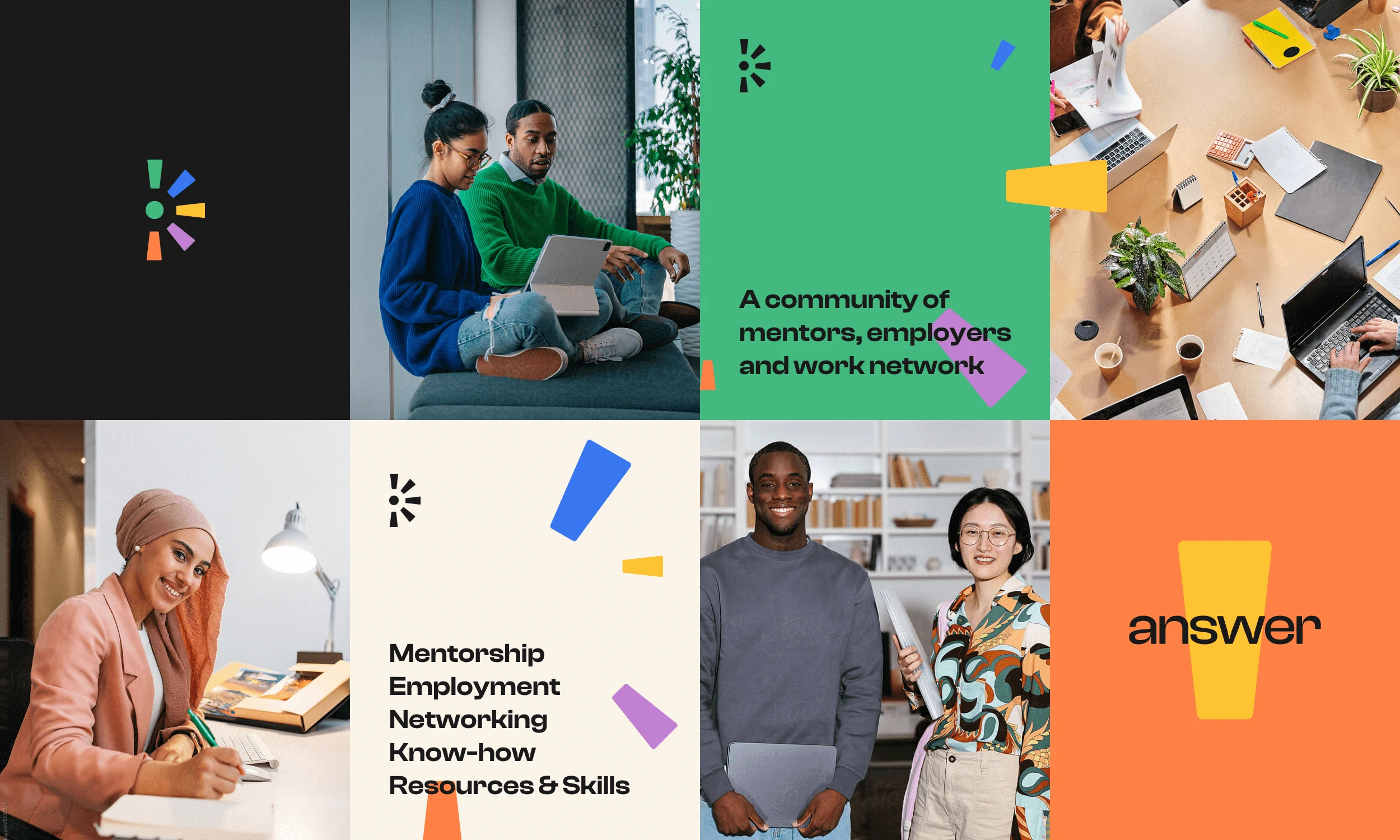
The logo combines the wordmark with a symbol that represents the different categories of help newcomers can find through the community. Mentorship, employment, networking, know-how, resources, and skills are all part of the Answer ecosystem, and the symbol was designed to reflect those different pieces coming together around one shared purpose.
The brand needed to feel human, open, and optimistic, but not childish or too playful. Since the platform is focused on work, career growth, and helping people navigate serious life decisions, the identity had to balance warmth with trust.
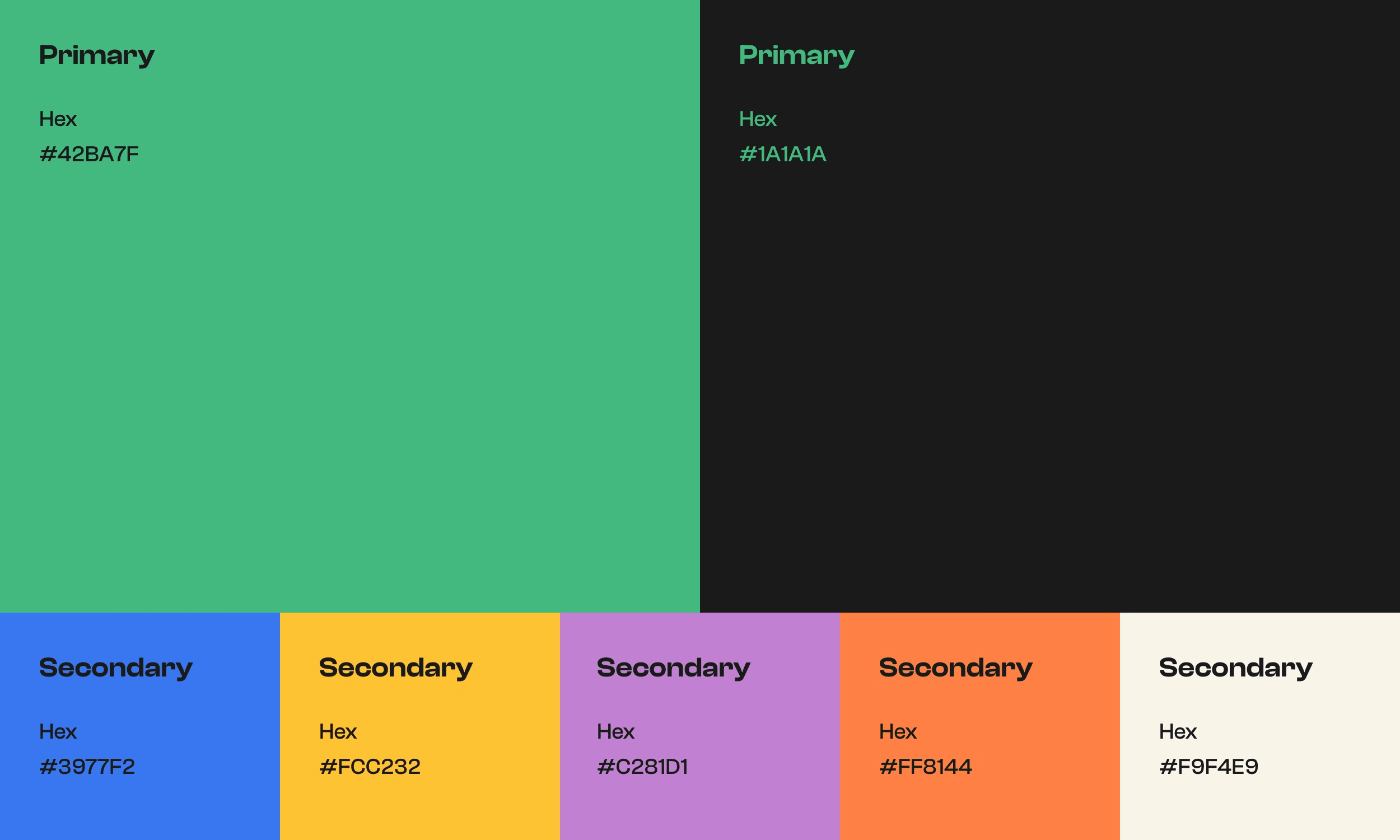
Colors
The colors played a big role in this balance. The palette was created to make newcomers feel welcome, safe, and supported, while also showing that Answer is a community for people from everywhere. Each color brings a different feeling into the brand: green feels fresh and action-oriented, blue brings trust and clarity, orange adds warmth and energy, yellow adds optimism, purple brings creativity and diversity, and the cream and almost-black tones give the brand structure and seriousness.
The almost-black color was especially important because it helped ground the identity. With a colorful brand, there is always a risk of making the design feel too playful. Using darker sections and cream backgrounds helped create contrast and made the brand feel more mature, professional, and credible.
Website Design
The main goal of the initial website was to introduce Answer, explain the purpose of the community, and encourage people to join the waiting list.
Since many people would first discover the brand through social media, the website needed to quickly explain what Answer is, who it helps, and why it exists. The experience was designed to build trust fast, create curiosity, and guide users toward applying to join the community.
Imagery and Colors
Imagery was a very important part of the website direction. I used lifestyle images and videos with people from different backgrounds, skin tones, and ethnicities to make the community feel open and inclusive. At the same time, the imagery always included work-related environments such as computers, books, desks, and workspaces. This helped show that Answer was not just a general community. It was a community built to support newcomers in Canada who wanted to grow professionally and find work in their field.
The color system on the website was also used in a strategic way. Green was used for CTAs to create a clear action path. Blue was used for eyebrows and smaller labels to guide the eye. Orange was used to highlight important words inside headlines and paragraphs. The broader color palette was also used to represent the different areas where the community could help, giving each category its own visual space while keeping everything connected to the main brand system.
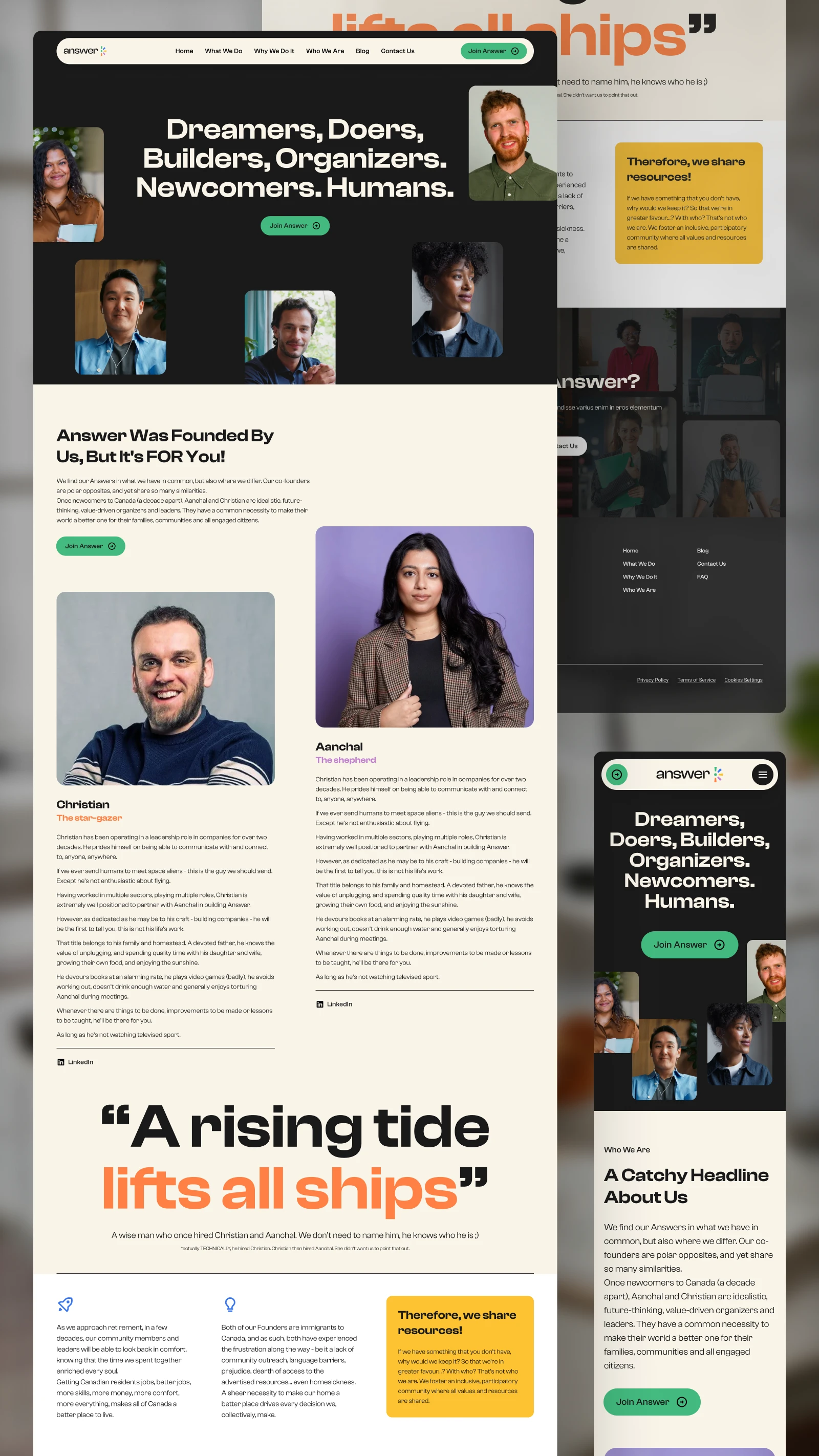
Homepage
The homepage was designed as the first main point of contact after social media.
Its role was to give visitors a clear and quick understanding of what Answer is, why it exists, and how it can help. The structure was created to introduce the community, explain the problem, show the founders’ intent, and build enough curiosity for people to continue exploring or take action.
I wanted users to feel that Answer understood their struggle, but also that the platform had a real plan to support them. The page uses a mix of strong headlines, community-focused sections, service categories, FAQs, and clear CTAs to move users from awareness to action.
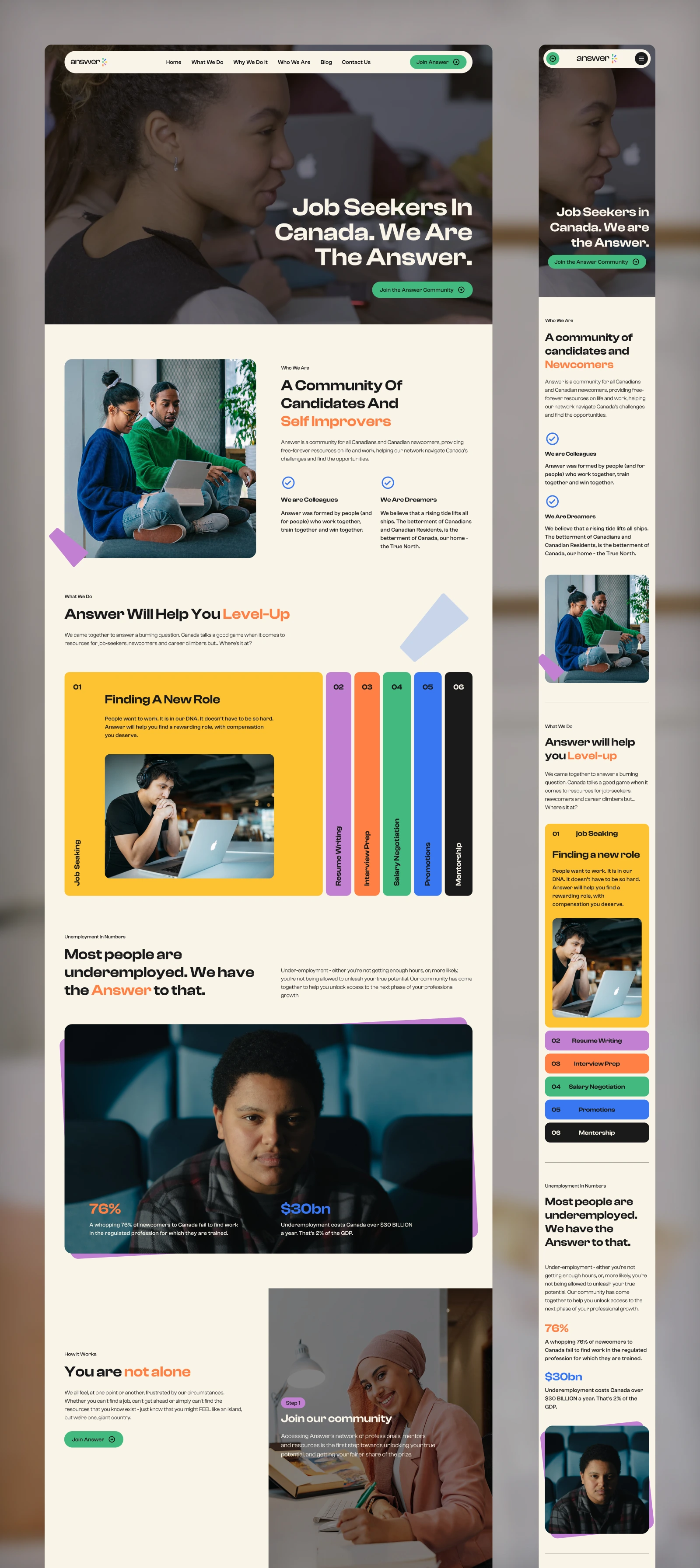
homepage - desktop version
Homepage - mobile interaction of how the steps it takes to join the community
What We Do Page
The “What We Do” page was designed to go deeper into the services and support Answer provides. This page explains the actual ways the community helps newcomers. The page breaks down the different support areas, such as preparing resumes, helping with interviews, building confidence, finding the right network, understanding the Canadian job market, and connecting with mentors and employers.
The hero section was designed around a series of videos that represent the different stages of the newcomer journey and the various ways someone can engage with the community.
To improve usability, I thought about including a sticky sidebar navigation that remains visible as users scroll through the content. Since the page contains multiple support categories, the sidebar allows visitors to quickly jump to the area most relevant to their needs without having to scroll through the entire page. Each category is associated with its own brand color, and hovering over the side bar navigation item triggers a color-specific interaction that corresponds to that section.
Each section was designed with its own color and visual rhythm so the content would feel organized, easy to scan, and connected to the wider brand system.
What We Do Page - A glimpse of the hero section and sticky sidebar navigation
Who We Are Page
The “Who We Are” page was designed to build trust through the founders’ story.
For a project like Answer, the people behind the brand matter a lot. Newcomers need to feel that the community was not created from a distance, but by people who understand the process and care about the outcome.
This page introduces the founders, their background, and the reason Answer exists. The messaging is more personal and emotional, but still professional. The goal was to make users feel that there are real people behind the platform, with real experience, a clear mission, and a strong reason for building this community.
Left side - Mobile view of the Who We Are page. Right side - website mobile interaction
Contact Us Page
The Contact Us page was designed to be simple, clear, and easy to use.
The goal was to give visitors a direct way to reach out, ask questions, or connect with Answer's team. It keeps the same brand language as the rest of the website, using the color system, clean layout, and approachable tone to make the experience feel consistent and trustworthy.
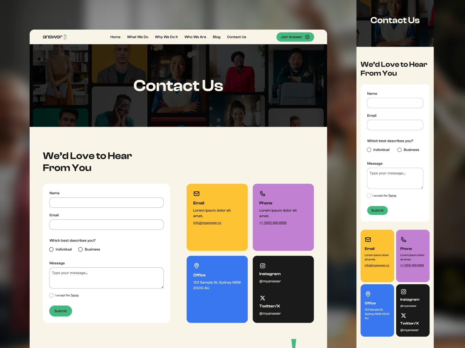
Contact Us page - Desktop and mobile
Final Thoughts
This project was about more than creating a visual identity. It was about building a brand that could make newcomers feel seen, supported, and confident enough to take the next step.
Every part of the identity and website was created to balance warmth, trust, diversity, and professionalism, so Answer could feel like both a safe community and a serious career support platform.
Like this project
Posted Sep 18, 2023
Developed brand strategy, visual identity, logo, and website design for a Canadian newcomer community connecting mentors, employers, and jobs.
Likes
0
Views
54
Timeline
Oct 9, 2022 - Apr 9, 2023