SARINASNYDER.COM
Sarina Snyder
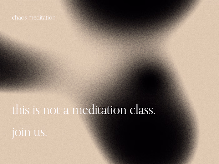
The opening sequence logo takes multiple forms, shapeshifting as I do in my professional and artistic practices. I opted for a simple palette and a clean, subtly playful design to harmonize and help showcase bold + vibrant selected work.
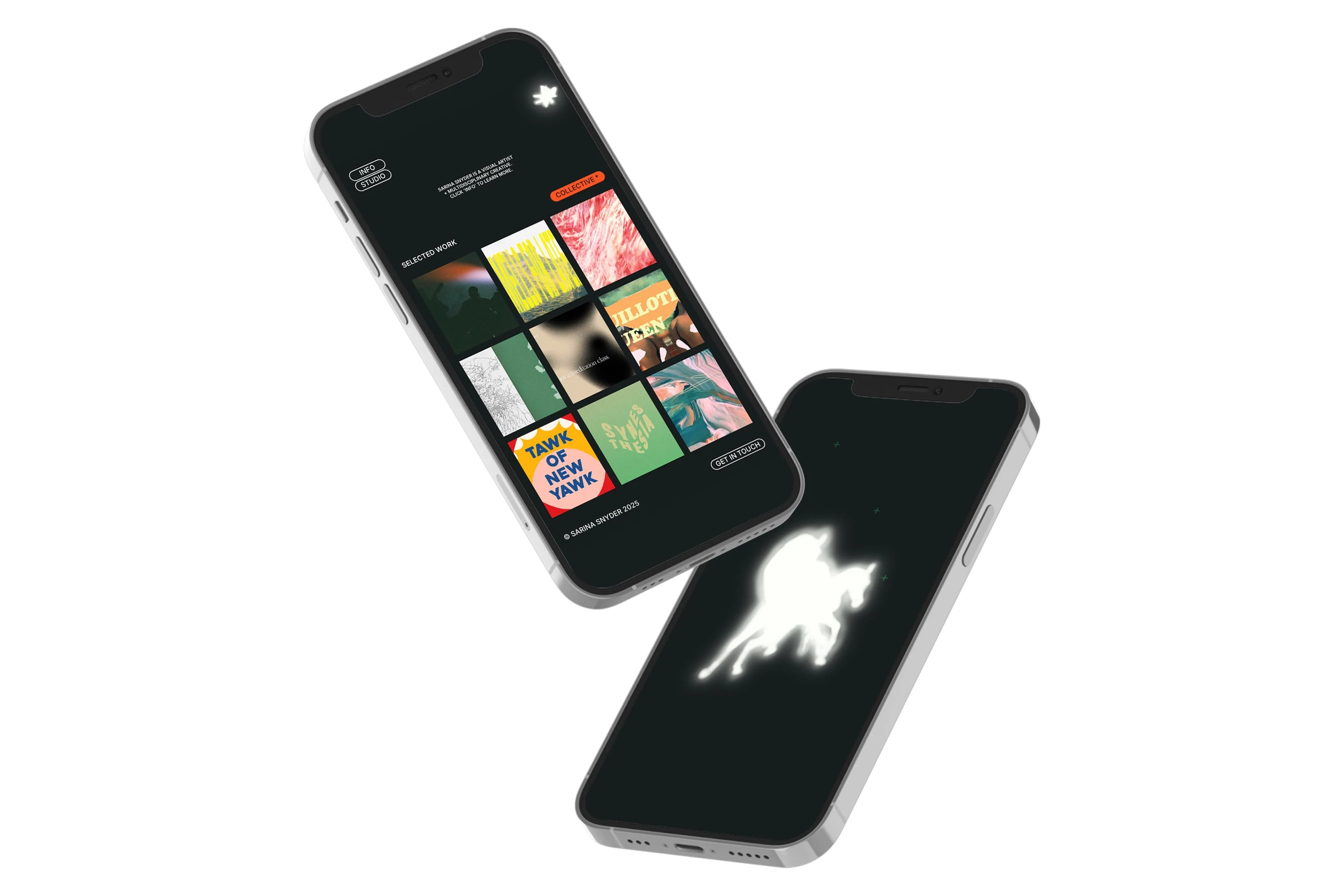
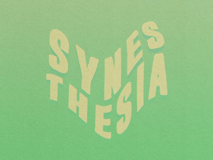
'selected work' main page + a quick look at the 'collective' project page
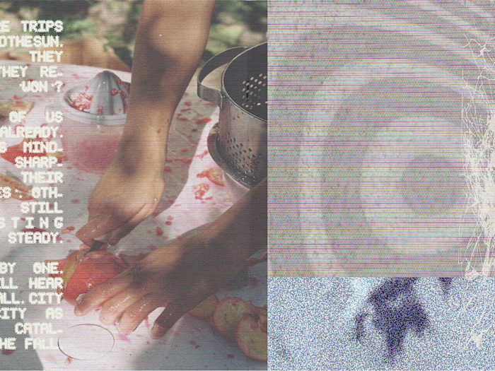
For the studio section, a video background and an inverted color palette signal that the user has entered into the other half of the site.
'studio' opener + a quick look at the photo page
Like this project
Posted Jun 2, 2025
After years of freelancing and furthering my visual art practice, it was time for a new look. I chose Readymag to help bring my brand and new site to life.