EQUITY — Redefining Real Estate
From Vision to Reality: Build, Test, Improve
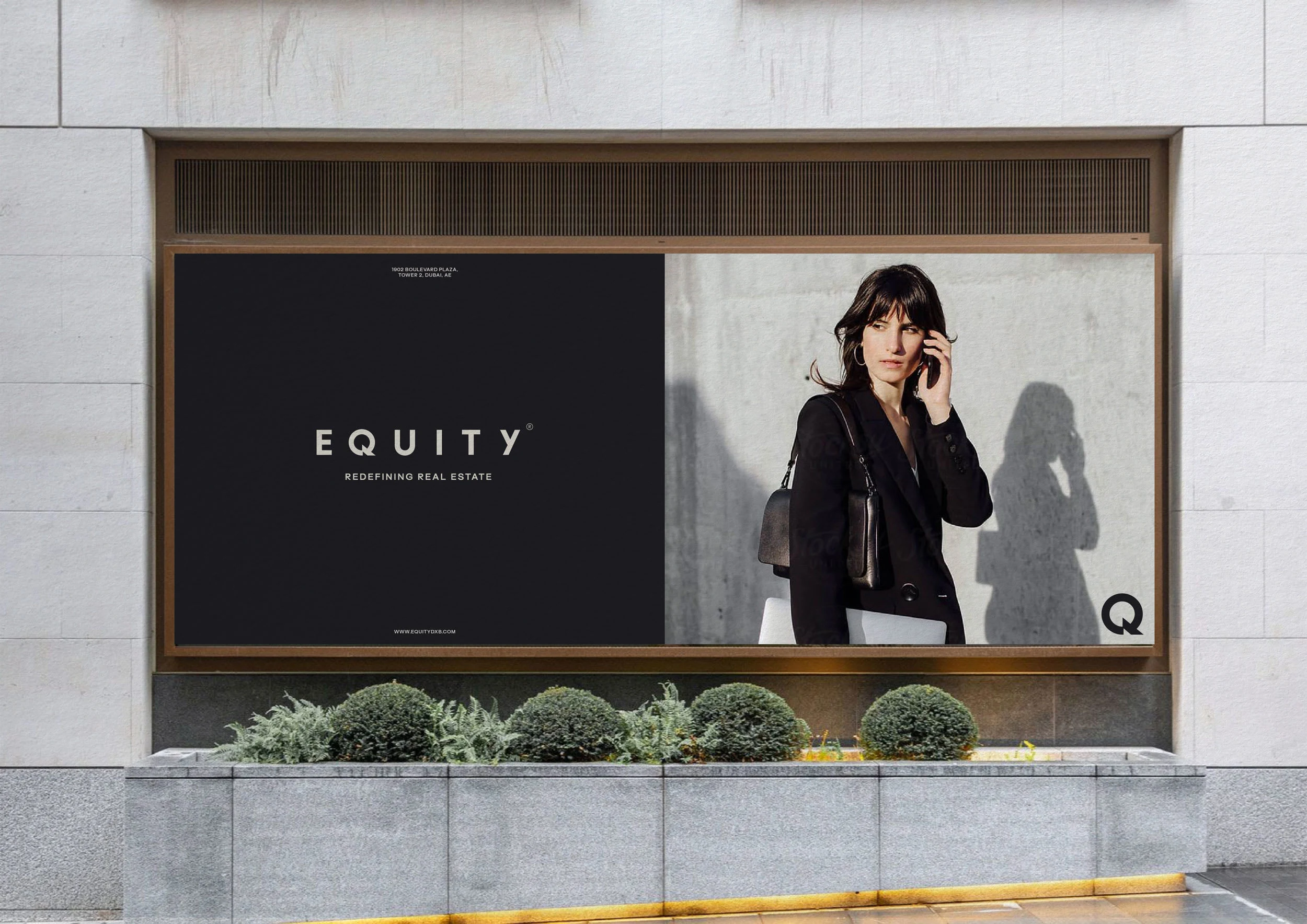
Equity is a rising player in Dubai's real estate market founded by Emrah Yar, a visionary leader with a proven track record in the field. The company was built on ambition, expertise, and a handpicked team dedicated to his vision. From day one, their goal was clear: to stand out and redefine the industry. As the business grew rapidly, its unfinished brand identity failed to reflect its confidence, attract top-tier clients, and recruit top agents. To keep up, they decided to refine and expand their brand identity, ensuring it matched their success.
Outdoor Advertising
Exploring Possibilities
Through meetings, conversations, and questionnaires, we developed a moodboard that captured insights, ideas, and potential directions. This process helped both teams validate and discard early concepts while shaping a vision for the brand’s future. With a solid foundation, we explored and tested high-level concepts to gather initial feedback and refine the creative direction.
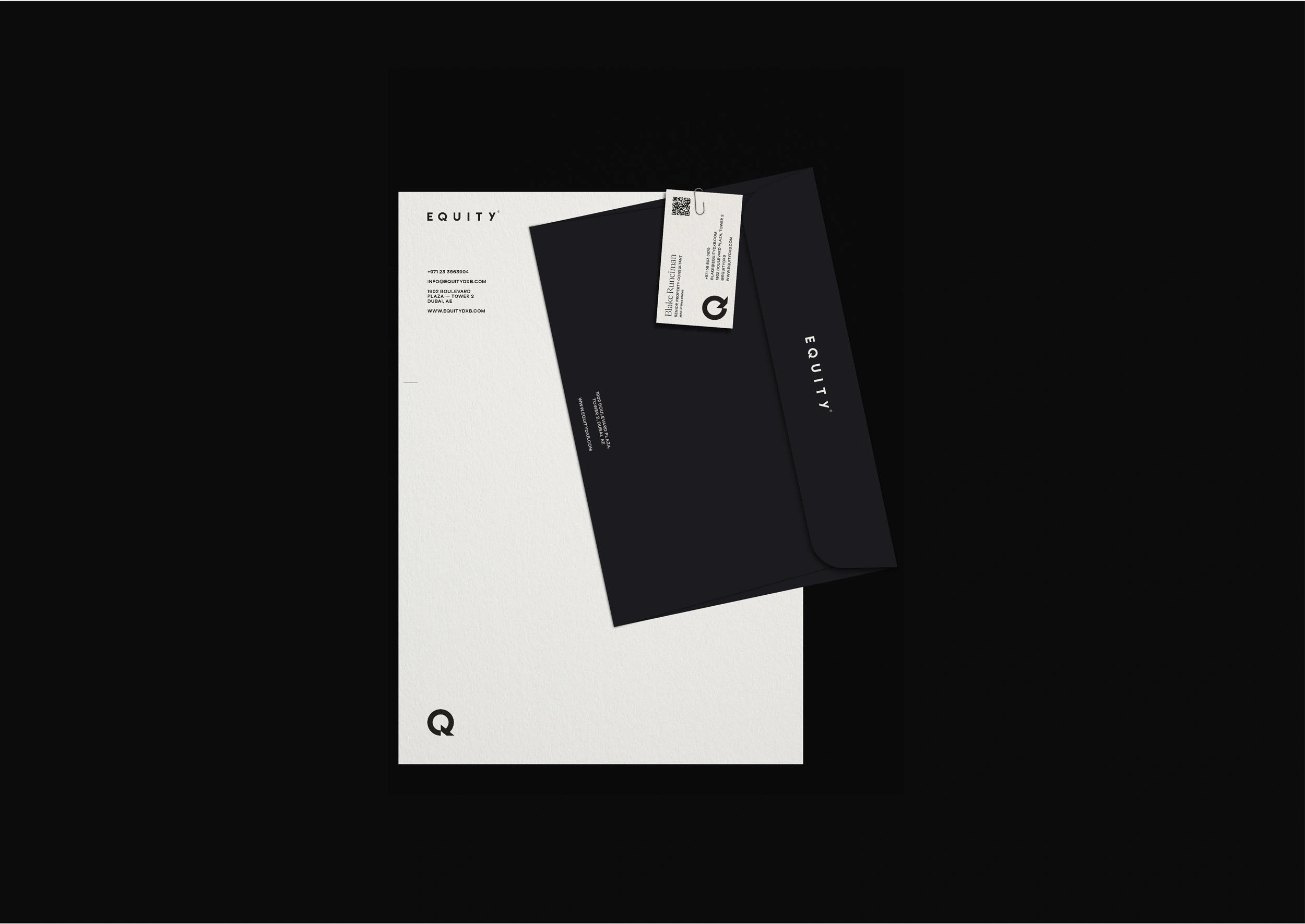
Stationery
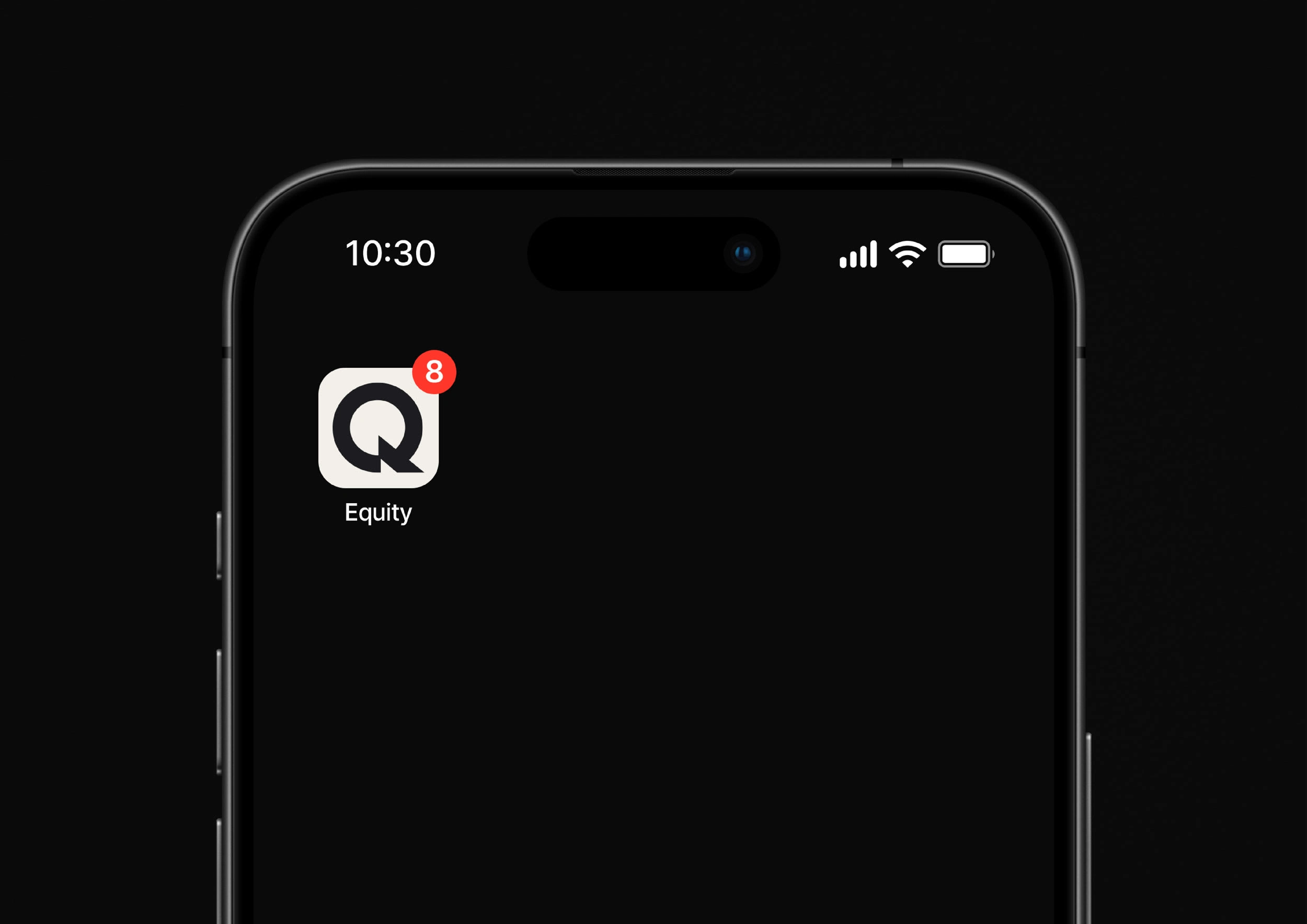
Symbol — App Icon
Re-shaping the form
Once the right visual direction was established, the first thing we did was to revisit the logo. Although there wasn’t nothing entirely wrong about it, we agreed that it lacked distinctiveness. Through some minor and careful adjustments, we managed to create a much more memorable and recognizable logo, largely due to the redesign of the letter 'Q' with its bespoke tail shape. We clearly saw something special and compelling in it, and in the end, it took center stage in many applications because of its uniqueness and ability to work in various sizes while remaining recognizable.
Logo animation
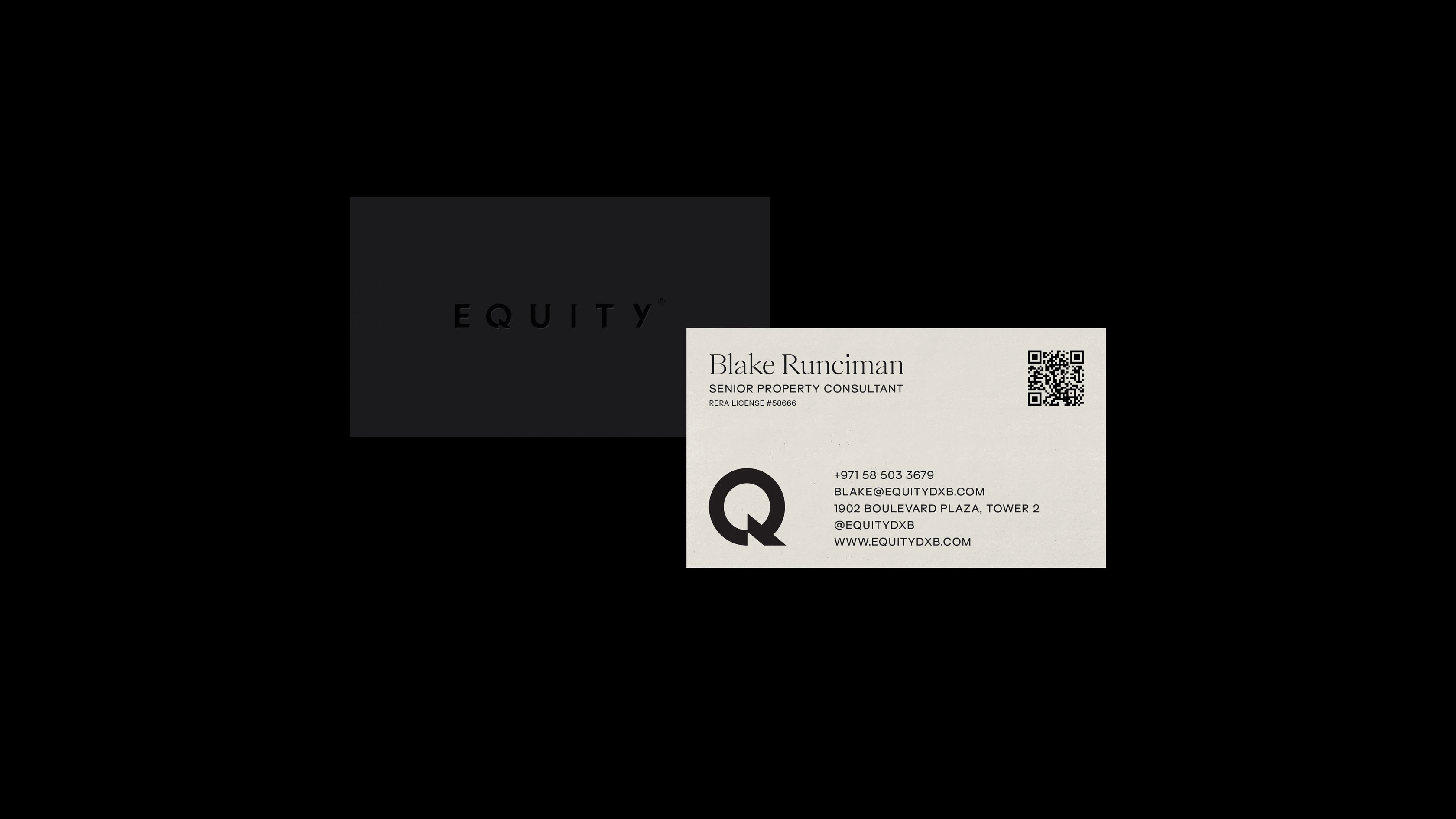
Business Cards
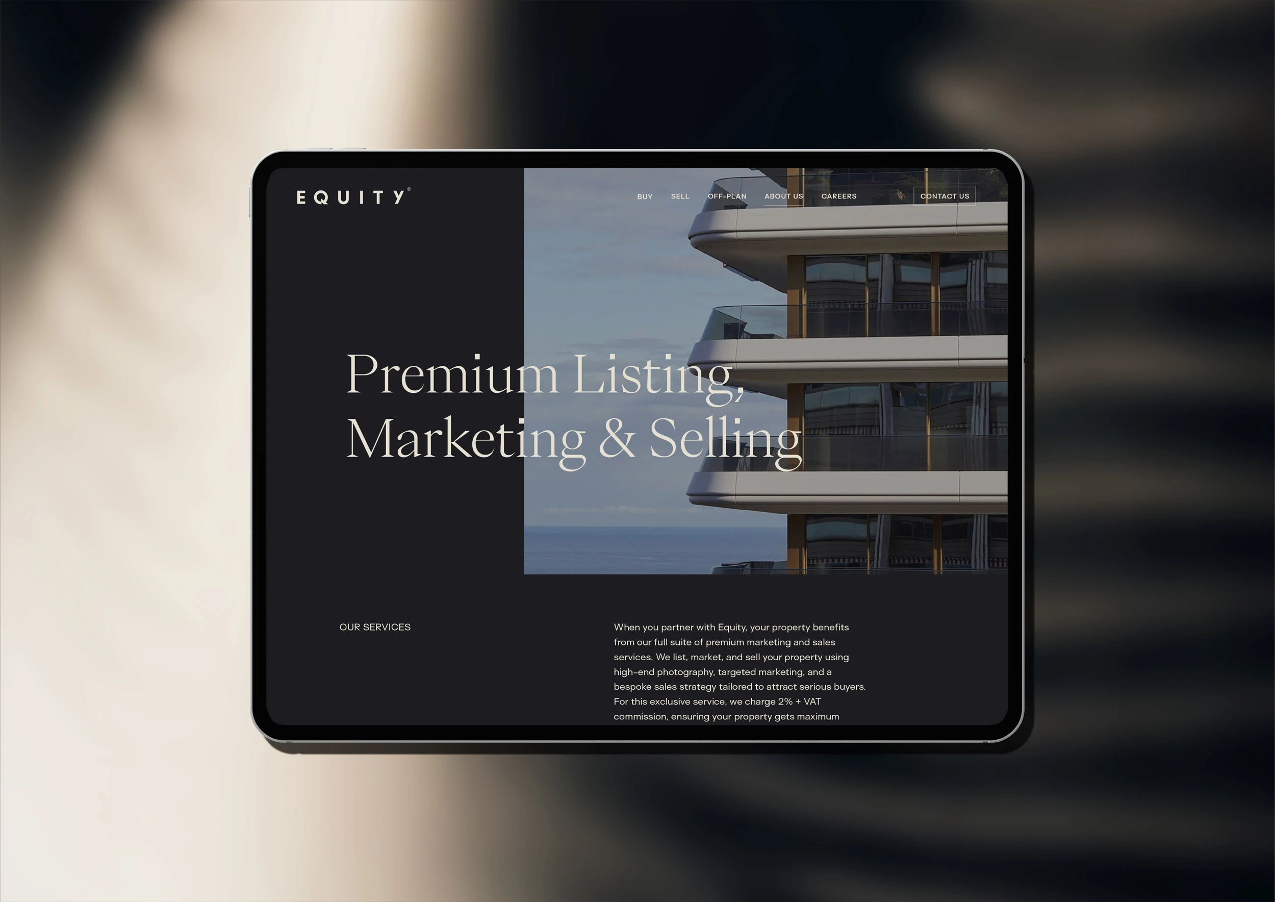
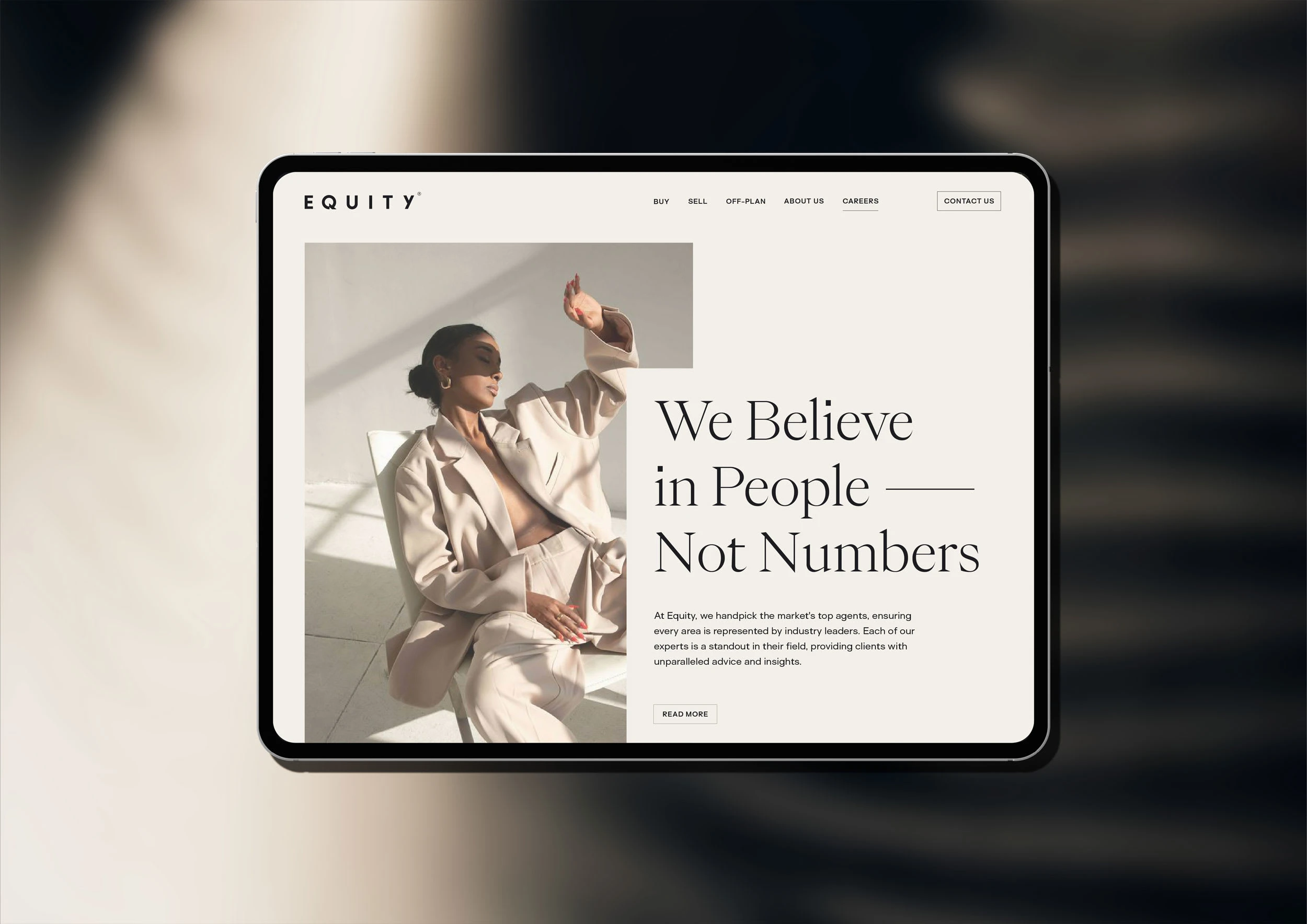
Landing Page — Website Design Visuals
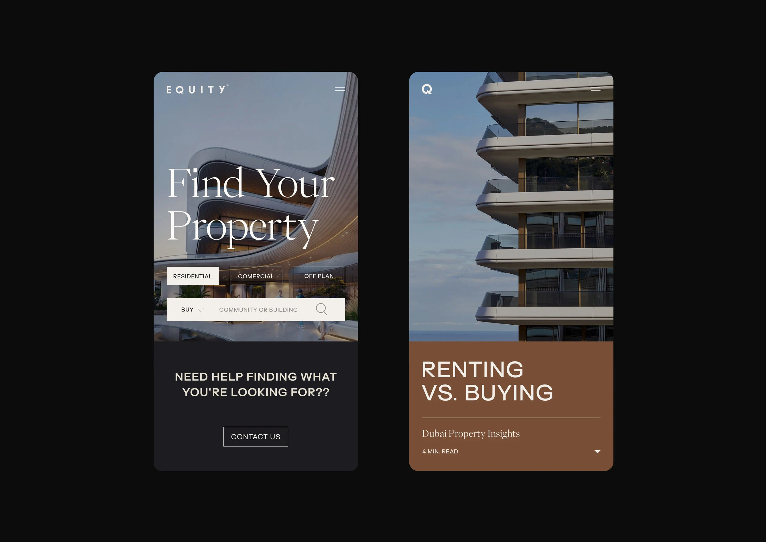
Website — Mobile Visuals
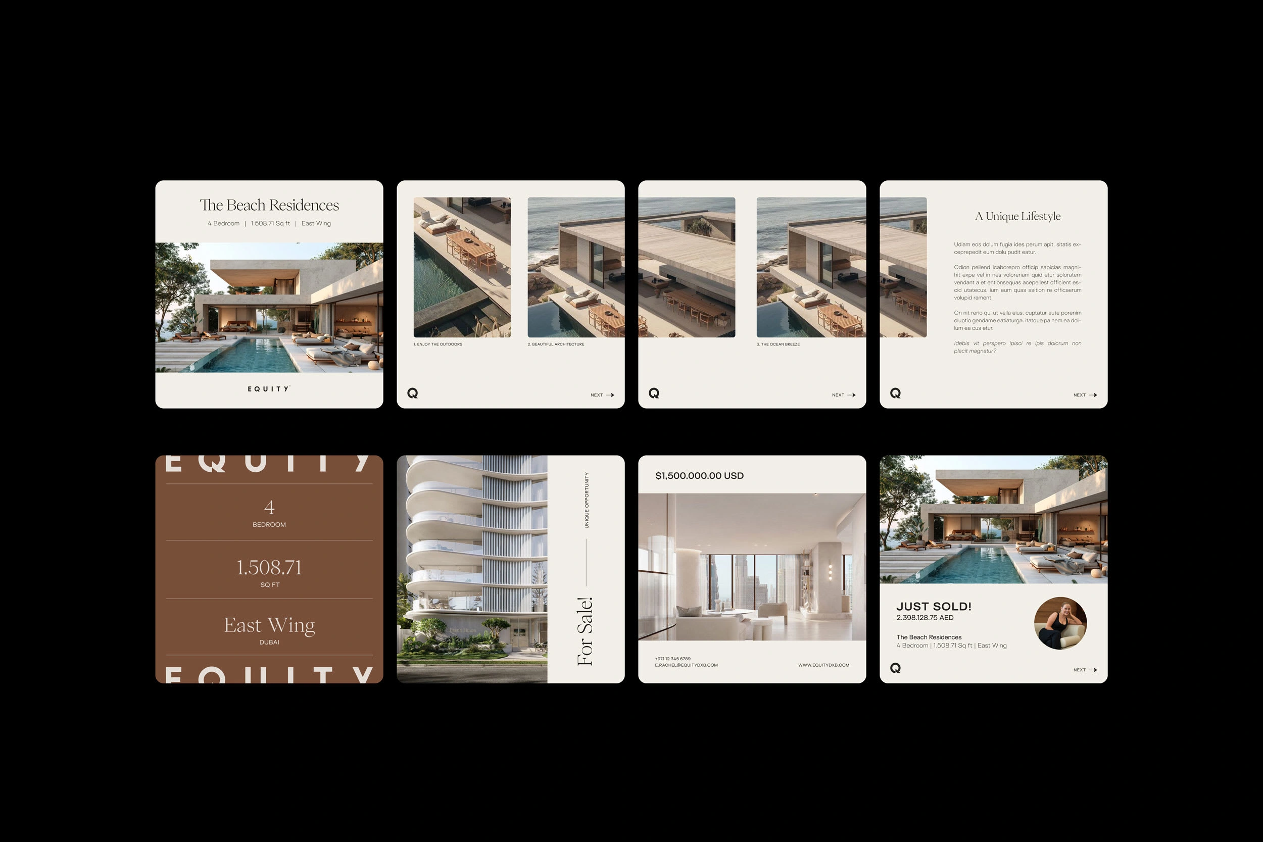
Social Media Visuals
Crafting Emotions Through Texture, Color and Photography Direction
Color, textures, and photography direction played a crucial role in shaping the brand identity as a whole. A predominantly charcoal color conveyed confidence and sophistication, while the rest of the palette introduced warmth and approachability, creating a balanced visual identity.
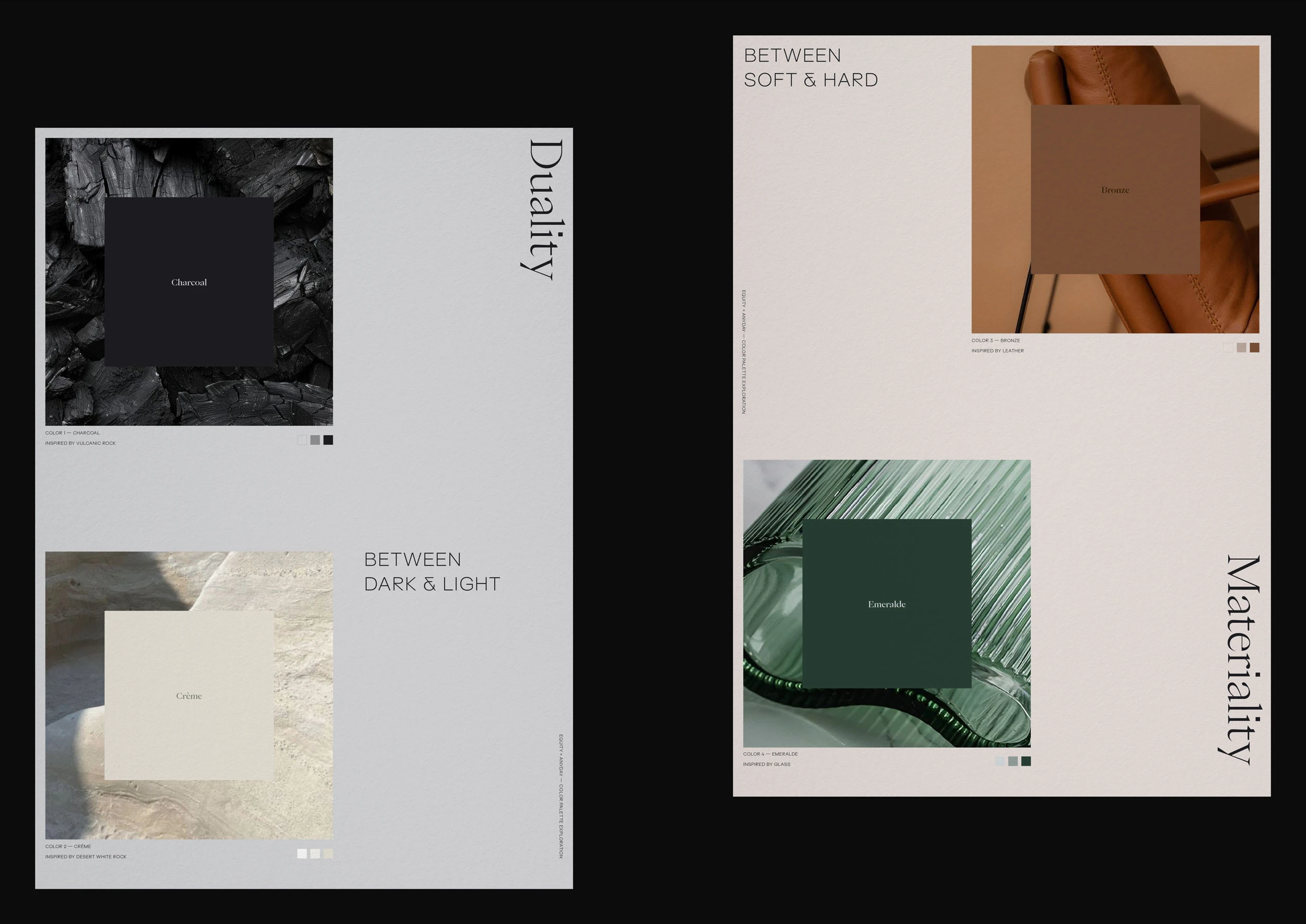
Color concept
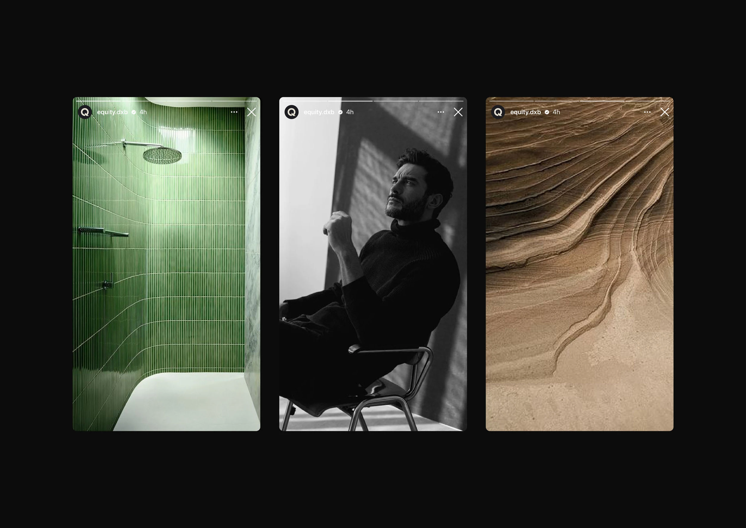
Art Direction (Photography & Texture)
These subtle yet intentional design elements reinforced the brand's personality, making it feel sophisticated yet grounded and inviting.
Textures were incorporated to evoke a deeper emotional connection and add a tactile dimension to the brand. Photography direction emphasized this depth by focusing on authenticity and human expression.
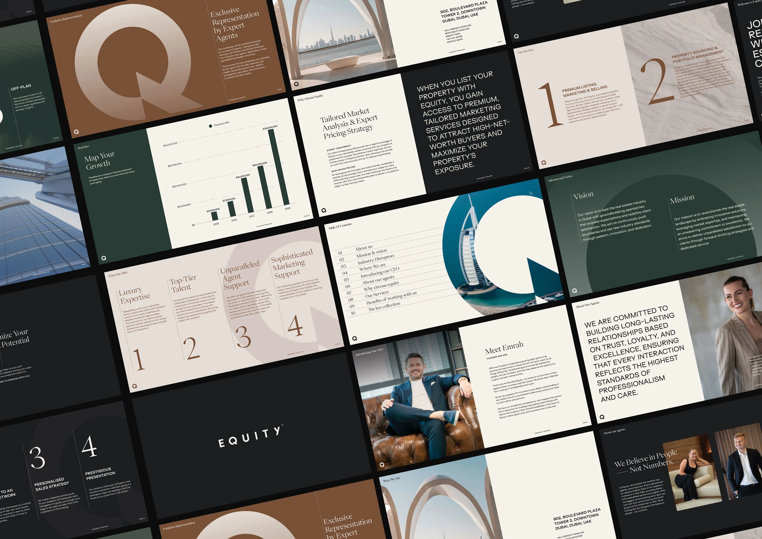
Business/Investors Deck
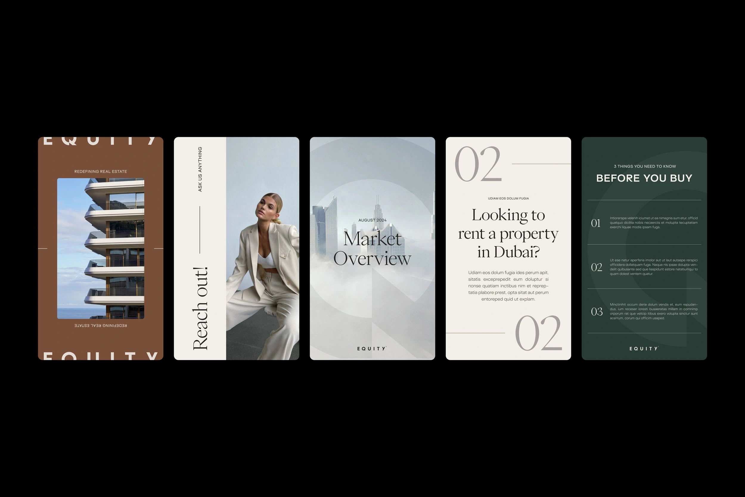
Social Media Visuals
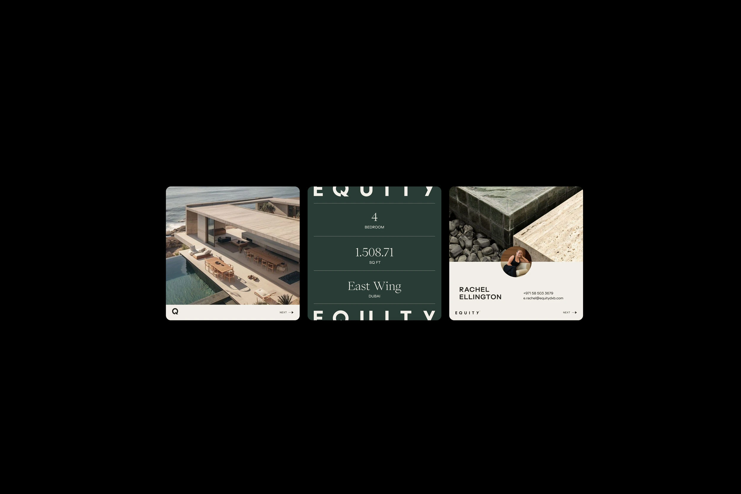
Social Media Visuals
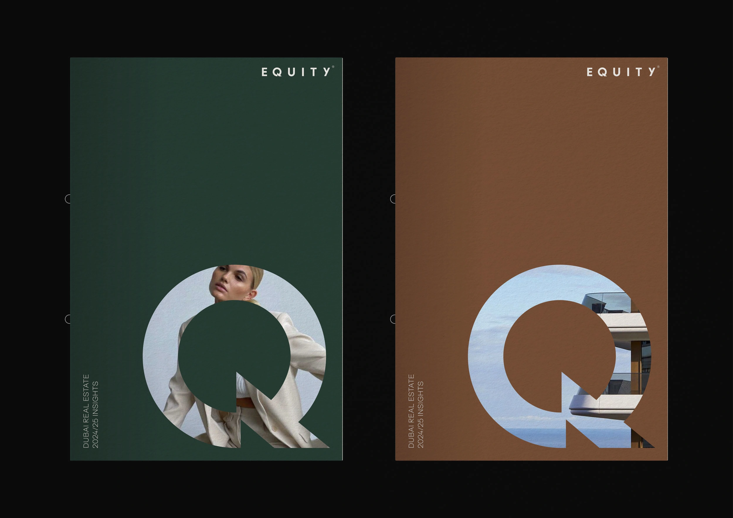
Brochures
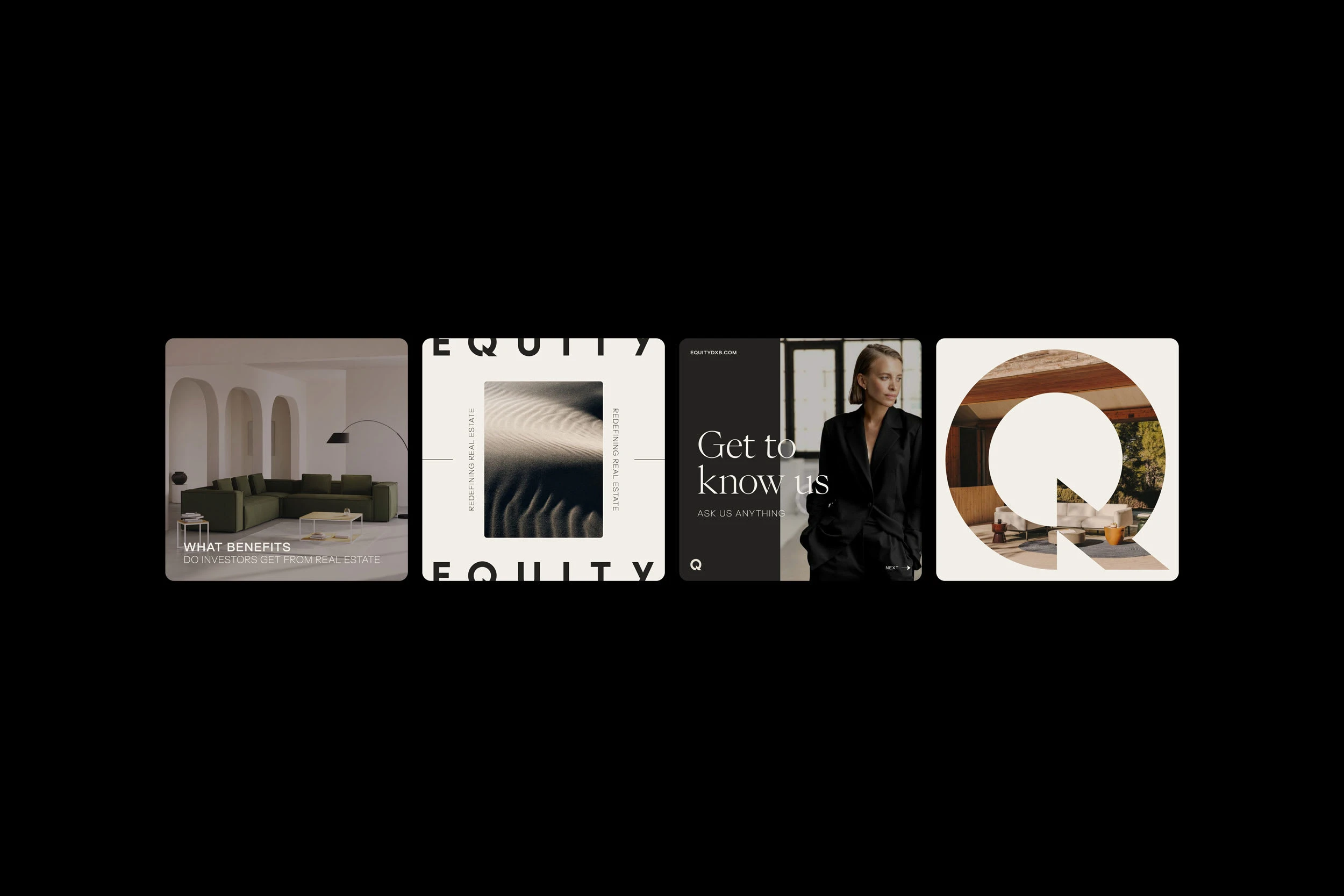
Social Media Visuals
Brand Guidelines
Brand Designer and Consultant for Architecture & Design — I work with companies in design and the built environment to uncover their unique creative DNA and build meaningful brands that stand out.
Lets talk?
Like this project
Posted Mar 21, 2025
As Equity grew into a key player in Dubai real estate, its brand was refined to better represent its ambition, expertise, and industry leadership.
