Web Designer. Framer Expert and Partner.


Web Designer. Framer Expert and Partner.


Design partner for growth-stage B2B tech companies.

Design partner for growth-stage B2B tech companies.


Fullstack Developer & Framer Expert
Fullstack Developer & Framer Expert
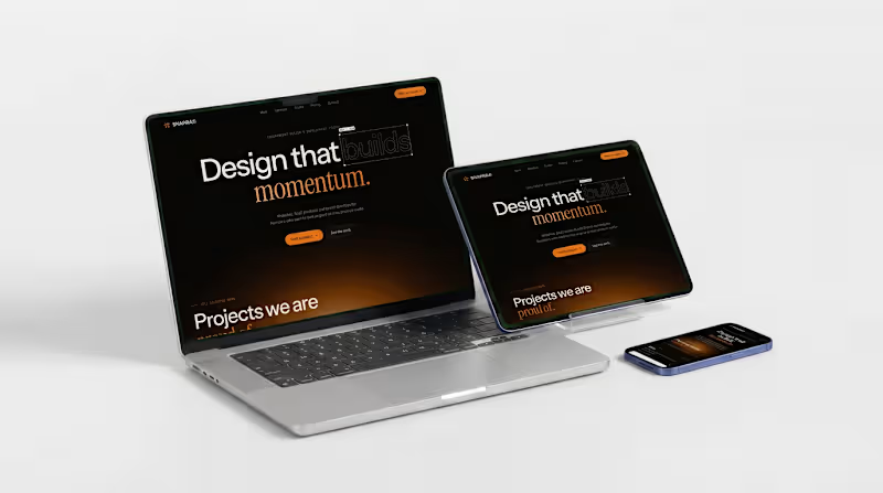
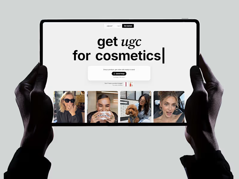

Unforgettable Web & Brand Design for SaaS Products
Unforgettable Web & Brand Design for SaaS Products
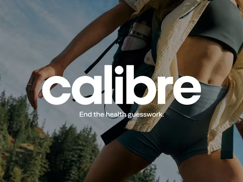




Top Rated Video Editor | Videographer | Photographer
- $•••••
- Earned
- 9x
- Hired
- 5.0
- Rating
- 22
- Followers
Top Rated Video Editor | Videographer | Photographer


Brand & Web Designer | Gold Laus Award | Ex-FutureBrand
Brand & Web Designer | Gold Laus Award | Ex-FutureBrand


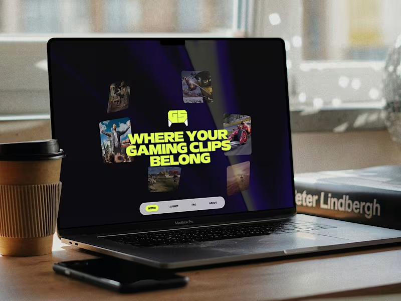

Expert Webflow Developer & Framer Designer
Expert Webflow Developer & Framer Designer


Creative designer blending strategy, style & AI tools.
- $1k+
- Earned
- 5x
- Hired
- 5.0
- Rating
- 196
- Followers
Creative designer blending strategy, style & AI tools.
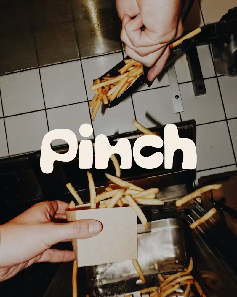
Bland is a choice.
Pinch is a concept brand for a mid-high salt line made to live on the counter, not in the cupboard. Five flavors, five two-color tins, one refillable keepsake people leave next to the bar cart.
I built the full identity: wordmark, lid lockups, hand-stamped pattern system, tone of voice, and art direction.
More from the system coming soon.
78
121
6.1K
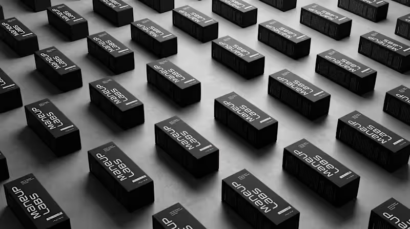
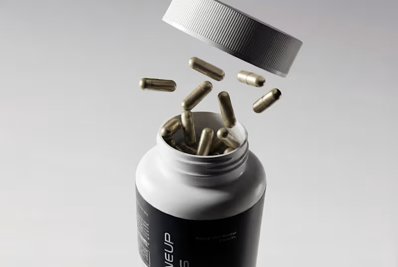
Hot take: hair growth products don't have to look like medicine to work like it.
Most brands in this category go clinical white and blue, it reads safe, but it also reads like something you'd hide in a drawer, not something you'd want visible on your sink. For Maneup Labs, I went almost fully black instead.
That was a real risk. In a category this saturated with sterile, pharmacy-white packaging, going dark could just as easily read cold, or get lost next to competitors leaning into "clean = trustworthy." But it did the opposite: next to every clinical-looking bottle on the shelf, black reads premium, not medicinal, closer to what you'd expect from a grooming or fragrance brand than a hair-loss aisle.
That's the audience shift the whole rebrand was built around, not the guy who wants to feel like he's medicating something, but the guy who wants a product that looks like it belongs on his counter.
Would a bottle like this make it out of your bathroom cabinet and onto your sink?
Check it out (https://contra.com/p/oN7mPNlL-maneup-labs-brand-identity-and-packaging-design)
63
111
6.1K