Hot take: hair growth products

Virginia Roson

Hot take: hair growth products don't have to look like medicine to work like it.
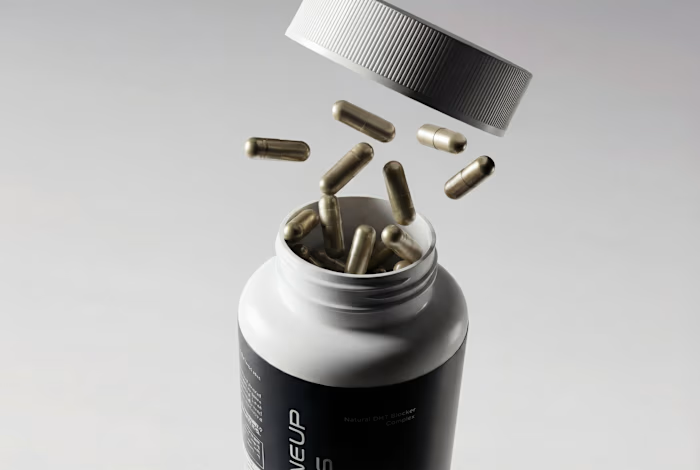
Most brands in this category go clinical white and blue, it reads safe, but it also reads like something you'd hide in a drawer, not something you'd want visible on your sink. For Maneup Labs, I went almost fully black instead.
That was a real risk. In a category this saturated with sterile, pharmacy-white packaging, going dark could just as easily read cold, or get lost next to competitors leaning into "clean = trustworthy." But it did the opposite: next to every clinical-looking bottle on the shelf, black reads premium, not medicinal, closer to what you'd expect from a grooming or fragrance brand than a hair-loss aisle.
That's the audience shift the whole rebrand was built around, not the guy who wants to feel like he's medicating something, but the guy who wants a product that looks like it belongs on his counter.
Would a bottle like this make it out of your bathroom cabinet and onto your sink?
Like this project
Posted Sep 21, 2026
Hot take: hair growth products don't have to look like medicine to work like it. Most brands in this category go clinical white and blue, it reads safe, but ...
Likes
0
Views
3