Built with Framer
Nutrition & Fitness Platform Website Design
Marto Mads
Verified
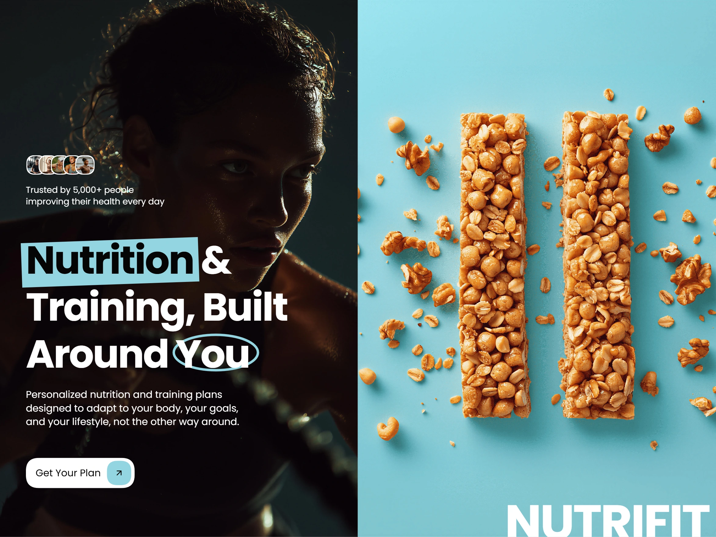
Nutrition & Fitness Platform Website
The client came to me with the need to build a solid digital platform to offer nutrition and personal training services in a clear, professional, and accessible way for a wide range of people, from users who are just starting to improve their health habits to more advanced profiles looking for structured and long-term guidance.
The main goal of the project was not simply to create a visually appealing website, but to build a digital foundation that communicates trust, professionalism, and approachability, while helping users easily understand what the platform offers, who the professionals behind it are, and how they can get started.
From the beginning, the project was approached as a people-focused platform, not a product-focused one.
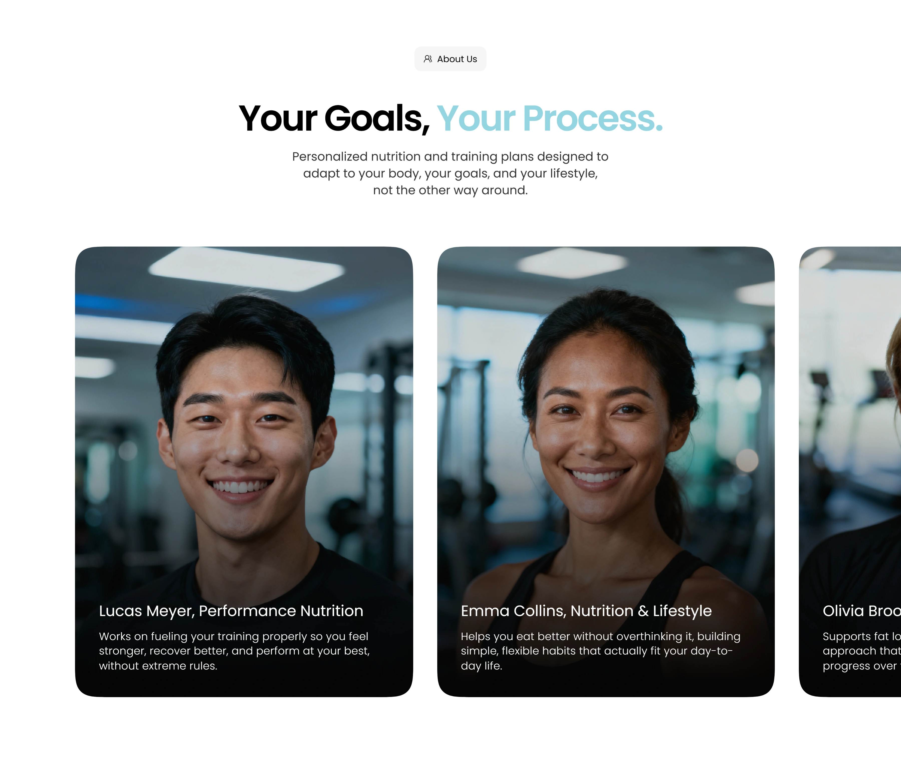
"Our Team" Section
Client Context and Needs
The platform brings together nutritionists and personal trainers under a single brand, offering personalized plans adapted to different goals, lifestyles, and levels of experience. This created an important communication challenge, as the website needed to explain multiple services clearly without overwhelming or confusing users.
The client’s main concerns were clarity, trust, and conversion. They wanted a website that could quickly answer common user questions, reduce hesitation, and make the service feel approachable rather than intimidating or overly technical.
The website also needed to work for a broad audience, including beginners who may feel unsure about nutrition or training, as well as more experienced users who are already familiar with structured fitness programs.
Project Goals
At a strategic level, the goals of the project were clearly defined from the start.
The website needed to clearly communicate the value of the platform, present the professionals as the core strength of the service, simplify complex nutrition and training concepts, and guide users naturally toward making contact or requesting more information.
Another important goal was to create a digital presence that felt human and supportive, avoiding the aggressive or generic tone that is common in many fitness-related websites.
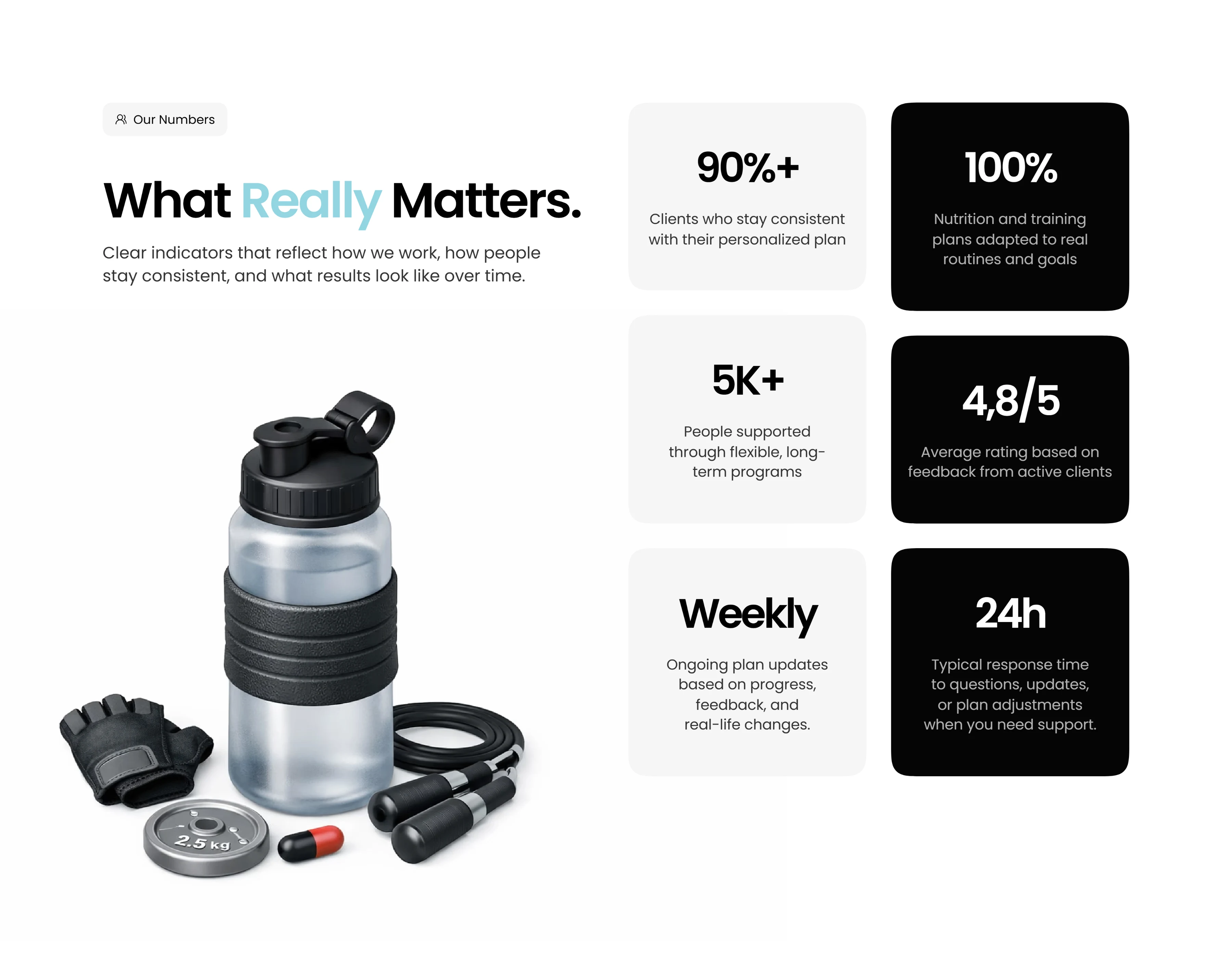
"Our Numbers" Section
Strategy and Planning
Before designing any layouts, I focused on defining a clear structure and content strategy. The platform needed a logical flow that would guide users step by step, starting with understanding the platform, then meeting the professionals, learning about the services, and finally taking action.
The information architecture was designed to reduce cognitive load, making sure users always know where they are and what to do next. Content was intentionally structured in short, digestible sections, using simple language and clear hierarchy.
The strategy was centered around one key idea, helping users feel understood and confident before asking them to take action.
Design Approach
The visual design was driven by clarity and emotional comfort rather than trends. The goal was to create a calm, modern, and trustworthy environment that reflects the idea of personalized guidance.
Layouts were designed with strong hierarchy, balanced spacing, and consistent patterns to improve readability and navigation. Visual choices avoided aggressive fitness clichés and instead focused on neutrality and warmth.
Every design decision was made to support understanding, trust, and ease of use across all devices.
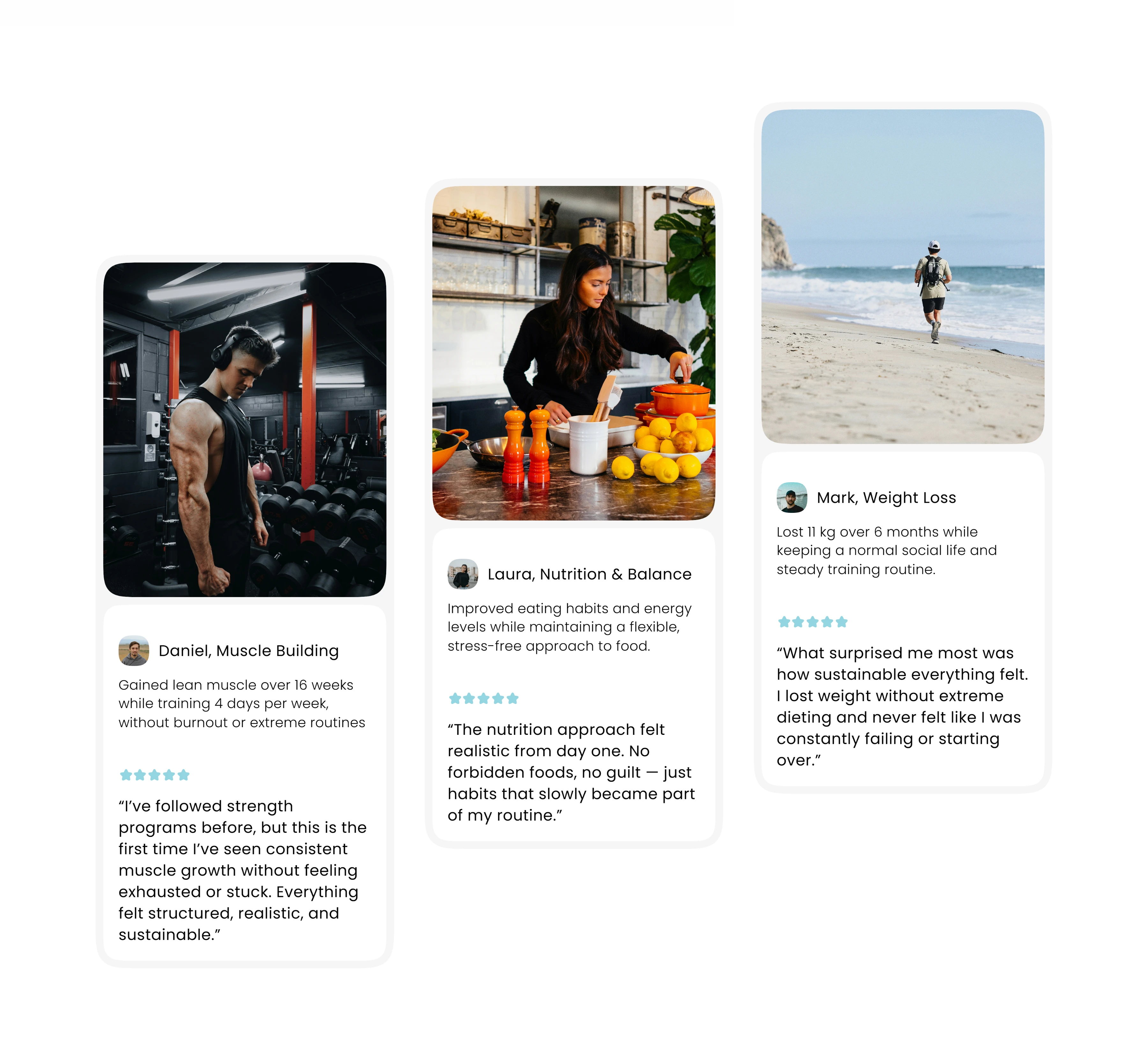
Reviews Section
Team-Centered Experience
A core part of the project was highlighting the team of nutritionists and personal trainers as real people, not just titles or credentials.
The team section was designed to clearly differentiate roles, present professionals in a consistent and approachable way, and communicate their personal approach to working with clients. Descriptions were written to feel human and relatable, focusing on how each professional supports users rather than listing certifications.
This approach helps build trust early and reinforces the idea that users are guided by real experts.
Service Communication
Nutrition and training services can easily feel complex or intimidating, especially for new users. To address this, services were structured around user needs and outcomes instead of technical details.
Each service section focuses on who the service is for, what problem it helps solve, and what kind of support users can expect. This allows visitors to quickly understand the value of the platform and decide if it fits their goals.
The content was intentionally designed to be easy to scan, helping users self-identify without friction.
User Journey and Conversion
The website experience was designed to guide users naturally toward contact without pressure.
Calls to action were placed at logical moments throughout the site, following the natural flow of information. The contact section was kept simple and accessible, reducing barriers for users who want to take the next step.
The overall journey moves from awareness to confidence, and finally to action, supporting both mobile and desktop users.
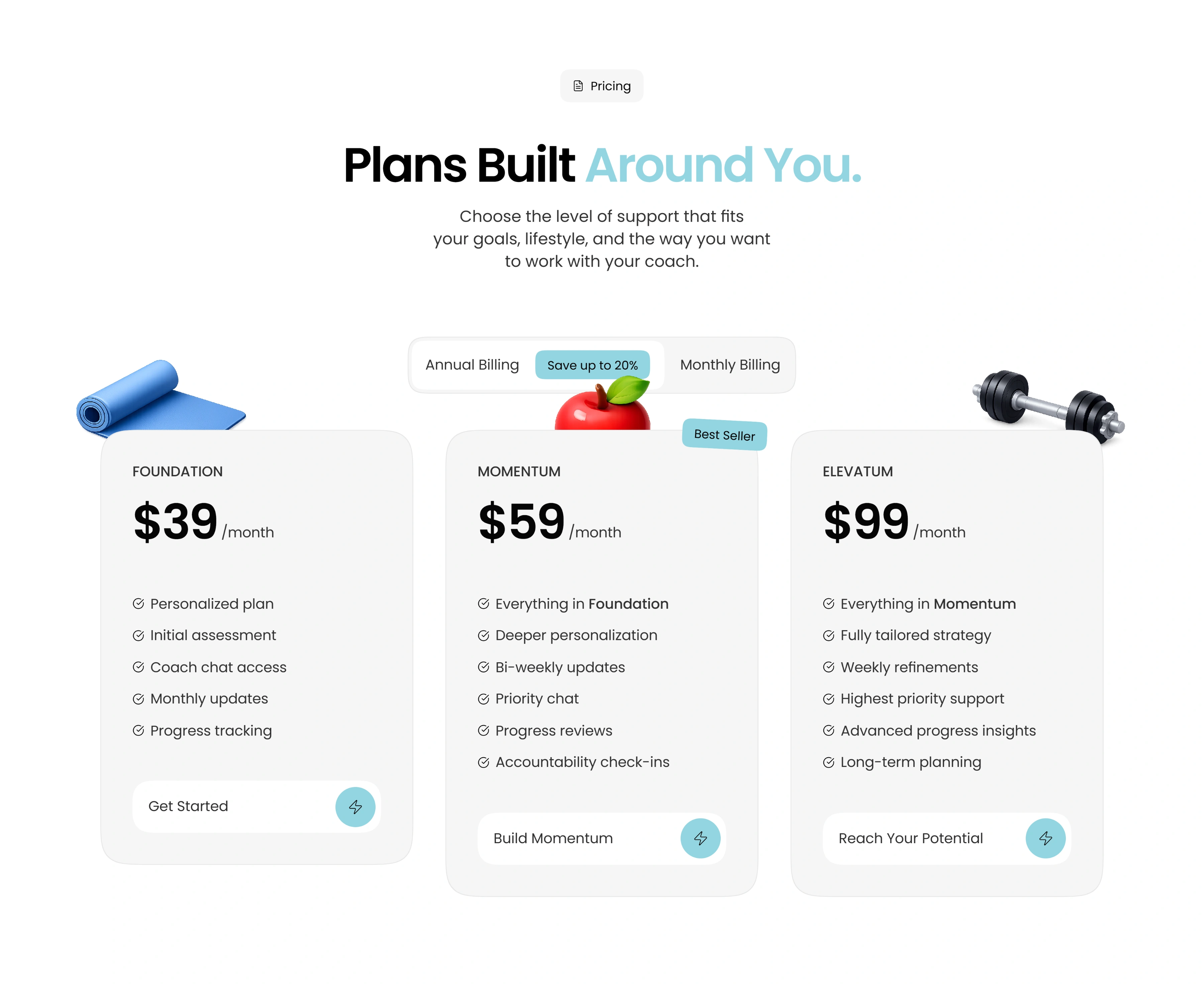
Pricing Section
Outcome and Results
The final result is a clear, professional, and human-centered website that successfully communicates the platform’s value and positioning.
The website provides the client with a strong digital presence that builds trust, improves clarity around services, and supports client acquisition. It also establishes a scalable foundation that can evolve as the platform grows.
Most importantly, the platform now reflects the client’s vision of offering personalized nutrition and fitness guidance through real professionals in a way that feels approachable and trustworthy.
My Role
Project planning, website structure, content strategy, visual design, and user experience.
Like this project
Posted Dec 23, 2025
A personalized nutrition and training platform designed to help you build sustainable results around your lifestyle.
Likes
1
Views
101
Timeline
Dec 22, 2025 - Dec 23, 2025