Freelance Typographers in Lahore
Sign Up
Post a job
Sign Up
Log In
Filters
2
Projects
People
Waleed B.
pro
Lahore, Pakistan
I Design What People Remember. Not Just Pretty.
1x
Hired
49
Followers
Follow
Message
I Design What People Remember. Not Just Pretty.
6
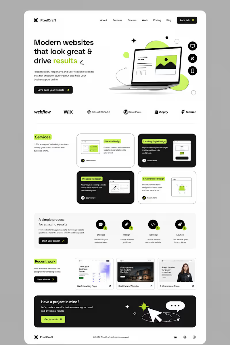
I didn’t want to build another website that simply “looked good.” I wanted to build something that felt clear, modern, and actually guided people toward taking action. So I started with a simple idea: less clutter, more clarity. I built the layout around strong typography, clean spacing, bold contrast, and small lime-green accents to make important elements stand out. Then came the details — service cards, responsive sections, portfolio previews, a simple process, and CTAs placed where they naturally make sense. The goal was simple: Make the website feel good to explore — and even better to use. This is what I love about web design. It’s not just about designing a pretty page. It’s about turning an idea into an experience. #Graphic Designer #Webdesigner #Website Designer
6
6
408
0
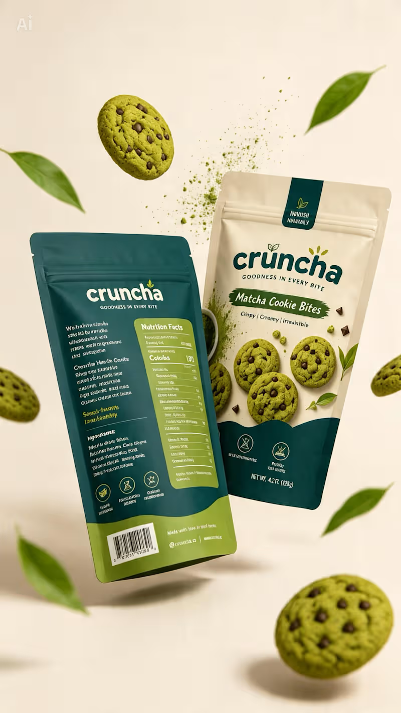
Cruncha was one of those projects I genuinely loved working on. ✦ From exploring the visual direction and color palette to shaping the packaging and bringing the whole concept together, every detail felt intentional. It gave me the freedom to experiment, think beyond the obvious, and turn a simple idea into something that actually feels like a brand. And honestly, the best part? I walked away from this project feeling like I’d actually earned something — not just completed another design.
0
111
1
Behind the Design ✦ This concept started with one goal: make the packaging feel as good as the product itself. I wanted to move away from the usual bright-green matcha aesthetic, so I explored a mix of warm ivory, deep teal, and muted olive — giving it a more premium yet approachable feel. The bold typography adds personality, while the curved color blocks and ingredient photography give the packaging a distinctive shelf presence. Piece by piece, the colors, typography, imagery, and packaging style came together to create something that feels fresh, playful, premium, and memorable. Sometimes the final design looks simple — but there’s a lot of thought behind every detail. ✦
1
172
1
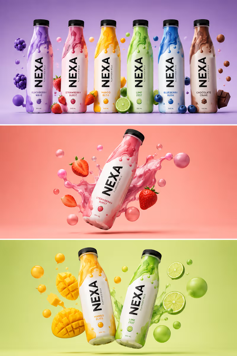
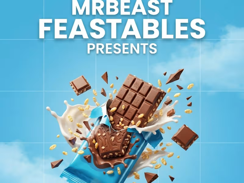
𝐁𝐄𝐇𝐈𝐍𝐃 𝐓𝐇𝐄 𝐃𝐄𝐒𝐈𝐆𝐍 𝑨 𝑵𝑬𝑾 𝑷𝑹𝑶𝑱𝑬𝑪𝑻. 𝑨 𝑵𝑬𝑾 𝑪𝑯𝑨𝑳𝑳𝑬𝑵𝑮𝑬. Every project teaches you something. This time, it was about creating a beverage brand that feels bold, playful, and unforgettable. The goal was simple: design a brand that stands out on the shelf and connects instantly with the right audience. 🎯 𝐌𝐘 𝐀𝐏𝐏𝐑𝐎𝐀𝐂𝐇 Bold Contrast – Each flavor has its own identity. Fluid Patterns – Inspired by energy and motion. 3D Visuals – To make the product look alive and irresistible. Storytelling Through Color – Every shade has a purpose and a mood. 💡𝐖𝐇𝐀𝐓 𝐈 𝐋𝐄𝐀𝐑𝐍𝐄𝐃 • Design is not just about looks, it’s about emotion. • The right colors and composition can make a product speak. • Patience, details, and iteration always pay off. 𝐀𝐍𝐎𝐓𝐇𝐄𝐑 𝐒𝐓𝐄𝐏 𝐅𝐎𝐑𝐖𝐀𝐑𝐃. 𝐀𝐍𝐎𝐓𝐇𝐄𝐑 𝐋𝐄𝐒𝐒𝐎𝐍 𝐋𝐄𝐀𝐑𝐍𝐄𝐃. 𝐎𝐧 𝐭𝐨 𝐭𝐡𝐞 𝐧𝐞𝐱𝐭. → TOOLS USED: Adobe Photoshop, Adobe Illustrator FOCUS • Brand Identity • Color Psychology • 3D Composition 𝐓𝐈𝐌𝐄 𝐒𝐏𝐄𝐍𝐓 Concept to Final – 2 Days Grateful for the process. Excited for what’s next. #graphicdesigner #brandidentity #branddesign #packgaing #barnding #designer
1
92
Typographer
(5)
Follow
Message
Abrar A. Faiz
Lahore, Pakistan
Senior Designer & Art Director | Premium CPG Brands | Remote
1x
Hired
3
Followers
Follow
Message
Senior Designer & Art Director | Premium CPG Brands | Remote
0
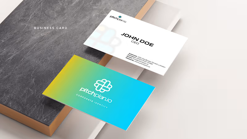
Pitchplan.io - Brand Identity
0
3
0
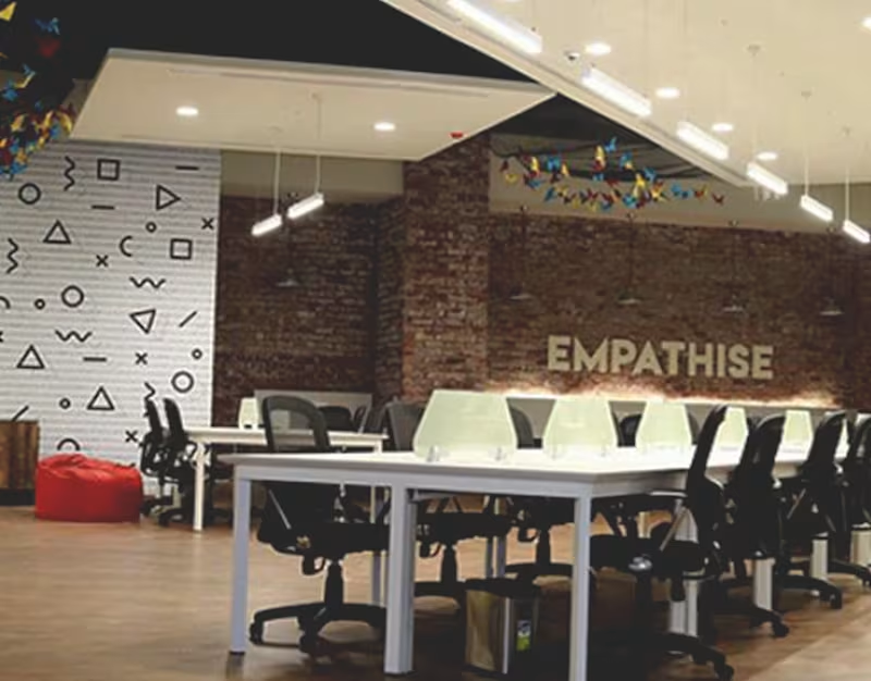
NIC LUMS | Interior Graphics
0
6
0
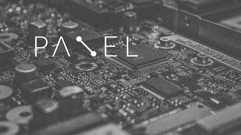
Panel - Brand Identity - Logo Design
0
3
0
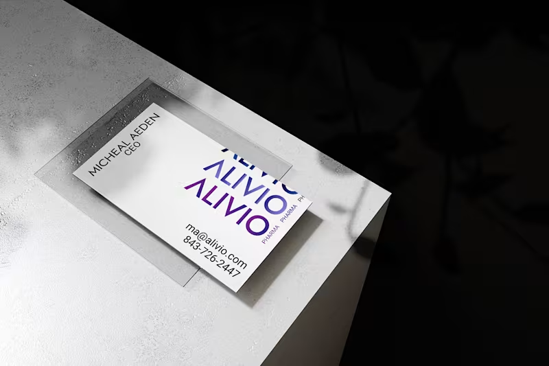
Alivio Pharma - Formation of a Brand
0
7
Typographer
(5)
Follow
Message
Fajar Rizwan
Lahore, Pakistan
CS student & designer automating the future with AI.
New to Contra
Follow
Message
CS student & designer automating the future with AI.
1
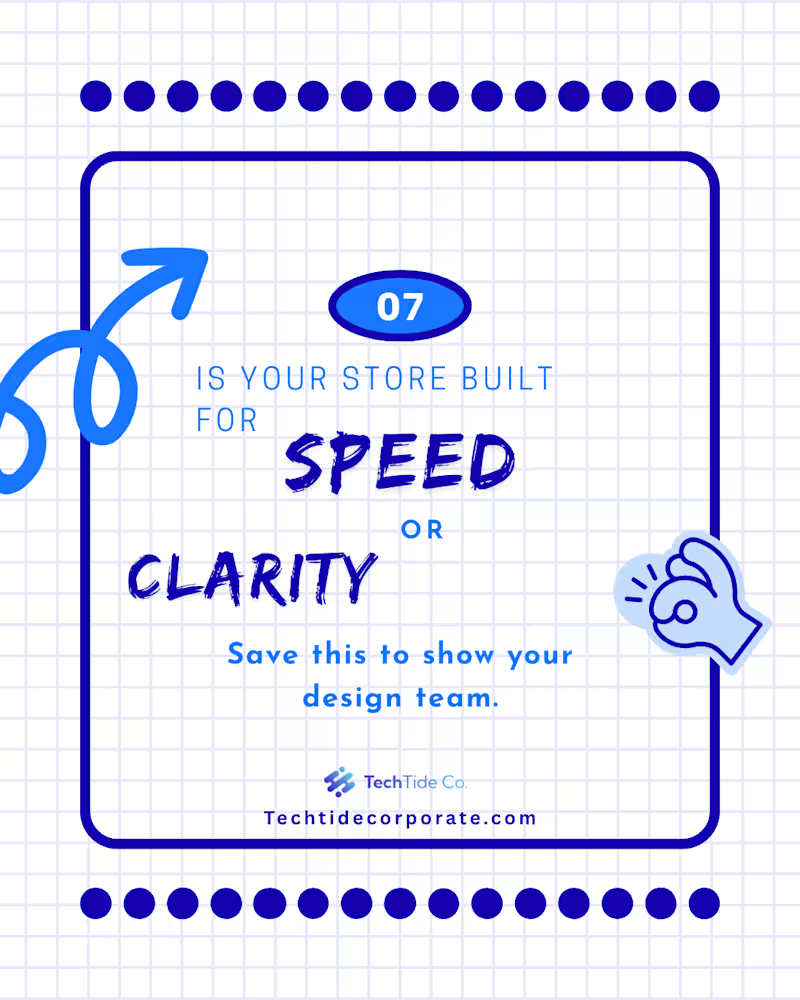
Since you mentioned Part 1 was about the "Psychology" and the "Problem," Part 2 needs to be about the "Solution" and the "Action." This makes you look like a designer who doesn't just point out flaws but actually knows how to fix them. Here is the professional English text for your Part 2 Contra post: Project Title: The "5 Confident Clicks" Framework – UX Case Study (Part 2 of 2) The Design Challenge: Following the psychological groundwork laid in Part 1, this second installment focuses on the practical execution of a high-conversion user journey. The challenge was to visualize a framework that balances speed with user certainty, ensuring that every interaction leads the customer closer to a "Confident Yes." My Creative Approach: In this concluding part, I transitioned from identifying myths to presenting actionable architectural solutions. My design strategy included: Framework Visualization: I designed the "5 Confident Clicks" roadmap, using a step-by-step visual flow to show how information should be staggered to prevent user overwhelm. Blueprint Detail: I maintained the blue-on-white technical aesthetic to ensure continuity from Part 1, signaling to the audience that this is a data-driven design solution. Clarity over Speed: I utilized custom icons and directional cues to demonstrate that "Certainty Converts." The design illustrates that a guided path, even if longer, significantly reduces cart abandonment. Conversion Optimization (CRO): The final slides focus on the "Visit" and "Contact" CTAs, transforming the educational experience into a direct lead-generation tool for the client. The Final Result: This two-part series serves as a comprehensive masterclass in modern UX. By the end of this installment, the viewer isn't just informed—they are equipped with a tangible framework to audit and improve their own digital storefronts. Series Conclusion: This completes the "Psychology of Conversion" series. While Part 1 challenged the status quo, Part 2 provides the roadmap for the future of digital interaction. “Mystery kills the sale. Certainty converts.”
1
55
1
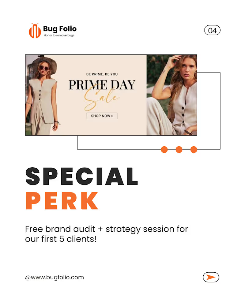
This new set of designs has a Fashion & Lifestyle vibe with a focus on Marketing Strategy (Offers, Sales, and Growth). It looks like a "Launch Campaign" or "Promo Kit." Here is the professional English text for your Contra post, focusing on your role as a Graphic Designer: Project Title: Fashion E-commerce Branding & Promotional Campaign Design The Design Brief: The goal of this project was to design a high-conversion promotional campaign for a fashion-forward brand. I needed to create a visual identity that felt premium yet accessible, focusing on driving "Growth" and "Sales" through clean, modern aesthetics. My Creative Approach: For this project, I moved away from abstract doodles and focused on High-Fashion Editorial Layouts. My design decisions included: Editorial Minimalism: Using a clean white base with bold, structured typography to give the brand a "luxury" feel. Strategic Call-to-Actions (CTAs): Designing the "Ready to Grow" and "Special Perk" sections to stand out using high-contrast orange tones, specifically aimed at increasing conversion rates. Lifestyle Integration: Carefully selecting and framing imagery to ensure the product (fashion) remained the focus while the text provided the strategic marketing value. Consistency Across Assets: Ensuring that the brand audit and strategy session offer looked cohesive with the "Prime Day Sale" visuals, creating a seamless user journey. The Results: The final delivery included a set of versatile marketing assets tailored for social media and web banners. These designs don't just look good—they are engineered to stop the scroll, build professional credibility, and convert cold traffic into loyal clients.
1
35
1
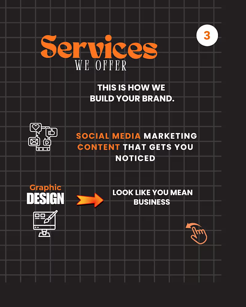
Project Title: Strategic Visual Storytelling – Brand Awareness & Engagement Campaign The Design Challenge: The objective of this project was to create a high-impact social media campaign for Bug Folio. The goal was to move beyond "pretty pictures" and develop a visual narrative that addresses core business pain points—specifically the high cost of a weak brand identity and the lack of digital trust. My Creative Approach: As the Lead Graphic Designer on this project, I focused on a "Minimalist-Bold" aesthetic to ensure the message was the hero. My process involved: Visual Hierarchy: Utilizing high-contrast typography to draw the eye immediately to key phrases like "Your Brand EXISTS" and "Weak Branding Costs You." Grid-Based Layouts: Implementing a structured dot-grid background (visible in the design) to maintain technical alignment and professional balance across all slides. Conceptual Illustration: Incorporating metaphors like the megaphone and hand-drawn doodles to humanize the brand while maintaining a "stop-the-scroll" quality. Psychology of Design: Using negative space strategically to ensure that complex information regarding social media presence and website conversion remained digestible for the audience. The Results: I delivered a cohesive set of educational carousels designed to convert viewers into leads. The final assets bridged the gap between brand strategy and visual execution, providing the client with a professional identity that builds instant authority in their niche.
1
34
0
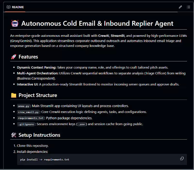
Taking corporate email automation beyond basic template generation. 🚀 I just open-sourced a new project: Autonomous Cold Email & Inbound Replier Agent! This is a modular, production-ready system built completely in pure Python using CrewAI for multi-agent orchestration and Streamlit for a clean, modern interactive UI. As shown in image_ea414f.png, the system moves away from single-prompt generation and splits the operational workload into specialized, sequential steps to ensure high-quality enterprise triage: Dynamic Context Parsing: Ingests dynamic company names, specific roles, and product offerings to craft completely personalized pitch assets based on an internal knowledge base. Multi-Agent Orchestration: Uses a CrewAI sequential flow to separate analysis from execution. A Triage Officer handles data categorization while a Business Correspondent handles context-aware drafting. 100% Free-Tier & Cost Compliance: Powered entirely by high-performance models via free-tier API orchestration (utilizing gemini-2.5-flash via Google AI Studio and Groq Cloud AI as a high-speed secondary model). Interactive UI Safety: Features a polished Streamlit interface (onee.py (http://onee.py)) to monitor active server queues and act as a human-in-the-loop gatekeeper to approve drafts before they go live. The repository is modularly structured, completely production-ready, and optimized with strict exception handling to respect rate limits safely. 🔗 Check out the code here: https://github.com/26FajarRizwan/Cold_Email_Replier_Agent #CrewAI #Streamlit #AIEngineering #Python #GenerativeAI #LLMs #OpenSource #Automation #GoogleGemini
0
34
Typographer
(3)
Follow
Message
Arslan Waseem
Lahore, Pakistan
Visual designer, delivering creatives for brand growth
Follow
Message
Visual designer, delivering creatives for brand growth
0
Standees, logos and social posts
0
5
0
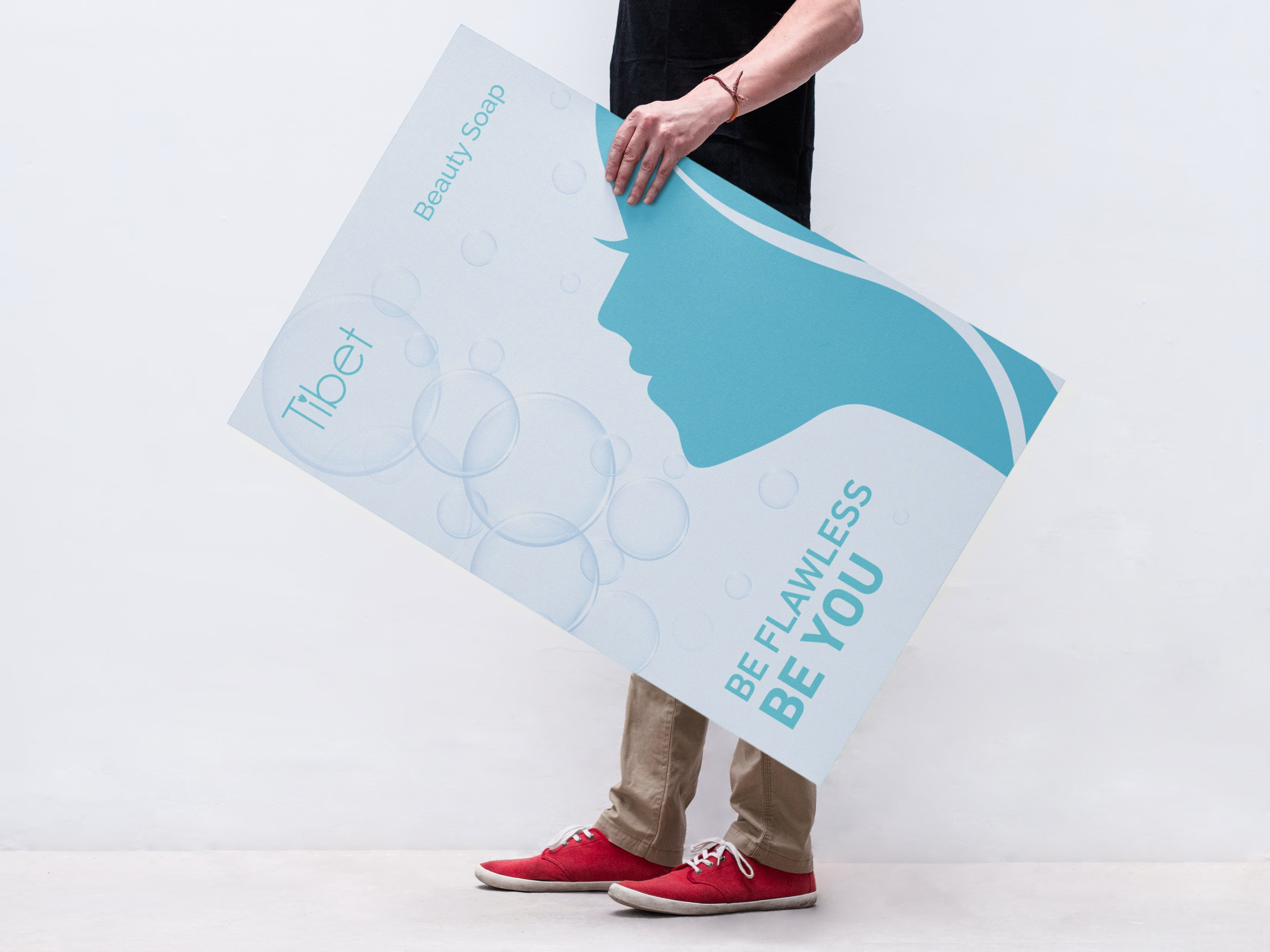
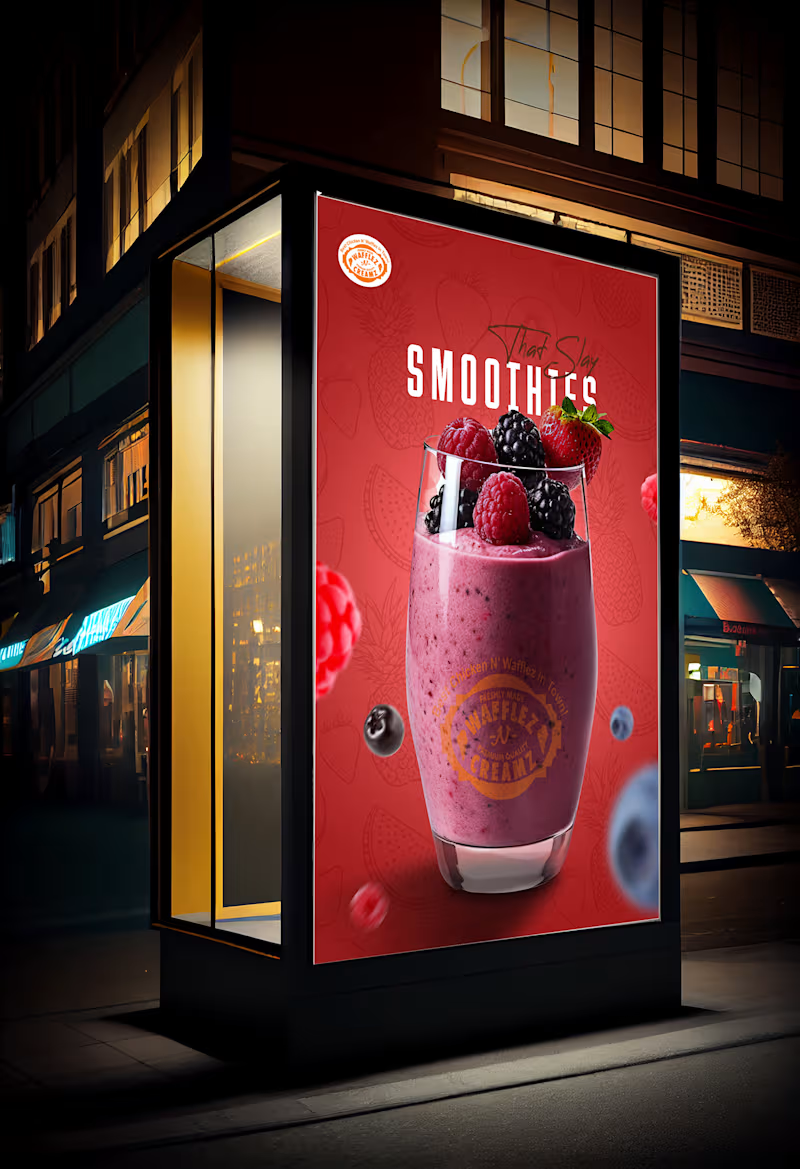
Posters for Wafflez N Creamz
0
5
0
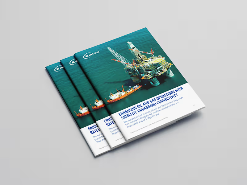
Brochures for Kacific
0
7
View more →
Typographer
(2)
Follow
Message
Asif Bashir
pro
Lahore, Pakistan
Design support that drives business success
5.0
Rating
78
Followers
Follow
Message
Design support that drives business success
3
EVMIZE - Branding Visual Identity
3
34
4
Evmize - Visual Identity Evmize is an ecommerce brand focused on premium accessories to customize electric vehicles from a Tesla to Rivian and Polestar. They reach me with a clear challenge: create a visual identity that communicates Evmize’s core values of modernity, elegance and simplicity, while resonating with forward‑thinking EV riders who care as much about aesthetics as performance. All design elements were carefully chosen and crafted to convey Evmize’s brand values, including modernity, elegance, and simplicity.
4
4
180
40
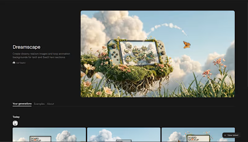
Every creative designer I know has the same problem Finding hero section visuals that actually feel human Not stock, not generic, not obviously AI We spend hours hunting for ther perfect visual for hero The brands I admired their hero sections felt alive, warm and human Like someone had actually crafted a world for them I needed to know how! → So I broke it down Until I understood the exact visual language behind it → Then I built it into a workflow And turned that workflow into a technique on Flora AI Now you can do what took me weeks, in a single input → Drop any image in Get 3 Dreamscape hero visuals + 3 seamless loop animations Ready to place behind your headline @FLORA's technique system really makes it easy Here you can try: https://app.flora.ai/techniques/dreamscape This one's for every creative who ever settled because the right visual was just out of reach
26
40
1.5K
2
Modern branding for a print partner
2
12
Typographer
(1)
Follow
Message
KAZIM HAIDER SYED
Lahore, Pakistan
Designing modern brands through UI/UX, web & visual content

10
Followers
Follow
Message
Designing modern brands through UI/UX, web & visual content
0
🌿 PURE NATURE. PURE YOU. 🌿 Your brand deserves a design that speaks before words do. Clean visuals, premium feel, and a modern aesthetic that instantly grabs attention ✨ This skincare product ad was designed to create: ✔ Strong brand identity ✔ Client trust & attraction ✔ Modern luxury vibes ✔ High-converting social media presence Good design doesn’t just look beautiful — it sells your product. 🚀 Need eye-catching graphics for your brand? 📩 DM me for: • Product Ads • Social Media Posts • Brand Identity • UI/UX Designs • Creative Marketing Visuals Let’s make your brand impossible to ignore. 💚
0
67
1
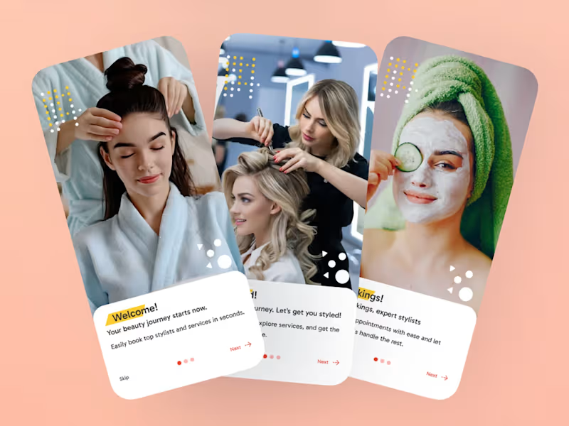
Salon Booking App A seamless salon booking platform that enables users to discover beauty services, schedule appointments, manage bookings, and connect with trusted professionals—all through a clean and user-friendly mobile experience.
1
224
0
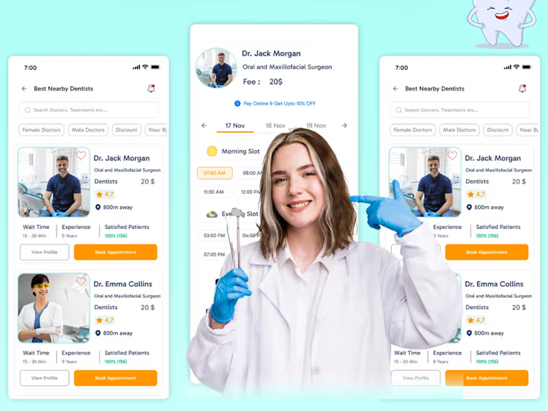
Dental Health – Healthcare Mobile App Designed a user-friendly Dental Health mobile app that simplifies appointment booking, dentist discovery, patient management, and healthcare services. The interface focuses on accessibility, trust, and a smooth patient experience through clean visuals and intuitive navigation.
0
202
0
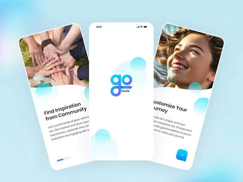
Daily Goals – Productivity & AI Assistant App Designed a modern and intuitive Daily Goals mobile app focused on productivity, task management, habit tracking, and AI-powered assistance. The UI combines clean layouts, engaging visuals, and a seamless user experience to help users stay organized, motivated, and productive throughout their day.
0
207
Typographer
(1)
Follow
Message
Moeez Ahmed
Lahore, Pakistan
Standout Brand Designs Tailored to Your Needs
5.0
Rating
8
Followers
Partner
Follow
Message
Standout Brand Designs Tailored to Your Needs
2
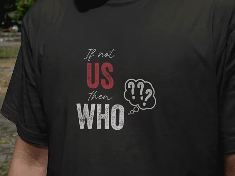
20 powerful and inspiring t-shirt designs Quotes
2
5
0
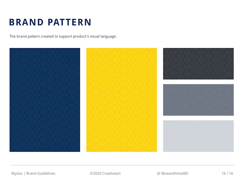
Comprehensive Brand Design for Mydas
0
24
0
Logo design & Brand Guidelines for Tornest
0
16
0
Creative Logos & Marks Vol.1 on Behance
0
21
Typographer
(1)
Follow
Message
Ammarah Azyal
Lahore, Pakistan
Graphic Designer & Prompt Engineer
5.0
Rating
5
Followers
Follow
Message
Graphic Designer & Prompt Engineer
1
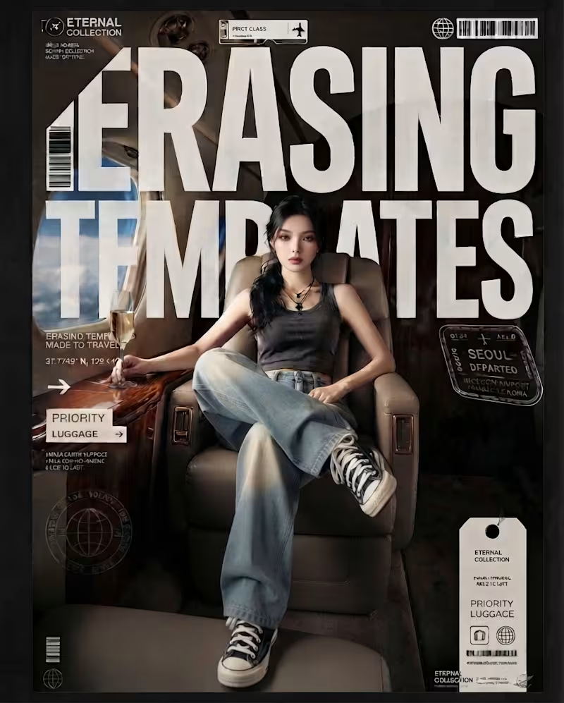
Lately, I’ve been spending a lot more time thinking about typography not just as something you place on a design, but as something that shapes the entire visual language. These pieces are all AI-generated, but the part I’ve been intentionally exploring is what happens after the image: how typography can interact with scale, perspective, composition, movement, and the subject itself. From oversized type becoming part of the image, to hand-drawn lettering carrying the energy of an illustration, to bold editorial type creating structure around a photograph. I’ve been experimenting with different ways for type and imagery to feel like one composition rather than two separate elements. The goal isn’t simply to make AI images look good. It’s to use AI as a visual tool while pushing the art direction, typography, hierarchy, and composition further. Still experimenting. Still learning. And honestly, typography is becoming one of my favorite parts of the process. Which of these approaches do you think works best, and is there one where the typography made you stop and look twice?
1
200
0
Behind every polished aesthetic is a mountain of rough drafts, late-night edits, and a whole lot of creative chaos. 🤫✨ Lately, I’ve been deep in the trenches bringing a few new visual concepts to life balancing client work, refining brand assets, and experimenting with dynamic new ways to make products pop on screen. Whether it's dialing in the exact color grading, tweaking packaging details, or staging the ultimate golden-hour shot, the process is just as rewarding as the final output. If you’ve ever wondered what goes on behind the grid, it’s mostly coffee, endless iterations, and chasing that one perfect frame. ☕️🎨 What project are you pouring your energy into this week? Let’s talk about it in the comments! 👇
0
83
0
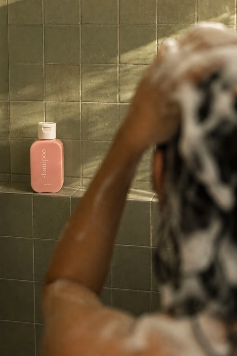
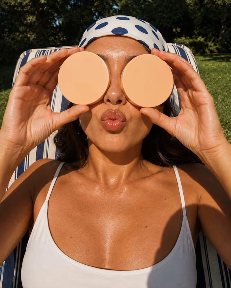
AI Art Direction & Product Campaign — Hair & Body Care I explored how a single beauty-product line could be translated into a series of premium campaign visuals without losing its visual identity. The project focused on AI-assisted product photography and art direction, placing the products into different lifestyle environments, from a warm, sunlit bathroom and tropical poolside setting to a playful retro-inspired composition and a close-up beauty portrait. The main challenge was maintaining consistent product packaging, proportions, colours, typography and brandingwhile changing the entire environment, lighting and photographic language around it. I treated each image like a real commercial shoot: defining the composition, camera perspective, lighting, colour palette, depth of field, styling and supporting elements before generating the final visuals. The result is a cohesive visual campaign that explores how the same product can feel editorial, nostalgic, luxurious and contemporary depending on the art direction.
0
109
0
I use prompt engineering and graphic design together to turn concepts into polished visual content, from product advertisements and campaign concepts to food & beverage creatives, social media ads, and branded visuals
0
176
Typographer
(1)
Follow
Message
Explore people