Freelancers using Figma Make in India
Sign Up
Post a job
Sign Up
Log In
Filters
2
Projects
People
Divan Raj
pro
Bengaluru, India
Product Designer · Scaling ideas · Mobile · Web · Motion
$50k+
Earned
17x
Hired
5.0
Rating
1.3K
Followers
Top
expert
+11
Follow
Message
Product Designer · Scaling ideas · Mobile · Web · Motion
9
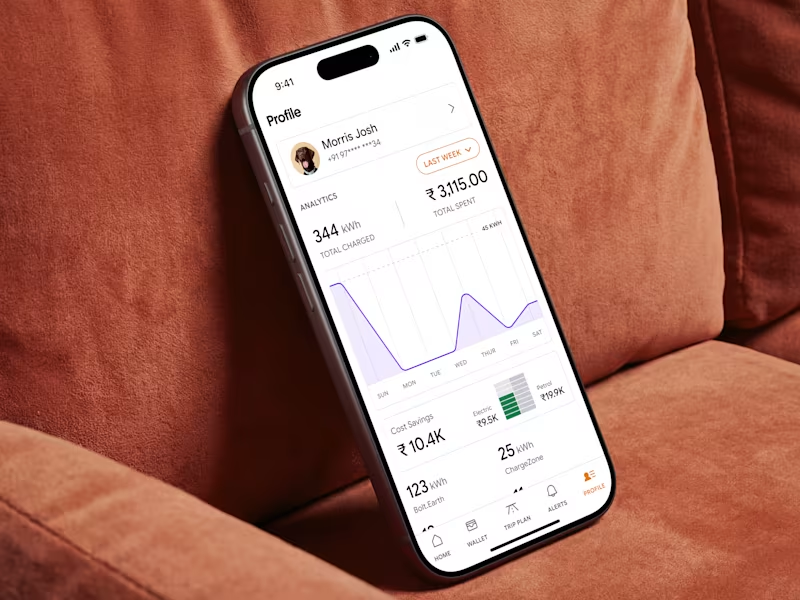
ChargeIndia - EV Charging Mobile App & Branding
9
135
6
Investor Pitch Deck for a Healthcare OS
6
117
$1.5K+ earned
54
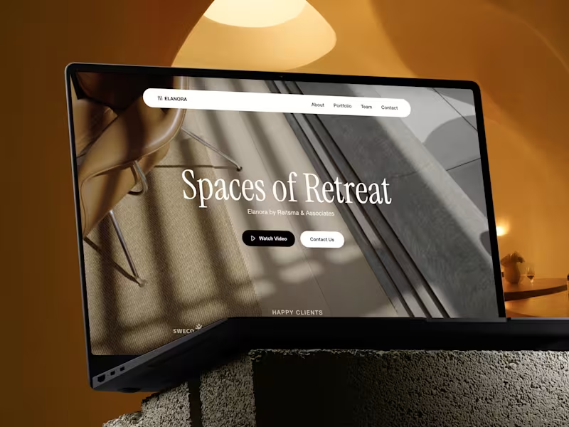
Website design project for an architecture firm
54
1.2K
31
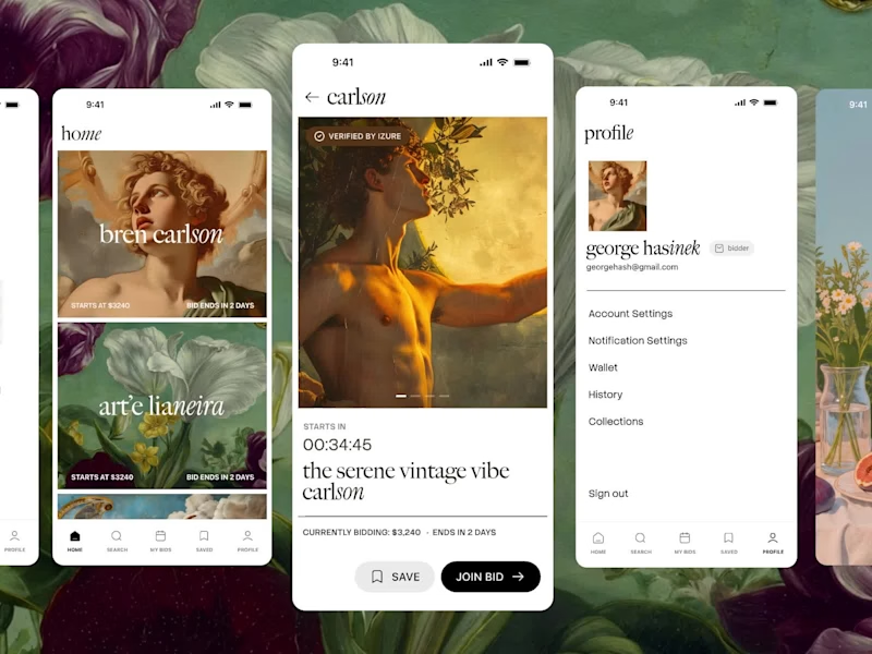
Art Gallery Mobile App Design for Bidd'me - FinTech
31
824
Figma Make
(2)
Follow
Message
7 Seers™
pro
India
Product studio for startups, apps, dashboards, and AI.
$25k+
Earned
8x
Hired
5.0
Rating
67
Followers
expert
Follow
Message
Product studio for startups, apps, dashboards, and AI.
2
Novex AI: AI Image Generator & Photo Editor App UI/UX Design
2
20
1
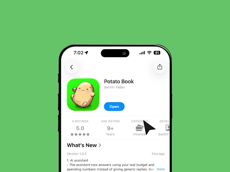
PotatoBook: Designing a Budgeting App People Don't Avoid
1
1
27
2
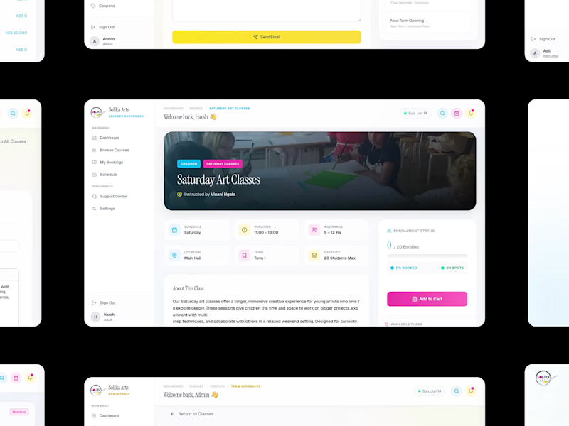
Solika Arts: Multi-Portal SaaS Platform for an Art School
2
2
31
2
Vaulta: Brand Identity for a Fintech Wealth Platform
2
34
Figma Make
(1)
Follow
Message
Ajendra Sutariya
pro
Surat, India
UI/UX & Product Designer | SaaS, Web, Mobile & Landing Pages
29
Followers
Follow
Message
UI/UX & Product Designer | SaaS, Web, Mobile & Landing Pages
2
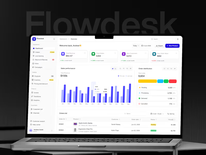
Flowdesk: E-commerce Operations Dashboard | UI/UX Design
2
6
0
SaaS Project Management Platform Design
0
10
1
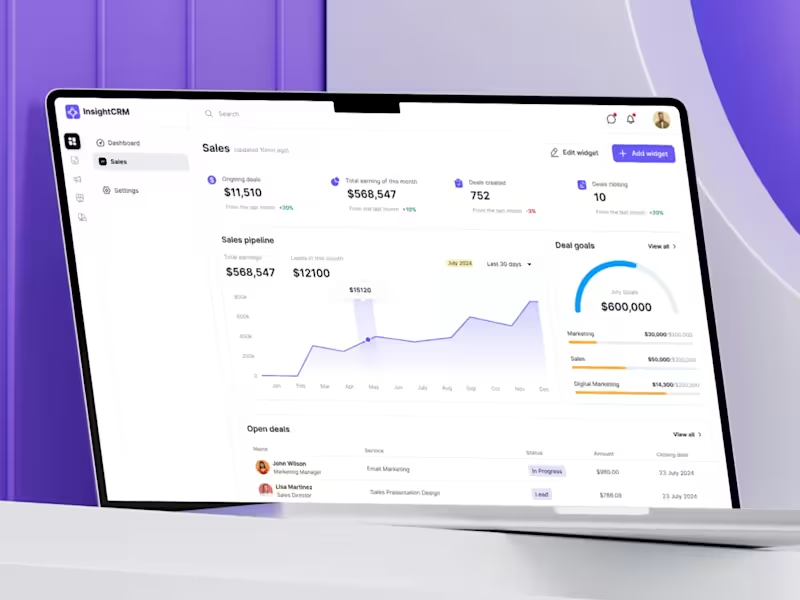
CRM SaaS Web Application Design
1
16
3
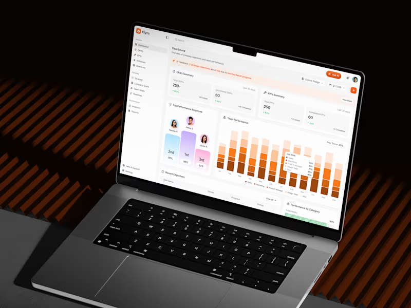
Klyro: SaaS Performance Management Dashboard | UI/UX Design
3
8
Figma Make
(3)
Follow
Message
Airzon Agency
pro
Surat, India
Product Design · UI/UX · Web & Mobile · Framer · AI
32
Followers
Follow
Message
Product Design · UI/UX · Web & Mobile · Framer · AI
0
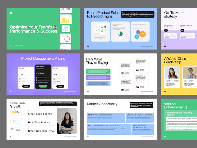
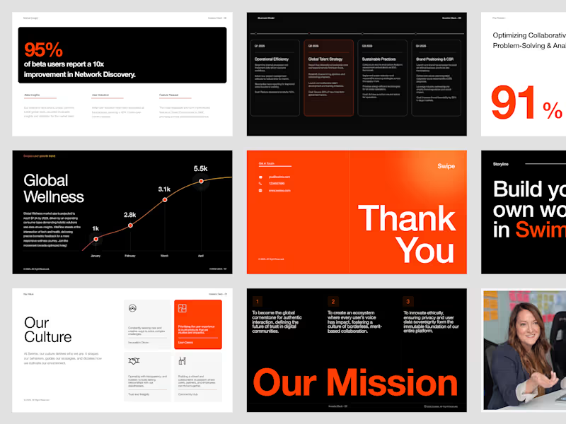
High-Performance Data Pitch Deck Design
0
4
0
Global Wellness Pitch Deck Design
0
7
0
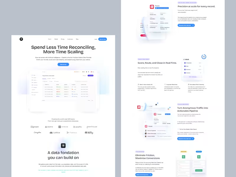
SaaS Landing Page Design and Development
0
9
0
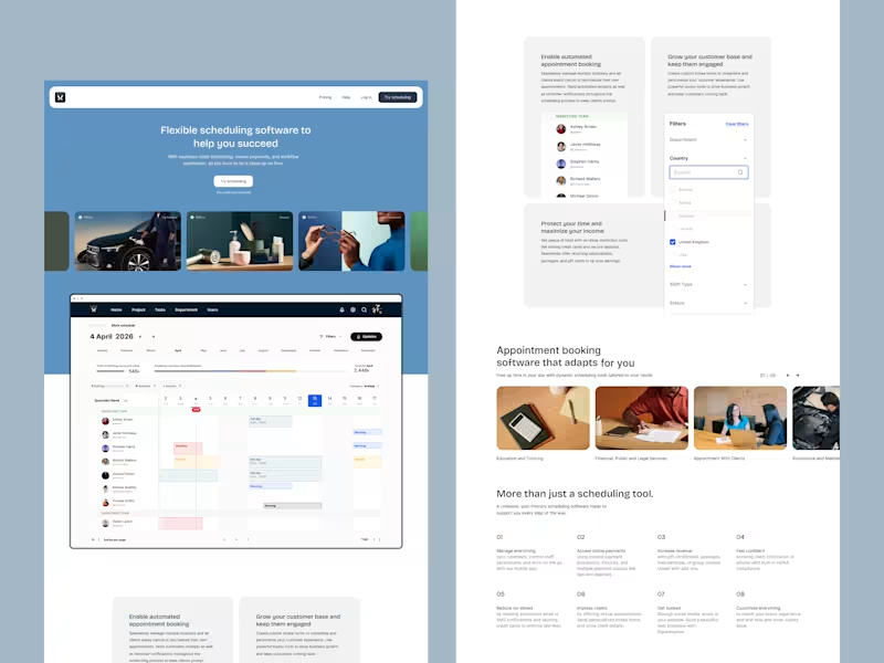
SaaS Landing Page Design for Scheduling Software
0
13
Figma Make
(8)
Follow
Message
Lovepreet Singh
Sahibzada Ajit Singh Nagar, India
Senior Product Designer | SaaS | AI | Figma Expert
5.0
Rating
10
Followers
Follow
Message
Senior Product Designer | SaaS | AI | Figma Expert
1
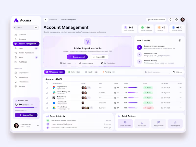
Accura – Account Management Dashboard UI/UX Design Accura is a modern SaaS account management platform designed to help businesses manage accounts, users, permissions, and organizational activities from one centralized dashboard. The goal was to create a clean, scalable, and user-friendly admin experience that makes complex account management tasks simple and efficient.
3
1
45
1
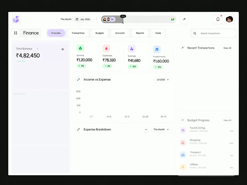
Finora — Personal Finance & Fintech Dashboard Design A modern fintech dashboard concept crafted to simplify personal financial management through thoughtful UX and clean visual design. The interface brings essential financial information together in one unified workspace, allowing users to monitor their total balance, income, expenses, savings, investments, transactions, and budget progress at a glance.
1
58
1
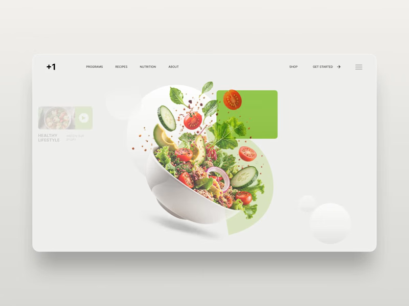
Diet Planner — Nutrition & Healthy Lifestyle Website Design Diet Planner is a modern website design concept focused on healthy eating, balanced nutrition, and personalized meal planning. The design features a clean editorial layout, fresh green accents, high-quality food imagery, and bold typography to create an appealing digital experience for health-conscious users. The hero section showcases a vibrant salad composition alongside clear navigation, nutrition-focused messaging, and a prominent call to action.
1
71
0
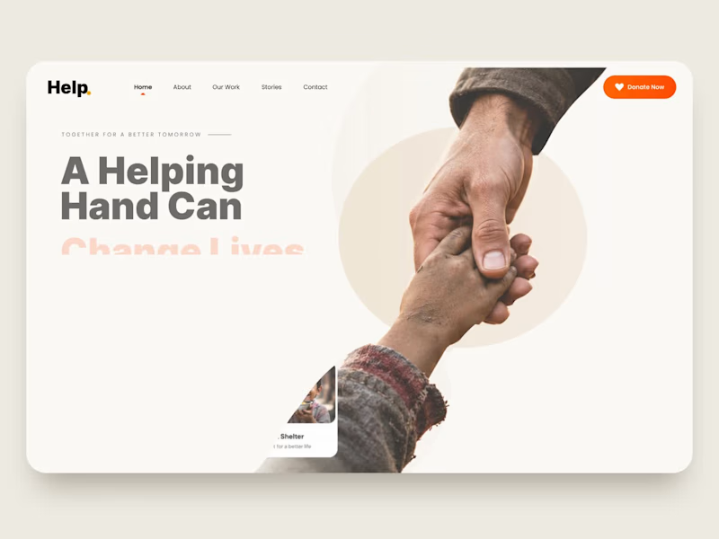
Helping Hand — Charity & Nonprofit Website UI/UX Design Helping Hand is a charity website landing page concept created to communicate a nonprofit organization's mission and encourage people to contribute to meaningful causes. The design uses a clean, minimal layout, warm colors, expressive typography, and authentic human imagery to build an emotional connection with visitors. Dedicated sections for education, healthcare, food assistance, and shelter make the organization's initiatives easy to explore. Key Features: Modern charity and nonprofit website design Donation-focused landing page Clear calls to action Impact statistics and cause-based cards Clean navigation and responsive-design direction Human-centered visual storytelling
0
48
Figma Make
(49)
Follow
Message
Anas Ahmad Khan
Delhi, India
Figma UI/UX & Product Designer | SaaS, AI, Fintech & Web App
New to Contra
Follow
Message
Figma UI/UX & Product Designer | SaaS, AI, Fintech & Web App
0
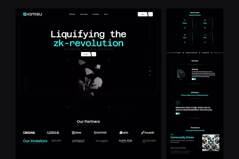
Kintsu — DeFi Website & Staking Dashboard UX/UI Design Kintsu was a project focused on making decentralized finance more accessible, intuitive, and trustworthy. A modern Web3 platform connecting liquid staking, lending, digital assets, and DeFi opportunities through one seamless experience. As the UX/UI Designer, I designed both the website and dashboard, transforming complex blockchain functionality into clear, engaging, and user-friendly interfaces. What I designed: Web3 Website & Homepage: Crafted a premium website with bold typography, modern visuals, and compelling storytelling. Simplified complex DeFi concepts while communicating the platform's value and building user confidence. DeFi Dashboard Experience: Designed a financial dashboard with intuitive navigation, organized data, and clear visual hierarchy, making it easier for users to explore assets, staking opportunities, and platform activity. Liquid Staking UX: Created streamlined staking and unstaking journeys with clear transaction steps, reward information, and confirmation states to simplify blockchain interactions. Portfolio & Asset Management: Designed structured interfaces for displaying asset balances, staking positions, rewards, and financial activity, making complex data easier to understand. DeFi Product Discovery: Organized staking, lending, and vault-related information into intuitive layouts, helping users explore financial opportunities without unnecessary complexity. Scalable Web3 Design System: Developed a consistent visual language with modern typography, reusable Figma components, responsive layouts, and polished interactions across the website and dashboard. The Result: A cohesive Web3 website and dashboard experience bringing decentralized finance, staking, and asset management into one unified design system. The design simplifies complex financial interactions, strengthens platform credibility, and creates an intuitive experience for users exploring DeFi.
0
2
0
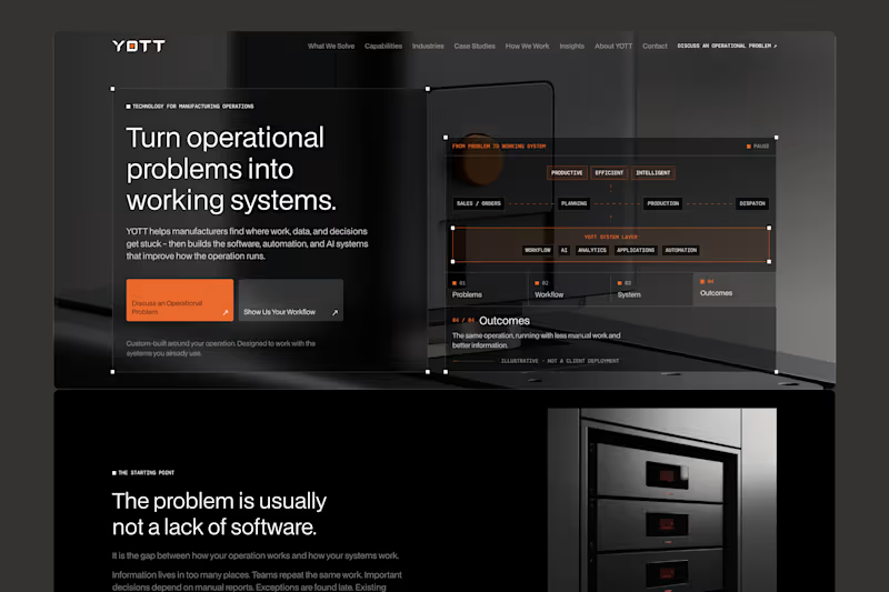
YOTT — AI & Industrial Technology Website UX/UI Design YOTT was a project focused on making complex industrial technology simple, accessible, and business-driven. A modern B2B website connecting AI, automation, software, and manufacturing solutions with real operational challenges. As the UX/UI Designer, I transformed complex technical services into a clear, professional, and conversion-focused digital experience. What I designed: Strategic Homepage & Storytelling: Designed a problem-first homepage highlighting manufacturing challenges such as manual workflows, disconnected systems, slow reporting, and operational inefficiencies. Focused on real business problems before introducing solutions. B2B Website Experience: Crafted eight core pages covering solutions, capabilities, industries, case studies, processes, insights, company information, and contact. Simplified navigation and improved information hierarchy. Interactive Discovery Tool: Designed a five-step journey helping visitors identify operational challenges and discover relevant technology opportunities without technical expertise. AI & Technology Solutions UX: Organized AI, automation, analytics, custom software, and system integration services into structured, intuitive product experiences. Premium Industrial UI Design: Developed a sophisticated dark visual identity with industrial imagery, modern typography, refined spacing, responsive layouts, and reusable Figma components. Conversion-Focused UX: Designed strategic calls to action, interactive problem-solution sections, and a six-step process guiding visitors from discovery to meaningful business inquiries. The Result: A complete, responsive B2B website that brings industrial technology and business-focused storytelling into one cohesive digital experience. The design simplifies complex solutions, strengthens brand credibility, and helps manufacturers confidently explore technology opportunities.
0
10
0
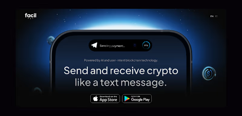
FacilPay — Web3 Fintech Website & Mobile App UX/UI Design FacilPay was a project focused on redefining how people interact with cryptocurrency. An AI-powered Web3 payment platform combining secure messaging, multi-chain wallets, and digital payments into one seamless experience. As the UX/UI Designer, I designed both the website and mobile app, transforming complex blockchain functionality into intuitive, secure, and user-friendly experiences. What I designed: Fintech Website & Homepage: Created a modern, conversion-focused website with compelling visuals, bold typography, and clear storytelling. Simplified Web3 concepts while highlighting the platform's unique payment capabilities. Mobile App UX/UI: Designed an intuitive crypto payment app with seamless navigation, wallet management, messaging, and transaction flows. Focused on making everyday crypto interactions feel as simple as traditional banking. Crypto Wallet & Dashboard: Crafted a clean wallet interface displaying balances, digital assets, NFTs, and transaction activity. Organized complex financial information into easy-to-understand layouts. Payments & Transaction UX: Designed streamlined send, receive, and payment request journeys with clear confirmation states and intuitive interactions to build user confidence. Multi-Chain & Swap Experience: Created user-friendly interfaces for managing assets across blockchains, swapping tokens, and bridging crypto without unnecessary complexity. AI & Messaging Experience: Designed conversational payment interactions combining secure messaging with AI-powered assistance, making crypto transactions feel as natural as sending a text. Scalable Fintech Design System: Developed consistent typography, reusable Figma components, responsive layouts, and polished UI patterns across the website and mobile app. The Result: A cohesive Web3 website and mobile app experience bringing AI, crypto payments, messaging, and multi-chain asset management into one unified design.
0
21
0
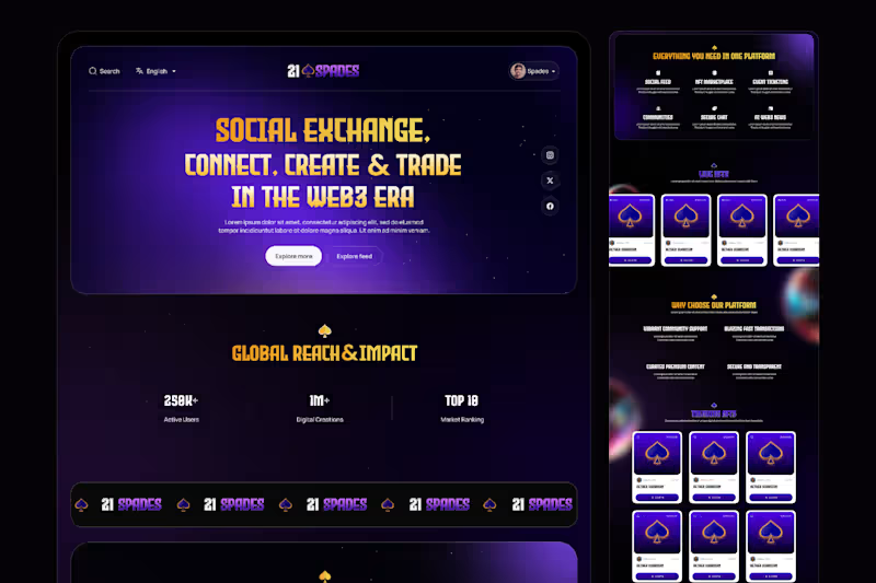
21SPADES — Web3 Marketplace & Community Platform UX/UI Design 21Spades was a Web3 project focused on making blockchain technology, digital ownership, and decentralized communities more accessible, engaging, and user-friendly. A modern digital ecosystem connecting creators, collectors, and communities through tokenized assets, social interactions, NFT marketplaces, and blockchain-powered experiences. As the UX/UI Designer, I transformed complex Web3 concepts into a visually engaging, intuitive, and user-centered digital experience, combining premium design aesthetics with seamless navigation and clear product storytelling. What I designed: Strategic Homepage & Visual Storytelling: Designed an immersive homepage built around the concept of "Participate, Connect, Own." Established a strong visual hierarchy through bold typography, dynamic imagery, modern layouts, and engaging content sections highlighting the platform's core value. Web3 Marketplace Experience: Crafted an intuitive digital marketplace experience for discovering tokenized assets, exploring trending collections, and connecting with creators. Simplified asset discovery through organized content sections, clear navigation, and visually engaging collection presentations. Community & Social Experience: Designed feature presentations for social feeds, Web3 communities, secure messaging, and creator engagement. Focused on making decentralized interactions feel familiar, accessible, and connected. NFT & Digital Asset Tokenization UX: Structured a clear four-step tokenization journey covering wallet setup, blockchain selection, collection creation, and asset minting. Simplified technical blockchain processes into easy-to-understand user journeys. Web3 Ecosystem & Feature Discovery: Organized marketplace, event ticketing, AI-powered Web3 news, community engagement, and secure communication features into a cohesive digital experience. Used structured information architecture to make the ecosystem easier to explore. Premium Web3 UI Design: Created a distinctive, modern visual experience featuring bold typography, immersive digital artwork, refined spacing, engaging content layouts, and consistent UI components. Focused on a premium aesthetic while maintaining usability and clarity across the website. Trust & User-Centered Experience: Designed sections communicating blockchain transparency, digital ownership, secure interactions, and platform benefits. Simplified complex technical messaging to help users understand the value of decentralized technology. Conversion-Focused UX: Designed strategic calls to action, marketplace discovery sections, educational content, and clear onboarding pathways guiding visitors from initial exploration to meaningful platform participation. The Result: A cohesive, modern Web3 website experience that brings digital ownership, NFT marketplaces, community engagement, and blockchain-powered services together into one connected ecosystem. The design simplifies complex Web3 concepts, strengthens brand identity, improves product discoverability, and creates an engaging journey for creators, collectors, and new users exploring decentralized digital experiences. Designed in Figma | UX/UI Design | Web3 | Blockchain | NFT Marketplace | Community Platform | Website Design
0
18
Figma Make
(5)
Follow
Message
Prakash Anand Kolkundi
Bengaluru, India
I’m a UI and Design System Expert
Follow
Message
I’m a UI and Design System Expert
1
Here is my Third Submission Future Interface Lab: Interaction Design 2040: Concept: A cinematic, immersive web experience showcasing 7 next-generation interaction paradigms through a spatial hub — no conventional navigation, menus, or page routes. The 7 Paradigms: Attention-Aware — UI that responds to where you're looking/focusing Anticipation Interface — predictive UI that acts before you ask Time-Fluid — interfaces that bend and stretch with temporal context Emotion-Responsive — adapts to your emotional state Collective Interface — shared, multi-user interaction design Self-Explaining — UI that teaches itself to you contextually Zero Navigation. Figma Published link: https://drop-blur-60344225.figma.site Figma Community published link: https://www.figma.com/community/file/1609958598777521514
1
166
12
🚀 What if interfaces disappeared — and technology just understood you? I built Futuristic Interaction 2050 for the Contra | Figma Makethon 2026 — a 5-scene cinematic prototype that reimagines how humans will interact with technology 25 years from now.No screens. No taps. No clicks. Just intent. This is a fully interactive, — a cinematic journey through a day in 2050 where biometric sensing, spatial computing, emotion-aware environments, and zero-navigation AI replace every interface we know today. You live it — walking through smart doors, watching rooms adapt to your stress levels, and collaborating in holographic workspaces. Published Figma Link: https://vocal-blur-83272003.figma.site Figma Community Link: https://www.figma.com/community/file/1609871721349340633 #figmamakeathon #ContraFigmaMakeathon @Zoë Colivas @Contra HQ
12
220
11
🚀 Contra x Figma Makeathon Submission — Contra x #FigmaMakeathon Proud to submit my experimental prototype for #FigmaMakeathon with Contra An experimental prototype exploring interfaces that respond to human presence instead of clicks. I designed three original interaction models — Attention Field, Interface Temperature, and Interface Gravity — that allow the system to reorganize itself based on focus, usage patterns, and behavioral clustering. Together, they form a unified adaptive interface that evolves in real time. Grateful to be part of this exploration with Contra x Figma Makeathon. Website link: https://glad-wad-53268566.figma.site Figma Community Link: https://www.figma.com/community/file/1608886078244703153 #figmamakeathon #ContraFigmaMakeathon #InteractionDesign #ExperimentalUI #FutureOfDesign
5
11
548
9
Excited for this Makeathon! I bring strong hands-on experience with Figma Make and have already built and launched a Figma plugin: https://codemydesign-ai-bro-by-prakash-a-k.figma.site/ @Figma (https://contra.com/company/figma) @Contra HQ (https://contra.com/contra) @Zoë Colivas (https://contra.com/zoe)
2
9
1.5K
Figma Make
(7)
Follow
Message
Nikita K Kakade
Bengaluru, India
UI/UX Designer + Webflow Developer | 7 yrs
Follow
Message
UI/UX Designer + Webflow Developer | 7 yrs
1
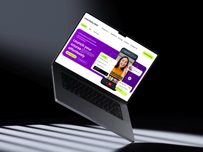
Designed a modern, high-converting SaaS hero section in Figma focused on strong visual hierarchy, clean aesthetics, and usability. Built using a structured grid system with precise spacing and alignment for a balanced and professional layout. The design highlights a bold gradient hero background, clear typography hierarchy, and impactful call-to-action buttons to boost engagement. Key components like the navbar, buttons, and cards are created using Auto Layout, ensuring scalability and responsiveness. Interactive elements such as course cards and video overlays are enhanced with subtle shadows, soft corner radius, and layered composition to add depth and a premium feel. Consistent use of color, spacing, and typography ensures a cohesive design system throughout. Perfect for SaaS platforms, course websites, and startups aiming for a modern, user-friendly, and conversion-driven interface. #UIUXDesign #FigmaDesign #SaaSDesign #WebDesign #ProductDesign #UIDesign #UXDesign #DesignSystem #LandingPageDesign #StartupDesign #CreativeDesign #InteractionDesign
1
84
1
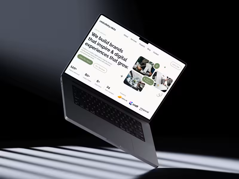
Designed this modern hero section in Figma using a structured 12-column grid for clean alignment and balance. Focused on strong typography to create clear visual hierarchy, paired with subtle supporting text for readability. A muted green accent builds brand identity and highlights key CTAs, while rounded buttons differentiate primary and secondary actions. The right side features an asymmetrical image composition with soft corners and minimal decorative elements for a polished, contemporary feel. Built using Auto Layout, consistent spacing, and reusable components to ensure scalability and responsiveness. #Figma #UIDesign #UXDesign #WebDesign #LandingPage #DesignSystems #AutoLayout #UIUX #ProductDesign #CreativeDesign #ModernDesign
1
95
1
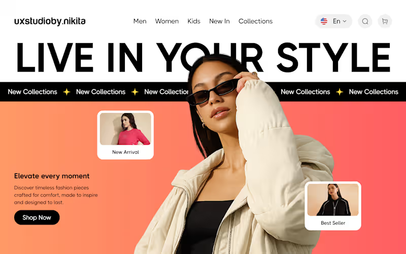
Clean, modern hero section designed in Figma with bold typography, gradient background, and layered visuals. The off-center model creates depth, while floating product cards and a strong CTA enhance engagement and guide user focus. #UIUXDesign #FigmaDesign #WebDesign #HeroSection #EcommerceDesign #UIDesign #UXInspiration #DesignInspiration #LandingPage #CreativeDesign #ModernUI #ProductDesign #UXUI #DesignerLife
1
99
2
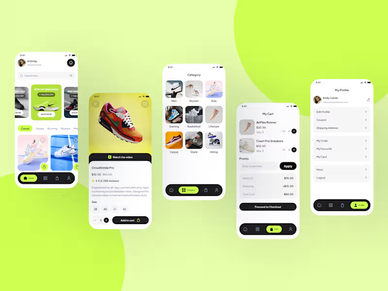
Designed a modern and visually engaging eCommerce sneaker app UI in Figma, focused on delivering a seamless and intuitive user experience. The design system is built using a clean grid, consistent spacing, and reusable components to ensure scalability and efficiency. Created end-to-end user flows including home, product details, category browsing, cart, and profile screens. Leveraged auto layout and component variants to maintain consistency across the interface. Incorporated high-quality visuals, soft shadows, and rounded elements to achieve a polished, modern look. Special attention was given to usability — clear CTAs, structured hierarchy, and accessible navigation enhance the overall experience. This design balances aesthetics with functionality, making it ready for real-world implementation. #UIUXDesign #FigmaExpert #MobileAppDesign #EcommerceDesign #AppUI #UserExperience #ProductDesign #FigmaUI #DesignSystem #UXUI #InterfaceDesign #StartupDesign #SaaSDesign #FreelanceDesigner
2
84
Figma Make
(13)
Follow
Message
Explore people