The network for creativity
Join 1.25M professional creatives like you
Connect with clients, get discovered, and run your business 100% commission-free
Creatives on Contra have earned over $150M and we are just getting started
Back to feedPost
🚀 Contra x Figma Makeathon Submission — Contra x #FigmaMakeathon
Proud to submit my experimental prototype for #FigmaMakeathon with Contra
An experimental prototype exploring interfaces that respond to human presence instead of clicks.
I designed three original interaction models — Attention Field, Interface Temperature, and Interface Gravity — that allow the system to reorganize itself based on focus, usage patterns, and behavioral clustering. Together, they form a unified adaptive interface that evolves in real time.
Grateful to be part of this exploration with Contra x Figma Makeathon.
Website link: https://glad-wad-53268566.figma.site
Figma Community Link: https://www.figma.com/community/file/1608886078244703153
#figmamakeathon
#ContraFigmaMakeathon
#InteractionDesign #ExperimentalUI #FutureOfDesign



So creative! I had fun playing with the cursor

Hey Kiera Sexton, Thanks. One more submission on the way soon, that will be more interesting.

Cool
The network for creativity
Join 1.25M professional creatives like you
Connect with clients, get discovered, and run your business 100% commission-free
Creatives on Contra have earned over $150M and we are just getting started



Related posts

A fashion storefront needs to show the outfit and make its individual pieces easy to find.
For FORM, I paired a warm, editorial lookbook with clearly grouped product names, prices, and size choices.
Cream surfaces, charcoal typography, and consistent product cards connect the homepage with the desktop and mobile screen concepts.
One useful design principle from this project: give campaign imagery and shopping details their own readable zones. The collection can have a strong visual presence while the next product decision stays clear.
Explore the complete design case study:
https://contra.com/p/rNPRqooQ-form-fashion-e-commerce-website-design
When exploring a clothing collection, what helps you most: a styled outfit or an individual product grid?

Adorable

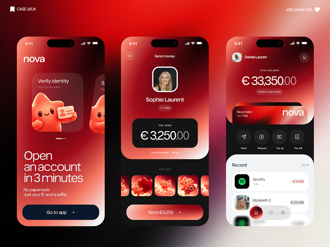
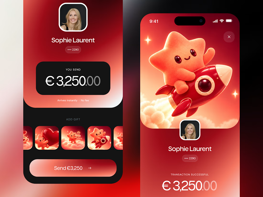
What if sending money felt a little more like giving a gift?
For Nova, I explored a banking app that brings payments, cards, and a bit of personality together. You can check your balance, browse recent transactions, send or request money, top up, and pay bills.
My favorite part is the digital postcard feature. Before sending a transfer, you can add a little illustrated card—a heart, a birthday greeting, or a playful character. A simple way to make birthday money or a thank-you feel more personal.
I carried that same 3D character into onboarding, pairing it with bold red gradients and large, clear payment details. There’s room for play, while the recipient and amount stay easy to check.
Would you add a postcard to a transfer? I’d love to know what occasion you’d use it for.




Weekend fun 😺. The new MacBook Pro has a Dynamic Island, and I kept wondering: what if that little pill was where your AI agent lived?
Try it live: https://lab.behzad.me/agent-mew/
So I spent the weekend prototyping Agent Mew. You drop a file on the notch, give it a task, and it quietly works up there while you keep doing your thing. It shows progress in the wings, asks a quick question when it needs one, and always waits for your OK before doing anything that leaves your Mac, like sending an email.
A few things I explored:
- Progress that stays out of the way, readable at a glance
- Questions as one tap, not a chat window
- Approval cards for anything with real consequences
- Paused and stuck states that tell you what to do next
- A small animated cat, because agents should have some personality


Approval cards for anything that leaves the Mac is the right line to draw. Does the card show the full email before you tap OK, or a short summary? I'd lean toward full text for anything going to another person.