
Nikita K Kakade
UI/UX Designer + Webflow Developer | 7 yrs
Ready for work
Nikita is ready for their next project!
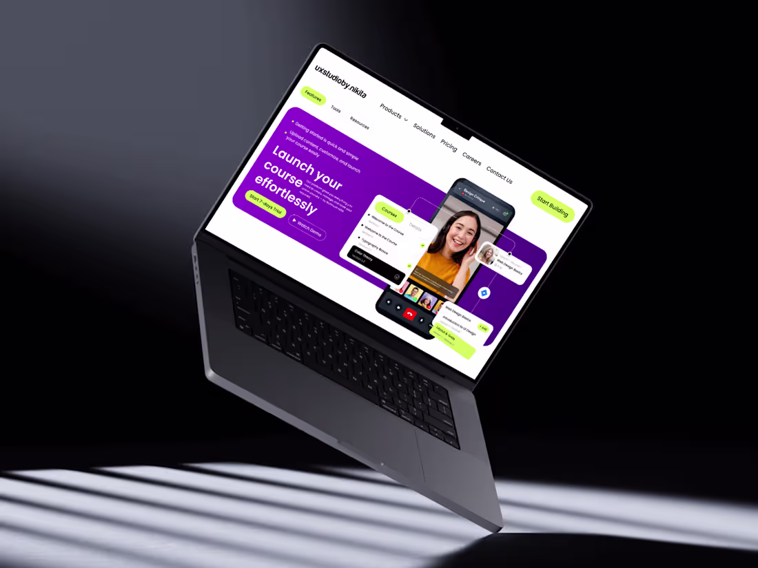
Designed a modern, high-converting SaaS hero section in Figma focused on strong visual hierarchy, clean aesthetics, and usability. Built using a structured grid system with precise spacing and alignment for a balanced and professional layout.
The design highlights a bold gradient hero background, clear typography hierarchy, and impactful call-to-action buttons to boost engagement. Key components like the navbar, buttons, and cards are created using Auto Layout, ensuring scalability and responsiveness.
Interactive elements such as course cards and video overlays are enhanced with subtle shadows, soft corner radius, and layered composition to add depth and a premium feel. Consistent use of color, spacing, and typography ensures a cohesive design system throughout.
Perfect for SaaS platforms, course websites, and startups aiming for a modern, user-friendly, and conversion-driven interface.
#UIUXDesign #FigmaDesign #SaaSDesign #WebDesign #ProductDesign #UIDesign #UXDesign #DesignSystem #LandingPageDesign #StartupDesign #CreativeDesign #InteractionDesign
1
41
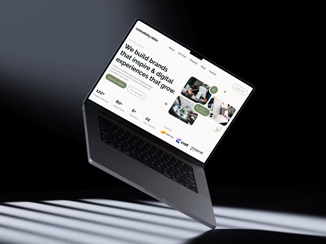
Designed this modern hero section in Figma using a structured 12-column grid for clean alignment and balance. Focused on strong typography to create clear visual hierarchy, paired with subtle supporting text for readability. A muted green accent builds brand identity and highlights key CTAs, while rounded buttons differentiate primary and secondary actions. The right side features an asymmetrical image composition with soft corners and minimal decorative elements for a polished, contemporary feel. Built using Auto Layout, consistent spacing, and reusable components to ensure scalability and responsiveness.
#Figma #UIDesign #UXDesign #WebDesign #LandingPage #DesignSystems #AutoLayout #UIUX #ProductDesign #CreativeDesign #ModernDesign
1
34
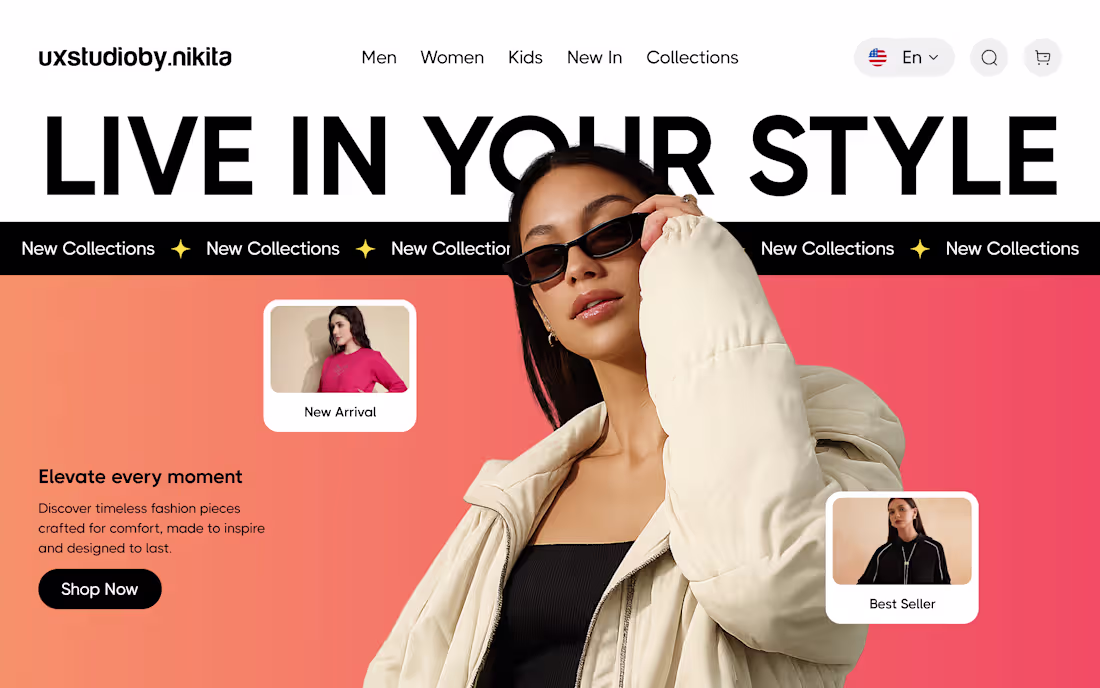
Clean, modern hero section designed in Figma with bold typography, gradient background, and layered visuals. The off-center model creates depth, while floating product cards and a strong CTA enhance engagement and guide user focus.
#UIUXDesign #FigmaDesign #WebDesign #HeroSection #EcommerceDesign #UIDesign #UXInspiration #DesignInspiration #LandingPage #CreativeDesign #ModernUI #ProductDesign #UXUI #DesignerLife
1
43
Designed this clean, conversion-focused hero section in Figma using strong typography, balanced layout, and a modern gradient palette. Focused on clear hierarchy, engaging visuals, and a bold CTA to drive attention and improve user experience.
#webdesign #figma #uidesign #uxdesign #landingpage #herosection #webdesigner #designinspiration #uiux #conversiondesign
1
41
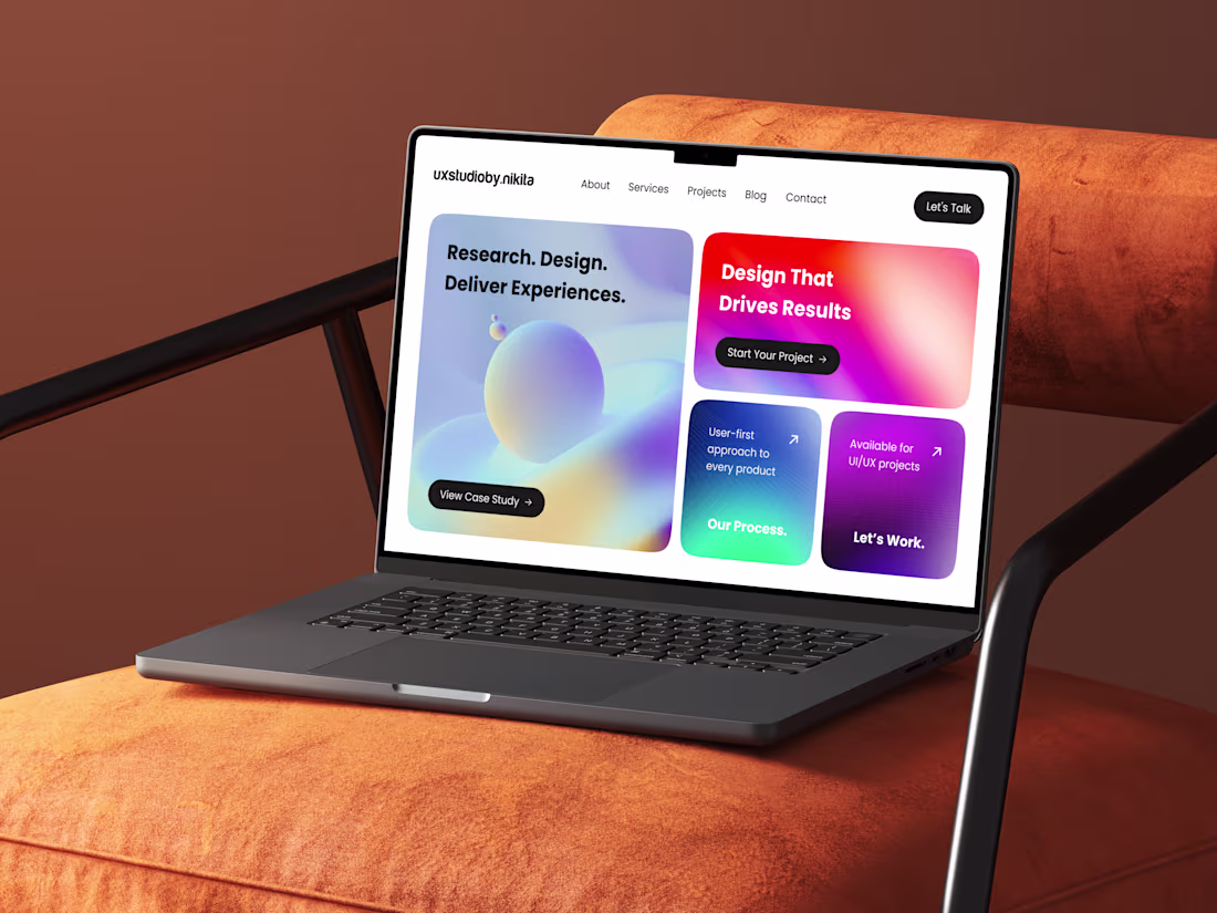
Check out this modern UX studio hero design—crafted with a user-first approach, bold gradients, and a clean card-based layout to drive engagement and conversions. Designed in Figma with scalability and clarity in mind.
#UIUX #FigmaDesign #UXDesign #UIDesign #WebDesign #DesignPortfolio #ProductDesign #UXStudio #CreativeDesign #InteractionDesign
1
35
I designed this hero section to balance visual impact with clarity and conversion. Using a structured grid and auto layout in Figma, I created a modular, responsive layout. Strong typography establishes hierarchy, while contrasting CTAs guide interaction. Subtle gradients and wave patterns add depth, supported by a clean blue palette for a modern, premium feel.
#UIDesign #UXDesign #FigmaDesign #WebDesign #HeroSection #DesignProcess #ProductDesign #UserExperience #InterfaceDesign #CreativeDesign
1
42
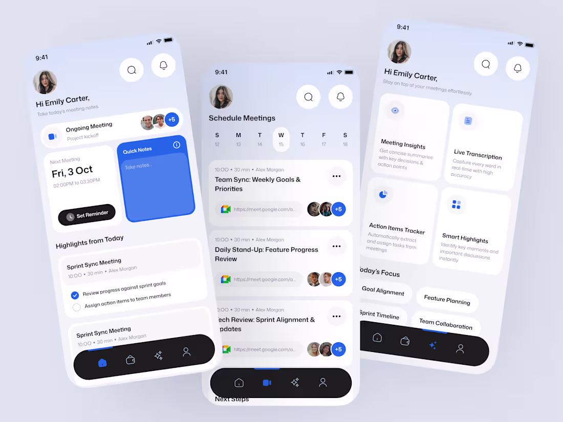
Designed to simplify meeting management, this UI focuses on clarity and efficiency. I used a modular, card-based layout to organize schedules, notes, and highlights for quick scanning. Key actions are emphasized with subtle accents, while a clean visual style ensures readability. Integrated AI features like insights, transcription, and task tracking make the experience smarter and more seamless.
#UIUXDesign #AppDesign #FigmaDesign #UXDesign #UIDesign #ProductDesign #MobileAppDesign #DesignInspiration #UserExperience #InterfaceDesign #CreativeDesign #UXInspiration #DesignThinking #StartupDesign #SaaSDesign #DigitalProductDesign #UXUI #CaseStudy #LinkedInDesign #DesignPortfolio
2
2
56
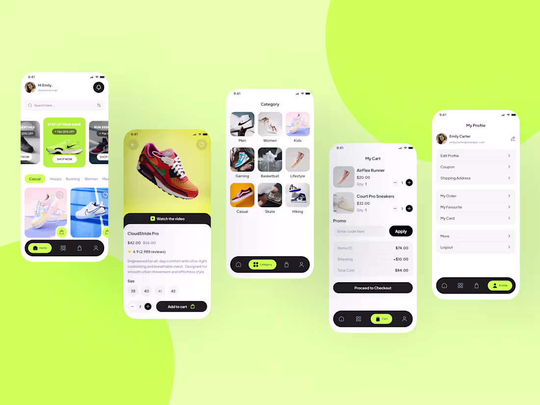
Designed a modern and visually engaging eCommerce sneaker app UI in Figma, focused on delivering a seamless and intuitive user experience. The design system is built using a clean grid, consistent spacing, and reusable components to ensure scalability and efficiency.
Created end-to-end user flows including home, product details, category browsing, cart, and profile screens. Leveraged auto layout and component variants to maintain consistency across the interface. Incorporated high-quality visuals, soft shadows, and rounded elements to achieve a polished, modern look.
Special attention was given to usability — clear CTAs, structured hierarchy, and accessible navigation enhance the overall experience. This design balances aesthetics with functionality, making it ready for real-world implementation.
#UIUXDesign #FigmaExpert #MobileAppDesign #EcommerceDesign #AppUI #UserExperience #ProductDesign #FigmaUI #DesignSystem #UXUI #InterfaceDesign #StartupDesign #SaaSDesign #FreelanceDesigner
2
74
I designed this modern food delivery mobile app UI in Figma with a strong focus on visual hierarchy, usability, and conversion-driven interactions. The layout follows a clean card-based structure, making it easy for users to browse categories, explore dishes, and quickly make decisions.
I started by defining a warm, appetizing color palette with rich browns and vibrant accents to enhance the food experience. Using Auto Layout and components, I ensured consistency across elements like cards, buttons, and navigation. The home screen highlights promotions and top items, while the menu list is structured for quick scanning with clear pricing, ratings, and prep time.
The product detail screen was crafted to drive engagement with high-quality imagery, clear descriptions, and intuitive quantity controls. I also designed an add-ons section and review area to improve user trust and customization. Spacing, typography, and micro-interactions were carefully balanced to create a smooth and premium user experience.
This design is fully scalable and developer-friendly, built with reusable components and a structured design system in Figma.
#UIUXDesign #FigmaDesign #MobileAppDesign #FoodApp #AppDesign #UXDesign #UIDesign #DesignSystem #InteractionDesign #ProductDesign #UserExperience #FoodDeliveryApp #InterfaceDesign #CreativeDesign
1
76
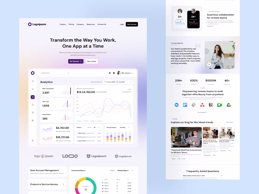
I designed this modern SaaS website UI in Figma with a focus on simplicity, scalability, and data-driven user experience.
I started by establishing a clean grid system and layout structure to maintain consistency across all sections. The hero section was crafted with a soft gradient background, bold typography, and clear call-to-action buttons to immediately communicate value and drive conversions.
The dashboard preview was a key focus, designed using card-based components to present analytics in a clear and visually engaging way. I used subtle shadows, rounded corners, and a minimal color palette to create depth while maintaining a clean interface.
Auto Layout and reusable components were implemented throughout the design to ensure consistency and easy scalability. Data visualization elements like charts, graphs, and progress indicators were carefully styled to enhance readability without overwhelming the user.
Additional sections such as testimonials, integrations, blogs, and FAQs were structured to build trust and improve user engagement. The overall design aims to deliver a seamless, modern, and intuitive experience tailored for SaaS products.
#WebDesign #UIDesign #UXDesign #Figma #SaaSDesign #DashboardUI #LandingPage #UIUX #ProductDesign #DataVisualization #DesignSystem #AutoLayout #ModernUI #CleanDesign
1
2
74
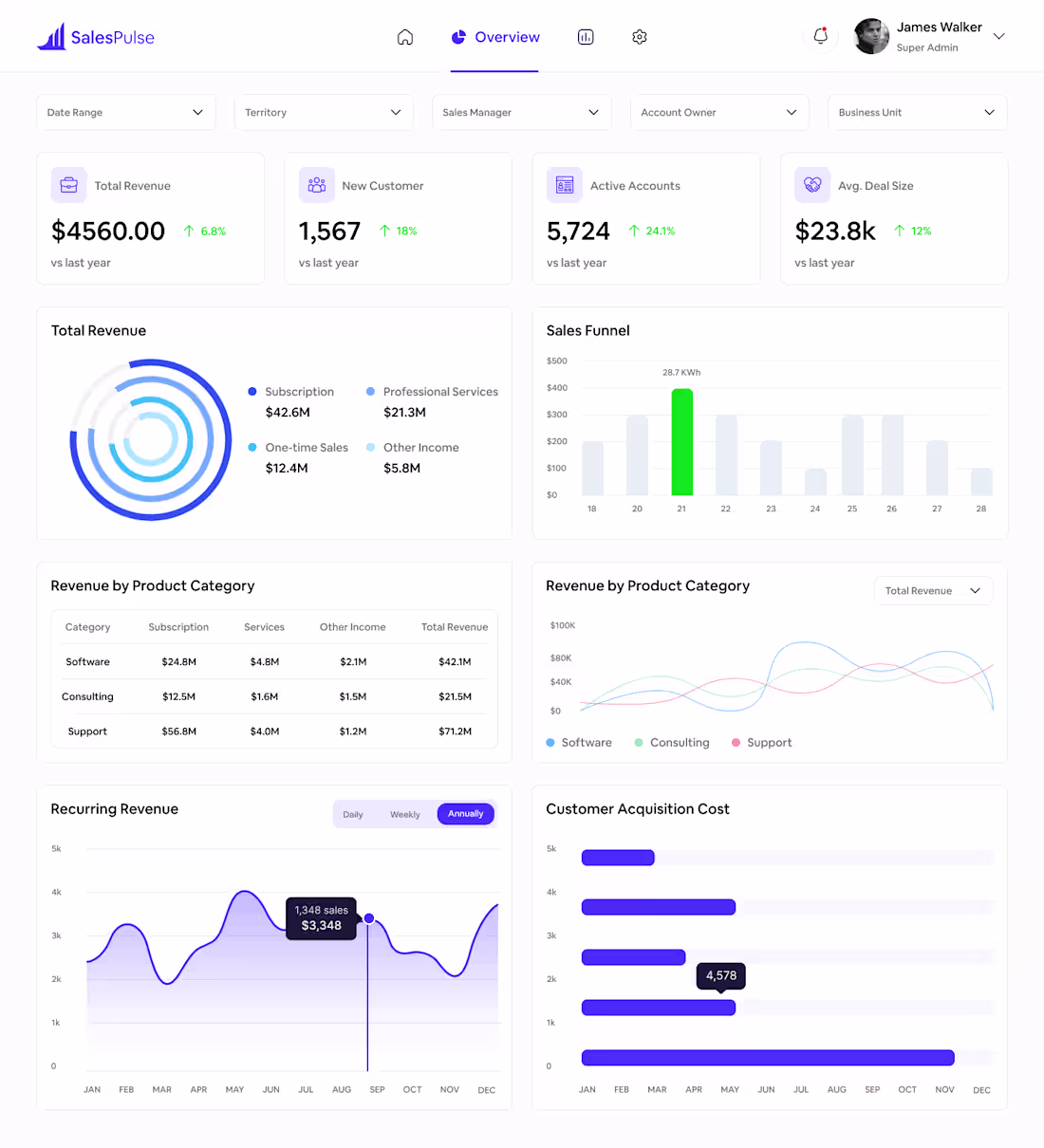
This SalesPulse dashboard was designed in Figma with a strong focus on clarity, usability, and scalable design systems. I began by setting up a 12-column grid and an 8pt spacing system to ensure consistency and alignment across all screens. The layout was structured using Auto Layout, making the design flexible and easy to adapt.
I built a component-based system including cards, dropdowns, navigation elements, and data widgets to maintain visual consistency. Each metric card was designed with a clear hierarchy—highlighting key data with bold typography and using subtle color cues to indicate performance trends.
For data visualization, I incorporated a mix of donut charts, bar graphs, line charts, and progress indicators to present complex information in an intuitive way. A minimal color palette with accent tones helps guide attention without overwhelming the user.
Typography and color styles were defined as global styles to streamline the workflow and ensure scalability. Variants were used for interactive states like toggles and filters. The final result is a clean, modern SaaS dashboard focused on readability, efficiency, and user-friendly experience.
#UIDesign #UXDesign #FigmaDesign #DashboardDesign #SaaSProduct #DataVisualization #DesignSystem #AutoLayout #AppDesign #WebAppDesign #UserInterface #UserExperience #MinimalUI #ProductDesign #CreativeUI
1
75
I designed this AI-powered mobile app UI in Figma with a strong focus on clarity, usability, and modern visual aesthetics. The process began with defining the core user journey—onboarding, authentication, home dashboard, and explore features—to ensure a seamless and intuitive flow.
Using Figma’s auto layout and an 8pt grid system, I created a consistent structure across all screens, maintaining precise spacing, alignment, and scalability. The visual direction leans toward a clean, minimal interface enhanced by soft gradients, rounded components, and subtle shadows to create depth without overwhelming the user.
Typography was kept bold and readable to establish hierarchy, while iconography and micro-interactions were carefully chosen to improve usability and engagement. The dashboard experience was designed to feel personalized and efficient, allowing users to quickly access key AI features like content creation, analytics, and brainstorming.
Overall, this project reflects my approach to combining functional UX thinking with modern UI design trends—resulting in a polished, user-friendly, and scalable mobile experience.
#UIUXDesign #FigmaDesign #MobileAppDesign #AppUI #UXDesign #ProductDesign #UIDesign #UserExperience #DesignPortfolio #InterfaceDesign #AIApp #SaaSDesign #StartupDesign #DesignSystem #InteractionDesign #CreativeDesign #MinimalDesign #ModernUI #UXPortfolio #AppDesign
2
81
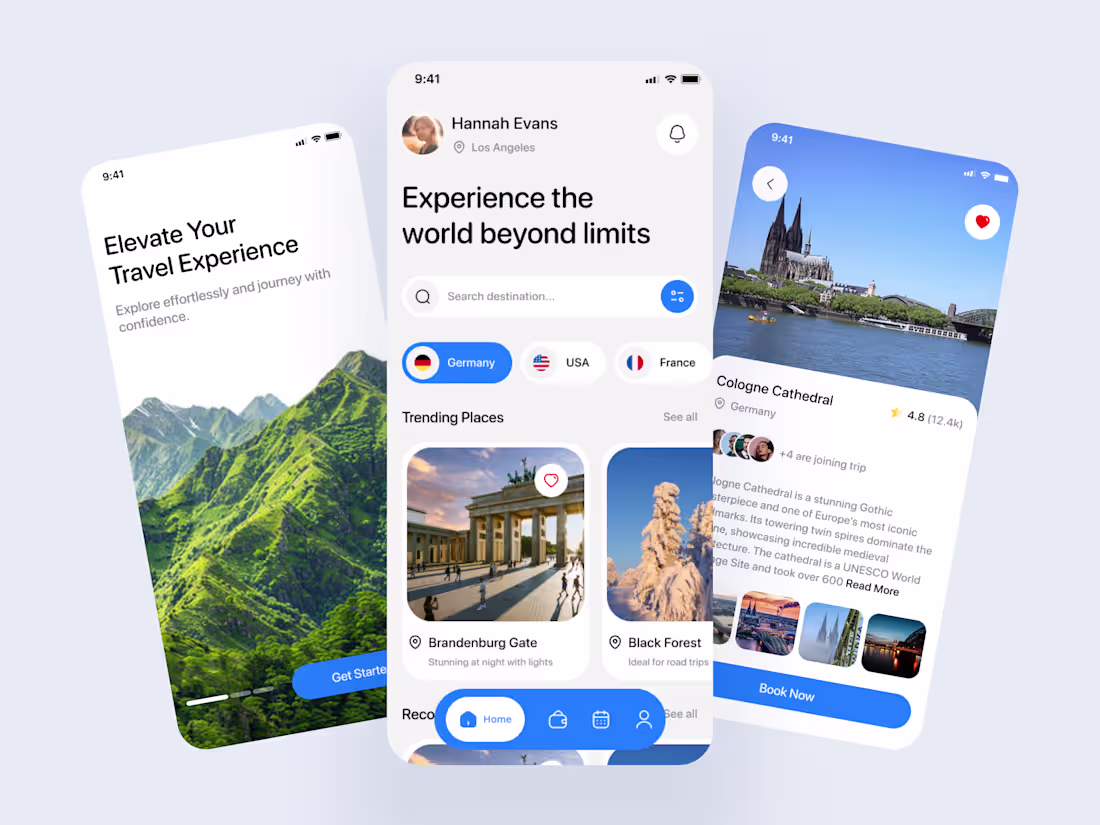
Designed a modern travel app UI in Figma focused on clarity, usability, and visual appeal. The project covers key screens like onboarding, home, and place details, ensuring a smooth and intuitive user flow.
Built using an 8pt grid system and auto layout for consistent spacing and scalable design. The interface follows a minimal aesthetic with bold typography and high-quality visuals to create an immersive travel experience.
Reusable components such as cards, buttons, and navigation elements were created for efficiency and consistency. Features like search, category filters, and trending sections enhance usability, while subtle shadows and rounded corners add a polished, modern feel.
Prototyped in Figma to demonstrate seamless interactions and transitions.
#UIUXDesign #FigmaDesign #AppDesign #MobileUI #ProductDesign #UXDesign #UIDesign #DesignPortfolio #TravelApp #CreativeDesign #InteractionDesign #DesignSystems #ModernUI #MinimalDesign #DigitalDesign
2
84
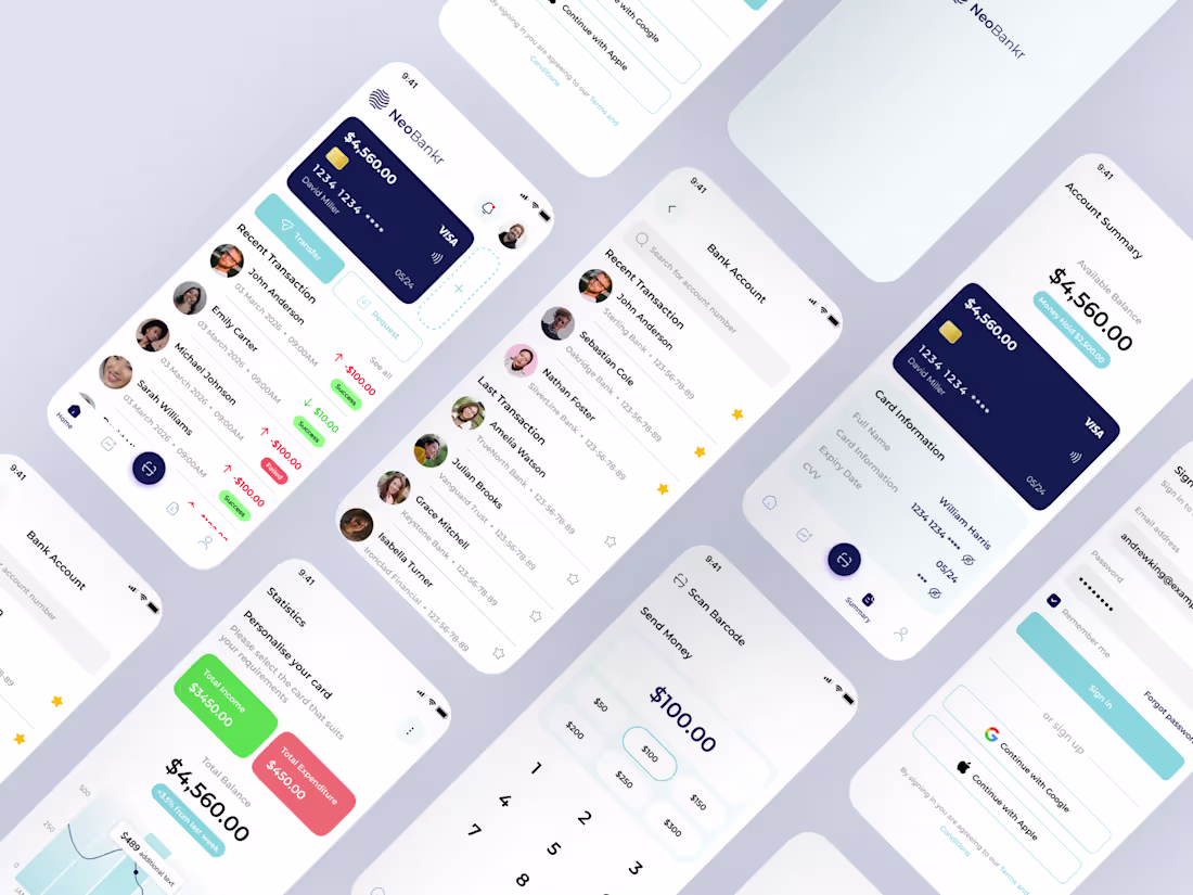
I designed a modern banking app UI in Figma with a strong focus on usability, clarity, and trust. The process included research, competitor analysis, and wireframing key user flows such as account overview, transactions, and payments.
I built a scalable design system with consistent typography, colors, and reusable components to ensure efficiency and visual consistency. The UI follows a clean, minimal approach to enhance user experience and reduce friction.
Interactive prototypes were created to demonstrate real user interactions, delivering a polished, user-centric fintech solution aligned with current design standards.
#UIUXDesign #FigmaDesign #FintechDesign #MobileAppDesign #ProductDesign #UserExperience #UserInterface #AppDesign #DesignSystem #Prototyping #UXResearch #InteractionDesign #FintechUI #DigitalProductDesign
2
96
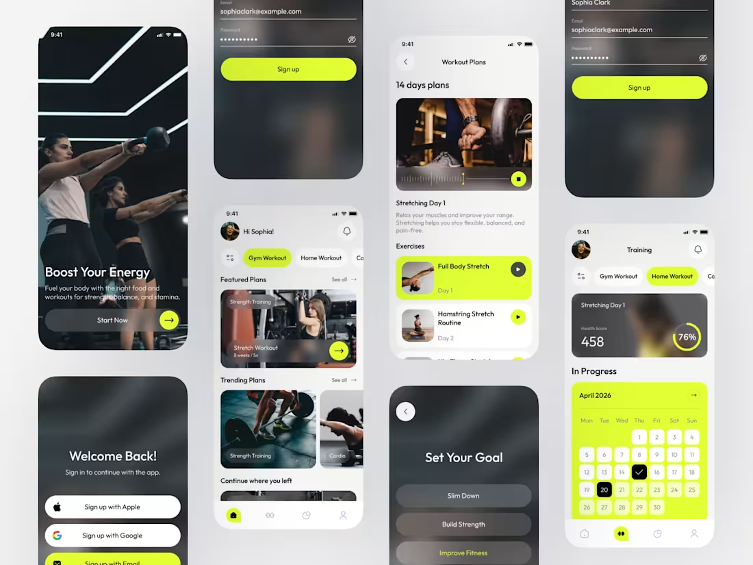
Designed a modern and scalable Fitness App UI in Figma, focused on delivering a clean, intuitive, and engaging user experience. The interface is crafted with a strong emphasis on usability, visual hierarchy, and seamless navigation to support users throughout their fitness journey.
This project includes thoughtfully designed screens for workout exploration, progress tracking, and goal-driven interactions. A minimal yet impactful design system ensures consistency while enhancing clarity and overall user engagement.
From wireframes to high-fidelity designs, every detail is built with a user-centered approach, reflecting a balance between aesthetics and functionality. This work highlights my ability to create polished, conversion-focused mobile app experiences tailored for real-world users.
3
4
190
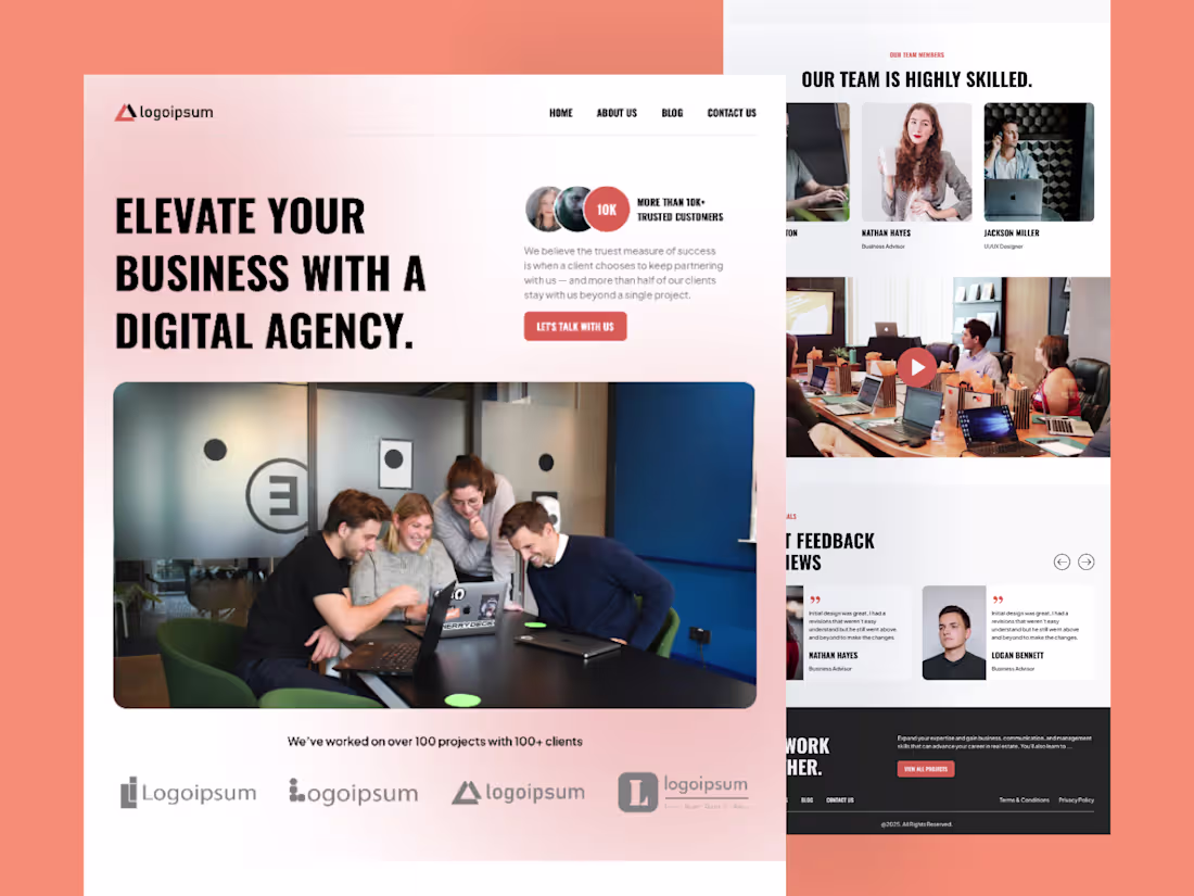
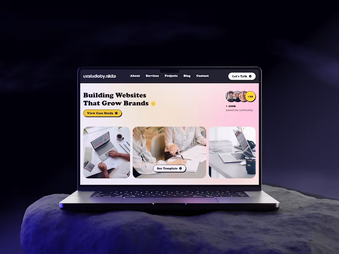
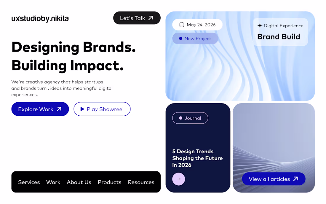
I designed this modern digital agency website in Figma with a focus on clean layout, strong visual hierarchy, and conversion-driven UI.
I started by structuring the layout using a grid system to ensure proper alignment and spacing across sections. The hero section was designed to immediately capture attention with bold typography, a clear value proposition, and a strong call-to-action.
I used a minimal color palette with a warm accent tone to create contrast and guide user focus. High-quality imagery and rounded containers were incorporated to add depth and make the interface feel approachable and modern.
Each section—from team showcase to testimonials and client logos—was carefully designed to build trust and improve user engagement. Auto Layout and reusable components were used throughout the design to maintain consistency and scalability.
The overall goal was to create a professional, user-friendly website that clearly communicates brand value while ensuring a smooth browsing experience.
#WebDesign #UIDesign #UXDesign #Figma #LandingPage #WebsiteDesign #DigitalAgency #UIUX #CleanDesign #ModernUI #ResponsiveDesign #DesignSystem #AutoLayout #ProductDesign
1
51
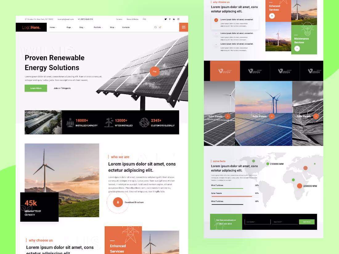
I designed this renewable energy website UI in Figma with a focus on clarity, structure, and modern visual appeal.
I began by defining a grid system and layout hierarchy to organize content effectively across sections. The hero section was designed to immediately communicate the brand’s value with bold typography, a strong headline, and high-quality imagery of solar panels to establish context and credibility.
I used a balanced color palette combining green and orange accents to represent sustainability and energy, while also guiding user attention to key actions like “Learn More” and contact sections. Clean spacing, consistent typography, and card-based layouts were used to improve readability and visual flow.
Key sections such as statistics, services, and global presence were designed using modular components and Auto Layout to ensure consistency and scalability. Visual elements like icons, progress bars, and maps were added to enhance data presentation and user engagement.
The overall design focuses on creating a professional, trustworthy, and easy-to-navigate experience tailored for an energy solutions brand.
#WebDesign #UIDesign #UXDesign #Figma #LandingPage #WebsiteDesign #CleanUI #ModernUI #UIUX #SaaSDesign #DashboardUI #DesignSystem #AutoLayout #Sustainability #GreenEnergy
1
47