The network for creativity
Join 1.25M professional creatives like you
Connect with clients, get discovered, and run your business 100% commission-free
Creatives on Contra have earned over $150M and we are just getting started
Back to feedPost
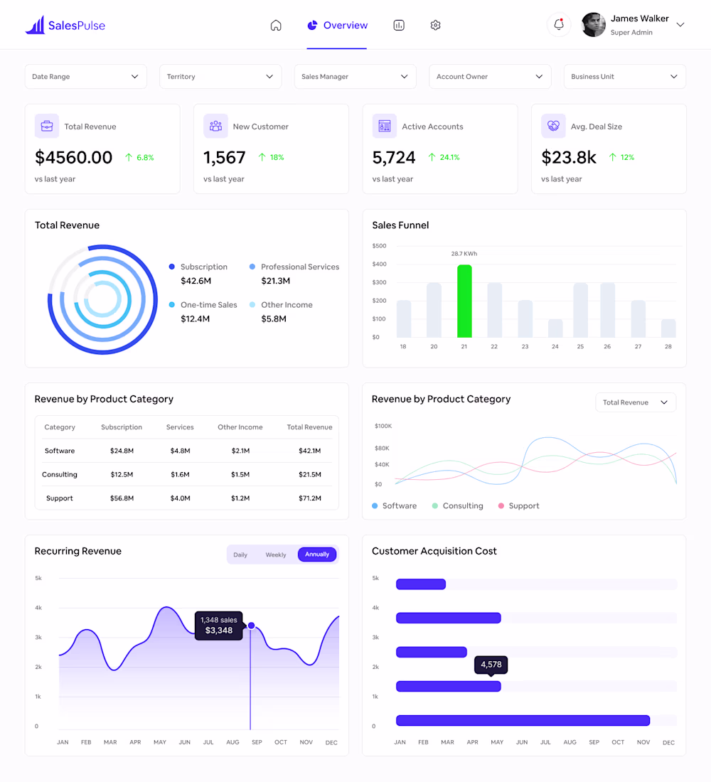
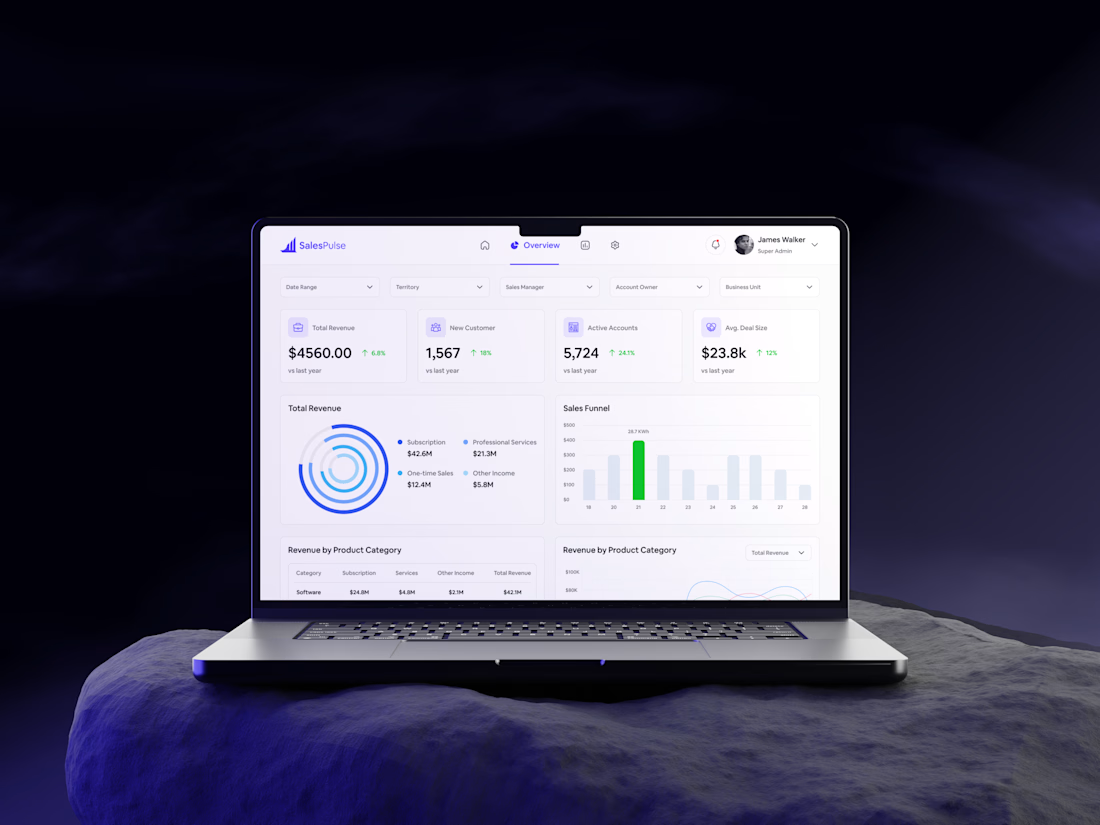
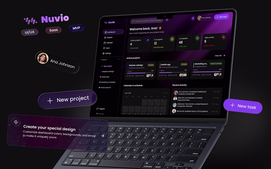
This SalesPulse dashboard was designed in Figma with a strong focus on clarity, usability, and scalable design systems. I began by setting up a 12-column grid and an 8pt spacing system to ensure consistency and alignment across all screens. The layout was structured using Auto Layout, making the design flexible and easy to adapt.
I built a component-based system including cards, dropdowns, navigation elements, and data widgets to maintain visual consistency. Each metric card was designed with a clear hierarchy—highlighting key data with bold typography and using subtle color cues to indicate performance trends.
For data visualization, I incorporated a mix of donut charts, bar graphs, line charts, and progress indicators to present complex information in an intuitive way. A minimal color palette with accent tones helps guide attention without overwhelming the user.
Typography and color styles were defined as global styles to streamline the workflow and ensure scalability. Variants were used for interactive states like toggles and filters. The final result is a clean, modern SaaS dashboard focused on readability, efficiency, and user-friendly experience.
#UIDesign #UXDesign #FigmaDesign #DashboardDesign #SaaSProduct #DataVisualization #DesignSystem #AutoLayout #AppDesign #WebAppDesign #UserInterface #UserExperience #MinimalUI #ProductDesign #CreativeUI
The network for creativity
Join 1.25M professional creatives like you
Connect with clients, get discovered, and run your business 100% commission-free
Creatives on Contra have earned over $150M and we are just getting started
Related posts
Hi Contra 👋
I'm Anastasiia, a UI/UX designer, and this is my first post here.
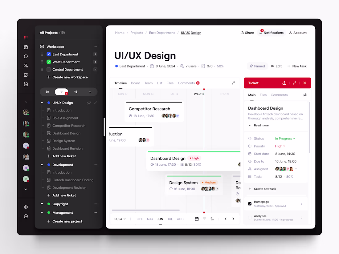
I've been in design for almost two years, and lately I've been working on a SaaS product for project and team management. It's been one of those projects that made me think deeply about collaboration, structure, and how to make complex workflows feel simple and intuitive.
I'm currently at the finish line, refining the last details, and I thought this would be the perfect time to share a first look.
Excited to be here, connect with other creatives, and share more of my journey along the way 😍
Amazing work! Welcome on Contra 😍
Hi everyone! 👋 Sharing a case study from my portfolio.
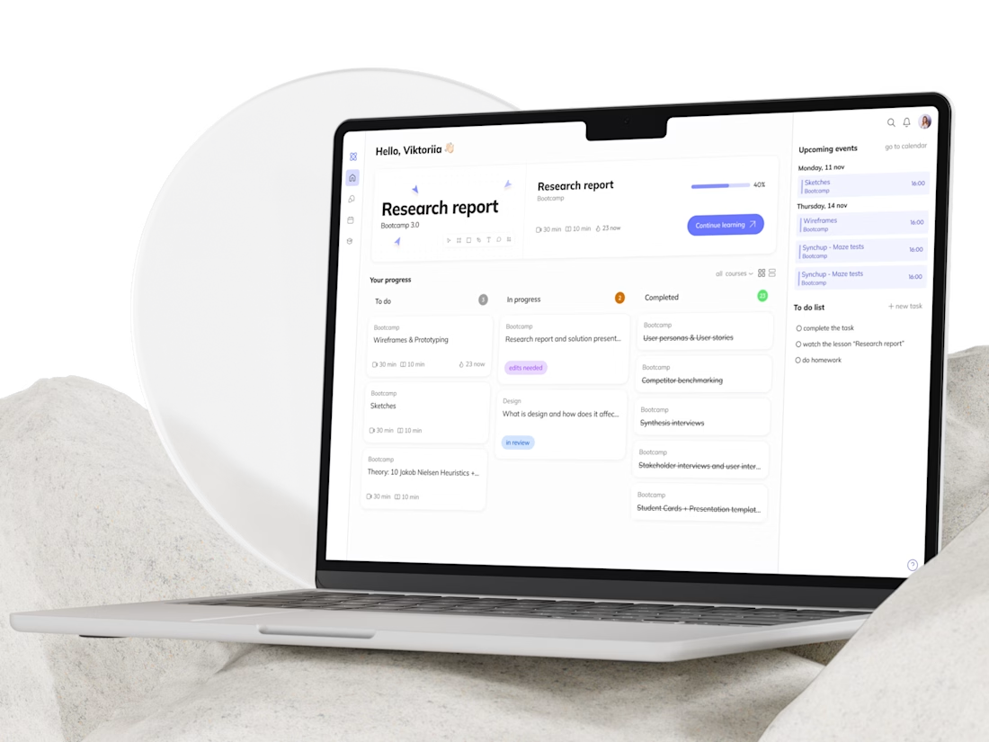
It's a learning platform called Students Hub, where all of a student's courses live in one place: lessons, homework, notes, schedule - no switching between a dozen different apps.
Worked through the full UX cycle: research, wireframes, usability testing, and final UI with a design system.
Details in the case study 👇
what a clean and airy work!
Hi, Contra community 🫶 We’re kicking off the new week with a new piece of work. I’d really appreciate your support 🤓❤️
Also, if you want to follow along as I grow my account from zero to 1,000 followers, follow me 🎉 Every day, I’ll post updates and show you what worked and what didn’t 🤝
Great job
Trending
Claude
Claude has entered the design space. How are you using Claude Design?
Contra University
Learn from expert creatives how to earn more using next-gen AI tools.
MagicPath
The canvas is infinite, and exploration is becoming the workflow. How are you using MagicPath?
creativeaiflow
Creative AI workflows are evolving. What tools do you use, and what are their strengths and weaknesses?
freelancerlife
Freelancer life is wins, pivots, and everything in between. What’s yours right now?