Freelancers using iStock in Ikeja
Sign Up
Post a job
Sign Up
Log In
Filters
2
Projects
People
Fadare Caleb Timileyin
Lagos, Nigeria
Canva & Digital Product, Brand, Website & UI/UX Designer
5.0
Rating
3
Followers
Follow
Message
Canva & Digital Product, Brand, Website & UI/UX Designer
0
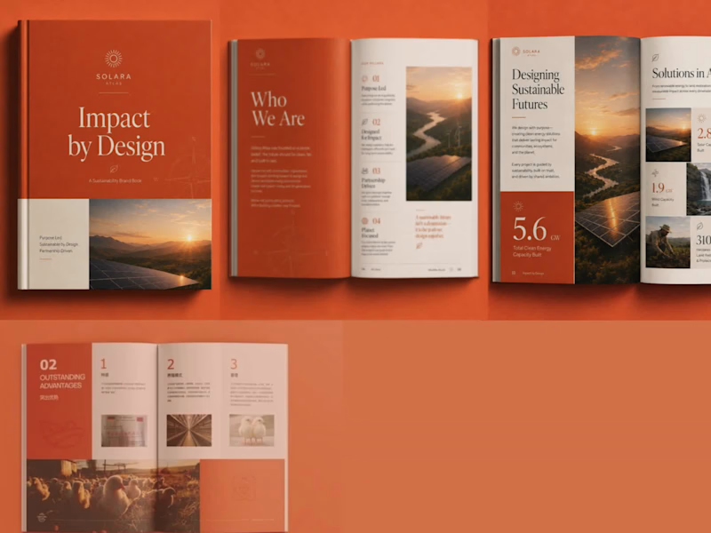
1. The Goal of the Project The goal was to transform an ordinary corporate book into a premium, modern, and visually engaging brand publication. I wanted the final design to communicate professionalism and sustainability while creating a strong visual identity that could remain consistent across the cover and interior pages. The project was rebranded as SOLARA ATLAS – Impact by Design, with a visual direction centred on sustainability, innovation, and positive environmental impact. 2. The Challenges Faced The original design had useful information but lacked a distinctive brand personality and stronger visual hierarchy. The main challenge was finding a way to present large amounts of text, statistics, images, and corporate information without making the pages feel crowded or repetitive. Another challenge was maintaining consistency across different types of pages while still making every spread visually interesting. The design needed to work equally well for storytelling pages, statistics, corporate information, photographs, and infographic-style content. 3. Project Overview SOLARA ATLAS is a premium sustainability-focused brand book designed to communicate a company's purpose, environmental initiatives, achievements, and impact. I developed a complete visual direction using a sophisticated combination of terracotta orange, warm cream, charcoal, and natural photography. Elegant serif typography was paired with clean supporting fonts, minimalist line icons, strong numerical highlights, modular grids, and carefully selected renewable-energy imagery. The final concept includes a distinctive book cover and multiple editorial page layouts, creating a cohesive publication that feels professional, contemporary, and premium. 4. The Solution I Brought to the Client's Problem I redesigned the publication around a clear editorial system rather than treating every page as an individual design. I established a consistent colour palette, typography hierarchy, grid structure, icon style, photography direction, and visual language that could be applied throughout the entire book. I used bold section introductions to improve navigation, large statistics to make important information immediately noticeable, modular layouts to simplify complex information, and high-quality imagery to create emotional and visual impact. The result was a publication that transformed the client's information into a strong branded experience that is easier to read, more memorable, and visually capable of positioning the organisation as modern, credible, and premium.
0
99
0
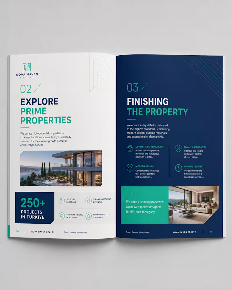
1. The Goal of the Project The goal of this project was to transform a basic real-estate brochure concept into a premium, professional, and highly engaging property investment publication. The client needed a brochure that could communicate property opportunities, investment benefits, development quality, and brand credibility in a way that felt trustworthy and visually sophisticated. The objective was not only to make the brochure attractive, but to create a strong visual identity that could position the company as a modern, reliable, and premium real-estate brand capable of appealing to investors, property buyers, and potential partners. For this reason, I developed the new brand concept NOVA HAVEN REALTY, with the tagline: Smart. Secure. Sustainable. 2. The Challenges Faced The major challenge was presenting a large amount of real-estate information without making the brochure look overcrowded or difficult to read. The content included property information, investment benefits, statistics, company strengths, project details, photographs, and supporting explanations. All of these needed to work together within one consistent design system. Another challenge was creating a professional balance between corporate credibility and luxury presentation. The brochure needed to look premium enough to attract serious property investors while remaining clean, informative, and easy to understand. It was also important to maintain consistency across the cover and different interior layouts while allowing each page to have its own visual character. 3. Project Overview Nova Haven Realty – Property Investment & Development Guide 2026 is a modern real-estate corporate brochure created to present investment opportunities, property developments, company strengths, and investor benefits. I developed a complete visual direction using a sophisticated combination of: Deep navy blue for trust, professionalism, and authority Teal and mint green for freshness, growth, and investment opportunities White and light grey for clarity and visual balance Premium architectural and property photography Clean geometric graphics and architectural line elements Modern typography with bold headings and clear information hierarchy The brochure includes a professionally designed front cover and multiple interior spread concepts, allowing different types of information to be presented while maintaining one consistent brand identity. The overall design direction communicates trust, investment confidence, modern living, quality development, and long-term value. 4. The Solution I Brought to the Client's Problem I approached the project by creating a complete editorial and visual design system instead of simply decorating individual pages. I established a consistent brand language using navy blue, teal, white, typography hierarchy, geometric elements, iconography, page numbering, photography, and structured layouts. Important information such as investment returns, number of projects, years of experience, and property advantages was presented using large numerical highlights and dedicated statistic blocks, making important information easier for readers to notice immediately. I also used modular grid layouts to separate complex information into smaller, easy-to-understand sections. High-quality property images were strategically positioned to create visual impact and help potential buyers imagine the lifestyle and quality associated with the developments. The final result is a premium, organised, and visually persuasive real-estate brochure that improves readability, strengthens brand credibility, and gives the client a professional marketing tool capable of presenting their property opportunities with greater confidence and authority.
0
89
0
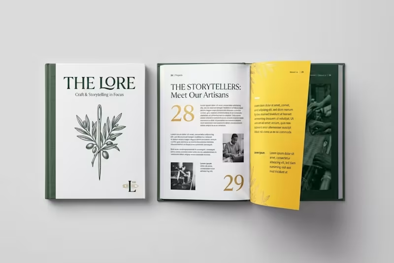
Project Overview THE LORE is a complete brand elevation and layout overhaul, transforming a stark corporate brochure into a premium, narrative-driven editorial book. Goal: Elevate a generic agency brochure into a high-end, artisanal publication that highlights heritage, craft, and brand storytelling. Challenges: The original design suffered from harsh contrast, rigid corporate formatting. Solution: Rebranded the title to "THE LORE," introduced an earthy color system (forest green, parchment, and gold), integrated custom botanical illustrations with high-contrast imagery.
0
103
0
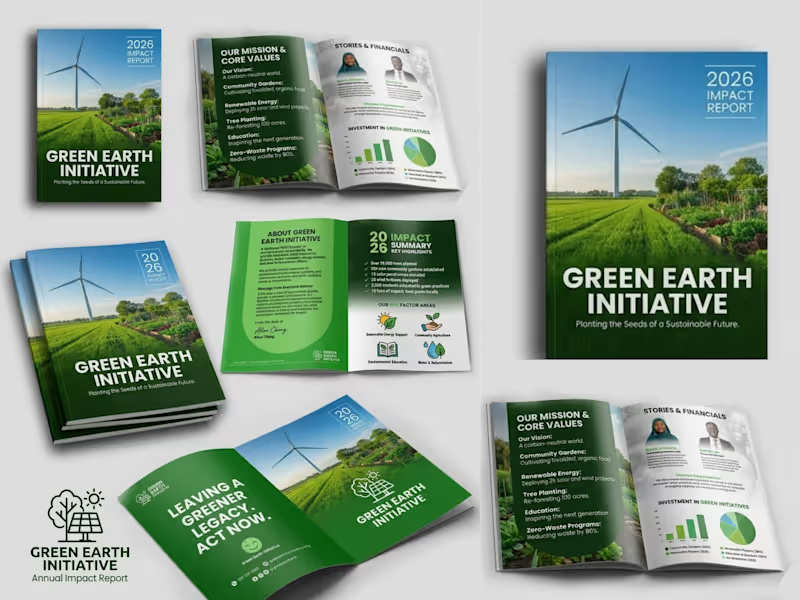
GREEN EARTH Overview I made a professional company profile design for GREEN EARTH INITIATIVE that showcases their brand's identity, values, services, and strengths through a clean, engaging, and visually compelling layout. Goal Create a company profile that builds credibility, communicates the brand's value, and leaves a lasting impression on clients, partners, and investors. Challenges Presenting detailed business information in a clear, organized, and visually appealing format while maintaining a strong brand identity. Solutions Developed a modern, well-structured design with strategic layouts, compelling visuals, and consistent branding to enhance readability, professionalism, and business impact.
0
219
iStock
(1)
Follow
Message
Timmy Labode
Lagos, Nigeria
Brand & UI/UX Designer helping brands bring ideas to life
Follow
Message
Brand & UI/UX Designer helping brands bring ideas to life
0
Ecowave Brand Identity
0
11
1
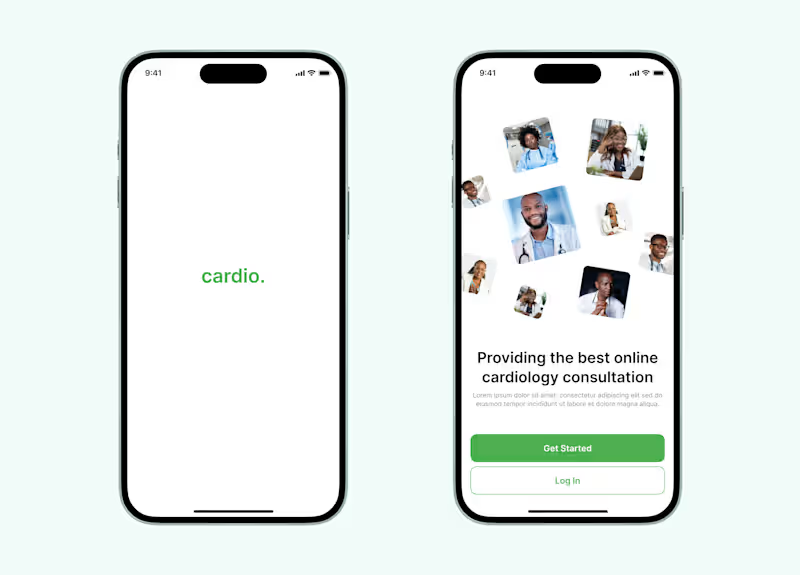
Mobile App Design for eHealth Cardiology Platform
1
5
1
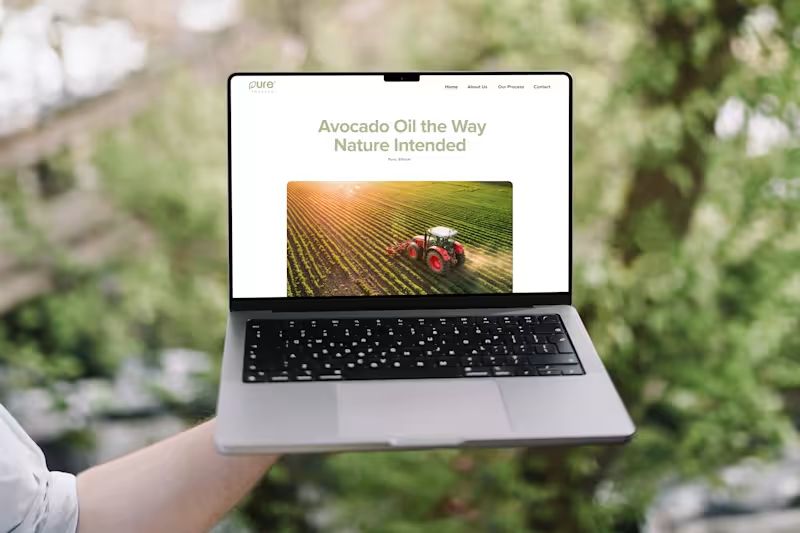
Landing Page Design for Pure Process
1
6
1
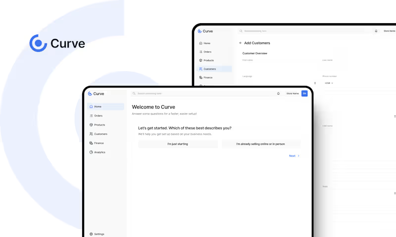
I designed the UI/UX for Curve, a modern CRM platform built to help businesses nurture customer relationships effortlessly. The goal was to create a clean, intuitive interface that makes client management simple and enjoyable. Check out the full project here 👇 https://timmyportfolio.notion.site/Curve-2627e92c210081f8ad69f91187470c41
1
130
iStock
(1)
Follow
Message
Edward Jaiyeola
pro
Lagos, Nigeria
Framer Designer & Revenue-Focused Sites | Ecom Partner | AI
$1k+
Earned
5.0
Rating
56
Followers
Follow
Message
Framer Designer & Revenue-Focused Sites | Ecom Partner | AI
1
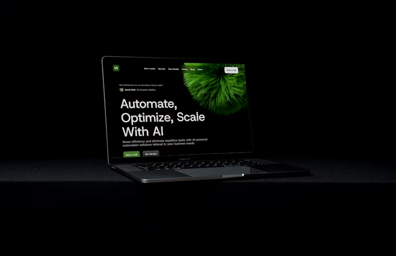
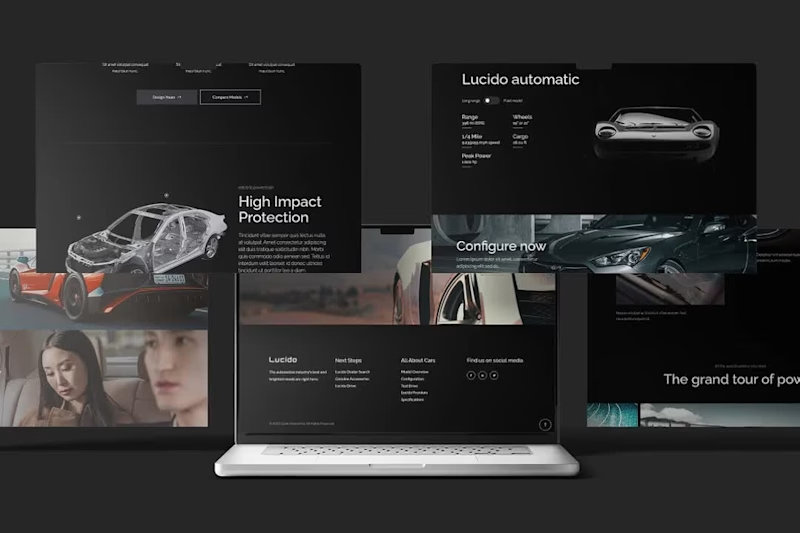
This was just me having fun with the Qi3 Theme Lucido Automotive template on my figma. Luxurious, Dark and Modern.
1
61
1
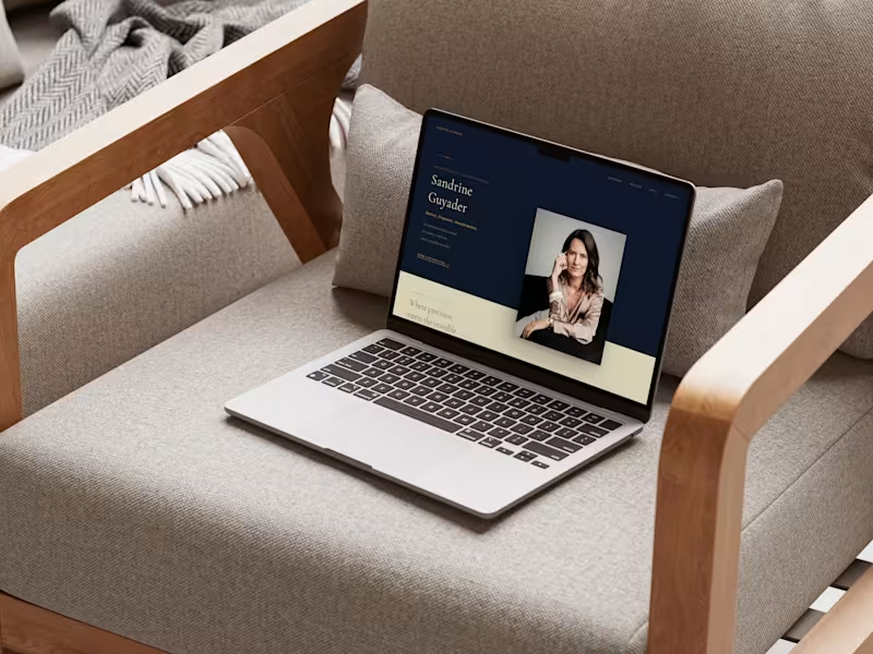
Premium Personal Brand Website for Executive Coach
1
12
2
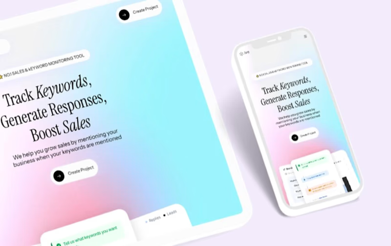
AI Agency Website
2
14
1
Sassy Hero Section Design on Framer.
1
12
iStock
(1)
Follow
Message
Abdullahi Usman
Lagos, Nigeria
Elite Logo & Brand Identity Designer
39
Followers
Follow
Message
Elite Logo & Brand Identity Designer
7
Tired of faceless brands and overseas call centers? So is SuperSolar. 🇦🇺 I recently wrapped up the brand identity and social media kit for Sydney’s newest solar leader. The goal was clear: move away from "digital-only" noise and back to local, face-to-face trust. ☀️ The Brand: SuperSolar ⚡ The Mission: 100% Australian-owned, in-person expertise. 📢 The Hook: "Bills Over." This project was about building a brand that feels like a neighbor, not a corporation. Check out the full identity below!
2
7
168
0
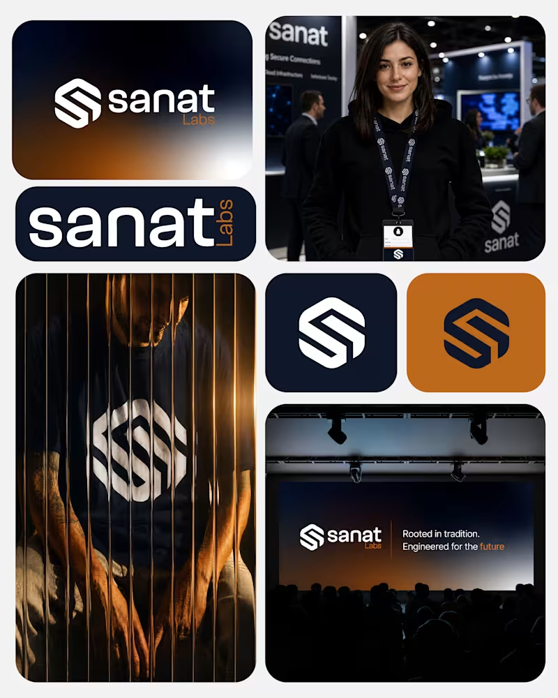
When most people think of a brand, the first thing that comes to mind is the mark. But a logo is just the tip of the iceberg; it’s the signature, not the entire conversation. For this recent project, the goal wasn't just to design something visually striking. It was to build a cohesive visual system that can scale across every touchpoint. A strong identity doesn’t just look good on a screen; it solves business problems, builds trust, and creates an unforgettable user experience. Swipe through to see the breakdown of the visual system in action. 👇
0
27
2
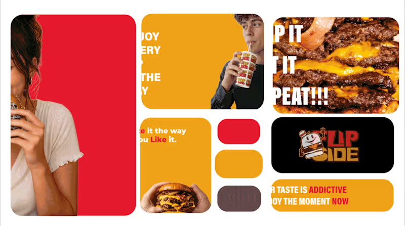
I’ve been exploring how to present brand systems in a more structured, modern way. For Flip Side, I created this bento grid animation to showcase how the mascot, wordmark, and color system work together in a digital space. When branding for high-energy food markets, the digital presentation needs to be just as punchy as the physical packaging.
2
2
90
1
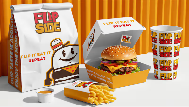
I recently completed the visual identity for Flip Side, a street burger brand targeting the US and European markets. For this project, the goal was to marry the high-energy vibe of modern street food with a nostalgic, character-driven aesthetic. The Strategy: Market Positioning: Leveraged a "rubber-hose" mascot style to create instant brand recognition and approachability in a competitive urban landscape. The System: Implemented a strict 60-30-10 color rule using a palette of Golden Yellow (#F0A116), Red (#E5192D), and Dark Brown (#442D17) to ensure consistency across every touchpoint—from burger wraps to staff apparel. Scalability: Designed a versatile pattern system that works as well on a snack box as it does on a digital menu. Deliverables: Brand Strategy, Mascot Illustration, Pattern Design, and Packaging Systems. Looking to launch or rebrand? I’m currently accepting new projects here on Contra. Let’s build something memorable. #BrandIdentity #LogoDesign #MascotDesign #PackagingDesign #ContraIndependents #StreetFoodBranding #GraphicDesign
1
54
iStock
(1)
Follow
Message
Abel-onuh Paul
Lagos, Nigeria
I create UGC video ads, product demos and reviews
New to Contra
Follow
Message
I create UGC video ads, product demos and reviews
0
YouTube Tutorial Video • SaaS Software Tutorial • Screen Recording Editing • Digital Marketing Content This is a software tutorial / educational YouTube video explaining how to use ManyChat for beginners. The video combines talking-head footage, screen recordings, branded title cards, animated visual elements, UI highlights, and product demonstrations.
0
11
0
Faceless YouTube Video Editing | Cloud Computing & Technology Education I Edited a faceless educational video around cloud computing with animated diagrams, illustrated characters, technology graphics, and information-driven visual storytelling. The structure is suited to educational YouTube channels where animation and graphics support the narration.
0
6
0
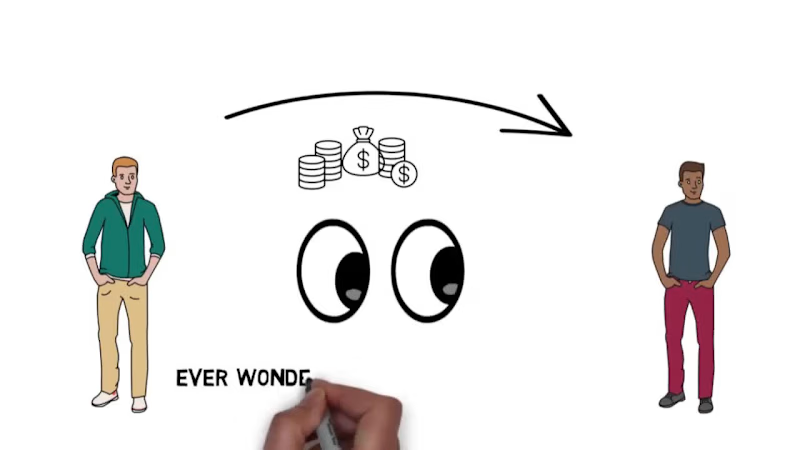
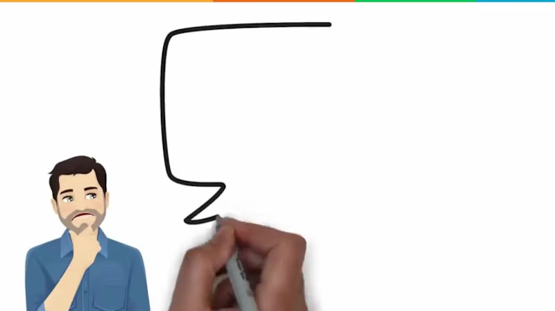
Blockchain Video Editing | Whiteboard Animation & Crypto Explainer Role Video Editor • Whiteboard Animation Editor • YouTube Video Editor Description Edited a blockchain education video using hand-drawn illustrations, character animation, transaction diagrams, cryptocurrency visuals, and animated explanations of hashing and digital signatures. The edit also incorporates an interactive quiz sequence to keep the educational content visually engaging and easy to follow.
0
3
0
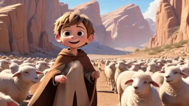
David & Goliath 3D Animation | Cinematic YouTube Video Editing Role 3D Animator • Video Editor • YouTube Content Editor Description Produced a cinematic 3D retelling of the David and Goliath story, moving from the shepherd's life and encounters with danger to his confrontation with a much larger warrior. Character-driven scenes, expressive animation, and cinematic compositions keep the story visually engaging throughout.
0
31
iStock
(1)
Follow
Message
Adefisayo Adojutelegan
Ikeja, Nigeria
Transform complex subjects into engaging lines.
New to Contra
Follow
Message
Transform complex subjects into engaging lines.
0
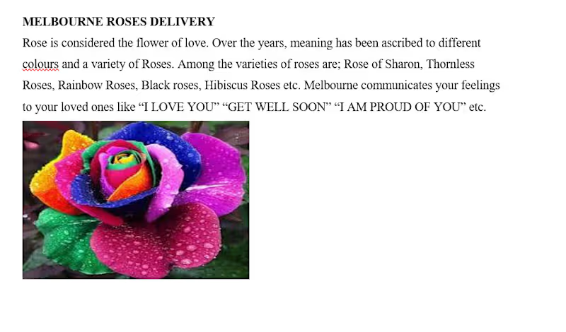
A landing page copy piece written for Melbourne florist shop, a flower delivery brand. The brief required translating a simple product listing into emotionally driven brand copy, connecting rose varieties and colours to human feelings and personal moments.
0
32
0
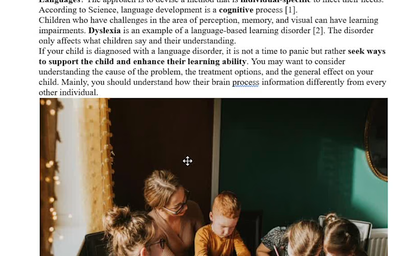
A research-backed blog post written to help parents and teachers identify, understand, and support children with language-based learning disabilities. The piece breaks down a complex psychological and educational topic into clear, accessible language, covering diagnosis, causes, symptoms, and practical support strategies for both home and classroom settings. It draws on peer-reviewed sources and expert references while remaining warm and readable for a non-specialist audience. This sample demonstrates the ability to handle sensitive health and education topics with accuracy, empathy, and clarity.
0
26
0
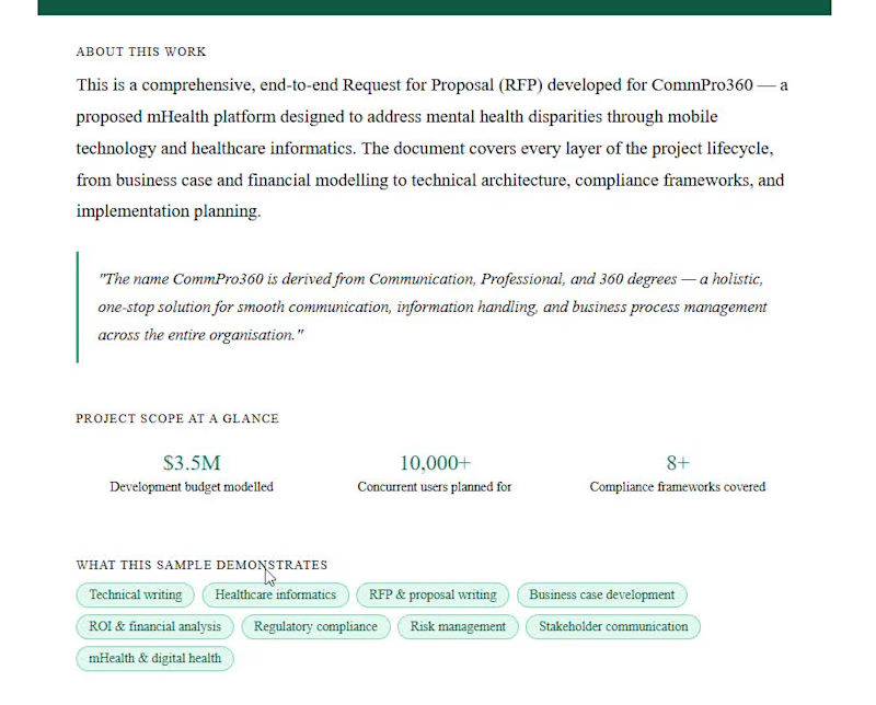
A full-scale Request for Proposal developed for CommPro360, a proposed mHealth platform targeting mental health disparities through mobile technology. The document spans technical architecture, financial modelling, regulatory compliance across eight frameworks, including HIPAA and GDPR, risk management, and a 12-month implementation roadmap. The proposal demonstrates research ability and structure. It communicates complex technical and business information with precision and clarity.
0
33
0
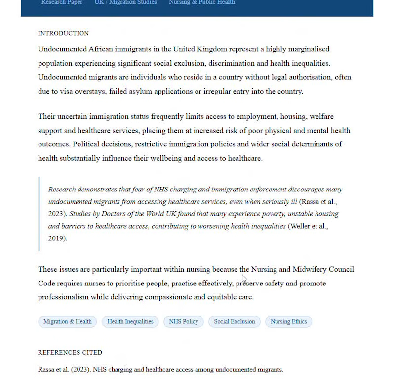
A research paper on healthcare access and health inequalities among undocumented African immigrants in the UK. It synthesises peer-reviewed evidence and institutional research to examine how immigration policy, NHS charging fears, and social exclusion intersect to marginalise a vulnerable population, while connecting the findings to nursing ethics and professional practice.
0
37
iStock
(1)
Follow
Message
Explore people